กำหนดค่าการตั้งค่าเทมเพลต In-App
การตั้งค่าเหล่านี้มีผลกับเทมเพลต In-App ทั้งหมดในครั้งเดียว แทนที่จะเป็นบล็อกเดียว เปิดหรือสร้างเทมเพลตใน editor ในตัว ก่อน (Content → In-apps) จากนั้นใช้ Settings และ In-app settings ตามที่อธิบายไว้ด้านล่าง
กำหนดค่าสไตล์ทั่วทั้งเทมเพลต
Anchor link toการตั้งค่าเทมเพลตจะควบคุมสไตล์สำหรับเทมเพลต In-App ทั้งหมด: ขนาดและพื้นหลังของเอกสาร ลักษณะของ popup และสไตล์เริ่มต้นสำหรับบล็อก
เปิดแท็บ Settings ในแผงด้านขวา
เริ่มต้นด้วยลักษณะที่ใช้ร่วมกัน จากนั้นขนาด แล้วจึงเป็นค่าเริ่มต้นสำหรับบล็อกใหม่:
- ตั้งค่า Color scheme และ Typography เพื่อให้สีและฟอนต์มีความสอดคล้องกันทั่วทั้งเทมเพลต
- ตั้งค่า Document และ Popup สำหรับขนาด ระยะขอบ พื้นหลัง และลักษณะที่ข้อความจะปรากฏบนพื้นหลังที่หรี่แสงลง
- ใช้ส่วนค่าเริ่มต้นเฉพาะเมื่อคุณต้องการให้บล็อกใหม่ตรงกับเทมเพลตโดยอัตโนมัติ
บน canvas ให้เปลี่ยนบล็อกเดียวเมื่อส่วนนั้นควรมีลักษณะแตกต่างออกไป ค่าเริ่มต้นจะถูกนำไปใช้ในทุกที่ที่บล็อกแต่ละบล็อกไม่ได้กำหนดค่าทับ หากต้องการล้างการกำหนดค่าสไตล์ทับบนเทมเพลตและกลับไปใช้ค่าเริ่มต้น ให้ใช้ Reset custom styles ในเมนู ⋮ ที่แถบด้านบน ดู สร้างข้อความ In-App ใน editor ในตัว
ขนาดเอกสารและ popup
Anchor link toใช้ Document เพื่อควบคุมขนาดข้อความและระยะห่างของ canvas ใช้ Popup เพื่อควบคุมลักษณะที่ข้อความจะปรากฏบนพื้นหลังที่หรี่แสงลง ไม่มีการตั้งค่าความสูง popup จะขยายตามเนื้อหา
Document
Anchor link toใน Document ให้ตั้งค่า padding, ภาพพื้นหลัง, ช่องว่างระหว่างบล็อก และรัศมีมุมเริ่มต้นสำหรับรูปภาพ
หากต้องการเปลี่ยนความกว้างของ popup ที่แสดงบนโทรศัพท์ ให้ใช้สองฟิลด์นี้ใน Document
Max width (px) คือความกว้างสูงสุดที่ popup สามารถมีได้ในหน่วยพิกเซล บนหน้าจอขนาดใหญ่ popup จะไม่ขยายเกินตัวเลขนี้
Side gutters (px) อยู่ใต้ Padding โดยตรง ใช้สำหรับตั้งค่าพื้นที่ว่างทางด้านซ้ายและขวาของ popup ค่าเดียวมีผลทั้งสองด้าน เปลี่ยนฟิลด์นี้เมื่อคุณต้องการให้ popup ดูกว้างขึ้นหรือแคบลง:
- เพิ่มตัวเลขเพื่อเว้นพื้นที่ว่างมากขึ้นและทำให้ popup แคบลง
- ลดตัวเลขเพื่อทำให้ popup กว้างขึ้น
- ป้อนตัวเลขติดลบและ editor จะถือว่าเป็น 0
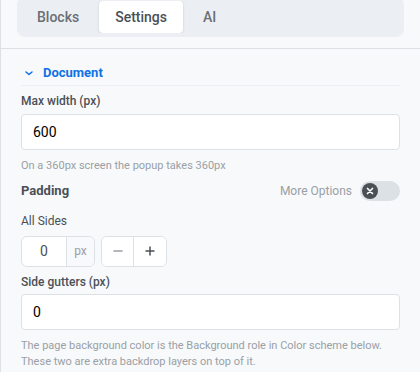
เทมเพลตใหม่เริ่มต้นที่ 0 px gutters ดังนั้น popup จะเต็มความกว้างของหน้าจอ
ตรวจสอบคำแนะนำใต้ Max width เพื่อดูว่า popup จะกว้างเท่าใดด้วยค่าปัจจุบันของคุณ
Popup
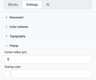
Anchor link toใน Popup ให้ตั้งค่ารัศมีมุมและสีของ overlay สำหรับลักษณะที่ข้อความจะปรากฏบนพื้นหลังที่หรี่แสงลง
รูปแบบสีและตัวอักษร
Anchor link toใน Color scheme ให้ตั้งค่าบทบาทสีที่มีชื่อ (heading, accent, links, background, borders และอื่นๆ) บทบาทเหล่านั้นจะอัปเดตสีทั่วทั้งเทมเพลตในครั้งเดียว บล็อกที่มีอยู่จะยังคงใช้สีที่คุณตั้งค่าไว้แล้ว
ใน Typography ให้ตั้งค่าตระกูลฟอนต์และขนาดเริ่มต้นสำหรับข้อความในเทมเพลต
รูปแบบ Dark mode
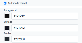
Anchor link toDark mode variant ช่วยให้คุณสามารถตั้งค่าชุดสีที่สองสำหรับเมื่อเทมเพลตแสดงใน dark mode
- ใน Color scheme ให้เปิด Dark mode variant
- ตั้งค่าสีแยกต่างหากสำหรับ dark mode
- ใช้ ไอคอนพระอาทิตย์/พระจันทร์ ในแถบด้านบนเพื่อตรวจสอบโหมดสว่างเทียบกับโหมดมืดขณะแก้ไข
การสลับบน canvas นี้ไม่เหมือนกับแผง Preview ที่เป็นแบบอ่านอย่างเดียว จนกว่าคุณจะตั้งค่าสีเข้มของคุณเอง การสลับนี้สามารถสร้างสีเหล่านั้นโดยอัตโนมัติได้ ดู สร้างข้อความ In-App ใน editor ในตัว
ค่าเริ่มต้นของบล็อกและเลย์เอาต์
Anchor link toใช้ส่วนเหล่านี้เพื่อให้เนื้อหาใหม่ตรงกับเทมเพลตจนกว่าคุณจะจัดสไตล์บล็อกบน canvas:
- Block defaults: สไตล์เริ่มต้นที่ใช้ร่วมกันสำหรับบล็อกที่คุณจะเพิ่มในภายหลัง
- Columns defaults: ระยะห่างสำหรับทุกเลย์เอาต์ Columns (padding ด้านนอก, padding ภายในแต่ละคอลัมน์ และช่องว่างระหว่างคอลัมน์)
- Card defaults: ลักษณะเริ่มต้นสำหรับคอนเทนเนอร์ Card ที่จัดกลุ่มเนื้อหาในเลย์เอาต์
- Button group defaults: ระยะห่างและการจัดตำแหน่งเมื่อมีปุ่มหลายปุ่มอยู่ด้วยกันเป็นกลุ่ม
- Button defaults: ลักษณะเริ่มต้นสำหรับบล็อก Button ใหม่เพื่อให้ CTA มีความสอดคล้องกันทั่วทั้งเทมเพลต
- Divider defaults: สไตล์เส้น, สี, ความหนา และความกว้างเริ่มต้นสำหรับบล็อก Divider ใหม่
เมื่อคุณทำเสร็จใน Settings ให้คลิก Save ที่แถบด้านบนเพื่อบันทึกการเปลี่ยนแปลงเทมเพลต
กำหนดค่าลักษณะของ In-App บนอุปกรณ์
Anchor link toIn-app settings ควบคุมลักษณะการปรากฏและการทำงานของข้อความบนอุปกรณ์: ตำแหน่ง, แอนิเมชัน, ท่าทางการปัด และปุ่มปิด ตำแหน่ง, แอนิเมชัน และการปัดจะใช้ได้กับ iOS และ Android Native สไตล์ของปุ่มปิดจะแตกต่างออกไป โดยจะถูกจัดเก็บไว้กับเทมเพลตนี้และแสดงบนทุกแพลตฟอร์มที่แสดงข้อความ
คลิก In-app settings ที่แถบด้านบน
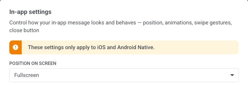
ตำแหน่งบนหน้าจอ
Anchor link toเลือก Fullscreen, Top, Center หรือ Bottom
สำหรับข้อความเต็มหน้าจอ ให้ตั้งค่า Max width ใน Document ด้วยตามที่อธิบายไว้ในหัวข้อ Document
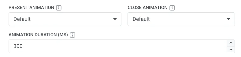
แอนิเมชัน
Anchor link to- Present Animation / Close Animation: None, Fade, Left, Right, Up หรือ Down เลือก Default เพื่อใช้การเคลื่อนไหวเปิด/ปิดแบบเดียวกับที่แอปของคุณใช้อยู่แล้วสำหรับ In-App
- Animation Duration (MS): 100 ถึง 3000 มิลลิวินาที เว้นว่างไว้เพื่อใช้เวลาตามปกติของแอปของคุณ
ปัดเพื่อปิด
Anchor link toเปิดใช้งานการผสมผสานใดๆ ของ Left, Right, Up และ Down

ปุ่มปิด
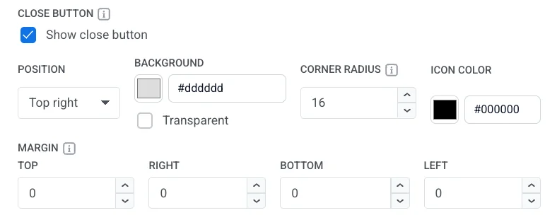
Anchor link toเปิดหรือปิด Show close button
เมื่อเปิดใช้งาน ให้ตั้งค่า:
- Position: Top right, Top left, Bottom right หรือ Bottom left
- Background: สี หรือ Transparent
- Corner radius: ทำให้มุมของพื้นหลังปุ่มปิดโค้งมน ใช้ได้เฉพาะเมื่อ Background เป็นสี (ไม่ใช่ Transparent) ตั้งค่า 0–16 px 16 px จะทำให้เป็นวงกลม (ค่าเริ่มต้น) 0 px จะทำให้เป็นสี่เหลี่ยม
- Icon Color: สีของไอคอนปิด
- Margin: พื้นที่รอบปุ่มปิดในแต่ละด้าน (Top, Right, Bottom, Left)
สไตล์ของปุ่มปิดจะแตกต่างจากตำแหน่ง, แอนิเมชัน และการปัด โดยจะถูกจัดเก็บไว้กับเทมเพลตนี้และแสดงบนทุกแพลตฟอร์มที่แสดงข้อความ ไม่ใช่แค่บน iOS และ Android Native เท่านั้น
- คลิก Apply เพื่อบันทึกตัวเลือก In-app settings ของคุณ หรือ Cancel เพื่อยกเลิก
- เปิด Preview จากเมนู ⋮ ที่แถบด้านบนเพื่อตรวจสอบตำแหน่ง, แอนิเมชัน และปุ่มปิดก่อนที่คุณจะบันทึก
- คลิก Save ที่แถบด้านบนเพื่อจัดเก็บเทมเพลต