บล็อกเนื้อหาป๊อปอัปบนเว็บ
ข้อมูลอ้างอิงสำหรับทุกบล็อกที่คุณสามารถเพิ่มลงในเค้าโครง เนื้อหาป๊อปอัปบนเว็บ จากแท็บ Elements
บล็อกแต่ละประเภทมีวัตถุประสงค์ที่แตกต่างกันในป๊อปอัป:
- Text: คัดลอกบนป๊อปอัป พร้อมการจัดรูปแบบในบรรทัดและสไตล์ข้อความ
- Button: คำกระตุ้นการตัดสินใจที่เปิดลิงก์ ปิดป๊อปอัป ขอ web push หรือไปที่หน้าอื่น
- Icon: รูปสัญลักษณ์ขนาดเล็กถัดจากข้อความของคุณ
- Countdown: ตัวจับเวลาเส้นตายแบบสด
- Topic picker: ช่องทำเครื่องหมายหรือชิปที่เขียนความสนใจไปยังแท็ก
- Rating: คะแนน NPS, ดาว หรือนิ้วโป้งที่ส่งเป็น event
- Subscription form: การสมัครรับอีเมลและช่องแบบฟอร์มอื่นๆ
วิธีการกำหนดค่าบล็อกเนื้อหา
Anchor link to- เปิดแท็บ Elements ทางด้านขวา
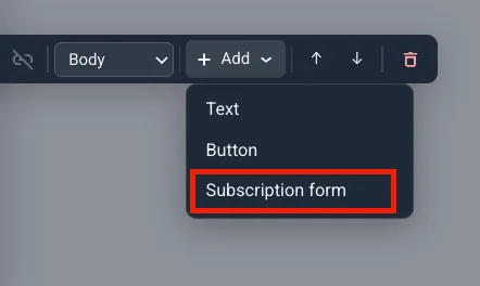
- ลากไทล์ลงบนป๊อปอัป หรือคลิกเพื่อเพิ่มลงในหน้า
- การคลิกจะแทรกบล็อกด้านล่างส่วนที่เลือกบน canvas
- หากไม่มีการเลือกอะไร บล็อกจะไปอยู่ที่ส่วนท้ายของส่วนแรกของหน้า
- เลือกบล็อกบนป๊อปอัปเพื่อเปิดแท็บ Settings (ถัดจาก Elements) การเพิ่มบลอกจาก Elements จะเปิด Settings ทันที
หากต้องการย้ายบล็อกไปที่ใดก็ได้บนป๊อปอัป รวมถึงไปยังส่วนอื่น ให้เลือกบล็อกแล้วลากที่จับซึ่งปรากฏทางด้านซ้ายของบล็อกไปวางในช่องว่างใดก็ได้
ใน Settings คุณสามารถ:
- กำหนดค่าตัวเลือกของบล็อกนั้นๆ
- ย้ายขึ้นหรือลงภายในส่วนของบล็อกด้วย POSITION (ลูกศรขึ้นและลง)
- ลบด้วยไอคอนลบ
Text
Anchor link toคลิกที่ข้อความหรือป้ายกำกับปุ่มใดๆ บนป๊อปอัปเพื่อแก้ไขในบรรทัด แถบเครื่องมือจะปรากฏขึ้นด้านบน:
- ใช้การจัดรูปแบบ ตัวหนา, ตัวเอียง หรือขีดเส้นใต้
- เพิ่มหรือลบลิงก์
- ตั้งค่าการจัดตำแหน่งชิดซ้าย กึ่งกลาง หรือชิดขวา
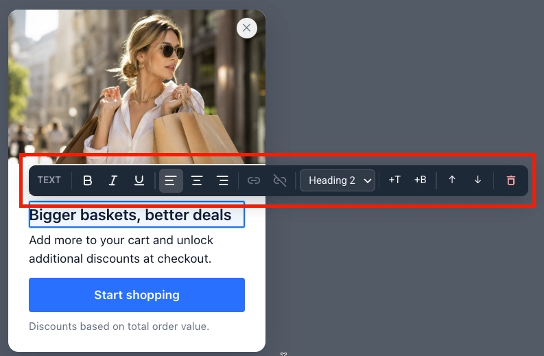
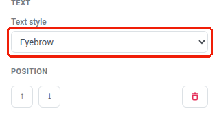
หากต้องการเปลี่ยนสไตล์ของข้อความ ให้เลือกแล้วเปิดแท็บ Settings ทางด้านขวา เลือก Icon (สไตล์ข้อความ ไม่ใช่บล็อก Icon), Eyebrow, Heading 1–3, Body หรือ Caption
Button
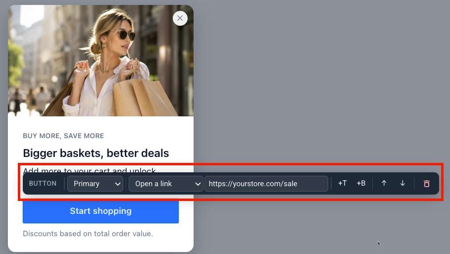
Anchor link toคลิกที่ปุ่มเพื่อเลือก จากนั้นเปิดแท็บ Settings ทางด้านขวา:
- Button style: Primary หรือ Secondary
- Action:
- Open a link: ป้อน Link URL New tab จะเปิดอยู่ตามค่าเริ่มต้น ล้างช่องทำเครื่องหมายเพื่อเปิดลิงก์ในแท็บเดียวกันแทน
- Close the popup
- Subscribe: ขออนุญาต web push และสมัครสมาชิกผู้เข้าชม นี่ไม่ใช่บล็อก Subscription form สำหรับอีเมล คำขอที่ได้รับอนุญาตจะปิดป๊อปอัป คำขอที่ถูกปฏิเสธจะปิดใช้งานปุ่ม เนื่องจากเบราว์เซอร์จะไม่แจ้งเตือนซ้ำสอง
- Go to page: เลือกหน้าอื่นของป๊อปอัปเพื่อสลับไป ตัวเลือกนี้จะปรากฏขึ้นเมื่อป๊อปอัปมีมากกว่าหนึ่งหน้า ดู ทำงานกับหลายหน้า
ใช้ POSITION เพื่อย้ายปุ่มขึ้นหรือลง หรือไอคอนลบเพื่อลบออก
Icon
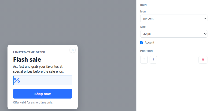
Anchor link toเพิ่มบล็อก Icon เพื่อวางรูปสัญลักษณ์ขนาดเล็ก (เช่น เครื่องหมายเปอร์เซ็นต์สำหรับการลดราคา หรือของขวัญสำหรับการแจกของรางวัล) ถัดจากข้อความของคุณ นี่คือบล็อก Icon ไม่ใช่สไตล์ข้อความ Icon ภายใต้ Text
- เปิดแท็บ Elements ทางด้านขวา
- คลิก Icon
- ตั้งค่าตัวเลือกในแท็บ Settings:
- Icon: เลือกจากชุดไอคอนคงที่ 20 ไอคอน (bell, gift, cart, chart, lock, calendar, check, star, clock, tag, mail, phone, download, play, shield, sparkle, percent, truck, ticket, user) ไม่รองรับการอัปโหลดไอคอนที่กำหนดเอง
- Size: 24, 32 หรือ 48 px
- Accent: เปิดอยู่ตามค่าเริ่มต้น ดังนั้นไอคอนจะตรงกับสีเน้นของป๊อปอัป ปิดเพื่อเลือกสีที่กำหนดเอง
Countdown
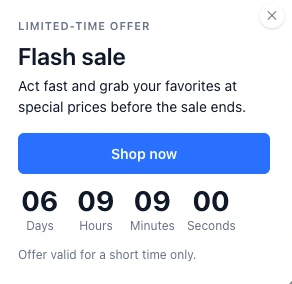
Anchor link toเพิ่มบล็อก Countdown เพื่อสร้างความเร่งด่วนด้วยเส้นตายที่นับถอยหลังแบบสดบนป๊อปอัป
- เปิดแท็บ Elements ทางด้านขวา
- คลิก Countdown
- ตั้งค่าตัวเลือกในแท็บ Settings:
- Deadline: วันที่และเวลาที่การนับถอยหลังถึงศูนย์
- Time zone: โซนเวลาที่อ่านเส้นตาย ไม่ใช่โซนเวลาของผู้เข้าชมเอง ค่าเริ่มต้นคือโซนเวลาของเบราว์เซอร์ของคุณ เลือก UTC จากรายการเพื่ออ่านเส้นตายตามตัวอักษรแทน
- Language: ภาษาของป้ายกำกับหน่วย (วัน ชั่วโมง และอื่นๆ) ปล่อยไว้ที่ English (default) หรือเลือกจาก 14 ภาษาอื่น
- Labels: เปิดเพื่อแสดงป้ายกำกับหน่วยถัดจากตัวเลข
- When the deadline passes:
- Show zeros: การนับถอยหลังจะยังคงแสดง 00:00:00
- Do not show the popup: ป๊อปอัปทั้งหมดจะถูกข้ามไปเมื่อเส้นตายผ่านไปแล้ว Pushwoosh จะตรวจสอบเส้นตายก่อนที่ป๊อปอัปจะปรากฏขึ้น ป๊อปอัปที่ถูกข้ามด้วยวิธีนี้จะไม่นับรวมกับความถี่ Once per visitor
- Go to page: ข้ามไปยังหน้าอื่นของป๊อปอัปเมื่อเส้นตายผ่านไป จะเสนอให้เฉพาะเมื่อป๊อปอัปมีมากกว่าหนึ่งหน้า เลือกหน้าเป้าหมายจากเมนูแบบเลื่อนลงที่ปรากฏขึ้น ดู ทำงานกับหลายหน้า
Topic picker
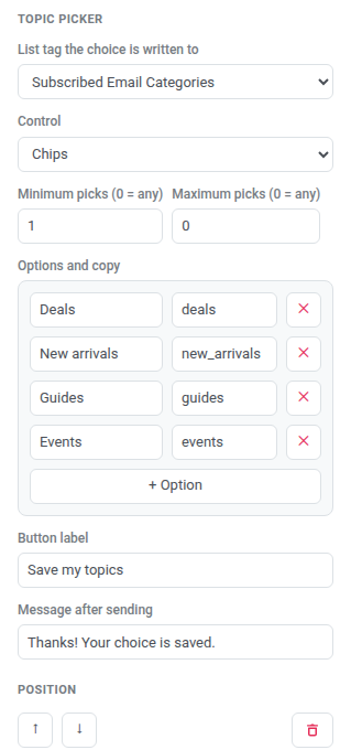
Anchor link toเพิ่มบล็อก Topic picker เพื่อให้ผู้เข้าชมเลือกความสนใจด้วยตนเองเป็นช่องทำเครื่องหมายหรือชิป การเลือกของพวกเขาจะถูกเขียนไปยัง tag บนอุปกรณ์ของพวกเขา
- เปิดแท็บ Elements ทางด้านขวา
- คลิก Topic picker บล็อกจะปรากฏขึ้นพร้อมตัวเลือกตัวยึดตำแหน่งสองตัว การตั้งค่าจะเปิดขึ้นในแท็บ Settings
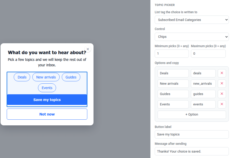
- ใน List tag the choice is written to ให้เลือกแท็กประเภท List ที่มีอยู่ หรือเลือก Create a list tag เพื่อสร้างแท็กใหม่โดยไม่ต้องออกจากตัวแก้ไข จนกว่าคุณจะเลือกแท็ก บล็อกจะไม่เขียนอะไรเลย
- ตั้งค่า Control เป็น Checkboxes หรือ Chips
- ตั้งค่า Minimum picks และ Maximum picks
0ที่ปลายด้านใดด้านหนึ่งหมายถึงไม่มีขีดจำกัดด้านนั้น (0 = anyในป้ายกำกับฟิลด์) ต้องมีการเลือกอย่างน้อยหนึ่งรายการเสมอเพื่อส่ง แม้ว่า Minimum จะเป็น0การเลือกเกินค่าสูงสุด หรือพยายามส่งต่ำกว่าค่าต่ำสุด จะแสดงข้อความในบรรทัดถัดจากบล็อกแทนที่จะส่งอะไรเลย - ภายใต้ Options and copy แก้ไขป้ายกำกับของแต่ละตัวเลือก (สิ่งที่ผู้เข้าชมอ่าน) และ Tag value (สิ่งที่เขียนไปยังแท็ก) หากคุณปล่อย Tag value ว่างไว้ Pushwoosh จะเขียน ID ภายในของตัวเลือกแทน (
option-1,option-2และอื่นๆ) ใช้ + Option เพื่อเพิ่มแถวอื่น รวมสูงสุด 12 ตัวเลือก - ตั้งค่า Button label (ค่าเริ่มต้น Save) และ Message after sending (ค่าเริ่มต้น Thanks! Your choice is saved.)
Rating
Anchor link toเพิ่มบล็อก Rating เพื่อรวบรวมคะแนนด่วน (NPS, ดาว หรือนิ้วโป้ง) เป็น custom event
- เปิดแท็บ Elements ทางด้านขวา
- คลิก Rating บล็อกจะปรากฏขึ้นโดยไม่มีการตั้งค่า event การตั้งค่าจะเปิดขึ้นในแท็บ Settings
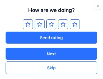
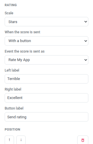
- ตั้งค่า Scale เป็น NPS 0–10, Stars (1 ถึง 5) หรือ Thumbs (ขึ้นหรือลง) ในทั้งสามแบบ คะแนนที่สูงขึ้นหมายถึงการให้คะแนนที่เป็นบวกมากขึ้น Thumbs จะส่ง
1สำหรับนิ้วโป้งขึ้น และ0สำหรับนิ้วโป้งลง - ตั้งค่า When the score is sent เป็น On tap (ส่งเมื่อผู้เข้าชมเลือกค่า) หรือ With a button (รอการคลิกส่ง)
- ใน Event the score is sent as เลือก event จากโปรเจกต์ของคุณ หรือเลือก Create an event เพื่อกำหนด event ใหม่โดยไม่ต้องออกจากป๊อปอัป คะแนนจะถูกเก็บไว้เป็น event นั้น (แอตทริบิวต์
score,scaleและslotKey) ใช้ใน segments หรือ Customer Journeys เช่นเดียวกับ event อื่นๆ จนกว่าคุณจะเลือก event บล็อกจะไม่ส่งอะไรเลย - เลือกที่จะกรอก Left label และ Right label ที่ปลายทั้งสองของมาตราส่วน
- หาก When the score is sent เป็น With a button ให้ตั้งค่า Button label (ค่าเริ่มต้น Send rating)
Subscription form
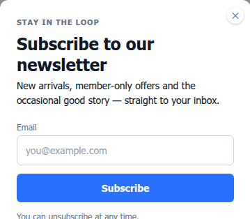
Anchor link toเพิ่มบล็อก Subscription form เพื่อรวบรวมการสมัครรับอีเมลและฟิลด์อื่นๆ ในป๊อปอัป ใช้สำหรับอีเมลและฟิลด์แบบฟอร์ม สำหรับการอนุญาต web push ให้ใช้ปุ่มที่มีการกระทำ Subscribe แทน เรียนรู้เพิ่มเติมเกี่ยวกับแบบฟอร์มการสมัครสมาชิก
เพิ่มบล็อก
Anchor link to- เปิดแท็บ Elements ทางด้านขวา
- คลิก Subscription form
- บล็อกจะปรากฏขึ้นพร้อมฟิลด์ Email และปุ่ม Subscribe ตามค่าเริ่มต้น การตั้งค่าจะเปิดขึ้นในแท็บ Settings
เลือกแหล่งที่มาของแบบฟอร์ม
Anchor link toเมื่อเลือกบล็อกแล้ว แท็บ Settings จะแสดงเมนูแบบเลื่อนลง Subscription form ที่เชื่อมโยงบล็อกกับ แบบฟอร์มการสมัครสมาชิก ในโปรเจกต์ของคุณ คุณสามารถสร้างแบบฟอร์มใหม่หรือเลือกแบบฟอร์มที่มีอยู่แล้ว:
| ตัวเลือก | ควรใช้เมื่อ |
|---|---|
| New form — created on save (ค่าเริ่มต้น) | เริ่มต้นได้เร็วที่สุด: Pushwoosh จะสร้างแบบฟอร์มให้คุณเมื่อคุณบันทึกป๊อปอัป โดยตั้งชื่อว่า “ชื่อป๊อปอัป — web popup” |
| + Create new form… | คุณต้องการตั้งชื่อแบบฟอร์มและตั้งค่าก่อนที่จะบันทึกป๊อปอัป จะเปิดกล่องโต้ตอบ New subscription form ป้อน Name ตั้งค่า Fields, Submit text และ Privacy จากนั้นคลิก Create |
| แบบฟอร์มที่มีอยู่จากเมนูแบบเลื่อนลง | ใช้แบบฟอร์มซ้ำที่มีผู้สมัครสมาชิกหรือการยืนยันสองขั้นตอน (double opt-in) กำหนดค่าไว้แล้ว |
ตั้งค่าฟิลด์และพฤติกรรมการส่ง
Anchor link toยังคงอยู่ในแท็บ Settings:
- ตั้งค่า Submit button style:
- Primary: ปุ่มทึบในสี Accent ของป๊อปอัป เหมาะที่สุดเมื่อ Subscribe เป็นการกระทำหลักบนหน้า
- Secondary: ปุ่มมีเส้นขอบและป้ายกำกับสีเน้น เหมาะที่สุดเมื่อป๊อปอัปมีปุ่มหลักอยู่แล้วหรือคุณต้องการรูปลักษณ์ที่เบาลง
- เปิด Privacy เพื่อเพิ่มบรรทัดยินยอมความเป็นส่วนตัวใต้แบบฟอร์ม จากนั้นป้อน URL นโยบายความเป็นส่วนตัวของคุณในฟิลด์ที่ปรากฏขึ้น

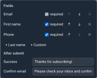
- ภายใต้ Fields ให้คง Email (จำเป็นเสมอ) และเพิ่ม First name, Last name, Phone หรือ Custom
- สำหรับฟิลด์ Custom ให้เลือก tag ที่ค่าของมันจะส่งไปจากเมนูแบบเลื่อนลง Pick a tag… หรือเลือก Create a tag เพื่อสร้างแท็กสตริงใหม่โดยไม่ต้องออกจากตัวแก้ไข
- ตั้งค่าข้อความ Success และ Confirm email ที่แสดงหลังจากผู้เข้าชมส่ง