Web-Popup-Einstellungen
Verwenden Sie das Panel Popup-Einstellungen, um ein Web-Popup-Inhalt-Layout zu gestalten und zu platzieren. Die Seiten-Tabs und + Seite hinzufügen befinden sich oben im Panel. Siehe Mit mehreren Seiten arbeiten.
Allgemeine Einstellungen umfassen das popup-weite Aussehen und die Platzierung. Aktuelle Seite deckt Medien und Größe für die Seite ab, die Sie bearbeiten.
Bilder und Video
Anchor link toWenn das Layout einen oder mehrere Medienblöcke enthält, öffnen Sie Aktuelle Seite. Jeder Medienblock hat eine Vorschau und Steuerelemente.
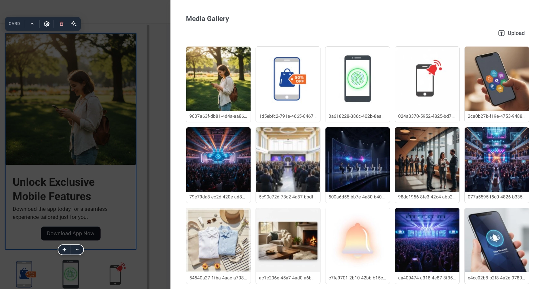
- Klicken Sie auf Bild ändern, um eine Datei aus dem Medienspeicher Ihres Projekts auszuwählen, oder fügen Sie die Bild-URL direkt ein oder bearbeiten Sie sie.
- Legen Sie mit Anpassen (Natürlich, Abdecken oder Enthalten) fest, wie das Bild seinen Rahmen ausfüllt. Anpassen wird bei einem Hintergrundbild nicht angezeigt, da dieses immer seinen Bereich abdeckt.
- Optional können Sie das Bild mit Weichzeichnen (0 bis 20 px) weicher machen.
- Nur für Hintergrundmedien: Verwenden Sie Abdunkeln (0 bis 100 %), um einen dunklen Schleier hinzuzufügen, damit der Text über dem Bild lesbar bleibt.
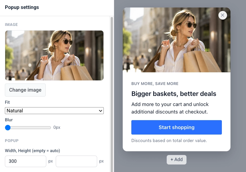
Bild für dunkles Thema
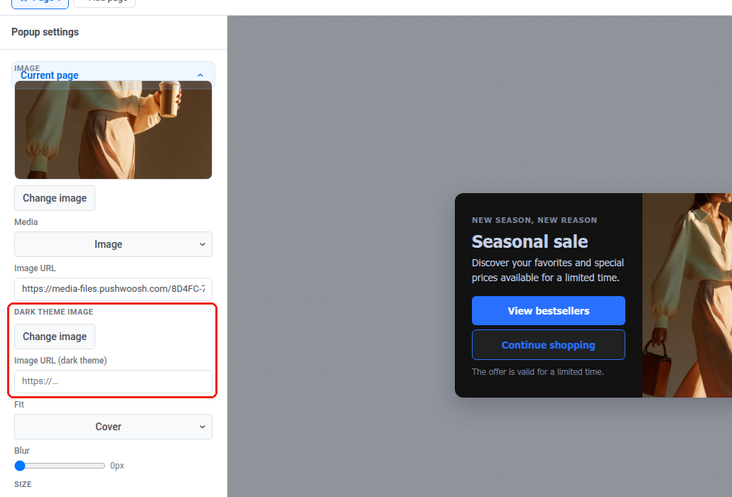
Anchor link toWenn das dunkle Thema aktiviert ist, fügt jeder Bildblock eine Zeile Bild für dunkles Thema hinzu.
- Klicken Sie auf Bild ändern oder legen Sie die Bild-URL (dunkles Thema) fest, um ein anderes Bild für den dunklen Modus auszuwählen (z. B. ein Logo mit dunkler Tinte).
- Lassen Sie es leer, um die helle Bild-URL in beiden Schemata weiterhin anzuzeigen.
Das Bild für das dunkle Thema wird überall dort angewendet, wo das Bild dieses Blocks gezeichnet wird, einschließlich eines Hintergrundbilds oder eines Video-Posters.
Video
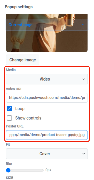
Anchor link to- Setzen Sie Medien auf Video.
- Geben Sie eine Video-URL ein: einen direkten Link zur Videodatei. Video akzeptiert nur eine externe URL. Sie können kein Video in den Medienspeicher hochladen. Exportieren Sie es als MP4 (H.264-Video, AAC-Audio) mit aktiviertem „Schnellstart“ (manchmal auch „web-optimiert“ genannt), damit der Browser mit der Wiedergabe beginnen kann, bevor die gesamte Datei heruntergeladen ist. Wenn die URL nicht geladen werden kann, sehen die Besucher nur das Poster.
- Schleife ist standardmäßig aktiviert, sodass das Video kontinuierlich wiedergegeben wird. Deaktivieren Sie es, um nach einer Wiedergabe zu stoppen.
- Aktivieren Sie Steuerelemente anzeigen, um die integrierten Wiedergabe-, Pause- und Lautstärkeregler des Browsers anzuzeigen. Videos starten immer stummgeschaltet. Ohne diese Option haben Besucher keine Möglichkeit, den Ton einzuschalten.
- Optional können Sie eine Poster-URL festlegen: das Bild, das während des Ladens des Videos angezeigt wird. Empfohlen. Bei einem älteren Popup-Skript, das kein Video unterstützt, wird nur das Poster angezeigt. Lassen Sie es leer, und der Besucher sieht nichts, wo das Video wäre.
Medienlayout
Anchor link toEinige Layouts fügen auch einen Abschnitt Vorlagenvariablen mit Platzierungseinstellungen für den Medienblock hinzu. Legen Sie die Bildbreite (Anteil an der Popup-Breite in Prozent) und die Bildposition (Links oder Rechts) fest, wenn das Layout Medien neben dem Text hat.
Der Abschnitt Vorlagenvariablen wird nur angezeigt, wenn das aktuelle Layout solche Einstellungen hat. Bei einem Layout mit unterer Leiste bietet er anstelle von Bildsteuerelementen die Schaltflächenbreite an.
Popup-Größe und -Stil
Anchor link to- Lassen Sie unter Aktuelle Seite → GRÖSSE die Felder Breite und Höhe leer für ein Popup, das sich an seinen Inhalt anpasst, oder legen Sie eine feste Größe in Pixeln fest. In einem Popup mit mehreren Seiten hat jede Seite ihre eigene Größe.
- Aktivieren Sie Volle Höhe, wenn die Seite die verfügbare Höhe ausfüllen soll.
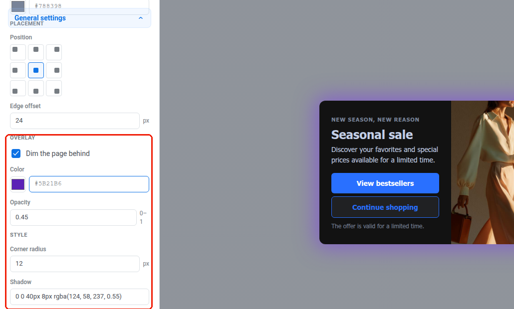
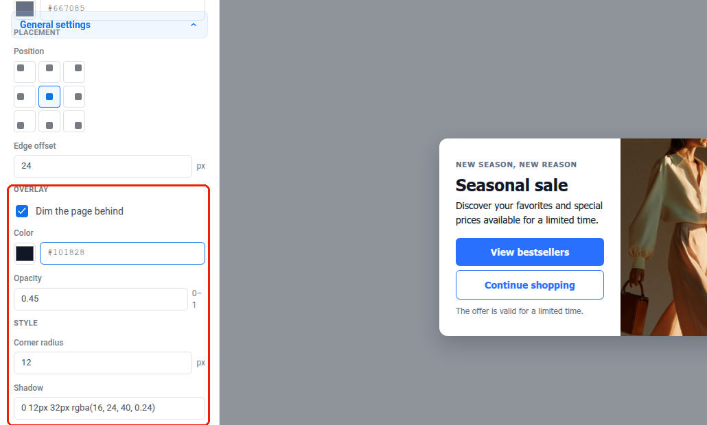
- Legen Sie in den Allgemeinen Einstellungen den Eckenradius und den Schatten für die Eckenabrundung und den Schlagschatten des Popups fest.
- Wählen Sie Animation: wie das Popup erscheint (Standard, Keine, Einblenden oder Gleiten).
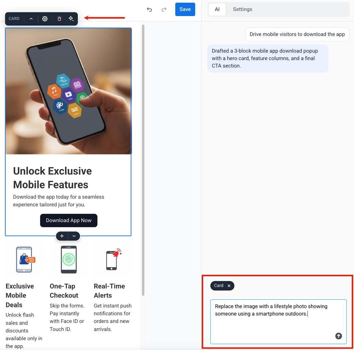
Wenn das dunkle Thema aktiviert ist, folgt der Schatten dem Sonne/Mond-Schema-Schalter. Stellen Sie den Schalter auf Dunkel, um den Schatten der dunklen Palette getrennt vom hellen zu bearbeiten. Ein auf eine helle Seite abgestimmter Schatten ist auf einer dunklen Seite oft unsichtbar, daher benötigen die beiden normalerweise unterschiedliche Werte. Lassen Sie den dunklen Schatten unberührt, um den Wert des hellen Schattens in beiden Schemata weiter zu verwenden.
Farben
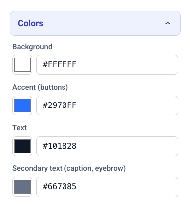
Anchor link to- Klicken Sie auf Farben, um die Farbpalette des Popups zu erweitern.
- Legen Sie Hintergrund und Akzent (Schaltflächen) für den Popup-Hintergrund und die auf Schaltflächen angewendete Akzentfarbe fest.
- Legen Sie Text und Sekundärtext für den Haupttext und für sekundären Text wie Bildunterschriften und Eyebrows fest.
- Wenn das Layout Text über einem Hintergrundbild hat, legen Sie Text über Bild für diesen Text fest.
Dunkler Modus
Anchor link to- Aktivieren Sie in Farben die Option Dunkles Thema aktivieren, um dem Popup eine zweite Palette für Besucher zu geben, deren Gerät auf ein dunkles Farbschema eingestellt ist. Wenn es deaktiviert ist, wird das Popup bei jedem Besucher immer mit der obigen hellen Palette gerendert.
- Verwenden Sie den Sonne/Mond-Schalter über den Farbfeldern, um auszuwählen, welche Palette Sie bearbeiten. Die Leinwand wird in diesem Schema neu gezeichnet.
- Klicken Sie auf Automatisch aus Hell, um die dunkle Palette aus den aktuellen hellen Farben (neu) zu generieren. Hintergründe und Oberflächen werden dunkel, und der Text wird hell. Akzent und Text über Bild werden unverändert übernommen. Bearbeiten Sie anschließend eines der fünf Felder zur Feinabstimmung.
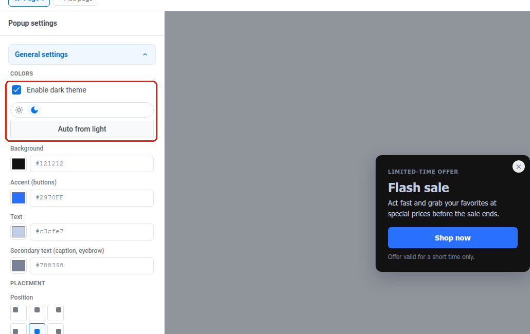
Wenn Sie Dunkles Thema aktivieren wieder deaktivieren, bleibt die dunkle Palette erhalten. Wenn Sie es wieder einschalten, werden Ihre Bearbeitungen wiederhergestellt, anstatt sie von Grund auf neu zu generieren.
Derselbe Sonne/Mond-Schalter erscheint neben Vorschau schließen (Esc), wenn Sie die Vorschau für ein Popup mit aktiviertem dunklen Thema öffnen. Sie können beide Paletten auch in der Vorschau in voller Größe überprüfen.
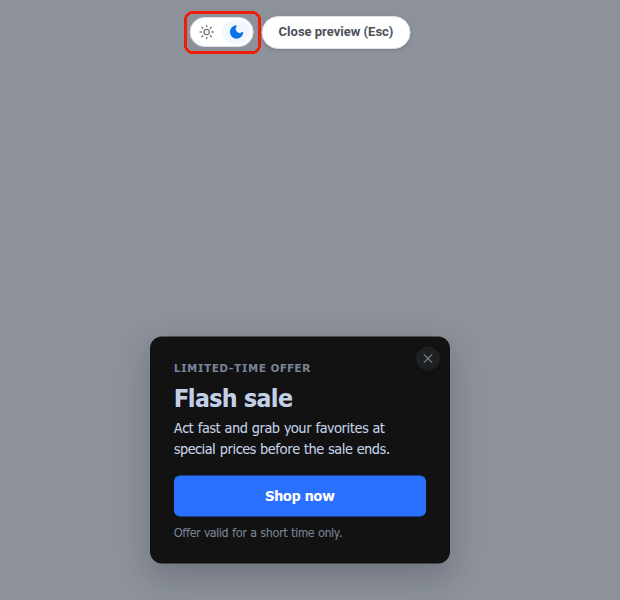
Der Browser eines Besuchers entscheidet, welche Palette er sieht, basierend auf der Dark-Mode-Einstellung auf Betriebssystemebene. Es gibt keinen Hell/Dunkel-Schalter auf dem Popup selbst. Eine Website kann ein Schema für alle erzwingen, unabhängig von der Betriebssystemeinstellung. Siehe webPopups.colorScheme in den Web SDK-Dokumenten.
Das dunkle Thema wirkt sich auch auf Bilder, Schatten und Überlagerung in diesem Panel aus. Jedes folgt demselben Sonne/Mond-Schema-Schalter, sobald es aktiviert ist.
Platzierung und Überlagerung
Anchor link to- Wählen Sie unter PLATZIERUNG mithilfe des 3×3-Rasters Position, wo das Popup auf der Seite verankert wird.
- Stellen Sie den Randabstand auf den Abstand in Pixeln vom ausgewählten Rand ein.
- Aktivieren Sie unter ÜBERLAGERUNG die Option Seite dahinter abdunkeln, um den Rest der Seite abzudunkeln, während das Popup in beiden Schemata angezeigt wird. Wenn Sie es deaktivieren, wird die Abdunkelung vollständig entfernt, einschließlich aller unten festgelegten Werte für das dunkle Schema.
- Legen Sie Farbe und Deckkraft für die Überlagerung fest (Deckkraft von 0 bis 1).
Wenn das dunkle Thema aktiviert ist, folgen auch Farbe und Deckkraft dem Sonne/Mond-Schema-Schalter. Stellen Sie den Schalter auf Dunkel, um der Abdunkelung eine eigene Farbe und Stärke für die dunkle Palette zu geben. Bis Sie sie dort bearbeiten, zeigt das dunkle Schema dieselbe Farbe und Deckkraft wie das helle Schema.