Referenz für E-Mail-Inhaltsblöcke
Referenz für jeden Block, den Sie auf der Leinwand des Drag & Drop-Editors hinzufügen können, sowie für die Link-Typen, die für Buttons und Text verfügbar sind. Um zu steuern, welche Empfänger einen Block sehen, legen Sie eine Anzeigebedingung fest.
Inhaltsblöcke hinzufügen
Anchor link toÖffnen Sie den Tab Blöcke und ziehen Sie einen Block auf die Leinwand, oder klicken Sie auf einen Block, um ihn am Ende der E-Mail hinzuzufügen. Verfügbare Blöcke:
- Überschrift: Titel und kurze Schlagzeilen in der E-Mail
- Text: Fließtext und längere Beschreibungen
- Button: ein klickbarer Call-to-Action
- Bild: Bilder aus dem Medienspeicher, Upload oder URL
- Logo-Header: Ihr Brand-Book-Logo als fertiger Header-Block
- Video: ein klickbares Videoposter, das auf ein YouTube- oder Vimeo-Video verlinkt
- Karte: ein Bild gepaart mit einer Überschrift, Text und einem Button in einem Layout
- Trennlinie: eine Linie, die Abschnitte visuell trennt
- 2 Spalten: zwei gleiche Spalten nebeneinander
- 3 Spalten: drei gleiche Spalten nebeneinander
- 4 Spalten: vier gleiche Spalten nebeneinander
- 33 / 67: zwei Spalten, bei denen die linke etwa 33 % der Breite und die rechte etwa 67 % einnimmt
- 67 / 33: zwei Spalten, bei denen die linke etwa 67 % der Breite und die rechte etwa 33 % einnimmt
- Timer: ein Countdown für Angebote und Fristen
- Barcode: ein scannbarer Code 128, EAN-13, EAN-8, UPC-A oder QR-Code, der aus einem Personalisierungswert, wie z. B. einem Gutschein, generiert wird
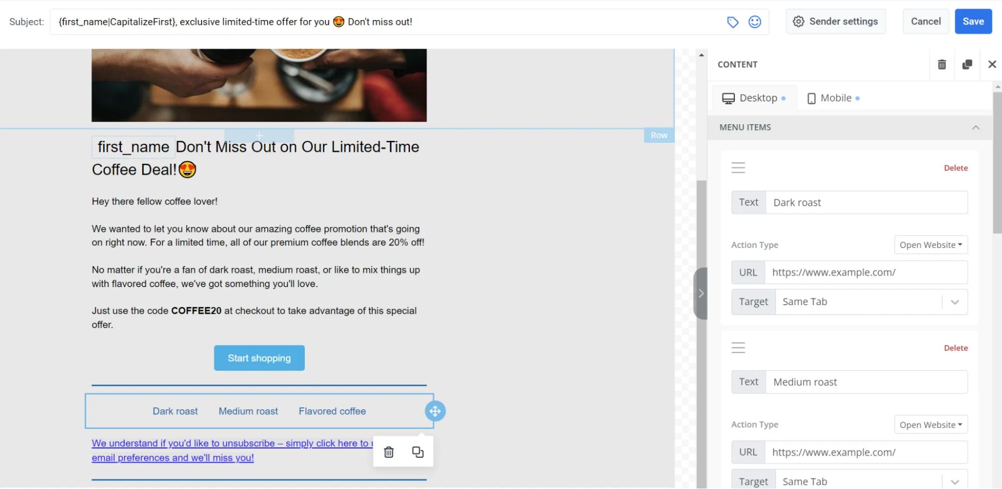
- Menü: eine Zeile oder Spalte mit Links, wie z. B. Navigation oder Kontakte
- Social: Symbole, die auf Ihre sozialen Profile verlinken
- HTML: benutzerdefiniertes HTML, wie z. B. ein Formular, eine Umfrage oder ein eingebettetes Video
- Produkte: ein sich wiederholendes Raster von Produktkarten. Geben Sie Produkte manuell ein oder ziehen Sie sie aus Ihrem Produktkatalog, dem Warenkorb eines Empfängers oder einer integrierten Empfehlungsstrategie wie Bestseller oder wieder vorrätige Artikel.
- Nachrichten: ein sich wiederholendes Raster von Artikelkarten. Wählen Sie sie manuell aus einem RSS- oder Atom-Feed aus oder ziehen Sie sie live aus einem für Ihre Anwendung registrierten Feed.
- Anzeigenplatz: eine bezahlte Platzierung, die den Empfängern eine gesponserte Kampagne anzeigt
Überschrift und Text
Anchor link toDie Blöcke Überschrift und Text enthalten den Text, den die Empfänger in der E-Mail lesen. Verwenden Sie Überschrift für Titel und kurze Zeilen, Text für Fließtext und längere Beschreibungen.
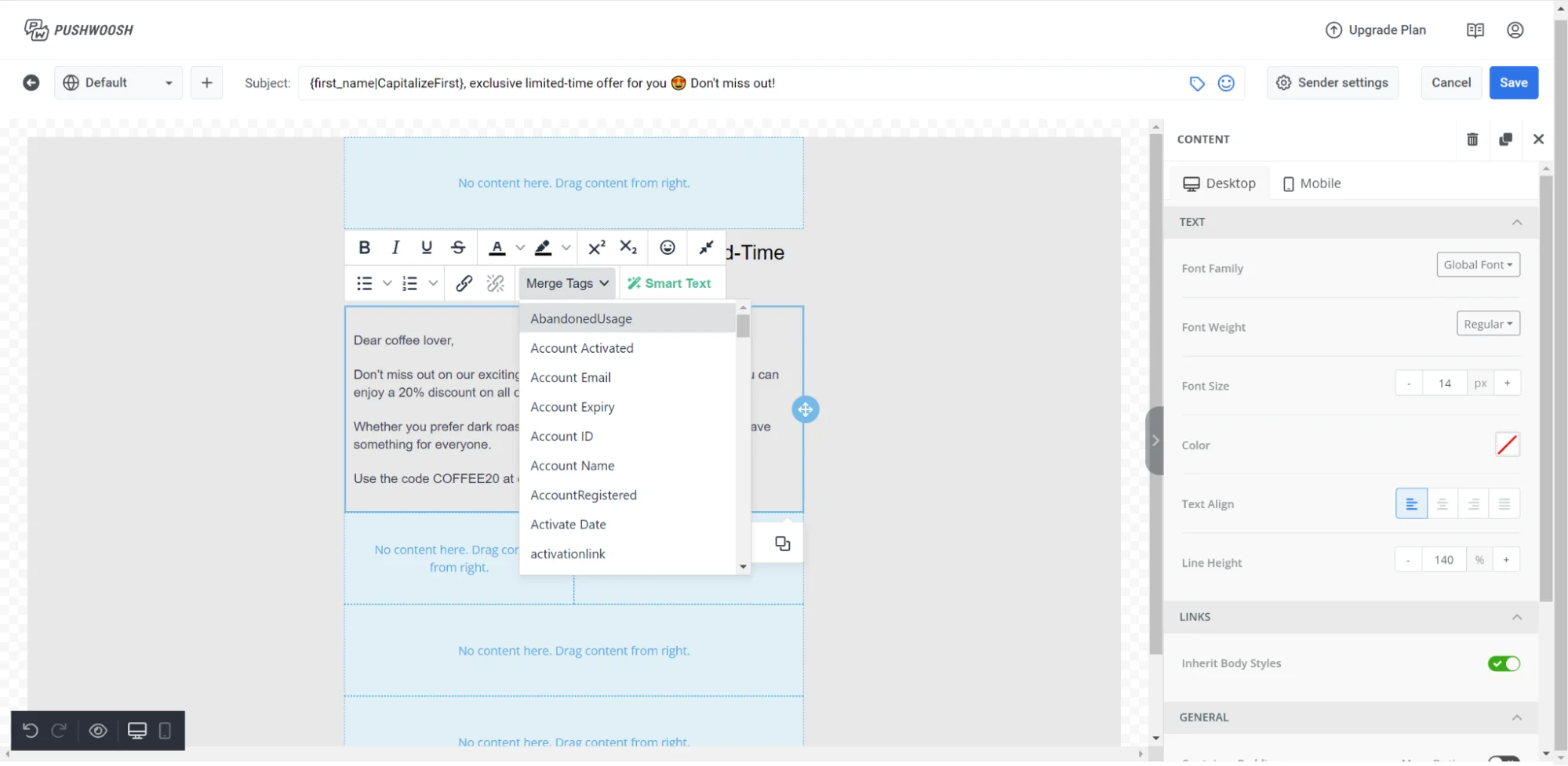
Klicken Sie auf einen Block auf der Leinwand, um mit der Bearbeitung zu beginnen. Wählen Sie Text aus, um die Formatierungs-Symbolleiste aufzurufen.
Optionen der Symbolleiste
- Textstil: Legen Sie einen Absatzstil (Überschrift 1, Überschrift 2, Normal usw.) für den gesamten Block fest
- Schriftgröße: Ändern Sie die Größe des ausgewählten Textes oder wenden Sie eine Größe auf den gesamten Absatz an
- Fett / Kursiv / Unterstrichen / Durchgestrichen: Standard-Zeichenformatierung
- Ausrichtung: links, zentriert oder rechts
- Link: Umschließen Sie den ausgewählten Text mit einem Hyperlink
- Aufzählung / Nummerierte Liste: Wandeln Sie die ausgewählten Zeilen in eine Liste um. Jeder Aufzählungspunkt oder jede Nummer, mit der die Zeilen bereits beginnen, wird entfernt, damit sie nicht mit dem eigenen Marker der Liste verdoppelt wird.
Wählen Sie den Block aus (nicht einen Textbereich), um seine Einstellungen im rechten Panel zu öffnen, und aktivieren Sie dann Zeichenabstand, um den Zeichenabstand für den gesamten Block zu vergrößern oder zu verkleinern. Akzeptiert gebrochene und negative Werte. Um den Zeichenabstand auf alle Textblöcke gleichzeitig anzuwenden, legen Sie ihn stattdessen als E-Mail-weiten Standard unter Typografie fest. Siehe E-Mail-weites Styling konfigurieren.
Einfügen aus anderen Dokumenten
Beim Einfügen von Text aus Google Docs, Word oder einer Webseite bleiben Fett, Kursiv, Unterstrichen, Durchgestrichen und Links erhalten. Farbe, Schriftgröße und Schriftfamilie aus der Quelle werden nicht übernommen – die eigene Typografie des Blocks hat immer Vorrang. Um die Quellformatierung vollständig zu ignorieren und den Stil des Blocks anzunehmen, fügen Sie mit Strg+Umschalt+V (Cmd+Umschalt+V auf dem Mac) ein.
Eine eingefügte Aufzählung oder nummerierte Liste behält ihren Aufzählungspunkt oder ihre Nummer als einfachen Text am Anfang jeder Zeile im selben Block bei. Wählen Sie diese Zeilen aus und klicken Sie auf Aufzählung / Nummerierte Liste, um sie in eine echte Liste umzuwandeln – der Button entfernt den übrig gebliebenen Marker für Sie.
In einzeiligen Feldern, wie z. B. der Beschriftung eines Buttons, werden eingefügte Zeilenumbrüche zu einem einzigen Leerzeichen zusammengefasst.
Personalisierung mit Merge-Tags
Merge-Tags sind Platzhalter, die einen Tag-Wert aus dem Profil des Empfängers einfügen, sodass jeder Abonnent personalisierten Text sieht. Um einen hinzuzufügen, wählen Sie den Text aus, klicken Sie in der Symbolleiste auf Merge-Tags und wählen Sie einen Tag aus Ihrem Konto. Klicken Sie auf einen eingefügten Merge-Tag, um ein Panel mit den Feldern Standard (der Wert, der angezeigt wird, wenn der Tag leer ist) und Format (Großschreibung, Zahlen- oder Datumsformatierung, die auf den Wert angewendet wird) zu öffnen.
Bild
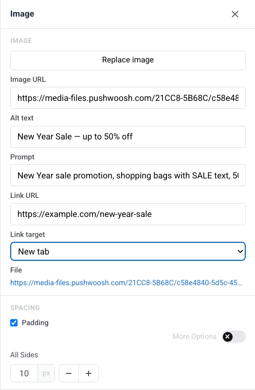
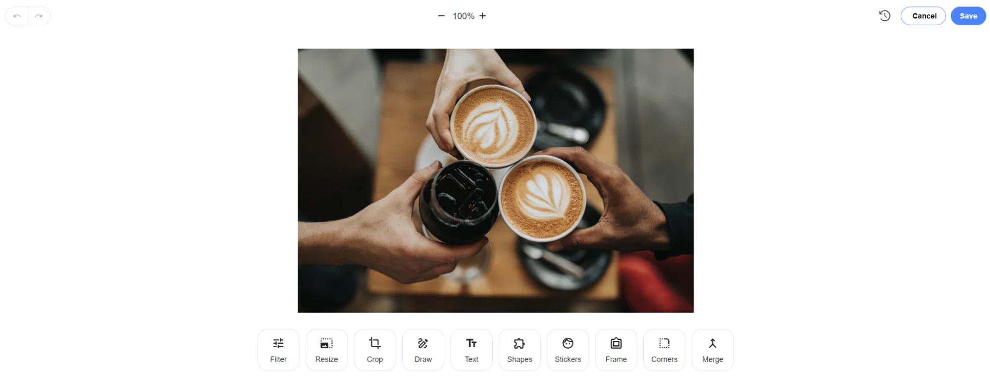
Anchor link toEin Bild-Block zeigt ein Bild in der E-Mail an. Wählen Sie es auf der Leinwand aus, um die Bild-Einstellungen im rechten Panel zu öffnen.
Ein Bild hinzufügen
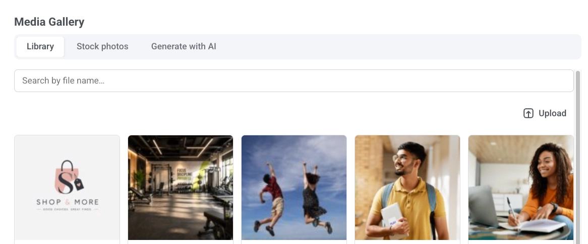
Klicken Sie auf Bild hinzufügen, wenn der Block leer ist, oder auf Bild ersetzen, wenn bereits ein Bild festgelegt ist. Dies öffnet die Mediengalerie mit drei Tabs:
- Bibliothek: Ihre hochgeladenen Dateien, durchsuchbar nach Dateinamen.
- Stockfotos: Suchen Sie kostenlose Pexels-Fotos, ohne den Editor zu verlassen. Klicken Sie auf eines, um es in Ihre Bibliothek zu kopieren und einzufügen.
- Mit KI generieren: Beschreiben Sie das gewünschte Bild und wählen Sie ein Seitenverhältnis. Das generierte Bild wird in Ihrer Bibliothek gespeichert.
Sie können auch einen gehosteten Link direkt in die Bild-URL einfügen, um die Galerie zu überspringen.
Bilder aus der Bibliothek löschen
Löschen Sie Bilder, ohne den Editor zu verlassen: Fahren Sie mit der Maus über eine Datei und klicken Sie auf Löschen, oder wählen Sie mehrere aus und klicken Sie auf Ausgewählte löschen, und bestätigen Sie dann im Dialogfeld.
Alternativtext
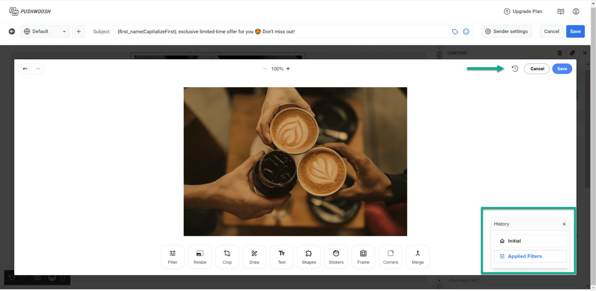
Beschreiben Sie das Bild im Alternativtext für die Barrierefreiheit, oder klicken Sie auf Alternativtext mit KI generieren, um die KI ihn aus dem Bild in Ihrer aktuellen Bearbeitungssprache schreiben zu lassen. Bilder, die aus Stockfotos oder mit KI generiert wurden, erhalten automatisch einen Alternativtext.
Größe & Passform
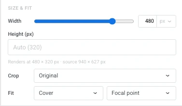
- Breite: Legen Sie die Breite des Bildes in px oder als Prozentsatz des verfügbaren Platzes fest, damit es fließend bleibt. Lassen Sie es auf dem Standardwert, um die natürliche Breite des Bildes zu verwenden.
- Höhe (px): Legen Sie eine feste Renderhöhe fest. Lassen Sie das Feld leer, um automatisch zu skalieren – vom Zuschneideverhältnis, falls eines festgelegt ist, andernfalls von den natürlichen Proportionen des Bildes.
- Zuschneiden: Wählen Sie Original, um die natürlichen Proportionen des Bildes beizubehalten, oder ein Verhältnis (Quadrat (1:1), 4:3, 3:2, 16:9), um das Bild auf diesen Kasten zuzuschneiden.
- Passform: Wählen Sie Abdecken, um den Kasten zu füllen und darauf zuzuschneiden. Legen Sie den Zuschneidepunkt mit Fokuspunkt fest. Oder wählen Sie Enthalten, um das gesamte Bild innerhalb des Kastens ohne Zuschneiden zu skalieren. Positionieren Sie es mit Position festlegen.
- Eckenradius (px): Runden Sie die Ecken des Bildes ab. Aktivieren Sie Weitere Optionen, um jede Ecke separat festzulegen, oder lassen Sie es deaktiviert, um den gleichen Radius auf alle vier anzuwenden.
Wechseln Sie die Leinwand zu Mobil (siehe Die mobile Ansicht bearbeiten), um eine dieser Einstellungen separat für Telefonbildschirme festzulegen. Aktivieren Sie Breite (mobil), Höhe (mobil), Zuschneiden (mobil) oder Passform (mobil), um diese eine Einstellung zu überschreiben, beginnend mit ihrem Desktop-Wert; lassen Sie ein Kästchen deaktiviert, um die Desktop-Einstellung weiterhin zu übernehmen. Zuschneiden (mobil) erscheint nur, wenn Zuschneiden auf dem Desktop auf ein Verhältnis eingestellt ist, und das Ändern von Zuschneiden zurück zu Original auf dem Desktop verwirft jede Zuschneiden (mobil)-Überschreibung.
Links und Abstände
Um einen Link zu öffnen, wenn auf das Bild geklickt wird, geben Sie ihn in die Link-URL ein und stellen Sie das Link-Ziel so ein, dass es im selben Tab oder in einem neuen geöffnet wird. Siehe Links hinzufügen für verfügbare Link-Typen.
Unter Abstand aktivieren Sie Innenabstand, um Platz um das Bild hinzuzufügen. Verwenden Sie Alle Seiten für einen einheitlichen Innenabstand oder aktivieren Sie Weitere Optionen, um jede Seite separat festzulegen.
Logo-Header
Anchor link toDer Logo-Header übernimmt sein Aussehen von Ihrem Logo im Brand Book, sodass jede E-Mail mit demselben Header beginnt, ohne ihn jedes Mal neu aufzubauen. Klicken Sie an einer beliebigen Stelle auf den Header, um den gesamten Block auszuwählen. Das Logo darin kann nicht einzeln ausgewählt werden.
Wählen Sie ihn auf der Leinwand aus, um seine Einstellungen im rechten Bereich zu öffnen:
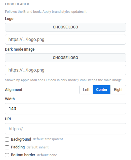
- Logo: Klicken Sie auf Logo auswählen, um das Bild aus Ihrem Medienspeicher auszuwählen, oder fügen Sie die URL eines gehosteten Bilds ein.
- Dark-Mode-Bild: legen Sie ein Bild für den Dark Mode fest. Apple Mail und Outlook zeigen es an, wenn der Empfänger im Dark Mode liest. Gmail behält immer das Hauptbild bei.
- Ausrichtung: links, zentriert oder rechts.
- Breite: die Breite des Logos in px.
- URL: Geben Sie ein Ziel ein, um das Logo klickbar zu machen.
- Hintergrund: aktivieren, um eine Hintergrundfarbe hinter dem Logo festzulegen.
- Innenabstand: aktivieren, um Platz um das Logo hinzuzufügen. Verwenden Sie Alle Seiten für einen einheitlichen Innenabstand, oder aktivieren Sie Weitere Optionen, um jede Seite separat festzulegen.
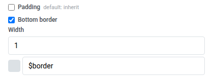
- Unterer Rand: aktivieren, um eine Linie unter dem Header zu zeichnen, und legen Sie dann deren Breite und Farbe fest.
Wie ein Header auf Ihr Brand Book reagiert, hängt davon ab, ob Sie ihn bearbeitet haben:
- Nicht bearbeitet: Solange der Header alle Einstellungen genauso beibehält wie in Ihrem Brand Book, zeigt das Bedienfeld: „Folgt dem Brand Book: Markenstile anwenden aktualisiert ihn.“ Brand Book-Stile anwenden färbt ihn zusammen mit dem Rest der E-Mail entsprechend Ihrer gespeicherten Marke neu ein.
- Bearbeitet: Ändern Sie eine beliebige Einstellung dieses Headers, und das Bedienfeld wechselt zu: „Hier geänderte Einstellungen bleiben erhalten, wenn die Marke angewendet wird.“ Ab diesem Zeitpunkt behält der Header Ihre Änderung bei, auch nachdem Brand-Book-Stile angewendet wurden.
Ein bearbeiteter Header erhält zwei weitere Aktionen:
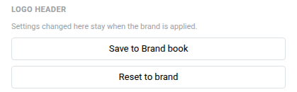
- Im Brand Book speichern: Speichert das Aussehen dieses Headers zurück ins Brand Book. Alle anderen Logo-Header in der E-Mail übernehmen sofort das neue Aussehen und behalten dabei ihre eigenen Änderungen bei.
- Auf Marke zurücksetzen: Verwirft die lokalen Änderungen dieses Headers und folgt wieder dem Brand Book.
Video
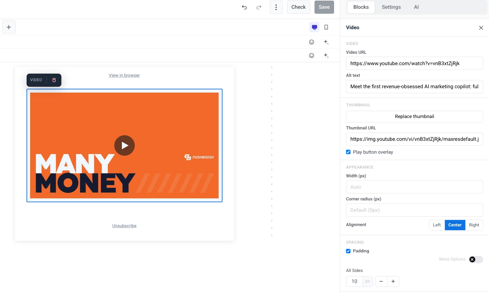
Anchor link toEin Video-Block fügt ein YouTube- oder Vimeo-Video als klickbares Vorschaubild zur E-Mail hinzu. E-Mail-Clients können Videos nicht innerhalb der Nachricht abspielen, daher zeigt der Block ein Standbild mit einem ▶-Overlay. Wenn der Empfänger darauf tippt, öffnet sich das Video auf YouTube oder Vimeo. Dies funktioniert in jedem wichtigen Client, einschließlich Outlook.
Wählen Sie den Video-Block auf der Leinwand aus, um seine Einstellungen im rechten Panel zu öffnen.
- Video-URL: Fügen Sie einen YouTube- oder Vimeo-Link ein. Der Editor ruft automatisch ein Vorschaubild ab.
- Alternativtext: Beschreiben Sie das Video für die Barrierefreiheit.
- Vorschaubild-URL: Behalten Sie das automatisch abgerufene Vorschaubild bei, oder klicken Sie auf Vorschaubild hinzufügen / Vorschaubild ersetzen, um eines aus der Mediengalerie auszuwählen, oder fügen Sie einen gehosteten Link direkt ein.
- Play-Button-Overlay: Standardmäßig aktiviert. Deaktivieren Sie es, um das einfache Vorschaubild ohne das ▶-Overlay anzuzeigen. Das Overlay ist für Vorschaubilder auf einigen externen Hosts nicht verfügbar. Der Editor warnt Sie, wenn dies zutrifft, und die E-Mail zeigt stattdessen das einfache Vorschaubild an.
- Breite (px), Eckenradius (px) und Ausrichtung: Steuern Sie, wie das Vorschaubild aussieht und wo es im Layout platziert ist. Sie können die Ausrichtung für Mobilgeräte separat einstellen.
Karte
Anchor link toEin Karten-Block kombiniert ein Bild mit einer Überschrift, Text und einem Button in einem einzigen vorgefertigten Layout. Wählen Sie ihn auf der Leinwand aus, um seine Einstellungen im rechten Panel zu öffnen.
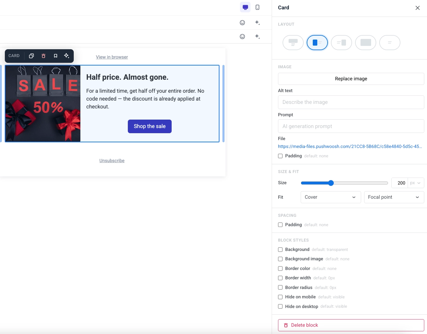
- Layout: Wählen Sie, auf welcher Seite das Bild im Verhältnis zum Inhalt platziert wird.
- Bild: Ersetzen Sie das Bild, legen Sie einen Alternativtext fest oder bearbeiten Sie die Anweisung für ein Bild, das Sie mit Mit KI generieren erstellt haben.
- Größe & Passform: Die Größenfelder hängen vom Layout ab. Zuschneiden ist für alle Layouts verfügbar. Passform gilt für jedes Layout:
- Oben: Höhe legt die Höhe des Bildes in px oder als Prozentsatz der Kartenbreite fest. Breite (px) verengt das Bild auf eine feste Pixelbreite und zentriert es.
- Hintergrund: Höhe legt die Höhe der Karte in px oder als Prozentsatz ihrer Breite fest. Es gibt kein Breite (px)-Feld. Das Bild ist der Hintergrund der Karte. Passform funktioniert hier auch: Abdecken schneidet das Bild auf die Karte zu – legen Sie den Zuschneidepunkt mit Fokuspunkt fest – und Enthalten skaliert das gesamte Bild darin, platziert mit Position festlegen. Outlook Desktop nähert Enthalten an und ignoriert beides.
- Links oder Rechts: Breite legt die Breite der Bildspalte in px oder als Prozentsatz der Karte fest. Höhe (px) fixiert das Bild auf eine Pixelhöhe. Das Festlegen einer Pixelhöhe löscht das Zuschneideverhältnis darunter. Das Auswählen eines Zuschneideverhältnisses löscht die Pixelhöhe. Sie können nicht beides gleichzeitig verwenden.
- Für alle Layouts:
- Zuschneiden: Wählen Sie Original, um die natürlichen Proportionen des Bildes beizubehalten, oder ein Verhältnis (Quadrat (1:1), 4:3, 3:2, 16:9), um das Bild auf diesen Kasten zuzuschneiden.
- Passform: Wählen Sie Abdecken, um den Kasten zu füllen und darauf zuzuschneiden. Legen Sie den Zuschneidepunkt mit Fokuspunkt fest. Oder wählen Sie Enthalten, um das gesamte Bild innerhalb des Kastens ohne Zuschneiden zu skalieren. Positionieren Sie es mit Position festlegen.
- Eckenradius (px): Runden Sie die Ecken des Bildes ab. Aktivieren Sie Weitere Optionen, um jede Ecke separat festzulegen, oder lassen Sie es deaktiviert, um den gleichen Radius auf alle vier anzuwenden. Gmail und Apple Mail rendern es; Outlook Desktop ignoriert es, genauso wie der Bildblock.
- Abstand: Legen Sie den Innenabstand um den Inhalt der Karte fest.
Button
Anchor link toEin Button ist ein klickbarer Call-to-Action in der E-Mail.
Klicken Sie auf einen Button-Block, um seine Beschriftung auf der Leinwand zu bearbeiten. Verwenden Sie die Symbolleiste, um Schriftgröße, Textfarbe, Fett, Kursiv, Unterstrichen, Durchgestrichen und Ausrichtung zu ändern. Die Beschriftung ist einzeilig: eingefügte Zeilenumbrüche werden zu einem Leerzeichen zusammengefasst. Siehe Einfügen aus anderen Dokumenten für das, was beim Einfügen erhalten bleibt und was nicht.
Um festzulegen, was passiert, wenn der Empfänger auf den Button klickt:
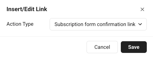
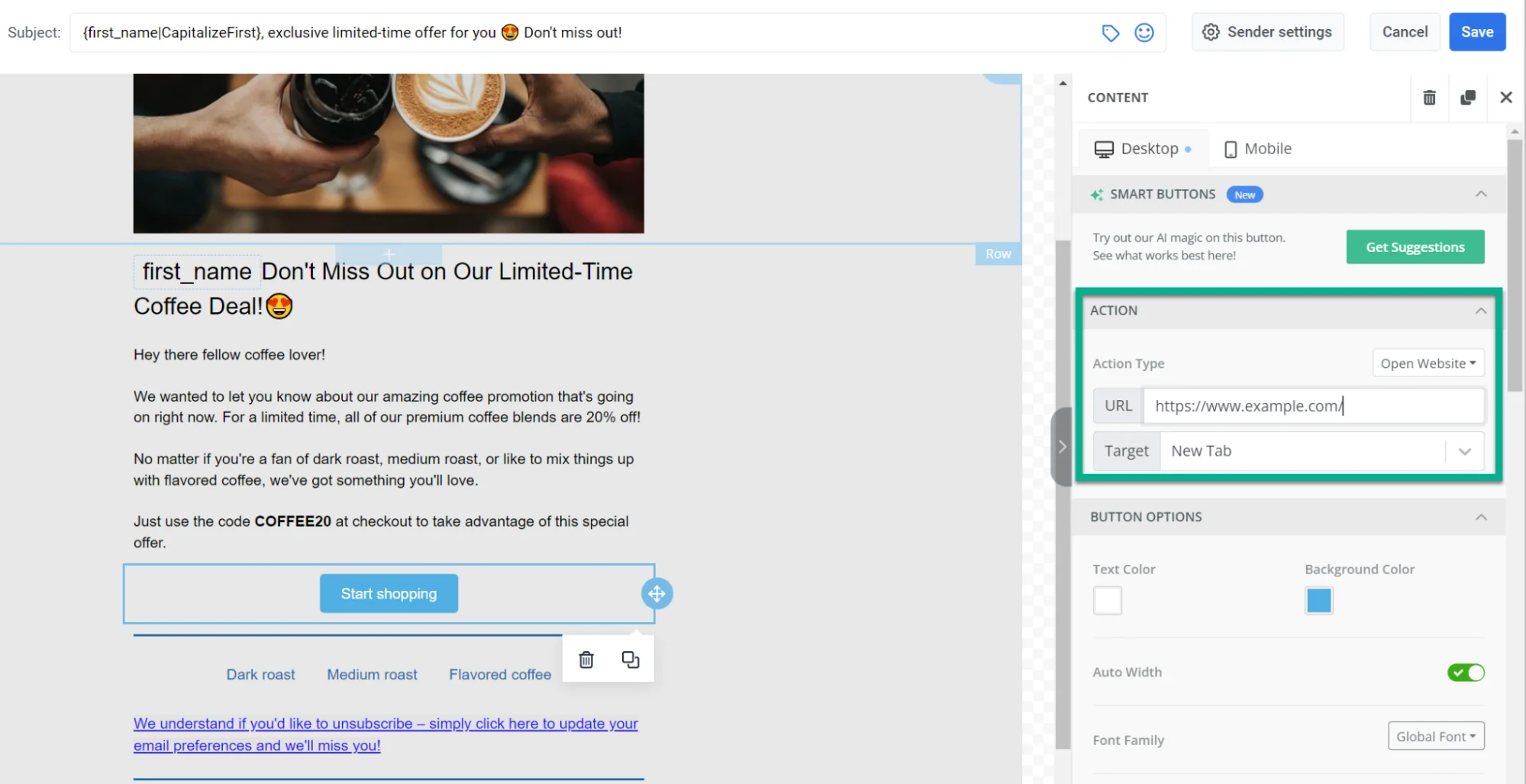
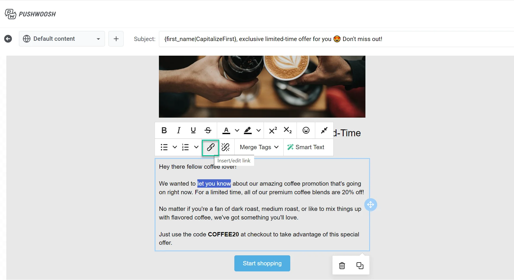
- Klicken Sie auf das Link-Symbol in der Symbolleiste, um Link einfügen/bearbeiten zu öffnen.
- Oder verwenden Sie Aktionstyp und URL im Abschnitt Link des rechten Panels.
Siehe Links hinzufügen für die verfügbaren Aktionstypen.
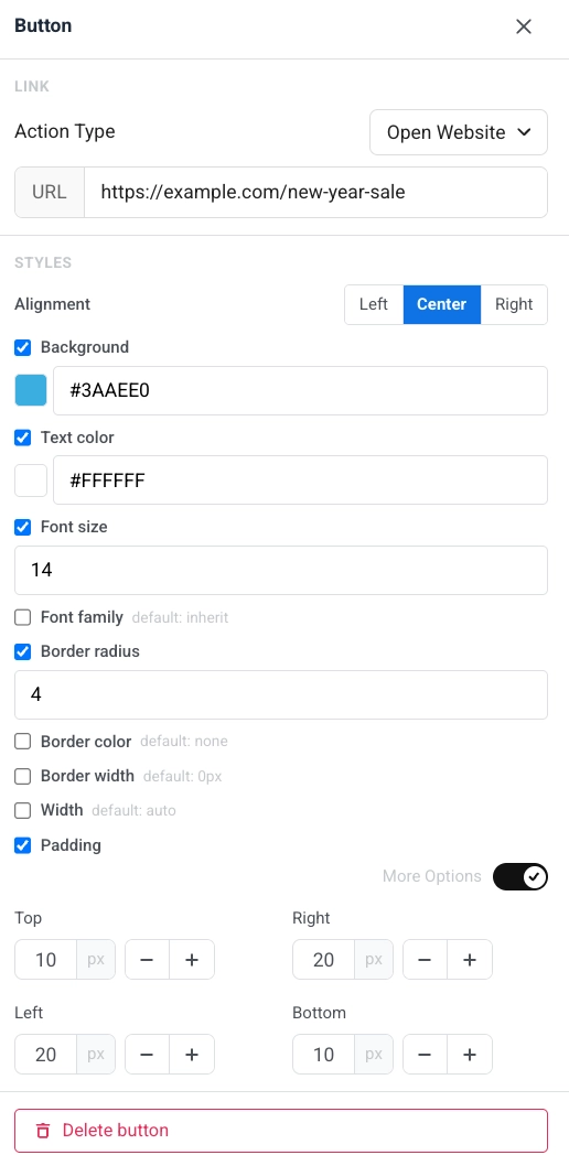
Im rechten Panel, unter Stile:
- Ausrichtung: links, zentriert oder rechts.
- Hintergrund: Aktivieren Sie diese Option, um das Standardaussehen zu überschreiben, und wählen Sie dann Einfarbig für eine einfarbige Farbe oder Farbverlauf für einen linearen Farbverlauf mit zwei Stopps (eine Startfarbe, eine Endfarbe und ein Winkel in Grad, Standard 90°). Wenn Farbverlauf ausgewählt ist, zeigt der Button in E-Mail-Clients, die keine Farbverlaufshintergründe unterstützen, wie z. B. Outlook unter Windows, immer noch eine einfarbige Füllung an. Buttons, die bereits einen einfarbigen Hintergrund hatten, behalten diesen und öffnen sich mit Einfarbig ausgewählt.
- Textfarbe, Schriftgröße und Schriftfamilie: Aktivieren Sie jede Option, um das Standardaussehen zu überschreiben.
- Eckenradius, Rahmenfarbe und Rahmenbreite: Form und Umriss des Buttons. Gmail und Apple Mail rendern den Eckenradius des Buttons; Outlook Desktop ignoriert ihn und zeigt eckige Ecken an, genauso wie bei Bildern.
- Breite: Legen Sie eine feste Button-Breite fest oder lassen Sie sie automatisch.
- Innenabstand: Fügen Sie Platz innerhalb des Buttons hinzu. Verwenden Sie Alle Seiten für einen einheitlichen Innenabstand oder aktivieren Sie Weitere Optionen, um jede Seite separat festzulegen.
Trennlinie
Anchor link toEine Trennlinie ist eine horizontale Linie zwischen Inhaltsblöcken. Verwenden Sie sie, um Abschnitte in der E-Mail visuell zu trennen.
Konfigurieren Sie Linienstil (Durchgezogen, Gestrichelt, Gepunktet), Farbe, Dicke und Breite im Einstellungsfeld.
HTML
Anchor link toDer HTML-Block ermöglicht es Ihnen, benutzerdefiniertes HTML in Ihre E-Mail einzufügen. Verwenden Sie ihn für ein benutzerdefiniertes Formular, eine Umfrage oder ein eingebettetes Video.
Über dem Code-Feld klicken Sie auf Merge-Tag, um die Tags Ihres Kontos zu durchsuchen und einen Merge-Tag an der Cursorposition einzufügen – dieselbe Personalisierungsfunktion, die oben beschrieben wurde – oder klicken Sie auf das Emoji-Symbol, um auf die gleiche Weise ein Emoji einzufügen. Klicken Sie auf einen eingefügten Merge-Tag, um dasselbe Standard / Format-Panel wie in einem Überschrift- oder Textblock zu öffnen.
Beispiele
Anchor link toDieses Lead-Formular sammelt eine E-Mail-Adresse, um einen Promo-Code für den Neujahrsverkauf zu senden.
HTML-Code
<!DOCTYPE html><html lang="en"><head><meta charset="UTF-8"><meta name="viewport" content="width=device-width, initial-scale=1.0"><style>  body { margin: 0; padding: 20px; font-family: Arial, sans-serif; }  h2 { font-size: 18px; margin-bottom: 8px; color: #222; }  p { font-size: 14px; color: #666; margin-bottom: 20px; }  input {    width: 100%;    padding: 12px;    margin-bottom: 12px;    border: 1px solid #ddd;    border-radius: 8px;    font-size: 15px;    box-sizing: border-box;  }  button {    width: 100%;    padding: 14px;    background: #CC0000;    color: white;    border: none;    border-radius: 8px;    font-size: 16px;    font-weight: bold;    cursor: pointer;  }</style></head><body>
<h2>Get your New Year Sale code</h2><p>Enter your email and we'll send you an exclusive promo code for up to 50% off.</p>
<div id="form">  <input type="email" placeholder="Your email address" />  <button type="button">Get my code</button></div>
</body></html>
Diese Umfrage fragt, für welche Kategorie der Empfänger einkauft, und verlinkt jede Option auf die entsprechende Verkaufsseite.
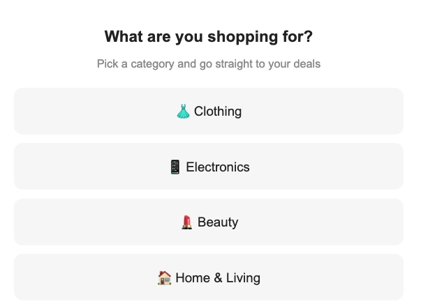
HTML-Code
<!DOCTYPE html><html lang="en"><head><meta charset="UTF-8"><meta name="viewport" content="width=device-width, initial-scale=1.0"><style>  body { margin: 0; padding: 20px; font-family: Arial, sans-serif; text-align: center; }  h2 { font-size: 18px; margin-bottom: 6px; color: #222; }  p { font-size: 13px; color: #888; margin-bottom: 20px; }  .option {    display: block;    width: 100%;    padding: 14px;    margin-bottom: 10px;    background: #f5f5f5;    border: 2px solid transparent;    border-radius: 10px;    font-size: 15px;    cursor: pointer;    box-sizing: border-box;    text-decoration: none;    color: #222;  }  .option:hover { border-color: #CC0000; background: #fff5f5; }</style></head><body>
<h2>What are you shopping for?</h2><p>Pick a category and go straight to your deals</p>
<a class="option" href="https://example.com/sale/clothing">👗 Clothing</a><a class="option" href="https://example.com/sale/electronics">📱 Electronics</a><a class="option" href="https://example.com/sale/beauty">💄 Beauty</a><a class="option" href="https://example.com/sale/home">🏠 Home & Living</a>
</body></html>
Dieses Beispiel bettet ein Werbevideo für den Neujahrsverkauf in die E-Mail ein.
HTML-Code
<!DOCTYPE html><html lang="en"><head><meta charset="UTF-8"><meta name="viewport" content="width=device-width, initial-scale=1.0"><style>  body {    font-family: Arial, sans-serif;    margin: 0;    padding: 20px;    text-align: center;  }  .video-container {    position: relative;    padding-bottom: 56.25%;    height: 0;    overflow: hidden;  }  .video-container iframe {    position: absolute;    top: 0;    left: 0;    width: 100%;    height: 100%;  }</style></head><body>
<h1>New Year Sale — Up to 50% Off</h1>
<div class="video-container">  <iframe src="https://www.youtube.com/embed/YOUR_VIDEO_ID"    allow="accelerometer; autoplay; clipboard-write; encrypted-media; gyroscope; picture-in-picture"    allowfullscreen></iframe></div>
</body></html>Menü
Anchor link toDer Menü-Block platziert mehrere klickbare Elemente in einer Zeile oder Spalte. Verwenden Sie ihn für eine Navigationsleiste oder eine Liste von Unternehmenskontakten.
Für jedes Menüelement legen Sie fest:
- Beschriftung: der Text, den die Empfänger sehen
- URL: wohin das Element führt
- Ziel: gleicher Tab oder ein neuer Tab
In den Blockeinstellungen können Sie auch festlegen:
- Richtung: Horizontal oder Vertikal
- Ausrichtung: Links, Zentriert oder Rechts
- Trennzeichen: ein optionales Trennzeichen zwischen den Elementen
- Schriftart, Größe, Gewicht, Zeichenabstand und Link-/Textfarben
Social
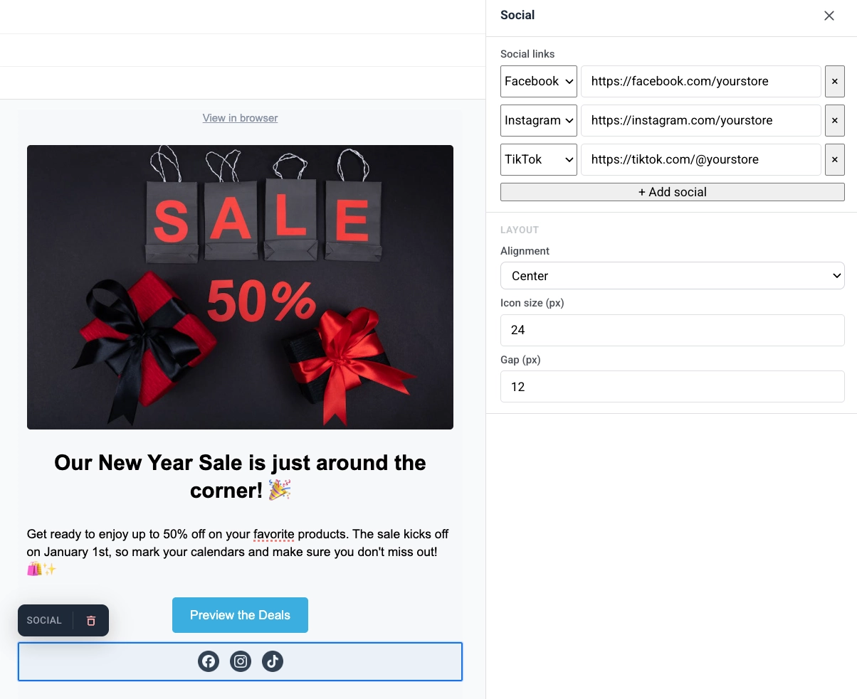
Anchor link toDer Social-Block zeigt eine Reihe von Social-Media-Symbolen an, die auf Ihre Profile verlinken. Verwenden Sie ihn, um Empfänger von der E-Mail aus zu Facebook, Instagram, X und anderen Plattformen zu leiten.
Fügen Sie Plattform-Einträge hinzu und legen Sie dann Ausrichtung, Symbolgröße und den Abstand zwischen den Symbolen fest.
Countdown-Timer
Anchor link toDer Timer-Block ist ein Countdown in der E-Mail. Verwenden Sie ihn für zeitlich begrenzte Angebote, Flash-Sales und Veranstaltungserinnerungen.
So richten Sie ihn ein:
- Unter Countdown legen Sie Enddatum und Endzeit fest, wählen Sie dann die Zeitzone und Sprache für die Timer-Beschriftungen.
- Aktivieren Sie Beschriftungen, um “Tage / Stunden / Minuten / Sekunden”-Unterschriften unter den Ziffern anzuzeigen, oder deaktivieren Sie sie für reine Zahlen.
- Unter Erscheinungsbild legen Sie Hintergrund, Ziffernfarbe, Beschriftungsfarbe und die Schriftgröße für Ziffern (Standard 40px) und Beschriftungen (Standard 16px) fest.
- Passen Sie den Abstand (Innenabstand) nach Bedarf an.
Der Timer wird als scharfes Bild in jeder Sprache oder Größe gerendert, mit einem Hintergrund, der sich über die gesamte E-Mail-Zeile erstreckt, und einer Version, die nativ für die mobile Breite gerendert wird, anstatt eines verkleinerten Desktop-Bildes.
Barcode
Anchor link toDer Barcode-Block rendert einen scannbaren Barcode oder QR-Code aus einem Personalisierungswert, am häufigsten einem Gutschein.
So richten Sie ihn ein:
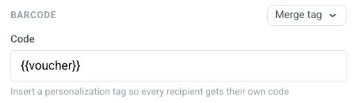
- Behalten Sie in Code
{{voucher}}bei, wenn die E-Mail mit einem Gutschein-Pool gesendet wird, oder klicken Sie auf Merge-Tag und wählen Sie den Tag, der den Code jedes Empfängers speichert. Die E-Mail löst den Tag zum Sendezeitpunkt auf, sodass jede Person ihren eigenen scannbaren Wert erhält.
- Wählen Sie die Symbologie:
- QR: ein quadratischer 2D-Code, den Telefone scannen können. Akzeptiert jeden Text, einschließlich alphanumerischer Codes wie
WELCOME2025-A1 - Code 128: ein linearer Barcode für jeden Text, einschließlich derselben alphanumerischen Codes
- EAN-13: der gängige Einzelhandels-Barcode in Europa und vielen anderen Regionen. Nur Ziffern, 12–13 Zeichen
- EAN-8: ein kürzerer Einzelhandels-Barcode für kleine Verpackungen. Nur Ziffern, 7–8 Zeichen
- UPC-A: der gängige Einzelhandels-Barcode in Nordamerika. Nur Ziffern, 11–12 Zeichen
- QR: ein quadratischer 2D-Code, den Telefone scannen können. Akzeptiert jeden Text, einschließlich alphanumerischer Codes wie
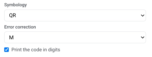
- Wenn Sie QR gewählt haben, stellen Sie die Fehlerkorrektur ein. Dies fügt zusätzliche Daten hinzu, sodass der Code auch dann noch gescannt werden kann, wenn ein Teil davon verdeckt, abgenutzt oder schwer zu erkennen ist. Wählen Sie L, M, Q oder H (Standard M). Höhere Stufen überstehen mehr Schaden, machen das Muster aber dichter, was bei kleinen Größen schwerer zu lesen sein kann. Überspringen Sie dieses Feld für andere Symbologien.
- Aktivieren Sie optional Code in Ziffern drucken, um den Wert unter dem Code anzuzeigen.
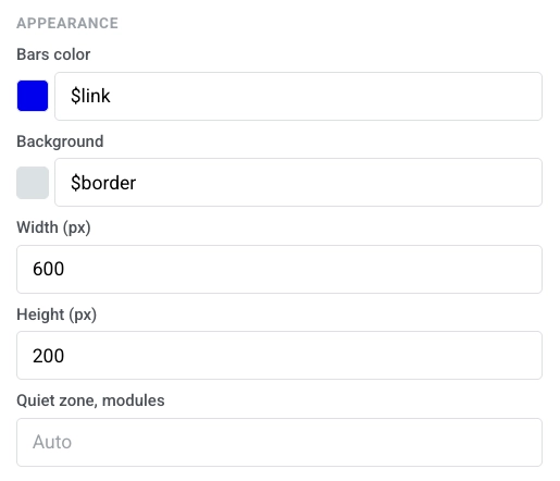
- Unter Erscheinungsbild legen Sie Balkenfarbe, Hintergrund, Breite (px) und Höhe (px) fest. Lassen Sie Ruhezone, Module auf Auto für den Standardrand.
Spalten
Anchor link toSpalten teilen die Leinwand in nebeneinander liegende Abschnitte, sodass Sie Inhalte in einer Zeile nebeneinander platzieren können.
Ziehen Sie einen dieser Blöcke auf die Leinwand:
- 2 Spalten: zwei gleiche Spalten
- 3 Spalten: drei gleiche Spalten
- 4 Spalten: vier gleiche Spalten
- 33 / 67: linke Spalte ca. 33 % breit, rechte ca. 67 %
- 67 / 33: linke Spalte ca. 67 % breit, rechte ca. 33 %
Fügen Sie dann Inhalte zu jeder Spalte hinzu. Um den Abstand für alle Spalten in der E-Mail zu ändern, öffnen Sie Einstellungen → Spalten-Standardeinstellungen und passen Sie den äußeren Innenabstand, den Spalten-Innenabstand und den Abstand zwischen den Spalten an.
Für das eigene Bild der Spalte (das Sie mit Bild hinzufügen in den Spalteneinstellungen hinzufügen) zeigen die Einstellungen einen Abschnitt Größe & Passform. Dies ist die gleiche Steuerung wie beim Links / Rechts-Layout des Kartenblocks. Ein Bild-Block, der in eine Spalte gezogen wird, ist ein separates Inhaltselement und behält seine eigenen einfachen Größenfelder – siehe Bild.
Sie können auch einen gehosteten Link direkt in die Bild-URL einfügen, um die Galerie zu überspringen.
- Breite: Legen Sie die Breite des Bildes in px oder als Prozentsatz der Spalte fest. Lassen Sie sie nicht festgelegt, um die Spalte zu füllen.
- Höhe (px): Fixieren Sie das Bild auf eine Pixelhöhe. Das Festlegen einer Pixelhöhe löscht das Zuschneideverhältnis darunter. Das Auswählen eines Zuschneideverhältnisses löscht die Pixelhöhe. Sie können nicht beides gleichzeitig verwenden.
- Zuschneiden: Wählen Sie Original, um die natürlichen Proportionen des Bildes beizubehalten, oder ein Verhältnis (Quadrat (1:1), 4:3, 3:2, 16:9), um das Bild auf diesen Kasten zuzuschneiden.
- Passform: Wählen Sie Abdecken, um den Kasten zu füllen und darauf zuzuschneiden. Legen Sie den Zuschneidepunkt mit Fokuspunkt fest. Oder wählen Sie Enthalten, um das gesamte Bild innerhalb des Kastens ohne Zuschneiden zu skalieren. Positionieren Sie es mit Position festlegen.
- Eckenradius (px): Runden Sie die Ecken des Bildes ab. Aktivieren Sie Weitere Optionen, um jede Ecke separat festzulegen, oder lassen Sie es deaktiviert, um den gleichen Radius auf alle vier anzuwenden. Gmail und Apple Mail rendern es; Outlook Desktop ignoriert es, genauso wie der Bildblock.
Produkte
Anchor link toEin Produkte-Block zeigt ein Raster von Produktkarten aus einer gemeinsamen Vorlage. Jede Karte kann ein Bild, einen Titel, eine Beschreibung, einen Preis und einen Kaufen-Button enthalten. Die Vorlage wiederholt sich für jedes Produkt.
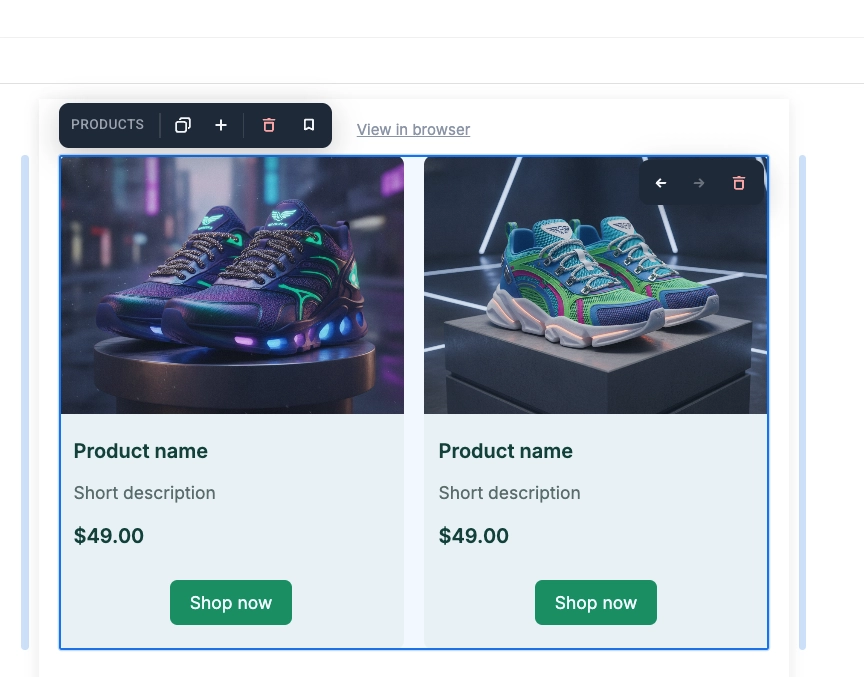
Klicken Sie auf eine Karte auf der Leinwand, um sie aktiv zu machen und zu bearbeiten:
- Ändern Sie den Titel, die Beschreibung, den Preis, das Bild oder den produktspezifischen Link, um nur diese Karte zu aktualisieren.
- Ändern Sie das Vorlagenlayout, die Farben, den Innenabstand oder die enthaltenen Elemente, um jede Karte zu aktualisieren.
Wählen Sie im Einstellungsfeld unter Quelle aus, woher die Produkte stammen:
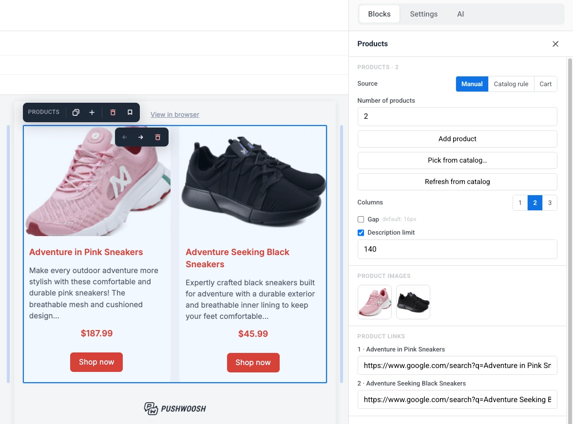
- Manuell: Geben Sie Produkte manuell ein, wählen Sie sie aus Ihrem Produktkatalog nach ID aus oder mischen Sie beides.
- Katalogregel: Ziehen Sie Produkte automatisch nach Kategorie und Sortierreihenfolge, die zum Sendezeitpunkt frisch aus dem Katalog aufgelöst werden.
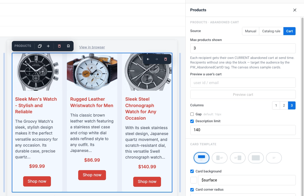
- Warenkorb: Zeigen Sie die Artikel aus dem aktuellen verlassenen Warenkorb jedes Empfängers an.
- Empfehlungen: Ziehen Sie Produkte, die nach einer integrierten Strategie geordnet sind – Bestseller, Neuheiten, wieder vorrätig oder Preisnachlass – die zum Sendezeitpunkt aus Ihrem Katalog aufgelöst werden.
Produkte manuell hinzufügen
Anchor link toFüllen Sie das Raster selbst, entweder durch manuelle Eingabe von Produkten oder durch Auswahl spezifischer Artikel aus Ihrem Produktkatalog nach ID. Sie können beides im selben Block mischen.
- Anzahl der Produkte: Legen Sie fest, wie viele Karten angezeigt werden sollen (1–24).
- Produkt hinzufügen: Fügen Sie eine Karte hinzu und füllen Sie Titel, Beschreibung, Preis, Bild und Link selbst aus.
- Aus Katalog auswählen…: Wählen Sie spezifische Produkte aus Ihrem Produktkatalog aus, anstatt sie einzutippen.
- Aus Katalog aktualisieren: Ziehen Sie den neuesten Titel, die Beschreibung, den Preis und das Bild für Produkte, die Sie aus dem Katalog ausgewählt haben, falls sie sich seit dem Hinzufügen geändert haben. Betrifft keine manuell eingegebenen Produkte.
- Produktbilder: Klicken Sie auf ein Vorschaubild, um das Bild dieses Produkts zu ersetzen.
- Produktlinks: Geben Sie die URL für jedes Produkt ein oder bearbeiten Sie sie.
Produkte mit einer Katalogregel ziehen
Anchor link toZiehen Sie Produkte automatisch nach Kategorie und Sortierreihenfolge, ohne manuelle Auswahl.
- Kategorie: Beschränken Sie sich auf eine bestimmte Katalogkategorie oder Alle Kategorien.
- Sortieren: Wählen Sie die Reihenfolge, in der Produkte gezogen werden: Neueste zuerst, Preis: niedrig nach hoch, Preis: hoch nach niedrig oder Titel A-Z.
- Anzahl der Produkte: Legen Sie ein Limit fest, wie viele Karten angezeigt werden sollen (1–12).
- Vorschau aktualisieren: Berechnen Sie die Leinwandvorschau jetzt sofort anhand des Katalogs neu.
Artikel aus dem Warenkorb anzeigen
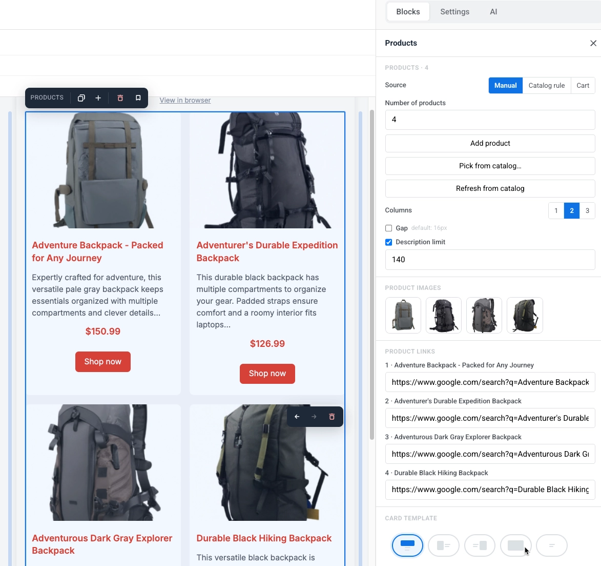
Anchor link toRendern Sie die aktuellen Artikel aus dem verlassenen Warenkorb eines Empfängers.
- Max. angezeigte Produkte: Legen Sie ein Limit fest, wie viele Karten angezeigt werden sollen (1–12).
- Warenkorb eines Benutzers vorschauen: Geben Sie eine Benutzer-ID oder E-Mail ein und klicken Sie auf Warenkorb vorschauen, um zu sehen, wie der Block für diesen spezifischen Empfänger gerendert wird.
Empfohlene Produkte erhalten
Anchor link toZiehen Sie Produkte, die nach einer integrierten Strategie geordnet sind, anstatt sie selbst auszuwählen oder eine Katalogregel zu schreiben.
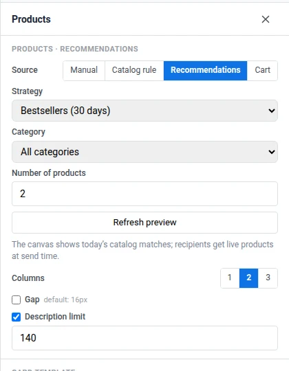
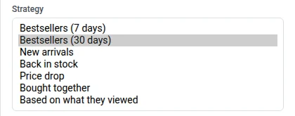
- Strategie: Wählen Sie, wie Produkte geordnet werden – Bestseller (7 Tage), Bestseller (30 Tage), Neuheiten, Wieder vorrätig, Preisnachlass, Zusammen gekauft oder Basierend auf dem, was sie angesehen haben. Die Auswahl von Empfehlungen ersetzt die Sortieren-Steuerung von Katalogregel durch diesen Strategie-Selektor. Bestseller, Zusammen gekauft und Basierend auf dem, was sie angesehen haben, benötigen Ereignisse von Ihrem Backend. Siehe Wie man Produktempfehlungen in E-Mails einrichtet.
- Kategorie: Beschränken Sie sich auf eine bestimmte Katalogkategorie oder Alle Kategorien.
- Anzahl der Produkte: Legen Sie ein Limit fest, wie viele Karten angezeigt werden sollen (1–12).
- Vorschau aktualisieren: Berechnen Sie die Leinwandvorschau jetzt sofort anhand des Katalogs neu.
Das Raster gestalten
Anchor link toSobald Sie eine Quelle ausgewählt haben, steuern diese Einstellungen das Aussehen des Rasters und seiner Karten. Sie bleiben gleich, egal welche Quelle Sie verwenden:
- Spalten: Wählen Sie 1, 2 oder 3 Karten pro Zeile. Auf Mobilgeräten werden Karten immer in einer Spalte gestapelt.
- Abstand: Aktivieren Sie diese Option, um den Abstand zwischen den Karten festzulegen. Deaktiviert verwendet den Standardwert (16px).
- Beschreibungslimit: Das Zeichenlimit, auf das die Produktbeschreibung gekürzt wird, damit die Karten eine einheitliche Größe behalten.
- Wert eingeben: Tippen Sie frei. Das Feld wird erst beim Verlassen oder mit Enter normalisiert, mit 10 als Untergrenze. Anders als beim Zusammenfassungslimit des Nachrichten-Blocks blendet 0 die Beschreibung hier nicht aus. Deaktivieren Sie stattdessen den Schalter, wenn es keine Begrenzung geben soll.
- Was zum Limit zählt: nur der Text, den man tatsächlich liest. Fett, Links und Zeilenumbrüche zählen nicht mit. Das Tippen über das Limit hinaus im Beschreibungsfeld wird blockiert.
- Kartenvorlage: Wählen Sie ein Layout und legen Sie dann Kartenhintergrund, Karten-Eckenradius und Inhalts-Innenabstand für jede Karte fest.
- Größe & Passform: Wird für jedes Layout mit einem Bild angezeigt. Dieselben Breite-, Höhe-, Zuschneiden- und Passform-Steuerelemente wie bei der Bildgrößenanpassung pro Layout des Kartenblocks, dimensioniert relativ zur Kartenbreite anstelle der gesamten E-Mail.
Die Blockstil-Einstellungen unten gestalten den Block als Ganzes, getrennt von den Karten darin:
- Hintergrund und Hintergrundbild: Legen Sie eine Hintergrundfarbe oder ein Bild hinter dem gesamten Raster fest. Wenn ein Bild festgelegt ist, wählt Passform, wie es im Block sitzt – Abdecken schneidet es auf den Block zu, Enthalten passt das gesamte Bild hinein – und Fokuspunkt / Position festlegen platziert es. Outlook Desktop zeigt nur die Hintergrundfarbe an und ignoriert das Bild, also behalten Sie eine lesbare Farbe dahinter.
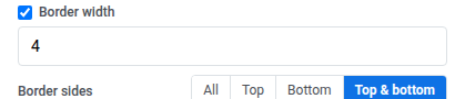
- Rahmenfarbe, Rahmenbreite und Eckenradius: Fügen Sie einen Umriss und abgerundete Ecken um das gesamte Raster hinzu. Aktivieren Sie Weitere Optionen im Eckenradius, um jede Ecke separat festzulegen, oder lassen Sie es deaktiviert, um den gleichen Radius auf alle vier anzuwenden. Gmail und Apple Mail rendern es; Outlook Desktop ignoriert es und zeigt eckige Ecken an, genauso wie bei Bildern.
- Rahmenseiten: Wählen Sie nach dem Festlegen von Rahmenbreite zwischen All, Top, Bottom oder Top & bottom, um festzulegen, an welchen Seiten des Rasters der Rahmen angezeigt wird.
- Auf Mobilgeräten ausblenden und Auf dem Desktop ausblenden: Blenden Sie den gesamten Block auf einem Gerät aus. Siehe Inhalte pro Gerät ein- oder ausblenden.
Nachrichten
Anchor link toEin Nachrichten-Block zeigt ein Raster von Artikelkarten. Jede Karte kann ein Bild, ein Datum, eine Überschrift, eine Zusammenfassung und einen “Weiterlesen”-Link enthalten. Die Vorlage wiederholt sich für jeden Artikel, genauso wie beim Produkte-Block. Ein neuer Nachrichten-Block beginnt mit 2 Beispielkarten.
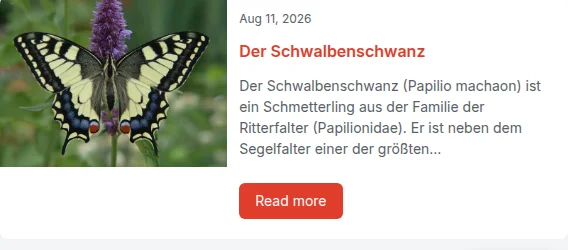
Wählen Sie im Einstellungsfeld unter Quelle aus, woher die Artikel stammen:
- Ausgewählt: Laden Sie Artikel einmalig aus einem RSS- oder Atom-Feed oder wählen Sie bestimmte manuell aus. Sie werden in die E-Mail kopiert und ändern sich nicht mehr.
- Live-Feed: Ziehen Sie Artikel aus einem für Ihre Anwendung registrierten Feed, der zum Sendezeitpunkt frisch aufgelöst wird, sodass jeder Empfänger die neuesten erhält.
Artikel aus einem Feed auswählen
Anchor link toKlicken Sie auf eine Karte auf der Leinwand, um sie aktiv zu machen und zu bearbeiten:
- Ändern Sie Datum, Überschrift, Zusammenfassung, Bild oder den Link pro Artikel, um nur diese Karte zu aktualisieren.
- Ändern Sie das Vorlagenlayout, die Farben, den Innenabstand oder die enthaltenen Elemente, um jede Karte zu aktualisieren.
Artikel werden in den E-Mail-Inhalt kopiert, sobald Sie sie laden; zum Sendezeitpunkt wird nichts mehr abgerufen. Artikelbilder werden in Ihren Medienspeicher kopiert und bei Bedarf von WebP in JPEG konvertiert, da Outlook WebP nicht rendern kann.
Fügen Sie eine RSS 2.0 oder Atom Feed-URL ein und dann entweder:
- Neueste Artikel laden: Ersetzen Sie die aktuellen Karten durch die neuesten Artikel aus dem Feed, mit der gleichen Anzahl von Karten, die Sie bereits haben (standardmäßig 2).
- Artikel auswählen…: Öffnen Sie eine Schublade mit bis zu 12 der neuesten Artikel des Feeds, mit Vorschaubild, Überschrift, Datum, Kategorie und Autor, und wählen Sie aus, welche Sie hinzufügen möchten. Ausgewählte Artikel werden an die vorhandenen Karten angehängt, bis zu insgesamt 12; Artikel, die bereits auf der Leinwand sind, können nicht zweimal ausgewählt werden.
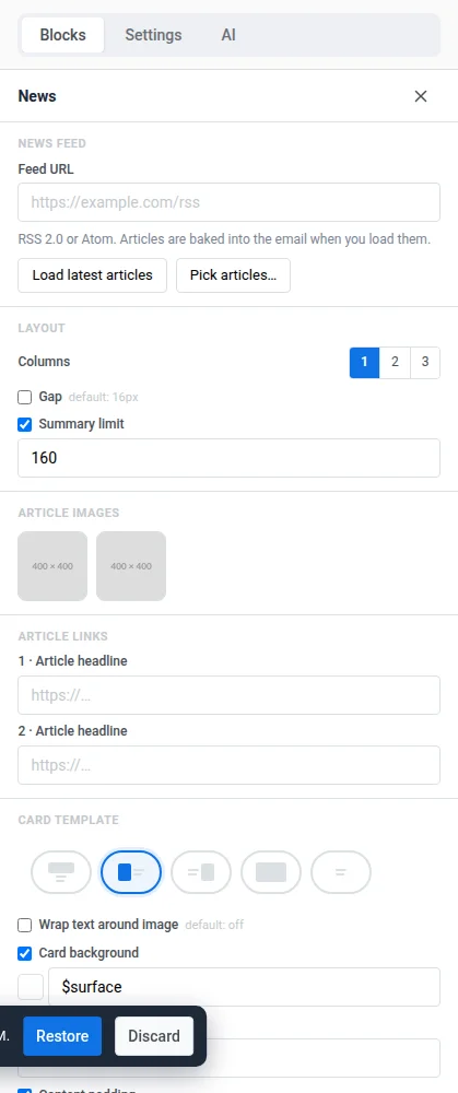
Die Schublade ermöglicht es Ihnen, bestimmte Artikel manuell auszuwählen, anstatt immer die neuesten zu nehmen.
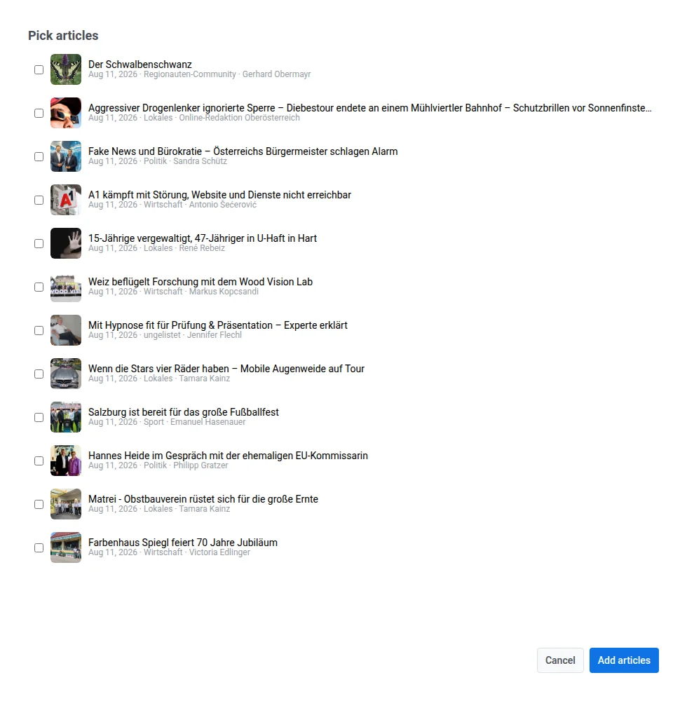
- Artikelbilder: Klicken Sie auf ein Vorschaubild, um das Bild dieses Artikels zu ersetzen.
- Artikellinks: Wird angezeigt, wenn die Kartenvorlage einen an den Artikel gebundenen Link hat (der standardmäßige “Weiterlesen”-Button). Listet jeden Artikel nach Überschrift auf, damit Sie seine Ziel-URL bearbeiten oder überschreiben können, die ursprünglich aus dem Feed gezogen wurde.
Artikeleinleitungen mit KI schreiben
Anchor link toFügen Sie unter der Überschrift jedes Artikels eine kurze redaktionelle Einleitung hinzu, die die KI im von Ihnen gewählten Ton schreibt. KI-Einleitungen funktionieren nur, wenn Quelle auf Ausgewählt gesetzt ist, nicht bei Live-Feed.
-
Gehen Sie in den Einstellungen des Nachrichten-Blocks zum Abschnitt KI-Einleitungen.
-
Legen Sie den Ton fest: Neutral, Warum es wichtig ist oder Witzig.
-
Optional füllen Sie Redaktionsrichtlinien mit Ihrem Stil, zu vermeidenden Wörtern oder der Zielgruppe aus. Bis zu 500 Zeichen.
-
Klicken Sie auf Einleitungen mit KI schreiben.
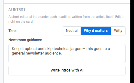
Pushwoosh schreibt eine Einleitung für jede Karte im Block, die noch keine hat. Dabei dient die Seite des Artikels selbst als Grundlage. Die Zusammenfassung aus dem Feed wird nur verwendet, wenn die Seite nicht gelesen werden kann. Die KI soll höchstens 280 Zeichen schreiben, und Pushwoosh kürzt jeden Überschuss, damit das Limit immer eingehalten wird.
Die Einleitung erscheint als eigenes Feld unter der Überschrift, über der Zusammenfassung. Wenn die Kartenvorlage keinen Platz dafür hat, fügt Pushwoosh dort einen hinzu. Hat die Vorlage auch kein Überschriftenfeld, wird die Einleitung stattdessen zum ersten Feld der Karte. Um eine Einleitung zu ändern, klicken Sie auf der Leinwand darauf und bearbeiten Sie sie wie die Überschrift oder die Zusammenfassung. Das Limit von 280 Zeichen gilt nur für das, was die KI schreibt, nicht für eine manuelle Bearbeitung.
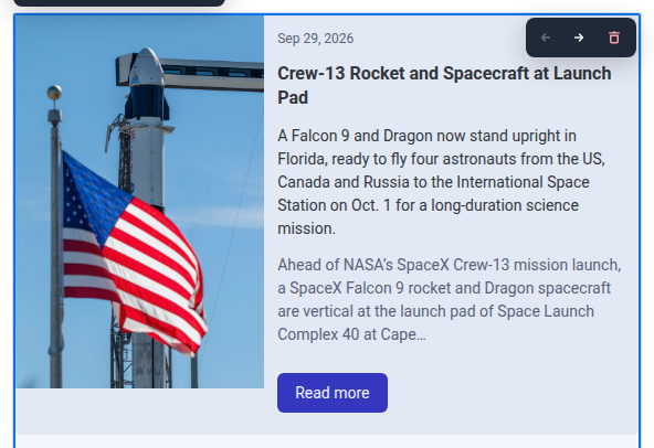
Um alle Einleitungen im Block zu ersetzen, klicken Sie auf Alle Einleitungen neu schreiben. Diese Schaltfläche erscheint anstelle von Einleitungen mit KI schreiben, sobald jede Karte eine Einleitung hat.
Wenn einige Einleitungen nicht geschrieben werden, zeigt Pushwoosh eine dieser Meldungen an:
- “Einleitungen für N Artikel nicht geschrieben – versuchen Sie es erneut”: Einige oder alle Artikel haben keine Einleitung erhalten. N zählt jeden Artikel, bei dem es fehlgeschlagen ist. Die bereits geschriebenen Einleitungen bleiben erhalten. Klicken Sie erneut auf Einleitungen mit KI schreiben. Es werden nur die Karten geschrieben, die noch keine haben, kein vollständiges Neuschreiben.
- “Die Einleitungen konnten nicht geschrieben werden”: Die Anfrage selbst ist fehlgeschlagen, zum Beispiel wegen eines Netzwerk- oder Serverfehlers.
Artikel aus einem Live-Feed ziehen
Anchor link toArtikel werden abgerufen, wenn die E-Mail gesendet wird, sodass jeder Empfänger die frischesten erhält. Anstatt Artikel selbst auszuwählen, wählen Sie einen Feed und ein Limit:
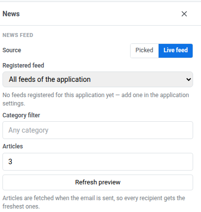
- Registrierter Feed: Wählen Sie einen bereits für Ihre Anwendung registrierten Feed oder Alle Feeds der Anwendung, um aus allen zu ziehen. Dieses Panel wählt nur einen Feed aus, es registriert keinen; wenn noch keiner existiert, fügen Sie einen auf der Seite Nachrichten-Feeds mit Feed hinzufügen hinzu.
- Kategoriefilter: ein optionaler Freitextfilter, der mit der Kategorie des Artikels aus dem Feed abgeglichen wird (Standard: jede Kategorie).
- Artikel: wie viele Karten angezeigt werden sollen (1–12, standardmäßig 3).
- Vorschau aktualisieren: Berechnen Sie die Leinwandvorschau jetzt sofort anhand des Feeds neu. Wenn der Feed keine Artikel zurückgibt, lässt Pushwoosh die aktuellen Karten unverändert; wenn der Feed nicht erreichbar ist, zeigt Pushwoosh stattdessen einen Fehler an.
Das Raster gestalten
Anchor link toSobald Sie eine Quelle ausgewählt haben, steuern diese Einstellungen das Aussehen des Rasters und seiner Karten. Sie bleiben gleich, egal welche Quelle Sie verwenden:
- Spalten: Wählen Sie 1, 2 oder 3 Karten pro Zeile. Auf Mobilgeräten werden Karten immer in einer Spalte gestapelt.
- Abstand: Aktivieren Sie diese Option, um den Abstand zwischen den Karten festzulegen. Deaktiviert verwendet den Standardwert (16px).
- Zusammenfassungslimit: Aktivieren Sie diese Option, um die Artikelzusammenfassung auf eine bestimmte Zeichenanzahl zu begrenzen (Standard 160), damit die Karten eine einheitliche Größe behalten.
- Wert eingeben: Tippen Sie frei. Das Feld wird erst beim Verlassen oder mit Enter normalisiert, wobei 1–9 auf 10 aufgerundet werden.
- Aus oder null: Aus bedeutet keine Begrenzung, sodass die gesamte Zusammenfassung angezeigt wird. Setzen Sie den Wert auf 0, um die Zusammenfassung vollständig aus der Karte, der gesendeten E-Mail und einer Live-Feed-Zelle zu entfernen. Das Panel zeigt dann “Summary is hidden: the cards show no article text (use it with AI intros).” an.
- Was zum Limit zählt: nur der Text, den man tatsächlich liest. Fett, Links und Zeilenumbrüche zählen nicht mit. Das Tippen über das Limit hinaus im Zusammenfassungsfeld wird blockiert.
- Kartenvorlage: Wählen Sie ein Layout und legen Sie dann Kartenhintergrund, Karten-Eckenradius und Inhalts-Innenabstand für jede Karte fest. Für das Links- oder Rechts-Layout aktivieren Sie Text um Bild fließen lassen, um die Überschrift und die Zusammenfassung um das Bild fließen zu lassen, anstatt sie in einer festen Spalte zu halten. Größe & Passform (Breite, Höhe, Zuschneiden, Passform) funktioniert genauso wie die Bildgrößenanpassung pro Layout des Kartenblocks, dimensioniert relativ zur Kartenbreite.
Die Blockstil-Einstellungen unten gestalten den Block als Ganzes, getrennt von den Karten darin:
- Hintergrund und Hintergrundbild: Legen Sie eine Hintergrundfarbe oder ein Bild hinter dem gesamten Raster fest. Wenn ein Bild festgelegt ist, wählt Passform, wie es im Block sitzt – Abdecken schneidet es auf den Block zu, Enthalten passt das gesamte Bild hinein – und Fokuspunkt / Position festlegen platziert es. Outlook Desktop zeigt nur die Hintergrundfarbe an und ignoriert das Bild, also behalten Sie eine lesbare Farbe dahinter.
- Rahmenfarbe, Rahmenbreite und Eckenradius: Fügen Sie einen Umriss und abgerundete Ecken um das gesamte Raster hinzu. Aktivieren Sie Weitere Optionen im Eckenradius, um jede Ecke separat festzulegen, oder lassen Sie es deaktiviert, um den gleichen Radius auf alle vier anzuwenden. Gmail und Apple Mail rendern es; Outlook Desktop ignoriert es und zeigt eckige Ecken an, genauso wie bei Bildern.
- Rahmenseiten: Wählen Sie nach dem Festlegen von Rahmenbreite zwischen All, Top, Bottom oder Top & bottom, um festzulegen, an welchen Seiten des Rasters der Rahmen angezeigt wird.
- Auf Mobilgeräten ausblenden und Auf dem Desktop ausblenden: Blenden Sie den gesamten Block auf einem Gerät aus. Siehe Inhalte pro Gerät ein- oder ausblenden.
Anzeigenplatz
Anchor link toEin Anzeigenplatz-Block zeigt eine gesponserte Kampagne für E-Mail-Empfänger. Es handelt sich um eine bezahlte Platzierung, die Ihr Account Manager verkauft, nicht um einen Block, den Sie mit Ihren eigenen Werbemitteln füllen.
Wählen Sie den Block auf der Leinwand aus, um seine Einstellungen im rechten Panel zu öffnen.
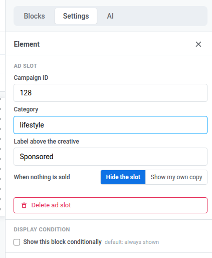
- Kampagnen-ID: Die numerische ID der anzuzeigenden Werbekampagne. Lassen Sie sie auf
0, um stattdessen eine beliebige aktive Kampagne abzugleichen. Die Liste des Anzeigeninventars zeigt keine ID für eine Kampagne an – kopieren Sie die Nummer aus der Adressleiste des Browsers auf der eigenen Seite der Kampagne, nachdem Sie sie gespeichert haben. - Kategorie: Beschränken Sie die Übereinstimmung auf Kampagnen, die mit dieser Kategorie getaggt sind. Legen Sie sie zusammen mit der Kampagnen-ID fest, um beides zu erfordern – die Anzeige wird nur geschaltet, wenn genau diese Kampagne auch diese Kategorie trägt. Lassen Sie die Kampagnen-ID auf
0, um stattdessen eine beliebige aktive Kampagne in der Kategorie abzugleichen. - Beschriftung über dem Werbemittel: Eine kurze Zeile, die über der Anzeige angezeigt wird, zum Beispiel “Gesponsert”. Lassen Sie sie leer, um keine Beschriftung anzuzeigen.
- Wenn nichts verkauft wird: Wählen Sie, was der Block anzeigt, wenn keine Kampagne übereinstimmt. Platz ausblenden (Standard) lässt nichts an seiner Stelle. Meinen eigenen Text anzeigen fügt einen zweiten Abschnitt innerhalb desselben Blocks hinzu, markiert mit “Wird angezeigt, wenn keine Kampagne läuft”, wo Sie Ihren eigenen Ersatztext schreiben und ein Bild hinzufügen. Dieser Abschnitt wird anstelle einer Anzeige in der E-Mail versendet, wenn keine Kampagne übereinstimmt. Wenn Sie ihn leer lassen, wird er als Platz ausblenden gespeichert – ein leerer Ersatz wird niemals als leerer Block versendet.
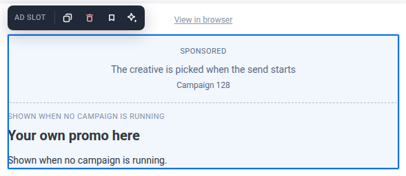
Die Leinwand zeigt die ID, Kategorie oder Beschriftung, die Sie als Platzhalter festgelegt haben – nicht das eigentliche Werbemittel. Pushwoosh wählt die passende Kampagne einmal aus, wenn die E-Mail zu senden beginnt, sodass jeder Empfänger dieses Versands dieselbe Anzeige sieht – es gibt keine pro-Empfänger-Zielgruppenansprache dafür, welche Kampagne angezeigt wird, und kein Frequency Capping in dieser Version.
Blöcke speichern und wiederverwenden
Anchor link toSpeichern Sie einen Block, um ihn in dieser oder anderen E-Mails wiederzuverwenden, anstatt ihn jedes Mal neu zu erstellen.
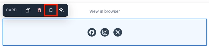
- Klicken Sie auf einen Block (seinen Rahmen oder Hintergrund, nicht den Text oder Button darin), um ihn auszuwählen. Karte, Spalten und Social sind Beispiele für Blöcke, die auf diese Weise funktionieren.
- Klicken Sie auf das Lesezeichen-Symbol in der Symbolleiste des Blocks und geben Sie ihm einen Namen.
Gespeicherte Blöcke erscheinen unter Gespeicherte Blöcke am unteren Rand des Blöcke-Tabs.
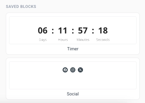
- Ziehen Sie einen gespeicherten Block auf die Leinwand oder klicken Sie darauf, um ihn am Ende der E-Mail hinzuzufügen.
- Klicken Sie auf das × auf der Kachel eines gespeicherten Blocks, um ihn zu löschen.
Kopien synchron halten
Anchor link toWenn Sie einen Block speichern, aktivieren Sie Kopien synchron halten, um jede eingefügte Kopie mit derselben Quelle zu verknüpfen. Bearbeiten Sie die Quelle einmal, und die Änderung wird überall dort angewendet, wo dieser Block verwendet wird, einschließlich bereits zum Senden geplanter E-Mails.
Das Speichern eines Bereichs von Blöcken funktioniert auf die gleiche Weise. Bearbeiten Sie einen beliebigen Block darin und wenden Sie dann die Änderung an, um jede Kopie zu aktualisieren, wo immer sie verwendet wird.
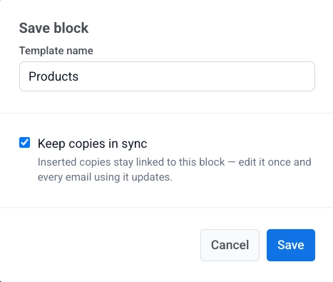
Eine synchronisierte Kopie ist auf der Leinwand gesperrt. Sie können sie nicht direkt bearbeiten. Wählen Sie die Kopie aus, um ihre Einstellungen zu öffnen:
- Synchronisierten Block bearbeiten: Entsperren Sie diese Kopie, damit Sie sie ändern können. Oben erscheint ein Banner. Klicken Sie auf Auf alle anwenden, um Ihre Änderungen an der Quelle und jeder anderen Kopie zu speichern, oder auf Abbrechen, um sie zu verwerfen. Sie können immer nur einen synchronisierten Block entsperren.
- Von Quelle aktualisieren: Ersetzen Sie diese Kopie durch die neueste Version aus der Quelle.
- Von Quelle trennen: Trennen Sie diese Kopie von der Quelle, damit Sie sie eigenständig bearbeiten können.
Während ein synchronisierter Block zur Bearbeitung entsperrt ist, ist der Rest der E-Mail gesperrt: Sie können nichts anderes auswählen, bearbeiten oder löschen, und Speichern ist deaktiviert, bis Sie fertig sind. Klicken Sie auf Auf alle anwenden, um Ihre Änderungen überall zu speichern, oder auf Abbrechen, um sie zu verwerfen und den Rest der E-Mail wieder zu entsperren.
Links hinzufügen
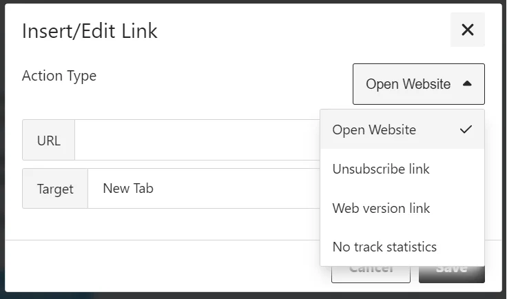
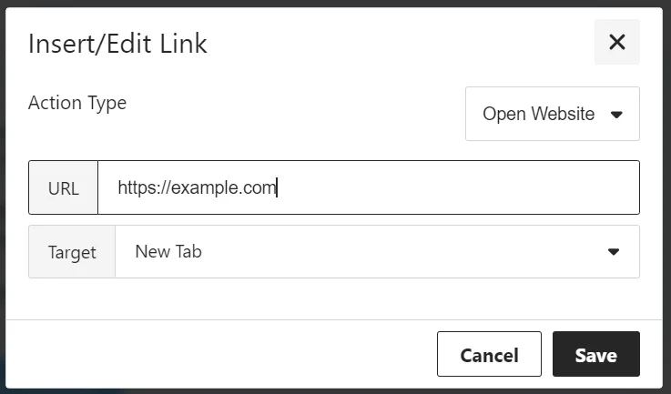
Anchor link toVerwenden Sie den Dialog Link einfügen/bearbeiten, um festzulegen, was passiert, wenn ein Empfänger auf einen Button oder ausgewählten Text klickt. Wählen Sie einen Aktionstyp und füllen Sie dann die Felder für diese Aktion aus.
Website öffnen
Anchor link toÖffnet einen Link, wenn der Empfänger klickt. Geben Sie die Adresse in URL ein.
Link zur Verwaltung der Präferenzen
Anchor link toFügt einen Link zum Abonnement-Präferenzzentrum hinzu, wo Empfänger auswählen können, welche E-Mail-Kategorien sie erhalten. Der Link wird automatisch eingefügt.
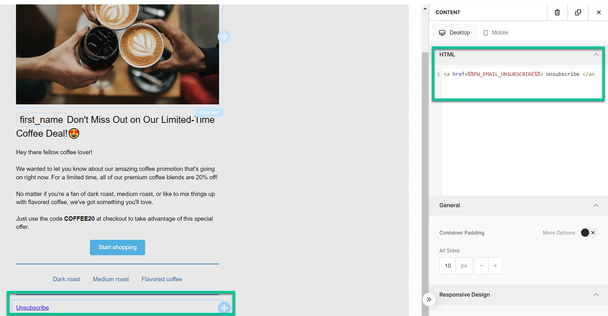
Abmeldelink
Anchor link toErmöglicht es den Empfängern, sich gemäß den Vorschriften und ihren Präferenzen abzumelden.
Was passiert, wenn der Empfänger auf den Abmeldelink klickt
Anchor link toWenn das Abonnement-Präferenzzentrum aktiviert ist
Anchor link toDer Empfänger wird nur von der Kategorie abgemeldet, die dieser E-Mail zugewiesen ist (z. B. Newsletter). Der Kategoriename wird aus seinem Tag Abonnierte E-Mail-Kategorien entfernt.
Ein Bestätigungsbildschirm erscheint mit den Optionen Erneut abonnieren und Präferenzen verwalten. Erfahren Sie mehr.
Wenn das Abonnement-Präferenzzentrum nicht aktiviert ist
Anchor link toDer Empfänger wird von allen Marketing-E-Mails abgemeldet und der Tag Abgemeldete E-Mails wird auf true gesetzt. Transaktions-E-Mails sind nicht betroffen und werden weiterhin zugestellt. Erfahren Sie mehr über Nachrichtentypen.
Klicks werden in der Abmelderate im Nachrichtenverlauf gezählt.
Webversion-Link
Anchor link toGibt den Empfängern Zugriff auf eine Webversion der E-Mail, nützlich, wenn sie Probleme haben, sie in ihrem Posteingang anzuzeigen.
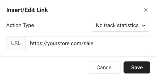
Keine Statistiken verfolgen
Anchor link toÖffnet einen Link, wenn der Empfänger klickt, ohne den Klick zu den Klickstatistiken Ihrer E-Mail zu zählen. Geben Sie die Adresse in URL ein.
Bestätigungslink für das Abonnementformular
Anchor link toFügt einen Bestätigungslink für eine Abonnementformular-Einreichung ein (zum Beispiel, um ein Double-Opt-In zu bestätigen). Erfahren Sie mehr über Double-Opt-In.