Créer des messages in-app natifs
Les in-apps natifs utilisent des mises en page prêtes à l’emploi que le SDK Pushwoosh affiche directement sur l’appareil, au lieu de la page HTML chargée par un in-app personnalisé. Cela leur permet de se charger plus rapidement et d’avoir des animations plus fluides, et vous n’avez pas besoin de compétences en design ou en développement pour en créer un.
Optez pour un in-app natif lorsque vous souhaitez lancer rapidement une promotion, un rappel ou une annonce de fonctionnalité et qu’une mise en page entièrement personnalisée n’est pas nécessaire. Si vous avez besoin d’un contrôle total sur le design, créez plutôt un in-app basé sur HTML.
Prérequis
Anchor link toAvant de créer un modèle d’in-app natif, assurez-vous que :
- Le SDK Pushwoosh est intégré dans votre application pour que les messages in-app puissent apparaître. En savoir plus
- Votre application exécute le SDK iOS 7.2.0+ ou le SDK Android 6.10.0+ pour les types modal, plein écran et stories. Les types feuille, carrousel et bannière nécessitent le SDK iOS 7.2.1+ ou le SDK Android 6.10.1+. Le type vidéo nécessite le SDK iOS 7.2.0+ ou le SDK Android 6.11.0+.
Frameworks multiplateformes
Anchor link toLe module in-app natif est fourni différemment selon votre pile technologique :
- Flutter intègre automatiquement le module in-app natif. Aucune configuration supplémentaire n’est nécessaire au-delà du plugin Pushwoosh pour Flutter.
- React Native, Cordova, Capacitor, Unity et Expo n’intègrent pas le module in-app natif. Ajoutez-le vous-même au projet Android/iOS sous-jacent de votre application :
pushwoosh-inapp-uisur Android,PushwooshInAppsur iOS. Consultez le guide d’intégration de votre framework pour savoir comment les modules natifs sont ajoutés à votre projet. - Le Web n’est pas pris en charge. Les in-apps natifs sont rendus via les SDK Android et iOS, et le SDK Web n’a pas de module in-app natif.
Créer un modèle d’in-app natif
Anchor link to- Allez dans Contenu → In-apps.
- Cliquez sur la flèche à côté de Créer un in-app et choisissez In-app natif. L’éditeur natif s’ouvre directement.
- Saisissez un nom de modèle.
- Dans Type d’affichage, en haut de l’éditeur, choisissez un type d’affichage : modal, plein écran, stories, feuille, carrousel, bannière ou vidéo. Consultez Configurer le type d’affichage pour savoir ce dont chaque type a besoin.
L’éditeur affiche un aperçu mobile en direct à droite et les champs du modèle à gauche, regroupés en Contenu, Configuration et Actions. Ce que vous voyez dans chaque groupe dépend du type d’affichage que vous avez choisi.
Configurer le type d’affichage
Anchor link toModal
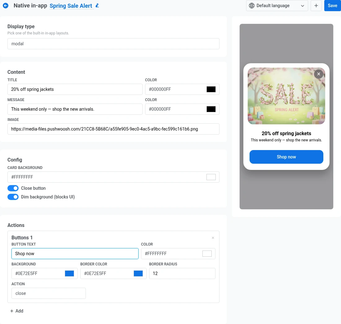
Anchor link toUne carte centrée, affichée éventuellement sur un fond estompé.
- Sous Contenu, ajoutez un titre et un message, chacun avec sa propre couleur de texte, plus une image facultative. Voir Ajouter une image.
- Sous Configuration, définissez la couleur de fond de la carte. Cela remplit la carte derrière votre texte et votre image.
- Activez Bouton de fermeture si vous voulez un contrôle ✕ pour que les utilisateurs puissent fermer l’in-app sans appuyer sur un bouton.
- Activez Estomper l’arrière-plan pour assombrir l’écran derrière la carte et maintenir l’attention sur votre message.
- Sous Actions, ajoutez un ou plusieurs boutons. Voir Configurer les boutons.
Plein écran
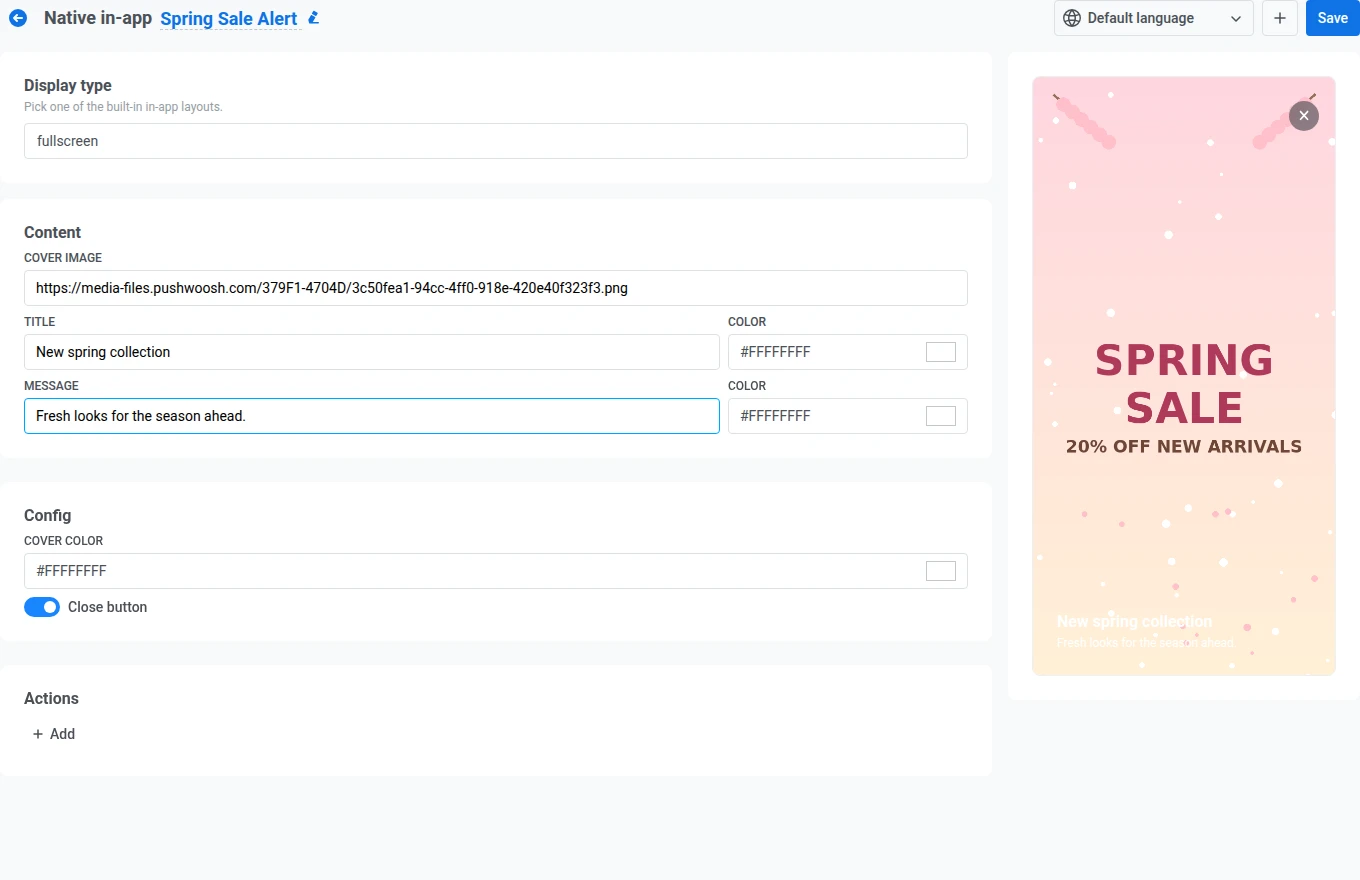
Anchor link toUne image de couverture bord à bord avec du texte et des boutons par-dessus. Remplissez ces champs dans le panneau de gauche :
- Sous Contenu, ajoutez une image de couverture, ainsi qu’un titre et un message, chacun avec sa propre couleur de texte. Voir Ajouter une image.
- Sous Configuration, définissez la couleur de couverture. Elle s’affiche pendant le chargement de l’image de couverture, ou seule si vous laissez le champ de l’image vide.
- Activez Bouton de fermeture si vous voulez un contrôle ✕ pour que les utilisateurs puissent fermer l’in-app sans appuyer sur un bouton.
- Sous Actions, ajoutez un ou plusieurs boutons. Voir Configurer les boutons.
Stories
Anchor link toUne séquence de diapositives en plein écran avec des barres de progression en haut, similaires aux stories des réseaux sociaux. Chaque diapositive est sa propre entrée Stories sous Contenu.
- Remplissez les champs Image, Titre et Message de la première diapositive (chacun avec sa propre couleur de texte). Voir Ajouter une image.
- Définissez Secondes sur la durée pendant laquelle la diapositive reste à l’écran avant de passer à la suivante. La valeur par défaut est 5. Entrez une valeur de 1 à 30. Les valeurs en dehors de cette plage bloquent la Sauvegarde avec une erreur de validation.
- Facultativement, cliquez sur Ajouter à l’intérieur de la diapositive pour lui donner son propre bouton CTA. Voir Configurer les boutons.
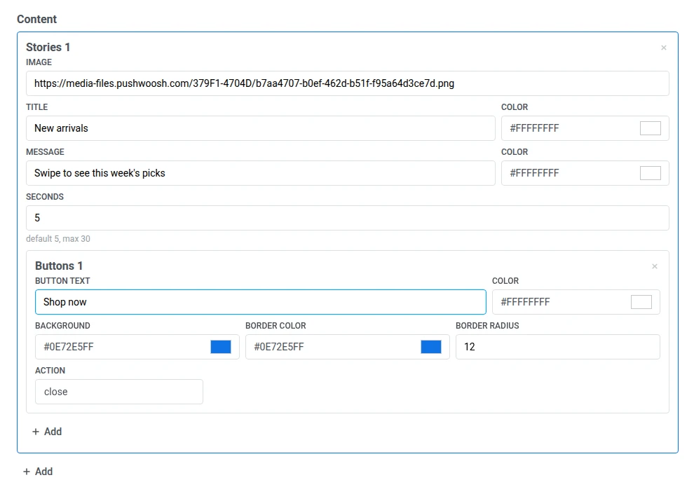
- Cliquez sur Ajouter sous la dernière diapositive pour en ajouter une autre, puis répétez les étapes 1 à 3 pour celle-ci.
- Sous Configuration, activez Boucle si vous voulez que la story recommence depuis la première diapositive après la fin de la dernière.
- Activez Bouton de fermeture si vous voulez un contrôle ✕ pour que les utilisateurs puissent quitter avant que toutes les diapositives ne soient lues.

Exemple de l’apparence de la story terminée pour l’utilisateur
Anchor link toFeuille
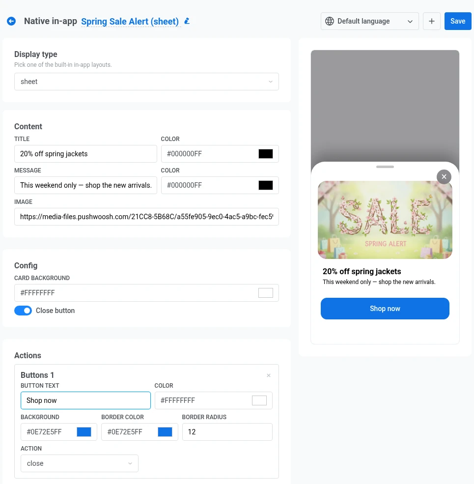
Anchor link toUne feuille inférieure qui glisse vers le haut depuis le bord inférieur de l’écran. Une poignée en haut permet aux utilisateurs de la faire glisser vers le bas pour la fermer.
Remplissez ces champs dans le panneau de gauche :
- Sous Contenu, ajoutez un titre et un message, chacun avec sa propre couleur de texte, plus une image facultative. Voir Ajouter une image.
- Sous Configuration, définissez la couleur de fond de la feuille. Cela remplit le panneau derrière votre texte et votre image.
- Activez Bouton de fermeture si vous voulez un contrôle ✕ pour que les utilisateurs puissent fermer la feuille sans appuyer sur un bouton.
- Sous Actions, ajoutez un ou plusieurs boutons. Voir Configurer les boutons.
Carrousel
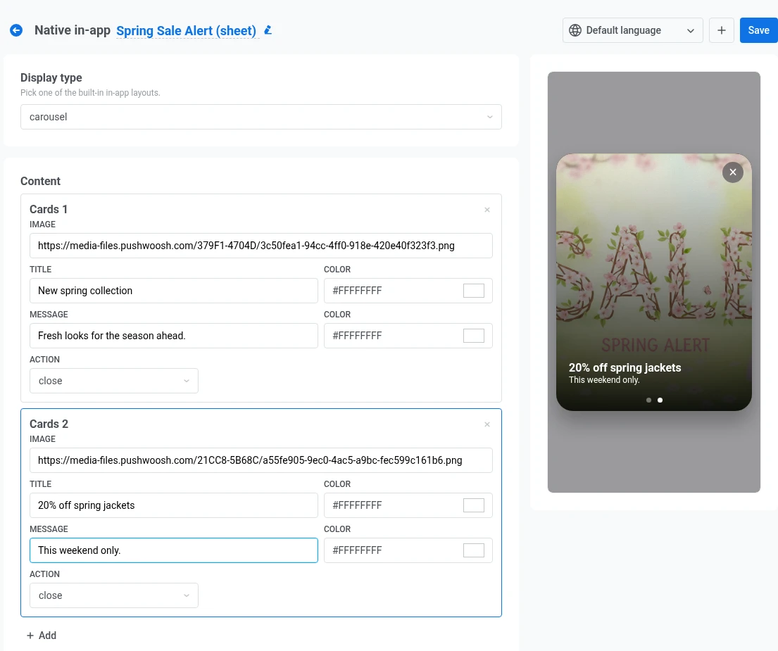
Anchor link toUn message en plein écran avec plusieurs cartes que les utilisateurs font défiler. Des points en bas indiquent quelle carte est active. Sous Contenu, chaque carte est une entrée Cartes distincte.
- Remplissez les champs Image, Titre et Message de la première carte (chacun avec sa propre couleur de texte). Voir Ajouter une image.
- Définissez l’Action pour la carte. Choisissez fermer pour fermer l’in-app lorsque l’utilisateur appuie sur la carte, ou url pour ouvrir un lien (mêmes options que pour Configurer les boutons).
- Cliquez sur Ajouter sous la dernière carte pour en ajouter une autre, puis répétez les étapes 1 et 2 pour celle-ci.
- Activez Bouton de fermeture si vous voulez un contrôle ✕ pour que les utilisateurs puissent quitter le carrousel sans appuyer sur une carte.
Bannière
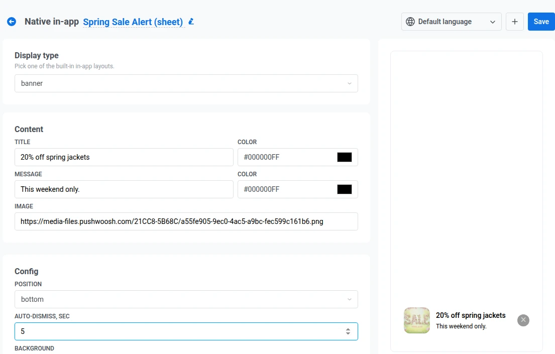
Anchor link toUne barre compacte épinglée au bord supérieur ou inférieur de l’écran, pour les messages qui ne doivent pas bloquer toute l’interface utilisateur.
- Sous Contenu, ajoutez un titre et un message, chacun avec sa propre couleur de texte, plus une petite image facultative. Voir Ajouter une image.
- Sous Configuration, définissez la Position sur haut ou bas pour épingler la bannière au bord de l’écran souhaité.
- Définissez Fermeture automatique, sec pour fermer automatiquement la bannière après ce nombre de secondes. Laissez ce champ vide pour conserver la bannière jusqu’à ce que l’utilisateur la ferme.
- Définissez la couleur de fond de la barre.
- Activez Bouton de fermeture si vous voulez un contrôle ✕ sur la bannière.
- Sous Actions, définissez l’Action sur fermer ou url. Les bannières n’ont pas de boutons séparés. Appuyer n’importe où sur la bannière exécute cette action. Voir Configurer les boutons pour le comportement de fermer et url.
Vidéo
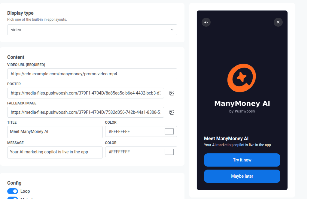
Anchor link toUn lecteur plein écran pour un lien de streaming HLS (.m3u8) ou un fichier .mp4 direct, avec un titre, un message et des boutons facultatifs par-dessus.
- Sous Contenu, définissez l’URL de la vidéo (obligatoire) sur un lien HTTPS absolu vers un fichier
.m3u8ou.mp4. Facultativement, ajoutez une image Affiche affichée avant le début de la lecture, et une Image de secours affichée si la vidéo ne peut pas être lue. - Ajoutez un titre et un message, chacun avec sa propre couleur de texte.
- Sous Configuration, activez Boucle pour redémarrer la vidéo après sa fin.
- Activez Muet pour démarrer la lecture avec le son désactivé.
- Activez Bouton de fermeture si vous voulez un contrôle ✕ pour que les utilisateurs puissent fermer l’in-app sans attendre la fin de la vidéo.
- Sous Actions, ajoutez un ou plusieurs boutons. Voir Configurer les boutons.
Configurer les champs de texte
Anchor link toLes champs de texte ne prennent pas en charge le texte multiligne. Si vous appuyez sur Entrée, l’éditeur peut afficher un saut de ligne, mais Pushwoosh enregistre un espace à la place. Sur l’appareil, le texte apparaît sur une seule ligne.
Pour ajouter un emoji, cliquez sur Emoji à côté de la barre d’outils du champ. Les emojis sont pris en charge dans les mêmes champs de texte que le texte brut. Vérifiez l’aperçu en direct pour voir leur apparence sur la mise en page.
Ajouter du contenu dynamique
Anchor link toChaque champ de texte prend en charge la personnalisation avec des tags et l’ID utilisateur.
- Cliquez sur Personnalisation à côté de la barre d’outils du champ.
- Sous Tag, choisissez un tag ou l’ID utilisateur.
- Choisissez un modificateur de format (par exemple, CapitalizeFirst ou regular).
- Facultativement, saisissez une Valeur de tag par défaut.
- Cliquez sur Insérer.
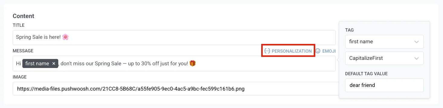
Le tag inséré s’affiche sous forme de puce dans le champ. Vous pouvez modifier le tag, le modificateur et la valeur par défaut avant de cliquer sur Insérer. La personnalisation utilise les mêmes tags, modificateurs et valeurs par défaut que le Contenu dynamique.
Lorsque vous cliquez sur Sauvegarder, Pushwoosh vérifie le contenu dynamique et Liquid dans chaque champ de texte. Si un champ ne peut pas être analysé (par exemple, une balise {% if %} non fermée), la Sauvegarde est bloquée et un message toast Le contenu dynamique contient des erreurs nomme le champ et la langue défectueux. Corrigez-le, puis cliquez à nouveau sur Sauvegarder.
Configurer les boutons
Anchor link toLes types modal, plein écran, chaque diapositive de stories, feuille et vidéo utilisent les mêmes champs de bouton :
- Texte du bouton et sa couleur.
- Arrière-plan, Couleur de la bordure et Rayon de la bordure.
- Action : choisissez ce qui se passe lorsque l’utilisateur appuie sur le bouton :
- fermer : ferme l’in-app.
- url : ouvre le lien que vous saisissez dans le champ qui apparaît. Utilisez une adresse web (par exemple,
https://example.com) ou un lien profond dans votre application (par exemple,myapp://product/123).
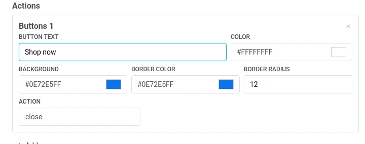
Cliquez sur Ajouter pour ajouter un autre bouton, ou sur le × d’un bouton pour le supprimer.
Ajouter une image
Anchor link toChaque champ d’image (image, image de couverture, et l’image de chaque carte ou diapositive) fonctionne de la même manière. Collez directement une URL d’image hébergée dans le champ, ou cliquez sur Choisir depuis la Médiathèque à côté pour ouvrir le Médiathèque et choisir une image que vous avez déjà téléchargée. Le choix d’une image depuis la Médiathèque remplace toute URL actuellement présente dans le champ.
Ajouter un code-barres
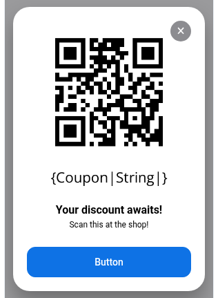
Anchor link toÀ côté de Choisir depuis la Médiathèque, cliquez sur Créer un code-barres pour ouvrir un tiroir qui génère un code scannable Code 128, EAN-13, EAN-8, UPC-A ou QR et écrit l’URL résultante dans le champ :
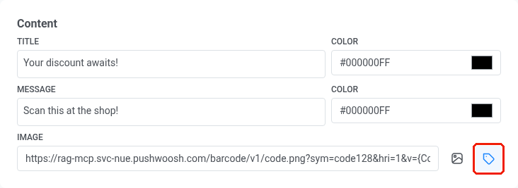
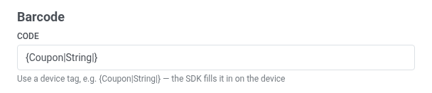
- Code. La valeur à encoder : soit un code fixe, comme
SAVE20, soit un tag d’appareil, comme{Coupon|String|}ou{LoyaltyCardNumber|String|}, afin que chaque destinataire voie son propre code. Un tag d’appareil est rempli avec la valeur réelle du destinataire directement sur son appareil, juste avant l’affichage de l’in-app. La valeur par défaut est{Coupon|String|}.
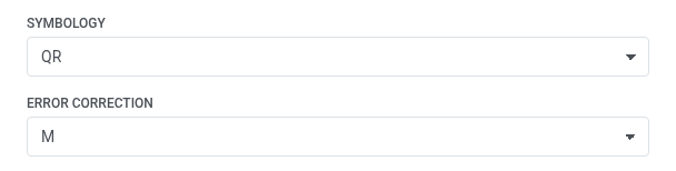
- Symbologie. Choisissez le format du code-barres : Code 128, EAN-13, EAN-8 et UPC-A sont des codes-barres de détail standard lus par des scanners portables, et QR est un code carré que n’importe quel appareil photo de téléphone peut scanner.
- Correction d’erreur. Apparaît uniquement après avoir défini la Symbologie sur QR. Les codes QR du monde réel peuvent être rayés, flous ou partiellement recouverts par un logo, et la correction d’erreur est une information supplémentaire intégrée dans le code pour qu’il puisse toujours être scanné malgré ces dommages. Choisissez le niveau de dommage qu’il peut tolérer :
L,M,QouH, du moins au plus robuste. Les niveaux supérieurs tolèrent plus de dommages mais produisent un code plus dense et d’apparence plus chargée. La valeur par défaut estM.
- Imprimer le code en chiffres. Affiche la valeur sous le code.
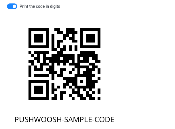
Lorsque le Code est un tag d’appareil, l’aperçu substitue une valeur d’exemple, car il ne peut pas résoudre le tag d’un destinataire réel. Un code fixe, comme SAVE20, est prévisualisé exactement tel qu’il a été saisi.
Cliquez sur Insérer dans le champ d’image pour copier l’URL générée dans le champ Image ci-dessus.
Ajouter des localisations
Anchor link toPar défaut, un in-app natif a une seule langue. Pour en ajouter d’autres :
- Cliquez sur + à côté du sélecteur de langue dans la barre supérieure.
- Sélectionnez les langues à ajouter et cliquez sur Appliquer.
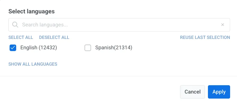
- Utilisez le sélecteur de langue dans la barre supérieure pour basculer entre les langues et remplir les champs de texte pour chacune d’elles.
Sauvegarder le modèle
Anchor link toCliquez sur Sauvegarder en haut à droite pour enregistrer vos modifications.
Le modèle apparaît alors dans Contenu → In-apps aux côtés de vos autres modèles d’in-app.
L’utiliser dans une campagne
Anchor link toUn modèle d’in-app natif apparaît dans le sélecteur de modèles avec vos autres modèles d’in-app.
Vous pouvez l’utiliser pour :
- Envoyer un in-app instantané
- Ajouter une étape in-app à un Customer Journey
- Ouvrir un in-app lorsque l’utilisateur appuie sur une notification push