Référence des blocs de l'éditeur in-app
Référence pour chaque bloc que vous pouvez ajouter sur le canevas de l’éditeur intégré.
Chaque type de bloc a un objectif différent dans le message :
- Titre : titres et gros titres courts
- Texte : corps du texte et descriptions plus longues
- Bouton : un appel à l’action cliquable
- Image : images de la Médiathèque, téléchargement ou URL
- Vidéo : une vignette vidéo cliquable qui ouvre une vidéo YouTube ou Vimeo
- Carte : une image avec titre, texte et bouton dans une seule mise en page
- Séparateur : une ligne qui sépare les sections
- Colonnes : mises en page côte à côte (2, 3 ou 4 colonnes égales, ou des divisions 33/67 et 67/33)
- Minuteur : un compte à rebours pour les offres et les dates limites
- Code-barres : un code scannable Code 128, EAN-13, EAN-8, UPC-A, ou QR code généré à partir d’une valeur de personnalisation, comme un bon de réduction
- Menu : une rangée ou une colonne de liens de navigation ou de contact
- Réseaux sociaux : icônes qui renvoient à vos profils sociaux
- HTML : HTML personnalisé, comme un formulaire, un sondage ou une vidéo intégrée
- Produits : une grille de fiches produits de votre Catalogue de produits ou du panier abandonné d’un utilisateur
Comment configurer les blocs de l’éditeur
Anchor link toFaites glisser un bloc sur le canevas depuis l’onglet Blocs, ou cliquez dessus pour l’ajouter à la fin. Sélectionnez le bloc pour ouvrir ses paramètres dans le panneau de droite et configurer le contenu, les liens, la taille et l’espacement.
Titre et texte
Anchor link toLes blocs Titre et Texte contiennent le texte que les utilisateurs lisent dans le message in-app. Modifiez le texte sur le canevas et mettez-le en forme avec la barre d’outils.
Cliquez sur un bloc Titre ou Texte pour modifier son contenu sur le canevas. Sélectionnez du texte pour faire apparaître la barre d’outils de formatage : gras, italique, souligné, alignement, un bouton de lien et un menu déroulant de style de texte.
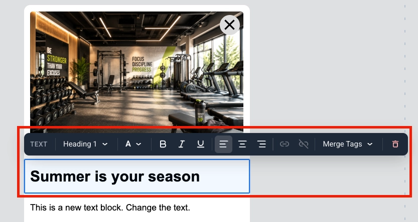
Les Merge Tags sont des espaces réservés qui insèrent une valeur de Tag du profil de l’utilisateur dans le message, afin que chaque abonné voie un texte personnalisé. Pour en ajouter un, sélectionnez le texte, cliquez sur Merge Tags dans la barre d’outils et choisissez un Tag de votre compte. En savoir plus sur les messages in-app personnalisés
Image
Anchor link toUn bloc Image affiche une image dans le modèle in-app.
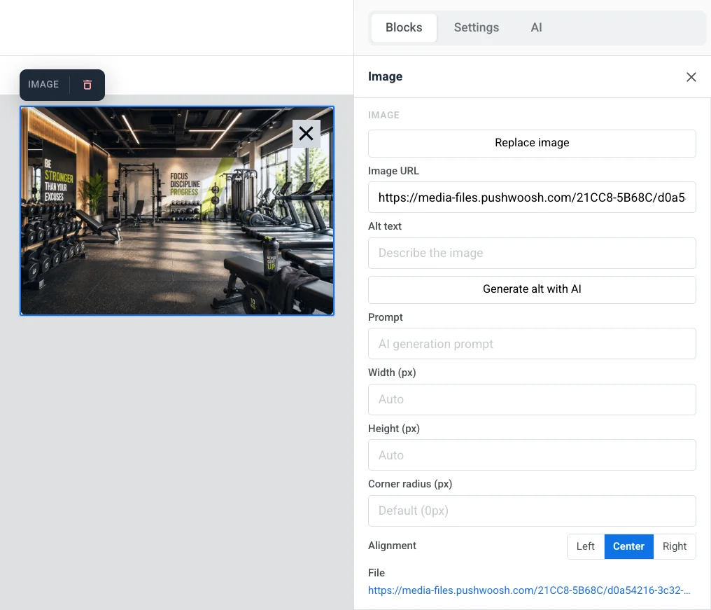
Sélectionnez-le sur le canevas pour ouvrir les paramètres de l’Image dans le panneau de droite.
- Ajouter une image / Remplacer l’image : cliquez sur Ajouter une image lorsque le bloc est vide, ou sur Remplacer l’image lorsqu’une image est déjà définie. Vous pouvez télécharger un fichier ou en choisir un dans votre Médiathèque.
- URL de l’image : collez un lien hébergé vers l’image.
- Texte alternatif : décrivez l’image pour l’accessibilité.
- Prompt : le prompt de génération par IA pour une image que vous avez créée avec Générer avec l’IA.
- Largeur (px) / Hauteur (px) : fixez l’image à une taille en pixels. Laissez un champ vide pour qu’elle se dimensionne automatiquement. Sous ces champs, une indication montre la taille à laquelle l’image est rendue et la taille à télécharger : 2× la taille rendue, afin que l’image reste nette sur les écrans de téléphone. Si le fichier téléchargé est plus petit que la taille rendue sur l’un des axes, un avertissement vous indique qu’il sera agrandi et paraîtra pixélisé.
- Rayon de l’angle (px) : arrondissez les coins de l’image.
- Alignement : gauche, centre ou droite.
Dans Lien, définissez un Type d’action (par exemple Ouvrir un site web ou URL ou Deeplink) et son URL pour ouvrir quelque chose lorsque l’image est touchée, et une Cible du lien pour l’ouvrir dans le même onglet ou un nouvel onglet.
Dans Espacement, activez le Rembourrage pour ajouter de l’espace autour de l’image. Utilisez Tous les côtés pour le même rembourrage de chaque côté, ou activez Plus d’options pour définir chaque côté séparément.
Tailles d’image recommandées
Anchor link toTéléchargez une image à 2× la taille indiquée sous Largeur (px) / Hauteur (px) pour ce bloc. C’est le nombre à vérifier, car il reflète vos propres paramètres de Largeur/Hauteur et de recadrage. Lorsque vous n’avez pas encore défini de bloc, utilisez ces largeurs d’emplacement courantes comme point de départ :
| Emplacement de l’image | Rendu à | Télécharger au moins |
|---|---|---|
| Image pleine largeur dans la fenêtre contextuelle par défaut | jusqu’à 600 px de large | 1200 px de large |
| Aperçu sur téléphone | 360–430 px de large, selon l’appareil | jusqu’à 860 px de large |
| Aperçu sur tablette/ordinateur | 768 px de large | 1536 px de large |
Le format d’image dépend de vous. La mise en page est responsive, donc la hauteur suit la Hauteur (px) ou le recadrage que vous avez défini. Voir Taille du document et de la fenêtre contextuelle pour modifier la largeur de la fenêtre contextuelle par défaut.
Vidéo
Anchor link toUn bloc Vidéo ajoute une vidéo YouTube ou Vimeo au message sous forme de vignette cliquable. Le message affiche une image fixe avec une superposition ▶. En la touchant, la vidéo s’ouvre dans l’application YouTube ou Vimeo ou dans le navigateur.
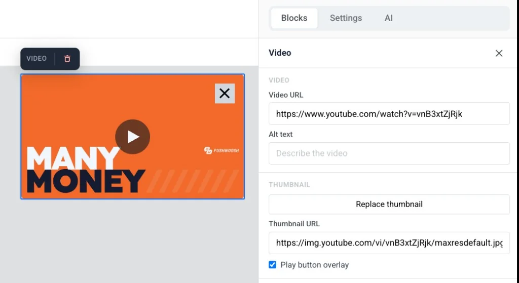
Sélectionnez le bloc sur le canevas pour ouvrir ses paramètres :
- URL de la vidéo : collez un lien YouTube ou Vimeo. L’éditeur récupère automatiquement une miniature.
- Texte alternatif : décrivez la vidéo pour l’accessibilité.
- URL de la miniature : conservez la miniature récupérée automatiquement, ou cliquez sur Ajouter une miniature / Remplacer la miniature pour en choisir une dans la Médiathèque, ou collez directement un lien hébergé.
- Superposition du bouton de lecture : activée par défaut. Désactivez pour afficher la miniature simple sans la superposition ▶.
- Largeur (px), Rayon de l’angle (px) et Alignement : contrôlez l’apparence de la miniature et son emplacement dans la mise en page.
Carte
Anchor link toUn bloc Carte associe une image à un titre, un texte et un bouton dans une seule mise en page prête à l’emploi, vous évitant ainsi de devoir placer et aligner quatre blocs distincts à la main.
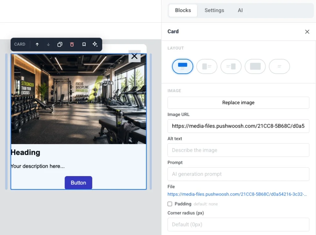
- Mise en page : choisissez de quel côté l’image se trouve par rapport au contenu, ou activez Habiller le texte autour de l’image.
- Image : ajoutez ou remplacez l’image, définissez le texte alternatif, modifiez le Prompt de génération par IA, ajoutez un Rembourrage et définissez le Rayon de l’angle (px).
- Taille et ajustement : définissez la Largeur, la Hauteur, le Recadrage (Original ou un ratio fixe) et l’Ajustement (Couvrir ou un point focal) de l’image. Les champs exacts dépendent de la Mise en page que vous avez choisie.
- Lien : faites en sorte que toute la carte ouvre une URL lorsqu’elle est touchée.
Modifiez le titre, le texte et le bouton de la carte de la même manière que vous modifiez les blocs autonomes Titre, Texte et Bouton.
Bouton
Anchor link toUn Bouton est un appel à l’action cliquable dans le message in-app. Utilisez-le pour ouvrir une URL, exécuter du JavaScript personnalisé ou fermer le message.
Cliquez sur un bloc Bouton pour modifier son libellé sur le canevas. Utilisez la barre d’outils pour changer la taille de la police, la couleur du texte, le gras, l’italique, le souligné et l’alignement.
Pour définir ce qui se passe lorsque l’utilisateur appuie sur le bouton :
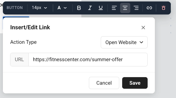
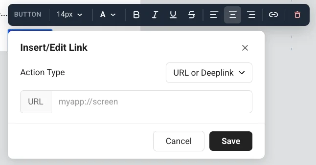
- Cliquez sur l’icône de lien dans la barre d’outils pour ouvrir Insérer/Modifier le lien.
- Choisissez un Type d’action : Ouvrir un site web, URL ou Deeplink, ou Javascript personnalisé.
- Remplissez les champs pour cette action (voir ci-dessous).
- Cliquez sur Enregistrer.
Ouvrir un site web
Anchor link toOuvrir un site web ouvre une page web lorsque l’utilisateur appuie sur le bouton. Entrez l’adresse dans URL, par exemple https://example.com.
URL ou Deeplink
Anchor link toURL ou Deeplink ouvre un lien ou un deep link lorsque l’utilisateur appuie sur le bouton. Entrez l’adresse dans URL, par exemple un écran d’application : myapp://screen.
Exécuter du JavaScript personnalisé
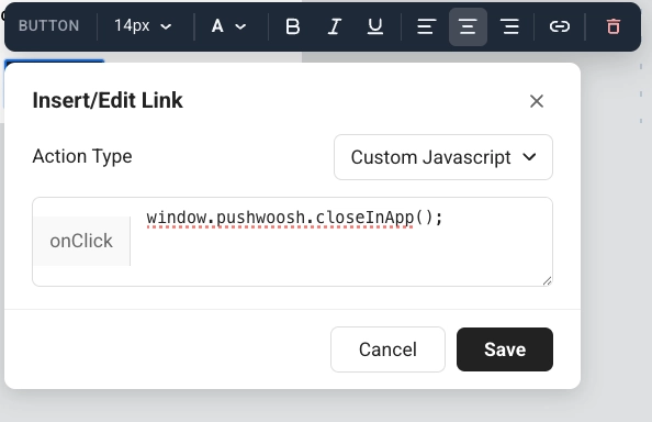
Anchor link toJavascript personnalisé exécute du code lorsque l’utilisateur appuie sur le bouton. Entrez le code dans le champ onClick.
Utilisez-le lorsqu’un appui doit faire quelque chose dans Pushwoosh, et pas seulement ouvrir un lien. La personne dans l’application voit toujours un bouton normal. Elle ne voit pas les tags ou les événements. Vous décidez de ce qui se passe ensuite à l’écran : laisser le message ouvert, ou le fermer dans le même onClick.
Méthodes disponibles dans onClick
pushwoosh.closeInApp(): ferme le message in-app. Omettez-le pour garder le message ouvert après l’appui.pushwoosh.sendTags({...}): enregistre des valeurs en tant que tags d’appareil pour des campagnes ultérieures.pushwoosh.postEvent(...): envoie un événement personnalisé, par exemple pour démarrer un Customer Journey.pushwoosh.getTags(...): lit les tags actuels. Utile en HTML personnalisé pour modifier ce que le message affiche.pushwoosh.getCustomData(): lit les données personnalisées transmises par la notification push qui a ouvert cet in-app.pushwoosh.registerForPushNotifications(): déclenche la boîte de dialogue de permission de notification push native de la plateforme, par exemple à partir d’un in-app de pré-permission.
Exemple : permettre aux utilisateurs de choisir un intérêt et de l’enregistrer pour des campagnes ultérieures
Anchor link to- Ajoutez une question dans un bloc Texte ou Titre, par exemple : « Quel sport vous intéresse ? »
- Ajoutez un Bouton par option, par exemple : Yoga et Gym.
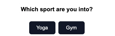
- Définissez le Type d’action sur Javascript personnalisé pour chaque bouton.
- Pour le bouton Yoga, collez ceci dans onClick :
pushwoosh.sendTags({ interest: "yoga" });pushwoosh.closeInApp();- Pour le bouton Gym, collez ceci dans onClick :
pushwoosh.sendTags({ interest: "gym" });pushwoosh.closeInApp();Lorsque l’utilisateur appuie sur Yoga, Pushwoosh écrit le tag interest sur son appareil et ferme l’in-app. Vous pouvez ensuite cibler cet utilisateur dans un segment ou un Customer Journey.
Séparateur
Anchor link toUn Séparateur est une ligne horizontale entre les blocs de contenu. Utilisez-le pour séparer visuellement les sections dans le modèle.
Configurez le style de ligne (Pleine, Tirets, Points), la couleur, l’épaisseur et la largeur dans le panneau des paramètres.
HTML
Anchor link toLe bloc HTML vous permet de coller du HTML personnalisé dans un modèle in-app. Utilisez-le pour un formulaire personnalisé, un sondage ou une vidéo intégrée lorsqu’il n’y a pas de bloc Formulaire dédié pour les messages in-app.
Exemples
Anchor link toLes exemples ci-dessous montrent des façons courantes d’utiliser le bloc HTML dans un modèle in-app : un formulaire de prospect, un sondage et une vidéo intégrée.
Ce formulaire de prospect enregistre le nom et l’e-mail en tant que tags, envoie un événement promo_requested, affiche un message de remerciement, puis ferme l’in-app.
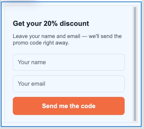
Code HTML
<!DOCTYPE html><html lang="en"><head><meta charset="UTF-8"><meta name="viewport" content="width=device-width, initial-scale=1.0"><style>  body { margin: 0; padding: 20px; font-family: Arial, sans-serif; }  h2 { font-size: 18px; margin-bottom: 8px; color: #222; }  p { font-size: 14px; color: #666; margin-bottom: 20px; }  input {    width: 100%;    padding: 12px;    margin-bottom: 12px;    border: 1px solid #ddd;    border-radius: 8px;    font-size: 15px;    box-sizing: border-box;  }  button {    width: 100%;    padding: 14px;    background: #FF6B35;    color: white;    border: none;    border-radius: 8px;    font-size: 16px;    font-weight: bold;    cursor: pointer;  }  .thanks { display: none; text-align: center; padding: 40px 0; font-size: 18px; color: #333; }</style></head><body>
<h2>Get your 20% discount</h2><p>Leave your name and email. We'll send the promo code right away.</p>
<div id="form">  <input type="text" id="name" placeholder="Your name" />  <input type="email" id="email" placeholder="Your email" />  <button onclick="submit()">Send me the code</button></div>
<div class="thanks" id="thanks">  🎉 Done! Check your inbox for the promo code.</div>
<script>function submit() {  const name = document.getElementById('name').value.trim();  const email = document.getElementById('email').value.trim();  if (!name || !email) return;
  pushwoosh.sendTags({ name: name, email: email });  pushwoosh.postEvent("promo_requested", { email: email });
  document.getElementById('form').style.display = 'none';  document.getElementById('thanks').style.display = 'block';  setTimeout(() => pushwoosh.closeInApp(), 3000);}</script>
</body></html>
Ce sondage enregistre l’heure d’entraînement sélectionnée en tant que tag, envoie un événement schedule_survey_completed, affiche un message de remerciement, puis ferme l’in-app.
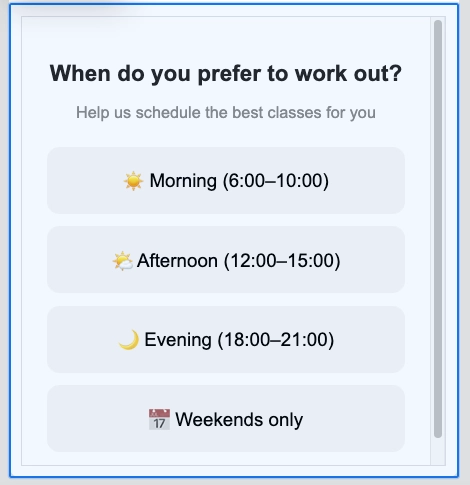
Code HTML
<!DOCTYPE html><html lang="en"><head><meta charset="UTF-8"><meta name="viewport" content="width=device-width, initial-scale=1.0"><style>  body { margin: 0; padding: 20px; font-family: Arial, sans-serif; text-align: center; }  h2 { font-size: 18px; margin-bottom: 6px; color: #222; }  p { font-size: 13px; color: #888; margin-bottom: 20px; }  .option {    display: block;    width: 100%;    padding: 14px;    margin-bottom: 10px;    background: #f5f5f5;    border: 2px solid transparent;    border-radius: 10px;    font-size: 15px;    cursor: pointer;    box-sizing: border-box;  }  .option:hover { border-color: #FF6B35; background: #fff5f0; }  .thanks { display: none; font-size: 17px; padding: 40px 0; color: #333; }</style></head><body>
<h2>When do you prefer to work out?</h2><p>Help us schedule the best classes for you</p>
<button class="option" onclick="pick('morning')">☀️ Morning (6:00–10:00)</button><button class="option" onclick="pick('afternoon')">🌤️ Afternoon (12:00–15:00)</button><button class="option" onclick="pick('evening')">🌙 Evening (18:00–21:00)</button><button class="option" onclick="pick('weekend')">📅 Weekends only</button>
<div class="thanks" id="thanks">Got it! We'll send you the best schedule 💪</div>
<script>function pick(time) {  pushwoosh.sendTags({ preferred_time: time });  pushwoosh.postEvent("schedule_survey_completed", { time: time });  document.querySelector('h2').style.display = 'none';  document.querySelector('p').style.display = 'none';  document.querySelectorAll('.option').forEach(el => el.style.display = 'none');  document.getElementById('thanks').style.display = 'block';  setTimeout(() => pushwoosh.closeInApp(), 2000);}</script>
</body></html>
Cet exemple intègre une vidéo YouTube dans le message in-app.
Code HTML
<!DOCTYPE html><html lang="en"><head><meta charset="UTF-8"><meta name="viewport" content="width=device-width, initial-scale=1.0"><title>In-App Video Example</title><style>  body {    font-family: Arial, sans-serif;    margin: 0;    padding: 20px;    text-align: center;  }  .video-container {    position: relative;    padding-bottom: 56.25%;    height: 0;    overflow: hidden;  }  .video-container iframe {    position: absolute;    top: 0;    left: 0;    width: 100%;    height: 100%;  }</style></head><body>
<h1>In-App Video Example</h1>
<div class="video-container">       <iframe src="https://www.youtube.com/embed/TN1uyD2mONs?autoplay=1&mute=1" allow="accelerometer; autoplay; clipboard-write; encrypted-media; gyroscope; picture-in-picture" allowfullscreen></iframe></div>
</body></html>
Menu
Anchor link toLe bloc Menu place plusieurs éléments cliquables dans une rangée ou une colonne. Utilisez-le pour une barre de navigation ou une liste de contacts d’entreprise.
Pour chaque élément de menu, définissez :
- Libellé : le texte que les utilisateurs voient
- URL : où l’élément s’ouvre
- Cible : même onglet ou un nouvel onglet
Dans les paramètres du bloc, vous pouvez également définir :
- Direction : Horizontale ou Verticale
- Alignement : Gauche, Centre ou Droite
- Séparateur : un séparateur optionnel entre les éléments
- Police, taille, graisse, espacement des lettres et couleurs du lien/texte
Réseaux sociaux
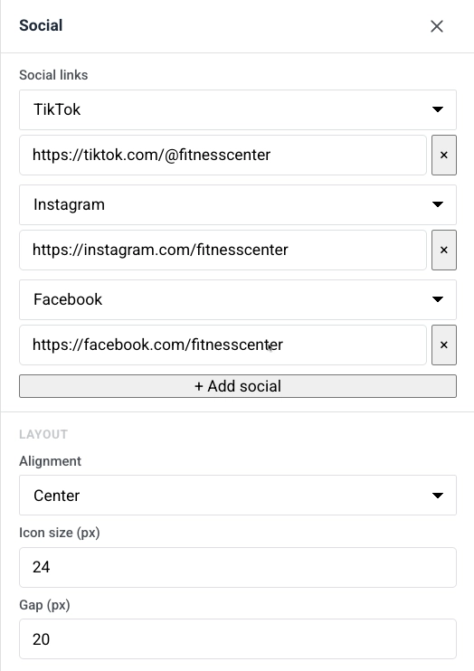
Anchor link toLe bloc Réseaux sociaux affiche une rangée d’icônes de médias sociaux qui renvoient à vos profils. Utilisez-le pour envoyer les utilisateurs vers Facebook, Instagram, X et d’autres plateformes depuis le message in-app.
Ajoutez des entrées de plateforme, puis définissez l’alignement, la taille de l’icône et l’écart entre les icônes.
Minuteur
Anchor link toLe bloc Minuteur est un compte à rebours dans le message in-app. Utilisez-le pour les offres à durée limitée, les ventes flash et les rappels d’événements.
Pour le configurer :
- Dans Compte à rebours, définissez la Date de fin et l’Heure de fin, puis choisissez le Fuseau horaire et la Langue pour les libellés du minuteur.
- Activez les Libellés pour afficher les légendes « jours / heures / minutes / secondes » sous les chiffres, ou désactivez-les pour n’afficher que les nombres.
- Dans Apparence, définissez l’Arrière-plan, la Couleur des chiffres, la Couleur des libellés et la taille de la police pour les chiffres (par défaut 40px) et les libellés (par défaut 16px).
- Ajustez l’Espacement (rembourrage) si nécessaire.
Code-barres
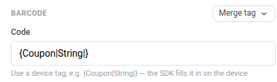
Anchor link toLe bloc Code-barres génère un code-barres ou un QR code scannable à partir d’une valeur de personnalisation, le plus souvent un bon de réduction.
Pour le configurer :
- Dans Code, conservez le tag d’appareil
{Coupon|String|}, ou cliquez sur Merge tag et choisissez un autre tag d’appareil qui stocke le code de chaque destinataire. Les in-apps n’évaluent pas Liquid. Le SDK remplit le tag sur l’appareil avant que l’in-app ne soit affiché. Cela diffère du bloc Code-barres pour e-mail, qui utilise{{voucher}}.
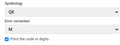
- Choisissez la Symbologie :
- QR : un code 2D carré que les téléphones peuvent scanner. Accepte n’importe quel texte, y compris les codes alphanumériques comme
BIENVENUE2025-A1 - Code 128 : un code-barres linéaire pour n’importe quel texte, y compris les mêmes codes alphanumériques
- EAN-13 : le code-barres de détail courant en Europe et dans de nombreuses autres régions. Chiffres uniquement, 12–13 caractères
- EAN-8 : un code-barres de détail plus court pour les petits emballages. Chiffres uniquement, 7–8 caractères
- UPC-A : le code-barres de détail courant en Amérique du Nord. Chiffres uniquement, 11–12 caractères
- QR : un code 2D carré que les téléphones peuvent scanner. Accepte n’importe quel texte, y compris les codes alphanumériques comme
- Si vous avez choisi QR, définissez la Correction d’erreur. Cela ajoute des données de rechange pour que le code puisse toujours être scanné même si une partie est couverte, usée ou difficile à voir. Choisissez L, M, Q ou H (par défaut M). Des niveaux plus élevés survivent à plus de dommages mais rendent le motif plus dense, ce qui peut être plus difficile à lire à de petites tailles. Ignorez ce champ pour les autres symbologies.
- Activez éventuellement Imprimer le code en chiffres pour afficher la valeur sous le code.
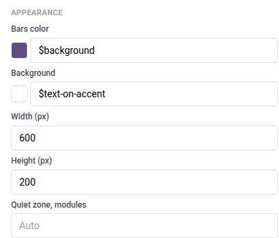
- Dans Apparence, définissez la Couleur des barres plus foncée que l’Arrière-plan — la plupart des scanners ne peuvent pas lire les barres claires sur un fond sombre. Définissez la Largeur (px) et la Hauteur (px) à au moins 600×200 pour que le code reste scannable à une distance typique de la caméra d’un téléphone. Laissez la Zone de silence, modules sur Auto pour la marge par défaut.
Colonnes
Anchor link toLes Colonnes divisent le canevas en sections côte à côte pour que vous puissiez placer du contenu les uns à côté des autres sur une même ligne.
Faites glisser l’un de ces blocs sur le canevas :
- 2 colonnes : deux colonnes égales
- 3 colonnes : trois colonnes égales
- 4 colonnes : quatre colonnes égales
- 33 / 67 : colonne de gauche d’environ 33 % de large, droite d’environ 67 %
- 67 / 33 : colonne de gauche d’environ 67 % de large, droite d’environ 33 %
Ajoutez ensuite du contenu à chaque colonne. Pour modifier l’espacement de toutes les colonnes dans le modèle, ouvrez Paramètres → Paramètres par défaut des colonnes et ajustez le rembourrage extérieur, le rembourrage des colonnes et l’écart entre les colonnes.
Produits
Anchor link toUn bloc Produits affiche une grille de fiches produits à partir d’un modèle partagé. Chaque fiche peut inclure une image, un titre, une description, un prix et un bouton d’achat. Le modèle se répète pour chaque produit.
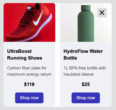
Dans le panneau des paramètres, sous Source, choisissez d’où proviennent les produits :
- Manuel : entrez les produits à la main, ou cliquez sur Choisir dans le catalogue… pour sélectionner des articles spécifiques de votre Catalogue de produits par ID. Vous pouvez mélanger les deux dans le même bloc.
- Règle de catalogue : extrayez automatiquement les produits par catégorie et ordre de tri, résolus à nouveau à partir du catalogue lorsque le message est affiché.
- Panier : affichez les articles du panier abandonné actuel de chaque utilisateur. Comment configurer une campagne de panier abandonné
Une fois que vous avez choisi une source, ces paramètres contrôlent l’apparence de la grille et de ses fiches :
- Nombre de produits (ou Max de produits affichés pour Panier) : combien de fiches afficher.
- Colonnes : 1, 2 ou 3 fiches par ligne.
- Écart : l’espace entre les fiches.
- Limite de description : la limite de caractères à laquelle le texte de la description est coupé, afin que les fiches conservent une taille cohérente.
- Modèle de fiche : choisissez une mise en page, puis définissez l’Arrière-plan de la fiche, le Rayon de l’angle de la fiche et le Rembourrage du contenu pour chaque fiche.
Enregistrer et réutiliser des blocs
Anchor link toEnregistrez un bloc pour le réutiliser dans ce modèle in-app ou d’autres au lieu de le reconstruire à chaque fois.
- Sélectionnez le bloc sur le canevas.
- Cliquez sur l’icône de signet (Enregistrer le bloc pour réutilisation) dans la barre d’outils du bloc et donnez-lui un nom.
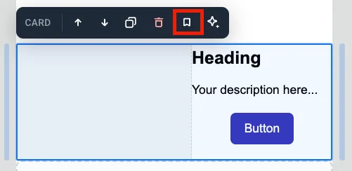
Les blocs enregistrés apparaissent sous Blocs enregistrés en bas de l’onglet Blocs.
- Faites glisser un bloc enregistré sur le canevas, ou cliquez dessus pour l’ajouter à la fin du modèle.
- Cliquez sur le × sur la tuile d’un bloc enregistré pour le supprimer.
Garder les copies synchronisées
Anchor link toLorsque vous enregistrez un bloc, activez Garder les copies synchronisées pour lier chaque copie insérée à la même source. Modifiez la source une fois, et le changement s’applique partout où ce bloc est utilisé.
Une copie synchronisée est verrouillée sur le canevas. Vous ne pouvez pas la modifier directement. Sélectionnez la copie pour ouvrir ses paramètres :
- Modifier le bloc synchronisé : déverrouillez cette copie pour pouvoir la modifier. une bannière apparaît en haut. Cliquez sur Appliquer à tous pour enregistrer vos modifications sur la source et toutes les autres copies, ou sur Annuler pour les annuler. Vous ne pouvez déverrouiller qu’un seul bloc synchronisé à la fois.
- Mettre à jour depuis la source : remplacez cette copie par la dernière version de la source.
- Détacher de la source : déliez cette copie de la source pour pouvoir la modifier seule.