Overview-Seite
Die Overview-Seite zeigt Trends zu Zielgruppe, Push, E-Mail und Conversions, ohne dass du ein Dashboard oder einen Report einrichten musst. Prüfe sie zuerst, um einen Rückgang bei der Retention oder einen Anstieg der Zustellfehler früh zu erkennen, statt erst nach einer Woche in einem schlechten Trend. Öffne Project overview im linken Menü.
- App metrics: prüfe aktive Nutzer (MAU/DAU), Plattform- und Kanal-Reichweite und Day 1 / 7 / 14 / 28 Retention
- Push: prüfe Push-Zielgruppe, Zustell-Performance und die Auswirkung von Frequency Capping
- Email: prüfe die Abonnentenbasis, Zustell-Performance, Aufschlüsselungen nach Kategorie und Mailbox-Provider sowie die Auswirkung von Frequency Capping
- Conversions: prüfe, welche Kampagnen und Journeys zu Conversions führen und wie viel Umsatz sie bringen
Für die allgemeine Messaging-Reichweite und das Engagement, siehe Statistics → Project Statistics.
Zeitraum festlegen
Anchor link toVerwende die Datumsbereichsauswahl, um festzulegen, für welchen Zeitraum die Overview-Seite Daten anzeigt. Jedes Diagramm auf den Tabs App metrics, Push, Email und Conversions verwendet denselben Zeitraum, damit du Metriken für dasselbe Fenster vergleichst.
Standardmäßig zeigt die Seite die letzten 30 Tage.
So änderst du den Zeitraum:
- Klicke oben rechts auf die Datumsbereich-Auswahl, neben Project settings und Export statistics.
- Wähle Last 7 days, Last 30 days, oder lege im Kalender ein individuelles Start- und Enddatum fest.
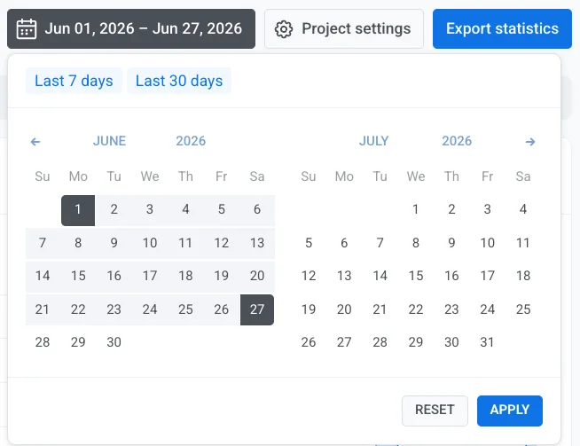
- Klicke auf Apply.
App metrics tab
Anchor link toPrüfe, wie viele Nutzer in deiner App aktiv sind und wie gut du sie hältst, damit du Wachstum oder Abwanderung früh erkennst, ohne die Project Overview zu verlassen.
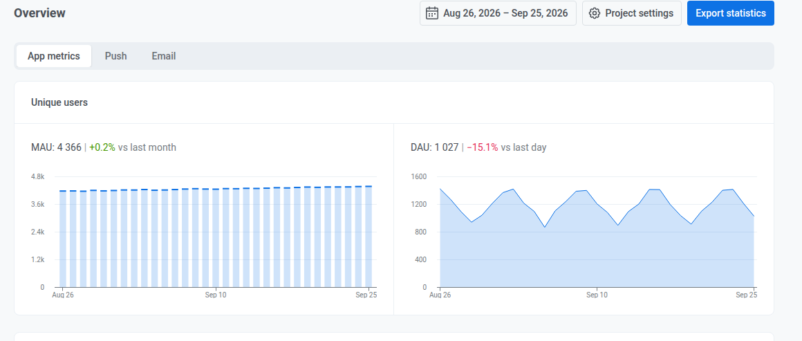
Einzigartige Nutzer
Anchor link toPrüfe den aktuellen Wert und die Veränderung gegenüber dem Vormonat oder Vortag:
- MAU: monatlich aktive Nutzer, über ein rollierendes 30-Tage-Fenster, das an jedem dargestellten Tag endet
- DAU: täglich aktive Nutzer, einzigartige Nutzer, die die App an diesem Tag geöffnet haben
Nutzerverteilung nach Plattformen
Anchor link toPrüfe, wie viele Nutzer über jeden für das Projekt konfigurierten Kanal erreichbar sind (einzelne mobile und Web-Push-Plattformen, E-Mail, SMS sowie Chat-Kanäle wie WhatsApp, Telegram und Viber), Stand des letzten Tages des gewählten Zeitraums.

Betrachte dies als Momentaufnahme, nicht als Summe über den Zeitraum: Die Plattformen können sich auf etwas mehr als die Projekt-Gesamtsumme addieren, da jede Plattform, über die ein Nutzer erreichbar ist, ihn einmal zählt.
Kanalreichweite (Channel reach)
Anchor link toPrüfe, wie viele Nutzer du über mindestens einen Kanal erreichen kannst, wie viele über zwei oder mehr und in welche genaue Kanalkombination jeder Nutzer fällt, Stand des letzten Tages des gewählten Zeitraums.
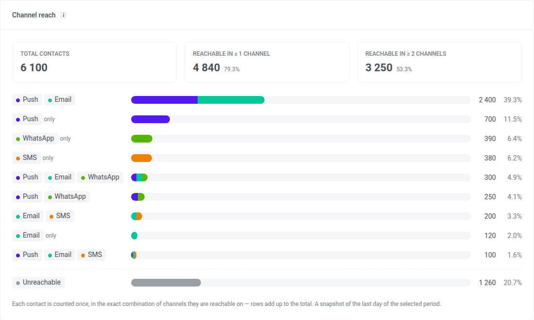
Was die einzelnen Teile der Karte bedeuten:
- Total contacts: jede User ID im Projekt, einschließlich Nutzern ohne Gerät, etwa Nutzern, die per Tag-Import hinzugefügt wurden. Nutzer ohne Gerät zählen als Unreachable.
- Reachable in ≥ 1 channel: Nutzer, die du über mindestens einen Kanal erreichen kannst, und ihr Anteil an Total contacts
- Reachable in ≥ 2 channels: Nutzer, die du über zwei oder mehr Kanäle erreichen kannst, und ihr Anteil an Total contacts
- Zeilen mit Kanalkombinationen: Jede Zeile ist eine genaue Kombination von Kanälen. Ein Nutzer in der Zeile Push + Email ist über Push und E-Mail erreichbar und über keinen anderen Kanal. Eine mit only markierte Zeile hat einen einzigen Kanal.
- Unreachable: Nutzer, die du über keinen Kanal erreichen kannst
Ein Nutzer gilt über einen Kanal als erreichbar, wenn:
- Push: sein Gerät einen Push-Token und eine Push-Berechtigung hat. Alle Push-Plattformen, einschließlich Web-Push, zählen als ein Kanal.
- Email: seine Adresse sich nicht abgemeldet hat und keinen Hard Bounce hatte
- SMS: er eine für SMS registrierte Telefonnummer hat
- WhatsApp: er eine für WhatsApp registrierte Telefonnummer hat
- Inbox: er ein beliebiges App- oder Browser-Gerät hat, mit oder ohne Push-Token. Inbox erscheint nur, wenn das Projekt Message Inbox in den letzten 30 Tagen genutzt hat.
Anders als bei Nutzerverteilung nach Plattformen wird hier jeder Nutzer einmal gezählt, daher ergeben die Zeilen und Unreachable zusammen Total contacts. Eine Person, die unter zwei User IDs gespeichert ist, wird zweimal gezählt.
Die Anzahl einer Zeile kann von der Größe eines Segments abweichen, das du mit denselben Bedingungen erstellst. Die Karte zeigt eine Momentaufnahme des letzten Tages des gewählten Zeitraums, während die Größe eines Segments die Daten zum Zeitpunkt seiner letzten Berechnung widerspiegelt. Ein Segment zeigt außerdem Geräte pro Kanal, nicht Nutzer in einer genauen Kanalkombination.
Nutzer-Retention
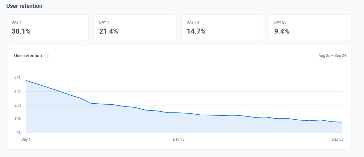
Anchor link toPrüfe Day 1, Day 7, Day 14 und Day 28 Retention, um zu sehen, wie viele neue Nutzer nach ihrem ersten Besuch zurückkehren und ob sie in der ersten Woche wiederkommen und über die folgenden Wochen engagiert bleiben. Jeder Tag zählt nur Nutzer, die genau an diesem Tag zurückgekehrt sind, nicht alle, die bis dahin zurückgekehrt sind.
Die Kohorte besteht aus allen, die an einem bestimmten Tag erstmals besucht haben, 30 Tage vor dem letzten Tag mit Daten, nicht aus allen, die während deines gewählten Zeitraums erstmals besucht haben. Das Ändern des Datumsbereichs ändert nicht, welche Kohorte angezeigt wird.
Push tab
Anchor link toNutze diesen Tab, um zu prüfen, wen du per Push erreichen kannst, wie viele Pushes im gewählten Zeitraum zugestellt und geöffnet wurden, und wie sich Frequency Capping auf den Versand ausgewirkt hat.
Audience
Anchor link toPrüfe deine Push-Zielgruppe Stand des letzten Tages des Zeitraums und wie sie sich seitdem verändert hat.
Wenn mehr als eine Push-Plattform für das Projekt konfiguriert ist, verwende das Dropdown All platforms neben der Abschnittsüberschrift, um Funnel, Subscribers, Push reachable und den Abschnitt Frequency capping weiter unten nach einer einzelnen Plattform zu filtern. Base change und der Abschnitt Performance werden von diesem Dropdown nicht beeinflusst.
Funnel
Anchor link toPrüfe die Schritte von Total users bis Active-reachable. Jeder Schritt zeigt, wie viele Nutzer verbleiben und welchen Anteil das am vorherigen Schritt ausmacht.
Der Funnel ist eine Momentaufnahme für den letzten Tag des gewählten Zeitraums. Er summiert keine Aktivität über den gesamten Zeitraum.
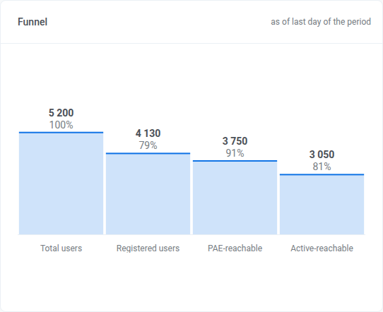
- Total users
- Registered users: hat einen Push-Token
- Push reachable: Nutzer, die tatsächlich einen Push empfangen können
- Active-reachable: Push reachable und hat die App in den letzten 30 Tagen geöffnet. Dieses Fenster ist fest und ändert sich nicht mit dem gewählten Datumsbereich.
Subscribers
Anchor link toPrüfe, in welches Segment jeder Nutzer fällt:
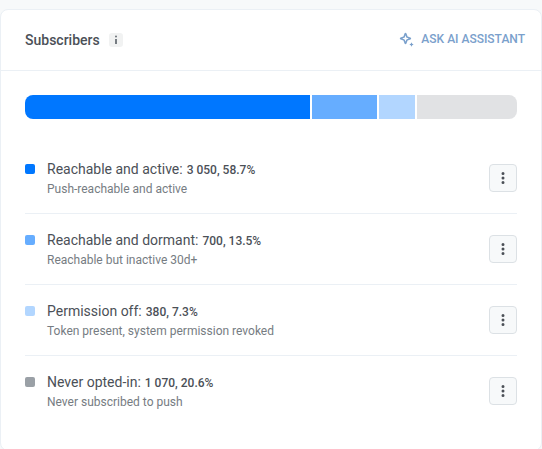
- Reachable and active: Push reachable und hat die App in den letzten 30 Tagen geöffnet
- Reachable and dormant: Push reachable, hat die App aber seit 30+ Tagen nicht geöffnet
- Permission off: Push-Token vorhanden, Systemberechtigung entzogen
- Never opted-in: kein Push-Token, nie für Push angemeldet
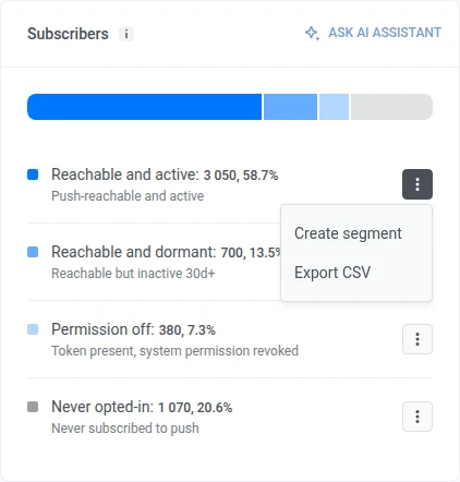
Öffne in einer Zeile das Kebab-Menü und wähle Create segment oder Export CSV.
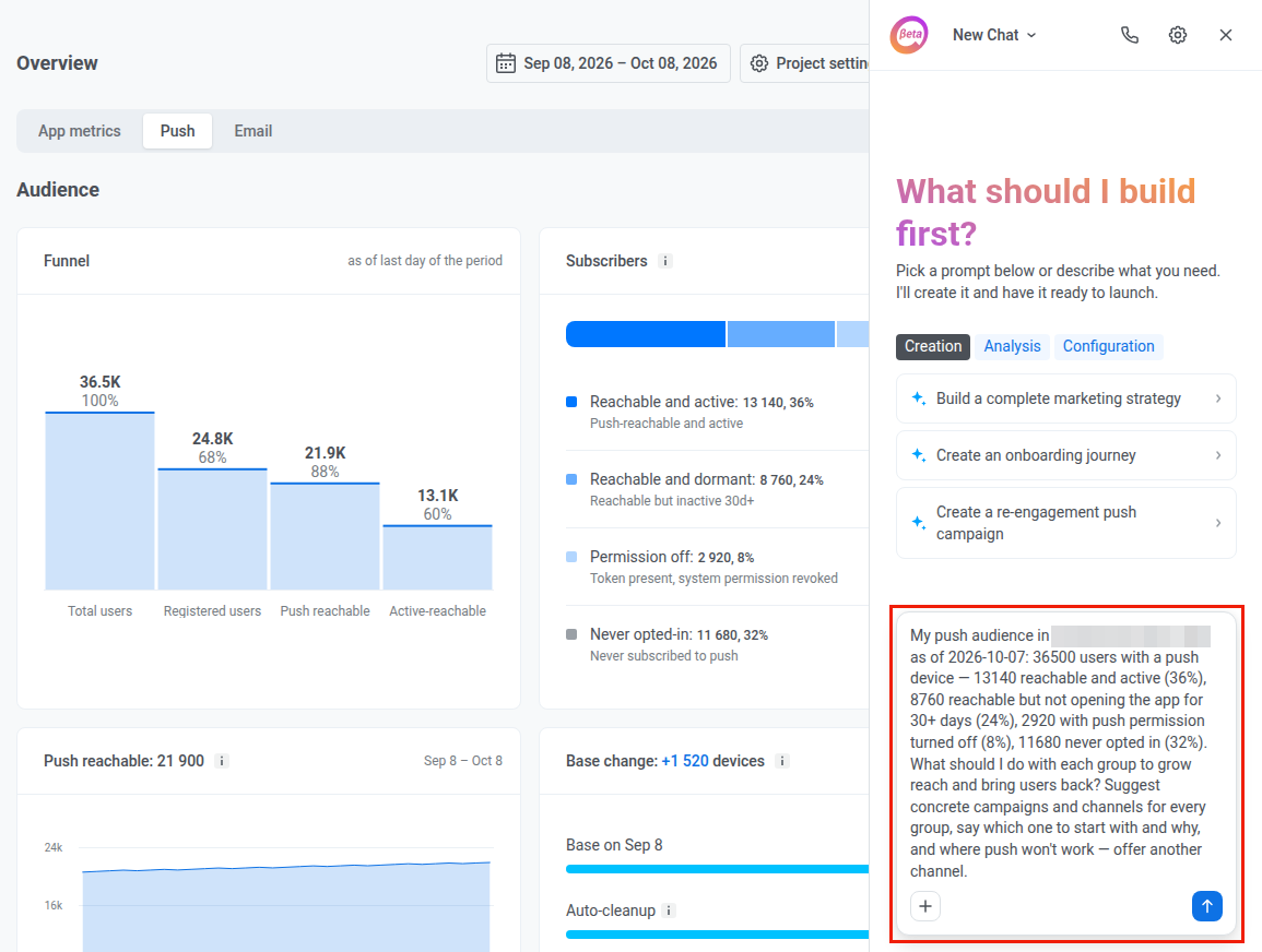
Um zu dieser Zielgruppe im Chat nachzufragen, klicke im Kartenkopf auf Ask AI Assistant, wenn der AI Assistant für das Konto aktiviert ist.

AI Assistant öffnet sich in einem Panel auf derselben Seite mit einem fertigen Prompt zu dieser Zielgruppe. Bearbeite den Prompt bei Bedarf und sende ihn dann ab.
Push reachable
Anchor link toPush reachable: Nutzer, die tatsächlich einen Push empfangen können. Pushwoosh hat einen gültigen Push-Token für ihr Gerät, und sie haben Benachrichtigungen in ihren Telefon- oder Browsereinstellungen nicht deaktiviert.
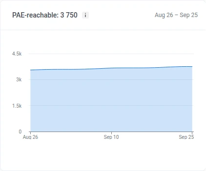
Prüfe, wie viele Nutzer an jedem Tag des Zeitraums einen Push empfangen konnten. Ein Rückgang bedeutet meist, dass Nutzer Benachrichtigungen deaktiviert oder die App deinstalliert haben. Ein Anstieg bedeutet neue Opt-ins.
Base change
Anchor link toPrüfe, wie viele Abonnenten die Basis durch Auto-cleanup und abgelaufene Tokens verlassen haben und wie viele durch Neuregistrierungen dazugekommen sind, seit Beginn des Zeitraums. Der Balken jeder Zeile ist im Verhältnis zur Basis zu Beginn des Zeitraums bemessen:
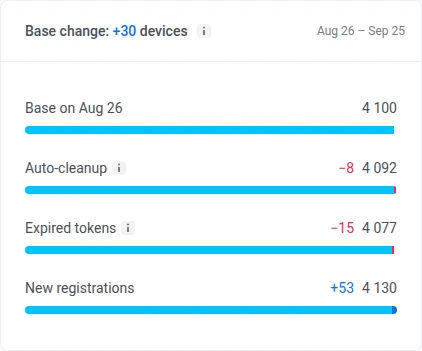
- Auto-cleanup: entfernt den Push-Token eines Geräts, sobald die App über das Inaktivitätslimit des Kontos hinaus nicht geöffnet wurde. Siehe automatische Inaktivitätsbereinigung.
- Expired tokens: ein Gerät, dessen Push-Token von APNs oder FCM allein anhand der Gateway-Antworten als ungültig gemeldet wurde. Siehe ungültige Push-Tokens.
- New registrations: Geräte, die sich während des Zeitraums für Push registriert haben
Pushwoosh hält diese Aufschlüsselung nur für die letzten 60 Tage vor. Beginnt dein Zeitraum früher, zeigt die Zeile unter der Aufschlüsselung das Datum, ab dem tatsächlich gezählt wird.
Performance
Anchor link toPrüfe Push-Zustellung und Engagement für den Zeitraum, öffne dann die tägliche Aufschlüsselung nach Plattform.

Wechsle über dem Dropdown zwischen Sent, Delivery rate, Open-to-sent rate und Errors:
- By sends: jeder Versand wird separat gezählt
- By uniques: jeder Empfänger wird einmal gezählt. In diesem Modus wird aus der ersten Metrik Recipients: einzigartige Geräte, an die der Push während des Zeitraums zugestellt wurde, jeweils einmal gezählt, auch wenn sie mehrere Sendungen erhalten haben.
Prüfe diese zusammenfassenden Metriken für den Zeitraum:
- Sent: wie viele Pushes verschickt wurden (wird im Modus By uniques zu Recipients)
- Delivery rate: wie sich Zustellungen zu Versendungen verhalten (inklusive der Zustellanzahl)
- Open-to-sent rate: wie sich Öffnungen zu Versendungen verhalten (inklusive der Öffnungsanzahl)
- Errors: wie viele Versendungen fehlgeschlagen sind
Daily performance
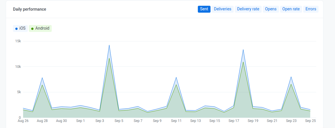
Anchor link toPrüfe diese Metriken pro Tag, aufgeschlüsselt nach Plattform. Wechsle die Metriken über die Chips oberhalb des Diagramms: Sent, Deliveries, Delivery rate, Opens, Open rate und Errors.
Frequency capping
Anchor link toPrüfe, wie sich Frequency Capping auf den Versand über den Zeitraum ausgewirkt hat. Um eine einzelne Push-Plattform zu prüfen, wähle sie im Dropdown All platforms im Abschnitt Audience aus.
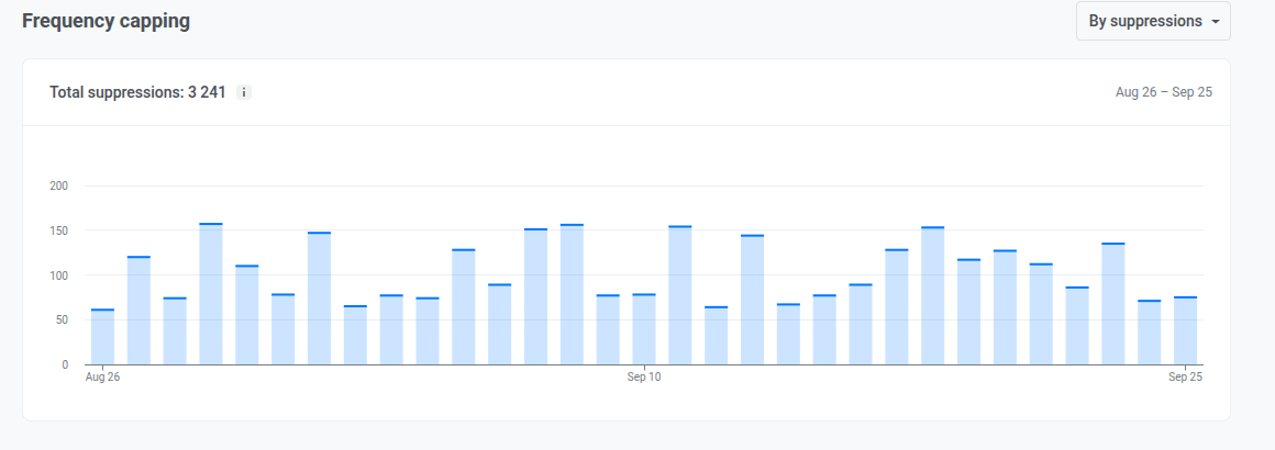
Das Diagramm zeigt, wie viele Pushes Frequency Capping pro Tag im Zeitraum blockiert hat, oder wie viele Nutzer davon betroffen waren. Der Wert Total suppressions im Header summiert dasselbe für den gesamten Zeitraum. Wechsle mit der Auswahl, was beide zählen:
- By suppressions: wie oft eine Nachricht durch Frequency Capping blockiert wurde
- By users: wie viele einzigartige Nutzer betroffen waren
Email tab
Anchor link toNutze diesen Tab, um die Gesundheit der Abonnentenbasis, das Engagement, Aufschlüsselungen nach Kategorie und Mailbox-Provider sowie die Auswirkung von Frequency Capping über den gewählten Zeitraum zu prüfen.
Audience
Anchor link toPrüfe deine Abonnentenbasis, was sie verändert hat und wie engagiert die Abonnenten sind.
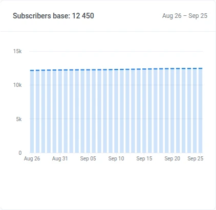
Subscribers base
Anchor link toPrüfe den Trend der Abonnentenzahl für den Zeitraum.
Base change
Anchor link toPrüfe, wie viele Abonnenten die Basis durch Beschwerden oder Hard Bounces verloren hat und wie viele durch neue Abonnenten hinzugekommen sind, seit Beginn des Zeitraums. Abmeldungen und andere Änderungen werden ebenfalls erfasst, entfernen die Adresse aber nicht von selbst. Der Balken jeder Zeile ist im Verhältnis zur Basis zu Beginn des Zeitraums bemessen:
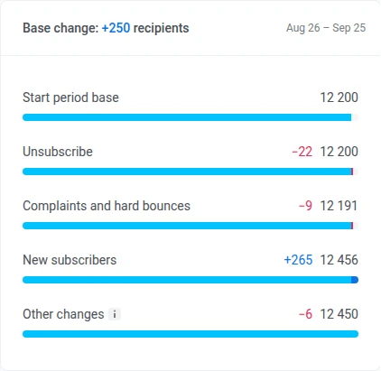
- Unsubscribe: Abonnenten, die sich im Zeitraum abgemeldet haben. Die Adresse bleibt in der Basis, dies verringert sie also nie.
- Complaints and hard bounces: Abonnenten, die Pushwoosh wegen einer Spam-Beschwerde oder eines Hard Bounce zur Suppression List hinzugefügt hat, einmal gezählt, auch wenn beides eingetreten ist
- New subscribers: Geräte oder Adressen, die sich während des Zeitraums für E-Mail angemeldet haben
- Other changes: alles, was die beiden obigen Verläufe nicht abdecken: Verschiebung durch die tägliche Momentaufnahme, eine zweite Adresse bei einem bestehenden Nutzer, Übertragungen zwischen Konten und Migrationen, gelöschte Geräte und Nutzer sowie Basisbereinigungen. Kann positiv oder negativ sein.
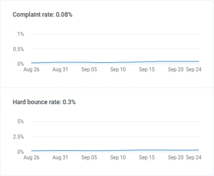
Complaint rate und Hard bounce rate
Anchor link toPrüfe die Complaint rate und Hard bounce rate über den Zeitraum sowie den aktuellen Wert im Header.
Subscribers activity distribution
Anchor link toPrüfe, wie sich die Subscribers activity distribution auf diese Gruppen aufteilt, mit jeweiliger Anzahl und Anteil an der Basis:
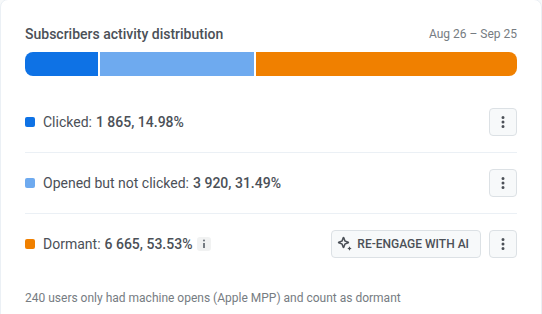
- Clicked
- Opened but not clicked
- Dormant: keine Öffnung im Zeitraum
Öffne in einer Zeile das Kebab-Menü und wähle Create segment oder Export CSV.
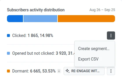
Klicke in der Zeile Dormant auf Re-engage with AI, wenn der AI Assistant für das Konto aktiviert ist. AI Assistant öffnet sich in einem Panel auf derselben Seite mit einem fertigen Prompt zu deinen inaktiven Abonnenten.

Event-triggered performance
Anchor link toPrüfe die Zustell- und Engagement-Summen für E-Mail über den Zeitraum, öffne dann die tägliche Aufschlüsselung.
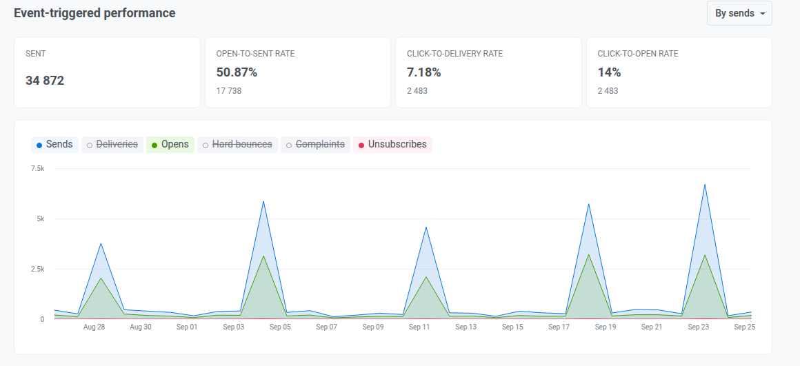
Wechsle über dem Dropdown zwischen Sent, Open-to-sent rate, Click-to-delivery rate und Click-to-open rate:
- By sends: jeder Versand wird separat gezählt
- By uniques: jeder Empfänger wird einmal gezählt
Prüfe diese zusammenfassenden Metriken für den Zeitraum:
- Sent: wie viele E-Mails verschickt wurden (Volumen für den Zeitraum)
- Open-to-sent rate: wie sich Öffnungen zu Versendungen verhalten, ob die Sendung geöffnet wurde
- Click-to-delivery rate: wie sich Klicks zu Zustellungen verhalten, ob zugestellte Mail Klicks ausgelöst hat
- Click-to-open rate: wie sich Klicks zu Öffnungen verhalten, ob Öffner weiter interagiert haben
Daily chart
Anchor link toKlicke auf einen Chip oberhalb des Diagramms, um eine Linie hinzuzufügen oder zu entfernen:
- Standardmäßig an: Sends, Opens, Unsubscribes
- Standardmäßig aus: Deliveries, Hard bounces, Complaints
Category-based performance
Anchor link toPrüfe die Versand-Performance nach E-Mail-Kategorie.
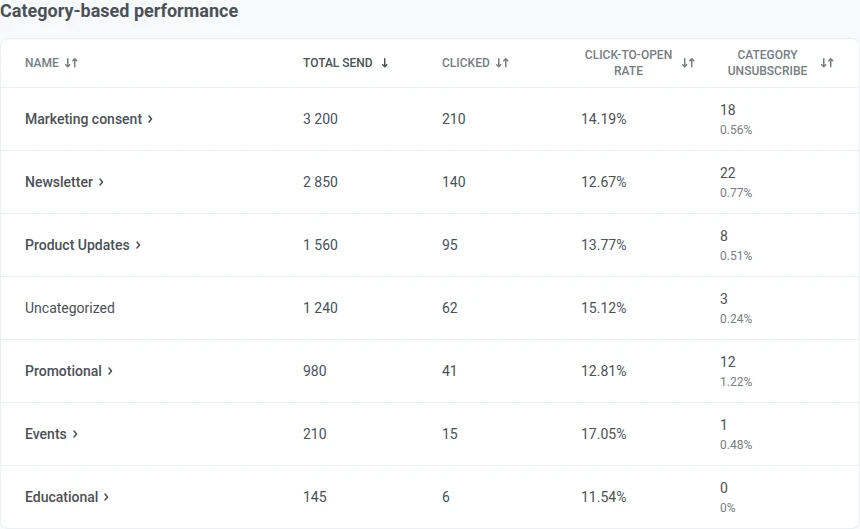
Wenn die Tabelle verfügbar ist:
- Versendungen ohne zugeordnete Kategorie werden unter Uncategorized zusammengefasst.
- Klicke auf eine Spaltenüberschrift, um zu sortieren.
Sind noch keine Kategorien eingerichtet, zeigt dieser Abschnitt statt der Tabelle eine Karte zum Einrichten.
Mailbox providers
Anchor link toPrüfe die Versand-Performance nach dem Mailbox-Provider des Empfängers (Gmail, Outlook usw.).
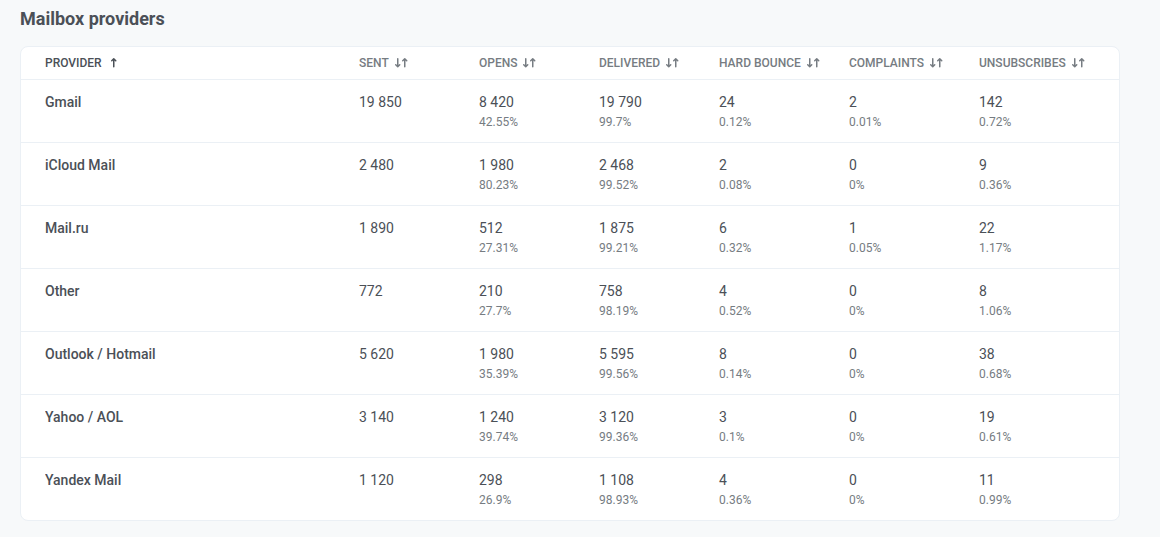
Provider, denen Pushwoosh einen Versand nicht zuordnen kann, werden unter Other zusammengefasst. Klicke auf eine Spaltenüberschrift, um zu sortieren.
Frequency capping
Anchor link toPrüfe, wie sich Frequency Capping auf den E-Mail-Versand über den Zeitraum ausgewirkt hat.
Total suppressions
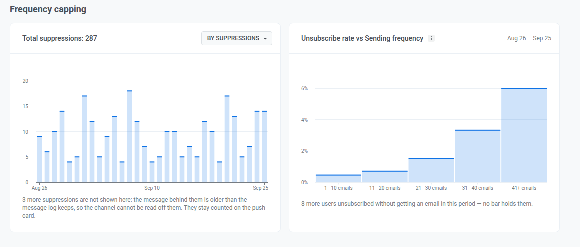
Anchor link toDas Diagramm zeigt, wie viele E-Mails Frequency Capping pro Tag im Zeitraum blockiert hat, oder wie viele Abonnenten davon betroffen waren. Der Wert Total suppressions im Header summiert dasselbe für den gesamten Zeitraum. Wechsle mit der Auswahl, was beide zählen:
- By suppressions: wie oft eine Nachricht durch Frequency Capping blockiert wurde
- By users: wie viele einzigartige Nutzer betroffen waren
Eine Suppression, die zu einer Nachricht gehört, die mehr als 30 Tage vor Beginn des Zeitraums versendet wurde, kann keinem Kanal zugeordnet werden und wird deshalb hier ausgeschlossen und stattdessen bei Total suppressions im Push-Tab gezählt. Ist das der Fall, lies die Zeile unter dem Diagramm für die genaue Anzahl.
Unsubscribe rate vs Sending frequency
Anchor link toNutze dieses Diagramm, um zu sehen, ob Personen, die im Zeitraum mehr E-Mails erhalten, sich auch häufiger abmelden. Das ist eine Korrelation, kein Kausalzusammenhang: Eine Abmeldung wird nicht zwangsläufig durch diese konkreten E-Mails ausgelöst.
Abonnenten werden danach gruppiert, wie viele E-Mails sie im Zeitraum erhalten haben. Jede Gruppe zeigt ihre Abmelderate.
Abonnenten, die sich abgemeldet haben, aber im Zeitraum keine E-Mail erhalten haben, werden aus jeder Gruppe ausgeschlossen. Wurden welche ausgeschlossen, zeigt eine Zeile unter dem Diagramm, wie viele.
Conversions-Tab
Anchor link toAuf diesem Tab siehst du, welche Kampagnen und Journeys Nutzer zu einer Conversion führen, etwa zu einem Kauf oder einer Anmeldung, und wie viel Umsatz sie im gewählten Zeitraum bringen. Der Tab zählt die Conversion-Events, die du für das Projekt ausgewählt hast.
Conversion-Events einrichten
Anchor link toSolange du neben PW_Conversion kein weiteres Event auswählst, zeigt der Tab das Banner Sehen Sie, welche Kampagnen zu Conversions führen.
Klicke auf Ereignisse einrichten und folge Conversion-Events auswählen und ihren Umsatz tracken. Um die Liste später zu ändern, klicke auf das Symbol Conversion-Ereignisse (Zahnrad) neben den Filtern.
Hat das ausgewählte Event im Zeitraum keine Conversions, zum Beispiel direkt nach der Einrichtung, zeigt der Tab Daten werden gesammelt.
Conversions filtern
Anchor link toMit den Filtern über den Kacheln legst du fest, was der Tab zählt:
- Ereignis: das Conversion-Event, über das berichtet wird.
- Attribution: das Attributionsfenster (1, 3, 7 oder 30 Tage, standardmäßig 3) und die Kontaktart. Jede Conversion wird genau einer Kampagne zugeordnet, nämlich der letzten, mit der der Nutzer innerhalb des Fensters interagiert hat. Bei Klick ist das die letzte Nachricht, die der Nutzer geöffnet oder angeklickt hat: ein geöffneter Push oder eine geöffnete Inbox-Nachricht oder ein angeklickter E-Mail-Link. Bei Versand ist es die letzte Nachricht, die an den Nutzer gesendet wurde.
- Kanal: Push, Email, Inbox, SMS oder WhatsApp. SMS ist nur mit der Kontaktart Versand verfügbar.
- Kampagnentyp: einmalige Nachrichten oder Journeys.
Wenn Nutzer im Zeitraum konvertiert haben, aber nicht nach deinen Nachrichten, zeigt der Tab Keine Conversions den Kampagnen zugeordnet. Klicke auf Attribution ändern, um ein längeres Fenster auszuprobieren.
Conversion-Kacheln
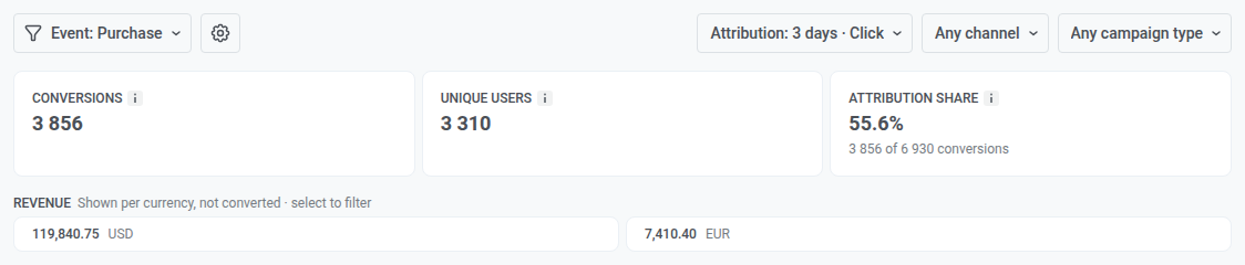
Anchor link toDie Kacheln zeigen Summen für das ausgewählte Event und zählen nur Conversions, die deinen Kampagnen zugeordnet sind:
- Conversions: Conversions, die deinen Kampagnen innerhalb des Attributionsfensters zugeordnet sind.
- Eindeutige Nutzer: die Nutzer hinter diesen Conversions. Jeder Nutzer wird einmal gezählt, egal wie oft er konvertiert hat.
- Umsatz: der Umsatz aus diesen Conversions mit seinem Anteil am Gesamtumsatz des Events. Bei einem Event, das noch keinen Umsatz trackt, bietet die Kachel Umsatz für dieses Ereignis einrichten an.
- Attributionsanteil: der Anteil aller Conversions dieses Events, die deinen Kampagnen zugeordnet sind.
Haben die Conversions mehr als eine Währung, ersetzt ein Umsatz-Streifen unter den Kacheln die Umsatz-Kachel. Er listet den Betrag für jede Währung separat auf, ohne Umrechnung nach Wechselkurs. Klicke auf eine Währung, um nur Kampagnen mit Umsatz in dieser Währung anzuzeigen.
Kampagnentabelle
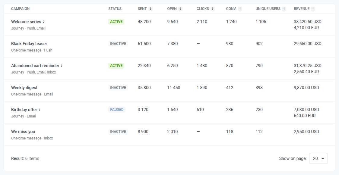
Anchor link toDie Tabelle listet jede Kampagne mit mindestens einer zugeordneten Conversion, mit Status, Gesendet, Geöffnet, Klicks, Conv., Eindeutige Nutzer und Umsatz für den Zeitraum. Klicks sind nur für E-Mail verfügbar.
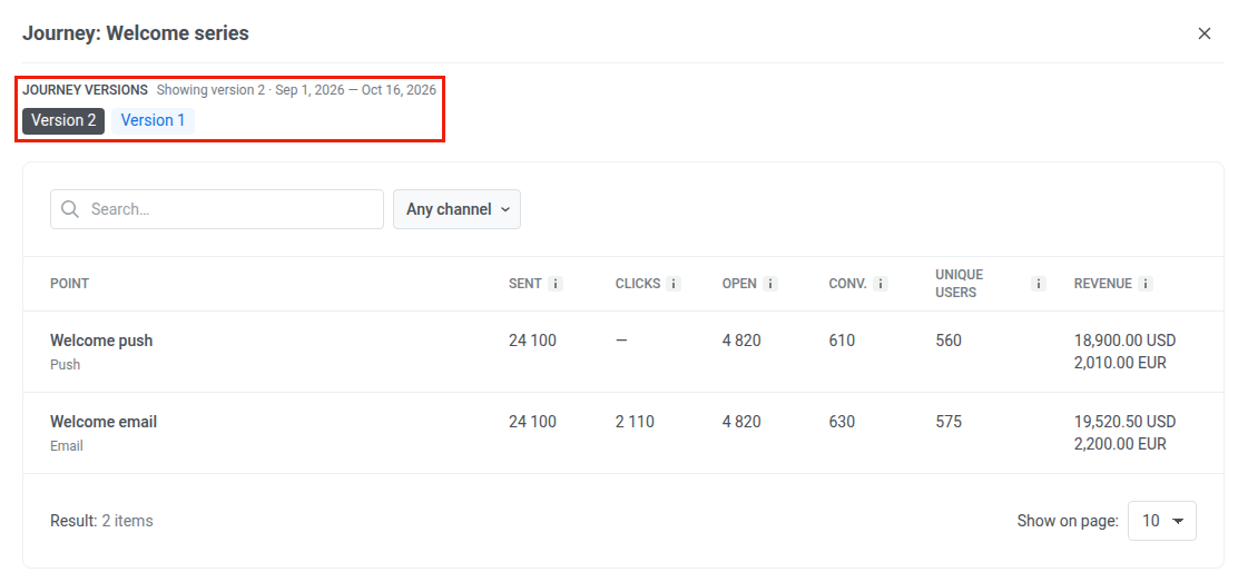
Klicke auf eine Journey-Zeile, um ihre Aufschlüsselung nach Punkten zu öffnen. Hat die Journey mehrere Versionen, wähle eine unter Journey-Versionen aus.
Export statistics
Anchor link toVerwende Export statistics im Seitenkopf, um Daten als CSV-Datei herunterzuladen.
- Klicke auf Export statistics.
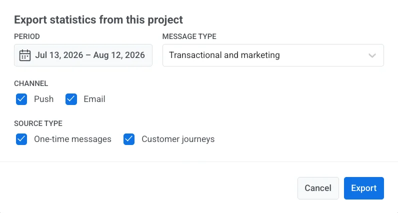
- Lege die Exportoptionen im Modal Export statistics from this project fest:
- Period: Standardmäßig der aktuell auf der Seite gewählte Zeitraum.
- Message type: Transactional and marketing, Only marketing oder Only transactional.
- Channel: Push und/oder Email.
- Source Type: One-time messages und/oder Customer journeys.
- Klicke auf Export.
Wenn du mit Overview fertig bist, öffne User retention statistics für individuelle Retention-Events, Messaging statistics für Details pro Nachricht, oder Dashboards für individuelle Diagramme.