تكوين التنسيق والتذييل على مستوى البريد الإلكتروني بالكامل
تكوين التنسيق على مستوى البريد الإلكتروني بالكامل
Anchor link toفي محرر السحب والإفلات، مع فتح بريدك الإلكتروني على لوحة التصميم، افتح علامة التبويب Settings في اللوحة اليمنى.
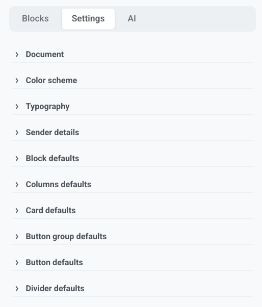
تنطبق هذه الإعدادات على البريد الإلكتروني بأكمله. لتغيير كتلة واحدة فقط، حددها على لوحة التصميم وقم بتجاوز النمط هناك.
المستند (Document)
Anchor link toقم بتعيين حجم ومظهر منطقة البريد الإلكتروني بأكملها:
- العرض والحشو
- صورة خلفية (مع Fit وموضع خاص بها) أو تدرج لوني
- الفجوة بين الكتل
- نصف قطر زاوية الصورة الافتراضي، نصف قطر زاوية منطقة المحتوى، وظل المحتوى
قم بتعيين لون الخلفية الصلب للبريد الإلكتروني بأكمله تحت Color scheme، وليس هنا.
نظام الألوان (Color scheme)
Anchor link toقم بتعيين لوحة ألوان البريد الإلكتروني:
- Background: لون صلب خلف البريد الإلكتروني بأكمله، بما في ذلك الحشو حول البطاقات والكتل الأخرى
- Text: نص الصفحة
- Heading: أنماط العناوين
- Link: روابط القائمة التي لا تحتوي على لون صريح
تُستخدم ألوان اللوحة الأخرى عند اختيار الألوان لاحقًا في المحرر وعند استخدام الذكاء الاصطناعي لإنشاء المحتوى. تحتفظ الكتل الموجودة بالفعل على لوحة التصميم بالألوان التي قمت بتعيينها عليها.
قم بتشغيل Dark mode variant لتعيين ألوان منفصلة للعملاء الذين يدعمون الوضع الداكن.
الطباعة (Typography)
Anchor link toقم بتعيين عائلة الخطوط على مستوى البريد الإلكتروني بالكامل. لكل نمط نص (Heading 1, Heading 2, Normal، وما إلى ذلك)، قم بتعيين حجم الخط، وزن الخط، ارتفاع السطر، وتباعد الأحرف.
تفاصيل المرسل (Sender details)
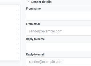
Anchor link toفي Sender details، قم بتعيين من هو مرسل البريد الإلكتروني وأين تذهب الردود: From name و From email للمرسل الذي يراه المستلمون، و Reply-to name و Reply-to email حيث تصل ردودهم.
الإعدادات الافتراضية للكتل والتخطيط
Anchor link toاستخدم هذه الإعدادات حتى تتطابق الكتل الجديدة مع البريد الإلكتروني حتى تقوم بتصميم كتلة على لوحة التصميم:
- Block defaults: الخلفية، صورة الخلفية، لون الحدود، عرض الحدود، نصف قطر الزاوية، ورؤية الجوال/سطح المكتب
- Columns defaults: الحشو الخارجي، الحشو داخل كل عمود، والفجوة بين الأعمدة
- Card defaults: المظهر الأولي لحاويات البطاقات
- Button group defaults: التباعد والمحاذاة للأزرار في مجموعة
- Button defaults: المظهر الأولي لكتل الأزرار الجديدة
- Divider defaults: نمط الخط، اللون، السماكة، والعرض
تنطبق الإعدادات الافتراضية فقط حيث لا تحدد الكتلة قيمتها الخاصة. إذا قمت بتغيير Corner radius على كتلة، فإن هذا الإعداد يحل محل الإعداد الافتراضي على مستوى البريد الإلكتروني لجميع الزوايا في تلك الكتلة. لا يمزج بين الزوايا من الإعداد الافتراضي والكتلة.
تكوين تذييل البريد الإلكتروني
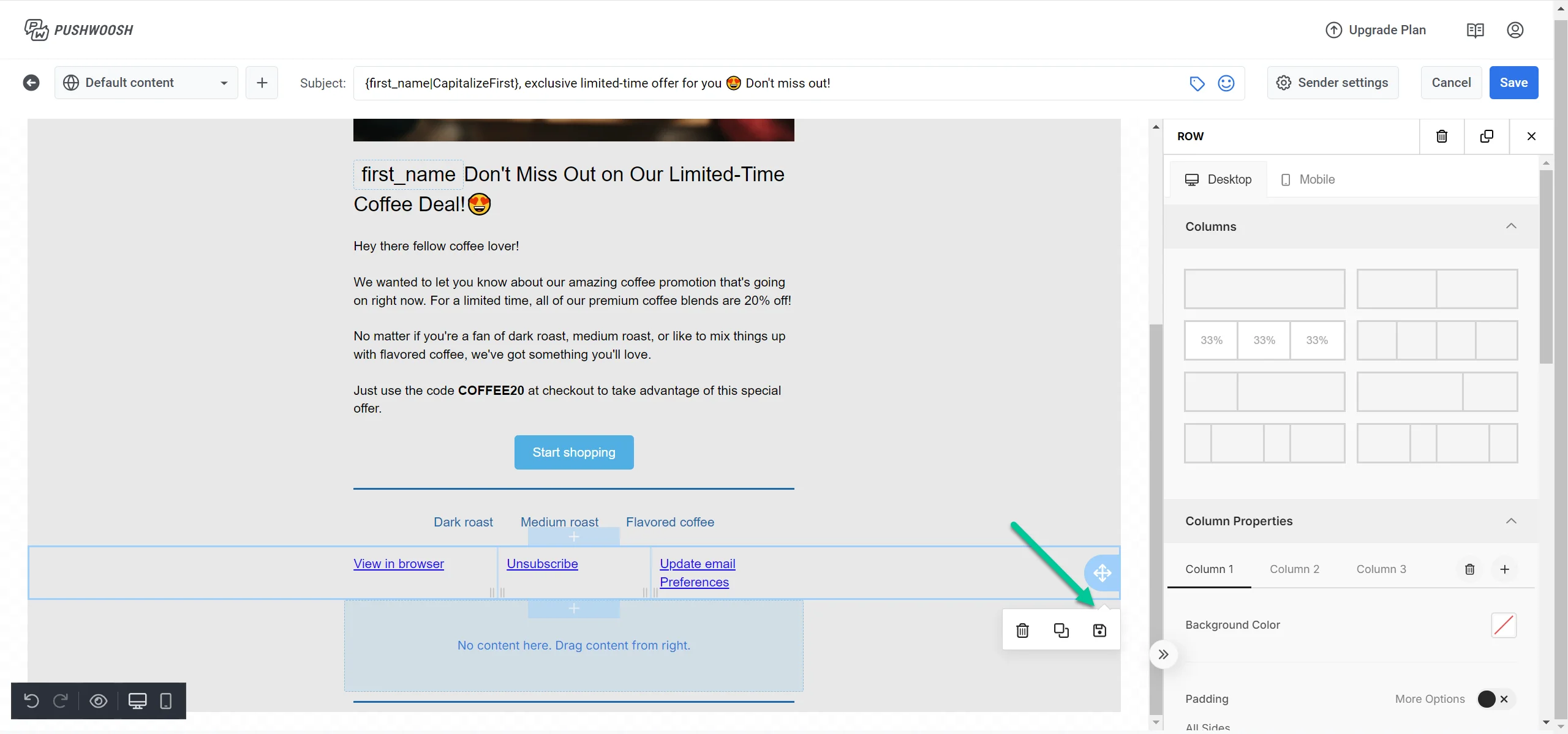
Anchor link toفي لوحة Layers، حدد Footer لفتح إعداداته في اللوحة اليمنى.
يتضمن كل بريد إلكتروني كتلة Footer للمعلومات المطلوبة قانونيًا عن المرسل ورابط إلغاء الاشتراك.
تحميل أو حفظ تذييل المشروع
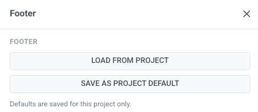
Anchor link to- Load from project: املأ تذييل هذا البريد الإلكتروني من تذييل المشروع المحفوظ على مستوى المشروع.
- Save as project default: قم بتخزين التذييل الحالي كنقطة بداية للرسائل الإلكترونية المستقبلية. استخدم هذا فقط عندما تريد أن تبدأ الرسائل الإلكترونية الجديدة من هذا التذييل.
يتم حفظ الإعدادات الافتراضية لهذا المشروع فقط.
نوع البريد الإلكتروني ومعلومات الشركة
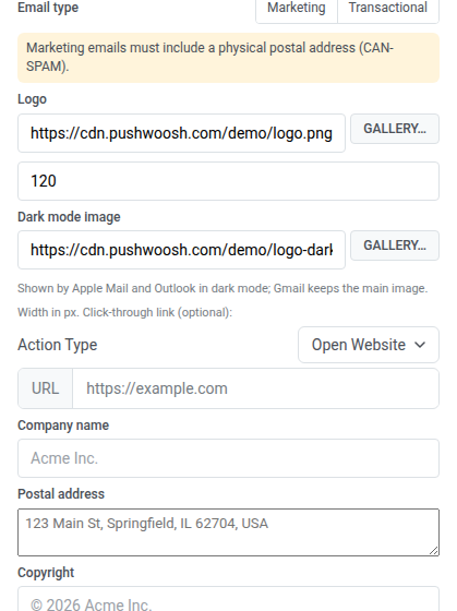
Anchor link to- تحت Email type، اختر Marketing أو Transactional. بالنسبة لـ Marketing، يحتفظ التذييل برابط إلغاء الاشتراك. بالنسبة لـ Transactional، يتم حذف رابط إلغاء الاشتراك. تتبع رؤية إلغاء الاشتراك هذا الإعداد. اعرف المزيد عن الرسائل التسويقية مقابل رسائل المعاملات.
- قم بتعيين عنوان URL للشعار أو اختر شعارًا من المعرض. يظهر هذا الشعار في التذييل، أسفل رسالة البريد الإلكتروني. لعرض شعارك أعلى رسالة البريد الإلكتروني، أضف كتلة رأس الشعار، التي تأخذ شعارها من Brand book الخاص بك.
- قم بتعيين عرض الشعار بالبكسل.
- اختياريًا، قم بتعيين عنوان URL لـ Dark mode image، أو اختر صورة من المعرض. يعرضه Apple Mail وOutlook بدلاً من الشعار الرئيسي عندما يقرأ المستلم في الوضع الداكن. يحتفظ Gmail دائمًا بالشعار الرئيسي.
يؤدي تطبيق Brand book يحتوي على شعار إلى استبدال شعار التذييل وصورة الوضع الداكن الخاصة به بتلك الموجودة في Brand book. 5. اختياريًا، قم بتعيين رابط للنقر: اختر Action Type وأدخل عنوان URL. 6. املأ Company name، Postal address، و Copyright.
الروابط والشارات
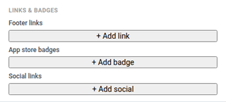
Anchor link to- أضف Footer links معنونة، مثل سياسة الخصوصية أو الشروط.
- أضف App store badges لـ App Store أو Google Play مع عناوين URL للوجهة.
- أضف Social links مع أيقونات تشير إلى ملفاتك الشخصية على وسائل التواصل الاجتماعي.
النمط (Style)
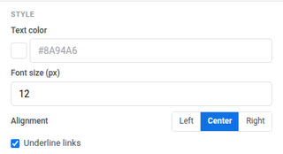
Anchor link to- Text color: لون نص التذييل
- Font size (px): حجم خط التذييل
- Alignment: يسار، وسط، أو يمين
- Underline links: قم بتشغيله لوضع خط تحت روابط التذييل
الخيارات (Options)
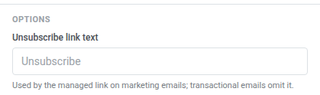
Anchor link toقم بتعيين Unsubscribe link text لرابط إلغاء الاشتراك المُدار في رسائل البريد الإلكتروني التسويقية. تحذف رسائل البريد الإلكتروني للمعاملات الرابط.
تحقق قبل الحفظ
Anchor link toعندما تبدو إعدادات التذييل والإعدادات على مستوى البريد الإلكتروني بالكامل صحيحة على لوحة التصميم، قم بتشغيل Check قبل الحفظ. انظر تحقق من بريدك الإلكتروني قبل الإرسال.