Страница Overview
Страница Overview показывает тренды по аудитории, push, email и конверсиям без настройки дашборда или отчета. Загляните сюда в первую очередь, чтобы заметить падение удержания или всплеск ошибок доставки на раннем этапе, а не через неделю плохого тренда. Откройте Project overview в левом меню.
- App metrics: проверьте активных пользователей (MAU/DAU), охват по платформам и каналам и удержание Day 1 / 7 / 14 / 28
- Push: проверьте push-аудиторию, эффективность доставки и влияние ограничения частоты
- Email: проверьте базу подписчиков, эффективность доставки, разбивку по категориям и почтовым провайдерам, а также влияние ограничения частоты
- Конверсии: проверьте, какие кампании и journey приводят к конверсиям и какой доход они приносят
Для общего охвата и вовлеченности по сообщениям перейдите в Statistics → Project Statistics.
Настройка отчетного периода
Anchor link toИспользуйте селектор диапазона дат, чтобы выбрать период, за который отчитывается страница Overview. Каждый график на вкладках App metrics, Push, Email и Конверсии использует один и тот же диапазон, поэтому вы сравниваете метрики за одно и то же окно.
По умолчанию страница показывает последние 30 дней.
Чтобы изменить период:
- Нажмите на селектор диапазона дат в правом верхнем углу, рядом с Project settings и Export statistics.
- Выберите Last 7 days, Last 30 days или задайте произвольные начальную и конечную даты в календаре.
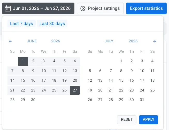
- Нажмите Apply.
Вкладка App metrics
Anchor link toПроверяйте, сколько пользователей активны в вашем приложении и насколько хорошо вы их удерживаете, чтобы заметить рост или отток на раннем этапе, не покидая обзор проекта.
Unique users
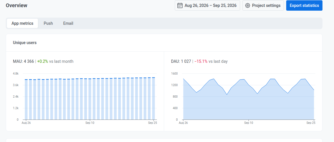
Anchor link toПроверьте текущее значение и изменение по сравнению с предыдущим месяцем или днем:
- MAU: активные пользователи за месяц, за скользящее окно в 30 дней, заканчивающееся на каждом отображаемом дне
- DAU: активные пользователи за день, уникальные пользователи, открывшие приложение в этот день
Распределение пользователей по платформам
Anchor link toПроверьте, сколько пользователей доступны на каждом канале, настроенном для проекта (отдельные платформы мобильного и веб-push, email, SMS и чат-каналы, такие как WhatsApp, Telegram и Viber), по состоянию на последний день выбранного периода.

Воспринимайте это как снимок на момент времени, а не как сумму за период: платформы в сумме могут немного превышать общее число по проекту, потому что каждая платформа, на которой доступен пользователь, учитывает его отдельно.
Охват по каналам (Channel reach)
Anchor link toПроверьте, сколько пользователей можно охватить хотя бы по одному каналу, сколько — по двум и более, и в какую именно комбинацию каналов попадает каждый пользователь, по состоянию на последний день выбранного периода.
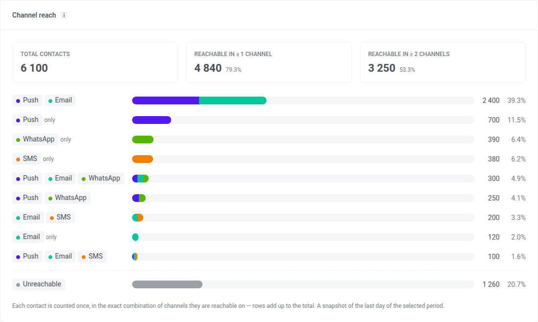
Что означает каждая часть карточки:
- Total contacts: все User ID в проекте, включая пользователей без устройства, например добавленных через импорт тегов. Пользователи без устройства учитываются как Unreachable.
- Reachable in ≥ 1 channel: пользователи, которых можно охватить хотя бы по одному каналу, и их доля от Total contacts
- Reachable in ≥ 2 channels: пользователи, которых можно охватить по двум и более каналам, и их доля от Total contacts
- Строки комбинаций каналов: каждая строка — это один точный набор каналов. Пользователь в строке Push + Email доступен по push и email и ни по какому другому каналу. Строка с пометкой only содержит один канал.
- Unreachable: пользователи, которых нельзя охватить ни по одному каналу
Пользователь считается доступным по каналу, если:
- Push: у его устройства есть push-токен и разрешение на push. Все push-платформы, включая веб-push, считаются одним каналом.
- Email: его адрес не отписался и не получил жесткий отказ
- SMS: у него есть номер телефона, зарегистрированный для SMS
- WhatsApp: у него есть номер телефона, зарегистрированный для WhatsApp
- Inbox: у него есть любое устройство с приложением или браузером, с push-токеном или без него. Inbox отображается, только если проект использовал Message Inbox за последние 30 дней.
В отличие от распределения пользователей по платформам, здесь каждый пользователь учитывается один раз, поэтому строки и Unreachable в сумме дают Total contacts. Человек, сохраненный под двумя User ID, учитывается дважды.
Значение в строке может отличаться от размера сегмента, созданного с теми же условиями. Карточка показывает снимок на последний день выбранного периода, а размер сегмента отражает данные на момент его последнего расчета. Кроме того, сегмент показывает устройства по каналам, а не пользователей в точной комбинации каналов.
Удержание пользователей
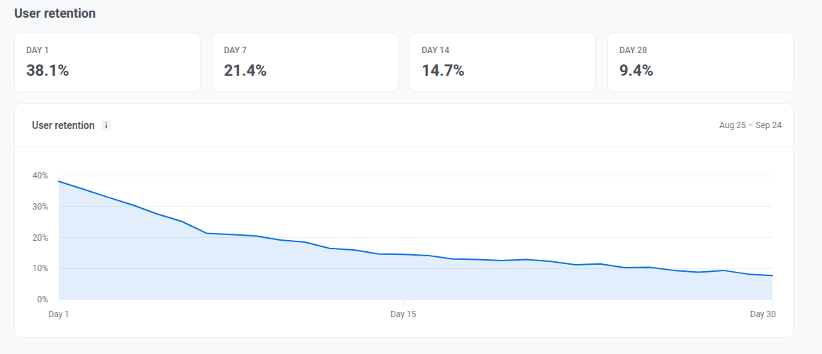
Anchor link toПроверьте удержание Day 1, Day 7, Day 14 и Day 28, чтобы увидеть, сколько новых пользователей возвращаются после первого визита и возвращаются ли они в первую неделю, оставаясь вовлеченными в последующие недели. Каждый день учитывает только пользователей, вернувшихся именно в этот день, а не всех, кто вернулся к этому моменту.
Когорта — это все, кто впервые посетил приложение в один конкретный день, за 30 дней до последнего дня с данными, а не все, кто впервые посетил приложение в выбранном вами периоде. Изменение диапазона дат не меняет отображаемую когорту.
Вкладка Push
Anchor link toИспользуйте эту вкладку, чтобы проверить, кого вы можете охватить push-уведомлениями, сколько push было доставлено и открыто за выбранный период, и как ограничение частоты повлияло на отправки.
Audience
Anchor link toПроверьте свою push-аудиторию по состоянию на последний день периода и то, как она изменилась с тех пор.
Когда для проекта настроена более чем одна push-платформа, используйте выпадающий список All platforms рядом с заголовком раздела, чтобы отфильтровать Funnel, Subscribers, Push reachable и раздел Frequency capping ниже по отдельной платформе. Base change и раздел Performance этим выпадающим списком не затрагиваются.
Funnel
Anchor link toПроверьте шаги от Total users до Active-reachable. Каждый шаг показывает, сколько пользователей остается и какую долю это составляет от предыдущего шага.
Funnel — это снимок за последний день выбранного периода. Он не суммирует активность за весь период.
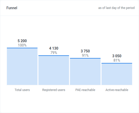
- Total users
- Registered users: имеет push-токен
- Push reachable: пользователи, которые действительно могут получить push
- Active-reachable: Push reachable и открывшие приложение за последние 30 дней. Это окно фиксированное и не меняется в зависимости от выбранного диапазона дат.
Subscribers
Anchor link toПроверьте, в какой сегмент попадает каждый пользователь:
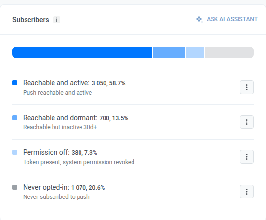
- Reachable and active: Push reachable и открывшие приложение за последние 30 дней
- Reachable and dormant: Push reachable, но не открывавшие приложение 30+ дней
- Permission off: push-токен есть, системное разрешение отозвано
- Never opted-in: push-токена нет, никогда не подписывались на push
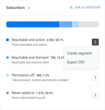
В строке откройте kebab-меню и выберите Create segment или Export CSV.
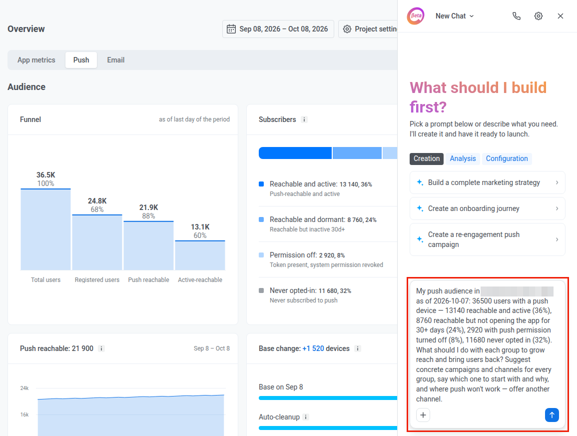
Чтобы задать вопрос об этой аудитории в чате, нажмите Ask AI Assistant в заголовке карточки, если AI Assistant включен для аккаунта.

AI Assistant открывается в панели на той же странице с готовым промптом об этой аудитории. При необходимости отредактируйте промпт, затем отправьте его.
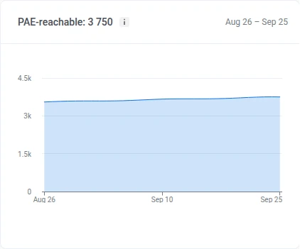
Push reachable
Anchor link toPush reachable: пользователи, которые действительно могут получить push. У Pushwoosh есть валидный push-токен для их устройства, и они не отключили уведомления в настройках телефона или браузера.
Проверьте, сколько пользователей могли получить push каждый день периода. Падение обычно означает, что люди отключили уведомления или удалили приложение. Рост означает новые подписки.
Base change
Anchor link toПроверьте, сколько подписчиков покинули базу из-за автоочистки и истекших токенов, и сколько присоединилось к ней благодаря новым регистрациям, с начала периода. Размер полосы каждой строки задан относительно базы на начало периода:
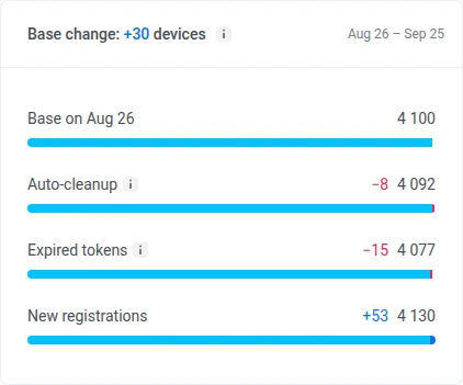
- Auto-cleanup: удаляет push-токен устройства, если приложение не открывалось дольше лимита неактивности аккаунта. См. автоматическую очистку неактивных.
- Expired tokens: устройство, чей push-токен APNs или FCM сообщили как недействительный, основываясь только на ответах шлюза. См. недействительные push-токены.
- New registrations: устройства, зарегистрировавшиеся для push за период
Pushwoosh хранит эту разбивку только за последние 60 дней. Если ваш период начинается раньше, строка под разбивкой показывает дату, с которой она реально учитывается.
Performance
Anchor link toПроверьте доставку и вовлеченность push за период, затем откройте ежедневную разбивку по платформам.

Переключайте выпадающий список над Sent, Delivery rate, Open-to-sent rate и Errors:
- By sends: каждая отправка учитывается отдельно
- By uniques: каждый получатель учитывается один раз. В этом режиме первая метрика становится Recipients: уникальные устройства, которым был доставлен push за период, каждое учитывается один раз, даже если получило несколько отправок.
Проверьте эти сводные метрики за период:
- Sent: сколько push было отправлено (становится Recipients в режиме By uniques)
- Delivery rate: как доставки соотносятся с отправками (включает количество доставок)
- Open-to-sent rate: как открытия соотносятся с отправками (включает количество открытий)
- Errors: сколько отправок завершились ошибкой
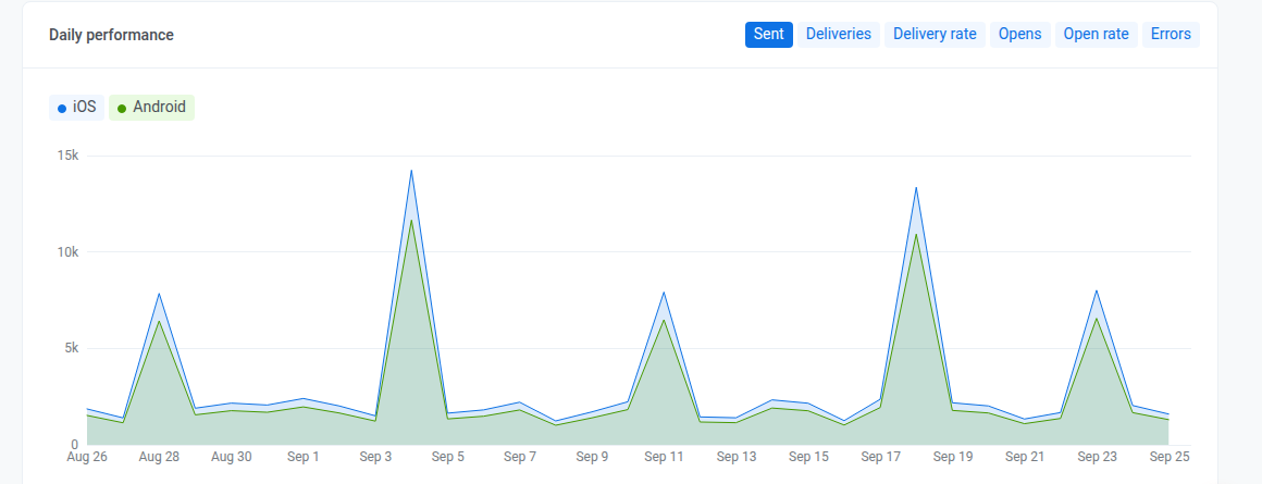
Daily performance
Anchor link toПроверьте эти метрики по дням, в разбивке по платформам. Переключайте метрики чипами над графиком: Sent, Deliveries, Delivery rate, Opens, Open rate и Errors.
Frequency capping
Anchor link toПроверьте, как ограничение частоты повлияло на отправки за период. Чтобы проверить одну push-платформу, выберите ее в выпадающем списке All platforms в разделе Audience.
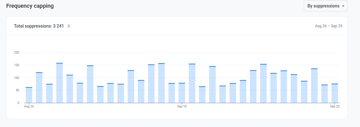
График показывает, сколько push заблокировало ограничение частоты или скольких пользователей оно затронуло, по дням за период. Показатель Total suppressions в заголовке суммирует то же самое за весь период. Переключайте, что считают оба показателя, селектором:
- By suppressions: сколько раз сообщение было заблокировано ограничением частоты
- By users: сколько уникальных пользователей было затронуто
Вкладка Email
Anchor link toИспользуйте эту вкладку, чтобы проверить состояние базы подписчиков, вовлеченность, разбивку по категориям и почтовым провайдерам, а также влияние ограничения частоты за выбранный период.
Audience
Anchor link toПроверьте базу подписчиков, что ее изменило и насколько вовлечены подписчики.
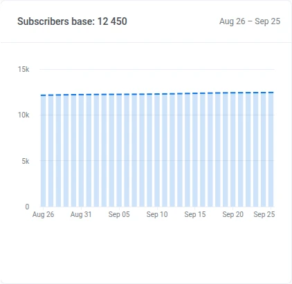
Subscribers base
Anchor link toПроверьте тренд числа подписчиков за период.
Base change
Anchor link toПроверьте, сколько подписчиков база потеряла из-за жалоб или жестких отказов, и сколько получила благодаря новым подписчикам, с начала периода. Отписки и другие изменения тоже учитываются, но сами по себе не удаляют адрес из базы. Размер полосы каждой строки задан относительно базы на начало периода:
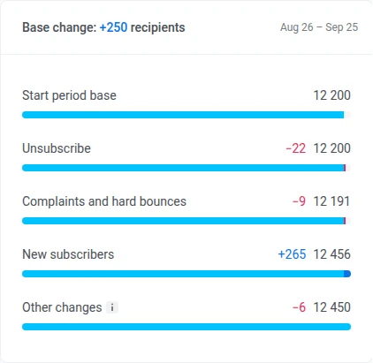
- Unsubscribe: подписчики, отписавшиеся за период. Адрес остается в базе, поэтому это никогда ее не уменьшает.
- Complaints and hard bounces: подписчики, которых Pushwoosh добавил в стоп-лист из-за жалобы на спам или жесткого отказа, учитывается один раз, даже если произошло и то, и другое
- New subscribers: устройства или адреса, подписавшиеся на email за период
- Other changes: все, что не покрывают два потока выше: смещение ежедневного снимка, второй адрес у существующего пользователя, переносы между аккаунтами и миграции, удаленные устройства и пользователи, а также очистки базы. Может быть положительным или отрицательным.
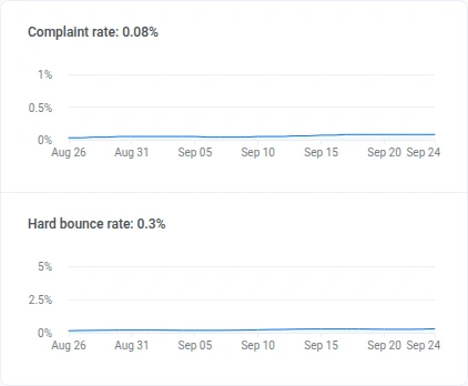
Complaint rate и Hard bounce rate
Anchor link toПроверьте Complaint rate и Hard bounce rate за период и текущее значение в заголовке.
Subscribers activity distribution
Anchor link toПроверьте, как Subscribers activity distribution разбивается на эти группы, с числом и долей базы для каждой:
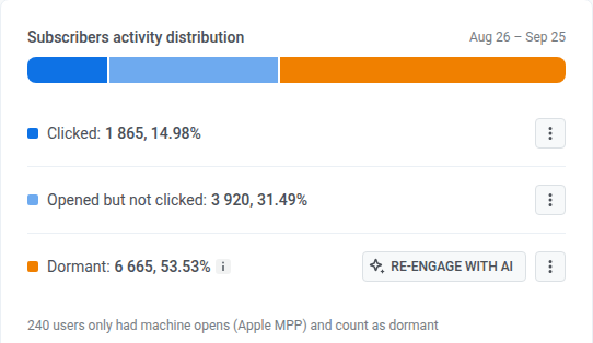
- Clicked
- Opened but not clicked
- Dormant: ни одного открытия за период
В строке откройте kebab-меню и выберите Create segment или Export CSV.
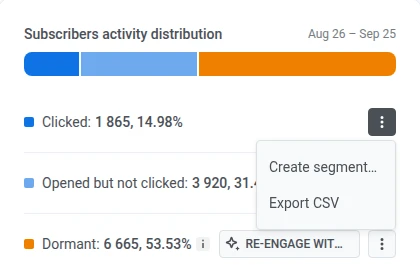
В строке Dormant нажмите Re-engage with AI, если AI Assistant включен для аккаунта. AI Assistant открывается в панели на той же странице с готовым промптом о ваших неактивных подписчиках.

Event-triggered performance
Anchor link toПроверьте итоги доставки и вовлеченности email за период, затем откройте ежедневную разбивку.
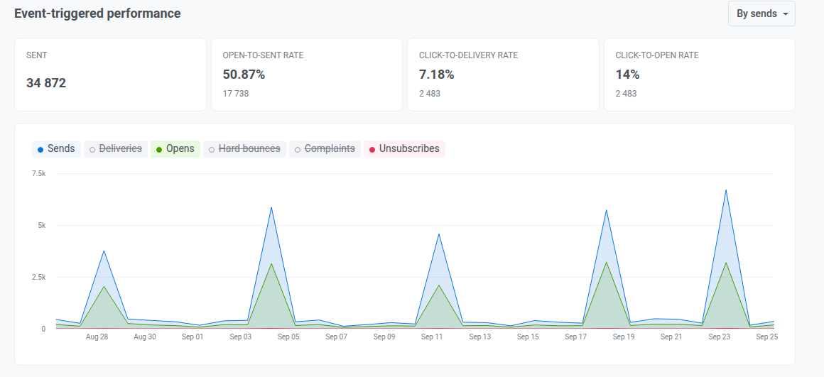
Переключайте выпадающий список над Sent, Open-to-sent rate, Click-to-delivery rate и Click-to-open rate:
- By sends: каждая отправка учитывается отдельно
- By uniques: каждый получатель учитывается один раз
Проверьте эти сводные метрики за период:
- Sent: сколько email было отправлено (объем за период)
- Open-to-sent rate: как открытия соотносятся с отправками, была ли отправка открыта
- Click-to-delivery rate: как клики соотносятся с доставками, привела ли доставленная почта к кликам
- Click-to-open rate: как клики соотносятся с открытиями, вовлеклись ли открывшие письмо дальше
Daily chart
Anchor link toНажмите на чип над графиком, чтобы добавить или убрать линию:
- Включены по умолчанию: Sends, Opens, Unsubscribes
- Изначально выключены: Deliveries, Hard bounces, Complaints
Category-based performance
Anchor link toПроверьте эффективность отправок по категории email.
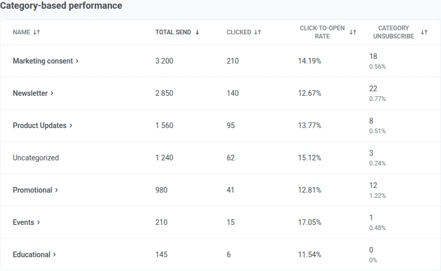
Когда таблица доступна:
- Отправки без привязанной категории группируются под Uncategorized.
- Нажмите на заголовок столбца, чтобы отсортировать.
Если категории еще не настроены, этот раздел показывает карточку для их настройки вместо таблицы.
Mailbox providers
Anchor link toПроверьте эффективность отправок по почтовому провайдеру получателя (Gmail, Outlook и так далее).
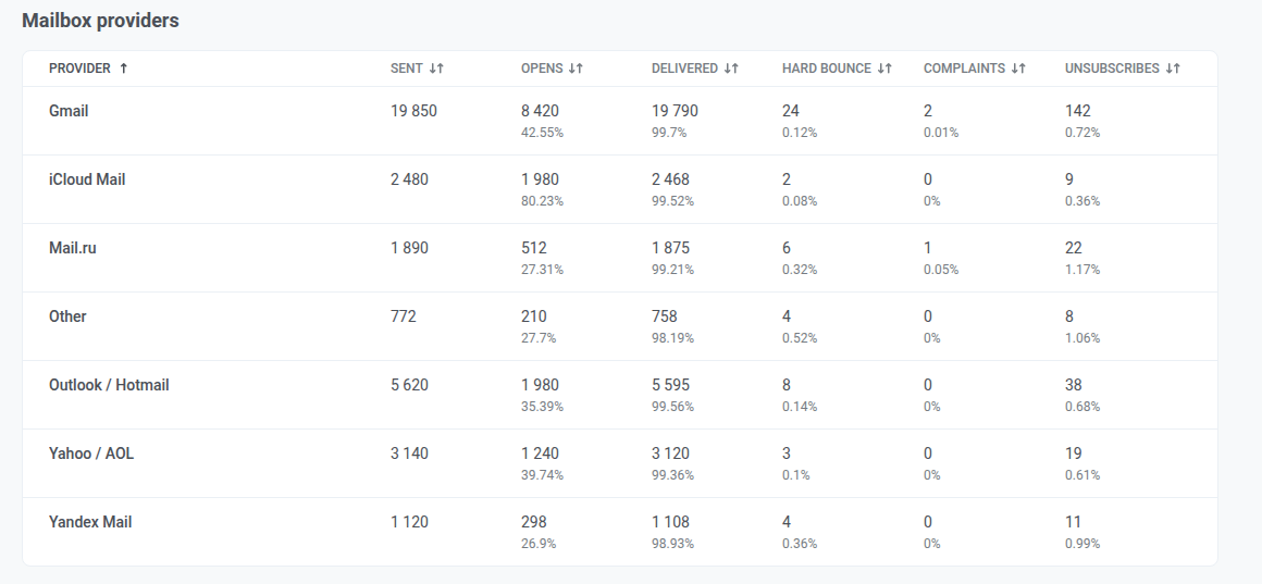
Провайдеры, которым Pushwoosh не может атрибутировать отправку, группируются под Other. Нажмите на заголовок столбца, чтобы отсортировать.
Frequency capping
Anchor link toПроверьте, как ограничение частоты повлияло на отправки email за период.
Total suppressions
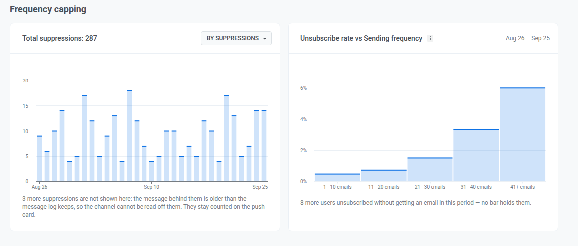
Anchor link toГрафик показывает, сколько email заблокировало ограничение частоты или скольких подписчиков оно затронуло, по дням за период. Показатель Total suppressions в заголовке суммирует то же самое за весь период. Переключайте, что считают оба показателя, селектором:
- By suppressions: сколько раз сообщение было заблокировано ограничением частоты
- By users: сколько уникальных пользователей было затронуто
Подавление, привязанное к сообщению, отправленному более чем за 30 дней до начала периода, невозможно атрибутировать к каналу, поэтому оно исключается здесь и вместо этого учитывается в Total suppressions на вкладке Push. Если так произошло, прочитайте строку под графиком, чтобы узнать, сколько именно.
Unsubscribe rate vs Sending frequency
Anchor link toИспользуйте этот график, чтобы увидеть, отписываются ли чаще те, кто получает больше email за период. Это корреляция, а не причина: отписка не обязательно вызвана именно этими письмами.
Подписчики группируются по тому, сколько email они получили за период. Для каждой группы показан ее уровень отписок.
Подписчики, которые отписались, но не получили ни одного email за период, исключены из всех групп. Если кто-то был исключен, строка под графиком показывает, сколько именно.
Вкладка Конверсии
Anchor link toИспользуйте эту вкладку, чтобы увидеть, какие кампании и journey приводят пользователей к конверсии, например к покупке или регистрации, и какой доход они приносят за выбранный период. Вкладка учитывает события-конверсии, выбранные для проекта.
Настройка событий-конверсий
Anchor link toПока вы не выберете хотя бы одно событие помимо PW_Conversion, на вкладке показывается баннер Узнайте, какие кампании приносят конверсии.
Нажмите Настроить события и следуйте инструкции Выбор событий-конверсий и отслеживание их дохода. Чтобы позже изменить список, нажмите значок Конверсионные события (шестеренка) рядом с фильтрами.
Если у выбранного события нет конверсий за период, например сразу после настройки, на вкладке показывается Собираем данные.
Фильтрация конверсий
Anchor link toИспользуйте фильтры над плитками, чтобы выбрать, что учитывает вкладка:
- Событие: событие-конверсия, по которому строится отчет.
- Атрибуция: окно атрибуции (1, 3, 7 или 30 дней, по умолчанию 3) и тип контакта. Каждая конверсия засчитывается одной кампании — последней, с которой пользователь взаимодействовал в пределах окна. С типом Клик это последнее сообщение, которое пользователь открыл или по которому кликнул: открытый push или сообщение Inbox либо клик по ссылке в email. С типом Отправка это последнее сообщение, отправленное пользователю.
- Канал: Push, Email, Inbox, SMS или WhatsApp. SMS доступен только с типом контакта Отправка.
- Тип кампании: разовые сообщения или journey.
Если пользователи совершали конверсии за период, но не после ваших сообщений, на вкладке показывается Конверсии не привязаны к кампаниям. Нажмите Изменить атрибуцию, чтобы попробовать более длинное окно.
Плитки конверсий
Anchor link toПлитки показывают итоги по выбранному событию и учитывают только конверсии, атрибутированные вашим кампаниям:
- Конверсии: конверсии, атрибутированные вашим кампаниям в пределах окна атрибуции.
- Уникальные пользователи: пользователи, стоящие за этими конверсиями. Каждый пользователь считается один раз, сколько бы конверсий у него ни было.
- Выручка: доход от этих конверсий и его доля в общем доходе события. Если событие еще не отслеживает доход, плитка предлагает Настроить выручку для этого события.
- Доля атрибуции: доля всех конверсий этого события, атрибутированных вашим кампаниям.
Если у конверсий больше одной валюты, вместо плитки Выручка под плитками появляется полоса Выручка. В ней сумма по каждой валюте указана отдельно, без пересчета по курсу. Нажмите на валюту, чтобы показать только кампании с доходом в ней.
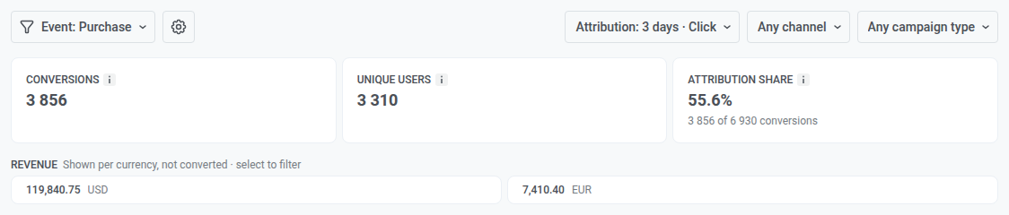
Таблица кампаний
Anchor link toВ таблице перечислены все кампании, у которых есть хотя бы одна атрибутированная конверсия, с колонками Статус, Отправлено, Открыто, Клики, Конв., Уникальные и Выручка за период. Клики доступны только для email.
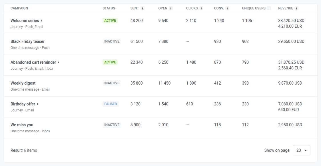
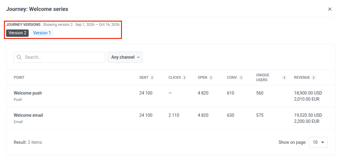
Нажмите на строку journey, чтобы открыть его разбивку по элементам. Если у journey несколько версий, выберите нужную в Версии journey.
Export statistics
Anchor link toИспользуйте Export statistics в заголовке страницы, чтобы скачать данные в виде CSV-файла.
- Нажмите Export statistics.
- Задайте параметры экспорта в модальном окне Export statistics from this project:
- Period: по умолчанию — диапазон, выбранный сейчас на странице.
- Message type: Transactional and marketing, Only marketing или Only transactional.
- Channel: Push и/или Email.
- Source Type: One-time messages и/или Customer journeys.
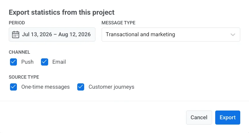
- Нажмите Export.
Закончив с Overview, откройте User retention statistics для пользовательских событий удержания, Messaging statistics для детализации по отдельным сообщениям или Dashboards для пользовательских графиков.