在内置编辑器中创建应用内消息
在 Pushwoosh 内置编辑器中构建一个应用内消息模板,无需编写代码。您将获得一个可重用的布局,其中包含内容块、图片、按钮和个性化文本,您可以在 Customer Journey 中、作为一次性应用内消息或从推送中显示。
创建新的应用内模板
Anchor link to应用内模板是您创建一次即可在营销活动中向用户展示的可重用设计。您可以在内置编辑器中创建一个,上传自定义的 HTML ZIP 文件,或构建一个原生富媒体模板。本文介绍如何在内置编辑器中从头开始创建模板。自定义现有模板也请遵循相同的步骤。
- 前往 内容 → 应用内消息。
- 点击 创建应用内消息。内置编辑器会直接打开。
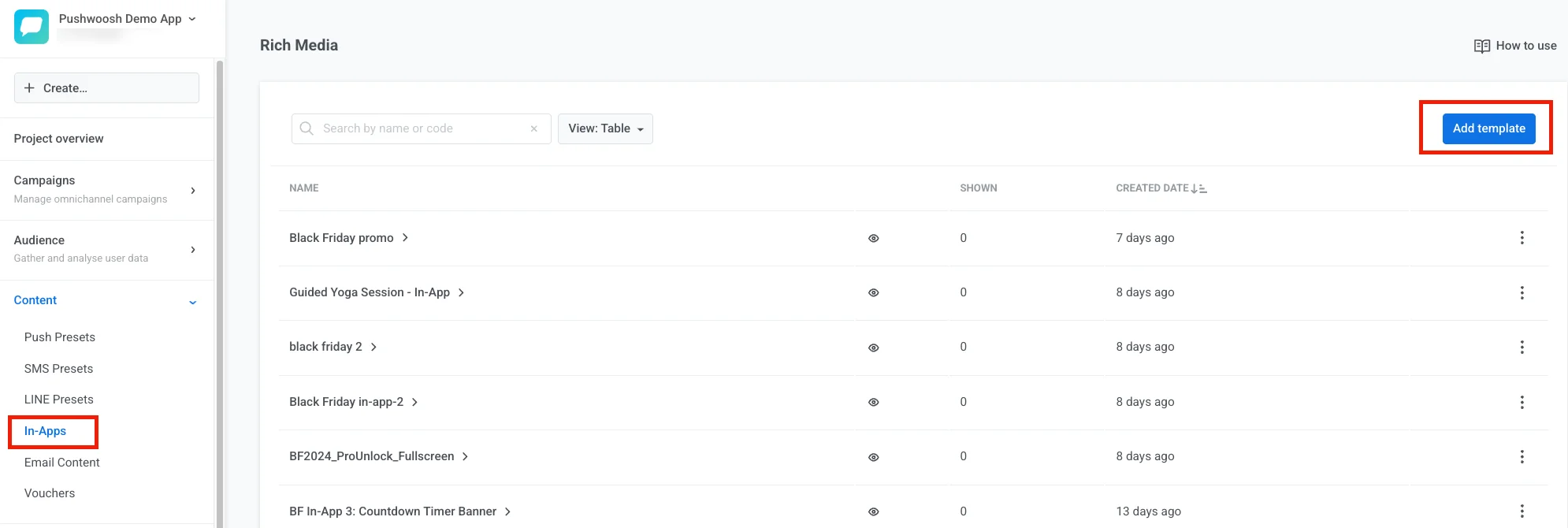
点击 创建应用内消息 旁边的箭头,以其他方式创建模板:
- 上传 ZIP: 上传一个 ZIP 文件,其中包含您的 HTML 应用内消息。
- 原生应用内消息: 使用现成的布局构建一个由 SDK 渲染的消息。了解更多
探索编辑器布局
Anchor link to内置编辑器有四个区域。每个区域都有明确的功能。
顶部栏用于管理整个模板:其名称、撤销历史、保存状态、在设备上的外观(应用内设置)、语言(自动翻译 和语言切换器)、手机或桌面预览宽度(手机提供 360、390、393 或 430 像素,匹配常见设备宽度),以及浅色/深色画布切换(太阳/月亮图标)。请参阅配置应用内消息在设备上的外观和本地化模板。

打开顶部栏中的 ⋮ 菜单以获取更多操作:
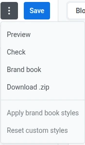
预览 功能让您可以在保存前试用消息:点击按钮、浏览多屏流程,并检查在手机或桌面上的布局。
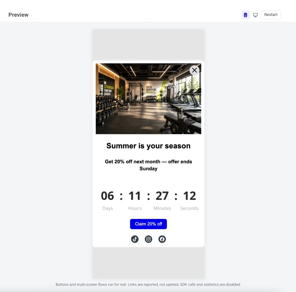
预览中可用的功能:
- 按钮和多屏流程会真实运行。
- 链接和深层链接会被报告,但不会打开。
- SDK 调用和打开/点击统计数据保持关闭。
- 语言与语言切换器中的设置匹配。Merge Tags (合并标签) 保持为占位符。
在预览标题栏中,切换手机和桌面、浅色和深色模式,以查看所有最终布局。点击 重启 以从头再次显示消息。要退出预览,请按 Esc 键或点击面板外部。
检查 会打开 智能检查 并扫描模板以查找常见问题。
智能检查会查找:
- 按钮、菜单项和图片链接没有 URL,或者 URL 不是 http(s)、
mailto:、tel:或深层链接(例如myapp://promo)地址 - 未完成的 AI 占位符块
- 空的图片或视频槽以及缺失的 alt 文本
- 产品卡片缺少或链接无效
- 文本对比度不符合 WCAG AA 标准
- 未翻译的内容
- 倒数计时器的结束日期已过
- 一个显示条件的规则损坏或为空、一个分支丢失了其链接的块,或者由于账户禁用了动态内容而导致条件不适用
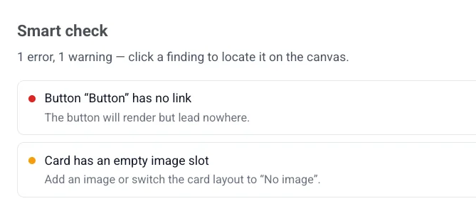
点击一个发现项可直接跳转到画布上受影响的元素。如果一切正常,面板会显示 所有检查已通过 — 内容看起来可以保存了。
品牌手册
Anchor link to- 品牌手册: 打开此应用的品牌手册。
- 应用品牌手册样式: 重新设置模板样式以匹配您的品牌手册(设置后)。
- 重置自定义样式: 移除模板上的样式覆盖并恢复为默认值。
下载 .zip
Anchor link to下载 .zip 将模板保存为 ZIP 文件。它会下载最后保存的版本,因此请先保存您的更改。该菜单项仅在模板至少保存过一次后才会出现 — 新的、未保存的模板不会显示它。
在画布上编辑消息:点击文本、图片和按钮进行更改。使用顶部栏中的手机/桌面切换来检查布局在不同宽度下的外观。该切换仅更改预览,不更改布局本身。
使用顶部栏中的 太阳/月亮图标 可以在画布渲染为浅色或深色时继续编辑。即使没有设置 深色模式变体,它也能工作 — 在您设置自己的颜色之前,深色会自动派生。这是一个实时编辑视图,而不是只读的 预览 面板。
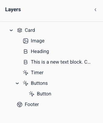
图层面板以树状结构列出模板中的每个块,顺序与画布上相同。从左边缘打开它以选择嵌套的块(例如,组内的按钮)或拖动行以重新排序内容。
右侧面板
Anchor link to在三个标签页之间切换:
添加内容块
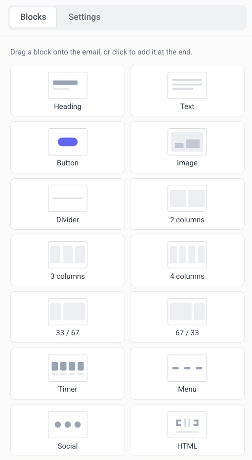
Anchor link to- 打开右侧面板中的 块 标签页。
- 将一个块拖到画布上,或点击一个块将其添加到模板的末尾。
- 继续添加块,直到布局完成。
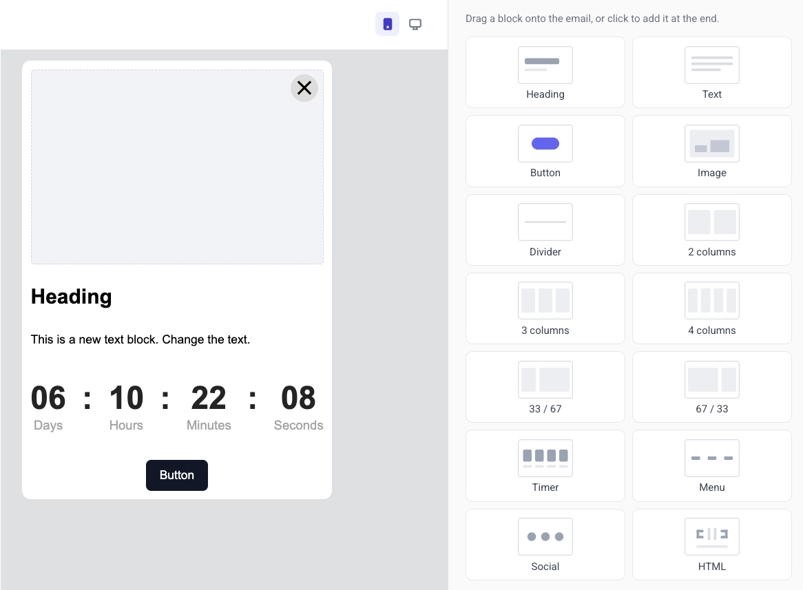
每种块类型在消息中都有不同的用途:
- 标题: 标题和短标题
- 文本: 正文和较长的描述
- 按钮: 可点击的行动号召
- 图片: 来自媒体库、上传或 URL 的图片
- 视频: 可点击的视频缩略图,可打开 YouTube 或 Vimeo 视频
- 卡片: 在一个布局中包含图片、标题、文本和按钮
- 分隔线: 分隔区域的线条
- 列: 并排布局(2、3 或 4 个等宽列,或 33/67 和 67/33 的分割)
- 计时器: 用于优惠和截止日期的倒计时
- 菜单: 一行或一列导航或联系链接
- 社交: 链接到您的社交媒体资料的图标
- HTML: 自定义 HTML,例如表单、调查或嵌入式视频
- 产品: 来自您的产品目录或用户废弃购物车的产品卡片网格
有关每个块的设置,以及如何保存和重用块,请参阅应用内编辑器块参考。
向特定用户显示块
Anchor link to并非每个用户都需要看到相同的块。在块上设置显示条件,使其根据用户的 Tags (标签) 显示或隐藏。您仍然发送一个模板,但每个人只看到适用于他们的部分。
在画布上选择该块,打开右侧面板中的显示条件,然后打开有条件地显示此块。了解更多
本地化模板
Anchor link to多语言模板在一个应用内设计中为每种语言存储本地化文案。有关多语言消息在各渠道中的工作方式,请参阅多语言消息。
要设置多语言内容:
- 点击顶部栏中的语言切换器以打开语言列表。
- 选择您要添加的语言,然后点击应用。
- 使用语言切换器在不同语言之间移动,并为所选语言编辑每个块的内容。
- 点击自动翻译以自动填充缺失的翻译 — 在保存前请检查 AI 生成的文本。
配置模板设置
Anchor link to使用两个地方来设置消息的样式和位置:
- 设置 标签页(右侧面板):文档大小、颜色、排版和块的默认样式。
- 应用内设置(顶部栏):屏幕上的位置、动画和关闭按钮。
保存模板
Anchor link to点击顶部栏中的保存以保存您的更改。使用顶部栏中的撤销/重做来在您的编辑中后退和前进。
从您自己的系统更新翻译
Anchor link to您的开发团队可以通过 Pushwoosh API 或连接到 ManyMoney AI MCP 服务器 的 AI 客户端来更新已保存模板的翻译,而无需重新发送模板的 HTML 或设计。
这仅适用于已保存过一次的模板(请参阅上面的保存模板)。没有已保存内容的模板无法合并翻译。
更新仅合并在 localization 字段中发送的语言和文本键。所有其他语言、键和视觉设计保持不变。
- 发送一个没有值的键会从其语言中删除该键。
- 发送一个没有值的语言会从模板中删除整个语言。
- 默认语言可以切换到更新后模板中剩下的任何语言。
- 如果更新会删除模板中的所有语言,或者请求的默认语言不是合并后剩下的语言之一,则更新将被拒绝。
为此,您需要开发团队的协助。