Apple Wallet pass builder
此内容尚未提供您的语言版本。
The Apple Wallet pass builder is a visual designer in the Control Panel. You pick a pass style, fill in branding, fields, and a barcode, watch a live preview, and generate the pass, so you don’t need to write pass.json by hand.
Create a pass
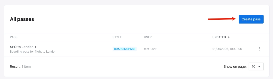
Anchor link toIn the Control Panel, go to Campaigns → Wallet Passes, open the All passes tab, select Apple Wallet, and click Create pass.
Configure the pass
Anchor link to-
From scratch: start with an empty pass. Choose a pass style, then set colors, images, fields, barcode, and other options yourself in the sections below.
-
From a template: click Load template, pick a built-in pass in Select Template (boarding pass, coupon, event ticket, generic, or store card). The template applies as soon as you click it. The form prefills pass style, colors, pass fields, barcode, and basic information, and sets Relevant Date to the current time. Templates don’t include images, so upload Icon and Logo before you generate the pass. Edit any value or change the style as needed. Pushwoosh replaces the template’s team and Pass Type IDs with your application’s values.
Choose a pass style
Anchor link toUnder PASS STYLE, pick one of the five Apple Wallet pass styles. The style controls the layout and which field areas and images are available:
- Boarding Pass
- Coupon
- Event Ticket
- Store Card
- Generic
Pick the style before you add fields and images, because switching the style clears all pass fields.
Add pass name and description
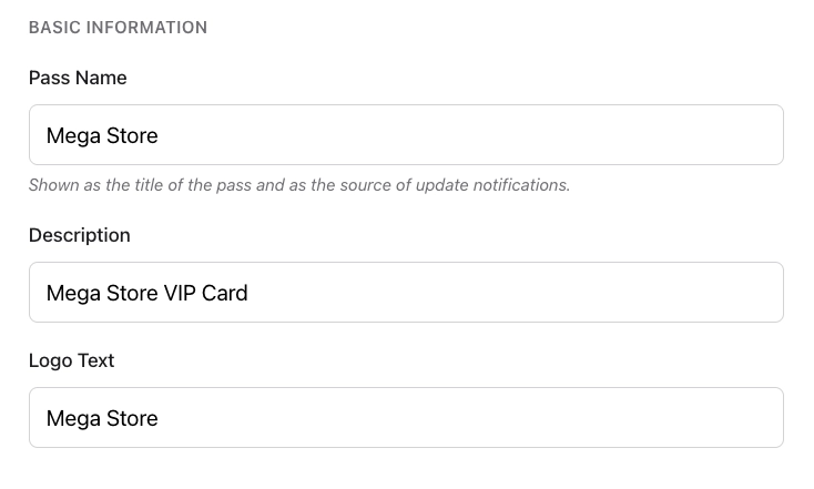
Anchor link toUnder BASIC INFORMATION, fill in:
| Pass Name | The pass title, and the source name shown on update notifications. |
| Description | A short description of the pass. |
| Logo Text | Text shown next to the logo. |
Set colors and images
Anchor link toColors
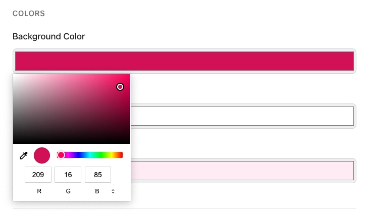
Anchor link toUnder COLORS, set:
- Background Color: the pass background.
- Foreground Color: main text and icons on the pass.
- Label Color: color of field labels (for example,
FROM,GATE).
To set or change a color, click its field and pick a color in the picker.
Images
Anchor link toUnder IMAGES, upload Icon and Logo (both required). Optional images depend on the pass style:
| Image | Size | Available for |
|---|---|---|
| Icon | 29×29 | All styles (required) |
| Logo | 160×50 | All styles (required) |
| Strip | 375×144 | Coupon, Event Ticket, Store Card |
| Background | 180×220 | Event Ticket |
| Thumbnail | 90×90 | Event Ticket, Generic |
| Footer | 286×15 | Boarding Pass |
Click Choose File next to each image slot and upload a PNG or JPEG file. Pushwoosh crops each image to the slot size from the center and prepares the resolutions Apple requires (@1x, @2x, @3x).
Fill in pass fields
Anchor link toUnder PASS FIELDS, add the text and values that appear on the pass. Every style has the same field groups, with these limits:
- Header Fields (Top of pass): up to 3
- Primary Fields (Main content): 1. On a Boarding Pass, the group is called Primary Fields (Origin/Destination) and holds 2
- Secondary Fields (Supporting info): up to 4
- Auxiliary Fields (Extra details): up to 4, or 5 on a Boarding Pass
- Back Fields (Flip side of pass)
Click + Add Field in each group you need.
For each field, set:
| Key (ID) | Unique field identifier (generated automatically). |
| Label | Short label on the pass (for example, FROM). |
| Value | Value shown on the pass (for example, SFO). |
| Change message | Text in the update notification when this value changes. Shown only when the value changes. Use %@ for the new value (for example, Gate changed to %@). |
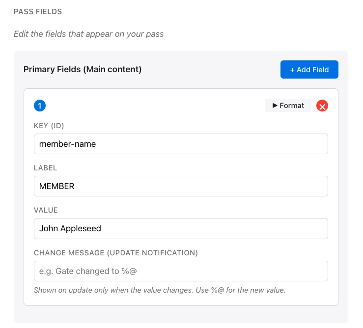
On the field card, click Format to show formatting options. Click X to remove the field.
Formatting options
Anchor link to- Value format: Text, Date / time, or Number/currency.
- Text alignment: Default (Natural), Left, Center, Right, or Natural.
- Data detectors (back fields only): turn phone numbers, links, addresses, and calendar events into tappable content on back fields.
Personalize pass content
Anchor link toTo show data unique to the recipient, such as a name or points balance, insert a tag placeholder into a text field. The { } button is available on:
- Pass Name, Description, and Logo Text
- A field’s Label, Value, and change message
- Barcode Message, Alt Text, and Grouping Identifier
To insert a placeholder:
- Click
{ }next to the text field. - Choose the tag.
- Choose a Format. For the options, see Personalize pass content in the Google Wallet builder, which uses the same dialog.
- Optionally, enter a Fallback (if empty) value.
The live preview shows the tag values of the user you enter in User ID. Without a User ID, it shows the placeholders.
Add a barcode
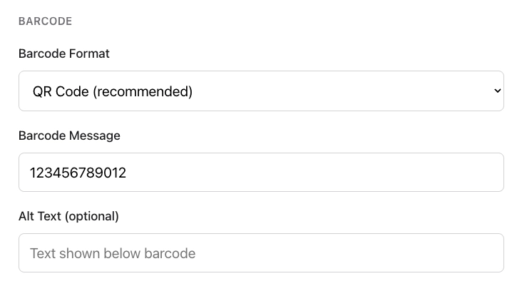
Anchor link toUnder BARCODE, choose a format and enter the data to encode:
- Barcode Format: choose how the barcode looks and what type of scanner can read it.
- QR Code (recommended): square code that most phones and scanners read easily. Best for coupons, loyalty cards, and most passes.
- PDF417: wide barcode made of several rows of lines. Often required for airline or transit boarding passes.
- Aztec: compact square code, similar to QR. Common on event and transit tickets.
- Code128: classic vertical-line barcode. Choose this only if your scanner or POS system requires a 1D barcode.
- Barcode Message: the value encoded in the barcode (for example, a ticket or membership number).
- Alt Text (optional): text shown below the barcode on the pass.
Set expiration and status
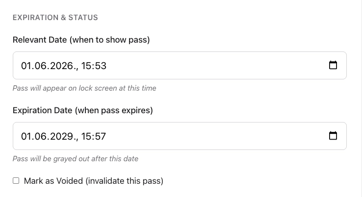
Anchor link toUnder EXPIRATION & STATUS, control when the pass is shown, when it expires, and whether it is still valid:
- Relevant Date (when to show pass): date and time when the pass may appear on the lock screen.
- Expiration Date (when pass expires): date and time after which the pass is grayed out in Wallet.
- Mark as Voided (invalidate this pass): checkbox to invalidate the pass so it is no longer usable.
Style-specific and advanced options
Anchor link to- Transit type (Boarding Pass only): Air, Train, Bus, Boat, or Generic.
- Grouping identifier: group related passes together in Wallet.
Location-based relevance (optional)
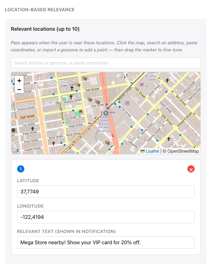
Anchor link toUnder LOCATION-BASED RELEVANCE, the pass appears when the user is near the locations you add. For each location, set the text shown on the lock screen when the user is nearby. You can add up to 10 locations.
Click the map, search an address, paste coordinates, or import a geozone to add a point. Drag the marker to fine-tune the position.
A max distance (in meters) controls how close the user must be for the pass to stay relevant.
Use case examples
- Retail: a loyalty card or coupon surfaces when the customer is close to your store. Lock screen text might say you are near the shop and remind them to use the pass.
- Events: an event ticket appears when the user is near the venue (stadium, theater, or festival grounds) so they can find the pass quickly at the door.
- Travel: a boarding pass becomes prominent near the departure airport or terminal, so the passenger sees gate or flight details on the lock screen before opening Wallet.
- Hospitality: a coupon or membership pass can show up near a café or hotel location you define.
iBeacon relevance (optional)
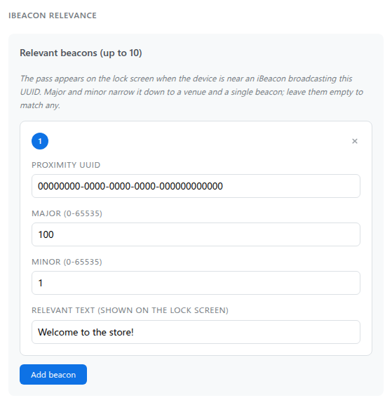
Anchor link toUnder IBEACON RELEVANCE, the pass appears when the device is near a physical iBeacon transmitter broadcasting a matching signal. This works indoors, where map-based location services are unreliable.
To add a beacon, click Add beacon (up to 10 in total). To remove one, click × on its card.
For each beacon, set:
- Proximity UUID: the beacon’s identifier (for example,
B9407F30-F5F8-466E-AFF9-25556B57FE6D). - Major and Minor (optional): narrow the match to a venue and a single beacon. Each is a number from 0 to 65535, and 0 behaves as empty. Leave both empty, or set both to 0, to match any beacon broadcasting that UUID.
- Relevant text: the text shown on the lock screen when the pass becomes relevant.
Enter a User ID
Anchor link toEnter the Pushwoosh User ID for the person who will receive this pass. Pushwoosh issues the pass to that user and lists it under USER on All passes.
Preview and validate
Anchor link toA live preview updates as you edit, so you can see roughly how the pass will look in Wallet.
To check the pass against Apple’s specifications without creating it, click Validate pass. The builder flags missing required images and other problems.
Generate the pass
Anchor link toSelect Generate. Pushwoosh validates the pass and processes the images. Generation takes a few seconds, after which the pass appears in All passes.
For editing (including update by serial number), downloading, and deleting passes after generation, see Manage existing passes. To send the pass to users, see Share Wallet passes.
To issue one design to many users and update shared fields on every issued pass at once, create a Wallet Pass Campaign instead. A campaign uses the same design sections as this builder.
Manage passes via API
Anchor link toEverything the pass builder does is also available through the PassKit Designer API: create, update, list, download, and delete passes.