跳到内容

Analyze control group impact

此内容尚未提供您的语言版本。

Each control group’s page shows how your messaging performs against that group. Open it from Settings > Control groups by clicking the group’s row.

Check the group’s mode and dates

Anchor link to

Below the group’s name, the page shows the Group size, the Mode, and a date that depends on the mode:

ModeDate below the nameLabel of the date-range selector
PermanentRunning since: the date the group startedNo label
Auto-refreshRange of the current cycleCurrent cycle
Experiment with an end dateRange of the current cycleCurrent experiment

To see the results of an earlier cycle, open the date-range selector and pick it under Previous. Ended cycles are listed there by number, as Cycle or Experiment. A Permanent group can have earlier cycles too, because resizing, rescoping, or changing the mode starts a new one.

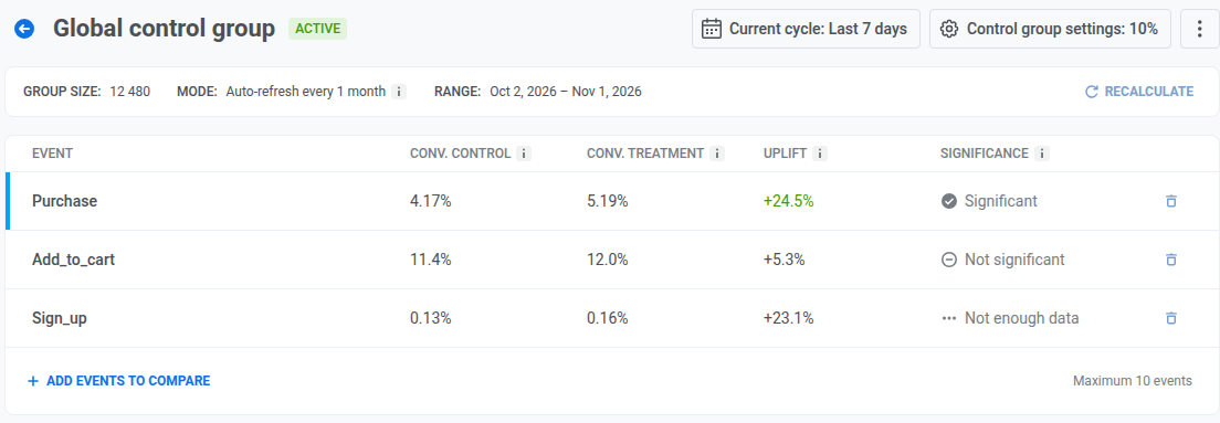
Control group page header showing Group size, Mode, and Running since, with a Recalculate link

What the page compares

Anchor link to

The page has two blocks: an events comparison table at the top and an Impact report below it. Both compare two groups of users on any event you choose:

  • Treatment group: all users who are not in the control group. They keep receiving your marketing messages (Push, Email, In-App, SMS, WhatsApp) as usual.
  • Control group: the holdout you configured above. These users are excluded from marketing messages, so any difference in their behavior isn’t influenced by your campaigns.

Both groups are drawn from your entire app user base. Pushwoosh doesn’t filter either group down to users with a valid push token, verified email, or other reachable channel.

Treatment and control come from the same set of users, with no separate filtering between them.

Compare events

Anchor link to
  1. Select a time window: Last 3 days, Last 7 days, or Last 30 days. To compare an earlier cycle, pick it under Previous.

    The measurement window restarts, and earlier data is no longer included, when:

    Data from before that point no longer matches the current members or audience. Ended cycles are listed under Previous in the date-range selector.

  2. Review the events comparison table. It only shows events automatically if you’ve set Conversion Goals in Customer Journey. Otherwise, the table starts empty.

  3. Click Add events to compare to add any event you want to measure. You can add up to 10 events in total.

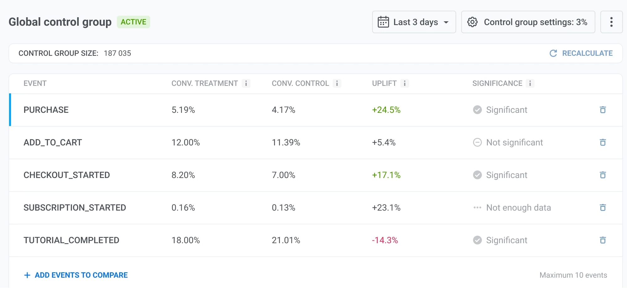
Events comparison table for the current cycle, with Conv. Control, Conv. Treatment, Uplift, and Significance for three events

The table shows these metrics for each event:

MetricWhat it shows
Conv. ControlThe share of unique users held out from marketing messages who triggered the event at least once anyway, without any messaging influence.
Conv. TreatmentThe share of unique users who received your marketing messages (Push, Email, In-App, SMS, WhatsApp) and triggered the event at least once.
UpliftThe percentage difference between the treatment and control conversion rates, relative to the control rate. A positive value means the treatment group converted better. Calculated as (conv. treatment − conv. control) / conv. control × 100%.
SignificanceWhether the difference is statistically reliable. See the statuses in the next table.
Significance statusWhat it means
SignificantThe uplift is unlikely to be due to chance.
Not significantThe difference isn’t statistically reliable yet.
Not enough dataEither group has fewer than 10 conversions or fewer than 10 non-conversions for this event, so significance can’t be calculated.

View the Impact report

Anchor link to

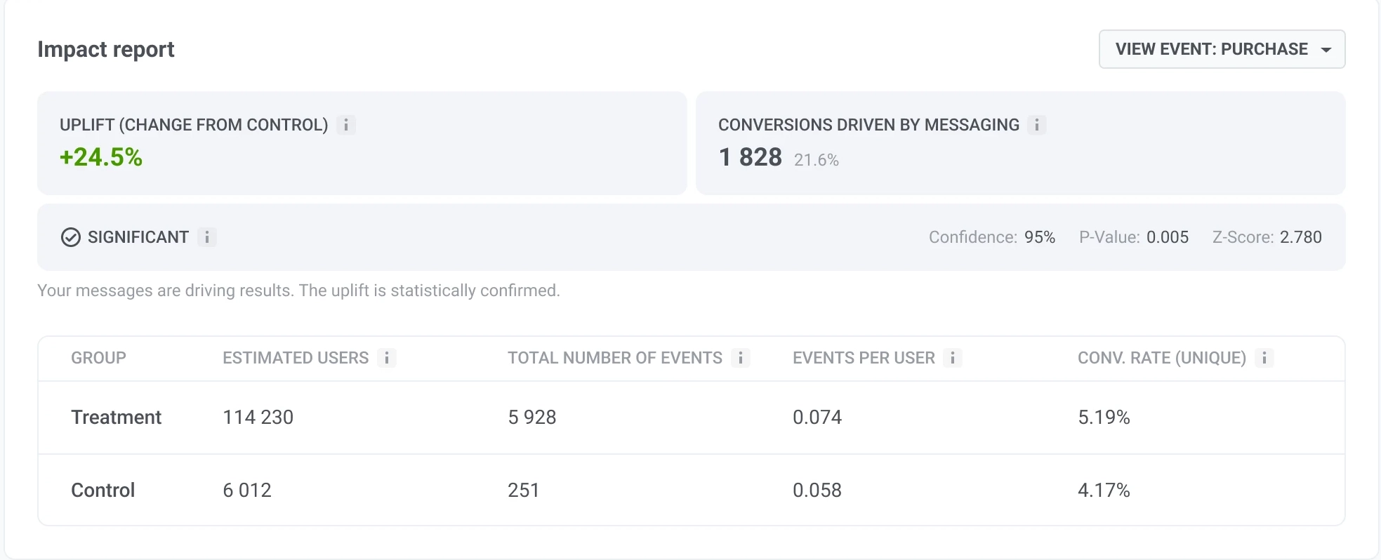
Use the View event dropdown to select an event from the table. The Impact report below shows a deeper breakdown for that event.

Impact report showing uplift, conversions driven by messaging, and a group breakdown table

MetricWhat it shows
Uplift (change from control)How much the treatment conversion rate differs from the control conversion rate. The same value as in the events table.
Conversions driven by messagingThe estimated number of extra events your messages generated beyond what’s expected without messaging. The percentage shows them as a share of all treatment events. Calculated as (events per user in treatment − events per user in control) × treatment group size.
SignificanceWhether the difference is statistically reliable: Significant, Not significant, or Not enough data. Based on Confidence and P-value.
ConfidenceHow sure Pushwoosh is that the uplift reflects a real difference rather than chance, as a percentage. The higher it is, the stronger the evidence.
P-valueHow likely this difference would appear by chance if messaging had no real effect. The lower it is, the stronger the evidence.
Z-scoreHow far apart the two groups performed. Close to 0, the difference could be random. The further from 0, the more confident you can be that one group is better.
Group breakdownTreatment and Control side by side: Estimated users, Total number of events, Events per user, and Conv. rate (unique).

How to read the results

Anchor link to
  • Significant, positive Uplift: your messaging is driving this event. Keep sending it.
  • Significant, negative Uplift: the control group converts better than the treatment group on this event. Before concluding messaging is working against you, check whether this event is one messaging is actually meant to drive.
  • Not significant: the difference isn’t reliable yet, not that there’s no effect. Let the event accumulate more conversions before judging it.
  • Not enough data: either group has fewer than 10 conversions or fewer than 10 non-conversions for this event. Compare an event with more volume, or wait for more of it to happen.

Two more things to keep in mind:

  • Compare within one measurement window. Reshuffling, resizing, rescoping, changing the mode, an Auto-refresh rollover, or an Experiment end restarts the window. Results from before and after one of these aren’t comparable.
  • Pick events your campaigns are meant to drive, such as a purchase or a sign-up, rather than events messaging has no direct path to.