বিল্ট-ইন এডিটরে ইন-অ্যাপ মেসেজ তৈরি করুন
Pushwoosh বিল্ট-ইন এডিটরে কোড না লিখেই একটি ইন-অ্যাপ মেসেজ টেমপ্লেট তৈরি করুন। আপনি কন্টেন্ট ব্লক, ছবি, বোতাম এবং ব্যক্তিগতকৃত টেক্সট সহ একটি পুনঃব্যবহারযোগ্য লেআউট পাবেন যা আপনি একটি Customer Journey-তে, এককালীন ইন-অ্যাপ হিসাবে, বা একটি পুশ থেকে দেখাতে পারেন।
একটি নতুন ইন-অ্যাপ টেমপ্লেট তৈরি করুন
Anchor link toএকটি ইন-অ্যাপ টেমপ্লেট হলো একটি পুনঃব্যবহারযোগ্য ডিজাইন যা আপনি একবার তৈরি করেন এবং তারপর ক্যাম্পেইনে ব্যবহারকারীদের দেখান। আপনি বিল্ট-ইন এডিটরে একটি তৈরি করতে পারেন, একটি কাস্টম HTML ZIP আপলোড করতে পারেন, অথবা একটি নেটিভ রিচ মিডিয়া টেমপ্লেট তৈরি করতে পারেন। এই নিবন্ধটি বিল্ট-ইন এডিটরে স্ক্র্যাচ থেকে একটি টেমপ্লেট তৈরি করার পদ্ধতি বর্ণনা করে। একটি বিদ্যমান টেমপ্লেট কাস্টমাইজ করতে একই ধাপ অনুসরণ করুন।
- Content → In-apps-এ যান।
- Create in-app-এ ক্লিক করুন। বিল্ট-ইন এডিটর সরাসরি খুলে যায়।
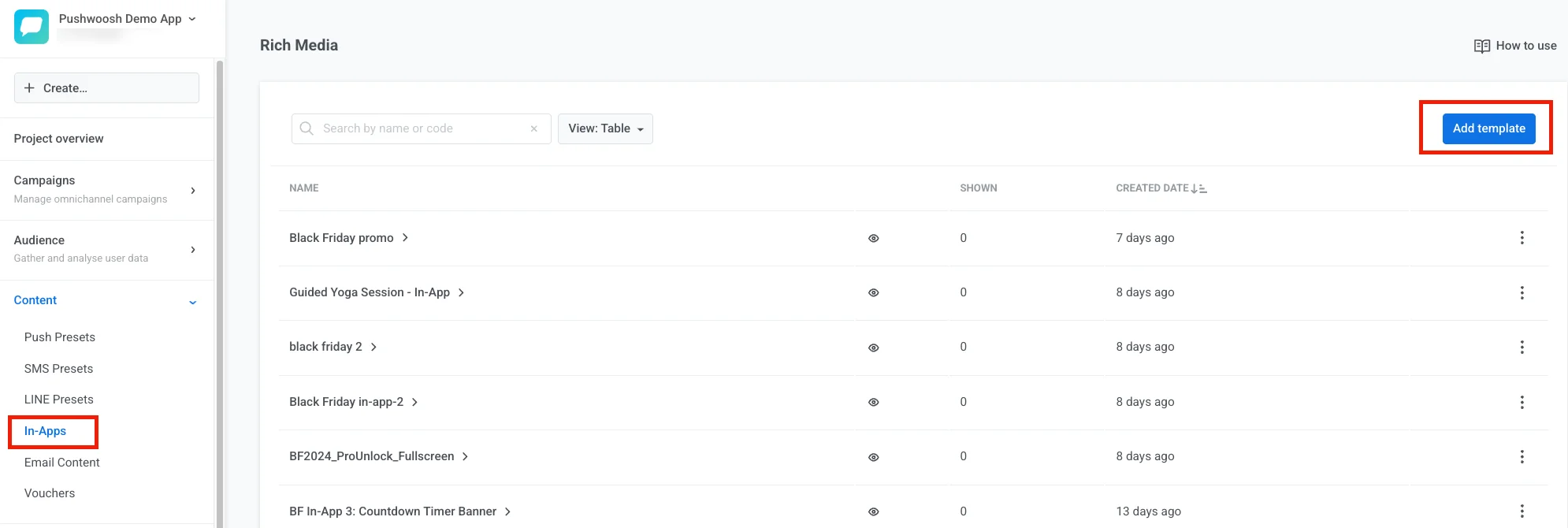
টেমপ্লেট অন্যভাবে তৈরি করতে Create in-app-এর পাশের তীরচিহ্নে ক্লিক করুন:
- Upload ZIP: আপনার HTML ইন-অ্যাপ মেসেজ সহ একটি ZIP ফাইল আপলোড করুন।
- Native in-app: রেডিমেড লেআউট ব্যবহার করে একটি SDK-রেন্ডার করা মেসেজ তৈরি করুন। আরও জানুন
এডিটর লেআউটটি অন্বেষণ করুন
Anchor link toবিল্ট-ইন এডিটরের চারটি এলাকা রয়েছে। প্রত্যেকটির একটি স্পষ্ট কাজ আছে।
টপ বার
Anchor link toটপ বার হলো যেখানে আপনি টেমপ্লেটটিকে সামগ্রিকভাবে পরিচালনা করেন: এর নাম, আনডু হিস্ট্রি, সেভ স্ট্যাটাস, ডিভাইসে এটি কেমন দেখায় (In-app settings), ভাষা (Auto-translate এবং ভাষা সুইচার), ফোন বা ডেস্কটপ প্রিভিউ প্রস্থ (ফোন 360, 390, 393, বা 430 px অফার করে, যা সাধারণ ডিভাইসের প্রস্থের সাথে মেলে), এবং একটি লাইট/ডার্ক ক্যানভাস টগল (sun/moon icon)। দেখুন ডিভাইসে ইন-অ্যাপ কেমন দেখাবে তা কনফিগার করুন এবং টেমপ্লেটটি স্থানীয়করণ করুন।

আরও অ্যাকশনের জন্য টপ বারে ⋮ মেনুটি খুলুন:
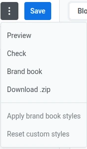
Preview
Anchor link toPreview আপনাকে মেসেজটি সেভ করার আগে চেষ্টা করতে দেয়: বোতাম ট্যাপ করুন, মাল্টি-স্ক্রিন ফ্লো দিয়ে যান এবং ফোন বা ডেস্কটপে লেআউট পরীক্ষা করুন।
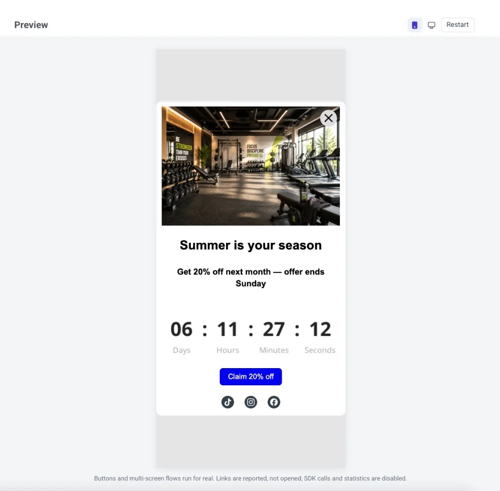
প্রিভিউতে যা কাজ করে:
- বোতাম এবং মাল্টি-স্ক্রিন ফ্লো বাস্তবে চলে।
- লিঙ্ক এবং ডিপ লিঙ্ক রিপোর্ট করা হয়, খোলা হয় না।
- SDK কল এবং ওপেন/ক্লিক পরিসংখ্যান বন্ধ থাকে।
- ভাষা সুইচারের সাথে ভাষা মেলে। Merge Tags প্লেসহোল্ডার হিসাবে থাকে।
প্রিভিউ হেডারে, ফোন এবং ডেস্কটপের মধ্যে এবং লাইট ও ডার্কের মধ্যে স্যুইচ করে সমস্ত লেআউট দেখুন। মেসেজটি আবার শুরু থেকে দেখানোর জন্য Restart ক্লিক করুন। প্রিভিউ থেকে বের হতে, Esc চাপুন বা প্যানেলের বাইরে ক্লিক করুন।
Check
Anchor link toCheck Smart check খোলে এবং সাধারণ সমস্যার জন্য টেমপ্লেটটি স্ক্যান করে।
Smart check যা যা খোঁজে:
- URL ছাড়া বোতাম, মেনু আইটেম এবং ইমেজ লিঙ্ক, অথবা এমন URL যা http(s),
mailto:,tel:, বা ডিপ লিঙ্ক (উদাহরণস্বরূপmyapp://promo) ঠিকানা নয় - অসম্পূর্ণ AI প্লেসহোল্ডার ব্লক
- খালি ছবি বা ভিডিও স্লট এবং অনুপস্থিত alt টেক্সট
- অনুপস্থিত বা অবৈধ লিঙ্ক সহ প্রোডাক্ট কার্ড
- টেক্সট কনট্রাস্ট যা WCAG AA পূরণ করে না
- অনূদিত কন্টেন্ট
- একটি কাউন্টডাউন টাইমার যার শেষ তারিখ ইতিমধ্যে পেরিয়ে গেছে
- একটি ডিসপ্লে কন্ডিশন যেখানে একটি ভাঙা বা খালি নিয়ম আছে, একটি শাখা যে ব্লকটির সাথে চেইন করা ছিল তা হারিয়েছে, অথবা একটি কন্ডিশন যা প্রয়োগ হবে না কারণ অ্যাকাউন্টের জন্য ডাইনামিক কন্টেন্ট নিষ্ক্রিয় করা আছে
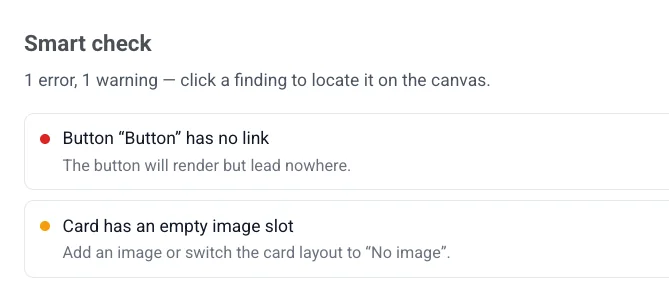
ক্যানভাসে প্রভাবিত এলিমেন্টে সরাসরি যেতে একটি ফাইন্ডিং-এ ক্লিক করুন। যদি কিছু ভুল না থাকে, প্যানেলটি দেখায় All checks passed — the content looks ready to save.
Brand book
Anchor link to- Brand book: এই অ্যাপ্লিকেশনের Brand book খুলুন।
- Apply brand book styles: আপনার Brand book-এর সাথে মেলানোর জন্য টেমপ্লেটটি পুনরায় স্টাইল করুন (একবার আপনি একটি সেট আপ করার পরে)।
- Reset custom styles: টেমপ্লেটের উপর স্টাইল ওভাররাইডগুলি সরিয়ে ডিফল্টে ফিরে যান।
Download .zip
Anchor link toDownload .zip টেমপ্লেটটিকে একটি ZIP ফাইল হিসাবে সংরক্ষণ করে। এটি সর্বশেষ সংরক্ষিত সংস্করণটি ডাউনলোড করে, তাই প্রথমে আপনার পরিবর্তনগুলি সংরক্ষণ করুন। মেনু আইটেমটি কেবল টেমপ্লেটটি অন্তত একবার সংরক্ষণ করার পরেই উপস্থিত হয় — নতুন, অসংরক্ষিত টেমপ্লেটগুলিতে এটি দেখায় না।
Canvas
Anchor link toক্যানভাসে মেসেজটি সম্পাদনা করুন: টেক্সট, ছবি এবং বোতামগুলিতে ক্লিক করে সেগুলি পরিবর্তন করুন। প্রতিটি প্রস্থে লেআউটটি কেমন দেখায় তা পরীক্ষা করতে টপ বারে ফোন/ডেস্কটপ টগল ব্যবহার করুন। টগলটি কেবল প্রিভিউ পরিবর্তন করে, লেআউটটি নিজে নয়।
ক্যানভাসটি লাইট বা ডার্ক মোডে রেন্ডার করার সময় সম্পাদনা চালিয়ে যেতে টপ বারে sun/moon icon ব্যবহার করুন। এটি একটি Dark mode variant সেট আপ না থাকলেও কাজ করে — আপনি নিজের রঙ সেট না করা পর্যন্ত ডার্ক রঙগুলি স্বয়ংক্রিয়ভাবে উদ্ভূত হয়। এটি একটি লাইভ এডিটিং ভিউ, শুধুমাত্র পঠনযোগ্য Preview প্যানেল নয়।
Layers
Anchor link toLayers প্যানেলটি আপনার টেমপ্লেটের প্রতিটি ব্লককে একটি ট্রি হিসাবে তালিকাভুক্ত করে, ক্যানভাসের মতো একই ক্রমে। একটি নেস্টেড ব্লক (উদাহরণস্বরূপ, একটি গ্রুপের ভিতরের একটি বোতাম) নির্বাচন করতে বা বিষয়বস্তু পুনরায় সাজাতে সারিগুলি টেনে আনতে বাম প্রান্ত থেকে এটি খুলুন।
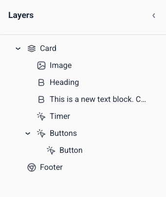
ডান প্যানেল
Anchor link toতিনটি ট্যাবের মধ্যে স্যুইচ করুন:
- Blocks: মেসেজে কন্টেন্ট যোগ করুন। দেখুন ইন-অ্যাপ এডিটর ব্লক রেফারেন্স।
- Settings: একবারে পুরো টেমপ্লেটে স্টাইলিং প্রয়োগ করুন। দেখুন ইন-অ্যাপ টেমপ্লেট সেটিংস কনফিগার করুন।
- AI: একটি প্রম্পট থেকে কন্টেন্ট তৈরি বা সম্পাদনা করতে AI সহকারীর সাথে চ্যাট করুন।
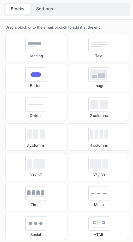
কন্টেন্ট ব্লক যোগ করুন
Anchor link to- ডান প্যানেলে Blocks ট্যাবটি খুলুন।
- ক্যানভাসে একটি ব্লক টেনে আনুন, অথবা টেমপ্লেটের শেষে এটি যোগ করতে একটি ব্লকে ক্লিক করুন।
- লেআউট প্রস্তুত না হওয়া পর্যন্ত ব্লক যোগ করতে থাকুন।
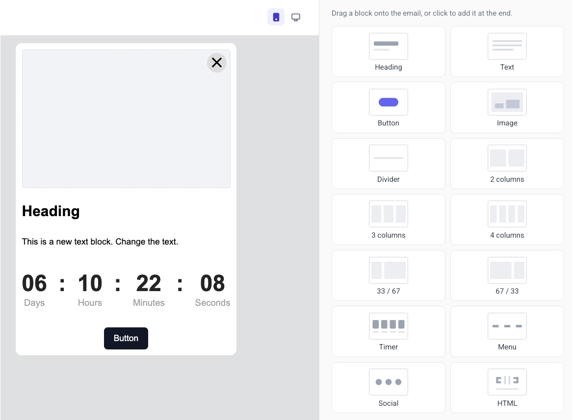
প্রতিটি ব্লকের প্রকার মেসেজে একটি ভিন্ন উদ্দেশ্য পূরণ করে:
- Heading: শিরোনাম এবং ছোট হেডলাইন
- Text: বডি কপি এবং দীর্ঘ বিবরণ
- Button: একটি ট্যাপযোগ্য কল টু অ্যাকশন
- Image: মিডিয়া স্টোরেজ, আপলোড, বা URL থেকে ছবি
- Video: একটি ট্যাপযোগ্য ভিডিও থাম্বনেইল যা একটি YouTube বা Vimeo ভিডিও খোলে
- Card: একটি লেআউটে শিরোনাম, টেক্সট এবং বোতাম সহ একটি ছবি
- Divider: একটি রেখা যা বিভাগগুলিকে আলাদা করে
- Columns: পাশাপাশি লেআউট (২, ৩, বা ৪টি সমান কলাম, অথবা ৩৩/৬৭ এবং ৬৭/৩৩ বিভাজন)
- Timer: অফার এবং সময়সীমার জন্য একটি কাউন্টডাউন
- Menu: নেভিগেশন বা যোগাযোগের লিঙ্কগুলির একটি সারি বা কলাম
- Social: আপনার সামাজিক প্রোফাইলগুলির সাথে লিঙ্ক করা আইকন
- HTML: কাস্টম HTML, যেমন একটি ফর্ম, সমীক্ষা, বা এমবেডেড ভিডিও
- Products: আপনার প্রোডাক্ট ক্যাটালগ বা একজন ব্যবহারকারীর পরিত্যক্ত কার্ট থেকে প্রোডাক্ট কার্ডের একটি গ্রিড
প্রতিটি ব্লকের সেটিংসের জন্য ইন-অ্যাপ এডিটর ব্লক রেফারেন্স এবং কীভাবে ব্লকগুলি সংরক্ষণ এবং পুনরায় ব্যবহার করবেন দেখুন।
নির্দিষ্ট ব্যবহারকারীদের ব্লক দেখান
Anchor link toপ্রত্যেক ব্যবহারকারীকে একই ব্লক দেখার প্রয়োজন নেই। একটি ব্লকে একটি display condition সেট করুন যাতে এটি ব্যবহারকারীর Tags-এর উপর ভিত্তি করে দেখায় বা লুকায়। আপনি এখনও একটি টেমপ্লেট পাঠান, কিন্তু প্রত্যেক ব্যক্তি কেবল সেই অংশগুলি দেখে যা তাদের জন্য প্রযোজ্য।
ক্যানভাসে ব্লকটি নির্বাচন করুন, ডান প্যানেলে Display condition খুলুন, এবং Show this block conditionally চালু করুন। আরও জানুন
টেমপ্লেটটি স্থানীয়করণ করুন
Anchor link toএকটি বহু-ভাষার টেমপ্লেট প্রতিটি ভাষার জন্য স্থানীয়কৃত কপি একটি ইন-অ্যাপ ডিজাইনে সংরক্ষণ করে। চ্যানেল জুড়ে বহু-ভাষার মেসেজিং কীভাবে কাজ করে তার জন্য, দেখুন বহু-ভাষার মেসেজিং।
বহু-ভাষার কন্টেন্ট সেট আপ করতে:
- ভাষা তালিকা খুলতে টপ বারে ভাষা সুইচারে ক্লিক করুন।
- আপনি যে ভাষাগুলি যোগ করতে চান তা নির্বাচন করুন, তারপর Apply ক্লিক করুন।
- ভাষাগুলির মধ্যে সরানোর জন্য ভাষা সুইচার ব্যবহার করুন এবং নির্বাচিত ভাষার জন্য প্রতিটি ব্লকের কন্টেন্ট সম্পাদনা করুন।
- অনুপস্থিত অনুবাদগুলি স্বয়ংক্রিয়ভাবে পূরণ করতে Auto-translate ক্লিক করুন — সংরক্ষণ করার আগে AI-জেনারেটেড টেক্সট পর্যালোচনা করুন।
টেমপ্লেট সেটিংস কনফিগার করুন
Anchor link toমেসেজটি স্টাইল এবং স্থাপন করার জন্য দুটি জায়গা ব্যবহার করুন:
- Settings ট্যাব (ডান প্যানেল): ডকুমেন্টের আকার, রঙ, টাইপোগ্রাফি, এবং ব্লকগুলির জন্য ডিফল্ট স্টাইল।
- In-app settings (টপ বার): স্ক্রিনে অবস্থান, অ্যানিমেশন, এবং ক্লোজ বোতাম।
টেমপ্লেটটি সংরক্ষণ করুন
Anchor link toআপনার পরিবর্তনগুলি সংরক্ষণ করতে টপ বারে Save ক্লিক করুন। আপনার সম্পাদনাগুলির মধ্যে পিছনে এবং সামনে যেতে টপ বারে Undo/Redo ব্যবহার করুন।
আপনার নিজের সিস্টেম থেকে অনুবাদ আপডেট করুন
Anchor link toআপনার ডেভেলপমেন্ট টিম Pushwoosh API বা ManyMoney AI MCP server-এর সাথে সংযুক্ত একটি AI ক্লায়েন্টের মাধ্যমে একটি সংরক্ষিত টেমপ্লেটের অনুবাদ আপডেট করতে পারে, টেমপ্লেটের HTML বা ডিজাইন পুনরায় না পাঠিয়ে।
এটি কেবল এমন একটি টেমপ্লেটে কাজ করে যা ইতিমধ্যে একবার সংরক্ষণ করা হয়েছে (উপরে টেমপ্লেট সংরক্ষণ করুন দেখুন)। কোনও সংরক্ষিত কন্টেন্ট ছাড়া একটি টেমপ্লেটে অনুবাদ মার্জ করার কিছু নেই।
আপডেটটি কেবল localization ফিল্ডে পাঠানো ভাষা এবং টেক্সট কীগুলি মার্জ করে। অন্য সব ভাষা, কী এবং ভিজ্যুয়াল ডিজাইন যেমন সংরক্ষিত ছিল তেমনই থাকে।
- কোনও মান ছাড়া একটি কী পাঠালে সেই কীটি তার ভাষা থেকে সরিয়ে দেওয়া হয়।
- কোনও মান ছাড়া একটি ভাষা পাঠালে পুরো ভাষাটি টেমপ্লেট থেকে সরিয়ে দেওয়া হয়।
- ডিফল্ট ভাষা আপডেটের পরে টেমপ্লেটে থাকা যে কোনও ভাষায় স্যুইচ করতে পারে।
- আপডেটটি প্রত্যাখ্যান করা হয় যদি এটি টেমপ্লেট থেকে প্রতিটি ভাষা সরিয়ে দেয়, অথবা যদি অনুরোধ করা ডিফল্ট ভাষাটি মার্জের পরে থাকা ভাষাগুলির মধ্যে একটি না হয়।
এর জন্য, আপনার ডেভেলপমেন্ট টিমের সহায়তা প্রয়োজন হবে।