ইন-অ্যাপ টেমপ্লেট সেটিংস কনফিগার করুন
এই সেটিংসগুলো একটি একক ব্লকের পরিবর্তে একবারে পুরো ইন-অ্যাপ টেমপ্লেটে প্রযোজ্য হয়। প্রথমে বিল্ট-ইন এডিটরে একটি টেমপ্লেট খুলুন বা তৈরি করুন (Content → In-apps), তারপর নিচে বর্ণিত হিসাবে Settings এবং In-app settings ব্যবহার করুন।
টেমপ্লেট-ব্যাপী স্টাইলিং কনফিগার করুন
Anchor link toটেমপ্লেট সেটিংস পুরো ইন-অ্যাপ টেমপ্লেটের জন্য স্টাইলিং নিয়ন্ত্রণ করে: ডকুমেন্ট সাইজ এবং ব্যাকগ্রাউন্ড, পপআপ লুক এবং ব্লকের জন্য ডিফল্ট স্টাইল।
ডান প্যানেলে Settings ট্যাবটি খুলুন।
শেয়ারড লুক দিয়ে শুরু করুন, তারপর সাইজ, তারপর নতুন ব্লকের জন্য ডিফল্ট:
- Color scheme এবং Typography সেট করুন যাতে টেমপ্লেট জুড়ে রঙ এবং ফন্ট সামঞ্জস্যপূর্ণ থাকে।
- সাইজ, মার্জিন, ব্যাকগ্রাউন্ড এবং মেসেজটি কীভাবে আবছা ব্যাকড্রপে বসে তার জন্য Document এবং Popup সেট করুন।
- ডিফল্ট সেকশনগুলো কেবল তখনই ব্যবহার করুন যখন আপনি চান নতুন ব্লকগুলো স্বয়ংক্রিয়ভাবে টেমপ্লেটের সাথে মিলে যাক।
ক্যানভাসে, যখন কোনো অংশ ভিন্ন দেখতে হওয়া উচিত তখন একটি একক ব্লক পরিবর্তন করুন। যেখানে একটি পৃথক ব্লক ডিফল্টকে ওভাররাইড করে না, সেখানে ডিফল্ট প্রযোজ্য হয়। টেমপ্লেটে স্টাইল ওভাররাইডগুলো পরিষ্কার করতে এবং ডিফল্টগুলোতে ফিরে যেতে, টপ বারের ⋮ মেনুতে Reset custom styles ব্যবহার করুন। দেখুন বিল্ট-ইন এডিটরে ইন-অ্যাপ মেসেজ তৈরি করুন।
ডকুমেন্ট এবং পপআপ সাইজ
Anchor link toমেসেজের সাইজ এবং ক্যানভাসের স্পেসিং নিয়ন্ত্রণ করতে Document ব্যবহার করুন। মেসেজটি কীভাবে আবছা ব্যাকড্রপে বসে তা নিয়ন্ত্রণ করতে Popup ব্যবহার করুন। এখানে কোনো উচ্চতা সেটিং নেই। পপআপ তার কন্টেন্টের সাথে বৃদ্ধি পায়।
ডকুমেন্ট
Anchor link toDocument-এ, প্যাডিং, একটি ব্যাকগ্রাউন্ড ইমেজ, ব্লকগুলোর মধ্যে গ্যাপ এবং ইমেজের জন্য একটি ডিফল্ট কর্নার রেডিয়াস সেট করুন।
ফোনে পপআপটি কতটা চওড়া দেখাবে তা পরিবর্তন করতে, Document-এর এই দুটি ফিল্ড ব্যবহার করুন।
Max width (px) হলো পিক্সেলের হিসাবে পপআপের সর্বোচ্চ অনুমোদিত প্রস্থ। একটি বড় স্ক্রিনে পপআপ এই সংখ্যার চেয়ে বেশি বাড়বে না।
Side gutters (px) ঠিক Padding-এর নিচে থাকে। এটি পপআপের বাম এবং ডান দিকে খালি জায়গা সেট করে। একটি মান উভয় দিকে প্রযোজ্য। যখন আপনি পপআপটি আরও চওড়া বা সরু দেখতে চান তখন এই ফিল্ডটি পরিবর্তন করুন:
- আরও খালি জায়গা ছাড়তে এবং পপআপকে সরু করতে সংখ্যাটি বাড়ান।
- পপআপকে চওড়া করতে সংখ্যাটি কমান।
- একটি ঋণাত্মক সংখ্যা লিখলে এডিটর এটিকে 0 হিসাবে বিবেচনা করে।
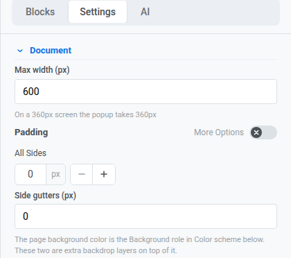
নতুন টেমপ্লেটগুলো 0 px গাটার দিয়ে শুরু হয়, তাই পপআপ স্ক্রিনের প্রস্থ পূরণ করে।
আপনার বর্তমান মানগুলোর সাথে পপআপটি কতটা চওড়া হবে তা দেখতে Max width-এর নিচের ইঙ্গিতটি দেখুন।
পপআপ
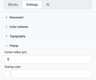
Anchor link toPopup-এ, মেসেজটি কীভাবে আবছা ব্যাকড্রপে বসে তার জন্য কর্নার রেডিয়াস এবং ওভারলে কালার সেট করুন।
কালার স্কিম এবং টাইপোগ্রাফি
Anchor link toColor scheme-এ, নামযুক্ত রঙের ভূমিকা (হেডিং, অ্যাকসেন্ট, লিঙ্ক, ব্যাকগ্রাউন্ড, বর্ডার এবং আরও অনেক কিছু) সেট করুন। এই ভূমিকাগুলো একবারে টেমপ্লেট জুড়ে রঙ আপডেট করে। বিদ্যমান ব্লকগুলো আপনার ইতিমধ্যে সেট করা রঙগুলো ধরে রাখে।
Typography-তে, টেমপ্লেটের টেক্সটের জন্য ডিফল্ট ফন্ট ফ্যামিলি এবং সাইজিং সেট করুন।
ডার্ক মোড ভ্যারিয়েন্ট
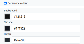
Anchor link toDark mode variant আপনাকে ডার্ক মোডে টেমপ্লেট দেখানোর জন্য রঙের একটি দ্বিতীয় সেট সেট করতে দেয়।
- Color scheme-এ, Dark mode variant চালু করুন।
- ডার্ক মোডের জন্য আলাদা রঙ সেট করুন।
- এডিট করার সময় লাইট বনাম ডার্ক চেক করতে টপ বারে sun/moon icon ব্যবহার করুন।
এই ক্যানভাস টগলটি শুধুমাত্র পঠনযোগ্য Preview প্যানেলের মতো নয়। যতক্ষণ না আপনি নিজের ডার্ক রঙ সেট করছেন, টগলটি স্বয়ংক্রিয়ভাবে সেগুলো ডিরাইভ করতে পারে। দেখুন বিল্ট-ইন এডিটরে ইন-অ্যাপ মেসেজ তৈরি করুন।
ব্লক এবং লেআউট ডিফল্ট
Anchor link toএই সেকশনগুলো ব্যবহার করুন যাতে নতুন কন্টেন্ট টেমপ্লেটের সাথে মিলে যায় যতক্ষণ না আপনি ক্যানভাসে একটি ব্লক স্টাইল করছেন:
- Block defaults: পরে যোগ করা ব্লকগুলোর জন্য শেয়ারড স্টার্টিং স্টাইল।
- Columns defaults: প্রতিটি কলাম লেআউটের জন্য স্পেসিং (বাইরের প্যাডিং, প্রতিটি কলামের ভিতরের প্যাডিং, এবং কলামগুলোর মধ্যে গ্যাপ)।
- Card defaults: লেআউটে কন্টেন্ট গ্রুপ করা কার্ড কন্টেইনারগুলোর জন্য স্টার্টিং লুক।
- Button group defaults: যখন বেশ কয়েকটি বাটন একটি গ্রুপ হিসাবে একসাথে বসে তখন স্পেসিং এবং অ্যালাইনমেন্ট।
- Button defaults: নতুন বাটন ব্লকগুলোর জন্য স্টার্টিং লুক যাতে CTA গুলো টেমপ্লেট জুড়ে সামঞ্জস্যপূর্ণ থাকে।
- Divider defaults: নতুন ডিভাইডার ব্লকগুলোর জন্য স্টার্টিং লাইন স্টাইল, রঙ, পুরুত্ব এবং প্রস্থ।
যখন আপনি Settings-এ কাজ শেষ করবেন, টেমপ্লেটের পরিবর্তনগুলো রাখতে টপ বারে Save-এ ক্লিক করুন।
ডিভাইসে ইন-অ্যাপ কেমন দেখাবে তা কনফিগার করুন
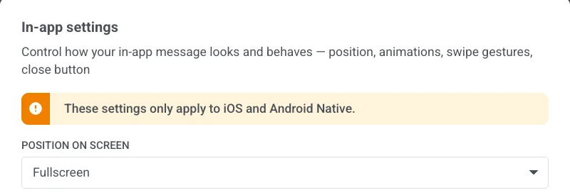
Anchor link toIn-app settings নিয়ন্ত্রণ করে মেসেজটি ডিভাইসে কীভাবে প্রদর্শিত হবে এবং আচরণ করবে: পজিশন, অ্যানিমেশন, সোয়াইপ জেসচার এবং ক্লোজ বাটন। পজিশন, অ্যানিমেশন এবং সোয়াইপ iOS এবং Android Native-এ প্রযোজ্য। ক্লোজ বাটনের স্টাইল ভিন্ন। এটি এই টেমপ্লেটের সাথে সংরক্ষিত থাকে এবং মেসেজটি প্রদর্শনকারী প্রতিটি প্ল্যাটফর্মে দেখায়।
টপ বারে In-app settings-এ ক্লিক করুন।
স্ক্রিনে পজিশন
Anchor link toFullscreen, Top, Center, বা Bottom বেছে নিন।
একটি ফুল-স্ক্রিন মেসেজের জন্য, ডকুমেন্ট-এর অধীনে বর্ণিত হিসাবে Document-এ Max width সেট করুন।
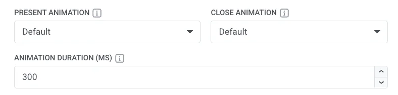
অ্যানিমেশন
Anchor link to- Present Animation / Close Animation: None, Fade, Left, Right, Up, বা Down। আপনার অ্যাপ ইন-অ্যাপের জন্য ইতিমধ্যে যে ওপেন/ক্লোজ মোশন ব্যবহার করে তা ব্যবহার করতে Default বেছে নিন।
- Animation Duration (MS): 100 থেকে 3000 মিলিসেকেন্ড। আপনার অ্যাপের স্বাভাবিক টাইমিং রাখতে খালি রাখুন।
বন্ধ করতে সোয়াইপ করুন
Anchor link toLeft, Right, Up, এবং Down-এর যেকোনো সংমিশ্রণ সক্রিয় করুন।

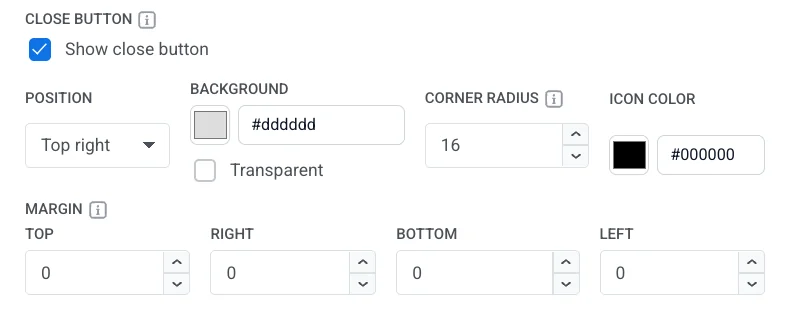
ক্লোজ বাটন
Anchor link toShow close button চালু বা বন্ধ করুন।
যখন এটি চালু থাকে, সেট করুন:
- Position: Top right, Top left, Bottom right, বা Bottom left।
- Background: একটি রঙ বা Transparent।
- Corner radius: ক্লোজ বাটন ব্যাকগ্রাউন্ডের কোণগুলোকে গোলাকার করে। শুধুমাত্র যখন Background একটি রঙ ( Transparent নয়) হয় তখন উপলব্ধ। 0–16 px সেট করুন। 16 px একটি বৃত্ত তৈরি করে (ডিফল্ট)। 0 px একটি বর্গক্ষেত্র তৈরি করে।
- Icon Color: ক্লোজ আইকনের রঙ।
- Margin: ক্লোজ বাটনের চারপাশে প্রতিটি দিকে স্পেস (Top, Right, Bottom, Left)।
পজিশন, অ্যানিমেশন এবং সোয়াইপের মতো নয়, ক্লোজ বাটনের স্টাইলটি এই টেমপ্লেটের সাথে সংরক্ষিত থাকে এবং মেসেজটি প্রদর্শনকারী প্রতিটি প্ল্যাটফর্মে দেখায়, শুধুমাত্র iOS এবং Android Native-এ নয়।
- আপনার In-app settings পছন্দগুলো সেভ করতে Apply-তে ক্লিক করুন, অথবা সেগুলো বাতিল করতে Cancel-এ ক্লিক করুন।
- সেভ করার আগে পজিশন, অ্যানিমেশন এবং ক্লোজ বাটন চেক করতে টপ বারের ⋮ মেনু থেকে Preview খুলুন।
- টেমপ্লেটটি সংরক্ষণ করতে টপ বারে Save-এ ক্লিক করুন।