인앱 에디터 블록 참조
내장 에디터 캔버스에 추가할 수 있는 모든 블록에 대한 참조입니다.
각 블록 유형은 메시지에서 다른 목적을 수행합니다:
- 제목: 제목 및 짧은 헤드라인
- 텍스트: 본문 및 긴 설명
- 버튼: 탭 가능한 클릭 유도 문구
- 이미지: 미디어 스토리지의 사진, 업로드 또는 URL
- 비디오: YouTube 또는 Vimeo 비디오를 여는 탭 가능한 비디오 썸네일
- 카드: 이미지, 제목, 텍스트, 버튼이 하나의 레이아웃에 포함된 형태
- 구분선: 섹션을 구분하는 선
- 열: 나란히 배치된 레이아웃 (2, 3 또는 4개의 동일한 열, 또는 33/67 및 67/33 분할)
- 타이머: 제안 및 마감일을 위한 카운트다운
- 바코드: 바우처와 같은 개인화 값에서 생성된 스캔 가능한 Code 128, EAN-13, EAN-8, UPC-A 또는 QR 코드
- 메뉴: 탐색 또는 연락처 링크의 행 또는 열
- 소셜: 소셜 프로필에 연결되는 아이콘
- HTML: 양식, 설문조사 또는 내장 비디오와 같은 사용자 지정 HTML
- 제품: 제품 카탈로그 또는 사용자의 버려진 장바구니에 있는 제품 카드의 그리드
에디터 블록 구성 방법
Anchor link to블록 탭에서 캔버스로 블록을 드래그하거나 클릭하여 끝에 추가합니다. 블록을 선택하여 오른쪽 패널에서 설정을 열고 콘텐츠, 링크, 크기 및 간격을 구성합니다.
제목 및 텍스트
Anchor link to제목 및 텍스트 블록은 사용자가 인앱 메시지에서 읽는 문구를 담습니다. 캔버스에서 텍스트를 편집하고 도구 모음으로 서식을 지정합니다.
제목 또는 텍스트 블록을 클릭하여 캔버스에서 문구를 편집합니다. 텍스트를 선택하면 굵게, 기울임꼴, 밑줄, 정렬, 링크 버튼 및 텍스트 스타일 드롭다운이 포함된 서식 도구 모음이 나타납니다.
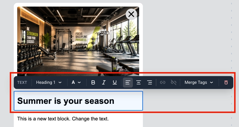
병합 태그는 사용자 프로필의 태그 값을 메시지에 삽입하는 자리 표시자이므로 각 구독자는 개인화된 문구를 보게 됩니다. 추가하려면 텍스트를 선택하고 도구 모음에서 병합 태그를 클릭한 다음 계정에서 태그를 선택합니다. 개인화된 인앱 메시지에 대해 자세히 알아보기
이미지 블록은 인앱 템플릿에 사진을 표시합니다.
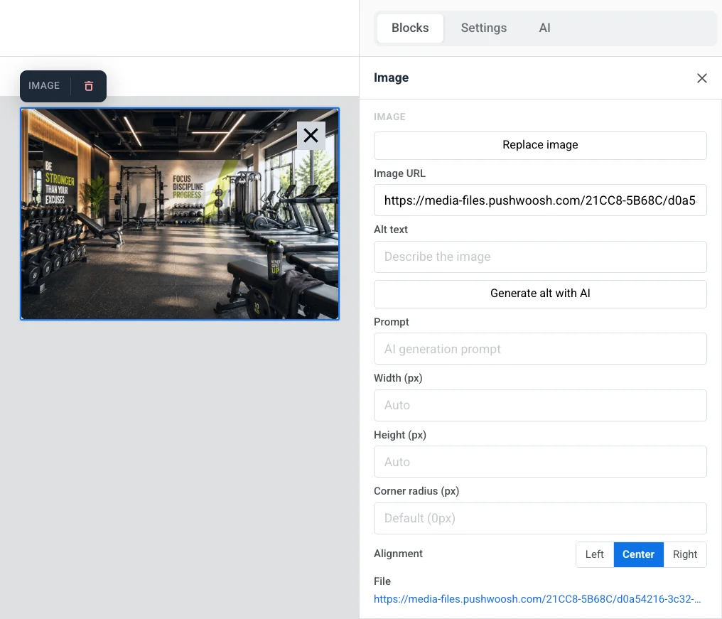
캔버스에서 선택하여 오른쪽 패널에서 이미지 설정을 엽니다.
- 이미지 추가 / 이미지 교체: 블록이 비어 있을 때 이미지 추가를 클릭하거나, 사진이 이미 설정되어 있을 때 이미지 교체를 클릭합니다. 파일을 업로드하거나 미디어 스토리지에서 선택할 수 있습니다.
- 이미지 URL: 이미지의 호스팅된 링크를 붙여넣습니다.
- 대체 텍스트: 접근성을 위해 이미지를 설명합니다.
- 프롬프트: AI로 생성을 사용하여 만든 이미지에 대한 AI 생성 프롬프트입니다.
- 너비 (px) / 높이 (px): 이미지를 픽셀 크기로 고정합니다. 필드를 비워두면 자동으로 크기가 조정됩니다. 이 필드 아래에는 이미지가 렌더링되는 크기와 업로드할 크기에 대한 힌트가 표시됩니다: 렌더링된 크기의 2배이므로 휴대폰 화면에서도 사진이 선명하게 유지됩니다. 업로드된 파일이 어느 축에서든 렌더링된 크기보다 작으면, 업스케일링되어 픽셀화되어 보일 것이라는 경고가 표시됩니다.
- 모서리 반경 (px): 이미지의 모서리를 둥글게 만듭니다.
- 정렬: 왼쪽, 가운데 또는 오른쪽.
링크에서 작업 유형(예: 웹사이트 열기 또는 URL 또는 딥링크)과 해당 URL을 설정하여 이미지를 탭했을 때 무언가를 열도록 하고, 링크 대상을 설정하여 동일한 탭이나 새 탭에서 열도록 합니다.
간격에서 패딩을 켜서 이미지 주위에 공간을 추가합니다. 모든 면에 동일한 패딩을 적용하려면 모든 면을 사용하거나, 각 면을 개별적으로 설정하려면 추가 옵션을 켭니다.
권장 이미지 크기
Anchor link to너비 (px) / 높이 (px) 아래의 힌트가 해당 블록에 대해 표시하는 크기의 2배로 이미지를 업로드하십시오. 이는 자신의 너비/높이 및 자르기 설정을 반영하므로 확인해야 할 숫자입니다. 아직 블록을 설정하지 않은 경우, 다음의 일반적인 슬롯 너비를 시작점으로 사용하십시오:
| 이미지가 위치하는 곳 | 렌더링 크기 | 최소 업로드 크기 |
|---|---|---|
| 기본 팝업의 전체 너비 이미지 | 최대 600 px 너비 | 1200 px 너비 |
| 휴대폰 미리보기 | 기기에 따라 360–430 px 너비 | 최대 860 px 너비 |
| 태블릿/데스크톱 미리보기 | 768 px 너비 | 1536 px 너비 |
가로 세로 비율은 자유롭게 선택할 수 있습니다. 레이아웃은 반응형이므로 높이는 설정한 높이 (px) 또는 자르기를 따릅니다. 기본 팝업 너비를 변경하려면 문서 및 팝업 크기를 참조하십시오.
비디오 블록은 YouTube 또는 Vimeo 비디오를 탭 가능한 썸네일로 메시지에 추가합니다. 메시지는 ▶ 오버레이가 있는 정지 이미지를 표시합니다. 이를 탭하면 YouTube 또는 Vimeo 앱이나 브라우저에서 비디오가 열립니다.
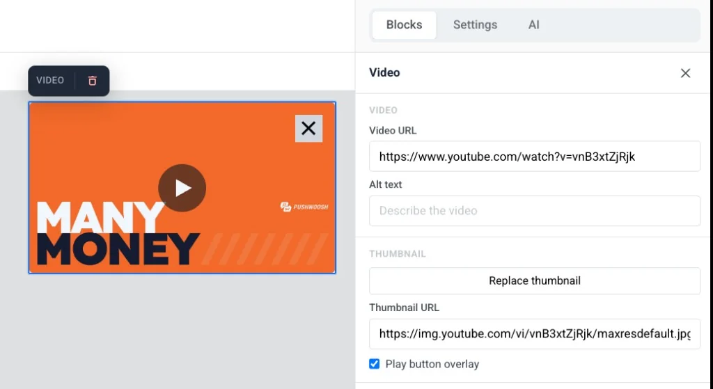
캔버스에서 블록을 선택하여 설정을 엽니다:
- 비디오 URL: YouTube 또는 Vimeo 링크를 붙여넣습니다. 에디터가 자동으로 썸네일을 가져옵니다.
- 대체 텍스트: 접근성을 위해 비디오를 설명합니다.
- 썸네일 URL: 자동으로 가져온 썸네일을 유지하거나, 썸네일 추가 / 썸네일 교체를 클릭하여 미디어 스토리지에서 선택하거나, 호스팅된 링크를 직접 붙여넣습니다.
- 재생 버튼 오버레이: 기본적으로 켜져 있습니다. ▶ 오버레이 없이 일반 썸네일을 표시하려면 끕니다.
- 너비 (px), 모서리 반경 (px) 및 정렬: 썸네일의 모양과 레이아웃 내 위치를 제어합니다.
카드 블록은 이미지와 제목, 텍스트, 버튼을 하나의 기성 레이아웃으로 결합하여 네 개의 개별 블록을 수동으로 배치하고 정렬할 필요가 없습니다.
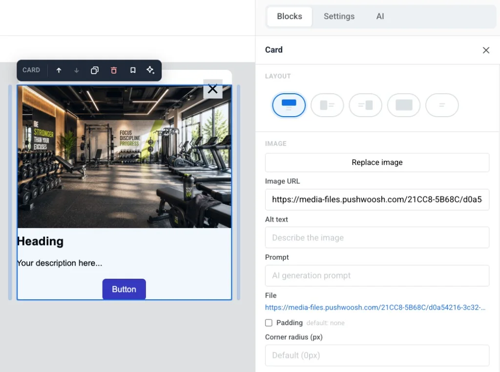
- 레이아웃: 콘텐츠에 대해 이미지가 어느 쪽에 위치할지 선택하거나, 이미지 주위로 텍스트 줄 바꿈을 켭니다.
- 이미지: 이미지를 추가하거나 교체하고, 대체 텍스트를 설정하고, AI 생성 프롬프트를 편집하고, 패딩을 추가하고, **모서리 반경 (px)**을 설정합니다.
- 크기 및 맞춤: 이미지의 너비, 높이, 자르기(원본 또는 고정 비율) 및 맞춤(커버 또는 초점)을 설정합니다. 정확한 필드는 선택한 레이아웃에 따라 다릅니다.
- 링크: 전체 카드를 탭했을 때 URL을 열도록 합니다.
독립형 제목, 텍스트 및 버튼 블록을 편집하는 것과 동일한 방식으로 카드의 제목, 텍스트 및 버튼을 편집합니다.
버튼은 인앱 메시지에서 탭할 수 있는 클릭 유도 문구입니다. URL을 열거나, 사용자 지정 JavaScript를 실행하거나, 메시지를 닫는 데 사용합니다.
버튼 블록을 클릭하여 캔버스에서 레이블을 편집합니다. 도구 모음을 사용하여 글꼴 크기, 텍스트 색상, 굵게, 기울임꼴, 밑줄 및 정렬을 변경합니다.
사용자가 버튼을 탭했을 때 발생하는 작업을 설정하려면:
- 도구 모음에서 링크 아이콘을 클릭하여 링크 삽입/편집을 엽니다.
- 작업 유형을 선택합니다: 웹사이트 열기, URL 또는 딥링크 또는 사용자 지정 JavaScript.
- 해당 작업에 대한 필드를 채웁니다(아래 참조).
- 저장을 클릭합니다.
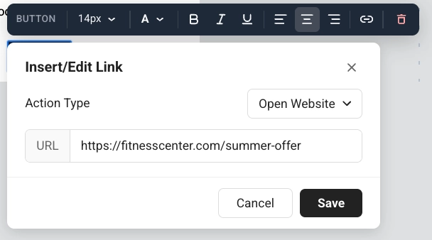
웹사이트 열기
Anchor link to웹사이트 열기는 사용자가 버튼을 탭했을 때 웹 페이지를 엽니다. URL에 주소를 입력합니다(예: https://example.com).
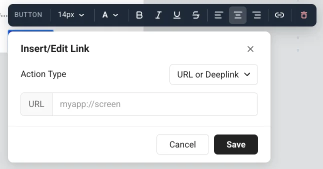
URL 또는 딥링크
Anchor link toURL 또는 딥링크는 사용자가 버튼을 탭했을 때 링크 또는 딥링크를 엽니다. URL에 주소를 입력합니다(예: 앱 화면: myapp://screen).
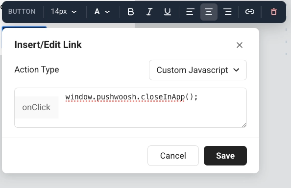
사용자 지정 JavaScript 실행
Anchor link to사용자 지정 JavaScript는 사용자가 버튼을 탭했을 때 코드를 실행합니다. onClick 필드에 코드를 입력합니다.
탭이 링크를 여는 것뿐만 아니라 Pushwoosh에서 무언가를 수행해야 할 때 사용합니다. 앱의 사용자는 여전히 일반 버튼을 봅니다. 그들은 태그나 이벤트를 보지 않습니다. 화면에서 다음에 일어날 일은 사용자가 결정합니다: 메시지를 열어 두거나 동일한 onClick에서 닫습니다.
onClick에서 사용 가능한 메서드
pushwoosh.closeInApp(): 인앱 메시지를 닫습니다. 탭 후 메시지를 열어 두려면 생략합니다.pushwoosh.sendTags({...}): 나중 캠페인을 위해 값을 장치 태그로 저장합니다.pushwoosh.postEvent(...): 예를 들어 Customer Journey를 시작하기 위해 사용자 지정 이벤트를 보냅니다.pushwoosh.getTags(...): 현재 태그를 읽습니다. 메시지가 표시하는 내용을 변경하기 위해 사용자 지정 HTML에서 유용합니다.pushwoosh.getCustomData(): 이 인앱을 연 푸시에서 전달된 사용자 지정 데이터를 읽습니다.pushwoosh.registerForPushNotifications(): 예를 들어 사전 권한 인앱에서 플랫폼의 네이티브 푸시 권한 대화상자를 트리거합니다.
예: 사용자가 관심사를 선택하고 나중 캠페인을 위해 저장하도록 하기
Anchor link to- 텍스트 또는 제목 블록에 질문을 추가합니다(예: “어떤 스포츠에 관심이 있으신가요?”).
- 옵션당 하나의 버튼을 추가합니다(예: 요가 및 헬스).
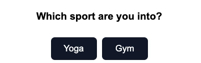
- 각 버튼에 대해 작업 유형을 사용자 지정 JavaScript로 설정합니다.
- 요가 버튼의 경우, onClick에 다음을 붙여넣습니다:
pushwoosh.sendTags({ interest: "yoga" });pushwoosh.closeInApp();- 헬스 버튼의 경우, onClick에 다음을 붙여넣습니다:
pushwoosh.sendTags({ interest: "gym" });pushwoosh.closeInApp();사용자가 요가를 탭하면 Pushwoosh는 해당 장치에 interest 태그를 쓰고 인앱을 닫습니다. 그런 다음 세그먼트 또는 Customer Journey에서 해당 사용자를 타겟팅할 수 있습니다.
구분선은 콘텐츠 블록 사이의 수평선입니다. 템플릿에서 시각적으로 섹션을 구분하는 데 사용합니다.
설정 패널에서 선 스타일(실선, 파선, 점선), 색상, 두께 및 너비를 구성합니다.
HTML
Anchor link toHTML 블록을 사용하면 사용자 지정 HTML을 인앱 템플릿에 붙여넣을 수 있습니다. 인앱 메시지용 전용 양식 블록이 없을 때 사용자 지정 양식, 설문조사 또는 내장 비디오에 사용합니다.
아래 예시는 인앱 템플릿에서 HTML 블록을 사용하는 일반적인 방법을 보여줍니다: 리드 양식, 설문조사 및 내장 비디오.
이 리드 양식은 이름과 이메일을 태그로 쓰고, promo_requested 이벤트를 보내고, 감사 메시지를 표시한 다음 인앱을 닫습니다.
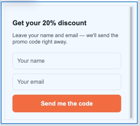
HTML 코드
<!DOCTYPE html><html lang="en"><head><meta charset="UTF-8"><meta name="viewport" content="width=device-width, initial-scale=1.0"><style>  body { margin: 0; padding: 20px; font-family: Arial, sans-serif; }  h2 { font-size: 18px; margin-bottom: 8px; color: #222; }  p { font-size: 14px; color: #666; margin-bottom: 20px; }  input {    width: 100%;    padding: 12px;    margin-bottom: 12px;    border: 1px solid #ddd;    border-radius: 8px;    font-size: 15px;    box-sizing: border-box;  }  button {    width: 100%;    padding: 14px;    background: #FF6B35;    color: white;    border: none;    border-radius: 8px;    font-size: 16px;    font-weight: bold;    cursor: pointer;  }  .thanks { display: none; text-align: center; padding: 40px 0; font-size: 18px; color: #333; }</style></head><body>
<h2>Get your 20% discount</h2><p>Leave your name and email. We'll send the promo code right away.</p>
<div id="form">  <input type="text" id="name" placeholder="Your name" />  <input type="email" id="email" placeholder="Your email" />  <button onclick="submit()">Send me the code</button></div>
<div class="thanks" id="thanks">  🎉 Done! Check your inbox for the promo code.</div>
<script>function submit() {  const name = document.getElementById('name').value.trim();  const email = document.getElementById('email').value.trim();  if (!name || !email) return;
  pushwoosh.sendTags({ name: name, email: email });  pushwoosh.postEvent("promo_requested", { email: email });
  document.getElementById('form').style.display = 'none';  document.getElementById('thanks').style.display = 'block';  setTimeout(() => pushwoosh.closeInApp(), 3000);}</script>
</body></html>
이 설문조사는 선택한 운동 시간을 태그로 저장하고, schedule_survey_completed 이벤트를 보내고, 감사 메시지를 표시한 다음 인앱을 닫습니다.
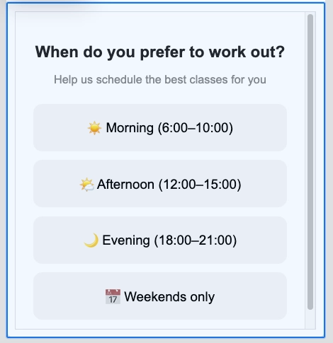
HTML 코드
<!DOCTYPE html><html lang="en"><head><meta charset="UTF-8"><meta name="viewport" content="width=device-width, initial-scale=1.0"><style>  body { margin: 0; padding: 20px; font-family: Arial, sans-serif; text-align: center; }  h2 { font-size: 18px; margin-bottom: 6px; color: #222; }  p { font-size: 13px; color: #888; margin-bottom: 20px; }  .option {    display: block;    width: 100%;    padding: 14px;    margin-bottom: 10px;    background: #f5f5f5;    border: 2px solid transparent;    border-radius: 10px;    font-size: 15px;    cursor: pointer;    box-sizing: border-box;  }  .option:hover { border-color: #FF6B35; background: #fff5f0; }  .thanks { display: none; font-size: 17px; padding: 40px 0; color: #333; }</style></head><body>
<h2>When do you prefer to work out?</h2><p>Help us schedule the best classes for you</p>
<button class="option" onclick="pick('morning')">☀️ Morning (6:00–10:00)</button><button class="option" onclick="pick('afternoon')">🌤️ Afternoon (12:00–15:00)</button><button class="option" onclick="pick('evening')">🌙 Evening (18:00–21:00)</button><button class="option" onclick="pick('weekend')">📅 Weekends only</button>
<div class="thanks" id="thanks">Got it! We'll send you the best schedule 💪</div>
<script>function pick(time) {  pushwoosh.sendTags({ preferred_time: time });  pushwoosh.postEvent("schedule_survey_completed", { time: time });  document.querySelector('h2').style.display = 'none';  document.querySelector('p').style.display = 'none';  document.querySelectorAll('.option').forEach(el => el.style.display = 'none');  document.getElementById('thanks').style.display = 'block';  setTimeout(() => pushwoosh.closeInApp(), 2000);}</script>
</body></html>
이 예시는 YouTube 비디오를 인앱 메시지에 내장합니다.
HTML 코드
<!DOCTYPE html><html lang="en"><head><meta charset="UTF-8"><meta name="viewport" content="width=device-width, initial-scale=1.0"><title>In-App Video Example</title><style>  body {    font-family: Arial, sans-serif;    margin: 0;    padding: 20px;    text-align: center;  }  .video-container {    position: relative;    padding-bottom: 56.25%;    height: 0;    overflow: hidden;  }  .video-container iframe {    position: absolute;    top: 0;    left: 0;    width: 100%;    height: 100%;  }</style></head><body>
<h1>In-App Video Example</h1>
<div class="video-container">       <iframe src="https://www.youtube.com/embed/TN1uyD2mONs?autoplay=1&mute=1" allow="accelerometer; autoplay; clipboard-write; encrypted-media; gyroscope; picture-in-picture" allowfullscreen></iframe></div>
</body></html>
메뉴 블록은 여러 개의 클릭 가능한 항목을 행이나 열에 배치합니다. 탐색 모음이나 회사 연락처 목록에 사용합니다.
각 메뉴 항목에 대해 다음을 설정합니다:
- 레이블: 사용자가 보는 텍스트
- URL: 항목이 열리는 위치
- 대상: 동일한 탭 또는 새 탭
블록 설정에서 다음을 설정할 수도 있습니다:
- 방향: 가로 또는 세로
- 정렬: 왼쪽, 가운데 또는 오른쪽
- 구분 기호: 항목 사이에 선택적 구분선
- 글꼴, 크기, 굵기, 글자 간격 및 링크/텍스트 색상
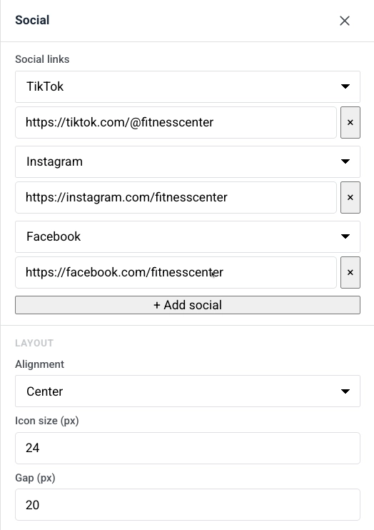
소셜 블록은 프로필에 연결되는 소셜 미디어 아이콘 행을 표시합니다. 인앱 메시지에서 사용자를 Facebook, Instagram, X 및 기타 플랫폼으로 보내는 데 사용합니다.
플랫폼 항목을 추가한 다음 정렬, 아이콘 크기 및 아이콘 사이의 간격을 설정합니다.
카운트다운 타이머
Anchor link to타이머 블록은 인앱 메시지의 카운트다운입니다. 기간 한정 제안, 반짝 세일 및 이벤트 알림에 사용합니다.
설정 방법:
- 카운트다운에서 종료 날짜와 종료 시간을 설정한 다음, 타이머 레이블에 대한 시간대와 언어를 선택합니다.
- 레이블을 켜서 숫자 아래에 “일 / 시간 / 분 / 초” 캡션을 표시하거나, 숫자만 표시하려면 끕니다.
- 모양에서 배경, 숫자 색상, 레이블 색상 및 숫자(기본 40px)와 레이블(기본 16px)의 글꼴 크기를 설정합니다.
- 필요에 따라 간격(패딩)을 조정합니다.
바코드 블록은 개인화 값, 가장 흔하게는 바우처에서 스캔 가능한 바코드 또는 QR 코드를 렌더링합니다.
설정 방법:
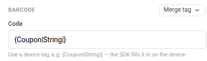
- 코드에서 장치 태그
{Coupon|String|}를 유지하거나 병합 태그를 클릭하고 각 수신자의 코드를 저장하는 다른 장치 태그를 선택합니다. 인앱은 Liquid를 평가하지 않습니다. SDK는 인앱이 표시되기 전에 장치에서 태그를 채웁니다. 이는{{voucher}}를 사용하는 이메일 바코드 블록과 다릅니다.
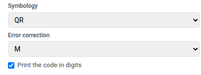
- 심볼로지 선택:
- QR: 휴대폰이 스캔할 수 있는 정사각형 2D 코드.
WELCOME2025-A1과 같은 영숫자 코드를 포함한 모든 텍스트를 허용합니다. - Code 128: 동일한 영숫자 코드를 포함한 모든 텍스트에 대한 선형 바코드
- EAN-13: 유럽 및 기타 여러 지역의 일반적인 소매 바코드. 숫자만, 12–13자
- EAN-8: 작은 포장용 짧은 소매 바코드. 숫자만, 7–8자
- UPC-A: 북미의 일반적인 소매 바코드. 숫자만, 11–12자
- QR: 휴대폰이 스캔할 수 있는 정사각형 2D 코드.
- QR을 선택한 경우 오류 수정을 설정합니다. 이는 코드의 일부가 덮이거나, 닳거나, 보기 어려울 때도 스캔할 수 있도록 예비 데이터를 추가합니다. L, M, Q 또는 H(기본 M)를 선택합니다. 높은 수준은 더 많은 손상을 견딜 수 있지만 패턴을 더 조밀하게 만들어 작은 크기에서 읽기 어려울 수 있습니다. 다른 심볼로지의 경우 이 필드를 건너뜁니다.
- 선택적으로 숫자로 코드 인쇄를 켜서 코드 아래에 값을 표시합니다.
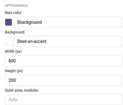
- 모양에서 바 색상을 배경보다 어둡게 설정합니다 — 대부분의 스캐너는 어두운 배경의 밝은 바를 읽을 수 없습니다. **너비 (px)**와 **높이 (px)**를 최소 600×200으로 설정하여 일반적인 휴대폰 카메라 범위에서 코드가 스캔 가능하도록 유지합니다. 기본 여백을 위해 여백 영역, 모듈을 자동으로 둡니다.
열은 캔버스를 나란히 배치된 섹션으로 분할하여 한 행에 콘텐츠를 서로 옆에 배치할 수 있도록 합니다.
다음 블록 중 하나를 캔버스로 드래그합니다:
- 2열: 두 개의 동일한 열
- 3열: 세 개의 동일한 열
- 4열: 네 개의 동일한 열
- 33 / 67: 왼쪽 열 약 33% 너비, 오른쪽 약 67%
- 67 / 33: 왼쪽 열 약 67% 너비, 오른쪽 약 33%
그런 다음 각 열에 콘텐츠를 추가합니다. 템플릿의 모든 열에 대한 간격을 변경하려면 설정 → 열 기본값을 열고 외부 패딩, 열 패딩 및 열 사이의 간격을 조정합니다.
제품 블록은 하나의 공유 템플릿에서 제품 카드 그리드를 표시합니다. 각 카드에는 이미지, 제목, 설명, 가격 및 구매 버튼이 포함될 수 있습니다. 템플릿은 모든 제품에 대해 반복됩니다.
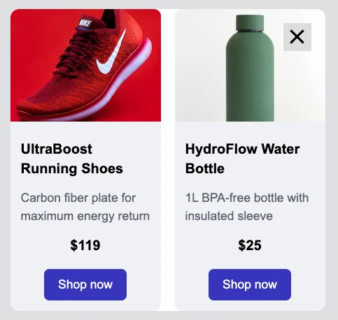
설정 패널의 소스에서 제품의 출처를 선택합니다:
- 수동: 제품을 직접 입력하거나 **카탈로그에서 선택…**을 클릭하여 제품 카탈로그에서 ID로 특정 항목을 선택합니다. 동일한 블록에서 두 가지를 혼합할 수 있습니다.
- 카탈로그 규칙: 메시지가 표시될 때 카탈로그에서 최신 정보로 해결되는 카테고리 및 정렬 순서에 따라 제품을 자동으로 가져옵니다.
- 장바구니: 각 사용자의 현재 버려진 장바구니에 있는 항목을 표시합니다. 버려진 장바구니 캠페인 설정 방법
소스를 선택한 후, 다음 설정은 그리드와 카드의 모양을 제어합니다:
- 제품 수(또는 장바구니의 경우 표시할 최대 제품 수): 표시할 카드 수.
- 열: 행당 1, 2 또는 3개의 카드.
- 간격: 카드 사이의 공간.
- 설명 제한: 카드가 일관된 크기를 유지하도록 설명 텍스트가 잘리는 문자 제한.
- 카드 템플릿: 레이아웃을 선택한 다음 모든 카드에 대해 카드 배경, 카드 모서리 반경 및 콘텐츠 패딩을 설정합니다.
블록 저장 및 재사용
Anchor link to블록을 저장하여 매번 다시 빌드하는 대신 이 템플릿이나 다른 인앱 템플릿에서 재사용할 수 있습니다.
- 캔버스에서 블록을 선택합니다.
- 블록의 도구 모음에서 북마크 아이콘(재사용을 위해 블록 저장)을 클릭하고 이름을 지정합니다.
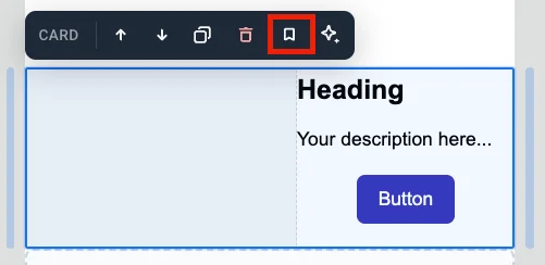
저장된 블록은 블록 탭 하단의 저장된 블록 아래에 나타납니다.
- 저장된 블록을 캔버스로 드래그하거나 클릭하여 템플릿의 끝에 추가합니다.
- 저장된 블록의 타일에서 **×**를 클릭하여 삭제합니다.
사본 동기화 유지
Anchor link to블록을 저장할 때 사본 동기화 유지를 켜서 삽입된 모든 사본을 동일한 소스에 연결합니다. 소스를 한 번 편집하면 해당 블록이 사용되는 모든 곳에 변경 사항이 적용됩니다.
동기화된 사본은 캔버스에서 잠겨 있습니다. 직접 편집할 수 없습니다. 사본을 선택하여 설정을 엽니다:
- 동기화된 블록 편집: 이 사본을 잠금 해제하여 변경할 수 있도록 합니다. 상단에 배너가 나타납니다. 모두에게 적용을 클릭하여 변경 사항을 소스 및 다른 모든 사본에 저장하거나, 취소를 클릭하여 변경 사항을 취소합니다. 한 번에 하나의 동기화된 블록만 잠금 해제할 수 있습니다.
- 소스에서 업데이트: 이 사본을 소스의 최신 버전으로 교체합니다.
- 소스에서 분리: 이 사본을 소스에서 연결 해제하여 독립적으로 편집할 수 있도록 합니다.