Email content blocks reference
Reference for every block you can add on the Drag & drop editor canvas, and for the link types available on buttons and text. To control which recipients see a block, set a display condition.
Add content blocks
Anchor link toOpen the Blocks tab and drag a block onto the canvas, or click a block to add it at the end of the email. Available blocks:
- Heading: titles and short headlines in the email
- Text: body copy and longer descriptions
- Button: a clickable call to action
- Image: pictures from Media storage, upload, or URL
- Logo header: your Brand book logo, as a ready-made header block
- Video: a clickable video poster that links to a YouTube or Vimeo video
- Card: an image paired with a heading, text, and button in one layout
- Divider: a line that separates sections visually
- 2 columns: two equal columns side by side
- 3 columns: three equal columns side by side
- 4 columns: four equal columns side by side
- 33 / 67: two columns where the left takes about 33% of the width and the right about 67%
- 67 / 33: two columns where the left takes about 67% of the width and the right about 33%
- Timer: a countdown for offers and deadlines
- Barcode: a scannable Code 128, EAN-13, EAN-8, UPC-A, or QR code generated from a personalization value, such as a voucher
- Menu: a row or column of links, such as navigation or contacts
- Social: icons that link to your social profiles
- HTML: custom HTML, such as a form, survey, or embedded video
- Products: a repeating grid of product cards. Enter products by hand, or pull them from your Product catalog, a recipient’s abandoned cart, or a built-in recommendation strategy such as bestsellers or back-in-stock.
- News: a repeating grid of article cards. Pick them by hand from an RSS or Atom feed, or pull them live from a feed registered for your application.
- Ad slot: a paid placement that shows a sponsored campaign to recipients
Heading and text
Anchor link toHeading and Text blocks hold the copy recipients read in the email. Use Heading for titles and short lines, Text for body copy and longer descriptions.
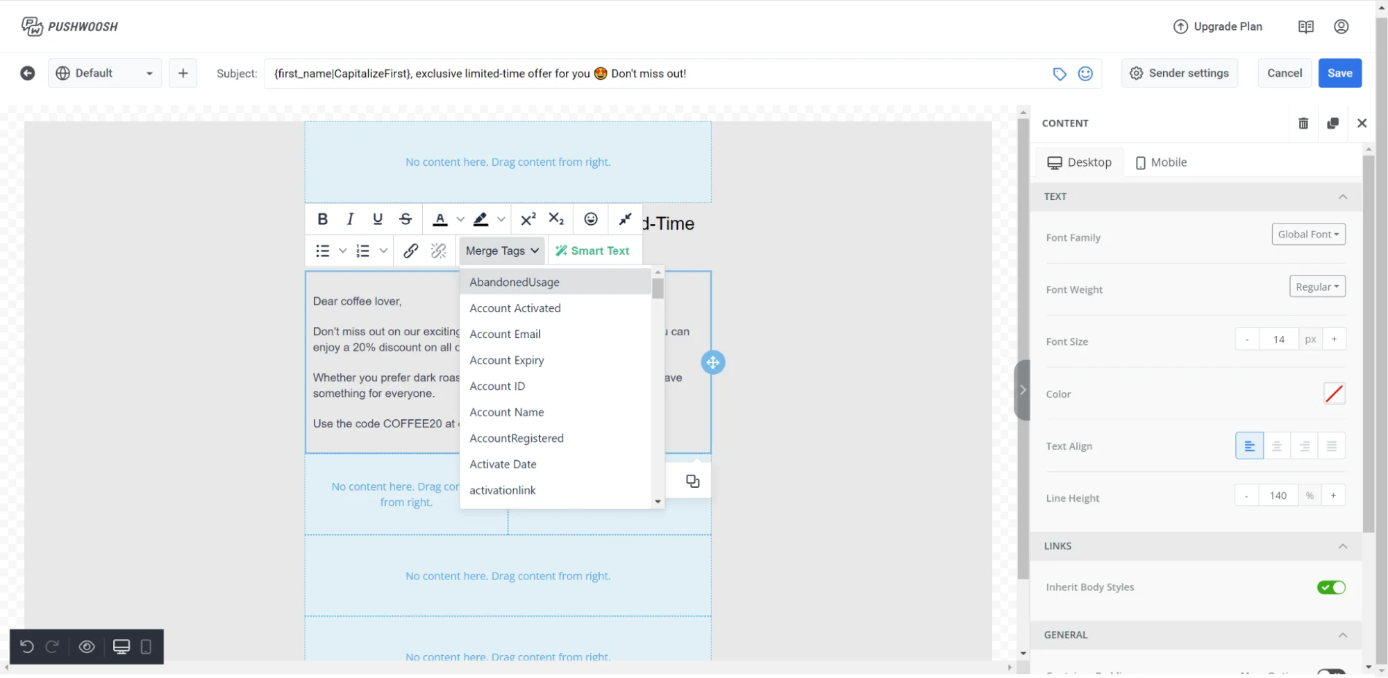
Click a block on the canvas to start editing. Select text to bring up the formatting toolbar.
Toolbar options
- Text style: set a paragraph style (Heading 1, Heading 2, Normal, etc.) for the whole block
- Font size: resize selected text, or apply a size to the whole paragraph
- Bold / Italic / Underline / Strikethrough: standard character formatting
- Alignment: left, center, or right
- Link: wrap selected text in a hyperlink
- Bulleted list / Numbered list: turn the selected lines into a list. Any bullet or number the lines already start with is dropped, so it isn’t doubled with the list’s own marker.
Select the block (not a text range) to open its settings in the right panel, then turn on Letter spacing to loosen or tighten character spacing for the whole block. Accepts fractional and negative values. To apply letter spacing across all text blocks at once instead, set it as an email-wide default under Typography. See Configure email-wide styling.
Pasting from other documents
Pasting text from Google Docs, Word, or a web page keeps bold, italic, underline, strikethrough, and links. Color, font size, and font family from the source are not carried over — the block’s own typography always wins. To ignore the source formatting entirely and take on the block’s style, paste with Ctrl+Shift+V (Cmd+Shift+V on Mac).
A pasted bulleted or numbered list keeps its bullet or number as plain text at the start of each line, in the same block. Select those lines and click Bulleted list / Numbered list to turn them into a real list — the button removes the leftover marker for you.
In single-line fields, such as a Button label, pasted line breaks collapse into a single space.
Personalization with Merge Tags
Merge Tags are placeholders that insert a Tag value from the recipient’s profile, so each subscriber sees personalized copy. To add one, select the text, click Merge Tags in the toolbar, and choose a Tag from your account. Click an inserted Merge Tag to open a panel with Default (the value shown when the tag is empty) and Format (capitalization, number, or date formatting to apply to the value) fields.
Image
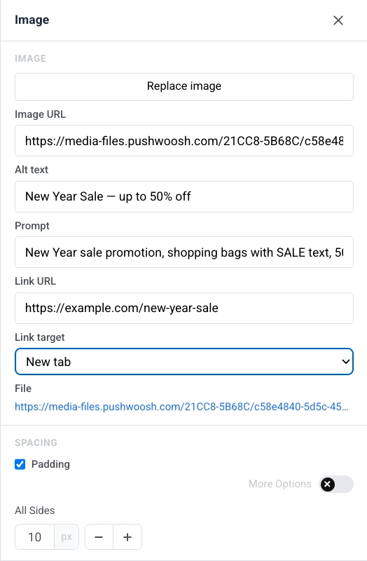
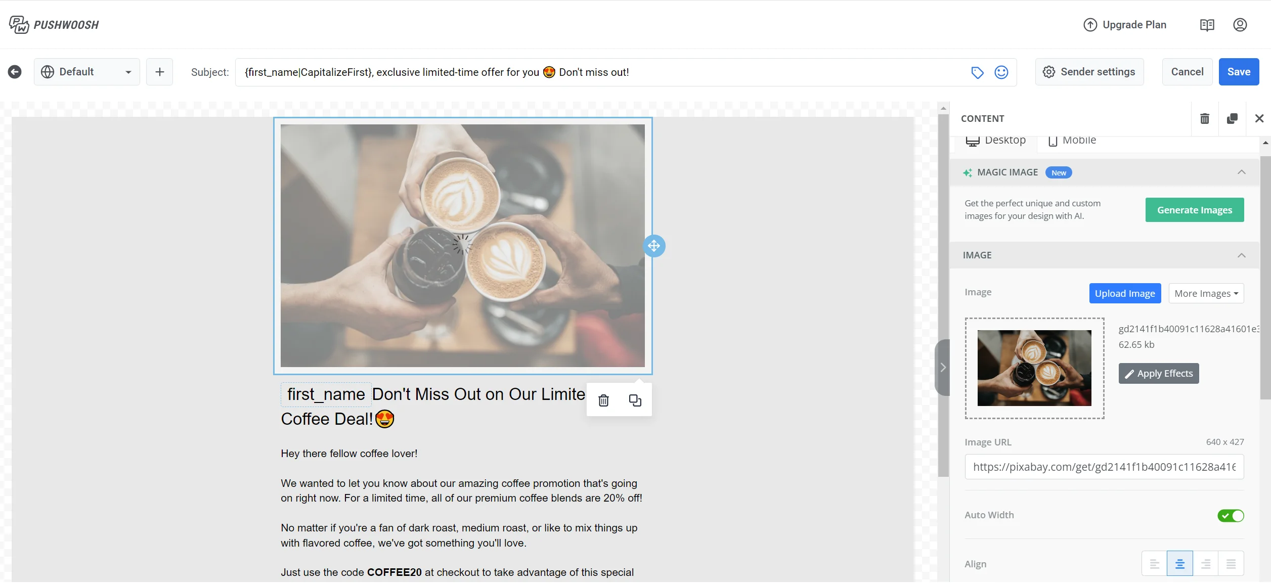
Anchor link toAn Image block displays a picture in the email. Select it on the canvas to open the Image settings in the right panel.
Adding an image
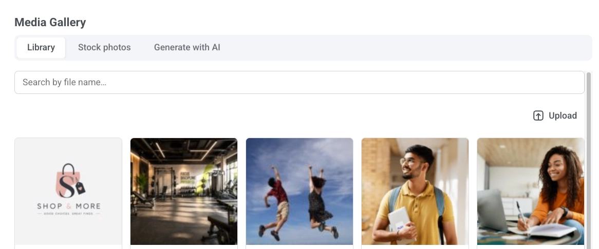
Click Add image when the block is empty, or Replace image when a picture is already set. This opens the Media Gallery with three tabs:
- Library: your uploaded files, searchable by file name.
- Stock photos: search free Pexels photos without leaving the editor. Click one to copy it into your library and insert it.
- Generate with AI: describe the image you want and pick an aspect ratio. The generated image is saved to your library.
You can also paste a hosted link directly into Image URL to skip the gallery.
Deleting images from the Library
Delete images without leaving the editor: hover a file and click Delete, or select several and click Delete selected, then confirm in the dialog.
Alt text
Describe the image in Alt text for accessibility, or click Generate alt with AI to have AI write it from the image in your current editing language. Images added from Stock photos or Generate with AI get alt text automatically.
Size & fit
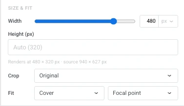
- Width: set the image’s width in px, or as a percentage of the available space so it stays fluid. Leave it at the default to use the image’s natural width.
- Height (px): set a fixed render height. Leave empty to scale automatically — from the crop ratio if one is set, otherwise from the image’s natural proportions.
- Crop: pick Original to keep the image’s natural proportions, or a ratio (Square (1:1), 4:3, 3:2, 16:9) to crop the image to that box.
- Fit: choose Cover to fill the box and crop to it. Set the crop point with Focal point. Or choose Contain to scale the whole image inside the box without cropping. Position it with Set position.
- Corner radius (px): round the image’s corners. Turn on More options to set each corner separately, or leave it off to apply the same radius to all four.
Switch the canvas to Mobile (see Edit the mobile view) to set any of these separately for phone screens. Check Width (mobile), Height (mobile), Crop (mobile), or Fit (mobile) to override that one setting, starting from its desktop value; leave a box unchecked to keep inheriting the desktop setting. Crop (mobile) only appears when Crop is set to a ratio on desktop, and changing Crop back to Original on desktop discards any Crop (mobile) override.
Links and spacing
To open a link when the image is clicked, enter it in Link URL and set Link target to open in the same tab or a new one. See Add links for available link types.
In Spacing, turn on Padding to add space around the image. Use All sides for uniform padding, or turn on More options to set each side separately.
Logo header
Anchor link toA Logo header takes its look from your Brand book logo, so every email starts with the same header without rebuilding it each time. Click anywhere on the header to select the whole block. The logo inside it can’t be selected on its own.
Select it on the canvas to open its settings in the right panel:
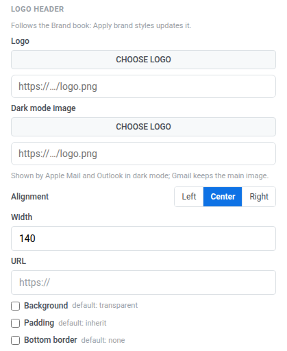
- Logo: click Choose logo to pick the image from your Media storage, or paste a hosted image URL.
- Dark mode image: set an image for dark mode. Apple Mail and Outlook show it when the recipient reads in dark mode. Gmail keeps the main image.
- Alignment: left, center, or right.
- Width: the logo’s width in px.
- URL: enter a destination to make the logo clickable.
- Background: turn on to set a background color behind the logo.
- Padding: turn on to add space around the logo. Use All sides for uniform padding, or turn on More options to set each side separately.
- Bottom border: turn on to draw a line under the header, then set its Width and color.
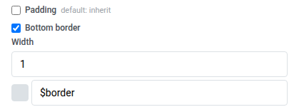
How a header reacts to your Brand book depends on whether you’ve edited it:
- Not edited: while a header keeps every setting the same as your Brand book, the panel reads “Follows the Brand book: Apply brand styles updates it.” Apply brand book styles repaints it from your saved brand along with the rest of the email.
- Edited: change any setting on this header and the panel switches to “Settings changed here stay when the brand is applied.” That header keeps your edit from then on, even after Apply brand book styles.
An edited header gets two more actions:
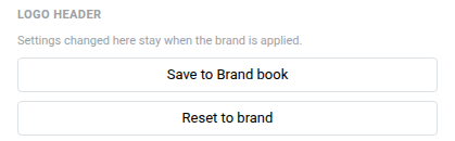
- Save to Brand book: write this header’s look back to the Brand book. Every other Logo header in the email picks up the new look at once, while keeping any edits of its own.
- Reset to brand: discard this header’s local edits and go back to following the Brand book.
Video
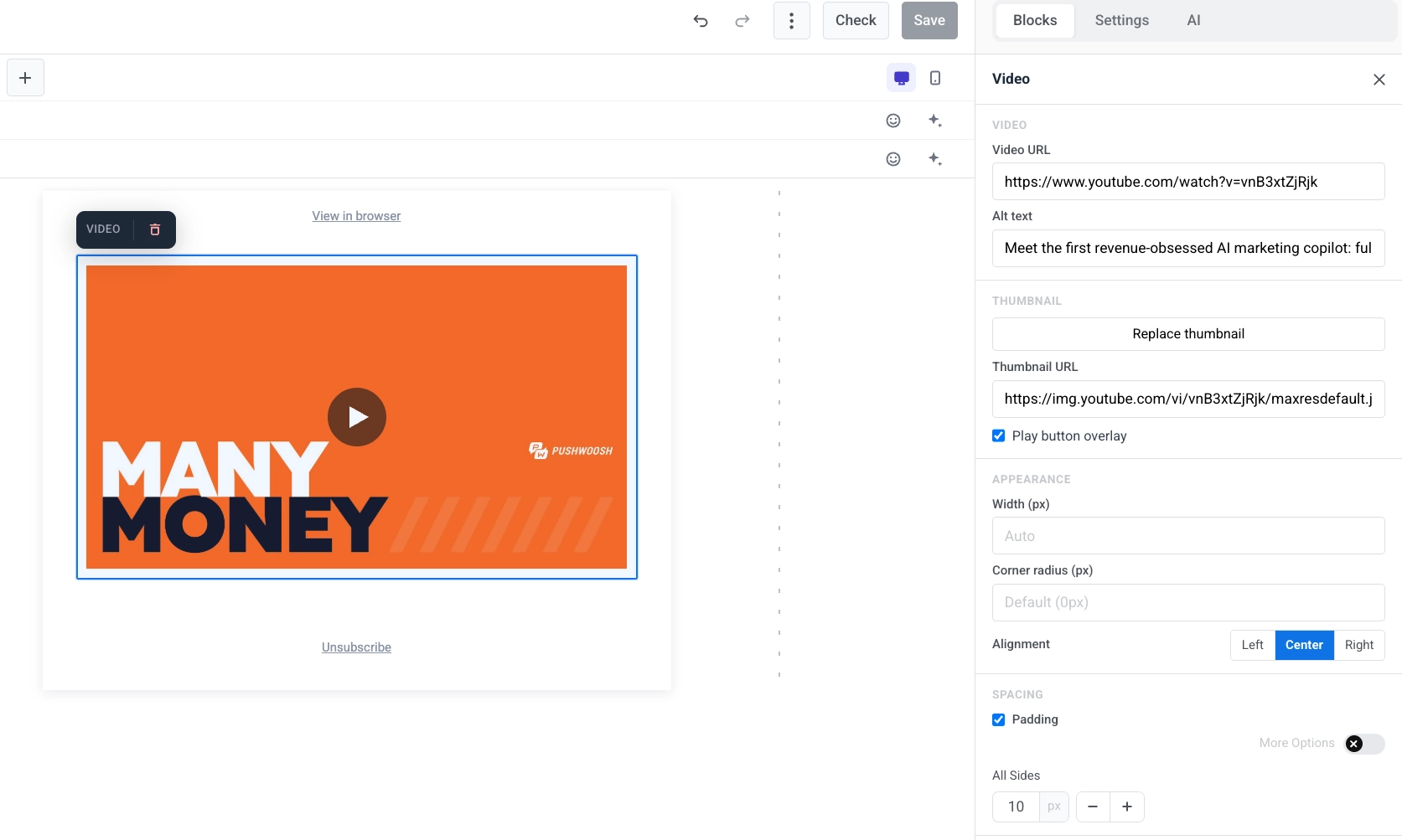
Anchor link toA Video block adds a YouTube or Vimeo video to the email as a clickable thumbnail. Email clients can’t play video inside the message, so the block shows a still image with a ▶ overlay. When the recipient taps it, the video opens on YouTube or Vimeo. This works in every major client, including Outlook.
Select the Video block on the canvas to open its settings in the right panel.
- Video URL: paste a YouTube or Vimeo link. The editor fetches a thumbnail automatically.
- Alt text: describe the video for accessibility.
- Thumbnail URL: keep the auto-fetched thumbnail, or click Add thumbnail / Replace thumbnail to pick one from the Media Gallery, or paste a hosted link directly.
- Play button overlay: on by default. Turn off to show the plain thumbnail without the ▶ overlay. The overlay isn’t available for thumbnails on some external hosts. The editor warns you when that applies, and the email shows the plain thumbnail instead.
- Width (px), Corner radius (px), and Alignment: control how the thumbnail looks and where it sits in the layout. You can set alignment separately for mobile.
Card
Anchor link toA Card block pairs an image with a heading, text, and button in a single ready-made layout. Select it on the canvas to open its settings in the right panel.
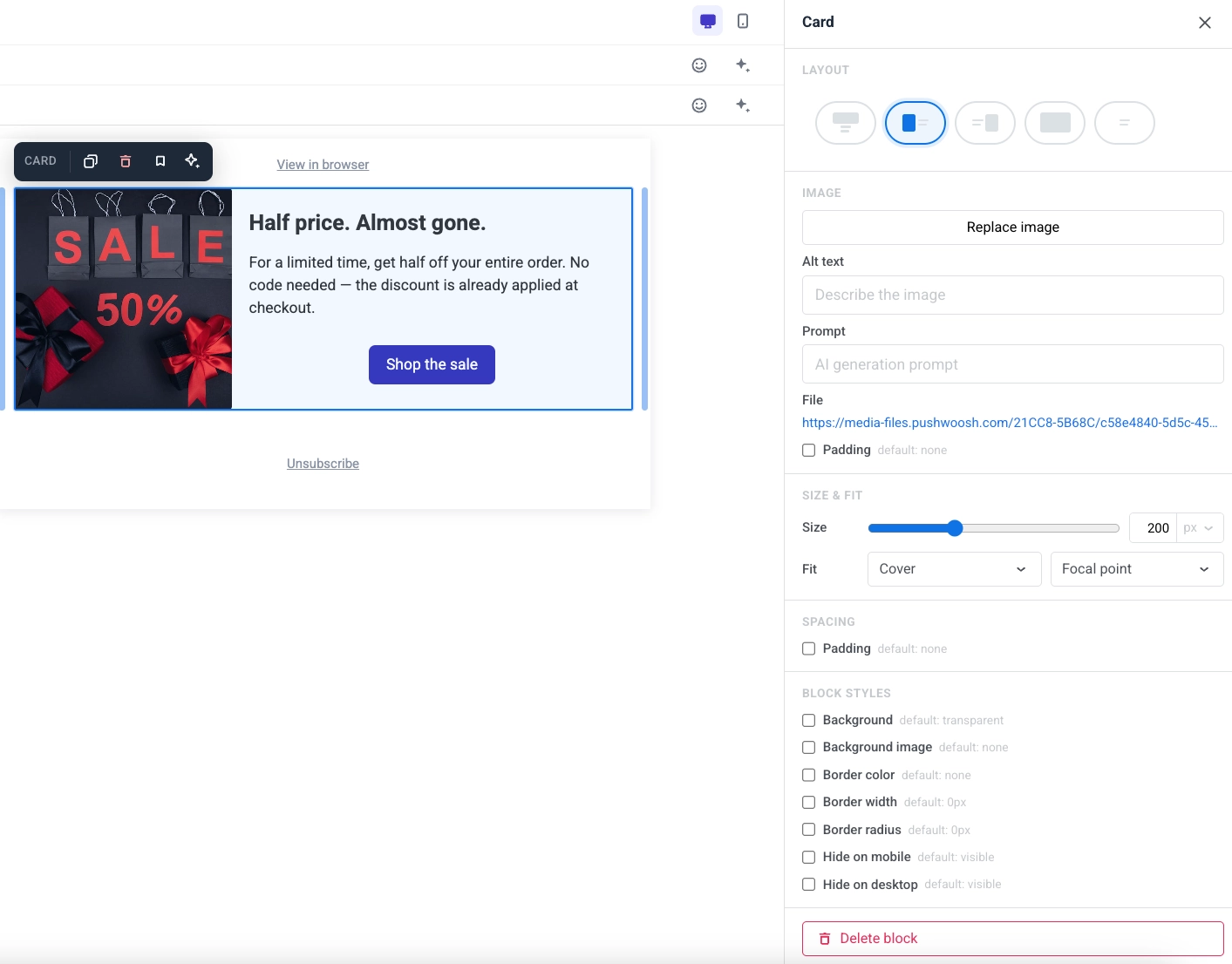
- Layout: choose which side the image sits on relative to the content.
- Image: replace the image, set alt text, or edit the prompt for an image you created with Generate with AI.
- Size & fit: the size fields depend on Layout. Crop is available for all layouts. Fit applies to every layout:
- Top: Height sets the image’s height in px or as a percentage of the card’s width. Width (px) narrows the image to a fixed pixel width and centers it.
- Background: Height sets the card’s height in px or as a percentage of its width. There is no Width (px) field. The image is the card’s background. Fit works here too: Cover crops the image to the card — set the crop point with Focal point — and Contain scales the whole image inside it, placed with Set position. Outlook Desktop approximates Contain and ignores both.
- Left or Right: Width sets the image column’s width in px or as a percentage of the card. Height (px) fixes the image to a pixel height. Setting a pixel height clears the crop ratio below. Picking a crop ratio clears the pixel height. You can’t use both at once.
- For all layouts:
- Crop: pick Original to keep the image’s natural proportions, or a ratio (Square (1:1), 4:3, 3:2, 16:9) to crop the image to that box.
- Fit: choose Cover to fill the box and crop to it. Set the crop point with Focal point. Or choose Contain to scale the whole image inside the box without cropping. Position it with Set position.
- Corner radius (px): round the image’s corners. Turn on More options to set each corner separately, or leave it off to apply the same radius to all four. Gmail and Apple Mail render it; Outlook Desktop ignores it, same as the Image block.
- Spacing: set the padding around the card’s content.
Button
Anchor link toA Button is a clickable call to action in the email.
Click a Button block to edit its label on the canvas. Use the toolbar to change font size, text color, bold, italic, underline, strikethrough, and alignment. The label is a single line: pasted line breaks collapse into a space. See Pasting from other documents for what a paste keeps and drops.
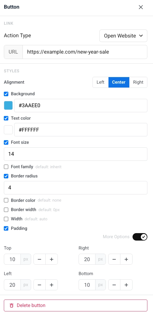
To set what happens when the recipient clicks the button:
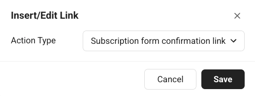
- Click the link icon in the toolbar to open Insert/Edit Link.
- Or use Action type and URL in the Link section of the right panel.
See Add links for the available action types.
In the right panel, under Styles:
- Alignment: left, center, or right.
- Background: turn on to override the default look, then choose Solid for a solid color or Gradient for a two-stop linear gradient (a starting color, an ending color, and an angle in degrees, default 90°). With Gradient selected, the button still shows a solid fill in email clients that don’t support gradient backgrounds, such as Outlook on Windows. Buttons that already had a solid background keep it and open with Solid selected.
- Text color, Font size, and Font family: turn each option on to override the default look.
- Corner radius, Border color, and Border width: shape and outline of the button. Gmail and Apple Mail render the button’s corner radius; Outlook Desktop ignores it and shows square corners, the same as it does for images.
- Width: set a fixed button width or leave it automatic.
- Padding: add space inside the button. Use All sides for uniform padding, or turn on More options to set each side separately.
Divider
Anchor link toA Divider is a horizontal line between content blocks. Use it to separate sections visually in the email.
Configure line style (Solid, Dashed, Dotted), color, thickness, and width in the settings panel.
HTML
Anchor link toThe HTML block lets you paste custom HTML into your email. Use it for a custom form, survey, or embedded video.
Above the code field, click Merge tag to search your account’s Tags and insert a Merge Tag at the cursor position — the same personalization feature described above — or click the emoji icon to insert an emoji the same way. Click an inserted Merge Tag to open the same Default / Format panel as in a Heading or Text block.
Examples
Anchor link toThis lead form collects an email address to send a promo code for the New Year Sale.
HTML code
<!DOCTYPE html><html lang="en"><head><meta charset="UTF-8"><meta name="viewport" content="width=device-width, initial-scale=1.0"><style>  body { margin: 0; padding: 20px; font-family: Arial, sans-serif; }  h2 { font-size: 18px; margin-bottom: 8px; color: #222; }  p { font-size: 14px; color: #666; margin-bottom: 20px; }  input {    width: 100%;    padding: 12px;    margin-bottom: 12px;    border: 1px solid #ddd;    border-radius: 8px;    font-size: 15px;    box-sizing: border-box;  }  button {    width: 100%;    padding: 14px;    background: #CC0000;    color: white;    border: none;    border-radius: 8px;    font-size: 16px;    font-weight: bold;    cursor: pointer;  }</style></head><body>
<h2>Get your New Year Sale code</h2><p>Enter your email and we'll send you an exclusive promo code for up to 50% off.</p>
<div id="form">  <input type="email" placeholder="Your email address" />  <button type="button">Get my code</button></div>
</body></html>
This survey asks what category the recipient is shopping for and links each option to the relevant sale page.
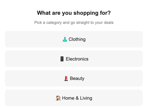
HTML code
<!DOCTYPE html><html lang="en"><head><meta charset="UTF-8"><meta name="viewport" content="width=device-width, initial-scale=1.0"><style>  body { margin: 0; padding: 20px; font-family: Arial, sans-serif; text-align: center; }  h2 { font-size: 18px; margin-bottom: 6px; color: #222; }  p { font-size: 13px; color: #888; margin-bottom: 20px; }  .option {    display: block;    width: 100%;    padding: 14px;    margin-bottom: 10px;    background: #f5f5f5;    border: 2px solid transparent;    border-radius: 10px;    font-size: 15px;    cursor: pointer;    box-sizing: border-box;    text-decoration: none;    color: #222;  }  .option:hover { border-color: #CC0000; background: #fff5f5; }</style></head><body>
<h2>What are you shopping for?</h2><p>Pick a category and go straight to your deals</p>
<a class="option" href="https://example.com/sale/clothing">👗 Clothing</a><a class="option" href="https://example.com/sale/electronics">📱 Electronics</a><a class="option" href="https://example.com/sale/beauty">💄 Beauty</a><a class="option" href="https://example.com/sale/home">🏠 Home & Living</a>
</body></html>
This example embeds a New Year Sale promo video in the email.
HTML code
<!DOCTYPE html><html lang="en"><head><meta charset="UTF-8"><meta name="viewport" content="width=device-width, initial-scale=1.0"><style>  body {    font-family: Arial, sans-serif;    margin: 0;    padding: 20px;    text-align: center;  }  .video-container {    position: relative;    padding-bottom: 56.25%;    height: 0;    overflow: hidden;  }  .video-container iframe {    position: absolute;    top: 0;    left: 0;    width: 100%;    height: 100%;  }</style></head><body>
<h1>New Year Sale — Up to 50% Off</h1>
<div class="video-container">  <iframe src="https://www.youtube.com/embed/YOUR_VIDEO_ID"    allow="accelerometer; autoplay; clipboard-write; encrypted-media; gyroscope; picture-in-picture"    allowfullscreen></iframe></div>
</body></html>Menu
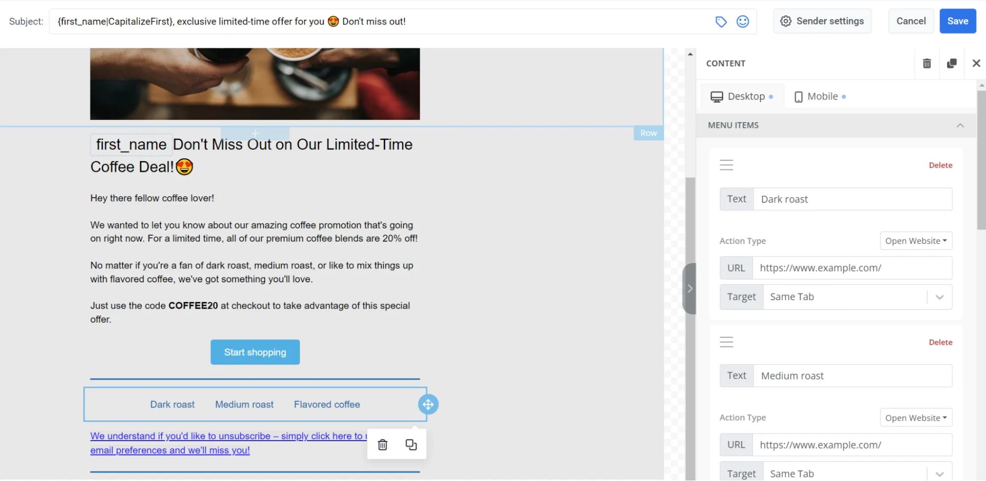
Anchor link toThe Menu block places several clickable items in a row or column. Use it for a navigation bar or a list of company contacts.
For each menu item, set:
- Label: the text recipients see
- URL: where the item opens
- Target: same tab or a new tab
In the block settings, you can also set:
- Direction: Horizontal or Vertical
- Alignment: Left, Center, or Right
- Separator: an optional divider between items
- Font, size, weight, letter spacing, and link/text colors
Social
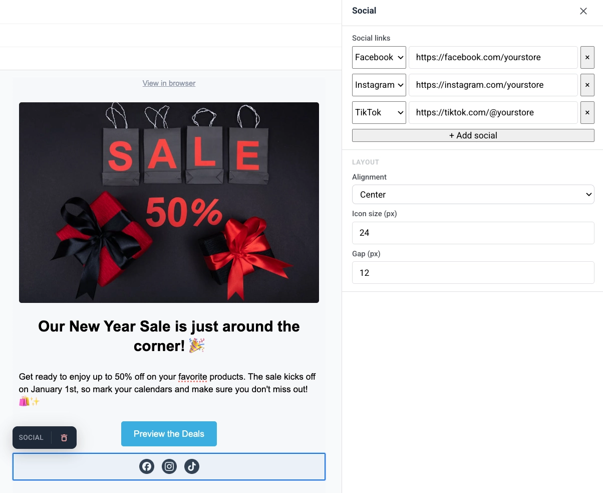
Anchor link toThe Social block displays a row of social media icons that link to your profiles. Use it to send recipients to Facebook, Instagram, X, and other platforms from the email.
Add platform entries, then set alignment, icon size, and the gap between icons.
Countdown timer
Anchor link toThe Timer block is a countdown in the email. Use it for limited-time offers, flash sales, and event reminders.
To set it up:
- In Countdown, set End date and End time, then choose the Timezone and Language for the timer labels.
- Turn Labels on to show “days / hours / minutes / seconds” captions under the digits, or off for numbers only.
- In Appearance, set Background, Digits color, Labels color, and the font size for digits (default 40px) and labels (default 16px).
- Adjust Spacing (padding) as needed.
The timer renders as a sharp image at any language or size, with a background that stretches across the full email row, and a version rendered natively for mobile width rather than a shrunk desktop image.
Barcode
Anchor link toThe Barcode block renders a scannable barcode or QR code from a personalization value, most often a voucher.
To set it up:
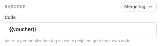
- In Code, keep
{{voucher}}when the email is sent with a voucher pool or click Merge tag and choose the tag that stores each recipient’s code. Email resolves the tag at send time so each person gets their own scannable value.
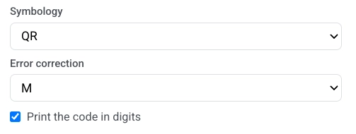
- Choose Symbology:
- QR: a square 2D code phones can scan. Accepts any text, including alphanumeric codes like
WELCOME2025-A1 - Code 128: a linear barcode for any text, including the same alphanumeric codes
- EAN-13: the common retail barcode in Europe and many other regions. Digits only, 12–13 characters
- EAN-8: a shorter retail barcode for small packaging. Digits only, 7–8 characters
- UPC-A: the common retail barcode in North America. Digits only, 11–12 characters
- QR: a square 2D code phones can scan. Accepts any text, including alphanumeric codes like
- If you chose QR, set Error correction. This adds spare data so the code can still scan when part of it is covered, worn, or hard to see. Choose L, M, Q, or H (default M). Higher levels survive more damage but make the pattern denser, which can be harder to read at small sizes. Skip this field for other symbologies.
- Optionally turn on Print the code in digits to show the value under the code.
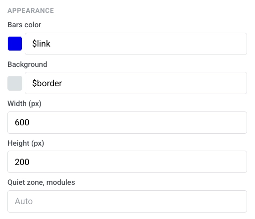
- In Appearance, set Bars color, Background, Width (px), and Height (px). Leave Quiet zone, modules on Auto for the default margin.
Columns
Anchor link toColumns split the canvas into side-by-side sections so you can place content next to each other in one row.
Drag one of these blocks onto the canvas:
- 2 columns: two equal columns
- 3 columns: three equal columns
- 4 columns: four equal columns
- 33 / 67: left column about 33% wide, right about 67%
- 67 / 33: left column about 67% wide, right about 33%
Then add content to each column. To change spacing for all columns in the email, open Settings → Columns defaults and adjust outer padding, column padding, and the gap between columns.
For the column’s own image (the one you add with Add image in the column’s settings), the settings show a Size & fit section. This is the same control as the Card block’s Left / Right layout. An Image block dragged into a column is a separate content element and keeps its own simple sizing fields — see Image.
You can also paste a hosted link directly into Image URL to skip the gallery.
- Width: set the image’s width in px or as a percentage of the column. Leave it unset to fill the column.
- Height (px): fix the image to a pixel height. Setting a pixel height clears the crop ratio below. Picking a crop ratio clears the pixel height. You can’t use both at once.
- Crop: pick Original to keep the image’s natural proportions, or a ratio (Square (1:1), 4:3, 3:2, 16:9) to crop the image to that box.
- Fit: choose Cover to fill the box and crop to it. Set the crop point with Focal point. Or choose Contain to scale the whole image inside the box without cropping. Position it with Set position.
- Corner radius (px): round the image’s corners. Turn on More options to set each corner separately, or leave it off to apply the same radius to all four. Gmail and Apple Mail render it; Outlook Desktop ignores it, same as the Image block.
Products
Anchor link toA Products block shows a grid of product cards from one shared template. Each card can include an image, title, description, price, and a buy button. The template repeats for every product.
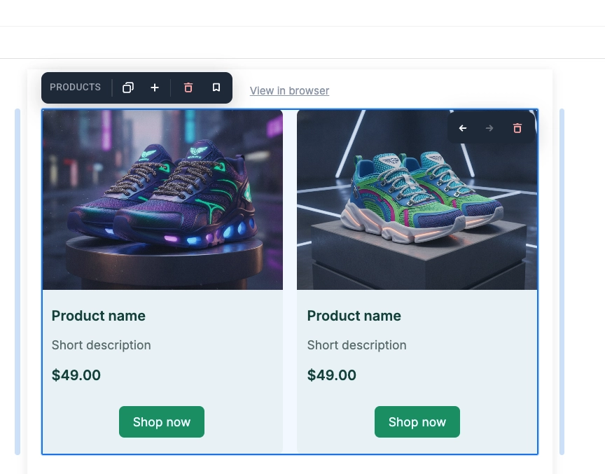
Click a card on the canvas to make it active and edit it:
- Change the title, description, price, picture, or per-product link to update only that card.
- Change the template layout, colors, padding, or which elements it contains to update every card.
In the settings panel, under Source, choose where the products come from:
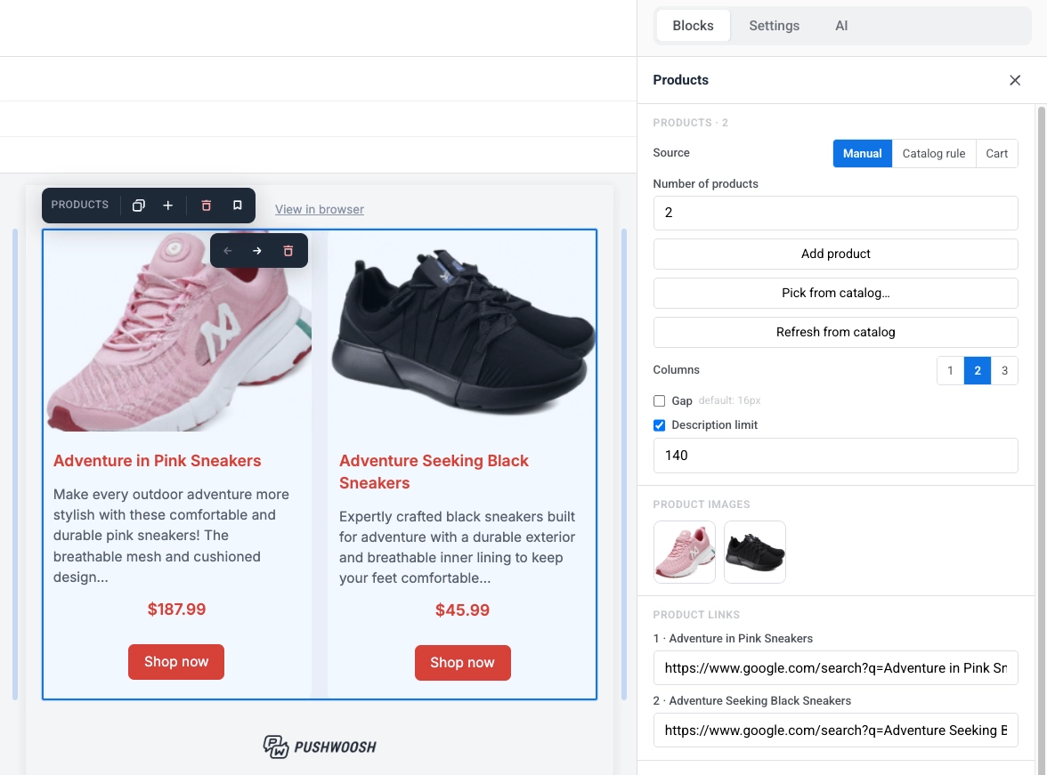
- Manual: enter products by hand, pick them from your Product catalog by ID, or mix both.
- Catalog rule: pull products automatically by category and sort order, resolved fresh from the catalog at send time.
- Cart: show the items from each recipient’s current abandoned cart.
- Recommendations: pull products ranked by a built-in strategy — bestsellers, new arrivals, back in stock, or price drop — resolved from your catalog at send time.
Add products manually
Anchor link toFill the grid yourself, either by entering products by hand or by picking specific items from your Product catalog by ID. You can mix both in the same block.
- Number of products: set how many cards to show (1–24).
- Add product: add a card and fill in its title, description, price, picture, and link yourself.
- Pick from catalog…: select specific products from your Product catalog instead of typing them in.
- Refresh from catalog: pull the latest title, description, price, and image for products you picked from the catalog, in case they changed since you added them. Does not affect hand-entered products.
- Product images: click a thumbnail to replace that product’s picture.
- Product links: enter or edit the URL for each product.
Pull products with a catalog rule
Anchor link toAutomatically pull products by category and sort order, with no manual picking.
- Category: limit to a specific catalog category, or All categories.
- Sort: choose the order products are pulled in: Newest first, Price: low to high, Price: high to low, or Title A-Z.
- Number of products: set a limit on how many cards to show (1–12).
- Refresh preview: recalculate the canvas preview against the catalog right now.
Show items from the cart
Anchor link toRender the current items from a recipient’s abandoned cart.
- Max products shown: set a limit on how many cards to show (1–12).
- Preview a user’s cart: enter a user ID or email and click Preview cart to see how the block renders for that specific recipient.
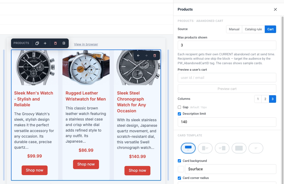
Get recommended products
Anchor link toPull products ranked by a built-in strategy instead of picking them yourself or writing a catalog rule.
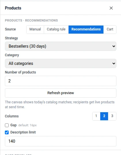
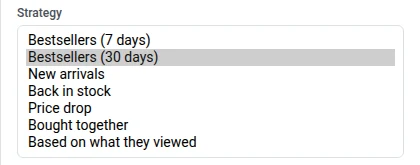
- Strategy: choose how products are ranked — Bestsellers (7 days), Bestsellers (30 days), New arrivals, Back in stock, Price drop, Bought together, or Based on what they viewed. Selecting Recommendations replaces the Sort control from Catalog rule with this Strategy selector. Bestsellers, Bought together, and Based on what they viewed need events from your backend. See How to set up product recommendations in email.
- Category: limit to a specific catalog category, or All categories.
- Number of products: set a limit on how many cards to show (1–12).
- Refresh preview: recalculate the canvas preview against the catalog right now.
Style the grid
Anchor link toOnce you’ve picked a source, these settings control how the grid and its cards look. They stay the same no matter which source you use:
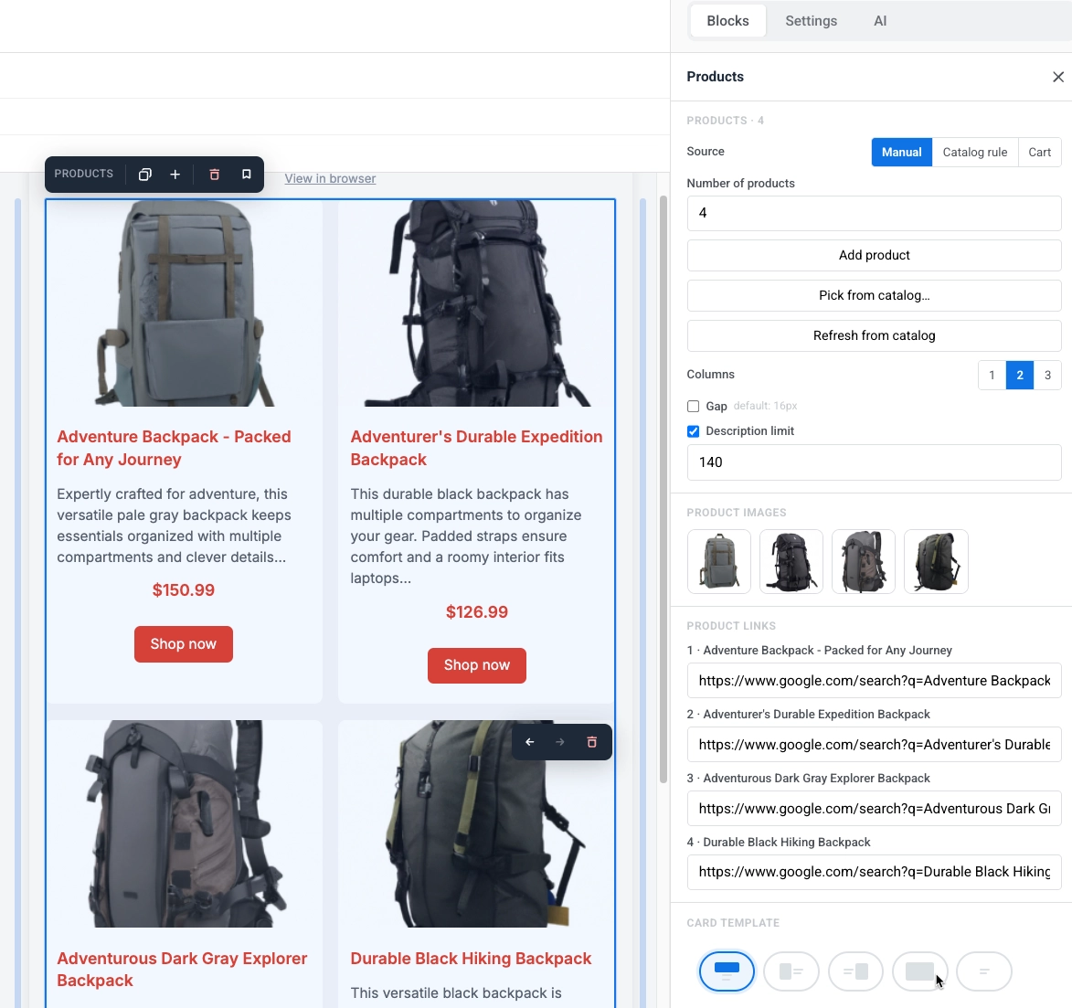
- Columns: choose 1, 2, or 3 cards per row. On mobile, cards always stack in one column.
- Gap: turn on to set the space between cards. Off uses the default (16px).
- Description limit: the character limit the product description is trimmed to, so cards stay a consistent size.
- Typing a value: type freely. The field only normalizes on blur or Enter, flooring at 10. Unlike the News block’s Summary limit, 0 doesn’t hide the description here. Turn the toggle off instead for no cap.
- What counts toward the cap: only the text you’d actually read. Bold, links, and line breaks are free. Typing past the limit in the description field is blocked.
- Card template: pick a layout, then set Card background, Card corner radius, and Content padding for every card.
- Size & fit: shown for every layout that has an image. Same Width, Height, Crop, and Fit controls as the Card block’s per-layout image sizing, sized relative to the card width instead of the whole email.
Block style settings below style the block as a whole, separately from the cards inside it:
- Background and Background image: set a background color or image behind the whole grid. With an image set, Fit chooses how it sits in the block — Cover crops it to the block, Contain fits the whole image inside it — and Focal point / Set position places it. Outlook Desktop shows the background color only and ignores the image, so keep a readable color behind it.
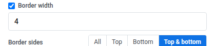
- Border color, Border width, and Corner radius: add an outline and rounded corners around the whole grid. Turn on More options in Corner radius to set each corner separately, or leave it off to apply the same radius to all four. Gmail and Apple Mail render it; Outlook Desktop ignores it and shows square corners, the same as it does for images.
- Border sides: once Border width is set, choose All, Top, Bottom, or Top & bottom to set which sides of the grid get the border.
- Hide on mobile and Hide on desktop: hide the entire block on one device. See Show or hide content per device.
News
Anchor link toA News block shows a grid of article cards. Each card can include an image, date, headline, summary, and a “Read more” link. The template repeats for every article, the same way it does for the Products block. A new News block starts with 2 sample cards.
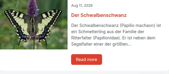
In the settings panel, under Source, choose where the articles come from:
- Picked: load articles from an RSS or Atom feed once, or hand-pick specific ones. They’re copied into the email and don’t change again.
- Live feed: pull articles from a feed registered for your application, resolved fresh at send time so every recipient gets the newest ones.
Pick articles from a feed
Anchor link toClick a card on the canvas to make it active and edit it:
- Change the date, headline, summary, image, or per-article link to update only that card.
- Change the template layout, colors, padding, or which elements it contains to update every card.
Articles are copied into the email content once you load them; nothing is fetched again at send time. Article images are copied into your Media storage and converted from WebP to JPEG if needed, since Outlook can’t render WebP.
Paste an RSS 2.0 or Atom Feed URL, then either:
- Load latest articles: replace the current cards with the most recent articles from the feed, the same number of cards you already have (2 by default).
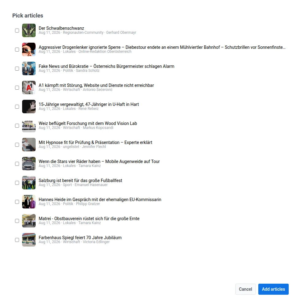
- Pick articles…: open a drawer listing up to 12 of the feed’s latest articles, with thumbnail, headline, date, category, and author, and choose which ones to add. Picked articles are appended to the existing cards, up to 12 total; articles already on the canvas can’t be picked twice.
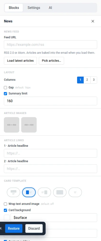
The drawer lets you hand-pick specific articles instead of always taking the newest ones.
- Article images: click a thumbnail to replace that article’s image.
- Article links: shown when the card template has a link bound to the article (the default “Read more” button). Lists each article by headline so you can edit or override its destination URL, initially pulled from the feed.
Write article intros with AI
Anchor link toAdd a short editorial intro under each article’s headline, written by AI in the tone you choose. AI intros work only with Source set to Picked, not Live feed.
-
In the News block settings, go to the AI intros section.
-
Set Tone: Neutral, Why it matters, or Witty.
-
Optionally, fill in Newsroom guidance with your voice, words to avoid, or the audience. Up to 500 characters.
-
Click Write intros with AI.
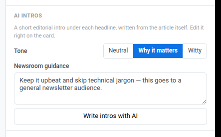
Pushwoosh writes an intro for every card in the block that doesn’t have one yet. It writes from the article’s own page and uses the feed summary only when the page can’t be read. The AI is told to write at most 280 characters, and Pushwoosh trims any excess so the cap always holds.
The intro appears as its own field under the headline, above the summary. If the card template has no place for it, Pushwoosh adds one there. If the template has no headline field either, the intro becomes the card’s first field instead. To change an intro, click it on the canvas and edit it the same way as the headline or summary. The 280-character cap applies only to what the AI writes, not to a manual edit.
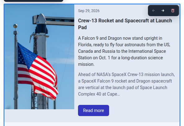
To replace all intros in the block, click Rewrite all intros. This button appears instead of Write intros with AI once every card has an intro.
If some intros aren’t written, Pushwoosh shows one of these messages:
- “Intros not written for N articles — try again”: some or all articles didn’t get an intro. N counts every article that failed. The intros that were written stay. Click Write intros with AI again. It writes only the cards that still don’t have one, not a full rewrite.
- “Could not write the intros”: the request itself failed, for example because of a network or server error.
Pull articles from a live feed
Anchor link toArticles are fetched when the email is sent, so every recipient gets the freshest ones. Instead of picking articles yourself, choose a feed and a limit:
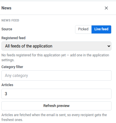
- Registered feed: choose a feed already registered for your application, or All feeds of the application to pull from all of them. This panel only picks a feed, it doesn’t register one; if none exist yet, add one on the News feeds page using Add feed.
- Category filter: an optional free-text filter matched against the article’s category from the feed (default: any category).
- Articles: how many cards to show (1–12, 3 by default).
- Refresh preview: recalculate the canvas preview against the feed right now. If the feed returns no articles, Pushwoosh leaves the current cards unchanged; if the feed can’t be reached, Pushwoosh shows an error instead.
Style the grid
Anchor link toOnce you’ve picked a source, these settings control how the grid and its cards look. They stay the same no matter which source you use:
- Columns: choose 1, 2, or 3 cards per row. On mobile, cards always stack in one column.
- Gap: turn on to set the space between cards. Off uses the default (16px).
- Summary limit: turn on to cap the article summary at a set number of characters (default 160), so cards stay a consistent size.
- Typing a value: type freely. The field only normalizes on blur or Enter, rounding 1–9 up to 10.
- Off or zero: off means no cap, so the whole summary renders. Set it to 0 to drop the summary entirely from the card, the sent email, and a live feed cell. The panel then shows “Summary is hidden: the cards show no article text (use it with AI intros).”
- What counts toward the cap: only the text you’d actually read. Bold, links, and line breaks are free. Typing past the limit in the summary field is blocked.
- Card template: pick a layout, then set Card background, Card corner radius, and Content padding for every card. For the Left or Right layout, turn on Wrap text around image to flow the headline and summary around the picture instead of keeping them in a fixed column. Size & fit (Width, Height, Crop, Fit) works the same as the Card block’s per-layout image sizing, sized relative to the card width.
Block style settings below style the block as a whole, separately from the cards inside it:
- Background and Background image: set a background color or image behind the whole grid. With an image set, Fit chooses how it sits in the block — Cover crops it to the block, Contain fits the whole image inside it — and Focal point / Set position places it. Outlook Desktop shows the background color only and ignores the image, so keep a readable color behind it.
- Border color, Border width, and Corner radius: add an outline and rounded corners around the whole grid. Turn on More options in Corner radius to set each corner separately, or leave it off to apply the same radius to all four. Gmail and Apple Mail render it; Outlook Desktop ignores it and shows square corners, the same as it does for images.
- Border sides: once Border width is set, choose All, Top, Bottom, or Top & bottom to set which sides of the grid get the border.
- Hide on mobile and Hide on desktop: hide the entire block on one device. See Show or hide content per device.
Ad slot
Anchor link toAn Ad slot block shows a sponsored campaign to email recipients. It’s a paid placement your account manager sells against, not a block you fill with your own creative.
Select the block on the canvas to open its settings in the right panel.
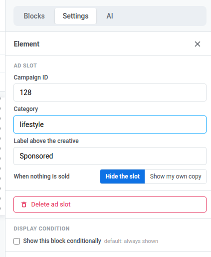
- Campaign ID: the numeric ID of the ad campaign to show. Leave it at
0to match any Active campaign instead. The ad inventory list shows no ID for a campaign — copy the number from the browser address bar on the campaign’s own page after you save it. - Category: limit the match to campaigns tagged with this category. Set it together with Campaign ID to require both — the ad only shows if that exact campaign also carries this category. Leave Campaign ID at
0to match any Active campaign in the category instead. - Label above the creative: a short line shown above the ad, for example “Sponsored”. Leave it empty to show no label.
- When nothing is sold: choose what the block shows if no campaign matches. Hide the slot (the default) leaves nothing in its place. Show my own copy adds a second section inside the same block, marked “Shown when no campaign is running,” where you write your own stand-in text and add an image. That section ships in the email instead of an ad whenever no campaign matches. Leaving it empty saves as Hide the slot — an empty stand-in never ships as a blank block.
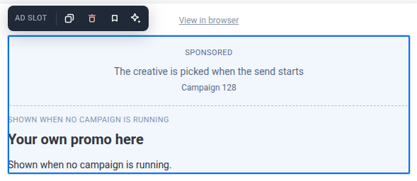
The canvas shows the ID, category, or label you set as a placeholder — not the actual ad creative. Pushwoosh picks the matching campaign once, when the email starts sending, so every recipient of that send sees the same ad — there’s no per-recipient targeting for which campaign shows, and no frequency capping in this release.
Save and reuse blocks
Anchor link toSave a block to reuse it in this or other emails instead of rebuilding it each time.
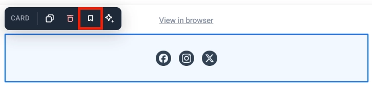
- Click a block (its frame or background, not the text or button inside it) to select it. Card, Columns, and Social are examples of blocks that work this way.
- Click the bookmark icon in the block’s toolbar and give it a name.
Saved blocks appear under Saved blocks at the bottom of the Blocks tab.
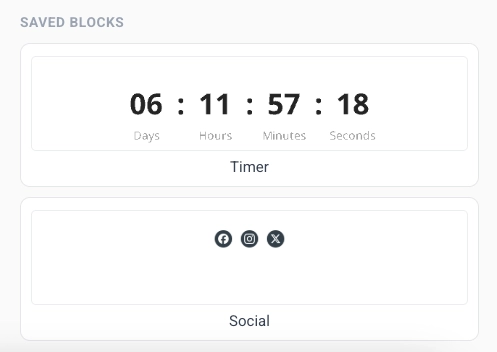
- Drag a saved block onto the canvas, or click it to add it at the end of the email.
- Click the × on a saved block’s tile to delete it.
Keep copies in sync
Anchor link toWhen you save a block, turn on Keep copies in sync to link every inserted copy to the same source. Edit the source once, and the change applies everywhere that block is used, including emails already scheduled to send.
Saving a range of blocks works the same way. Edit any block inside it, then apply the change to update every copy wherever it’s used.
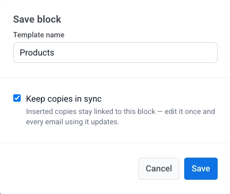
A synced copy is locked on the canvas. You can’t edit it directly. Select the copy to open its settings:
- Edit synced block: unlock this copy so you can change it. A banner appears at the top. Click Apply to all to save your changes to the source and every other copy, or Cancel to discard them. You can unlock only one synced block at a time.
- Update from source: replace this copy with the latest version from the source.
- Detach from source: unlink this copy from the source so you can edit it on its own.
While a synced block is unlocked for editing, the rest of the email is locked: you can’t select, edit, or delete anything else, and Save is disabled until you finish. Click Apply to all to save your changes everywhere, or Cancel to discard them and unlock the rest of the email again.
Add links
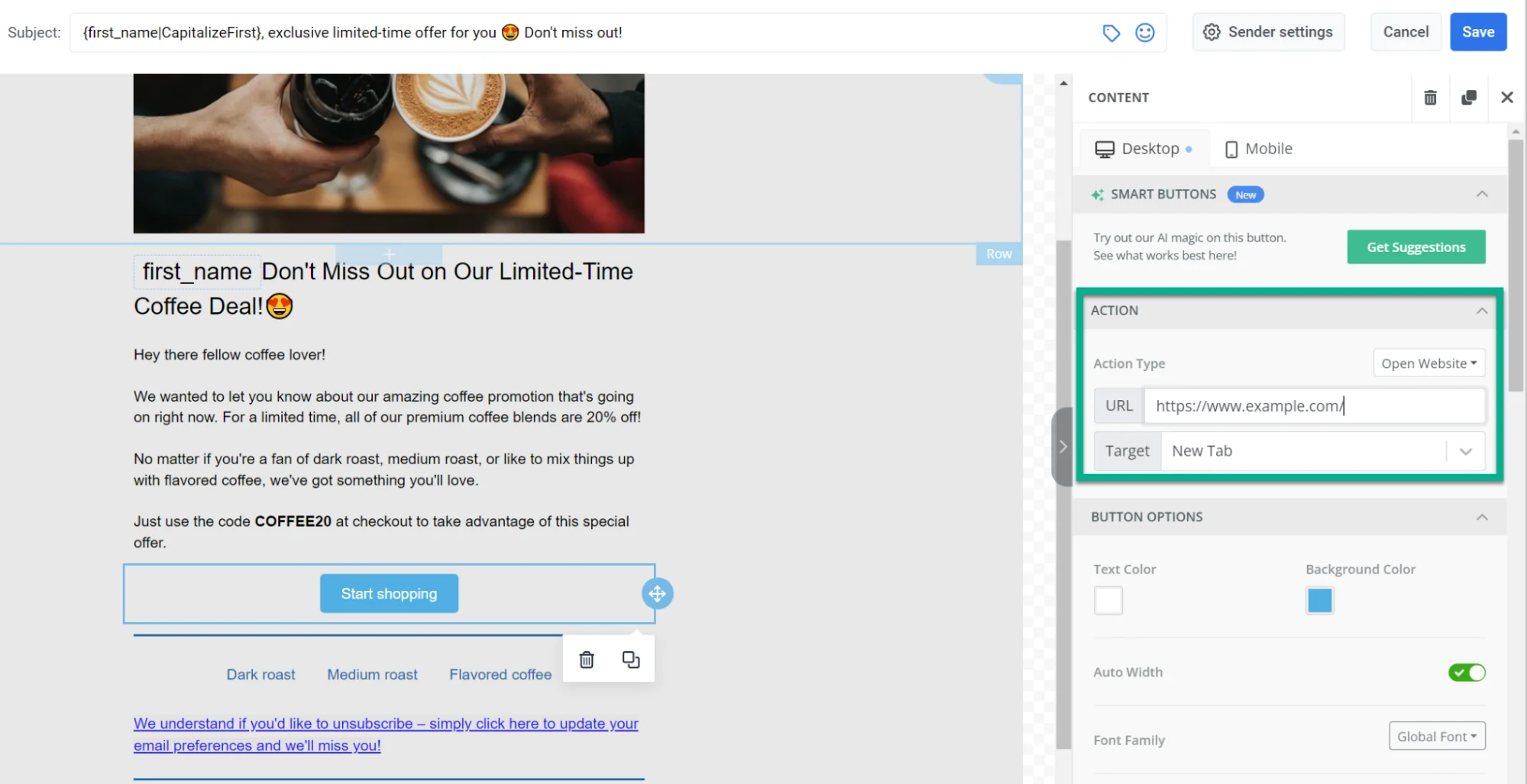
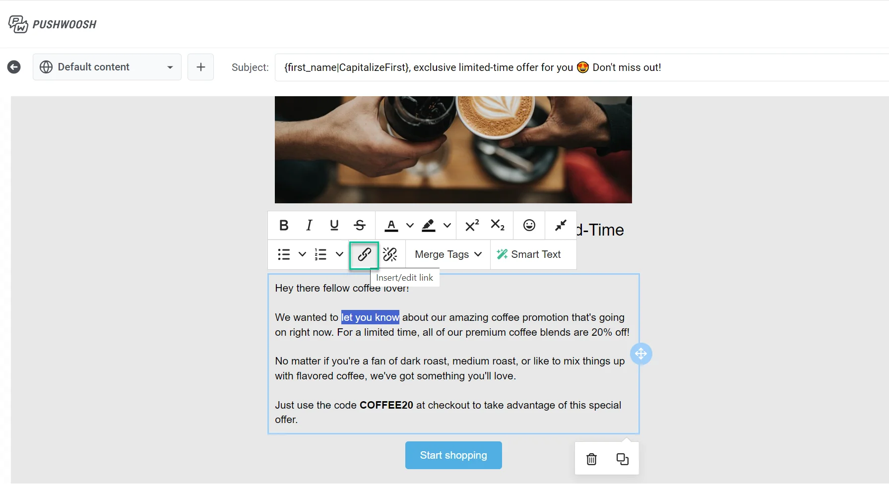
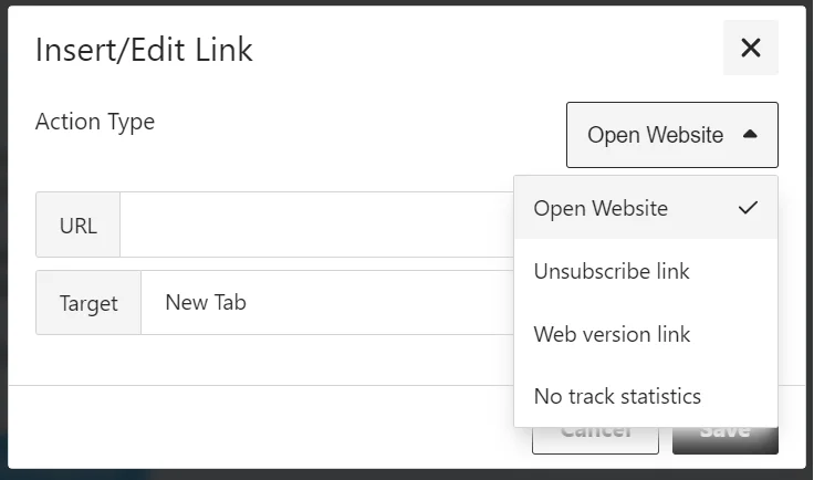
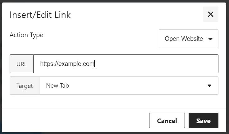
Anchor link toUse the Insert/Edit Link dialog to set what happens when a recipient clicks a button or selected text. Choose an Action type, then fill in the fields for that action.
Open Website
Anchor link toOpens a link when the recipient clicks. Enter the address in URL.
Manage preferences link
Anchor link toAdds a link to the subscription preference center where recipients can choose which email categories they receive. The link is inserted automatically.
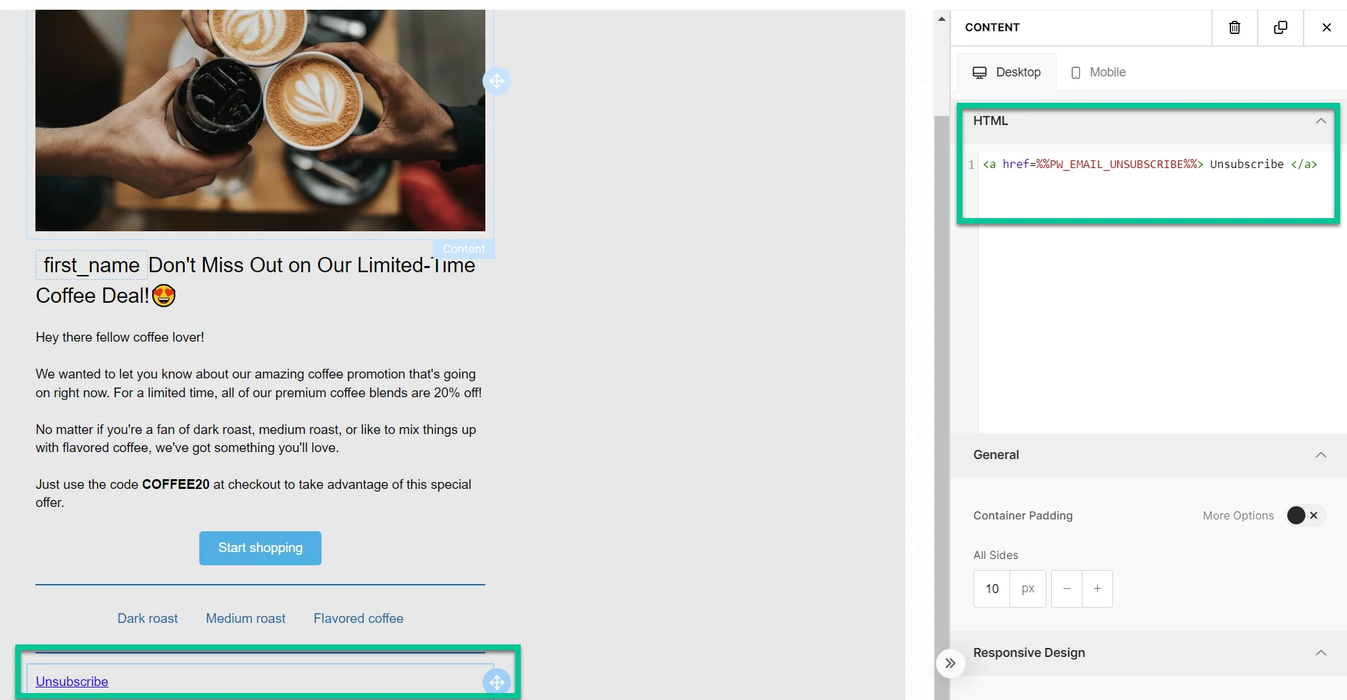
Unsubscribe link
Anchor link toLets recipients opt out in line with regulations and their preferences.
What happens when the recipient clicks the unsubscribe link
Anchor link toIf the subscription preference center is enabled
Anchor link toThe recipient is unsubscribed only from the category assigned to that email (e.g., Newsletter). The category name is removed from their Subscribed Email Categories tag.
A confirmation screen appears with Resubscribe and Manage preferences options. Learn more.
If the subscription preference center is not enabled
Anchor link toThe recipient is opted out of all marketing emails and the Unsubscribed Emails tag is set to true. Transactional emails are not affected and will continue to be delivered. Learn more about message types.
Clicks are counted in the unsubscribe rate in Message History.
Web version link
Anchor link toGives recipients access to a web version of the email, useful if they have trouble viewing it in their inbox.
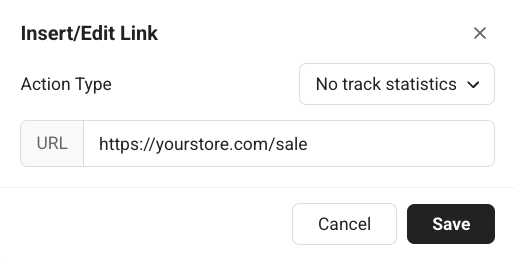
No track statistics
Anchor link toOpens a link when the recipient clicks, without counting the click toward your email’s click statistics. Enter the address in URL.
Subscription form confirmation link
Anchor link toInserts a confirmation link for a subscription form submission (for example, to confirm a double opt-in). Learn more about double opt-in.