Create native in-app messages
Native in-apps use ready-made layouts that the Pushwoosh SDK renders directly on the device, instead of the HTML page a custom in-app loads. This makes them load faster and animate more smoothly, and you don’t need design or development skills to build one.
Reach for a native in-app when you want to launch a promotion, reminder, or feature announcement quickly and a fully custom layout isn’t necessary. If you need full control over the design, build an HTML-based in-app instead.
Prerequisites
Anchor link toBefore you create a native in-app template, make sure:
- The Pushwoosh SDK is integrated in your app so in-app messages can appear. Learn more
- Your app runs iOS SDK 7.2.0+ or Android SDK 6.10.0+ for modal, fullscreen, and stories. Sheet, carousel, and banner need iOS SDK 7.2.1+ or Android SDK 6.10.1+. Video needs iOS SDK 7.2.0+ or Android SDK 6.11.0+.
Cross-platform frameworks
Anchor link toThe native in-app module ships differently depending on your stack:
- Flutter bundles the native in-app module automatically. No extra setup is needed beyond the Pushwoosh Flutter plugin.
- React Native, Cordova, Capacitor, Unity, and Expo don’t bundle the native in-app module. Add it to your app’s underlying Android/iOS project yourself:
pushwoosh-inapp-uion Android,PushwooshInAppon iOS. See your framework’s integration guide for how native modules are added to your project. - Web isn’t supported. Native in-apps render through the Android and iOS SDKs, and the Web SDK has no native in-app module.
Create a native in-app template
Anchor link to- Go to Content → In-apps.
- Click the arrow next to Create in-app and choose Native in-app. The native editor opens directly.
- Enter a template name.
- In Display type at the top of the editor, pick a display type: modal, fullscreen, stories, sheet, carousel, banner, or video. See Configure the display type for what each type needs.
The editor shows a live mobile preview on the right and the template fields on the left, grouped into Content, Config, and Actions. What you see in each group depends on the display type you picked.
Configure the display type
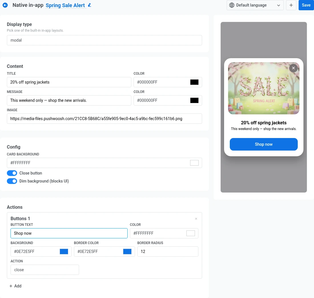
Anchor link toModal
Anchor link toA centered card, optionally shown over a dimmed background.
- Under Content, add a title and message, each with its own text color, plus an optional image. See Add an image.
- Under Config, set the card background color. This fills the card behind your text and image.
- Turn Close button on if you want a ✕ control so users can dismiss the in-app without tapping a button.
- Turn Dim background on to darken the screen behind the card and keep focus on your message.
- Under Actions, add one or more buttons. See Configure buttons.
Fullscreen
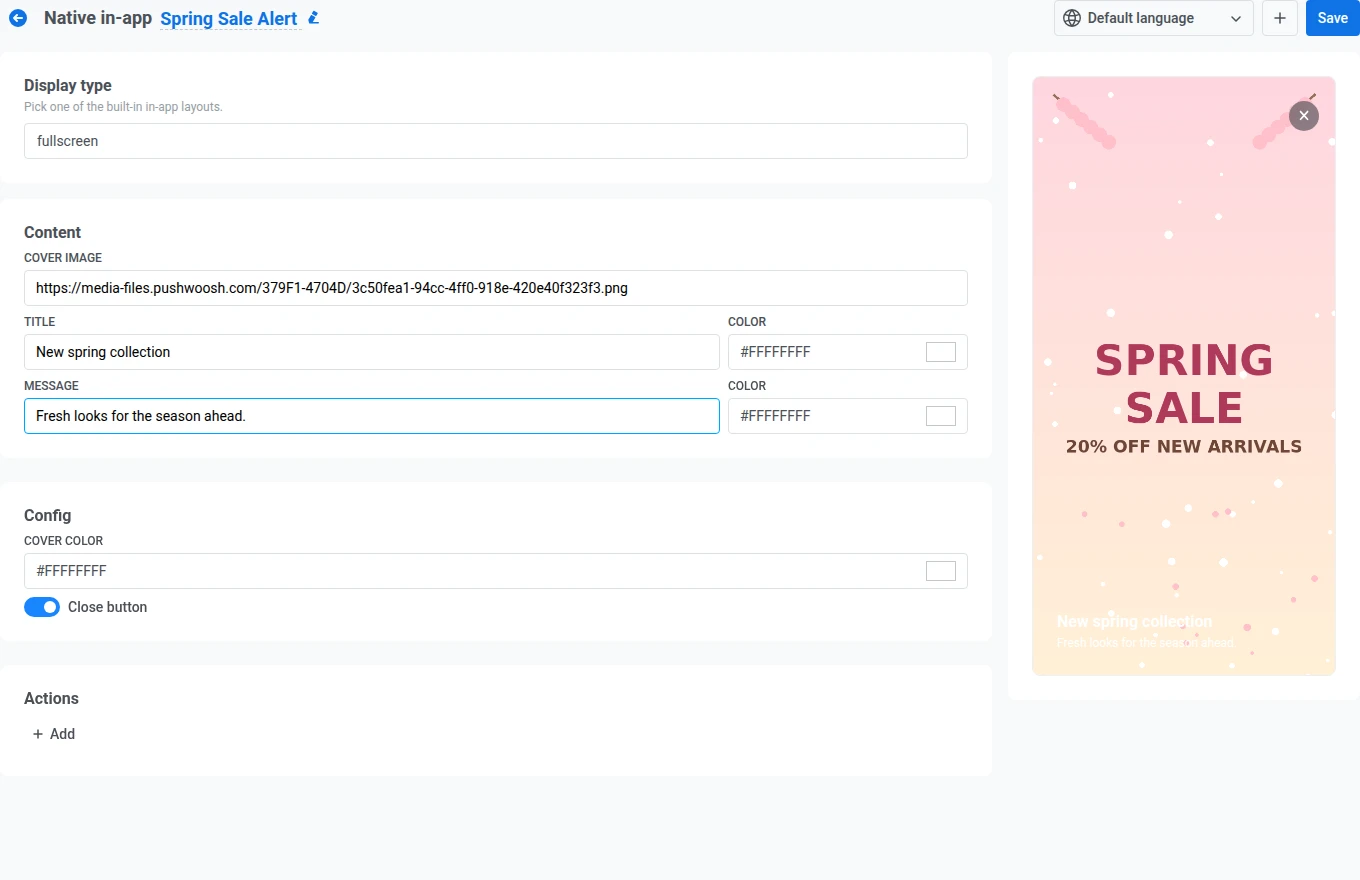
Anchor link toAn edge-to-edge cover image with text and buttons on top. Fill in these fields on the left panel:
- Under Content, add a cover image, plus a title and message, each with its own text color. See Add an image.
- Under Config, set the cover color. It shows while the cover image loads, or on its own if you leave the image empty.
- Turn Close button on if you want a ✕ control so users can dismiss the in-app without tapping a button.
- Under Actions, add one or more buttons. See Configure buttons.
Stories
Anchor link toA sequence of full-screen slides with progress bars at the top, similar to social media stories. Each slide is its own Stories entry under Content.
- Fill in the first slide’s Image, Title, and Message (each with its own text color). See Add an image.
- Set Seconds to how long the slide stays on screen before advancing. The default is 5. Enter a value from 1 to 30. Values outside this range block Save with a validation error.
- Optionally, click Add inside the slide to give it its own CTA button. See Configure buttons.
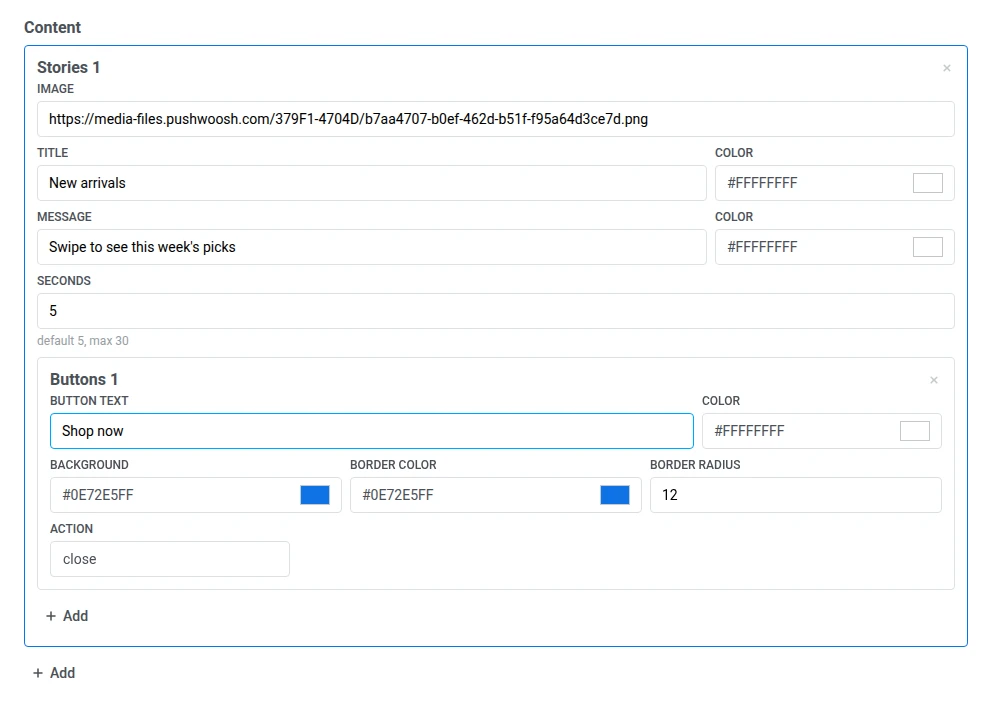
- Click Add below the last slide to add another slide, then repeat steps 1-3 for it.
- Under Config, turn Loop on if you want the story to start again from the first slide after the last one finishes.
- Turn Close button on if you want a ✕ control so users can exit before all slides play through.

Example of how the finished story looks for the user
Anchor link toSheet
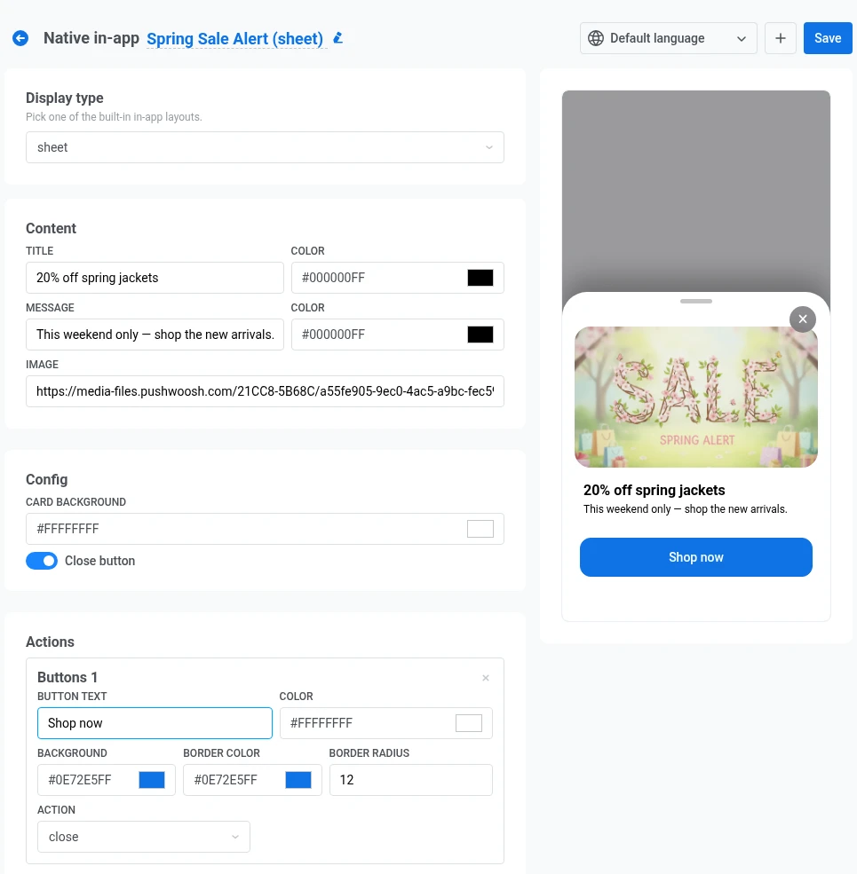
Anchor link toA bottom sheet that slides up from the lower edge of the screen. A handle at the top lets users drag it down to dismiss.
Fill in these fields on the left panel:
- Under Content, add a title and message, each with its own text color, plus an optional image. See Add an image.
- Under Config, set the sheet background color. This fills the panel behind your text and image.
- Turn Close button on if you want a ✕ control so users can dismiss the sheet without tapping a button.
- Under Actions, add one or more buttons. See Configure buttons.
Carousel
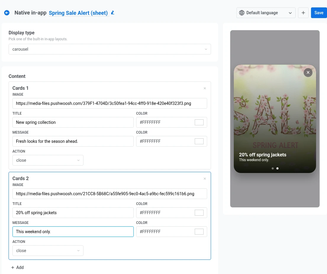
Anchor link toA full-screen message with several cards users swipe through. Dots at the bottom show which card is active. Under Content, each card is a separate Cards entry.
- Fill in the first card’s Image, Title, and Message (each with its own text color). See Add an image.
- Set Action for the card. Choose close to dismiss the in-app when the user taps the card, or url to open a link (same options as Configure buttons).
- Click Add below the last card to add another one, then repeat steps 1-2 for it.
- Turn Close button on if you want a ✕ control so users can leave the carousel without tapping a card.
Banner
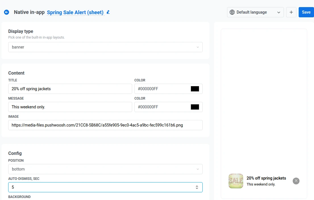
Anchor link toA compact bar pinned to the top or bottom edge of the screen, for messages that shouldn’t block the whole UI.
- Under Content, add a title and message, each with its own text color, plus an optional small image. See Add an image.
- Under Config, set Position to top or bottom to pin the banner at the screen edge you want.
- Set Auto-dismiss, sec to close the banner automatically after that many seconds. Leave it empty to keep the banner until the user dismisses it.
- Set the background color for the bar.
- Turn Close button on if you want a ✕ control on the banner.
- Under Actions, set Action to close or url. Banners don’t have separate buttons. Tapping anywhere on the banner runs this action. See Configure buttons for close and url behavior.
Video
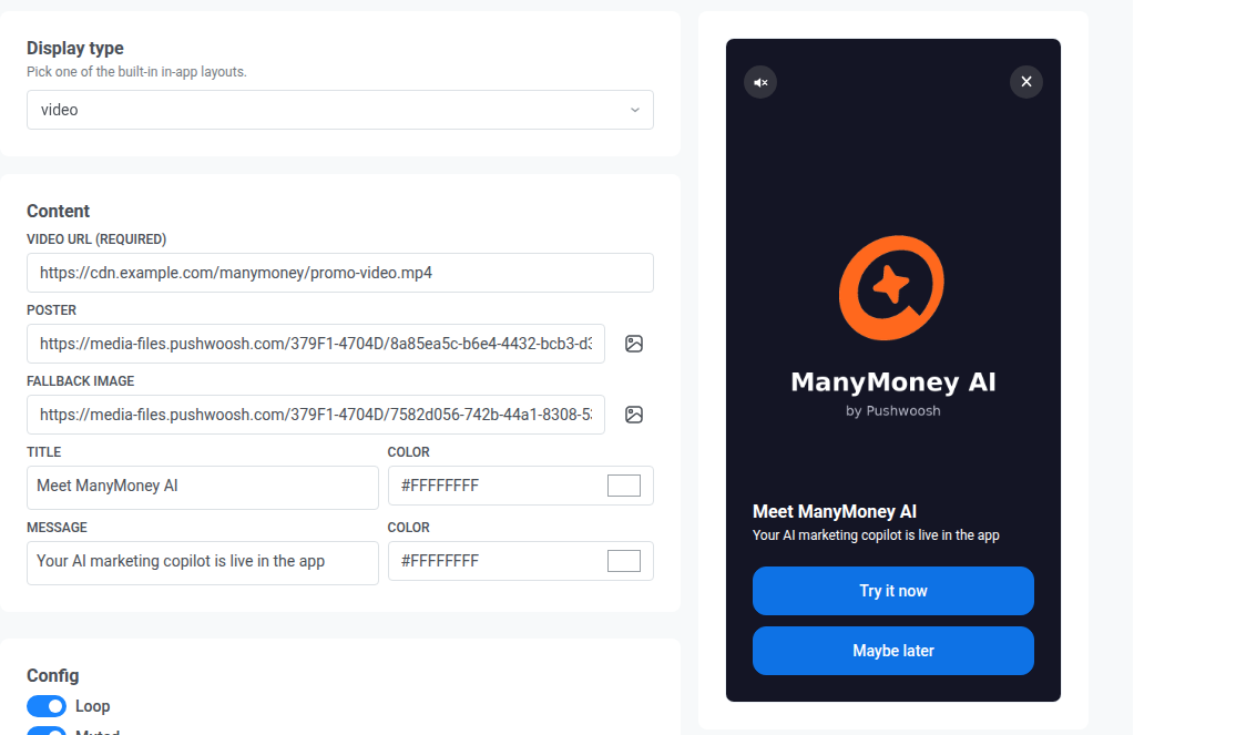
Anchor link toA full-screen player for an HLS streaming link (.m3u8) or a direct .mp4 file, with an optional title, message, and buttons on top.
- Under Content, set the Video URL (required) to an absolute HTTPS link to an
.m3u8or.mp4file. Optionally, add a Poster image shown before playback starts, and a Fallback image shown if the video can’t play. - Add a title and message, each with its own text color.
- Under Config, turn Loop on to restart the video after it ends.
- Turn Muted on to start playback with the sound off.
- Turn Close button on if you want a ✕ control so users can dismiss the in-app without waiting for the video to end.
- Under Actions, add one or more buttons. See Configure buttons.
Configure text fields
Anchor link toText fields don’t support multi-line text. If you press Enter, the editor may show a line break, but Pushwoosh saves a space instead. On the device, the text appears as one line.
To add an emoji, click Emoji next to the field toolbar. Emojis are supported in the same text fields as plain text. Check the live preview to see how they look on the layout.
Add dynamic content
Anchor link toEvery text field supports personalization with tags and User ID.
- Click Personalization next to the field toolbar.
- Under Tag, choose a tag or User ID.
- Choose a format modifier (for example, CapitalizeFirst or regular).
- Optionally, enter a Default Tag Value.
- Click Insert.
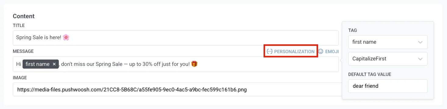
The inserted tag shows as a chip in the field. You can change the tag, modifier, and default before you click Insert. Personalization uses the same tags, modifiers, and defaults as Dynamic content.
When you click Save, Pushwoosh checks the dynamic content and Liquid in every text field. If a field doesn’t parse (for example, an unclosed {% if %} tag), Save is blocked and a Dynamic content contains errors toast names the broken field and language. Fix it there, then click Save again.
Configure buttons
Anchor link toModal, fullscreen, each stories slide, sheet, and video use the same button fields:
- Button text and its color.
- Background, Border color, and Border radius.
- Action: choose what happens when the user taps the button:
- close: dismisses the in-app.
- url: opens the link you enter in the field that appears. Use a web address (for example,
https://example.com) or a deep link into your app (for example,myapp://product/123).
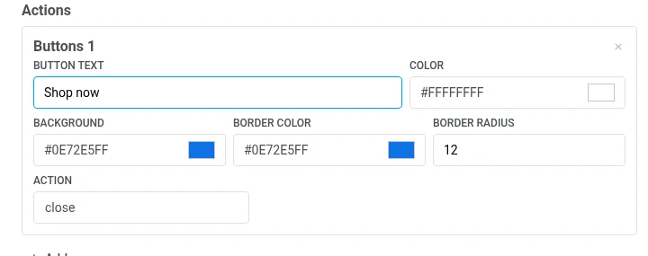
Click Add to add another button, or the × on a button to remove it.
Add an image
Anchor link toEvery image field (image, cover image, and each card or slide’s image) works the same way. Paste a hosted image URL directly into the field, or click Choose from Media storage next to it to open the Media storage and pick an image you’ve already uploaded. Picking an image from the Media storage replaces whatever URL is currently in the field.
Add a barcode
Anchor link toNext to Choose from Media storage, click Build a barcode to open a drawer that generates a scannable Code 128, EAN-13, EAN-8, UPC-A, or QR code and writes the resulting URL into the field:
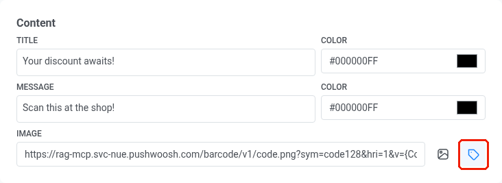
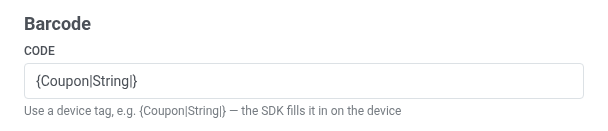
- Code. The value to encode: either a fixed code, like
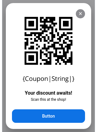
SAVE20, or a device tag, like{Coupon|String|}or{LoyaltyCardNumber|String|}, so each recipient sees their own code. A device tag is filled in with the recipient’s real value right on their device, just before the in-app appears. Defaults to{Coupon|String|}.
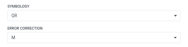
- Symbology. Choose the barcode format: Code 128, EAN-13, EAN-8, and UPC-A are standard retail barcodes read by handheld scanners, and QR is a square code that any phone camera can scan.
- Error correction. Appears only after you set Symbology to QR. Real-world QR codes can get scratched, blurry, or partly covered by a logo, and error correction is extra information baked into the code so it still scans despite that damage. Choose how much damage it can tolerate:
L,M,Q, orH, from least to most robust. Higher levels tolerate more damage but produce a denser, busier-looking code. Defaults toM.
- Print the code in digits. Show the value under the code.
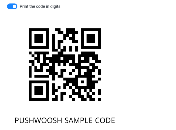
When Code is a device tag, the preview substitutes a sample value, since it can’t resolve a real recipient’s tag. A fixed code, like SAVE20, previews exactly as entered.
Click Insert into the image field to copy the generated URL into the Image field above.
Add localizations
Anchor link toBy default, a native in-app has one language. To add more:
- Click + next to the language selector in the top bar.
- Select the languages to add and click Apply.
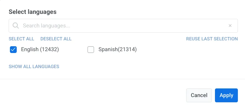
- Use the language selector in the top bar to switch between languages and fill in the text fields for each one.
Save the template
Anchor link toClick Save in the top right to persist your changes.
The template then appears in Content → In-apps alongside your other in-app templates.
Use it in a campaign
Anchor link toA native in-app template appears in the template picker together with your other in-app templates.
You can use it to:
- Send an instant in-app
- Add an in-app step to a Customer Journey
- Open an in-app when the user taps a push