Web popup content blocks
Reference for every block you can add on a Web popup content layout from the Elements tab.
Each block type serves a different purpose in the popup:
- Text: copy on the popup, with inline formatting and text styles
- Button: a call to action that opens a link, closes the popup, requests web push, or goes to another page
- Icon: a small pictogram next to your text
- Countdown: a live deadline timer
- Topic picker: checkboxes or chips that write interests to a tag
- Rating: an NPS, stars, or thumbs score sent as an event
- Subscription form: email signup and other form fields
How to configure content blocks
Anchor link to- Open the Elements tab on the right.
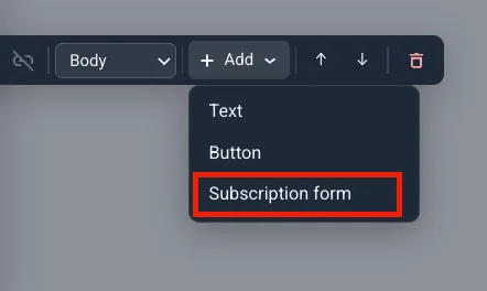
- Drag a tile onto the popup, or click it to add it to the page.
- A click inserts the block below the selection on the canvas.
- If nothing is selected, the block goes at the end of the page’s first section.
- Select a block on the popup to open the Settings tab (next to Elements). Adding a block from Elements opens Settings right away.
To move a block anywhere on the popup, including into another section, select it and drag the handle that appears to its left into any gap.
In Settings you can:
- Configure that block’s own options
- Move it up or down within its section with POSITION (up and down arrows)
- Delete it with the delete icon
Text
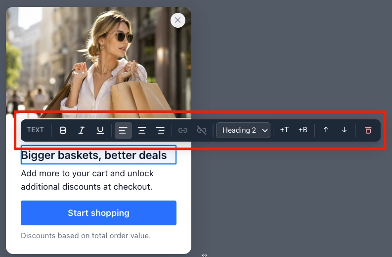
Anchor link toClick any text or button label on the popup to edit it inline. A toolbar appears above it:
- Apply bold, italic, or underline formatting.
- Add or remove a link.
- Set left, center, or right alignment.
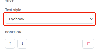
To change the text’s style, select it and open the Settings tab on the right. Choose Icon (text style, not the Icon block), Eyebrow, Heading 1–3, Body, or Caption.
Button
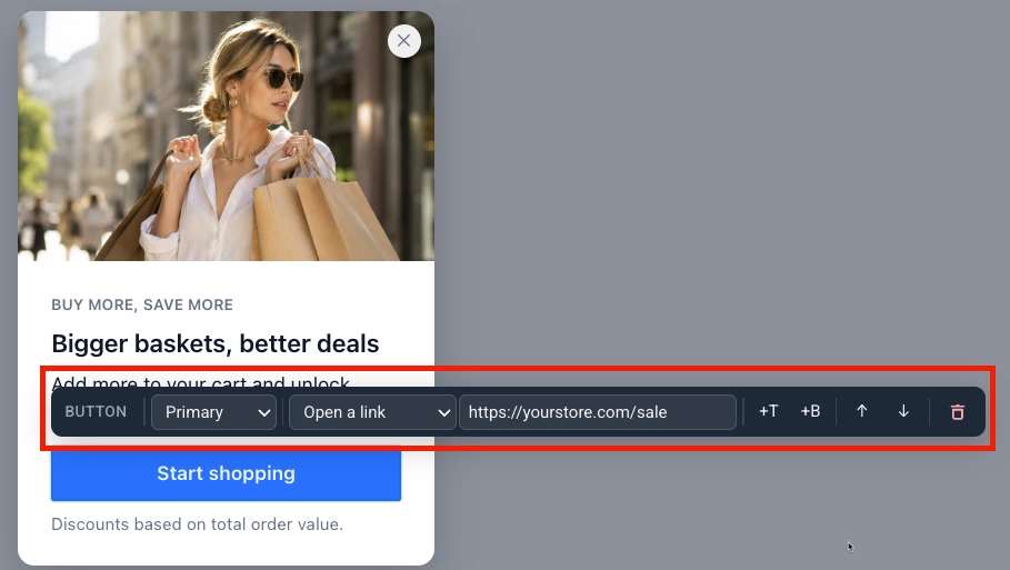
Anchor link toClick a button to select it, then open the Settings tab on the right:
- Button style: Primary or Secondary.
- Action:
- Open a link: enter the Link URL. New tab is on by default. Clear the checkbox to open the link in the same tab instead.
- Close the popup.
- Subscribe: request web push permission and subscribe the visitor. This is not the email Subscription form block. A granted request closes the popup. A denied one disables the button, because the browser won’t prompt twice.
- Go to page: pick another page of the popup to switch to. This option appears once the popup has more than one page. See Work with multiple pages.
Use POSITION to move the button up or down, or the delete icon to remove it.
Icon
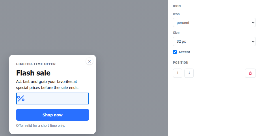
Anchor link toAdd an Icon block to drop a small pictogram (for example a percent sign for a sale, or a gift for a giveaway) next to your text. This is the Icon block, not the Icon text style under Text.
- Open the Elements tab on the right.
- Click Icon.
- Set the options in the Settings tab:
- Icon: pick from a fixed set of 20 icons (bell, gift, cart, chart, lock, calendar, check, star, clock, tag, mail, phone, download, play, shield, sparkle, percent, truck, ticket, user). Custom icon uploads aren’t supported.
- Size: 24, 32, or 48 px.
- Accent: on by default, so the icon matches the popup’s accent color. Turn it off to pick a custom color.
Countdown
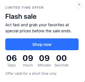
Anchor link toAdd a Countdown block to build urgency with a deadline that ticks down live on the popup.
- Open the Elements tab on the right.
- Click Countdown.
- Set the options in the Settings tab:
- Deadline: the date and time the countdown reaches zero.
- Time zone: the zone the deadline is read in, not the visitor’s own time zone. Defaults to your browser’s time zone; pick UTC from the list to read the deadline literally instead.
- Language: the language of the unit labels (days, hours, and so on). Leave it on English (default) or pick from 14 other languages.
- Labels: turn on to show unit labels next to the numbers.
- When the deadline passes:
- Show zeros: the countdown keeps showing 00:00:00.
- Do not show the popup: the whole popup is skipped once the deadline is in the past. Pushwoosh checks the deadline right before the popup would appear. A popup skipped this way doesn’t count against Once per visitor frequency.
- Go to page: jump to another page of the popup when the deadline passes. Only offered once the popup has more than one page. Pick the target page from the dropdown that appears. See Work with multiple pages.
Topic picker
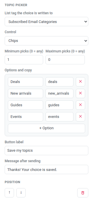
Anchor link toAdd a Topic picker block to let visitors self-select interests as checkboxes or chips. Their picks are written to a tag on their device.
- Open the Elements tab on the right.
- Click Topic picker. The block appears with two placeholder options. Its settings open in the Settings tab.
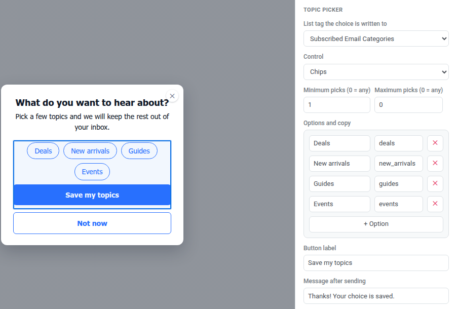
- In List tag the choice is written to, pick an existing List-type tag, or choose Create a list tag to make one without leaving the editor. Until you pick a tag, the block does not write anything.
- Set Control to Checkboxes or Chips.
- Set Minimum picks and Maximum picks.
0on either end means no limit on that side (0 = anyin the field labels). At least one pick is always required to submit, even when Minimum is0. Picking past the maximum, or trying to submit under the minimum, shows an inline message next to the block instead of sending anything. - Under Options and copy, edit each option’s label (what the visitor reads) and Tag value (what’s written to the tag). If you leave Tag value empty, Pushwoosh writes the option’s internal ID instead (
option-1,option-2, and so on). Use + Option to add another row, up to 12 options total. - Set the Button label (default Save) and the Message after sending (default Thanks! Your choice is saved.).
Rating
Anchor link toAdd a Rating block to collect a quick score (NPS, stars, or thumbs) as a custom event.
- Open the Elements tab on the right.
- Click Rating. The block appears with no event set. Its settings open in the Settings tab.
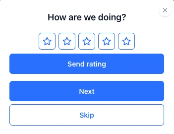
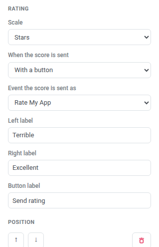
- Set Scale to NPS 0–10, Stars (1 to 5), or Thumbs (up or down). Across all three, a higher score means a more positive rating. Thumbs sends
1for a thumbs-up and0for a thumbs-down. - Set When the score is sent to On tap (sends when the visitor picks a value) or With a button (waits for a submit click).
- In Event the score is sent as, pick an event from your project, or choose Create an event to define a new one without leaving the popup. The score is stored as that event (
score,scale, andslotKeyattributes). Use it in segments or Customer Journeys like any other event. Until you pick an event, the block does not send anything. - Optionally fill Left label and Right label at the two ends of the scale.
- If When the score is sent is With a button, set the Button label (default Send rating).
Subscription form
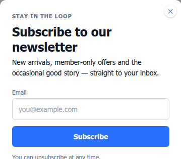
Anchor link toAdd a Subscription form block to collect email signups and other fields in the popup. Use this for email and form fields. For web push permission, use a button with the Subscribe action instead. Learn more about subscription forms.
Add the block
Anchor link to- Open the Elements tab on the right.
- Click Subscription form.
- The block appears with a default Email field and Subscribe button. Its settings open in the Settings tab.
Choose a form source
Anchor link toWith the block selected, the Settings tab shows a Subscription form dropdown that links the block to a subscription form in your project. You can create a new form or pick one that already exists:
| Option | When to use |
|---|---|
| New form — created on save (default) | Fastest start: Pushwoosh creates the form for you when you save the popup, named “popup name — web popup”. |
| + Create new form… | You want to name the form and set it up before you save the popup. Opens a New subscription form dialog. Enter a Name, set Fields, Submit text, and Privacy, then click Create. |
| An existing form from the dropdown | Reuse a form that already has subscribers or double opt-in configured. |
Set fields and submit behavior
Anchor link toStill in the Settings tab:
- Set the Submit button style:
- Primary: filled button in the popup Accent color. Best when Subscribe is the main action on the page.
- Secondary: outlined button with a border and accent-colored label. Best when the popup already has a primary button or you want a lighter look.
- Turn on Privacy to add a privacy-consent line under the form, then enter your privacy policy URL in the field that appears.

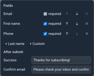
- Under Fields, keep Email (always required) and add First name, Last name, Phone, or Custom.
- For a Custom field, pick the tag its value submits to from the Pick a tag… dropdown, or choose Create a tag to make a new string tag without leaving the editor.
- Set the Success and Confirm email texts shown after a visitor submits.