Configure email-wide styling and footer
Configure email-wide styling
Anchor link toIn the Drag & drop editor, with your email open on the canvas, open the Settings tab in the right-hand panel.
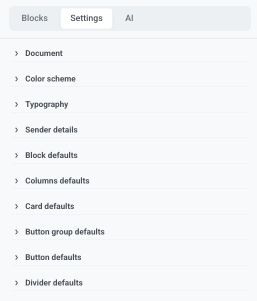
These settings apply to the whole email. To change one block only, select it on the canvas and override the style there.
Document
Anchor link toSet the size and look of the whole email area:
- Width and padding
- Background image (with its own Fit and position) or gradient
- Gap between blocks
- Default image corner radius, content area corner radius, and content shadow
Set the solid background color for the whole email under Color scheme, not here.
Color scheme
Anchor link toSet the email’s palette:
- Background: solid color behind the entire email, including padding around cards and other blocks
- Text: page text
- Heading: heading styles
- Link: menu links that don’t have an explicit color
Other palette colors are used when you pick colors later in the editor and when you use AI to generate content. Blocks already on the canvas keep the colors you set on them.
Turn on Dark mode variant to set separate colors for clients that honor dark mode.
Typography
Anchor link toSet the email-wide font family. For each text style (Heading 1, Heading 2, Normal, and so on), set font size, font weight, line height, and letter spacing.
Sender details
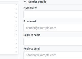
Anchor link toIn Sender details, set who the email is from and where replies go: From name and From email for the sender recipients see, Reply-to name and Reply-to email for where their replies land.
Block and layout defaults
Anchor link toUse these so new blocks match the email until you style a block on the canvas:
- Block defaults: background, background image, border color, border width, corner radius, and mobile/desktop visibility
- Columns defaults: outer padding, padding inside each column, and gap between columns
- Card defaults: starting look for Card containers
- Button group defaults: spacing and alignment for buttons in a group
- Button defaults: starting look for new Button blocks
- Divider defaults: line style, color, thickness, and width
Defaults apply only where a block does not set its own value. If you change Corner radius on a block, that setting replaces the email-wide default for all corners on that block. It does not mix corners from the default and the block.
Configure the email footer
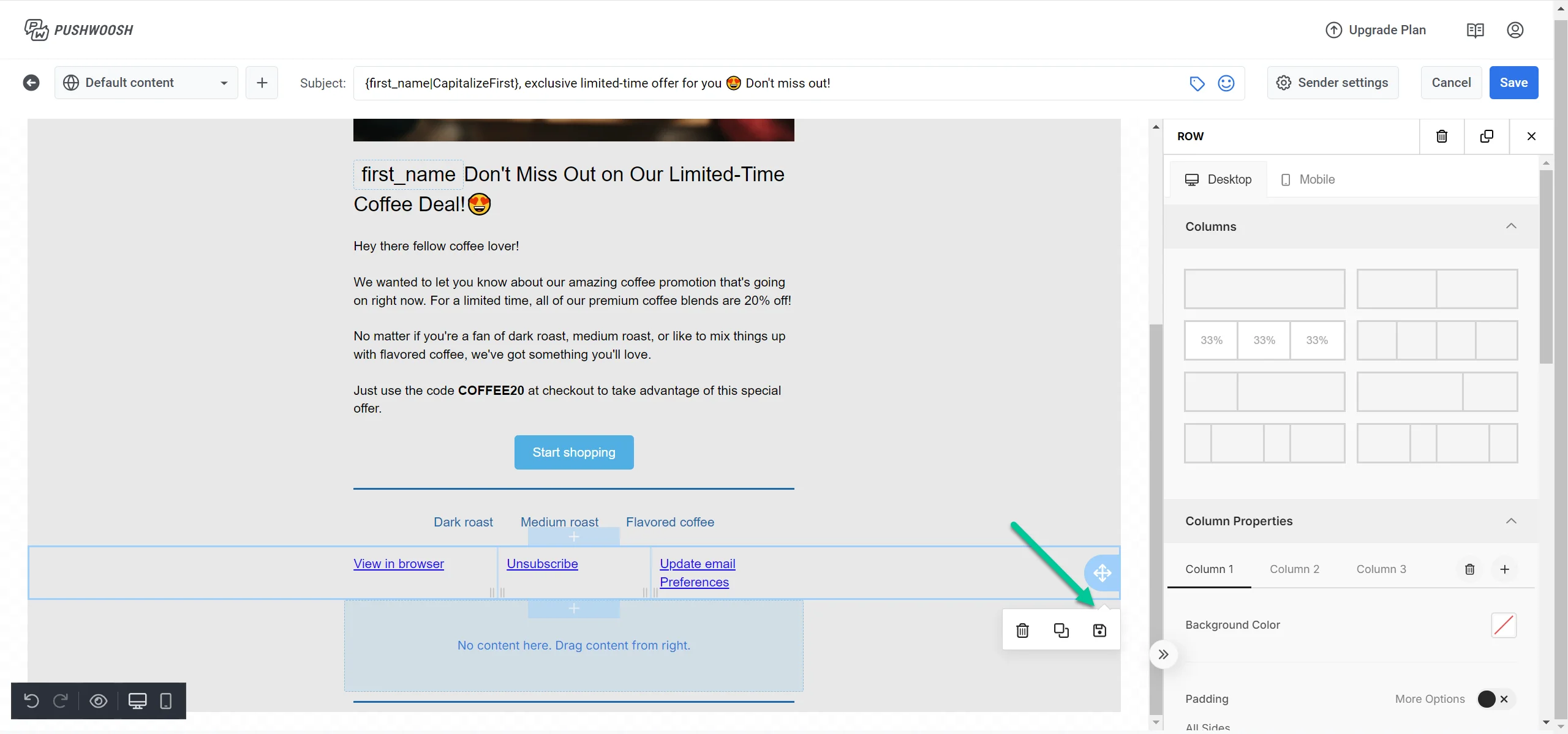
Anchor link toIn the Layers panel, select Footer to open its settings in the right-hand panel.
Every email includes a Footer block for legally required sender information and the unsubscribe link.
Load or save a project footer
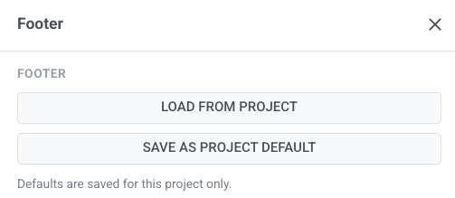
Anchor link to- Load from project: fill this email’s footer from your saved project-level footer.
- Save as project default: store the current footer as the starting point for future emails. Use this only when you want new emails to start from this footer.
Defaults are saved for this project only.
Email type and company info
Anchor link to-
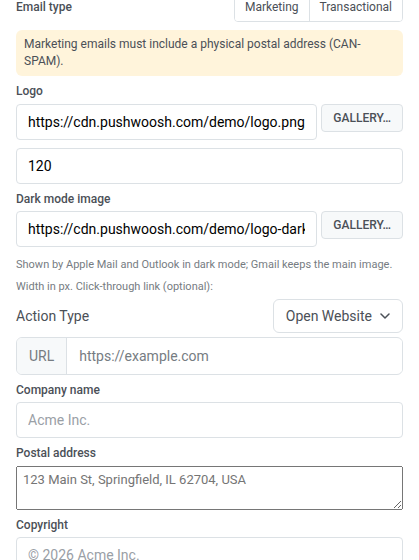
Under Email type, choose Marketing or Transactional. For Marketing, the footer keeps the unsubscribe link. For Transactional, the unsubscribe link is omitted. Unsubscribe visibility follows this setting. Learn more about marketing vs. transactional messages.
-
Set the logo URL or pick a logo from the gallery. This logo appears in the footer, at the bottom of the email. To show your logo at the top of the email, add a Logo header block, which takes its logo from your Brand book.
-
Set the logo width in px.
-
Optionally set a Dark mode image URL, or pick an image from the gallery. Apple Mail and Outlook show it in place of the main logo when the recipient reads in dark mode. Gmail always keeps the main logo.
Applying a Brand book that has a logo replaces both the footer logo and its dark mode image with the Brand book ones.
-
Optionally set a click-through link: choose an Action Type and enter the URL.
-
Fill in Company name, Postal address, and Copyright.
Links and badges
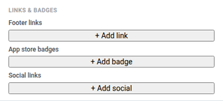
Anchor link to- Add labeled Footer links, such as Privacy Policy or Terms.
- Add App store badges for App Store or Google Play with destination URLs.
- Add Social links with icons that point to your social profiles.
Style
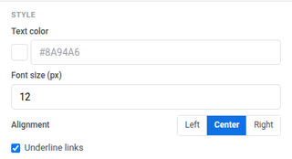
Anchor link to- Text color: footer text color
- Font size (px): footer font size
- Alignment: left, center, or right
- Underline links: turn on to underline footer links
Options
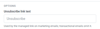
Anchor link toSet Unsubscribe link text for the managed unsubscribe link on marketing emails. Transactional emails omit the link.
Check before you save
Anchor link toWhen the footer and email-wide settings look right on the canvas, run Check before you save. See Check your email before sending.