Configure in-app template settings
These settings apply to the whole in-app template at once, rather than a single block. Open or create a template in the built-in editor first (Content → In-apps), then use Settings and In-app settings as described below.
Configure template-wide styling
Anchor link toTemplate settings control styling for the whole in-app template: document size and background, popup look, and default styles for blocks.
Open the Settings tab in the right panel.
Start with shared look, then size, then defaults for new blocks:
- Set Color scheme and Typography so colors and fonts stay consistent across the template.
- Set Document and Popup for size, margins, background, and how the message sits on the dimmed backdrop.
- Use the defaults sections only when you want new blocks to match the template automatically.
On the canvas, change a single block when that piece should look different. Defaults apply wherever an individual block does not override them. To clear style overrides on the template and return to the defaults, use Reset custom styles in the top bar ⋮ menu. See Create in-app messages in the built-in editor.
Document and popup size
Anchor link toUse Document to control the message size and canvas spacing. Use Popup to control how the message sits on the dimmed backdrop. There’s no height setting. The popup grows with its content.
Document
Anchor link toIn Document, set the padding, a background image, the gap between blocks, and a default corner radius for images.
To change how wide the popup looks on the phone, use these two fields in Document.
Max width (px) is the widest the popup is allowed to be, in pixels. On a large screen the popup will not grow past this number.
Side gutters (px) sits right under Padding. It sets empty space on the left and right of the popup. One value applies to both sides. Change this field when you want the popup to look wider or narrower:
- Raise the number to leave more empty space and make the popup narrower.
- Lower the number to make the popup wider.
- Enter a negative number and the editor treats it as 0.
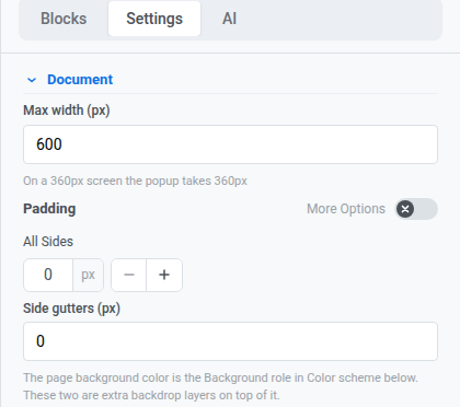
New templates start at 0 px gutters, so the popup fills the screen width.
Check the hint under Max width to see how wide the popup will be with your current values.
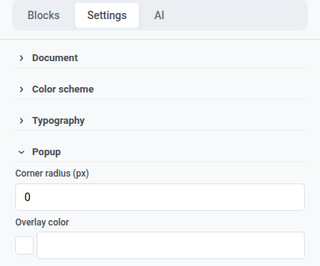
Popup
Anchor link toIn Popup, set the corner radius and overlay color for how the message sits on the dimmed backdrop.
Color scheme and typography
Anchor link toIn Color scheme, set named color roles (heading, accent, links, background, borders, and more). Those roles update colors across the template at once. Existing blocks keep colors you already set on those blocks.
In Typography, set the default font family and sizing for text in the template.
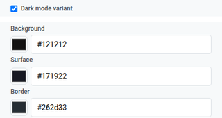
Dark mode variant
Anchor link toDark mode variant lets you set a second set of colors for when the template shows in dark mode.
- In Color scheme, turn on Dark mode variant.
- Set the separate colors for dark mode.
- Use the sun/moon icon in the top bar to check light vs. dark while you edit.
This canvas toggle isn’t the same as the read-only Preview panel. Until you set your own dark colors, the toggle can derive them automatically. See Create in-app messages in the built-in editor.
Block and layout defaults
Anchor link toUse these sections so new content matches the template until you style a block on the canvas:
- Block defaults: shared starting styles for blocks you add later.
- Columns defaults: spacing for every Columns layout (outer padding, padding inside each column, and the gap between columns).
- Card defaults: starting look for Card containers that group content in the layout.
- Button group defaults: spacing and alignment when several buttons sit together as a group.
- Button defaults: starting look for new Button blocks so CTAs stay consistent across the template.
- Divider defaults: starting line style, color, thickness, and width for new Divider blocks.
When you finish in Settings, click Save in the top bar to keep the template changes.
Configure how the in-app looks on device
Anchor link toIn-app settings control how the message appears and behaves on the device: position, animations, swipe gestures, and the close button. Position, animations, and swipe apply on iOS and Android Native. The close button style is different. It is stored with this template and shows on every platform that displays the message.
Click In-app settings in the top bar.
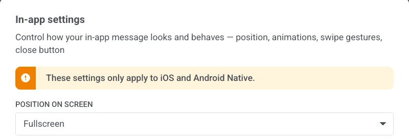
Position on screen
Anchor link toChoose Fullscreen, Top, Center, or Bottom.
For a full-screen message, also set Max width in Document as described under Document.
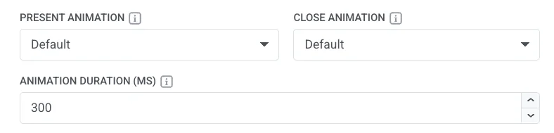
Animations
Anchor link to- Present Animation / Close Animation: None, Fade, Left, Right, Up, or Down. Choose Default to use the same open/close motion your app already uses for in-apps.
- Animation Duration (MS): 100 to 3000 milliseconds. Leave empty to keep your app’s usual timing.
Swipe to close
Anchor link toEnable any combination of Left, Right, Up, and Down.

Close button
Anchor link toTurn Show close button on or off.
When it’s on, set:
- Position: Top right, Top left, Bottom right, or Bottom left.
- Background: a color or Transparent.
- Corner radius: rounds the corners of the close button background. Available only when Background is a color (not Transparent). Set 0–16 px. 16 px makes a circle (default). 0 px makes a square.
- Icon Color: color of the close icon.
- Margin: space around the close button on each side (Top, Right, Bottom, Left).
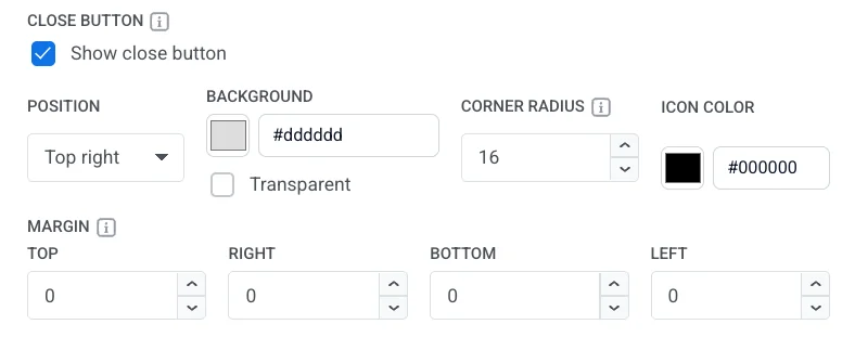
Unlike position, animations, and swipe, the close button style is stored with this template and shows on every platform that displays the message, not only on iOS and Android Native.
- Click Apply to save your In-app settings choices, or Cancel to discard them.
- Open Preview from the top bar ⋮ menu to check position, animations, and the close button before you save.
- Click Save in the top bar to store the template.