Overview page
The Overview page shows audience, push, email, and conversion trends without setting up a dashboard or report. Check it first to catch a drop in retention or a spike in delivery errors early, rather than a week into a bad trend. Open Project overview in the left menu.
- App metrics: check active users (MAU/DAU), platform and channel reach, and Day 1 / 7 / 14 / 28 retention
- Push: check push audience, delivery performance, and frequency capping impact
- Email: check subscriber base, delivery performance, category and mailbox-provider breakdowns, and frequency capping impact
- Conversions: check which campaigns and journeys lead to conversions and how much revenue they bring
For high-level messaging reach and engagement, go to Statistics → Project Statistics.
Set the reporting period
Anchor link toUse the date range picker to choose which period the Overview page reports on. Every chart on the App metrics, Push, Email, and Conversions tabs uses the same range, so you compare metrics for the same window.
By default, the page shows the last 30 days.
To change the period:
- Click the date range picker in the top-right corner, next to Project settings and Export statistics.
- Choose Last 7 days, Last 30 days, or set a custom start and end date on the calendar.
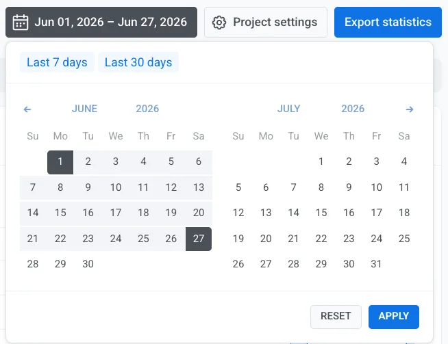
- Click Apply.
App metrics tab
Anchor link toCheck how many users are active in your app and how well you retain them, so you can spot growth or churn early without leaving the project overview.
Unique users
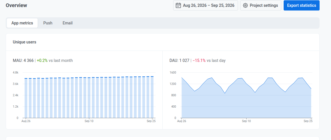
Anchor link toCheck the current value and the change compared to the previous month or day:
- MAU: monthly active users, over a rolling 30-day window ending on each plotted day
- DAU: daily active users, unique users who opened the app that day
User distribution by platforms
Anchor link toCheck how many users are reachable on each channel configured for the project (individual mobile and web push platforms, email, SMS, and chat channels such as WhatsApp, Telegram, and Viber), as of the last day of the selected period.

Treat it as a snapshot, not a sum over the period: the platforms can add up to slightly more than the project total, because every platform a user is reachable on counts them once.
Channel reach
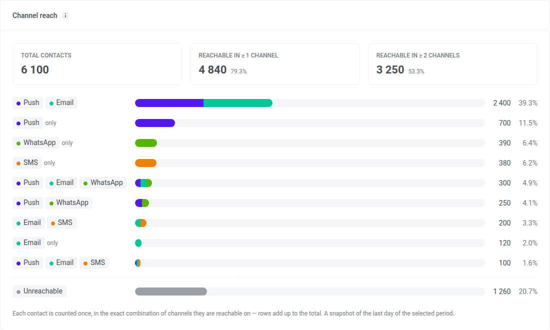
Anchor link toCheck how many users you can reach on at least one channel, how many on two or more, and which exact combination of channels each user falls into, as of the last day of the selected period.
What each part of the card means:
- Total contacts: every User ID in the project, including users with no device, such as users added by a tag import. Users with no device count as Unreachable.
- Reachable in ≥ 1 channel: users you can reach on at least one channel, and their share of Total contacts
- Reachable in ≥ 2 channels: users you can reach on two or more channels, and their share of Total contacts
- Channel combination rows: each row is one exact set of channels. A user in the Push + Email row is reachable on push and email and on no other channel. A row marked only has a single channel.
- Unreachable: users you can’t reach on any channel
A user counts as reachable on a channel when:
- Push: their device has a push token and push permission. All push platforms, including web push, count as one channel.
- Email: their address hasn’t unsubscribed and hasn’t hard-bounced
- SMS: they have a phone number registered for SMS
- WhatsApp: they have a phone number registered for WhatsApp
- Inbox: they have any app or browser device, with or without a push token. Inbox appears only if the project used Message Inbox in the last 30 days.
Unlike User distribution by platforms, each user is counted once here, so the rows and Unreachable add up to Total contacts. A person stored under two User IDs is counted twice.
A row’s count can differ from the size of a segment you build with the same conditions. The card shows a snapshot of the last day of the selected period, while a segment’s size reflects the data at the moment you last calculated it. A segment also shows devices per channel, not users in an exact combination of channels.
User retention
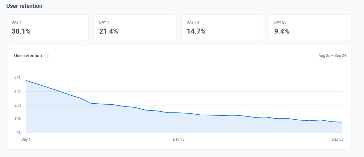
Anchor link toCheck Day 1, Day 7, Day 14, and Day 28 retention to see how many new users return after their first visit, and whether they come back in the first week and stay engaged over the following weeks. Each day counts only users who returned on exactly that day, not everyone who returned by then.
The cohort is everyone who first visited on one specific day, 30 days before the last day with data, not everyone who first visited during your selected period. Changing the date range doesn’t change which cohort is shown.
Push tab
Anchor link toUse this tab to check who you can reach with push, how many pushes got delivered and opened over the selected period, and how frequency capping affected sends.
Audience
Anchor link toCheck your push audience as of the last day of the period and how it changed since.
When more than one push platform is configured for the project, use the All platforms dropdown next to the section heading to filter Funnel, Subscribers, Push reachable, and the Frequency capping section below by a single platform. Base change and the Performance section aren’t affected by this dropdown.
Funnel
Anchor link toCheck the steps from Total users down to Active-reachable. Each step shows how many users remain and what share that is of the step before it.
The funnel is a snapshot for the last day of the selected period. It does not add up activity across the whole period.
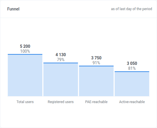
- Total users
- Registered users: has a push token
- Push reachable: users who can actually receive a push
- Active-reachable: Push reachable and opened the app in the last 30 days. This window is fixed and doesn’t change with the date range you pick.
Subscribers
Anchor link toCheck which segment each user falls into:
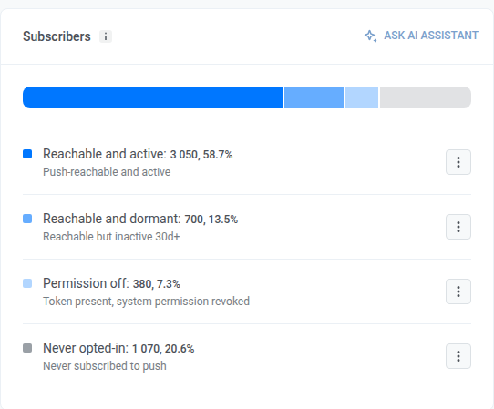
- Reachable and active: Push reachable and opened the app in the last 30 days
- Reachable and dormant: Push reachable but hasn’t opened the app in 30+ days
- Permission off: push token present, system permission revoked
- Never opted-in: no push token, never subscribed to push
On a row, open the kebab menu and choose Create segment or Export CSV.
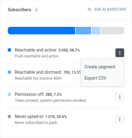
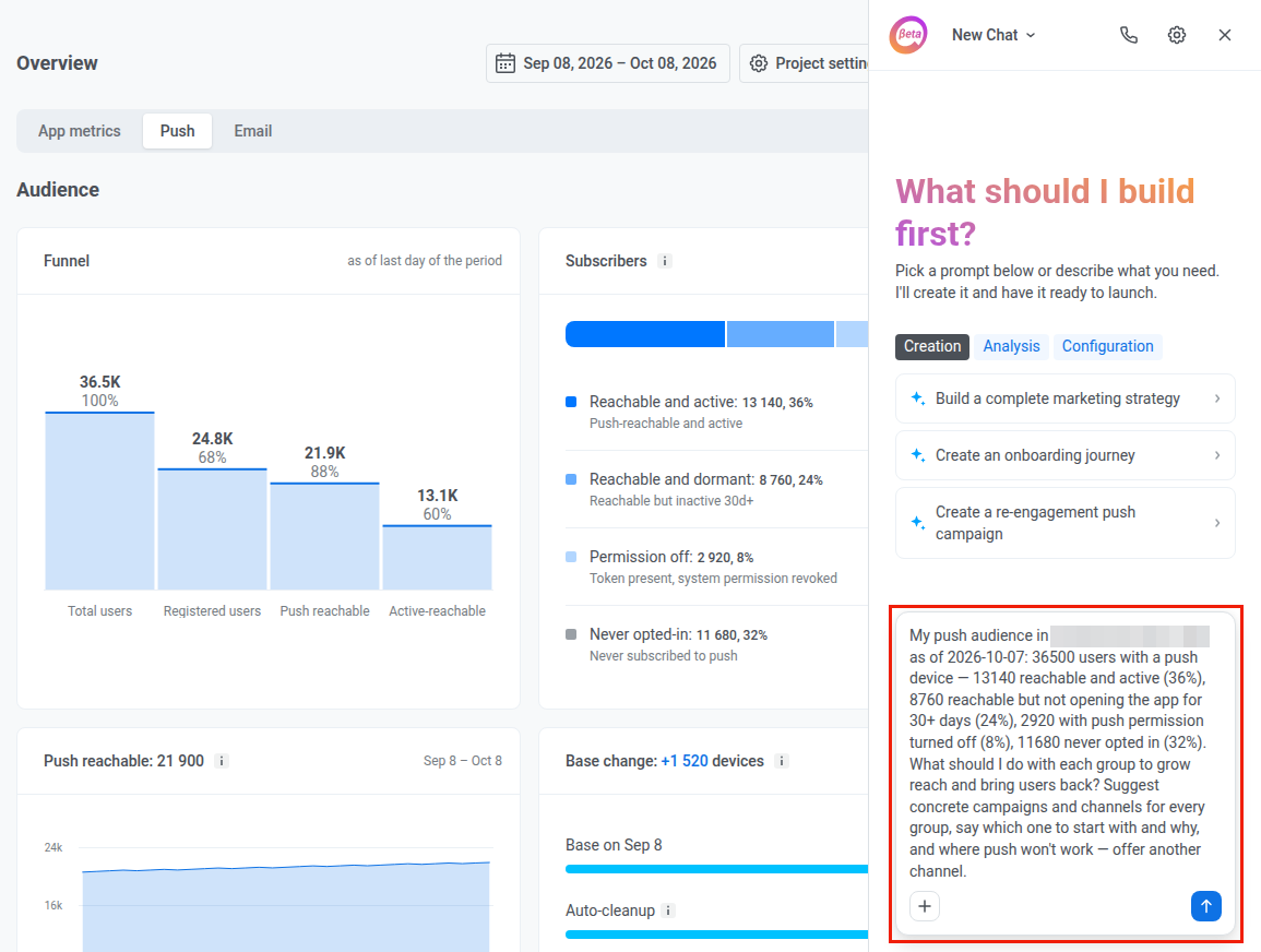
To ask about this audience in chat, click Ask AI Assistant in the card header when the AI Assistant is enabled for the account.

AI Assistant opens in a panel on the same page with a ready prompt about this audience. Edit the prompt if you need to, then send it.
Push reachable
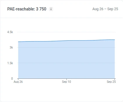
Anchor link toPush reachable: users who can actually receive a push. Pushwoosh has a valid push token for their device, and they haven’t turned off notifications in their phone or browser settings.
Check how many users could receive a push each day of the period. A drop usually means people turned off notifications or uninstalled the app. A rise means new opt-ins.
Base change
Anchor link toCheck how many subscribers left the base through auto-cleanup and expired tokens, and how many joined it through new registrations, since the start of the period. Each row’s bar is sized against the base at the start of the period:
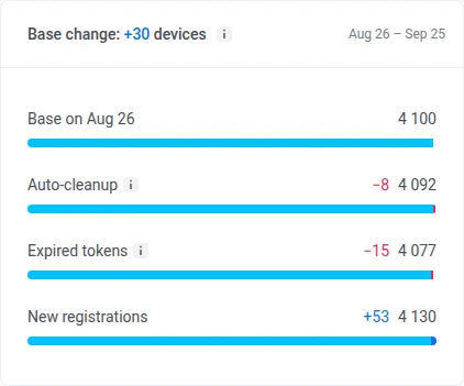
- Auto-cleanup: removes a device’s push token once the app has gone unopened past the account’s inactivity limit. See automatic inactivity cleanup.
- Expired tokens: a device whose push token APNs or FCM reported invalid, based on gateway responses only. See invalid push tokens.
- New registrations: devices that registered for push during the period
Pushwoosh only keeps this breakdown for the last 60 days. If your period starts earlier, the line under the breakdown shows the date it’s actually counted from.
Performance
Anchor link toCheck push delivery and engagement for the period, then open the daily breakdown by platform.

Switch the dropdown above Sent, Delivery rate, Open-to-sent rate, and Errors:
- By sends: every send counted separately
- By uniques: each recipient counted once. In this mode, the first metric becomes Recipients: unique devices the push was delivered to during the period, each counted once even if they received several sends.
Check these summary metrics for the period:
- Sent: how many pushes went out (becomes Recipients in By uniques mode)
- Delivery rate: how deliveries compare to sends (includes the delivery count)
- Open-to-sent rate: how opens compare to sends (includes the open count)
- Errors: how many sends failed
Daily performance
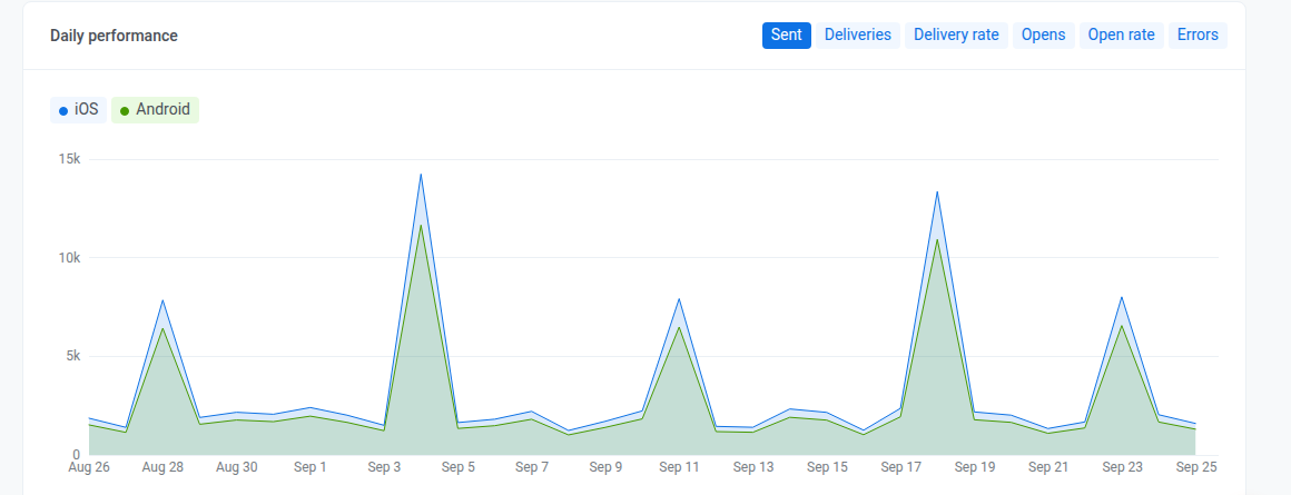
Anchor link toCheck these metrics per day, split by platform. Switch metrics with the chips above the chart: Sent, Deliveries, Delivery rate, Opens, Open rate, and Errors.
Frequency capping
Anchor link toCheck how frequency capping affected sends over the period. To check one push platform, pick it in the All platforms dropdown in the Audience section.
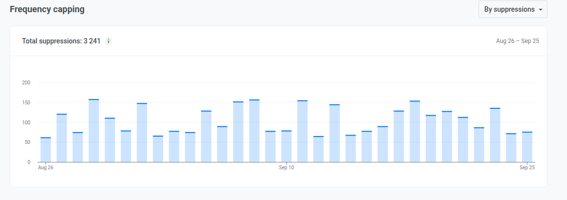
The chart shows how many pushes frequency capping blocked, or how many users it affected, per day for the period. The Total suppressions figure in the header sums the same for the whole period. Switch what both count with the selector:
- By suppressions: how many times a message was blocked by frequency capping
- By users: how many unique users were affected
Email tab
Anchor link toUse this tab to check subscriber-base health, engagement, category and mailbox-provider breakdowns, and frequency capping impact over the selected period.
Audience
Anchor link toCheck your subscriber base, what changed it, and how engaged subscribers are.
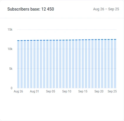
Subscribers base
Anchor link toCheck the subscriber count trend for the period.
Base change
Anchor link toCheck how many subscribers the base lost through complaints or hard bounces, and how many it gained through new subscribers, since the start of the period. Unsubscribes and other changes are tracked too, but don’t remove the address on their own. Each row’s bar is sized against the base at the start of the period:
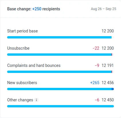
- Unsubscribe: subscribers who unsubscribed in the period. The address stays on the base, so this never reduces it.
- Complaints and hard bounces: subscribers Pushwoosh added to the suppression list for a spam complaint or a hard bounce, counted once even if both happened
- New subscribers: devices or addresses that subscribed to email during the period
- Other changes: everything the two flows above don’t cover: daily snapshot offset, a second address on an existing user, transfers between accounts and migrations, deleted devices and users, and base cleanups. Can be positive or negative.
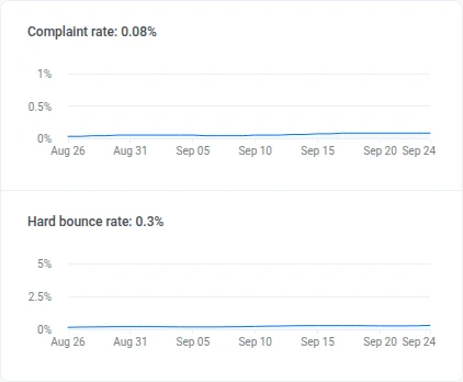
Complaint rate and Hard bounce rate
Anchor link toCheck the Complaint rate and Hard bounce rate over the period and the current value in the header.
Subscribers activity distribution
Anchor link toCheck how the Subscribers activity distribution splits into these groups, with each count and share of the base:
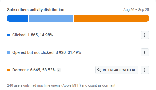
- Clicked
- Opened but not clicked
- Dormant: no open in the period
On a row, open the kebab menu and choose Create segment or Export CSV.
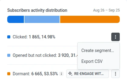
On the Dormant row, click Re-engage with AI when the AI Assistant is enabled for the account. AI Assistant opens in a panel on the same page with a ready prompt about your dormant subscribers.

Event-triggered performance
Anchor link toCheck email delivery and engagement totals for the period, then open the daily breakdown.
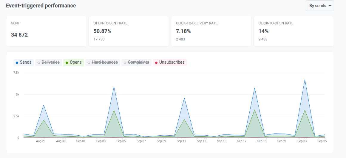
Switch the dropdown above Sent, Open-to-sent rate, Click-to-delivery rate, and Click-to-open rate:
- By sends: every send counted separately
- By uniques: each recipient counted once
Check these summary metrics for the period:
- Sent: how many emails went out (volume for the period)
- Open-to-sent rate: how opens compare to sends, whether the send got opened
- Click-to-delivery rate: how clicks compare to deliveries, whether delivered mail drove clicks
- Click-to-open rate: how clicks compare to opens, whether openers engaged further
Daily chart
Anchor link toClick a chip above the chart to add or remove a line:
- On by default: Sends, Opens, Unsubscribes
- Start off: Deliveries, Hard bounces, Complaints
Category-based performance
Anchor link toCheck send performance by email category.
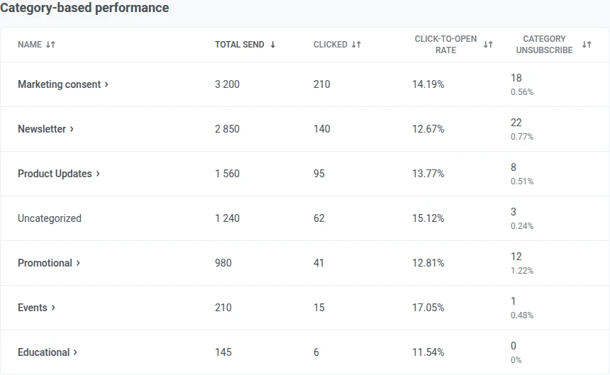
When the table is available:
- Sends with no category attached are grouped under Uncategorized.
- Click a column header to sort.
If no categories are set up yet, this section shows a card to set them up instead of the table.
Mailbox providers
Anchor link toCheck send performance by the recipient’s mailbox provider (Gmail, Outlook, and so on).
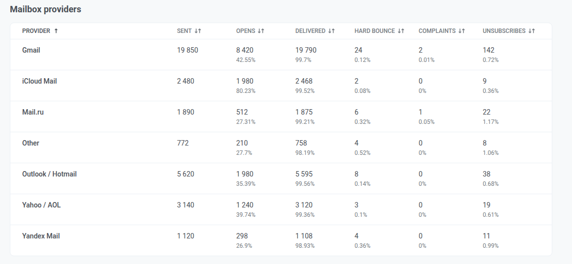
Providers Pushwoosh can’t attribute a send to are grouped under Other. Click a column header to sort.
How Gmail sees your domain
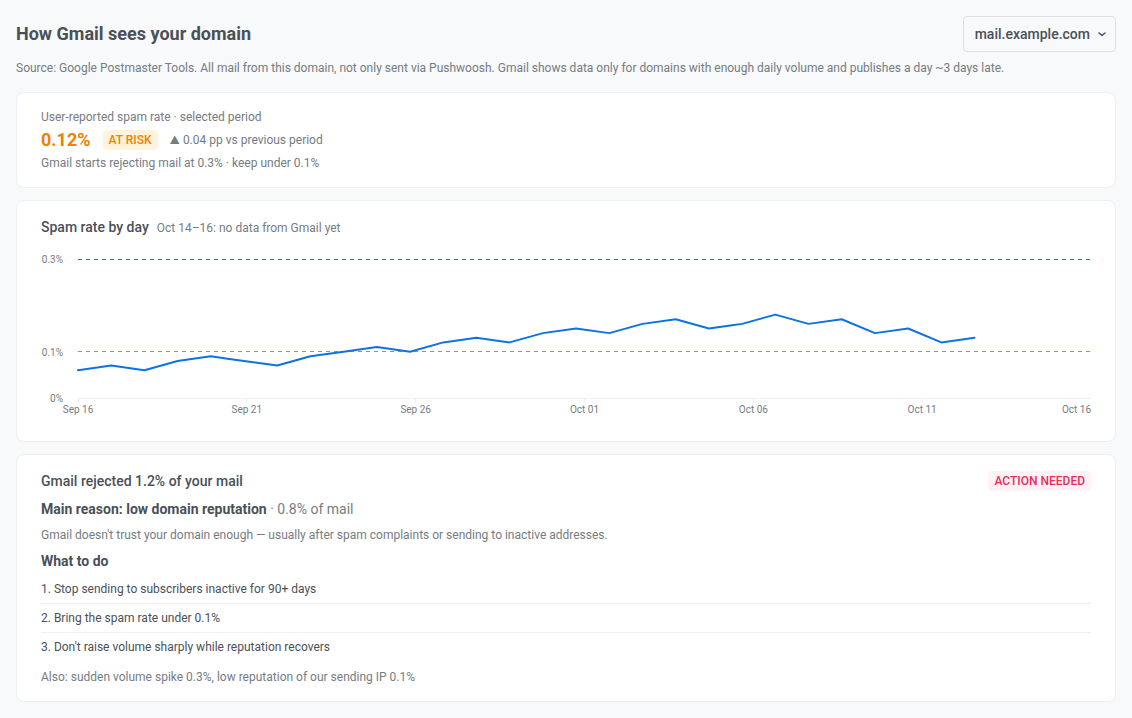
Anchor link toThe How Gmail sees your domain section shows how Gmail rates mail from your sender domain: the spam rate reported by Gmail users and the share of mail Gmail refused, with the main reason and what to do about it. The data comes from Google Postmaster Tools.
The section appears only when at least one sender domain of your account is connected to Gmail Postmaster and verified. If several domains are verified, choose one in the domain selector next to the section title.
Keep in mind how Gmail reports this data:
- It covers all mail from the domain. Mail you send from the same domain through other services is included, not only mail sent via Pushwoosh.
- It needs enough volume. Gmail reports a day only for domains that send it enough mail. If the domain sent too little mail to Gmail in the selected period, the section says there isn’t enough mail for Gmail to report.
- It arrives about 3 days late. The newest days of the period stay empty, and the chart title marks them with “no data from Gmail yet”.
Spam rate
Anchor link toThe spam rate is the share of mail that Gmail users marked as spam, averaged over the days Gmail reported in the selected period. Next to it, you see the change from the previous period of the same length, in percentage points.
Compare it with Gmail’s thresholds:
- Under 0.1%: the rate is healthy. Keep it there.
- 0.1% or higher: the value turns orange and an At risk badge appears.
- 0.3% or higher: the value turns red. At this rate, Gmail starts rejecting mail.
The Spam rate by day chart shows the daily values with both thresholds as dashed lines, so you can see which days pushed the rate up.
Mail Gmail refused
Anchor link toIf Gmail refused less than 0.5% of the domain’s mail in the selected period, the section says Gmail accepts your mail normally. Otherwise, it shows the share of refused mail, the main reason with its share, and the steps that address it. Other reasons are listed under Also. The share includes both mail Gmail rejected and mail it temporarily refused.
The badge shows who acts on the main reason. Action needed means the fix is on your side. On our side means the reason concerns Pushwoosh sending infrastructure, and you don’t need to do anything.
The following table lists the reasons and what to do about each:
| Reason | What it means | What to do |
|---|---|---|
| Low domain reputation | Gmail doesn’t trust your domain enough, usually after spam complaints or sending to inactive addresses. | Stop sending to subscribers inactive for 90 days or more, bring the spam rate under 0.1%, and don’t raise volume sharply while reputation recovers. |
| Suspected spam content | Gmail considers the content of your emails likely spam. | Review your template content and wording, check that links point to trusted domains, and avoid spam-like subject lines. |
| Sudden volume spike | Gmail saw an unusual jump in how much mail you send. | Raise volume gradually over several days and spread large campaigns over time instead of sending them in one burst. |
| Low reputation of our sending IP, our sending IP is on a blocklist, missing reverse DNS of our sending IP | The reason concerns Pushwoosh sending IPs. | Nothing on your side. Pushwoosh handles it. |
| Unsupported attachment, Gmail policy error, other reasons | Gmail refused part of your mail for this reason. | Make sure your mail follows Gmail’s sender guidelines. |
To lower your spam rate and keep your list healthy, see Email deliverability best practices.
Frequency capping
Anchor link toCheck how frequency capping affected email sends over the period.
Total suppressions
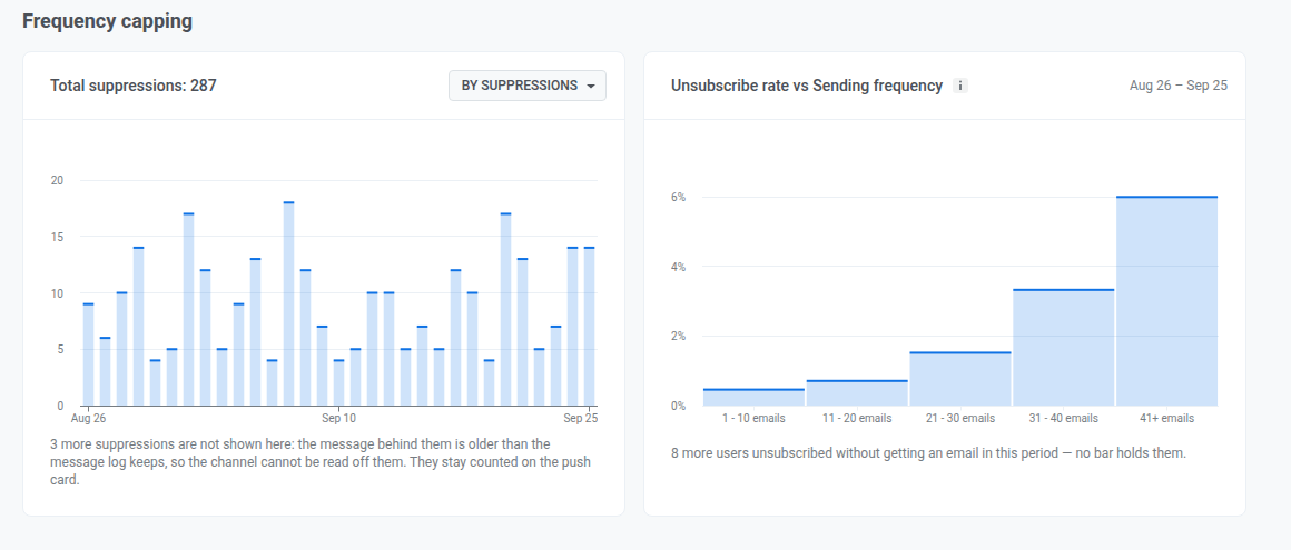
Anchor link toThe chart shows how many emails frequency capping blocked, or how many subscribers it affected, per day for the period. The Total suppressions figure in the header sums the same for the whole period. Switch what both count with the selector:
- By suppressions: how many times a message was blocked by frequency capping
- By users: how many unique users were affected
A suppression tied to a message sent more than 30 days before the start of the period can’t be attributed to a channel, so it’s excluded here and counted on the Push tab’s Total suppressions instead. If that happened, read the line below the chart for how many.
Unsubscribe rate vs Sending frequency
Anchor link toUse this chart to see whether people who get more emails in the period also unsubscribe more often. This is a correlation, not a cause: an unsubscribe isn’t necessarily triggered by those specific emails.
Subscribers are grouped by how many emails they received in the period. Each group shows its unsubscribe rate.
Subscribers who unsubscribed but received no email in the period are left out of every group. If any were left out, a line below the chart shows how many.
Conversions tab
Anchor link toUse this tab to see which campaigns and journeys lead users to a conversion, such as a purchase or a signup, and how much revenue they bring over the selected period. The tab counts the conversion events you’ve chosen for the project.
Set up conversion events
Anchor link toUntil you choose at least one event besides PW_Conversion, the tab shows the See which campaigns lead to conversions banner.
Click Set up events and follow Choose conversion events and track their revenue. To change the list later, click the Conversion events (gear) icon next to the filters.
If the selected event has no conversions in the period, for example right after setup, the tab shows Collecting data.
Filter conversions
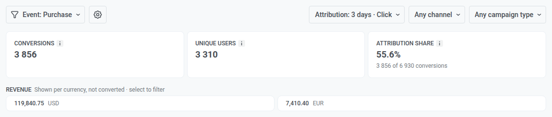
Anchor link toUse the filters above the tiles to choose what the tab counts:
- Event: the conversion event to report on.
- Attribution: the attribution window (1, 3, 7, or 30 days, 3 by default) and the contact type. Each conversion goes to one campaign, the last one the user interacted with inside the window. With Click, that’s the last message the user opened or clicked: an opened push or Inbox message, or a clicked email link. With Sent, it’s the last message sent to the user.
- Channel: Push, Email, Inbox, SMS, or WhatsApp. SMS is available only with the Sent contact type.
- Campaign type: one-time messages or journeys.
If users converted in the period but not after your messages, the tab shows No conversions attributed to campaigns. Click Change attribution to try a longer window.
Conversion tiles
Anchor link toThe tiles show totals for the selected event, counting only conversions attributed to your campaigns:
- Conversions: conversions attributed to your campaigns within the attribution window.
- Unique users: users behind these conversions. Each user is counted once, however many times they converted.
- Revenue: revenue from these conversions, with its share of the event’s total revenue. For an event that doesn’t track revenue yet, the tile offers Set up revenue for this event.
- Attribution share: the share of all conversions of this event that are attributed to your campaigns.
When the conversions carry more than one currency, a Revenue strip below the tiles replaces the Revenue tile. It lists the amount for each currency separately, with no exchange-rate calculation. Click a currency to show only campaigns with revenue in it.
Campaigns table
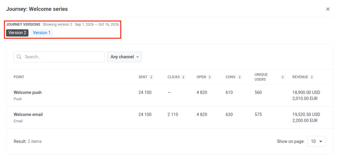
Anchor link toThe table lists every campaign with at least one attributed conversion, with its Status, Sent, Open, Clicks, Conv., Unique users, and Revenue for the period. Clicks are available for email only.
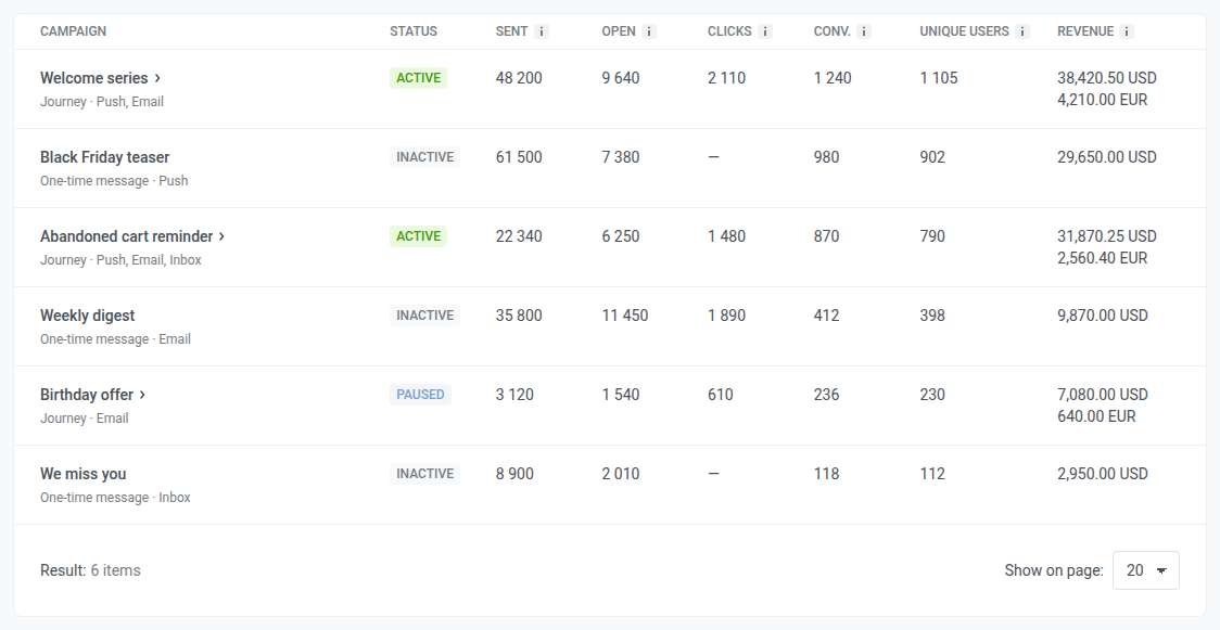
Click a journey row to open its breakdown by point. If the journey has several versions, pick one in Journey versions.
Export statistics
Anchor link toUse Export statistics in the page header to download data as a CSV file.
- Click Export statistics.
- Set the export options in the Export statistics from this project modal:
- Period: defaults to the range currently selected on the page.
- Message type: Transactional and marketing, Only marketing, or Only transactional.
- Channel: Push and/or Email.
- Source Type: One-time messages and/or Customer journeys.
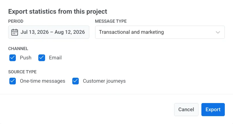
- Click Export.
After you finish on Overview, open User retention statistics for custom retention events, Messaging statistics for per-message detail, or Dashboards for custom charts.