Web 弹窗内容
Web 弹窗内容是当 Web 弹窗出现在您的网站上时,访问者看到的视觉布局。在内容下构建它,然后将其附加到 Web 弹窗营销活动中。
创建 Web 弹窗内容
Anchor link to- 前往内容 → Web 弹窗内容。
- 点击创建 Web 弹窗内容。
- 从库中选择一个起始模板。使用右上角的类别下拉菜单按用例筛选(例如促销与优惠、游戏与市场或反馈与调查),或将其保留在所有模板上。空白布局类别包含纯粹的起始点,包括模态框 + 订阅表单,其中已包含一个订阅表单块。
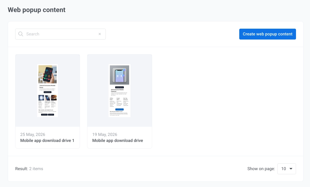
- 选择模板后,在编辑器中自定义弹窗。
命名弹窗
Anchor link to点击顶部栏中的弹窗名称进行编辑。该名称用于在 Pushwoosh 内部、内容列表和营销活动向导中识别此内容。网站访问者不会看到它。
编辑弹窗设置
Anchor link to在画布左侧的设置面板中调整弹窗的外观和位置:
图片和视频
Anchor link to如果布局包含一个或多个媒体块,每个块在面板顶部都有自己的区域,带有预览和控件。
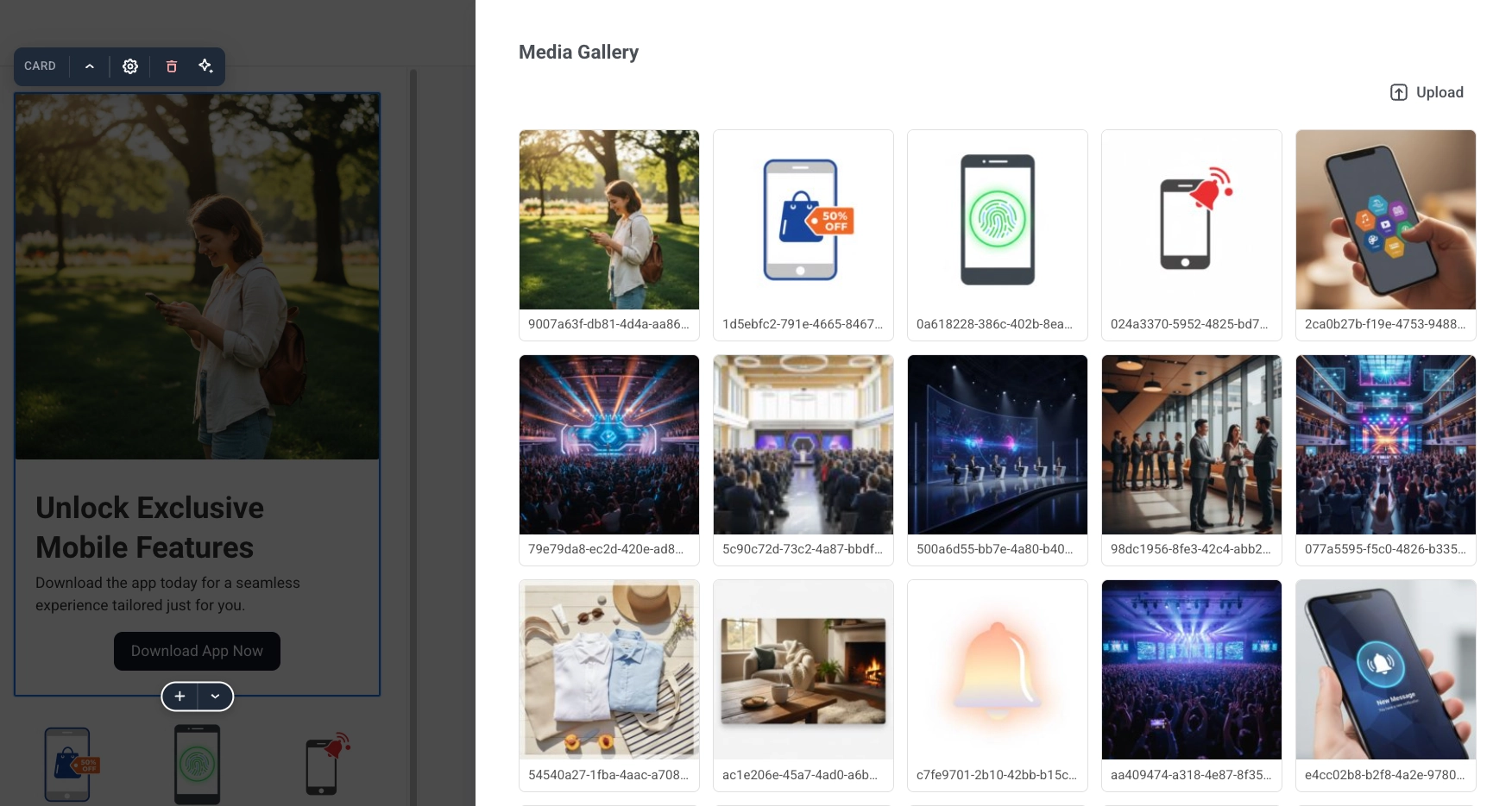
点击更改图片从您项目的 媒体库 中选择一个文件,或将媒体设置为视频以播放视频而不是静态图片。
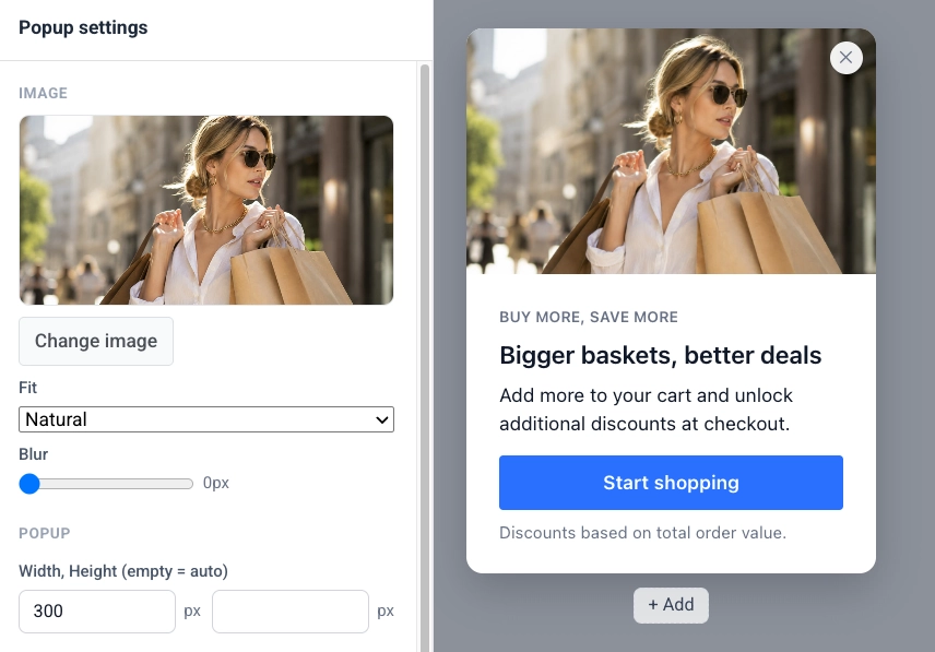
预览下方:
- 媒体: 图片或视频。
- 适应: 图片或海报如何填充其框架:自然、覆盖或包含。对于背景图片不显示此项,背景图片总是覆盖其区域。
- 模糊: 柔化图片或海报,从 0 到 20 像素。
- 变暗: 仅限背景媒体。在图片或视频上添加一个暗色纱罩,以便放置在其上的文本保持可读性,从 0 到 100%。
将媒体设置为视频会增加四个字段:
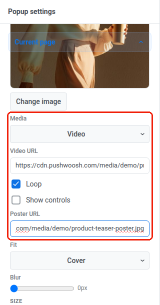
- 视频 URL: 指向视频文件的直接链接。视频只接受外部 URL。您不能将视频上传到媒体库。将其导出为 MP4(H.264 视频,AAC 音频),并启用“快速启动”(有时称为“Web 优化”),这样浏览器可以在整个文件下载完成前开始播放。如果 URL 加载失败,访问者只会看到海报。
- 循环: 连续重播视频,而不是播放一次后停止。
- 显示控件: 显示浏览器内置的播放、暂停和音量控件。视频总是静音开始,没有此选项,访问者无法打开声音。
- 海报 URL: 视频加载时显示的图片。这是可选的,但建议使用:对于浏览器仍在运行不支持视频的旧版弹窗脚本的访问者来说,这也是唯一显示的内容,因此留空意味着该访问者在视频位置什么也看不到。
某些布局还会添加一个布局部分,其中包含媒体块的放置设置:
- 图片宽度: 弹窗宽度的百分比。
- 图片位置: 左侧或右侧,适用于媒体与文本并排的布局。
布局部分仅在当前布局具有此类设置时出现。在底部栏布局上,它提供按钮宽度而不是图片控件。
弹窗大小和样式
Anchor link to在弹窗部分:
- 宽度,高度(空 = 自动): 两者都留空,弹窗会根据其内容自动调整大小,或设置以像素为单位的固定大小。在多页弹窗中,每个页面都有自己的大小。
- 圆角半径,阴影: 弹窗的圆角和投影。
- 动画: 弹窗出现的方式:无、淡入或滑动。
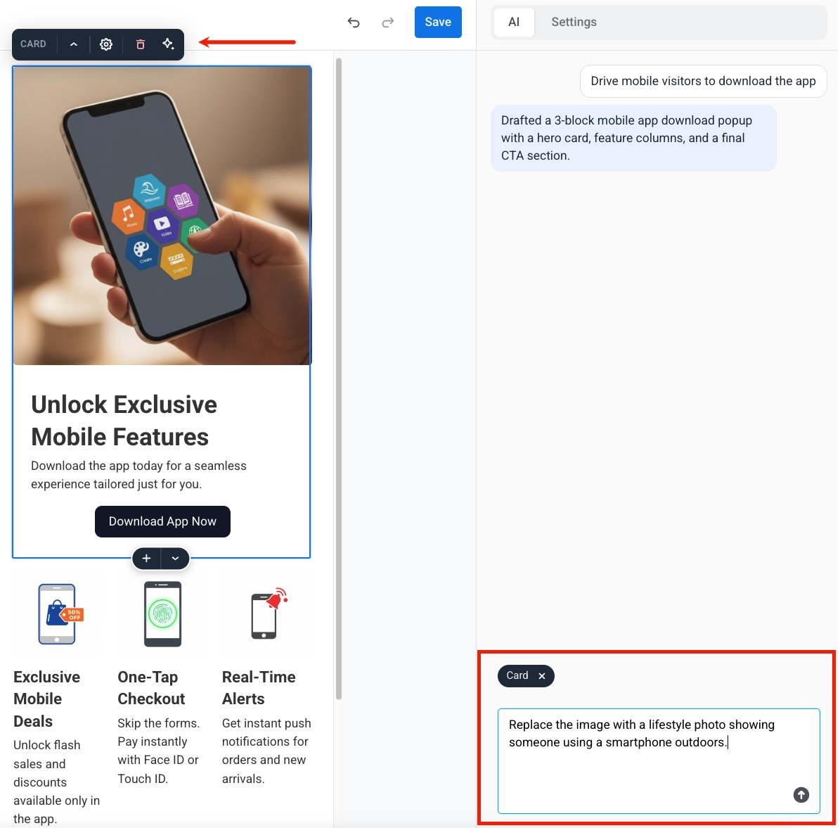
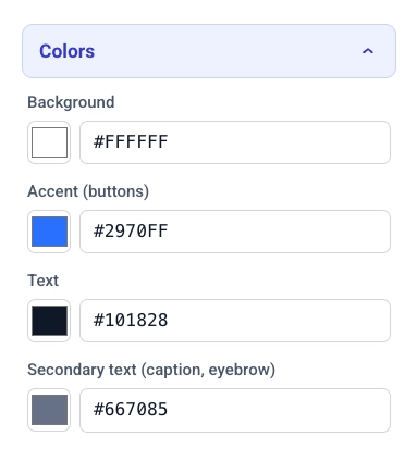
点击颜色展开弹窗的调色板:
- 背景,强调色(按钮): 弹窗背景和应用于按钮的强调色。
- 文本,次要文本: 正文文本和次要文本(如说明文字和眉题)的颜色。
- 图片上文本: 仅在文本位于背景图片之上的布局中显示。设置该文本使用的颜色。
深色模式
Anchor link to打开深色模式,为设备设置为深色方案的访问者提供第二个调色板。关闭时,弹窗始终使用上面的浅色调色板为每位访问者渲染。
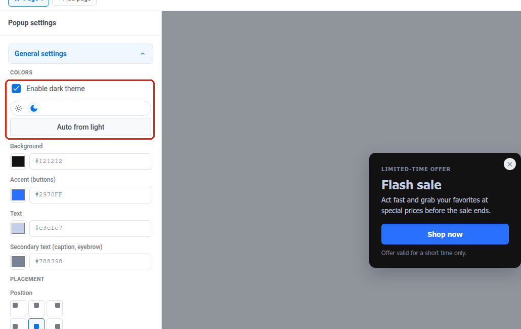
一旦深色模式开启:
- 使用颜色字段上方的浅色 / 深色开关选择您正在编辑的调色板。画布会以该方案重绘,因此您可以检查弹窗在每种模式下的实际外观。
- 点击从浅色自动生成以从当前浅色(重新)生成深色调色板:表面变暗,文案变亮,而强调色和图片上文本保持不变。之后可以编辑五个字段中的任何一个以微调结果。
- 再次关闭深色模式不会丢弃深色调色板——它会被保留,因此再次打开它会恢复您的编辑,而不是从头开始重新生成。
访问者的浏览器根据其操作系统级别的深色模式设置来决定他们看到的调色板——弹窗本身没有深色/浅色切换。网站可以强制所有人使用一种方案,无论操作系统设置如何;请参阅 Web SDK 文档中的 webPopups.colorScheme。
位置和遮罩层
Anchor link to在位置部分:
- 位置: 使用 3×3 网格选择弹窗在页面上的锚定位置。
- 边缘偏移: 设置与所选边缘的距离(以像素为单位)。
在遮罩层部分:
- 调暗页面背景: 打开此项可在显示弹窗时使页面其余部分变暗。
- 颜色,不透明度: 设置遮罩层的颜色和不透明度,从 0 到 1。
编辑文本
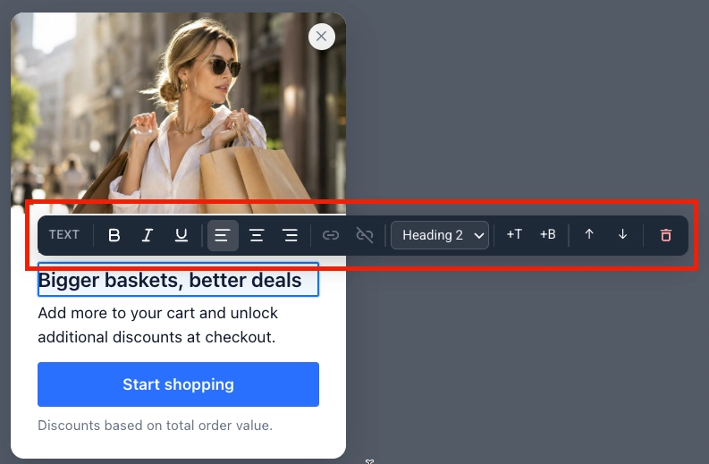
Anchor link to点击弹窗上的任何文本块进行内联编辑。其上方会出现一个工具栏:
- 应用粗体、斜体或下划线格式。
- 添加或删除链接。
- 设置左对齐、居中对齐或右对齐。
- 选择文本样式:图标、眉题、标题 1–3、正文或说明文字。
编辑按钮
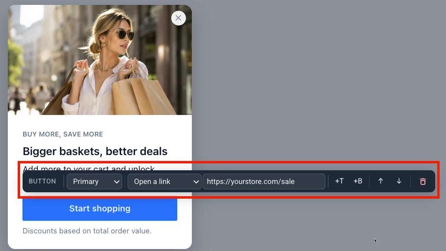
Anchor link to点击一个按钮以打开其工具栏:
- 选择按钮样式:主要或次要。
- 选择按钮的功能:
- 打开链接: 输入目标 URL。
- 关闭弹窗。
- 转到页面: 选择弹窗的另一个页面进行切换。此选项在弹窗有多个页面后出现。请参阅使用多个页面。
添加订阅表单
Anchor link to添加一个订阅表单块,直接在弹窗中收集电子邮件注册和其他字段。了解更多关于订阅表单的信息。
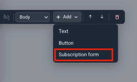
- 在画布上选择一个文本块、按钮或其他元素。
- 点击其工具栏上的添加。
- 选择订阅表单。该块会立即出现,带有一个默认的电子邮件字段和订阅按钮。
选择表单来源
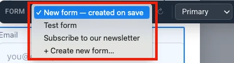
Anchor link to点击订阅表单块以打开表单工具栏。其第一个下拉菜单将该块链接到您项目中的一个订阅表单。您可以创建一个新表单或选择一个已有的表单:
| 选项 | 何时使用 |
|---|---|
| 新表单 — 保存时创建(默认) | 最快的开始方式:当您保存弹窗时,Pushwoosh 会为您创建表单,命名为“弹窗名称 — Web 弹窗”。 |
| + 创建新表单… | 您想在保存弹窗前命名表单并进行设置。会打开一个新订阅表单对话框——输入名称,然后像下面一样设置其字段、提交文本和隐私,然后点击创建。 |
| 下拉菜单中的现有表单 | 重用一个已经配置了订阅者或双重确认的表单。 |
设置字段和提交行为
Anchor link to- 在表单工具栏中设置提交按钮样式:
- 主要: 填充按钮,使用弹窗的强调色。当订阅是页面上的主要操作时最佳。
- 次要: 轮廓按钮,带有边框和强调色标签。当弹窗已有主要按钮或您想要更轻盈的外观时最佳。
- 打开隐私以在表单下方添加隐私同意行,然后在出现的字段中输入您的隐私政策 URL。

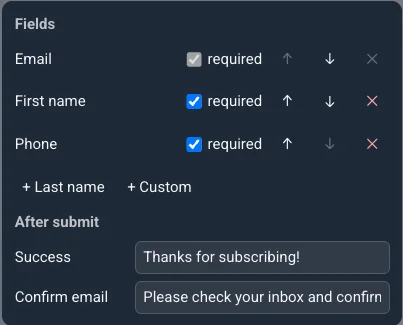
- 点击字段… 打开一个弹窗,您可以在其中保留电子邮件(始终为必填项)并添加名字、姓氏、电话或自定义,并设置访问者提交后显示的成功和确认电子邮件文本。
添加倒计时
Anchor link to添加一个倒计时块,通过在弹窗上实时倒计时的截止日期来营造紧迫感。
- 在画布上选择一个文本块、按钮或其他元素。
- 点击其工具栏上的添加并选择倒计时。
- 点击倒计时以打开其工具栏:
- 截止日期: 倒计时归零的日期和时间。
- 时区: 读取截止日期的时区。留空则为 UTC。
- 语言: 单位标签(天、小时等)的语言。保留为**英语(默认)**或从其他 13 种语言中选择。
- 标签: 打开以在数字旁边显示单位标签。
- 当截止日期过后:
- 显示零: 倒计时继续显示 00:00:00。
- 不显示弹窗: 一旦截止日期过去,整个弹窗将被跳过。
- 转到页面: 当截止日期过后,跳转到弹窗的另一个页面。仅在弹窗有多个页面后提供——从出现的下拉菜单中选择目标页面。请参阅使用多个页面。
添加图标
Anchor link to添加一个图标块,在您的文案旁边放置一个小图标——例如销售的百分比符号,或赠品的礼物。
- 选择一个元素,点击添加,然后选择图标。
- 点击图标以打开其工具栏:
- 图标: 从一组固定的 20 个图标中选择(铃铛、礼物、购物车、图表、锁、日历、勾选、星星、时钟、标签、邮件、电话、下载、播放、盾牌、闪光、百分比、卡车、票、用户)。不支持自定义图标上传。
- 大小: 24、32 或 48 像素。
- 强调色: 默认开启,使图标与弹窗的强调色匹配。关闭它以选择自定义颜色。
添加主题选择器
Anchor link to添加一个主题选择器块,让访问者以复选框或标签片的形式自行选择兴趣。他们的选择会写入其设备上的一个标签。
添加块并绑定标签
Anchor link to- 选择一个元素,点击添加,然后选择主题选择器。它会带有两个占位符选项,并且没有绑定标签——在您选择一个之前,它不会写入任何内容。
- 点击该块以打开其工具栏。第一个下拉菜单将其链接到您项目中的一个列表类型标签——选择一个现有的,或选择创建列表标签以在不离开编辑器的情况下创建一个。
设置选项和限制
Anchor link to仍在工具栏中:
- 控件: 将选项显示为复选框或标签片。
- 最少/最多选择: 访问者必须或可以选择多少个选项。任一端为 0 表示没有限制——但即使最小值为 0,也总是需要至少选择一个才能提交。选择超过最大值,或尝试在低于最小值时提交,将在块旁边显示一条内联消息,而不是发送任何内容。
- 点击选项打开选项面板:
- 编辑每个选项的标签(访问者阅读的内容)和标签值(写入标签的内容)。将标签值留空,Pushwoosh 会写入选项的内部 ID(
option-1、option-2等)——如果您需要在标签中有一个可读的值,请填写它。 - + 选项会添加另一行,总共最多 12 个选项。
- 设置按钮标签和发送后消息。
- 编辑每个选项的标签(访问者阅读的内容)和标签值(写入标签的内容)。将标签值留空,Pushwoosh 会写入选项的内部 ID(
添加评分
Anchor link to添加一个评分块,以自定义事件的形式收集快速评分——NPS、星级或赞/踩。
添加块并设置事件
Anchor link to- 选择一个元素,点击添加,然后选择评分。它在没有设置事件的情况下出现——在您选择一个之前,它不会发送任何内容。
- 点击该块以打开其工具栏,并从您项目的现有事件中选择一个事件,或选择创建事件以在不离开弹窗的情况下定义一个新事件——Pushwoosh 会为其设置块发送的
score、scale和slotKey属性。分数会作为该事件发布到 Pushwoosh——在细分或客户旅程中像使用任何其他事件一样使用它。
如果绑定到该块的事件后来在其他地方被重命名或删除——或者在它变成选择器之前被输入到此字段中——选择器会将其显示为缺失:<事件名称>,而不是静默地丢弃或替换它。选择一个不同的事件来修复绑定。
配置量表
Anchor link to仍在工具栏中:
- 量表: NPS 0–10、星级(1 到 5)或赞/踩(赞或踩)。
- 分数发送时机: 点击时在访问者选择一个值时立即发送分数。通过按钮则等待他们也点击一个提交按钮——选择此项后设置其标签。
- 量表两端的可选标签,以及发送后消息。
使用多个页面
Anchor link toWeb 弹窗可以有多个页面,例如引导访问者完成一个简短的多步骤优惠。
添加页面
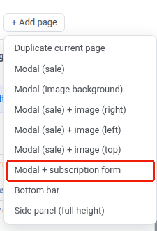
Anchor link to点击 + 添加页面打开添加页面菜单:
- 复制当前页面: 将活动页面(包括您所做的任何编辑)复制为一个新页面。如果源页面有订阅表单,副本创建时将不包含它——一个弹窗只能有一个。
- 选择一个单页布局,以该布局的演示内容添加一个新页面。新页面独立于其他页面,因此可以使用不同的布局。模态框 + 订阅表单是这些布局之一——它已包含一个订阅表单块。
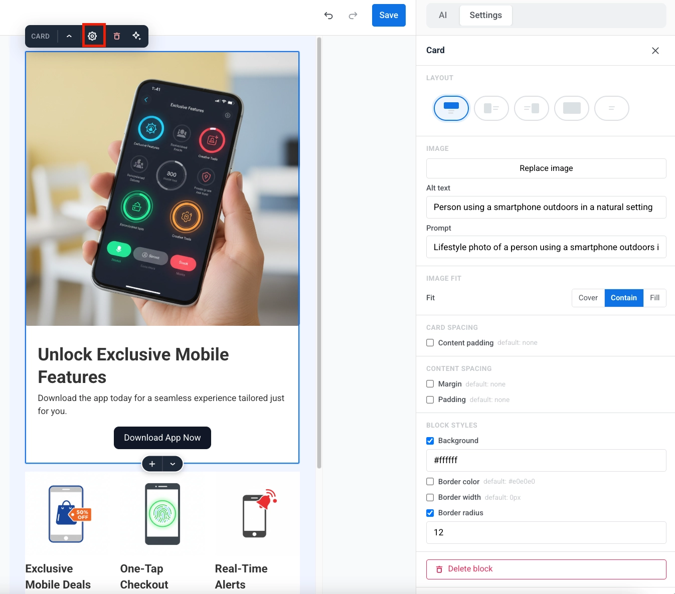
每个标签页都是一个页面。点击一个标签页以切换到它。
设置起始页
Anchor link to标有 ★ 的标签页是起始页,即访问者首先看到的页面。要更改它,请打开另一个标签页并点击该标签页上的 ☆。
删除页面
Anchor link to在活动标签页上,点击 ✕。会打开一个确认对话框。点击删除以移除该页面。此操作无法撤销。
保存内容
Anchor link to检查内容、图片和视频以及按钮操作。完成后,点击顶部栏中的保存。
在营销活动中使用内容
Anchor link to保存后,内容会出现在内容 → Web 弹窗内容中。从列表中打开它以继续编辑。
要将其显示在网站上,请前往营销活动 → Web 弹窗,创建或编辑一个营销活动,并在内容步骤中选择此内容。
然后配置受众、显示设置、频率和启动选项。有关完整流程,请参阅创建 Web 弹窗营销活动。