Amorce de push iOS
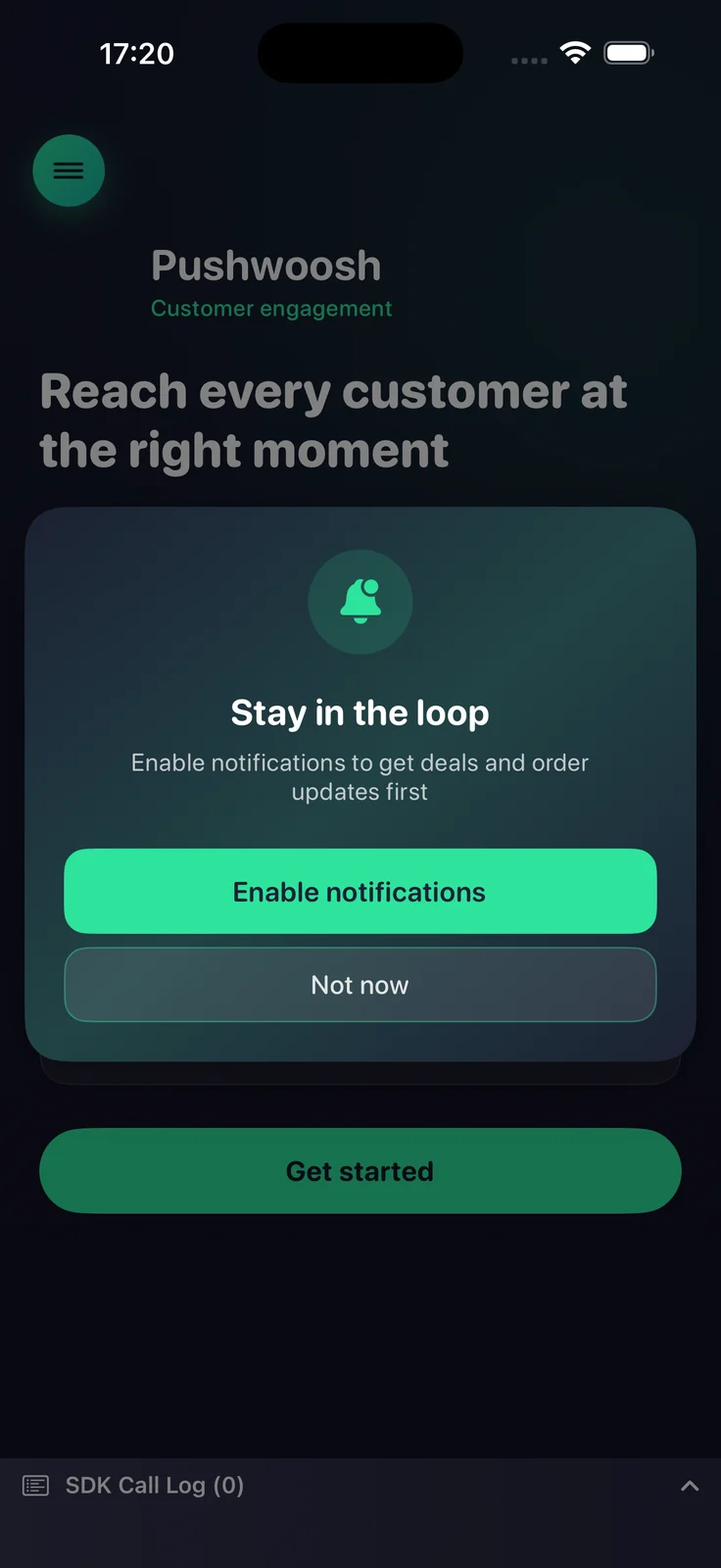
Une amorce de push est une boîte de dialogue d’adhésion que vous affichez avant l’invite de permission push du système iOS. iOS n’affiche l’invite système qu’une seule fois par installation — si l’utilisateur appuie sur Ne pas autoriser, les notifications push sont perdues jusqu’à ce qu’il les réactive dans les Réglages. L’amorce vous permet d’expliquer d’abord la valeur et de demander au bon moment, afin que vous utilisiez l’unique invite système sur les utilisateurs qui ont déjà dit oui.
Disponible depuis la version 7.1.1. L’amorce fait partie de PushwooshFramework ; aucun module supplémentaire n’est requis.
Comment ça marche
Anchor link toL’amorce est entièrement consciente de l’état. Elle lit l’état d’autorisation de notification actuel et décide quoi faire, il est donc sûr de l’appeler à chaque lancement :
- Non déterminé — affiche l’amorce ; en cas d’acceptation, elle déclenche l’invite de permission système.
- Autorisé ou provisoire — supprime silencieusement l’amorce (rien n’est affiché).
- Refusé — affiche l’amorce ; en cas d’acceptation, elle redirige l’utilisateur vers les réglages de notification de l’application (lorsque
fallbackToSettingsest activé).
Vous décidez quand appeler l’amorce (par exemple après l’intégration ou après une action clé). Le SDK n’impose aucun calendrier propre, à l’exception de la limitation optionnelle minInterval décrite ci-dessous.
Utilisation de base
Anchor link toConfigurez l’amorce avec un constructeur fluent et appelez present. La configuration minimale nécessite un titre, un message et les titres des deux boutons.
import PushwooshFramework
Pushwoosh.configure.pushPrimer .title("Stay in the loop") .message("Get notified about deals and order updates first") .acceptButton("Enable notifications") .declineButton("Not now") .present()Styles et positions
Anchor link toUtilisez style pour choisir entre une alerte système et une feuille personnalisée, et position pour placer la feuille personnalisée. Chaque position a son propre design par défaut.
| Valeur | Description |
|---|---|
.alert | UIAlertController système. La position est ignorée. |
.sheet + .bottom | Feuille inférieure qui glisse vers le haut, avec une poignée et des boutons pleine largeur (par défaut). |
.sheet + .top | Bannière compacte qui descend du haut, comme une notification. |
.sheet + .center | Boîte de dialogue centrée qui s’agrandit et apparaît en fondu. |
Pushwoosh.configure.pushPrimer .style(.sheet) .position(.top) .title("Stay in the loop") .message("Get notified about deals and order updates first") .acceptButton("Enable notifications") .declineButton("Not now") .present()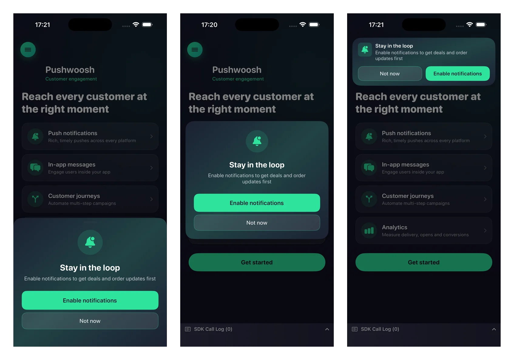
Personnalisation
Anchor link toTous les paramètres visuels sont optionnels — omettez-les pour utiliser les valeurs par défaut natives qui s’adaptent aux modes clair et sombre.
Pushwoosh.configure.pushPrimer .style(.sheet) .position(.center) .title("Stay in the loop") .message("Get notified about deals and order updates first") .acceptButton("Enable notifications") .declineButton("Not now") .image(UIImage(named: "PrimerHero")) // image locale, ou .imageURL("https://…") .backgroundColor(.systemBackground) .titleColor(.label) .messageColor(.secondaryLabel) .acceptButtonColor(.systemBlue) .acceptButtonTextColor(.white) .declineButtonColor(.clear) .declineButtonTextColor(.secondaryLabel) .cornerRadius(24) .buttonCornerRadius(14) .buttonBorderColor(.separator) .present()Référence de personnalisation :
| Setter | Description |
|---|---|
image / imageURL | Une UIImage locale ou une URL distante. Affichée sous forme de cercle sur les mises en page centrale et inférieure, et comme icône sur la bannière supérieure. Une image locale a la priorité sur une URL. |
backgroundColor | Couleur de fond unie de la carte. |
backgroundGradient | Un tableau de couleurs rendu comme un dégradé doux multicolore. Remplace backgroundColor. |
titleColor / messageColor | Couleurs du texte du titre et du message. |
acceptButtonColor / acceptButtonTextColor | Couleurs de fond et de texte du bouton d’acceptation. La couleur d’acceptation teinte également l’icône par défaut. |
declineButtonColor / declineButtonTextColor | Couleurs de fond et de texte du bouton de refus. |
cornerRadius | Rayon des coins de la carte. |
buttonCornerRadius / buttonBorderColor | Rayon des coins et couleur de la bordure des deux boutons. |
Paramètres de comportement
Anchor link toComportement de repli vers les réglages
Anchor link toPar défaut, lorsque les notifications sont déjà refusées, l’amorce est affichée et le bouton d’acceptation emmène l’utilisateur vers les réglages de notification de l’application. Passez false pour supprimer entièrement l’amorce dans l’état refusé à la place.
.fallbackToSettings(false)Fréquence d’affichage
Anchor link toPar défaut, l’amorce n’a pas de limitation intégrée — elle s’affiche chaque fois que vous appelez present (et est automatiquement supprimée une fois les notifications autorisées). Utilisez minInterval pour limiter la fréquence de réapparition de l’amorce. La dernière heure d’affichage est conservée entre les lancements.
.minInterval(7 * 24 * 60 * 60) // afficher au maximum une fois par semaineGérer le résultat
Anchor link toPassez une complétion à present pour réagir au résultat.
Pushwoosh.configure.pushPrimer .title("Stay in the loop") .message("Get notified about deals and order updates first") .acceptButton("Enable notifications") .declineButton("Not now") .present { outcome in switch outcome { case .accepted: break // affichée, utilisateur a accepté, invite système demandée case .declined: break // affichée, utilisateur a refusé case .suppressed: break // non affichée (déjà autorisée, ou limitée) case .redirectedToSettings: break // état refusé, utilisateur envoyé aux Réglages @unknown default: break } }Le résultat final de l’invite système (l’état accordé/refusé et le token de l’appareil) arrive via les rappels d’enregistrement réguliers — l’amorce réutilise registerForPushNotifications lors de l’acceptation et ne duplique pas cette chaîne.