Web 收件箱小组件
将 Web 消息收件箱集成到您的网站中,可显著提高转化率。一个即用型的 Web 收件箱小组件开箱即用,订阅了与用户通信所需的所有方法。只需将该小组件集成到您的网站中,并自定义其外观以适应您的品牌即可。
设置 inboxWidget.enable: true 会为访问者的设备注册收件箱投递,即使访问者尚未授予推送通知权限,因此它可以触达从未订阅过推送的访问者。
先决条件
Anchor link to要为网站集成消息收件箱,请遵循指南。
集成小组件
Anchor link to在初始化 Pushwoosh WebSDK 时,添加 inboxWidget 参数:
Pushwoosh.push(['init', { ..., inboxWidget: { enable: true, triggerId: 'pwInbox' }}]);要渲染小组件,您应为其指定一个触发元素。页面上的任何 DOM 元素都可以作为触发器。将其 ID 指定为“pwInbox”,或在初始化 SDK 时为 triggerId 参数分配任何自定义 ID。
当 WebSDK 初始化后,未读消息徽章会显示在触发元素上。一旦点击触发元素,小组件就会出现在页面上。
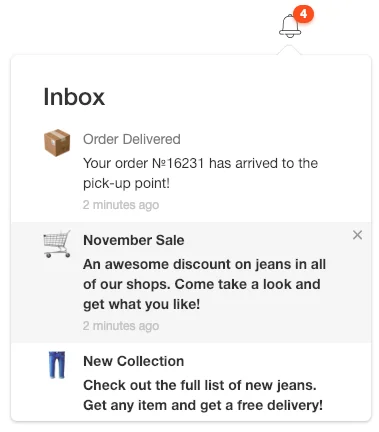
默认情况下,小组件位于离触发元素最近的屏幕边框的相反方向。 您可以通过配置参数设置小组件的位置:
Pushwoosh.push(['init', {
..., inboxWidget: { enable: true, triggerId: 'pwInbox', position: 'top' }}]);默认情况下,inboxWidget 应放在结束的 </body> 标签之前。
如下例所示,在页面上的任何位置渲染小组件:
Pushwoosh.push(['init', {  ...,  inboxWidget: {
    enable: true,    triggerId: 'pwInbox',    appendTo: '.widget-parent-element-class'  }}]);
父元素的搜索是通过 querySelector 执行的,因此需要明确指定类、id 或元素。
自定义小组件
Anchor link to自定义文本
Anchor link to要自定义小组件文本,请添加 emptyInboxTitle 和 emptyInboxText 参数:
Pushwoosh.push(['init', { ..., inboxWidget: { enable: true, triggerId: 'pwInbox', title: 'Inbox', // 小组件标题 emptyInboxTitle: 'You\'re all caught up', // 空收件箱小组件标题 emptyInboxText: 'There are no new messages. Stay tuned!' // 空收件箱小组件文本 }}]);结果如下所示:

自定义外观
Anchor link to要自定义小组件的外观,请使用以下参数:
Pushwoosh.push(['init', { ..., inboxWidget: { enable: true, triggerId: 'pwInbox', bgColor: '#ffffff', // 小组件背景 borderColor: 'transparent', // 小组件边框颜色 borderRadius: 4, // 小组件边框半径 (px) widgetWidth: 350, // 小组件宽度 (px) zIndex: 100 // z-index }}]);未读消息计数徽章可按如下方式自定义:
Pushwoosh.push(['init', { ..., inboxWidget: { enable: true, triggerId: 'pwInbox', badgeBgColor: '#ff4c00', // 徽章颜色 badgeTextColor: '#ffffff' // 徽章文本颜色 }}]);要自定义文本属性,请添加以下代码:
Pushwoosh.push(['init', { ..., inboxWidget: { enable: true, triggerId: 'pwInbox', textColor: '#333333', // 文本颜色 fontFamily: 'Helvetica, Arial, sans-serif', // 字体 messageTitleColor: '#7a7a7a', // 消息标题颜色 timeTextColor: '#c4c4c4', // 时间戳文本颜色 emptyInboxTitleColor: '#333333', // 空收件箱标题颜色 emptyInboxTextColor: '#7a7a7a' // 空收件箱文本颜色 }}]);最后,您可以指定空收件箱的图标:
Pushwoosh.push(['init', { ..., inboxWidget: { enable: true, triggerId: 'pwInbox', emptyInboxIconUrl: 'https://pushon.pushwoosh.com/images/icon-empty-inbox.png' // 图标的 URL 路径 }}]);自定义单元格布局
Anchor link to小组件以四种单元格布局之一(classic、banner、captioned 或 carousel)绘制消息——与控制面板中的营销活动预览显示的布局相同。如果布局无法用消息所携带的内容进行渲染,则会降级为 classic:banner 需要主图,captioned 需要主图以及标题和正文,而 carousel 需要至少一张幻灯片以及标题和正文。
要自定义布局的外观,请使用以下参数:
Pushwoosh.push(['init', { ..., inboxWidget: { enable: true, triggerId: 'pwInbox', unreadDotColor: '#ff4c00', // classic 头像上的未读点 avatarBgColor: '#e6e6e6', // classic 头像背景 avatarTextColor: '#333333', // classic 头像首字母颜色 avatarSize: 52, // classic 头像大小 (px) mediaRadius: 8, // banner/captioned/carousel 媒体的圆角半径 (px) slideCaptionColor: '#ffffff', // carousel 幻灯片标题文本颜色 slideScrimColor: '#000000', // carousel 幻灯片标题背景遮罩 pagerDotActiveColor: '#ff4c00', // carousel 活动页面点 pagerDotColor: '#c4c4c4' // carousel 非活动页面点 }}]);在 Control Panel 中管理
Anchor link to要在 Control Panel 中设置小组件:
-
前往 Settings → Configure platforms → Web。
-
在 Inbox widget 卡片上,点击 Configure。

-
开启 Show the inbox on the site。
-
填写您希望在面板中管理的字段,其余字段留空。留空的字段不会被保存,因此代码段中的值或 SDK 默认值仍然生效。将 ID of the element that opens the inbox 和 Insert into (CSS selector) 留空,可使
triggerId和appendTo保留在代码段中,紧邻它们所指向的标记。 -
在预览中检查效果。在 With messages 和 No messages 之间切换,查看两种状态。
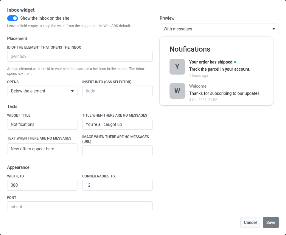
-
保存表单。Width, px 接受 200 到 1200 之间的整数,Corner radius, px 接受 0 到 64 之间的整数。其他任何值都会在字段下方显示错误,且不会被保存。
卡片与代码段如何配合
Anchor link to卡片中保存的值会逐个键地覆盖 init 代码段中相同的 inboxWidget 键。每个字段对应一个键:
| 分区 | 字段 | inboxWidget 键 |
|---|---|---|
| Placement | ID of the element that opens the inbox | triggerId |
| Placement | Opens | position |
| Placement | Insert into (CSS selector) | appendTo |
| Texts | Widget title | title |
| Texts | Title when there are no messages | emptyInboxTitle |
| Texts | Text when there are no messages | emptyInboxText |
| Texts | Image when there are no messages (URL) | emptyInboxIconUrl |
| Appearance | Width, px (200–1200) | widgetWidth |
| Appearance | Corner radius, px (0–64) | borderRadius |
| Appearance | Font | fontFamily |
| Appearance | Background, Text, Border | bgColor, textColor, borderColor |
| Appearance | Counter background, Counter text, Unread mark | badgeBgColor, badgeTextColor, unreadDotColor |
卡片中没有的键,例如单元格布局参数和 legacyClassicCell,始终从代码段读取。
Show the inbox on the site 开关的工作方式相同。在面板中保存该开关之前,卡片徽章显示 Set in the snippet,由代码段的 enable 决定小组件是否显示。保存开关后,徽章显示 On 或 Off,卡片将覆盖代码段:
- Off 会隐藏小组件,即使代码段设置了
enable: true。 - On 会显示小组件,即使代码段中根本没有
inboxWidget。与enable: true一样,它会为访问者注册收件箱投递,无需推送权限。
保存的更改会在一分钟内、下次加载页面时生效于站点。
要将小组件交还给代码段管理,请点击卡片上的 Return to snippet 并确认。只要卡片中保存了任何内容,该按钮就会出现。它会删除面板中保存的所有收件箱设置,站点将重新使用其代码段中的 inboxWidget 设置。
要打开或关闭小组件,请使用以下 API 方法:
Pushwoosh.pwinboxWidget.toggle(open?: boolean);打开小组件会从服务器刷新它,最多每 30 秒一次——一个独立的 App 收件箱消息通过一个没有推送的渠道传输,因此在页面加载之间没有其他东西会通知新消息的到来。