iOS 推送前置提示
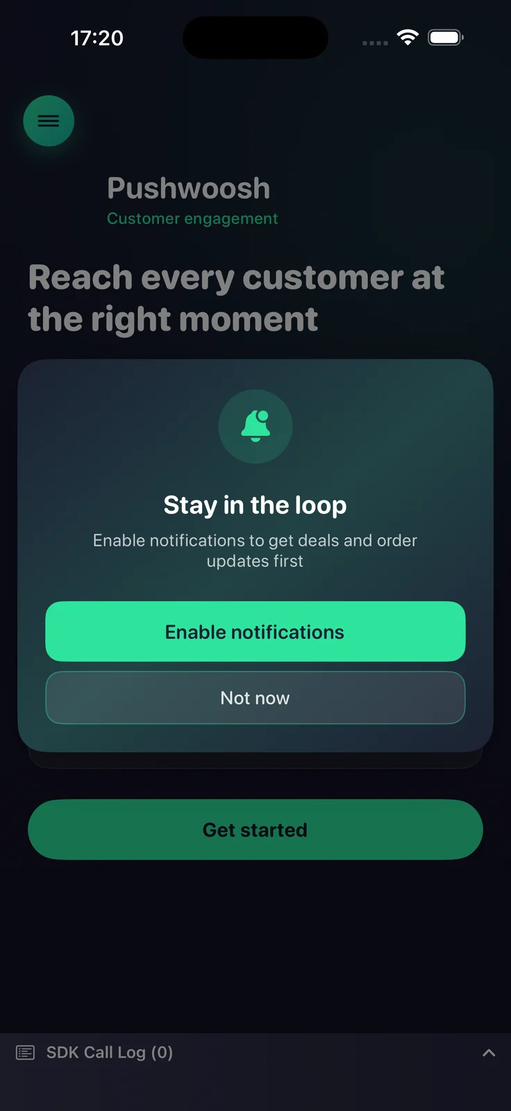
推送前置提示 (push primer) 是一个在显示 iOS 系统推送权限提示之前展示的软性选择加入对话框。iOS 在每次安装后仅显示一次系统提示——如果用户点击不允许,推送功能将丢失,直到他们在“设置”中重新启用。前置提示让您可以先解释其价值,并在合适的时机请求权限,这样您就可以将仅有一次的系统提示机会用在已经同意的用户身上。
自 7.1.1 版本起可用。该前置提示是 PushwooshFramework 的一部分,无需额外模块。
工作原理
Anchor link to前置提示是完全状态感知的。它会读取当前的通知授权状态并决定如何操作,因此在每次启动时调用它都是安全的:
- 尚未决定 — 显示前置提示;用户接受后会触发系统权限提示。
- 已授权或临时授权 — 静默抑制前置提示(不显示任何内容)。
- 已拒绝 — 显示前置提示;用户接受后会将其引导至应用的通知设置(当
fallbackToSettings启用时)。
您可以决定何时调用前置提示(例如,在用户引导流程后或在某个关键操作后)。SDK 本身不强制任何调用时机,除了下面描述的可选 minInterval 节流阀。
基本用法
Anchor link to使用链式构建器配置前置提示并调用 present。最基本的设置需要一个标题、一条消息和两个按钮的标题。
import PushwooshFramework
Pushwoosh.configure.pushPrimer .title("Stay in the loop") .message("Get notified about deals and order updates first") .acceptButton("Enable notifications") .declineButton("Not now") .present()样式和位置
Anchor link to使用 style 在系统警报和自定义表单之间进行选择,并使用 position 来放置自定义表单。每个位置都有其自己的默认设计。
| 值 | 描述 |
|---|---|
.alert | 系统 UIAlertController。position 将被忽略。 |
.sheet + .bottom | 从底部滑出的底部表单,带有抓取器和全宽按钮(默认)。 |
.sheet + .top | 从顶部降下的紧凑横幅,类似于通知。 |
.sheet + .center | 居中的对话框,会缩放并淡入。 |
Pushwoosh.configure.pushPrimer .style(.sheet) .position(.top) .title("Stay in the loop") .message("Get notified about deals and order updates first") .acceptButton("Enable notifications") .declineButton("Not now") .present()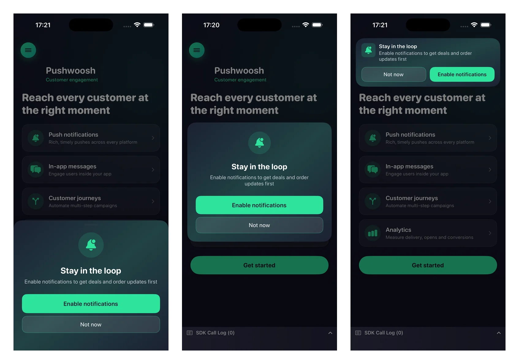
所有视觉设置都是可选的——省略它们将使用能适应浅色和深色模式的原生默认值。
Pushwoosh.configure.pushPrimer .style(.sheet) .position(.center) .title("Stay in the loop") .message("Get notified about deals and order updates first") .acceptButton("Enable notifications") .declineButton("Not now") .image(UIImage(named: "PrimerHero")) // local image, or .imageURL("https://…") .backgroundColor(.systemBackground) .titleColor(.label) .messageColor(.secondaryLabel) .acceptButtonColor(.systemBlue) .acceptButtonTextColor(.white) .declineButtonColor(.clear) .declineButtonTextColor(.secondaryLabel) .cornerRadius(24) .buttonCornerRadius(14) .buttonBorderColor(.separator) .present()自定义参考:
| 设置器 | 描述 |
|---|---|
image / imageURL | 本地 UIImage 或远程 URL。在居中和底部布局中渲染为圆形,在顶部横幅中渲染为图标。本地图像优先于 URL。 |
backgroundColor | 卡片的纯色背景颜色。 |
backgroundGradient | 一个颜色数组,渲染为柔和的多色渐变。会覆盖 backgroundColor。 |
titleColor / messageColor | 标题和消息文本的颜色。 |
acceptButtonColor / acceptButtonTextColor | 接受按钮的背景和文本颜色。接受按钮的颜色也会为默认图标着色。 |
declineButtonColor / declineButtonTextColor | 拒绝按钮的背景和文本颜色。 |
cornerRadius | 卡片的圆角半径。 |
buttonCornerRadius / buttonBorderColor | 两个按钮的圆角半径和边框颜色。 |
行为设置
Anchor link to回退到设置
Anchor link to默认情况下,当通知已被拒绝时,会显示前置提示,接受按钮会将用户带到应用的通知设置。传入 false 则会在拒绝状态下完全抑制前置提示。
.fallbackToSettings(false)显示频率
Anchor link to默认情况下,前置提示没有内置的节流功能——只要您调用 present,它就会显示(一旦通知被授权,它会自动抑制)。使用 minInterval 来限制前置提示的重新出现频率。上次显示的时间会在应用重启后持久化。
.minInterval(7 * 24 * 60 * 60) // show at most once a week处理结果
Anchor link to向 present 传入一个完成回调来响应结果。
Pushwoosh.configure.pushPrimer .title("Stay in the loop") .message("Get notified about deals and order updates first") .acceptButton("Enable notifications") .declineButton("Not now") .present { outcome in switch outcome { case .accepted: break // 已显示,用户接受,已请求系统提示 case .declined: break // 已显示,用户拒绝 case .suppressed: break // 未显示(已授权或被节流) case .redirectedToSettings: break // 拒绝状态,用户被引导至设置 @unknown default: break } }最终的系统提示结果(授予/拒绝状态和设备令牌)会通过常规的注册回调返回——前置提示在用户接受时会复用 registerForPushNotifications,并且不会重复该调用链。