InboxKit mit dem Swift Package Manager einrichten
Verfügbar seit iOS SDK 7.0.40.
InboxKit wird als separates Bibliotheksprodukt innerhalb des Swift-Pakets Pushwoosh-XCFramework ausgeliefert. Das Haupt-SDK muss bereits integriert sein. Wenn Sie bei Null anfangen, folgen Sie zuerst der Anleitung zur Basisintegration.
Das InboxKit-Paketprodukt hinzufügen
Anchor link to-
Öffnen Sie Ihr Projekt in Xcode und navigieren Sie zu den Projekteinstellungen → Package Dependencies und klicken Sie dann auf die Schaltfläche +.
-
Geben Sie die folgende Paket-URL ein:
https://github.com/Pushwoosh/Pushwoosh-XCFramework-
Richten Sie die Dependency Rule auf Up to Next Major Version mit der neuesten stabilen Version ein und klicken Sie dann auf Add Package.
-
Wählen Sie auf dem Bildschirm zur Paketauswahl mindestens die folgenden Produkte aus und fügen Sie sie zu Ihrem Haupt-App-Ziel (Target) hinzu:
- PushwooshFramework (erforderlich)
- PushwooshCore (erforderlich)
- PushwooshBridge (erforderlich)
- PushwooshInboxKit (das neue Modul)
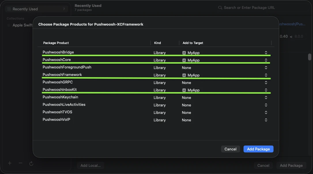
Fügen Sie die vier hervorgehobenen Produkte zu Ihrem Haupt-App-Ziel (Target) hinzu.
- Öffnen Sie Ihr Haupt-App-Ziel (Target) und bestätigen Sie unter Frameworks, Libraries, and Embedded Content, dass
PushwooshInboxKit.xcframeworkaufgeführt und eingebettet ist.
Das ist alles – InboxKit ist jetzt neben dem Haupt-SDK verknüpft.
Die Inbox anzeigen
Anchor link toFügen Sie den Inbox-Controller zu einem beliebigen Navigationsfluss hinzu. Die Standardkonfiguration reicht aus, um eine funktionierende Inbox mit den drei Standard-Zelltypen zu erhalten:
import PushwooshInboxKit
let inboxVC = PushwooshInboxKitViewController()navigationController?.pushViewController(inboxVC, animated: true)
@import PushwooshInboxKit;
PushwooshInboxKitViewController *inboxVC = [PushwooshInboxKitViewController new];[self.navigationController pushViewController:inboxVC animated:YES];Die Inbox anpassen
Anchor link toIn Swift konfigurieren Sie den Controller über den Werttyp PushwooshInboxKitAttributes. In Objective-C verwenden Sie die @objc-freundlichen Setter auf dem Controller – PushwooshInboxKitAttributes ist eine Swift-Struktur und wird nicht überbrückt.
var attributes = PushwooshInboxKitAttributes()attributes.pullToRefreshEnabled = trueattributes.swipeToDeleteEnabled = trueattributes.pinningEnabled = trueattributes.style.unreadBadgeColor = .systemBlueattributes.style.titleFont = .systemFont(ofSize: 17, weight: .semibold)
let inboxVC = PushwooshInboxKitViewController(attributes: attributes)
PushwooshInboxKitViewController *inboxVC = [PushwooshInboxKitViewController new];[inboxVC setBackgroundColor:[UIColor systemBackgroundColor]];[inboxVC setEmptyMessage:@"You have no messages yet"];Die Style-Struktur legt alle Farben, Schriftarten, Eckenradien und den Datumsformatierer offen, die von den Standardzellen verwendet werden. Jeder Wert ist standardmäßig eine semantische Farbe von Apple, sodass die Inbox automatisch auf den systemweiten Dunkelmodus reagiert.
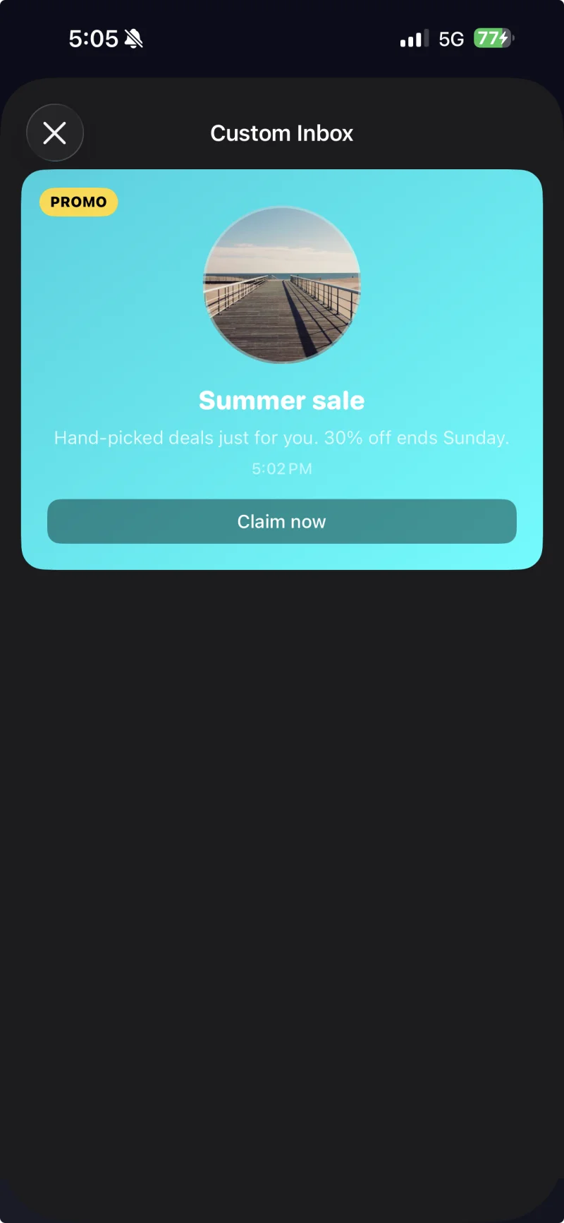
Zelle mit Beschriftung und einem benutzerdefinierten Design, das über PushwooshInboxKitAttributes.Style angewendet wird.
Taps und Aktualisierungen handhaben
Anchor link toKonformieren Sie mit PushwooshInboxKitDelegate, um auf Benutzeraktionen und Aktualisierungsereignisse zu reagieren. Jede Methode hat eine Standardimplementierung, sodass Sie nur das überschreiben, was Sie benötigen:
final class InboxCoordinator: NSObject, PushwooshInboxKitDelegate {    func inboxKit(_ vc: PushwooshInboxKitViewController,                  didSelect message: PWInboxMessageProtocol) -> Bool {        // Geben Sie true zurück, damit das SDK die Nachrichten-URL oder Rich Media öffnen kann.        // Geben Sie false zurück, wenn Sie den Tap vollständig selbst behandelt haben (z. B. auf einen benutzerdefinierten Bildschirm weitergeleitet haben).        return true    }
    func inboxKit(_ vc: PushwooshInboxKitViewController,                  didRefreshWith messages: [PWInboxMessageProtocol],                  error: Error?) {        // Zeigen Sie hier bei Bedarf Ihren eigenen leeren / Fehlerzustand an.    }}
inboxVC.delegate = inboxCoordinator