Guía de inicio para push de iOS
Una guía de inicio para push es un diálogo de pre-aceptación que se muestra antes de la solicitud de permisos de notificaciones push del sistema iOS. iOS muestra la solicitud del sistema solo una vez por instalación; si el usuario toca No permitir, las notificaciones push se pierden hasta que las vuelva a habilitar en Ajustes. La guía de inicio te permite explicar primero el valor y preguntar en el momento adecuado, para que uses la única solicitud del sistema en usuarios que ya han dicho que sí.
Disponible desde la versión 7.1.1. La guía de inicio es parte de PushwooshFramework; no se requiere ningún módulo adicional.
Cómo funciona
Anchor link toLa guía de inicio es totalmente consciente del estado. Lee el estado actual de autorización de notificaciones y decide qué hacer, por lo que es seguro llamarla en cada inicio:
- No determinado — muestra la guía de inicio; al aceptar, activa la solicitud de permisos del sistema.
- Autorizado o provisional — suprime silenciosamente la guía de inicio (no se muestra nada).
- Denegado — muestra la guía de inicio; al aceptar, dirige al usuario a los ajustes de notificaciones de la aplicación (cuando
fallbackToSettingsestá habilitado).
Tú decides cuándo llamar a la guía de inicio (por ejemplo, después del proceso de incorporación o después de una acción clave). El SDK no impone ningún momento propio, excepto por la limitación opcional de minInterval que se describe a continuación.
Uso básico
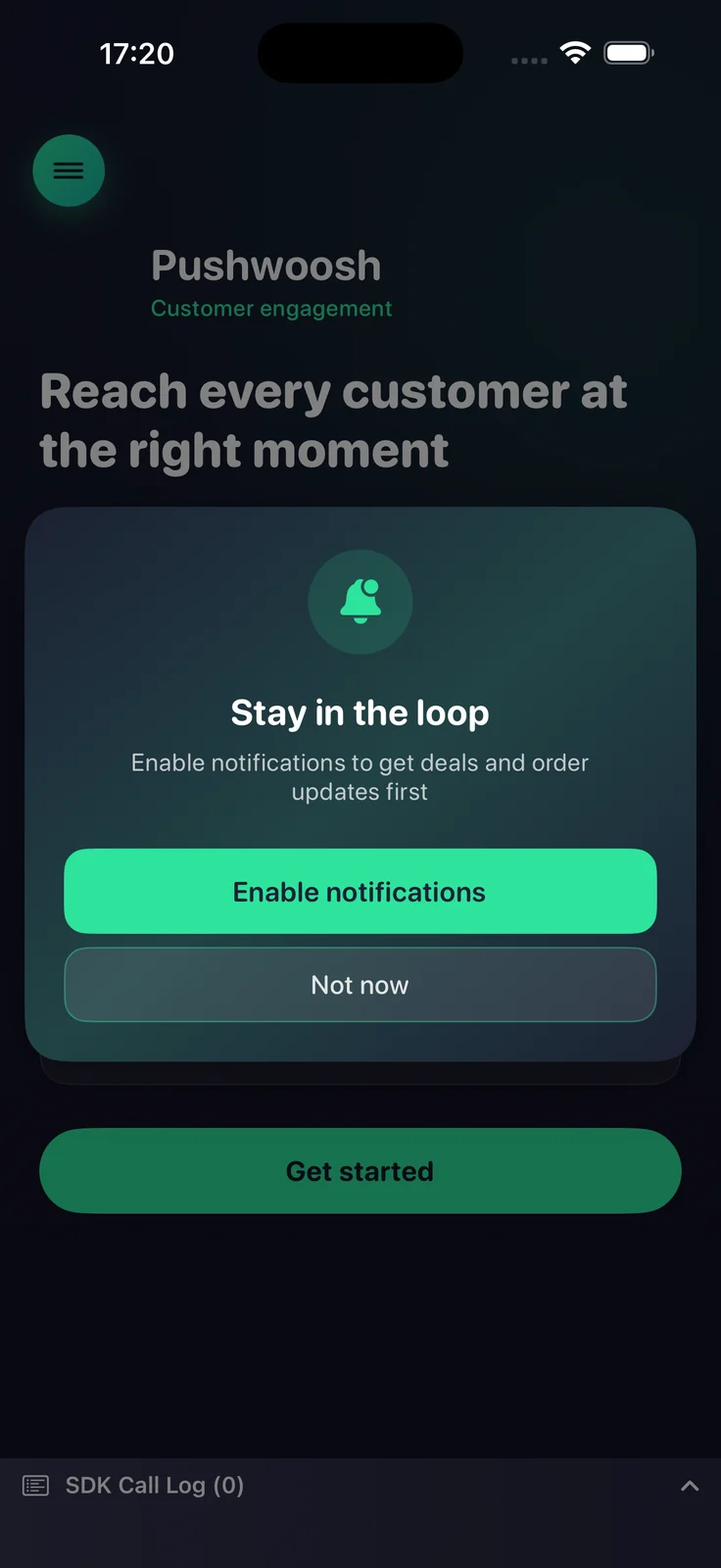
Anchor link toConfigura la guía de inicio con un constructor fluído y llama a present. La configuración mínima necesita un título, un mensaje y los títulos de los dos botones.
import PushwooshFramework
Pushwoosh.configure.pushPrimer .title("Mantente al día") .message("Recibe notificaciones sobre ofertas y actualizaciones de pedidos primero") .acceptButton("Activar notificaciones") .declineButton("Ahora no") .present()Estilos y posiciones
Anchor link toUsa style para elegir entre una alerta del sistema y una hoja personalizada, y position para colocar la hoja personalizada. Cada posición tiene su propio diseño predeterminado.
| Valor | Descripción |
|---|---|
.alert | UIAlertController del sistema. La posición se ignora. |
.sheet + .bottom | Hoja inferior que se desliza hacia arriba, con un agarre y botones de ancho completo (predeterminado). |
.sheet + .top | Banner compacto que se despliega desde la parte superior, como una notificación. |
.sheet + .center | Diálogo centrado que se escala y aparece gradualmente. |
Pushwoosh.configure.pushPrimer .style(.sheet) .position(.top) .title("Mantente al día") .message("Recibe notificaciones sobre ofertas y actualizaciones de pedidos primero") .acceptButton("Activar notificaciones") .declineButton("Ahora no") .present()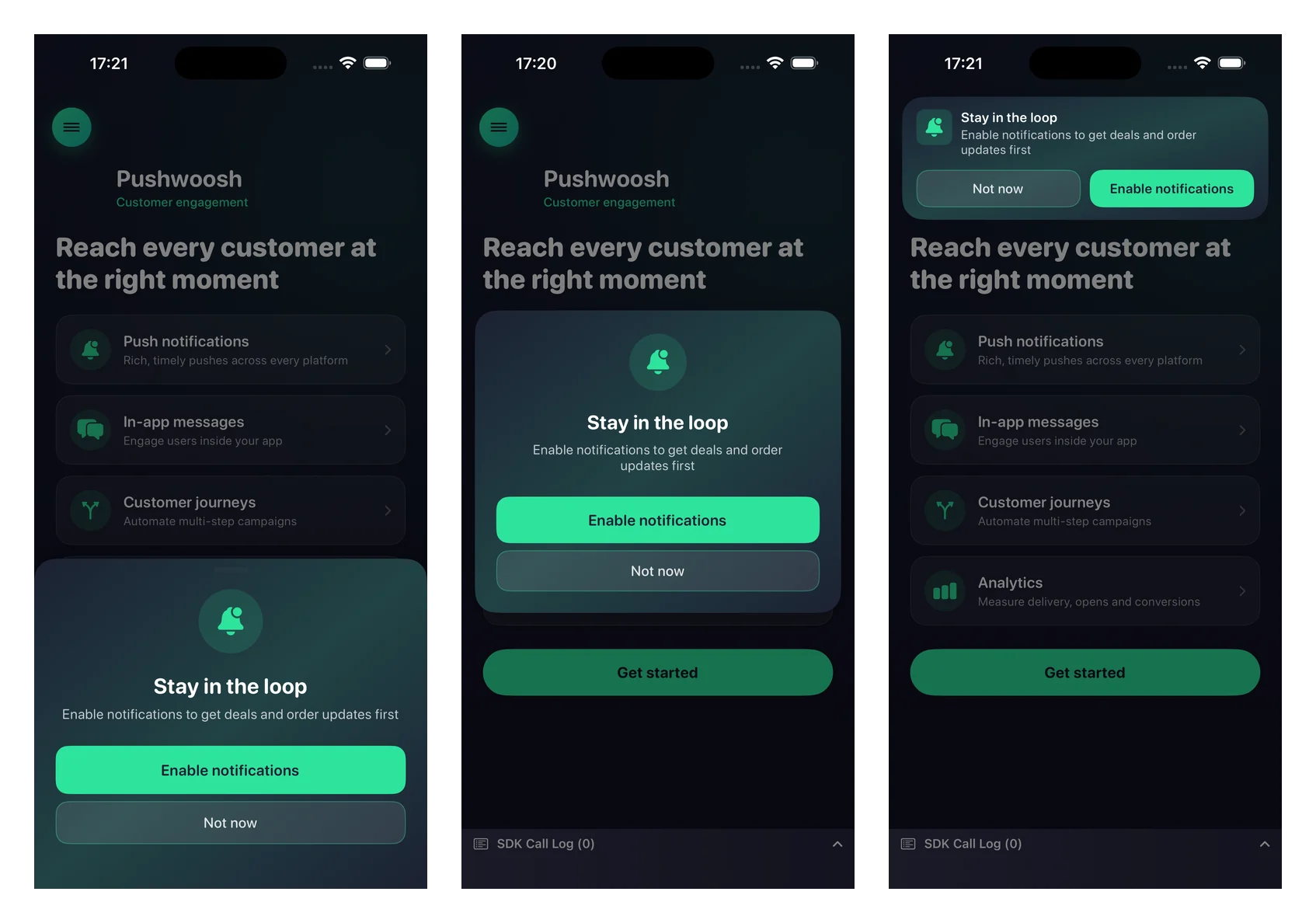
Personalización
Anchor link toTodos los ajustes visuales son opcionales; omítelos para usar los valores predeterminados nativos que se adaptan al modo claro y oscuro.
Pushwoosh.configure.pushPrimer .style(.sheet) .position(.center) .title("Mantente al día") .message("Recibe notificaciones sobre ofertas y actualizaciones de pedidos primero") .acceptButton("Activar notificaciones") .declineButton("Ahora no") .image(UIImage(named: "PrimerHero")) // imagen local, o .imageURL("https://…") .backgroundColor(.systemBackground) .titleColor(.label) .messageColor(.secondaryLabel) .acceptButtonColor(.systemBlue) .acceptButtonTextColor(.white) .declineButtonColor(.clear) .declineButtonTextColor(.secondaryLabel) .cornerRadius(24) .buttonCornerRadius(14) .buttonBorderColor(.separator) .present()Referencia de personalización:
| Setter | Descripción |
|---|---|
image / imageURL | Un UIImage local o una URL remota. Se renderiza como un círculo en los diseños central e inferior, y como el ícono en el banner superior. Una imagen local tiene prioridad sobre una URL. |
backgroundColor | Color de fondo sólido de la tarjeta. |
backgroundGradient | Un array de colores renderizado como un gradiente suave multicolor. Sobrescribe backgroundColor. |
titleColor / messageColor | Colores del texto del título y del mensaje. |
acceptButtonColor / acceptButtonTextColor | Colores de fondo y de texto del botón de aceptar. El color de aceptar también tiñe el ícono predeterminado. |
declineButtonColor / declineButtonTextColor | Colores de fondo y de texto del botón de rechazar. |
cornerRadius | Radio de esquina de la tarjeta. |
buttonCornerRadius / buttonBorderColor | Radio de esquina y color del borde de ambos botones. |
Ajustes de comportamiento
Anchor link toRedirección a Ajustes
Anchor link toPor defecto, cuando las notificaciones ya están denegadas, se muestra la guía de inicio y el botón de aceptar lleva al usuario a los ajustes de notificaciones de la aplicación. Pasa false para suprimir completamente la guía de inicio en el estado denegado.
.fallbackToSettings(false)Frecuencia de visualización
Anchor link toPor defecto, la guía de inicio no tiene una limitación de frecuencia incorporada; se muestra cada vez que llamas a present (y se suprime automáticamente una vez que se autorizan las notificaciones). Usa minInterval para limitar la frecuencia con la que reaparece la guía de inicio. La última vez que se mostró se guarda entre inicios.
.minInterval(7 * 24 * 60 * 60) // mostrar como máximo una vez por semanaManejo del resultado
Anchor link toPasa una finalización a present para reaccionar al resultado.
Pushwoosh.configure.pushPrimer .title("Mantente al día") .message("Recibe notificaciones sobre ofertas y actualizaciones de pedidos primero") .acceptButton("Activar notificaciones") .declineButton("Ahora no") .present { outcome in switch outcome { case .accepted: break // mostrado, usuario aceptó, solicitud del sistema solicitada case .declined: break // mostrado, usuario rechazó case .suppressed: break // no mostrado (ya autorizado, o con limitación de frecuencia) case .redirectedToSettings: break // estado denegado, usuario enviado a Ajustes @unknown default: break } }El resultado final de la solicitud del sistema (el estado concedido/denegado y el token del dispositivo) llega a través de las devoluciones de llamada de registro habituales; la guía de inicio reutiliza registerForPushNotifications al aceptar y no duplica esa cadena.