Configurar InboxKit con Swift Package Manager
Disponible desde el SDK de iOS 7.0.40.
InboxKit se distribuye como un producto de biblioteca separado dentro del paquete Swift Pushwoosh-XCFramework. Necesitas que el SDK principal ya esté integrado; si estás empezando desde cero, sigue primero la Guía de integración básica.
Añadir el producto del paquete InboxKit
Anchor link to1. Abre tu proyecto en Xcode y navega a los ajustes del proyecto → Package Dependencies, luego presiona el botón +.
2. Introduce la siguiente URL del paquete:
https://github.com/Pushwoosh/Pushwoosh-XCFramework3. Configura la Dependency Rule como Up to Next Major Version con la última versión estable, luego haz clic en Add Package.
4. En la pantalla de selección de paquetes, elige al menos los siguientes productos y añádelos a tu target principal de la aplicación:
- PushwooshFramework (requerido)
- PushwooshCore (requerido)
- PushwooshBridge (requerido)
- PushwooshInboxKit (el nuevo módulo)
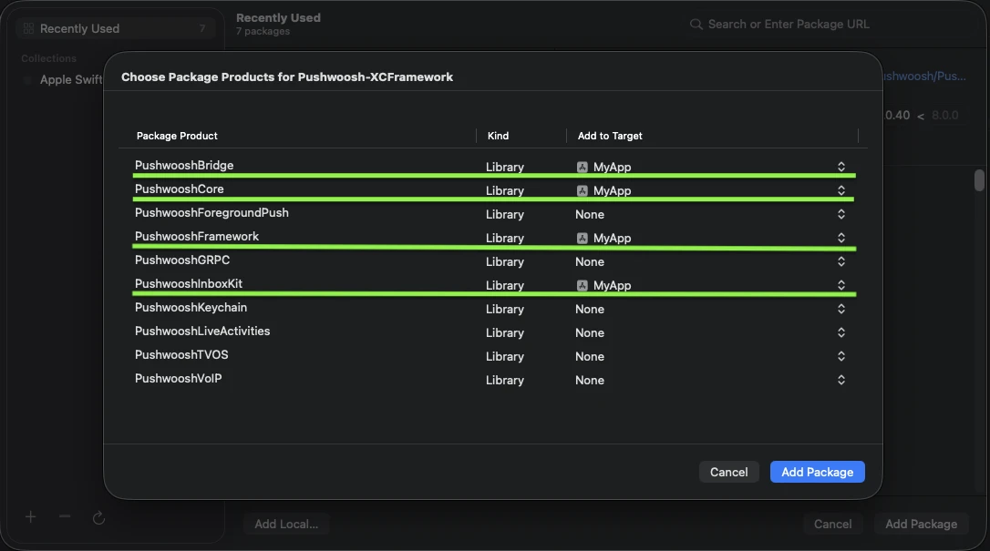
Añade los cuatro productos resaltados a tu target principal de la aplicación.
5. Abre tu target principal de la aplicación y en Frameworks, Libraries, and Embedded Content, confirma que PushwooshInboxKit.xcframework esté listado e incrustado.
Eso es todo — InboxKit ahora está enlazado junto con el SDK principal.
Mostrar la bandeja de entrada
Anchor link toAñade el controlador de la bandeja de entrada a cualquier flujo de navegación. La configuración por defecto es suficiente para obtener una bandeja de entrada funcional con los tres tipos de celdas estándar:
import PushwooshInboxKit
let inboxVC = PushwooshInboxKitViewController()navigationController?.pushViewController(inboxVC, animated: true)
@import PushwooshInboxKit;
PushwooshInboxKitViewController *inboxVC = [PushwooshInboxKitViewController new];[self.navigationController pushViewController:inboxVC animated:YES];Personalizar la bandeja de entrada
Anchor link toEn Swift, configura el controlador a través del tipo de valor PushwooshInboxKitAttributes. En Objective-C, utiliza los setters compatibles con @objc en el controlador — PushwooshInboxKitAttributes es una struct de Swift y no tiene puente (bridge) a Objective-C.
var attributes = PushwooshInboxKitAttributes()attributes.pullToRefreshEnabled = trueattributes.swipeToDeleteEnabled = trueattributes.pinningEnabled = trueattributes.style.unreadBadgeColor = .systemBlueattributes.style.titleFont = .systemFont(ofSize: 17, weight: .semibold)
let inboxVC = PushwooshInboxKitViewController(attributes: attributes)
PushwooshInboxKitViewController *inboxVC = [PushwooshInboxKitViewController new];[inboxVC setBackgroundColor:[UIColor systemBackgroundColor]];[inboxVC setEmptyMessage:@"You have no messages yet"];La struct Style expone todos los colores, fuentes, radios de esquina y el formateador de fecha utilizados por las celdas por defecto. Cada valor es un color semántico de Apple por defecto, por lo que la bandeja de entrada reacciona automáticamente al modo oscuro del sistema.
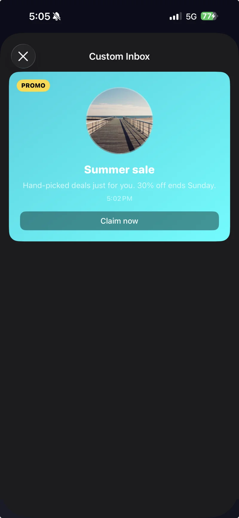
Celda con leyenda y un tema personalizado aplicado a través de PushwooshInboxKitAttributes.Style.
Manejar toques y actualizaciones
Anchor link toAdopta el protocolo PushwooshInboxKitDelegate para reaccionar a las acciones del usuario y a los eventos de actualización. Cada método tiene una implementación por defecto, por lo que solo necesitas sobreescribir lo que necesites:
final class InboxCoordinator: NSObject, PushwooshInboxKitDelegate {    func inboxKit(_ vc: PushwooshInboxKitViewController,                  didSelect message: PWInboxMessageProtocol) -> Bool {        // Devuelve true para permitir que el SDK abra la URL del mensaje o el richmedia.        // Devuelve false si manejaste el toque por completo (p. ej., enrutando a una pantalla personalizada).        return true    }
    func inboxKit(_ vc: PushwooshInboxKitViewController,                  didRefreshWith messages: [PWInboxMessageProtocol],                  error: Error?) {        // Muestra tu propio estado de vacío / error aquí si es necesario.    }}
inboxVC.delegate = inboxCoordinator