Web inbox widget
Web Message Inbox being integrated into your website increases conversions drastically. A ready-to-use Web Inbox Widget is out of the box subscribed to all methods needed to communicate with users. Just integrate the widget into your website and customize its appearance to fit your brand.
Setting inboxWidget.enable: true registers a visitor’s device for Inbox delivery even when the visitor hasn’t granted push notification permission, so it can reach visitors who never subscribed to push.
Prerequisites
Anchor link toTo integrate Message Inbox for websites, please follow the guide.
Integrating widget
Anchor link toWhen initializing Pushwoosh WebSDK, add the inboxWidget parameter:
Pushwoosh.push(['init', { ..., inboxWidget: { enable: true, triggerId: 'pwInbox' }}]);Trigger
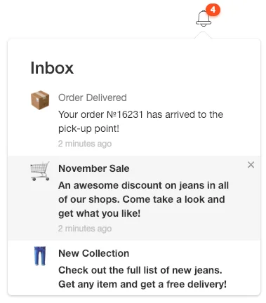
Anchor link toTo render the widget, you should specify a trigger element for the widget. Any DOM-element on the page could be the trigger. Specify its ID as “pwInbox” or assign any custom ID to the triggerId parameter when initializing SDK.
When WebSDK is initialized, the unread messages badge displays on the trigger element. Once the trigger element is tapped, the widget appears on the page.
Positioning
Anchor link toBy default, the widget is located in the opposite direction from the screen border closest to the trigger element.
You can set the widget’s position through configuration params:
Pushwoosh.push(['init', {
  ...,  inboxWidget: {    enable: true,    triggerId: 'pwInbox',    position: 'top'  }}]);
By default, the inboxWidget should be placed before the closing </body> tag.
Render the widget anywhere on the page as shown in the example below:
Pushwoosh.push(['init', {  ...,  inboxWidget: {
    enable: true,    triggerId: 'pwInbox',    appendTo: '.widget-parent-element-class'  }}]);
Search for a parent element is performed by querySelector, so it needs clear specification of a class, id, or element.
Customizing widget
Anchor link toCustomizing texts
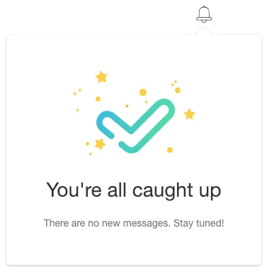
Anchor link toTo customize widget text, add emptyInboxTitle and emptyInboxText parameters:
Pushwoosh.push(['init', { ..., inboxWidget: { enable: true, triggerId: 'pwInbox', title: 'Inbox', // widget title emptyInboxTitle: 'You\'re all caught up', // empty inbox widget title emptyInboxText: 'There are no new messages. Stay tuned!' // empty inbox widget text }}]);The result looks like this:
Customizing appearance
Anchor link toTo customize the widget’s appearance, use the following parameters:
Pushwoosh.push(['init', { ..., inboxWidget: { enable: true, triggerId: 'pwInbox', bgColor: '#ffffff', // widget background borderColor: 'transparent', // widget border color borderRadius: 4, // widget border radius (px) widgetWidth: 350, // widget width (px) zIndex: 100 // z-index }}]);Unread messages count badge can be customized as follows:
Pushwoosh.push(['init', { ..., inboxWidget: { enable: true, triggerId: 'pwInbox', badgeBgColor: '#ff4c00', // badge color badgeTextColor: '#ffffff' // badge text color }}]);To customize text properties, add the following code:
Pushwoosh.push(['init', { ..., inboxWidget: { enable: true, triggerId: 'pwInbox', textColor: '#333333', // text color fontFamily: 'Helvetica, Arial, sans-serif', // font messageTitleColor: '#7a7a7a', // messages title color timeTextColor: '#c4c4c4', // timestamp text color emptyInboxTitleColor: '#333333', // empty inbox title color emptyInboxTextColor: '#7a7a7a' // empty inbox text color }}]);Lastly, you can specify the icon for empty inbox:
Pushwoosh.push(['init', { ..., inboxWidget: { enable: true, triggerId: 'pwInbox', emptyInboxIconUrl: 'https://pushon.pushwoosh.com/images/icon-empty-inbox.png' // URL path to an icon }}]);Customizing cell layouts
Anchor link toThe widget draws a message as one of four cell layouts — classic, banner, captioned, or carousel — the same layouts the campaign preview in the control panel shows. A layout that can’t render with what the message carries degrades to classic: banner needs a hero image, captioned needs a hero image plus both a title and a body, and carousel needs at least one slide plus both a title and a body.
To customize the layouts’ appearance, use the following parameters:
Pushwoosh.push(['init', { ..., inboxWidget: { enable: true, triggerId: 'pwInbox', unreadDotColor: '#ff4c00', // unread dot on the classic avatar avatarBgColor: '#e6e6e6', // classic avatar background avatarTextColor: '#333333', // classic avatar initial color avatarSize: 52, // classic avatar size (px) mediaRadius: 8, // corner radius of banner/captioned/carousel media (px) slideCaptionColor: '#ffffff', // carousel slide caption text color slideScrimColor: '#000000', // carousel slide caption background scrim pagerDotActiveColor: '#ff4c00', // carousel active page dot pagerDotColor: '#c4c4c4' // carousel inactive page dots }}]);Managing it in the Control Panel
Anchor link toTo set up the widget from the Control Panel:
-
Go to Settings → Configure platforms → Web.
-
On the Inbox widget card, click Configure.

-
Turn on Show the inbox on the site.
-
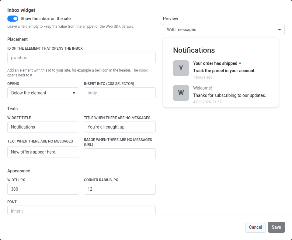
Fill in the fields you want to manage from the panel, and leave the rest empty. An empty field isn’t saved, so the snippet’s value, or the SDK default, still applies. Leave ID of the element that opens the inbox and Insert into (CSS selector) empty to keep
triggerIdandappendToin the snippet next to the markup they point to. -
Check the result in the preview. Switch between With messages and No messages to see both states.
-
Save the form. Width, px takes a whole number from 200 to 1200, and Corner radius, px from 0 to 64. Any other value shows an error under the field and isn’t saved.
How the card works with the snippet
Anchor link toValues saved in the card override the same inboxWidget keys in the init snippet, key by key. Each field sets one key:
| Section | Field | inboxWidget key |
|---|---|---|
| Placement | ID of the element that opens the inbox | triggerId |
| Placement | Opens | position |
| Placement | Insert into (CSS selector) | appendTo |
| Texts | Widget title | title |
| Texts | Title when there are no messages | emptyInboxTitle |
| Texts | Text when there are no messages | emptyInboxText |
| Texts | Image when there are no messages (URL) | emptyInboxIconUrl |
| Appearance | Width, px (200–1200) | widgetWidth |
| Appearance | Corner radius, px (0–64) | borderRadius |
| Appearance | Font | fontFamily |
| Appearance | Background, Text, Border | bgColor, textColor, borderColor |
| Appearance | Counter background, Counter text, Unread mark | badgeBgColor, badgeTextColor, unreadDotColor |
Keys the card doesn’t have, such as the cell layout parameters and legacyClassicCell, are always read from the snippet.
The Show the inbox on the site switch works the same way. Until it’s saved in the panel, the card’s badge reads Set in the snippet, and the snippet’s enable decides whether the widget shows. Once you save the switch, the badge reads On or Off, and the card overrides the snippet:
- Off hides the widget even if the snippet sets
enable: true. - On shows the widget even if the snippet has no
inboxWidgetat all. Likeenable: true, it registers visitors for Inbox delivery without push permission.
Saved changes reach the site within a minute, on the next page load.
To hand the widget back to the snippet, click Return to snippet on the card and confirm. The button appears once anything is saved in the card. It deletes every inbox setting saved in the panel, and the site uses the inboxWidget settings of its snippet again.
To open or close the widget, use the following API method:
Pushwoosh.pwinboxWidget.toggle(open?: boolean);Opening the widget refreshes it from the server, at most once every 30 seconds — a standalone App Inbox message rides a channel with no push, so nothing else announces one between page loads.