Setting up Pushwoosh InboxKit iOS
Available since iOS SDK 7.0.40.
Pushwoosh InboxKit ships a modern UIKit inbox screen on top of the existing inbox backend. Six default cell layouts cover the common content-card shapes — from simple banners to image carousels, inline video, and Apple Wallet passes — inline CTA buttons handle the most common interactions, and the entire surface is open for subclassing if you need a bespoke look.
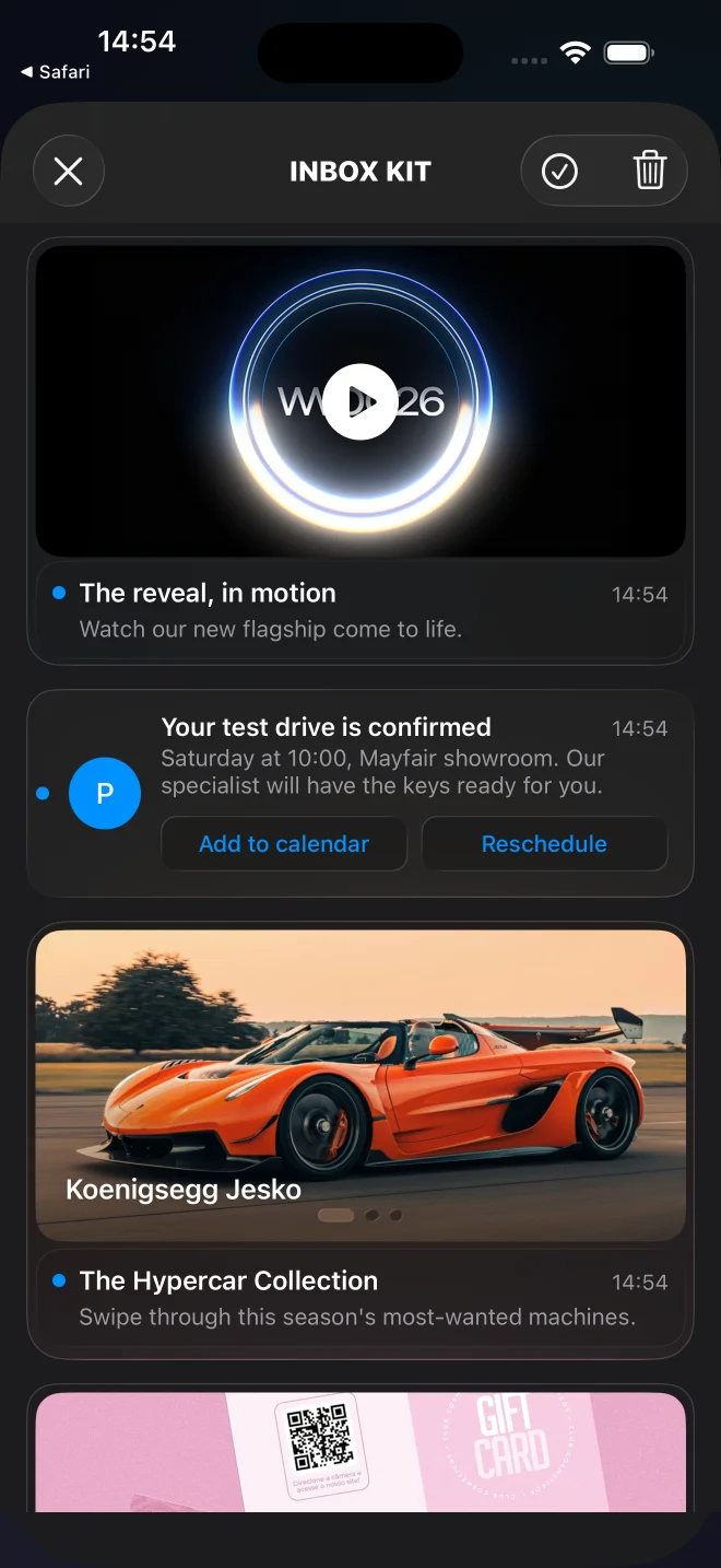
Default InboxKit feed with banner, captioned, classic, carousel, video, and Apple Wallet cards.
When to use InboxKit
Anchor link toUse InboxKit for any new iOS integration. It is the recommended replacement for the older Objective-C PushwooshInboxUI module.
InboxKit gives you:
- Six built-in cell types — banner, captioned, classic, carousel, video, and Apple Wallet — selected per message via the payload’s
displayType, or forced from code viaattributes.forceCellKind. See Card types for the full list. (The Apple Wallet card is iOS-only.) - Inline CTA buttons with a typed
PushwooshInboxButtonActionenum (openURL,dismiss,markRead,custom). The SDK handles the first three automatically; your delegate routescustomto your own logic. - Pinning support: messages with
actionParams["pinned"] == truefloat to the top of the feed and render a pin glyph. - Swipe-to-delete, pull-to-refresh, automatic mark-as-read on disappear — all toggleable via
PushwooshInboxKitAttributes. - Persistent storage: deletes and read state survive a process restart even if the network call has not been acknowledged yet.
- An open
PushwooshInboxCellbase class for fully custom layouts.
The server contract is unchanged — the same Pushwoosh inbox backend, payloads, and dashboard tooling work as before.
Choose your integration method
Anchor link to- Set up InboxKit with Swift Package Manager — recommended for new projects.
- Set up InboxKit with CocoaPods — for projects already using CocoaPods.
Card types
Anchor link toInboxKit picks a cell layout per message. The default resolver reads displayType from the push payload — put it inside the data object, which the SDK delivers under actionParams. When displayType is missing, the resolver falls back to a heuristic: image + no title → banner, image + title + body → captioned, otherwise classic. To force one layout for the whole feed from code, set attributes.forceCellKind.
Each rich layout degrades gracefully: if a mandatory field is absent or malformed, the card falls back to classic rather than rendering an empty placeholder (and a WARN is logged with the reason). classic is the terminal fallback and renders whatever the message carries; the message editor is expected to fill its title, body and icon.
displayType | Layout | Required payload field | Degrades to |
|---|---|---|---|
banner | Full-bleed image, no text | image (inbox_image or data.image) | classic when no image |
captioned | Image on top, title + body below | image (inbox_image or data.image), message title and content | classic when the image, title or body is missing |
classic | Coloured initial avatar + title + body | — (title, body and icon expected) | — |
carousel | Swipeable multi-image gallery | message title and content, data.carousel (1–5 slides) | classic when no slides or no title/body |
video | Poster with play badge, full-screen player on tap | data.video (url + optional poster) | classic when no descriptor |
wallet | ”Add to Apple Wallet” button (iOS only) | data.wallet (.pkpass URL) | classic when no pass URL |
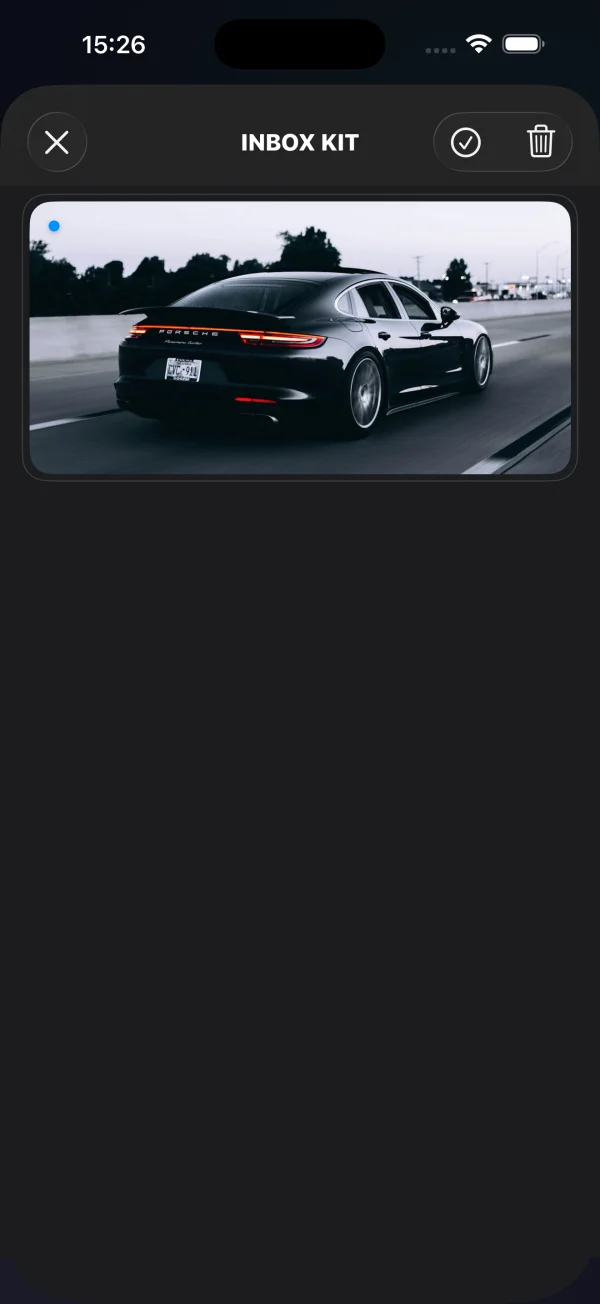
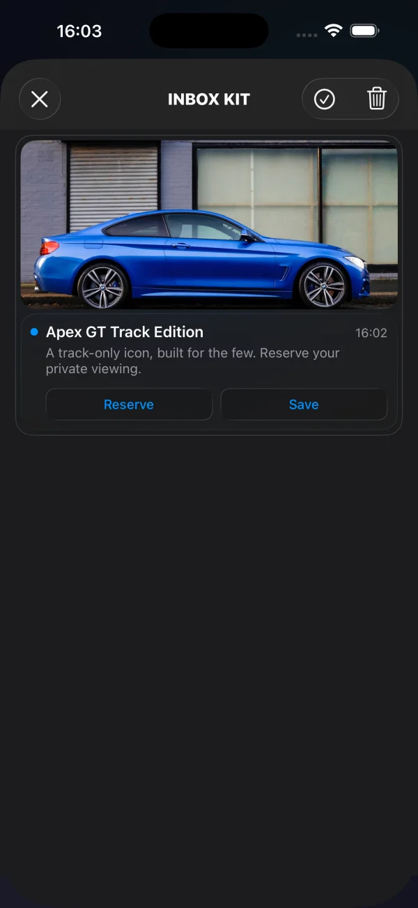
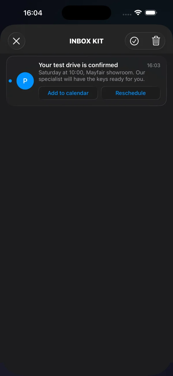
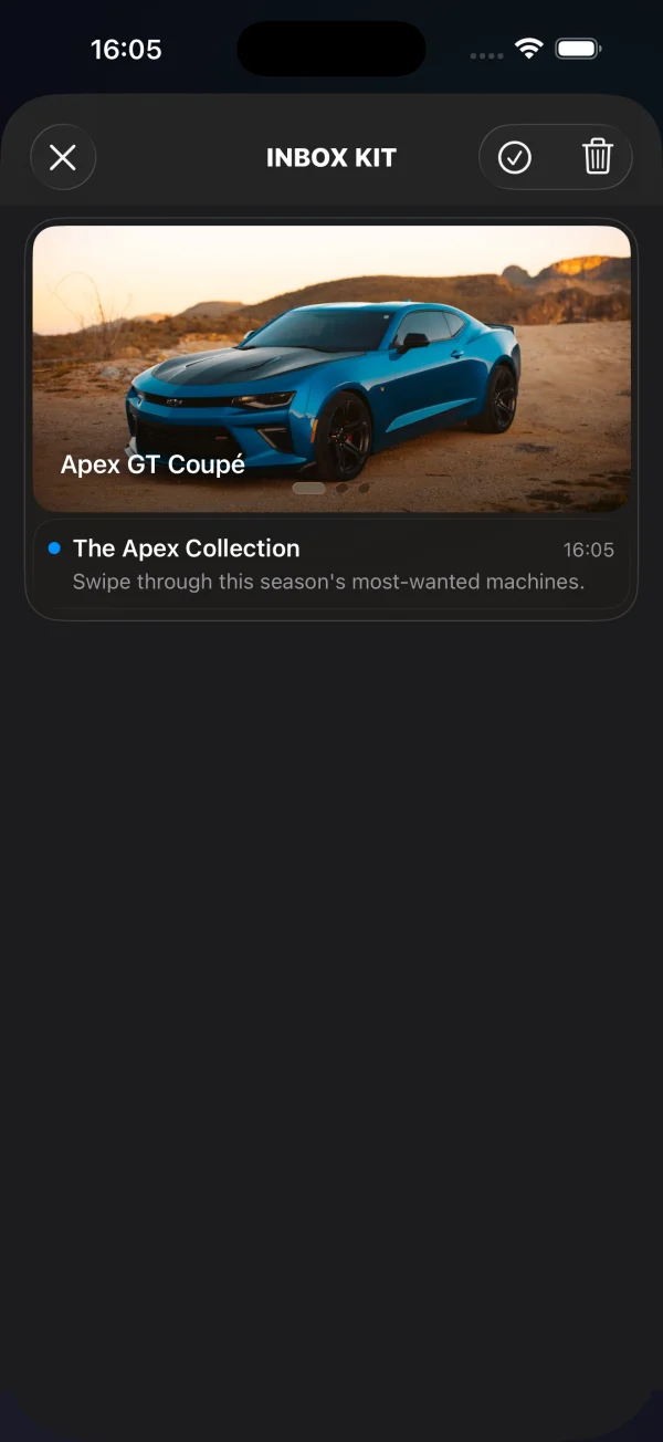
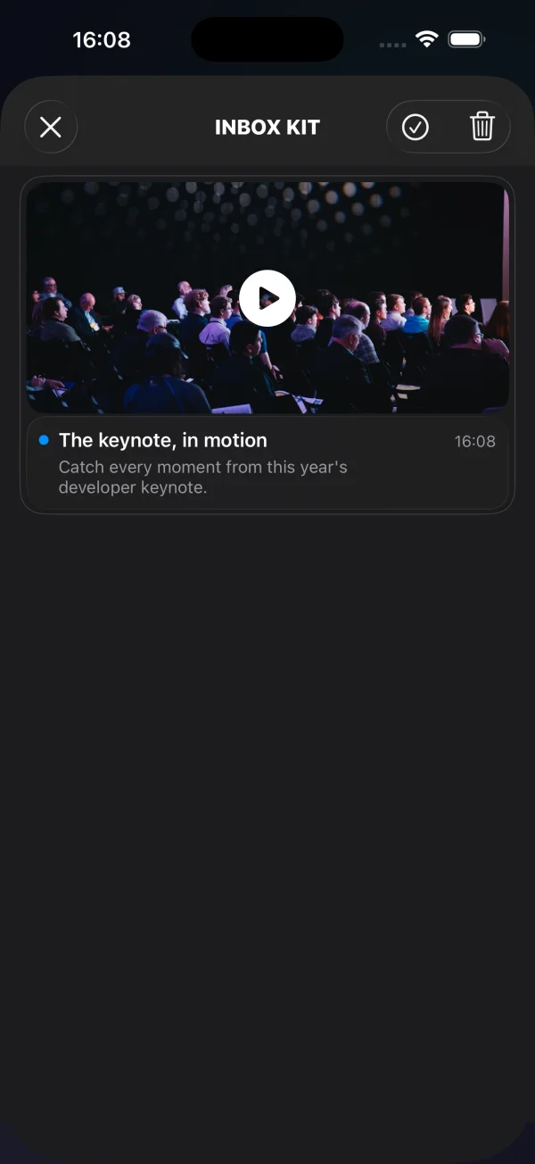
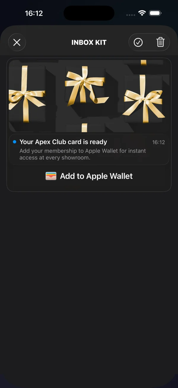
Banner, captioned, and classic cards are driven by the standard message fields (image, title, body) plus the optional buttons array — see Add inline CTA buttons. The carousel, video, and Apple Wallet cards carry extra structured data inside data, documented below.
Carousel card
Anchor link toA carousel renders several images from a single message — a swipeable gallery with optional per-slide captions and tap destinations. Slides live in data.carousel. Each slide needs an image; title (caption overlay) and url (deep link opened on tap) are optional. A slide without an image is dropped; a tap on a slide with no url falls through to the message’s default row action. At most 5 slides are shown — extra slides are dropped (a slide without an image does not use up a place). The message title and content are mandatory for this layout; without them the card degrades to classic.
{ "request": { "application": "XXXXX-XXXXX", "auth": "API_TOKEN", "notifications": [{ "send_date": "now", "ios_title": "New arrivals", "content": "Swipe through this week's drops", "inbox_days": 7, "data": { "displayType": "carousel", "carousel": [ { "image": "https://cdn.example.com/inbox/1.jpg", "title": "New in", "url": "myapp://product/1" }, { "image": "https://cdn.example.com/inbox/2.jpg", "title": "On sale", "url": "myapp://product/2" }, { "image": "https://cdn.example.com/inbox/3.jpg" } ] }, "platforms": [1] }] }}Video card
Anchor link toA video card shows a poster image with a play badge; tapping it opens a full-screen player (sound on, even with the silent switch engaged). The descriptor lives in data.video: url is required and must be an http/https stream or file; poster is an optional preview image.
{ "request": { "application": "XXXXX-XXXXX", "auth": "API_TOKEN", "notifications": [{ "send_date": "now", "ios_title": "Watch the reveal", "content": "Tap to play", "inbox_days": 7, "data": { "displayType": "video", "video": { "url": "https://cdn.example.com/inbox/clip.mp4", "poster": "https://cdn.example.com/inbox/poster.jpg" } }, "platforms": [1] }] }}Apple Wallet card
Anchor link toThe Apple Wallet card shows an optional hero image, title, and body above the official Add to Apple Wallet button. Tapping the button downloads the .pkpass and presents the system add-passes sheet. Use it to deliver coupons, loyalty cards, tickets, or boarding passes straight from the inbox. The card is iOS / Mac Catalyst only — on other platforms the message renders as a classic card.
The pass URL lives in data.wallet, either as a bare string or as an object with a pass field. An optional data.image adds the hero image. The button hides itself automatically when there is no pass URL or the device cannot add passes.
{ "request": { "application": "XXXXX-XXXXX", "auth": "API_TOKEN", "notifications": [{ "send_date": "now", "ios_title": "Your loyalty card is ready", "content": "Add it to Apple Wallet in one tap", "inbox_days": 7, "data": { "displayType": "wallet", "image": "https://cdn.example.com/inbox/loyalty.png", "wallet": "https://passes.example.com/v1/passes/pass.com.example.loyalty/abc123?token=…" }, "platforms": [1] }] }}The outcome is reported to your delegate:
extension MyInboxHost: PushwooshInboxKitDelegate {
    func inboxKit(_ vc: PushwooshInboxKitViewController,                  didAddWalletPassFor message: PWInboxMessageProtocol) {        // The pass is now in the user's Wallet — show a confirmation if you like.    }
    func inboxKit(_ vc: PushwooshInboxKitViewController,                  didFailToAddWalletPassFor message: PWInboxMessageProtocol,                  error: Error?) {        // Download failed — surface a retry, log, etc.    }}
Both callbacks are optional (they carry default empty implementations). A user cancelling the system sheet is neither success nor failure, so no callback fires in that case.
Accessibility
Anchor link toInboxKit cells are VoiceOver-ready out of the box. Banner, captioned, and classic cards expose their title, body, and date through the underlying labels, and inline CTA buttons read their own titles. The rich cards add explicit semantics:
- Video — the poster is exposed as a single button element labelled “Play video” (traits
.button+.startsMediaSession), so VoiceOver announces it as a media control rather than a plain image. - Carousel — each slide is a button element whose accessibility label is the slide’s caption, or “Slide” when it has none. The page indicator announces the current position as “n of total”.
- Apple Wallet — the Add to Apple Wallet button is Apple’s standard
PKAddPassButton, which carries its own localized VoiceOver label.
For UI testing and automation, two stable accessibilityIdentifiers are set: inboxkit.video.play on the video poster and inboxkit.wallet.add on the Wallet button.
Read custom data from a message
Anchor link toTo make a push appear in the inbox, the Messages API createMessage request must include inbox_image, inbox_date, or inbox_days — without one of those fields the push is delivered as a regular notification and never reaches the inbox feed. Free-form custom data goes under the data key, which the SDK delivers to the client as the u parameter:
{ "request": { "application": "XXXXX-XXXXX", "auth": "API_TOKEN", "notifications": [{ "send_date": "now", "ios_title": "Summer sale", "content": "30% off everything — limited time only", "inbox_image": "https://cdn.example.com/inbox/summer.png", "inbox_days": 7, "data": { "displayType": "captioned", "promo_id": "SUMMER2026", "screen": "promo_details" }, "platforms": [1] }] }}The SDK exposes that object on the inbox message through actionParams. Read it from the delegate when the user taps the row or an inline CTA:
extension MyInboxHost: PushwooshInboxKitDelegate {
    func inboxKit(_ vc: PushwooshInboxKitViewController,                  didSelect message: PWInboxMessageProtocol) -> Bool {        guard let params = message.actionParams as? [String: Any] else { return true }
        // The custom `data` object arrives under the "u" key —        // either as a nested dictionary or as a JSON-encoded string,        // depending on how the payload was built upstream.        let custom: [String: Any]? = {            if let dict = params["u"] as? [String: Any] { return dict }            if let raw = params["u"] as? String,               let bytes = raw.data(using: .utf8),               let parsed = try? JSONSerialization.jsonObject(with: bytes) as? [String: Any] {                return parsed            }            return nil        }()
        if let promoId = custom?["promo_id"] as? String {            navigateToPromo(promoId)            return false   // we handled the tap; SDK should not run the default action        }        return true    }}
The same actionParams["u"] lookup works inside inboxKit(_:didTapButton:onMessage:) for inline CTA buttons. For the typed CTA cases (openURL, dismiss, markRead) the SDK already performs the default action — return true to keep that behavior, or false to suppress it and run your own.
Add inline CTA buttons
Anchor link toA message can carry up to three inline call-to-action buttons. Buttons live alongside other custom data inside data as a buttons array. The SDK auto-renders them inside the captioned and classic cells:
{ "request": { "application": "XXXXX-XXXXX", "auth": "API_TOKEN", "notifications": [{ "send_date": "now", "ios_title": "New promo card", "content": "Tap a button to claim or save", "inbox_image": "https://cdn.example.com/inbox/promo.png", "inbox_days": 7, "data": { "displayType": "captioned", "promo_id": "SUMMER2026", "buttons": [ { "title": "Claim", "url": "https://example.com/promo/SUMMER2026" }, { "title": "Read", "action": "markRead" }, { "title": "Save", "action": "custom", "tag": "save_promo" } ] }, "platforms": [1] }] }}Each button object has these fields:
| Field | Type | When |
|---|---|---|
title | string | Required. Visible button label. |
url | string | A non-empty parseable URL produces an openURL action. The SDK opens it via UIApplication.shared.open unless your delegate suppresses it. |
action | string | Explicit action token: dismiss (removes the message from the feed), markRead (marks the message read), or custom (host-handled). Case-insensitive. |
| Anything else | any | When action is custom, every key on the button object except title and action is forwarded to your delegate as the custom payload — agree on a key with the marketer (e.g. tag) and dispatch on it. |
Resolution priority: explicit action token first, then url if non-empty, otherwise the button falls into custom carrying the full payload (minus title and action).
Intercept taps from your delegate. The button.action property is the typed PushwooshInboxButtonAction enum:
extension MyInboxHost: PushwooshInboxKitDelegate {
    func inboxKit(_ vc: PushwooshInboxKitViewController,                  didTapButton button: PushwooshInboxButton,                  onMessage message: PWInboxMessageProtocol) -> Bool {        switch button.action {        case .openURL(let url):            // Default behavior is fine — let SDK open the URL.            return true
        case .dismiss, .markRead:            // SDK handles both. Return false if you want to override.            return true
        case .custom(let payload):            // Marketer-defined custom button. Dispatch on a key you agreed on.            if let tag = payload["tag"] as? String {                switch tag {                case "save_promo":                    saveCurrentPromoLocally(message: message)                default:                    break                }            }            return true   // ignored for custom — SDK never runs a default action here        }    }}