# Building and managing charts in dashboards
## How to build a chart
Each dashboard contains charts displaying various metrics, which enables you to gain a comprehensive insight into your campaign and application performance. A dashboard can have up to 10 charts.
1. To add a chart, click **Add Chart** in the Dashboard Builder.
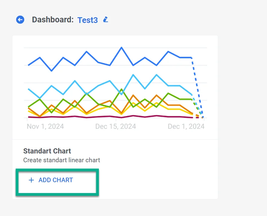 2. In the Chart Widget that opens, provide a descriptive and clear chart name that accurately represents the data it contains. You can always edit the chart name later if necessary.
 ### Selecting metrics
In the **Metrics** section, choose the specific metrics you need to monitor. You can select up to five metrics to display in a single chart. This allows for a comprehensive view of multiple data points simultaneously.
### Selecting metrics
In the **Metrics** section, choose the specific metrics you need to monitor. You can select up to five metrics to display in a single chart. This allows for a comprehensive view of multiple data points simultaneously.
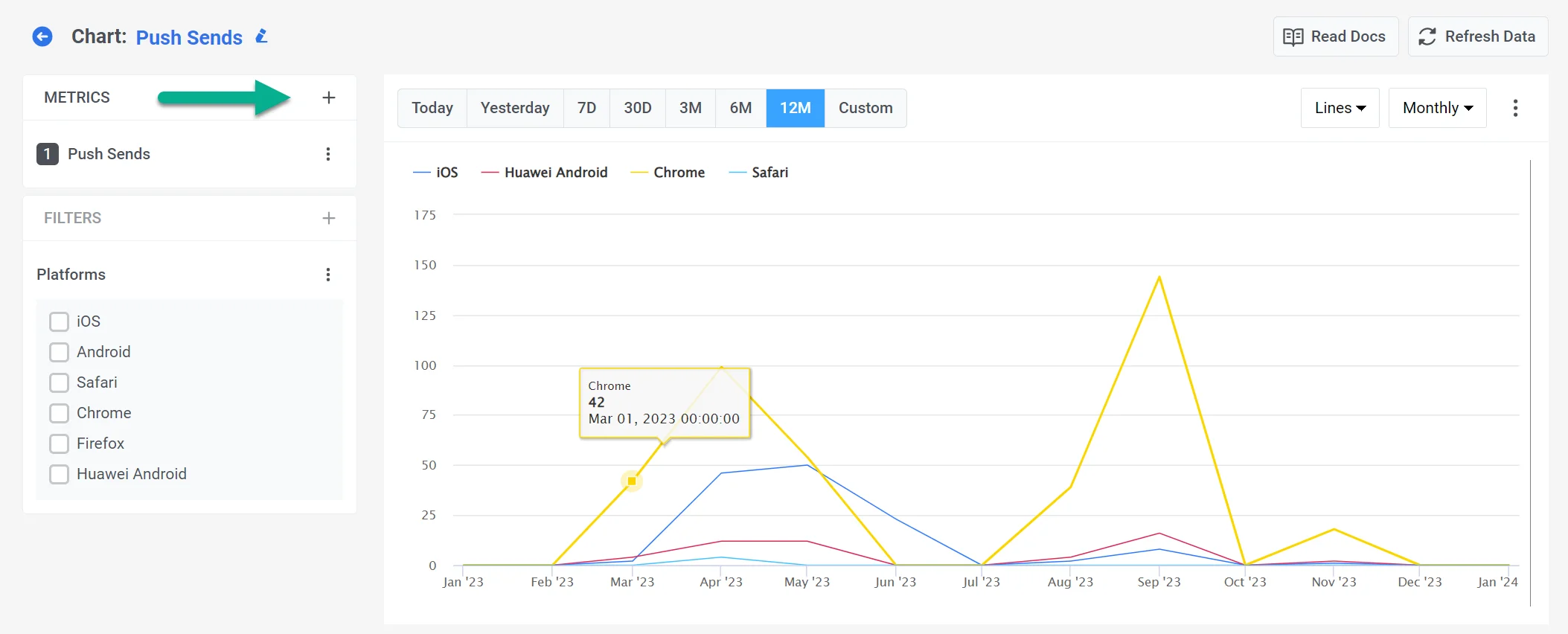 All the metrics available are divided into the following groups:
* **Communication Metrics** that offer insights into the performance of various communication channels. [Learn more](/product/statistics-and-analytics/dashboards/metrics/#communication-metrics)
* **Audience Metrics** that provide insights into your application's audience. [Learn more](/product/statistics-and-analytics/dashboards/metrics/#audience-metrics)
* **Finance Metrics** that reflect Stripe transaction data (revenue and subscriptions) attributed to your Pushwoosh campaigns. [Learn more](/product/statistics-and-analytics/dashboards/metrics/#finance-metrics)
* **Events Metrics** that allow you to understand user behavior by examining event-related metrics. [Learn more](/product/statistics-and-analytics/dashboards/metrics/#events)
* **Tags Metrics** that allow you to understand the reach and distribution of tags across your user base [Learn more](/product/statistics-and-analytics/dashboards/metrics/#tags)
You can mix and match metrics from different groups to tailor your chart to your needs.
### Visualization
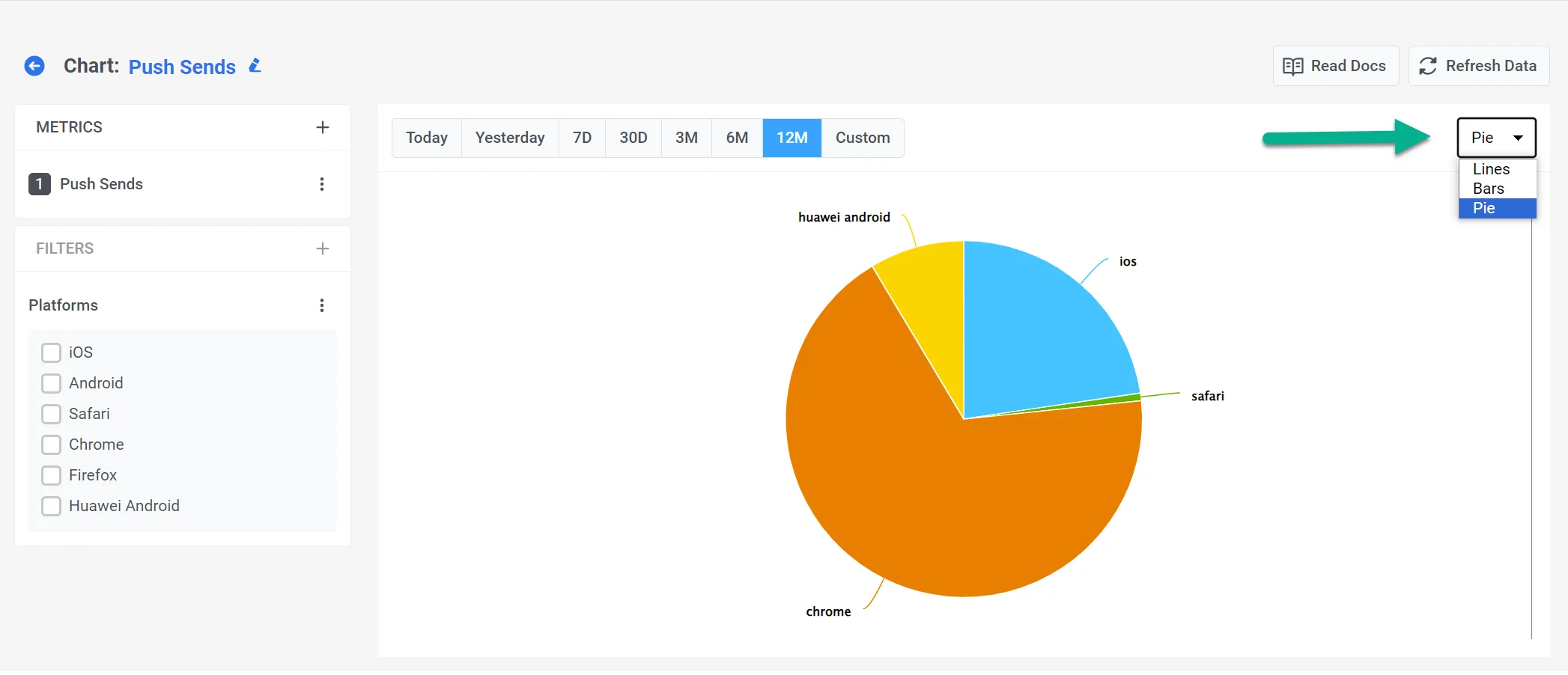
Dashboard Builder supports several types of visualizations, including:
* **Lines** – Ideal for trend analysis over time.
* **Bars** – Useful for comparing values across categories.
* **Pie** – Best for displaying percentage breakdowns.
All the metrics available are divided into the following groups:
* **Communication Metrics** that offer insights into the performance of various communication channels. [Learn more](/product/statistics-and-analytics/dashboards/metrics/#communication-metrics)
* **Audience Metrics** that provide insights into your application's audience. [Learn more](/product/statistics-and-analytics/dashboards/metrics/#audience-metrics)
* **Finance Metrics** that reflect Stripe transaction data (revenue and subscriptions) attributed to your Pushwoosh campaigns. [Learn more](/product/statistics-and-analytics/dashboards/metrics/#finance-metrics)
* **Events Metrics** that allow you to understand user behavior by examining event-related metrics. [Learn more](/product/statistics-and-analytics/dashboards/metrics/#events)
* **Tags Metrics** that allow you to understand the reach and distribution of tags across your user base [Learn more](/product/statistics-and-analytics/dashboards/metrics/#tags)
You can mix and match metrics from different groups to tailor your chart to your needs.
### Visualization
Dashboard Builder supports several types of visualizations, including:
* **Lines** – Ideal for trend analysis over time.
* **Bars** – Useful for comparing values across categories.
* **Pie** – Best for displaying percentage breakdowns.
 At the top of the page, specify the period or set a custom period. You can also specify the interval at which your data is displayed: Daily or Hourly for periods up to 30 days and Daily or Monthly for longer periods.
For a more in-depth analysis of your data, refer to the [Filters](/product/statistics-and-analytics/dashboards/filters/)
and [Breakdowns](/product/statistics-and-analytics/dashboards/breakdowns/) sections.
## Exporting data
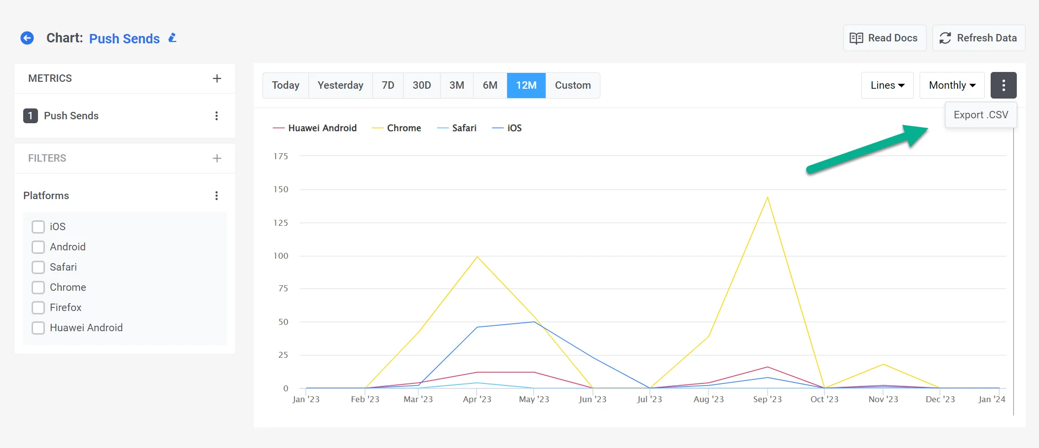
You can also export your chart as a CSV file. To do this, click on the three dots in the upper right corner of the report.
At the top of the page, specify the period or set a custom period. You can also specify the interval at which your data is displayed: Daily or Hourly for periods up to 30 days and Daily or Monthly for longer periods.
For a more in-depth analysis of your data, refer to the [Filters](/product/statistics-and-analytics/dashboards/filters/)
and [Breakdowns](/product/statistics-and-analytics/dashboards/breakdowns/) sections.
## Exporting data
You can also export your chart as a CSV file. To do this, click on the three dots in the upper right corner of the report.