# Gain deeper insights with data breakdowns
## Understanding breakdowns
Breakdowns help you analyze data by dividing it into smaller groups. For instance, you can break down your data
by platform to see how users on iOS compare to those on Android. Unlike filters, which limit the data shown,
breakdowns let you see all the data but organized into categories for easier comparison.
## Applying breakdowns
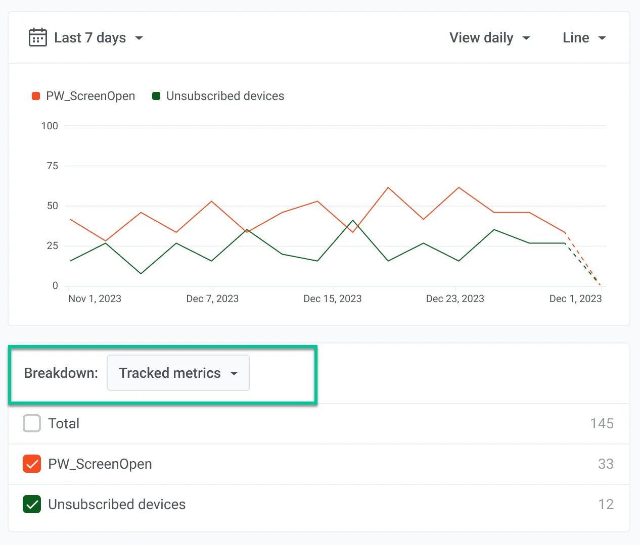
To add a metric breakdown, locate the **Breakdown** field at the bottom of your chart and select the metrics you want
to break down. Please note that a maximum of five breakdowns can be displayed at once to avoid cluttering the chart.
Metrics can be broken down by:
* **Platforms** - applicable to all data.
* **Attribute values** - applicable only for events.
* **Tag values** - applicable only for tags.
* **Segment** - applicable to Communication and Events metrics, with a few exceptions (see [Segment](#segment) below).
### Platforms
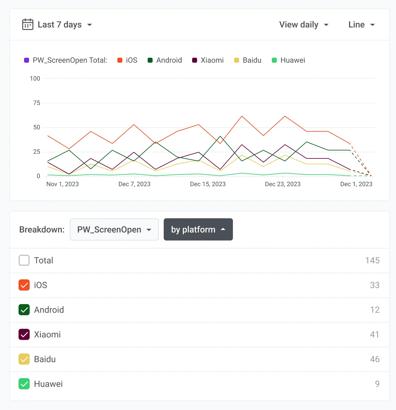
The following chart breaks down the **PW\_ScreenOpen** event by platform, showing iOS, Android, Baidu, and Huawei.
This breakdown helps you understand how users on different platforms interact with your app. For instance, you might
discover that iOS users open screens more frequently than Android users. This insight can help you prioritize features
or marketing efforts for iOS to capitalize on user engagement.
### Attribute values
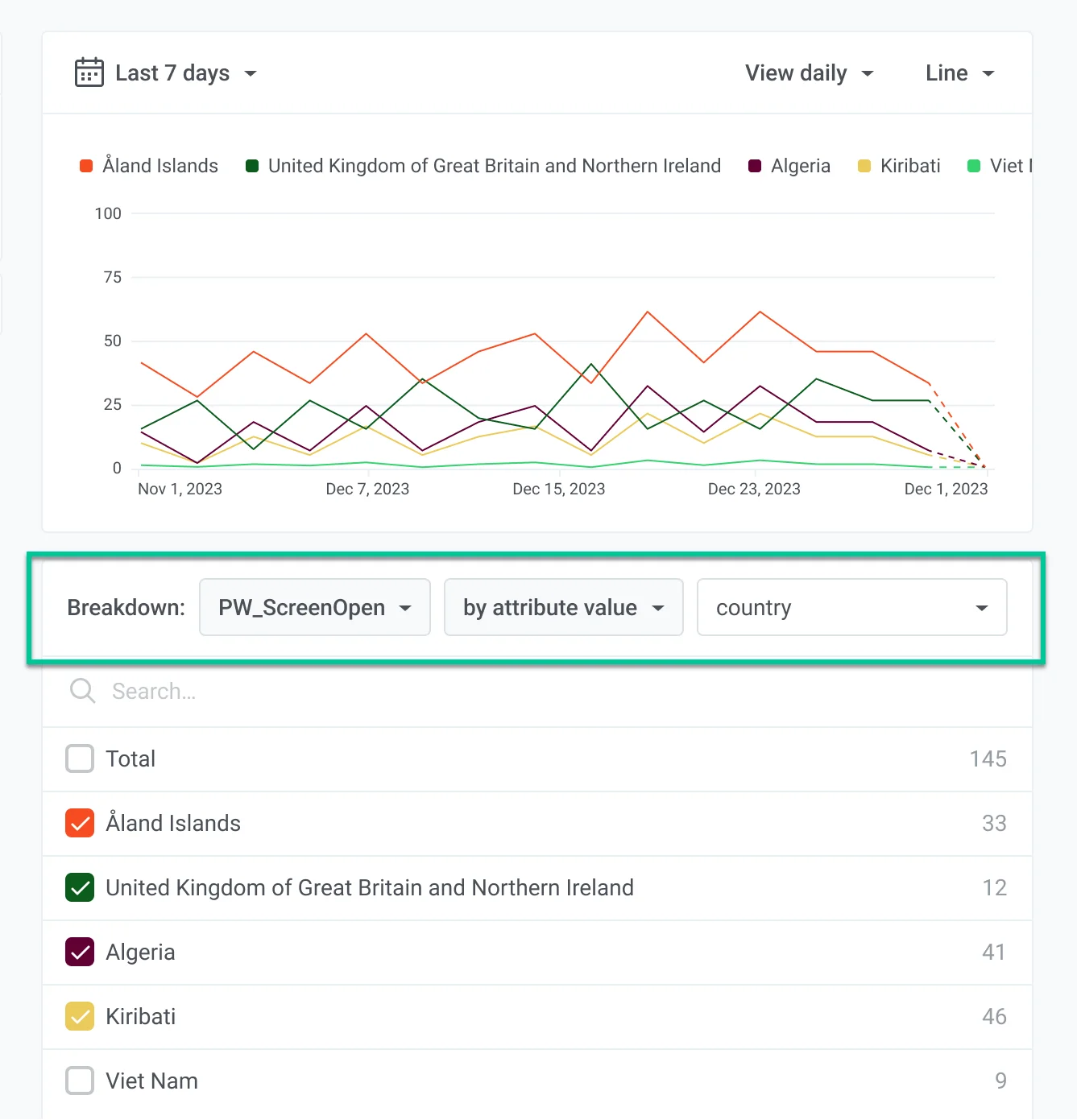
This chart displays the breakdown of the **PW\_ScreenOpen** metric by the country attribute. It provides insights into
user engagement across different regions. Analyzing these trends helps businesses customize strategies and enhance
user engagement in specific locations.
### Tag values
The breakdown by the tag attribute provides insights into user behavior based on the different tags assigned to events.
Analyzing these trends helps businesses understand how specific tags affect user engagement, enabling more targeted
decisions for content and strategy optimization.
### Segment
Use the **Segment** breakdown to compare audience segments on one chart. Each selected segment becomes its own series, so you can see how engagement or messaging metrics differ between groups, instead of looking at one combined audience. The breakdown works with Communication and Events metrics (with a few exceptions noted below).
To set it up:
1. Add up to **three** [Segment filters](/product/statistics-and-analytics/dashboards/filters/#segment) to the chart.
2. Turn on the **Segment** breakdown.
Without the breakdown, those filters act as one audience: a user is included if they match **any** of the selected segments.
With the **Segment** breakdown on, each segment is its own line on the chart, with its name in the legend. Use this when you want to compare the segments next to each other.
If a segment still needs recalculation, the chart does not show app-wide totals. It shows a status message with the segment names that need an update. You see the same status in the chart builder and on the saved dashboard card.
Some metrics do not support Segment breakdown (for example **Subscribers**, **DAU/MAU**, and **Opens**). For those, the chart returns an error that names the metric. It does not silently switch to app-wide totals.
## Total value
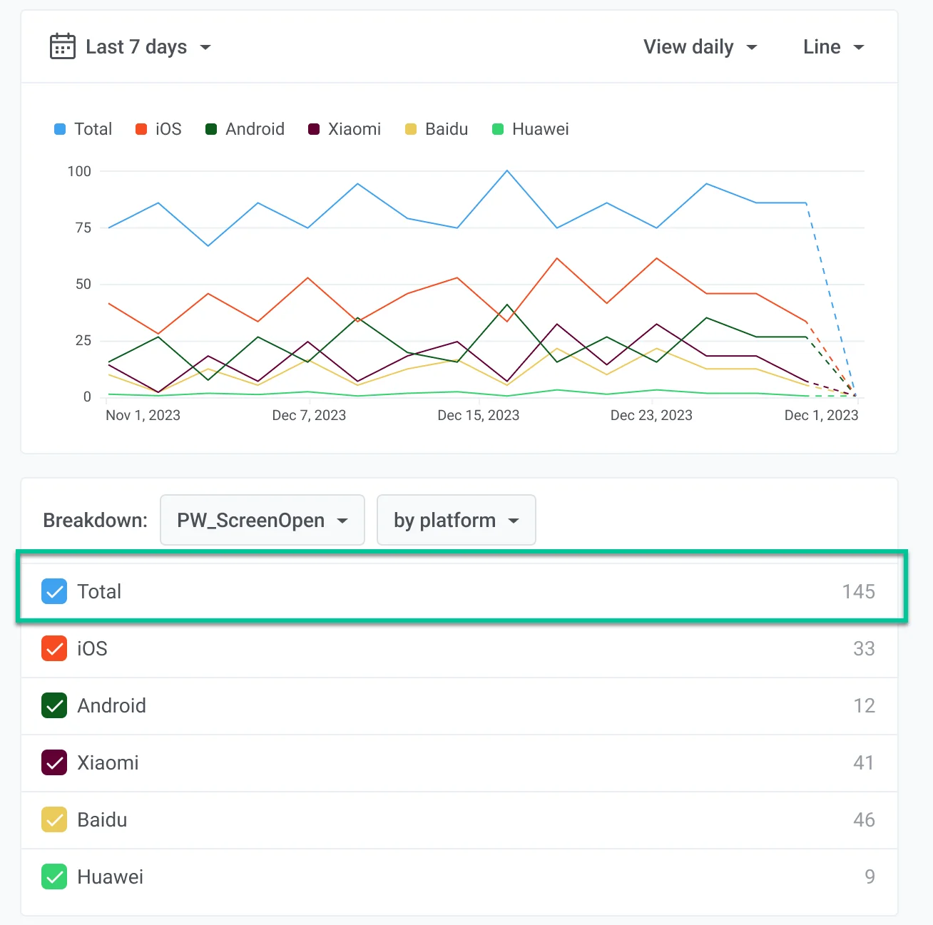
You also have the option to include a total value in your chart. This helps you see the big picture of your data
and provides a baseline against which individual metrics can be compared.
 Metrics can be broken down by:
* **Platforms** - applicable to all data.
* **Attribute values** - applicable only for events.
* **Tag values** - applicable only for tags.
* **Segment** - applicable to Communication and Events metrics, with a few exceptions (see [Segment](#segment) below).
### Platforms
The following chart breaks down the **PW\_ScreenOpen** event by platform, showing iOS, Android, Baidu, and Huawei.
This breakdown helps you understand how users on different platforms interact with your app. For instance, you might
discover that iOS users open screens more frequently than Android users. This insight can help you prioritize features
or marketing efforts for iOS to capitalize on user engagement.
Metrics can be broken down by:
* **Platforms** - applicable to all data.
* **Attribute values** - applicable only for events.
* **Tag values** - applicable only for tags.
* **Segment** - applicable to Communication and Events metrics, with a few exceptions (see [Segment](#segment) below).
### Platforms
The following chart breaks down the **PW\_ScreenOpen** event by platform, showing iOS, Android, Baidu, and Huawei.
This breakdown helps you understand how users on different platforms interact with your app. For instance, you might
discover that iOS users open screens more frequently than Android users. This insight can help you prioritize features
or marketing efforts for iOS to capitalize on user engagement.
 ### Attribute values
This chart displays the breakdown of the **PW\_ScreenOpen** metric by the country attribute. It provides insights into
user engagement across different regions. Analyzing these trends helps businesses customize strategies and enhance
user engagement in specific locations.
### Attribute values
This chart displays the breakdown of the **PW\_ScreenOpen** metric by the country attribute. It provides insights into
user engagement across different regions. Analyzing these trends helps businesses customize strategies and enhance
user engagement in specific locations.
 ### Tag values
The breakdown by the tag attribute provides insights into user behavior based on the different tags assigned to events.
Analyzing these trends helps businesses understand how specific tags affect user engagement, enabling more targeted
decisions for content and strategy optimization.
### Segment
Use the **Segment** breakdown to compare audience segments on one chart. Each selected segment becomes its own series, so you can see how engagement or messaging metrics differ between groups, instead of looking at one combined audience. The breakdown works with Communication and Events metrics (with a few exceptions noted below).
To set it up:
1. Add up to **three** [Segment filters](/product/statistics-and-analytics/dashboards/filters/#segment) to the chart.
2. Turn on the **Segment** breakdown.
Without the breakdown, those filters act as one audience: a user is included if they match **any** of the selected segments.
With the **Segment** breakdown on, each segment is its own line on the chart, with its name in the legend. Use this when you want to compare the segments next to each other.
If a segment still needs recalculation, the chart does not show app-wide totals. It shows a status message with the segment names that need an update. You see the same status in the chart builder and on the saved dashboard card.
Some metrics do not support Segment breakdown (for example **Subscribers**, **DAU/MAU**, and **Opens**). For those, the chart returns an error that names the metric. It does not silently switch to app-wide totals.
## Total value
You also have the option to include a total value in your chart. This helps you see the big picture of your data
and provides a baseline against which individual metrics can be compared.
### Tag values
The breakdown by the tag attribute provides insights into user behavior based on the different tags assigned to events.
Analyzing these trends helps businesses understand how specific tags affect user engagement, enabling more targeted
decisions for content and strategy optimization.
### Segment
Use the **Segment** breakdown to compare audience segments on one chart. Each selected segment becomes its own series, so you can see how engagement or messaging metrics differ between groups, instead of looking at one combined audience. The breakdown works with Communication and Events metrics (with a few exceptions noted below).
To set it up:
1. Add up to **three** [Segment filters](/product/statistics-and-analytics/dashboards/filters/#segment) to the chart.
2. Turn on the **Segment** breakdown.
Without the breakdown, those filters act as one audience: a user is included if they match **any** of the selected segments.
With the **Segment** breakdown on, each segment is its own line on the chart, with its name in the legend. Use this when you want to compare the segments next to each other.
If a segment still needs recalculation, the chart does not show app-wide totals. It shows a status message with the segment names that need an update. You see the same status in the chart builder and on the saved dashboard card.
Some metrics do not support Segment breakdown (for example **Subscribers**, **DAU/MAU**, and **Opens**). For those, the chart returns an error that names the metric. It does not silently switch to app-wide totals.
## Total value
You also have the option to include a total value in your chart. This helps you see the big picture of your data
and provides a baseline against which individual metrics can be compared.