# Web popup content
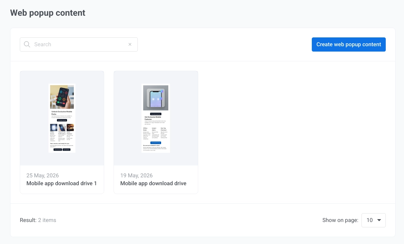
**Web popup content** is the visual layout visitors see when a Web popup appears on your website. Build it under **Content**, then attach it to a [Web popup campaign](/product/messaging-channels/web-popups/create-web-popups-campaigns/).
## Create Web popup content
1. Go to **Content** → **Web popup content**.
2. Click **Create web popup content**.
3. Pick a starting template from the gallery.
4. Once you've picked a template, customize the popup in the editor.
### Name the popup
Click the popup name in the top bar to edit it. The name identifies this content inside Pushwoosh, in the content list and the campaign wizard. Website visitors do not see it.
### Edit popup settings
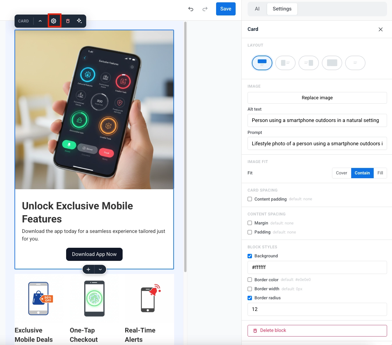
Adjust the popup's appearance and position in the settings panel on the left of the canvas:
#### Images
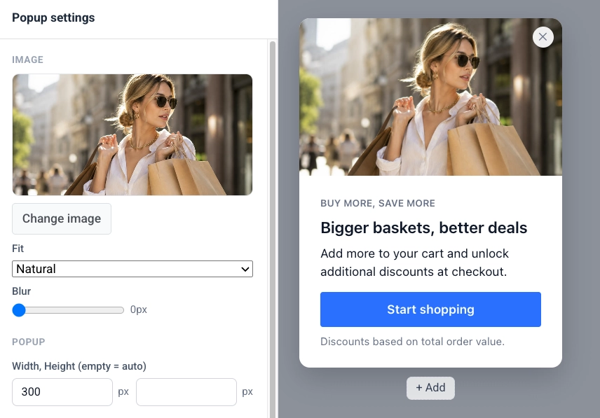
If the layout includes one or more images, each gets its own block at the top of the panel with a preview and controls.
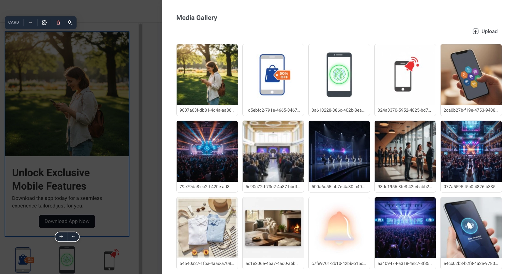
Click **Change image** to pick a file from your project's [Media store](/product/content/media-store/).
Below the preview:
- **Fit:** how the image fills its frame: **Natural**, **Cover**, or **Contain**. Not shown for a background image, which always covers its area.
- **Blur:** soften the image, from 0 to 20 px.
- **Dim:** background images only. Adds a dark scrim over the photo so text placed on top of it stays readable, from 0 to 100%.
Some layouts also add a **Layout** section with image placement settings:
- **Image width:** share of the popup width, as a percentage.
- **Image position:** **Left** or **Right**, for layouts with an image beside the text.
The **Layout** section only appears when the current layout has settings like these. On a bottom bar layout, it offers **Buttons width** instead of image controls.
#### Popup size and style
In the **Popup** section:
- **Width, Height (empty = auto):** leave both empty for a popup that sizes itself to its content, or set a fixed size in pixels. In a popup with multiple pages, each page has its own size.
- **Corner radius, Shadow:** the popup's corner rounding and drop shadow.
- **Animation:** how the popup appears: **None**, **Fade**, or **Slide**.
#### Colors
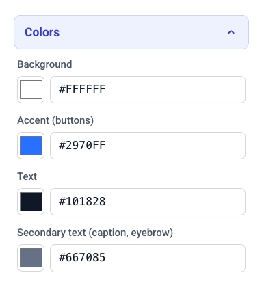
Click **Colors** to expand the popup's color palette:
- **Background, Accent (buttons):** the popup background and the accent color applied to buttons.
- **Text, Secondary text:** the color of body text and of secondary text such as captions and eyebrows.
- **Text over image:** only shown for layouts with text over a background image. Sets the color used for that text.
#### Placement and overlay
In the **PLACEMENT** section:
- **Position:** pick where the popup anchors on the page using the 3×3 grid.
- **Edge offset:** set the distance in pixels from the selected edge.
In the **OVERLAY** section:
- **Dim the page behind:** turn on to darken the rest of the page while the popup is shown.
- **Color, Opacity:** set the overlay color and opacity from 0 to 1.
### Edit text
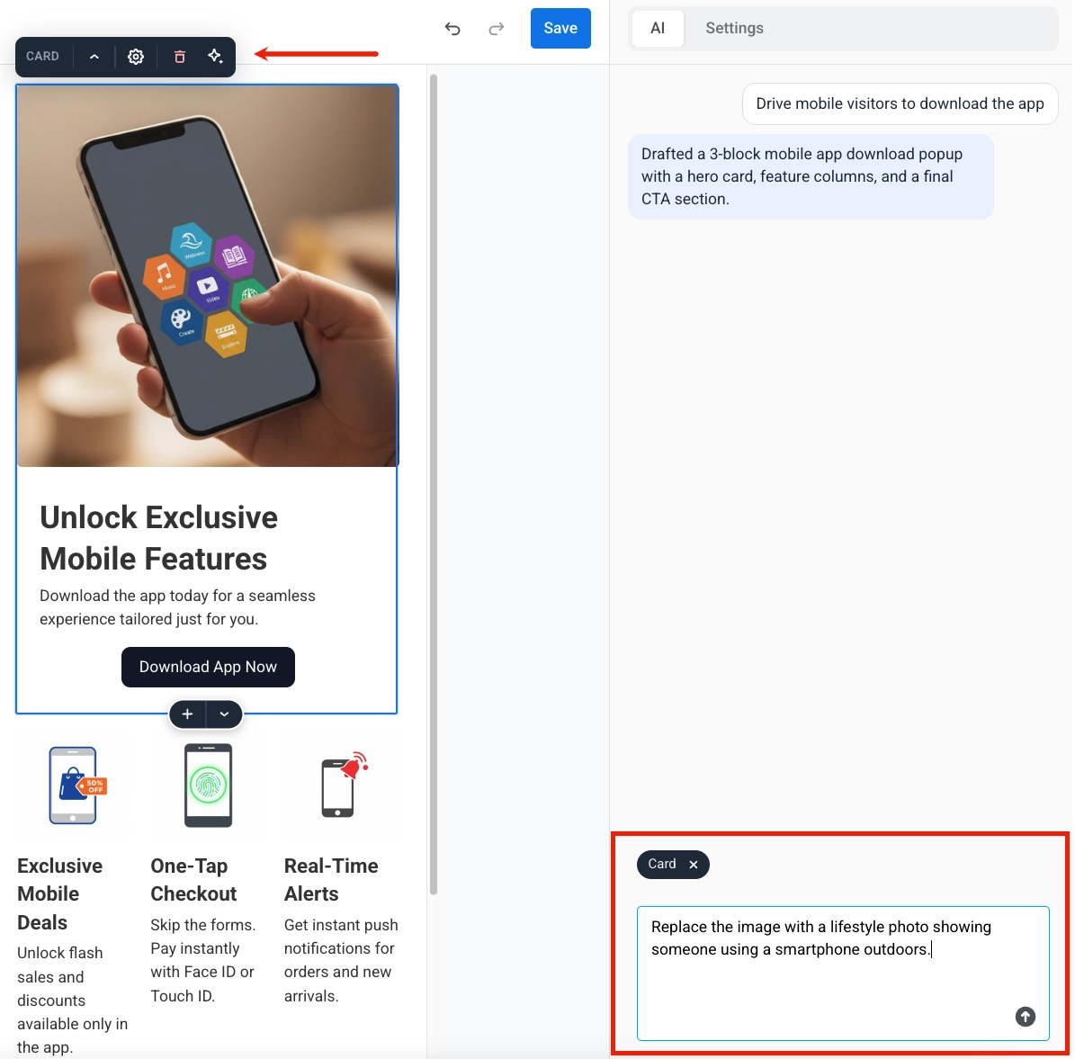
Click any text block on the popup to edit it inline. A toolbar appears above it:
- Apply **bold**, *italic*, or underline formatting.
- Add or remove a link.
- Set left, center, or right alignment.
- Choose a text style: **Icon**, **Eyebrow**, **Heading 1–3**, **Body**, or **Caption**.
### Edit buttons
Click a button to open its toolbar:
- Choose the button style: **Primary** or **Secondary**.
- Choose what the button does:
- **Open a link:** enter the target URL.
- **Close the popup**.
- **Go to page:** pick another page of the popup to switch to. This option appears once the popup has more than one page. See [Work with multiple pages](#work-with-multiple-pages).
## Work with multiple pages
A Web popup can have more than one page, for example to guide visitors through a short multi-step offer.
### Add a page
Click **+ Add page** to open the add-page menu:
- **Duplicate current page:** copies the active page, including any edits you've made, as a new page.
- Pick one of the single-page layouts to add a fresh page with that layout's demo content. The new page is independent of the others, so it can use a different layout.
Each tab is one page. Click a tab to switch to it.
### Set the start page
The tab marked with ★ is the **start page**, the page visitors see first. To change it, open another tab and click ☆ on that tab.
### Delete a page
On the active tab, click **✕**. A confirmation dialog opens. Click **Delete** to remove the page. This can't be undone.
## Save the content
Review the content, images, and button actions. When you are finished, click **Save** in the top bar.
## Use the content in a campaign
After you save, the content appears in **Content** → **Web popup content**. Open it from the list to keep editing.
To show it on the site, go to **Campaigns** → **Web popups**, create or edit a campaign, and pick this content in the **Content** step.
Then configure the audience, display settings, frequency, and launch options. For the full flow, see [Create Web popup campaigns](/product/messaging-channels/web-popups/create-web-popups-campaigns/).
 4. Once you've picked a template, customize the popup in the editor.
### Name the popup
Click the popup name in the top bar to edit it. The name identifies this content inside Pushwoosh, in the content list and the campaign wizard. Website visitors do not see it.
### Edit popup settings
Adjust the popup's appearance and position in the settings panel on the left of the canvas:
#### Images
If the layout includes one or more images, each gets its own block at the top of the panel with a preview and controls.
Click **Change image** to pick a file from your project's [Media store](/product/content/media-store/).
4. Once you've picked a template, customize the popup in the editor.
### Name the popup
Click the popup name in the top bar to edit it. The name identifies this content inside Pushwoosh, in the content list and the campaign wizard. Website visitors do not see it.
### Edit popup settings
Adjust the popup's appearance and position in the settings panel on the left of the canvas:
#### Images
If the layout includes one or more images, each gets its own block at the top of the panel with a preview and controls.
Click **Change image** to pick a file from your project's [Media store](/product/content/media-store/).
 Below the preview:
- **Fit:** how the image fills its frame: **Natural**, **Cover**, or **Contain**. Not shown for a background image, which always covers its area.
- **Blur:** soften the image, from 0 to 20 px.
- **Dim:** background images only. Adds a dark scrim over the photo so text placed on top of it stays readable, from 0 to 100%.
Some layouts also add a **Layout** section with image placement settings:
- **Image width:** share of the popup width, as a percentage.
- **Image position:** **Left** or **Right**, for layouts with an image beside the text.
The **Layout** section only appears when the current layout has settings like these. On a bottom bar layout, it offers **Buttons width** instead of image controls.
#### Popup size and style
In the **Popup** section:
- **Width, Height (empty = auto):** leave both empty for a popup that sizes itself to its content, or set a fixed size in pixels. In a popup with multiple pages, each page has its own size.
- **Corner radius, Shadow:** the popup's corner rounding and drop shadow.
- **Animation:** how the popup appears: **None**, **Fade**, or **Slide**.
Below the preview:
- **Fit:** how the image fills its frame: **Natural**, **Cover**, or **Contain**. Not shown for a background image, which always covers its area.
- **Blur:** soften the image, from 0 to 20 px.
- **Dim:** background images only. Adds a dark scrim over the photo so text placed on top of it stays readable, from 0 to 100%.
Some layouts also add a **Layout** section with image placement settings:
- **Image width:** share of the popup width, as a percentage.
- **Image position:** **Left** or **Right**, for layouts with an image beside the text.
The **Layout** section only appears when the current layout has settings like these. On a bottom bar layout, it offers **Buttons width** instead of image controls.
#### Popup size and style
In the **Popup** section:
- **Width, Height (empty = auto):** leave both empty for a popup that sizes itself to its content, or set a fixed size in pixels. In a popup with multiple pages, each page has its own size.
- **Corner radius, Shadow:** the popup's corner rounding and drop shadow.
- **Animation:** how the popup appears: **None**, **Fade**, or **Slide**.
 #### Colors
Click **Colors** to expand the popup's color palette:
- **Background, Accent (buttons):** the popup background and the accent color applied to buttons.
- **Text, Secondary text:** the color of body text and of secondary text such as captions and eyebrows.
- **Text over image:** only shown for layouts with text over a background image. Sets the color used for that text.
#### Colors
Click **Colors** to expand the popup's color palette:
- **Background, Accent (buttons):** the popup background and the accent color applied to buttons.
- **Text, Secondary text:** the color of body text and of secondary text such as captions and eyebrows.
- **Text over image:** only shown for layouts with text over a background image. Sets the color used for that text.
 #### Placement and overlay
In the **PLACEMENT** section:
- **Position:** pick where the popup anchors on the page using the 3×3 grid.
- **Edge offset:** set the distance in pixels from the selected edge.
In the **OVERLAY** section:
- **Dim the page behind:** turn on to darken the rest of the page while the popup is shown.
- **Color, Opacity:** set the overlay color and opacity from 0 to 1.
#### Placement and overlay
In the **PLACEMENT** section:
- **Position:** pick where the popup anchors on the page using the 3×3 grid.
- **Edge offset:** set the distance in pixels from the selected edge.
In the **OVERLAY** section:
- **Dim the page behind:** turn on to darken the rest of the page while the popup is shown.
- **Color, Opacity:** set the overlay color and opacity from 0 to 1.
 ### Edit text
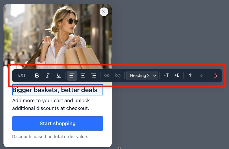
Click any text block on the popup to edit it inline. A toolbar appears above it:
- Apply **bold**, *italic*, or underline formatting.
- Add or remove a link.
- Set left, center, or right alignment.
- Choose a text style: **Icon**, **Eyebrow**, **Heading 1–3**, **Body**, or **Caption**.
### Edit text
Click any text block on the popup to edit it inline. A toolbar appears above it:
- Apply **bold**, *italic*, or underline formatting.
- Add or remove a link.
- Set left, center, or right alignment.
- Choose a text style: **Icon**, **Eyebrow**, **Heading 1–3**, **Body**, or **Caption**.
 ### Edit buttons
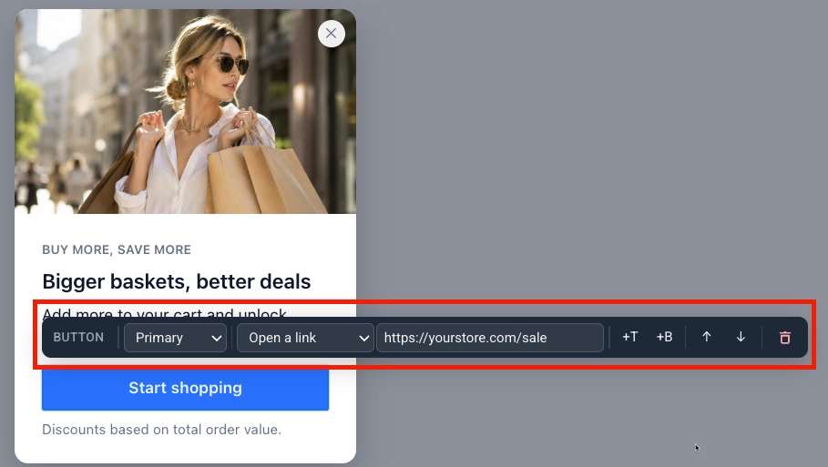
Click a button to open its toolbar:
- Choose the button style: **Primary** or **Secondary**.
- Choose what the button does:
- **Open a link:** enter the target URL.
- **Close the popup**.
- **Go to page:** pick another page of the popup to switch to. This option appears once the popup has more than one page. See [Work with multiple pages](#work-with-multiple-pages).
### Edit buttons
Click a button to open its toolbar:
- Choose the button style: **Primary** or **Secondary**.
- Choose what the button does:
- **Open a link:** enter the target URL.
- **Close the popup**.
- **Go to page:** pick another page of the popup to switch to. This option appears once the popup has more than one page. See [Work with multiple pages](#work-with-multiple-pages).
 ## Work with multiple pages
A Web popup can have more than one page, for example to guide visitors through a short multi-step offer.
### Add a page
Click **+ Add page** to open the add-page menu:
- **Duplicate current page:** copies the active page, including any edits you've made, as a new page.
- Pick one of the single-page layouts to add a fresh page with that layout's demo content. The new page is independent of the others, so it can use a different layout.
## Work with multiple pages
A Web popup can have more than one page, for example to guide visitors through a short multi-step offer.
### Add a page
Click **+ Add page** to open the add-page menu:
- **Duplicate current page:** copies the active page, including any edits you've made, as a new page.
- Pick one of the single-page layouts to add a fresh page with that layout's demo content. The new page is independent of the others, so it can use a different layout.
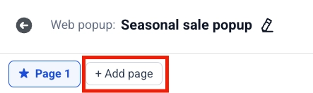 Each tab is one page. Click a tab to switch to it.
### Set the start page
The tab marked with ★ is the **start page**, the page visitors see first. To change it, open another tab and click ☆ on that tab.
Each tab is one page. Click a tab to switch to it.
### Set the start page
The tab marked with ★ is the **start page**, the page visitors see first. To change it, open another tab and click ☆ on that tab.
 ### Delete a page
On the active tab, click **✕**. A confirmation dialog opens. Click **Delete** to remove the page. This can't be undone.
## Save the content
Review the content, images, and button actions. When you are finished, click **Save** in the top bar.
## Use the content in a campaign
After you save, the content appears in **Content** → **Web popup content**. Open it from the list to keep editing.
To show it on the site, go to **Campaigns** → **Web popups**, create or edit a campaign, and pick this content in the **Content** step.
Then configure the audience, display settings, frequency, and launch options. For the full flow, see [Create Web popup campaigns](/product/messaging-channels/web-popups/create-web-popups-campaigns/).
### Delete a page
On the active tab, click **✕**. A confirmation dialog opens. Click **Delete** to remove the page. This can't be undone.
## Save the content
Review the content, images, and button actions. When you are finished, click **Save** in the top bar.
## Use the content in a campaign
After you save, the content appears in **Content** → **Web popup content**. Open it from the list to keep editing.
To show it on the site, go to **Campaigns** → **Web popups**, create or edit a campaign, and pick this content in the **Content** step.
Then configure the audience, display settings, frequency, and launch options. For the full flow, see [Create Web popup campaigns](/product/messaging-channels/web-popups/create-web-popups-campaigns/).