# Web popup settings
Use the **Popup settings** panel to style and place a [Web popup content](/product/content/web-popup-content/) layout. Page tabs and **+ Add page** sit at the top of the panel. See [Work with multiple pages](/product/content/web-popup-content/multi-page/).
**General settings** cover popup-wide look and placement. **Current page** covers media and size for the page you're editing.
## Images and video
If the layout includes one or more media blocks, open **Current page**. Each media block has a preview and controls.
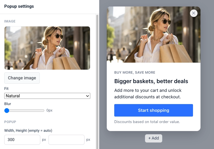
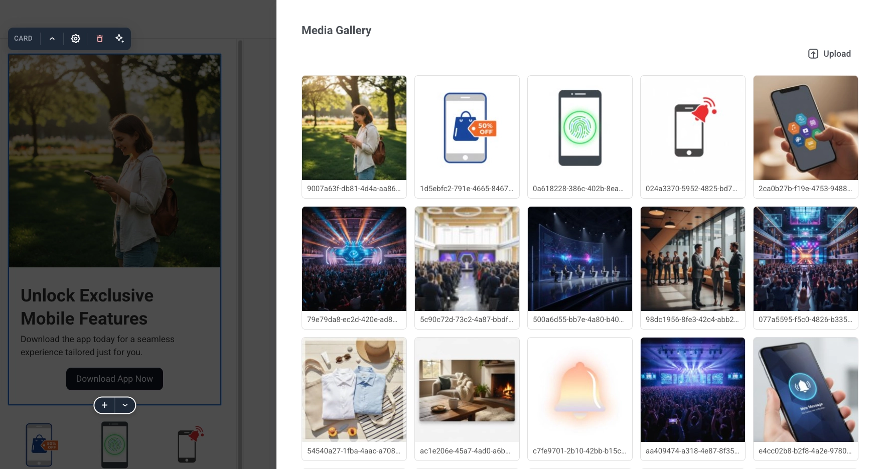
1. Click **Change image** to pick a file from your project's [Media store](/product/content/media-store/), or paste or edit the **Image URL** directly.
2. Set how the image fills its frame with **Fit** (**Natural**, **Cover**, or **Contain**). **Fit** is not shown for a background image, which always covers its area.
3. Optionally soften the image with **Blur** (0 to 20 px).
4. For background media only, use **Dim** (0 to 100%) to add a dark scrim so text on top of the image stays readable.
### Dark theme image
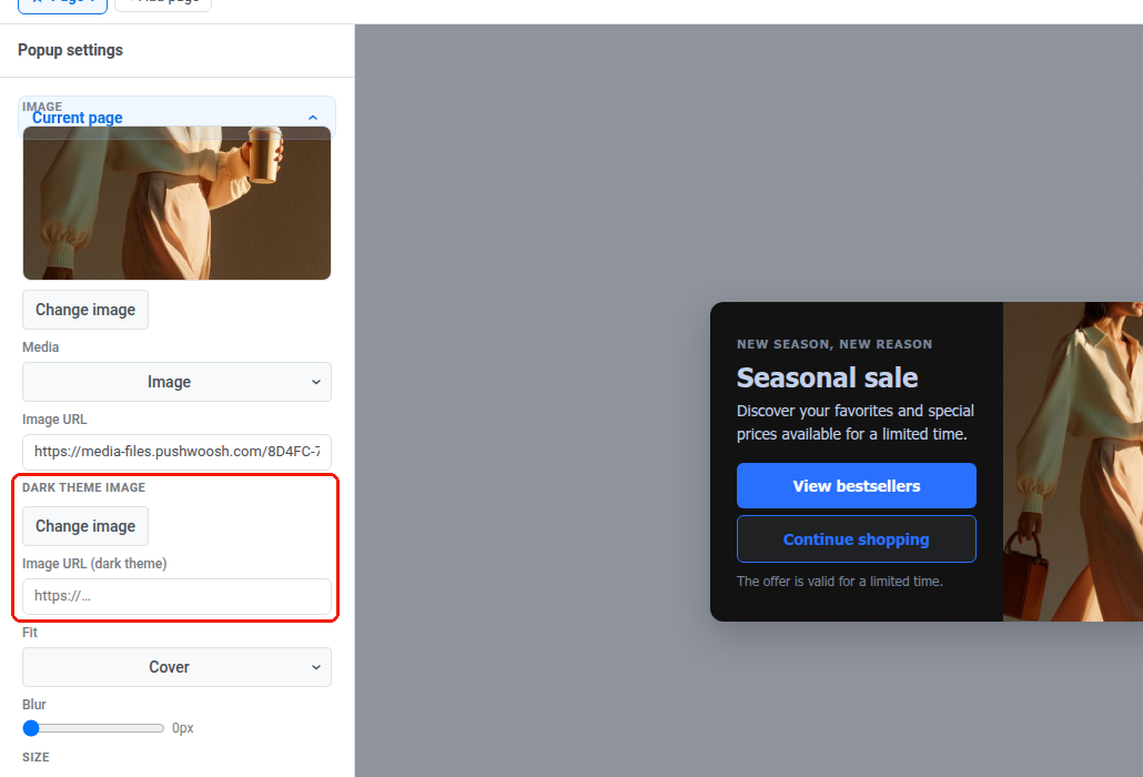
With [dark theme](#dark-mode) enabled, each image block adds a **Dark theme image** row.
1. Click **Change image** or set **Image URL (dark theme)** to pick a different image for dark mode (for example a logo with dark ink).
2. Leave it empty to keep showing the light **Image URL** in both schemes.
The dark theme image applies everywhere that block's image paints, including a background image or a video poster.
### Video
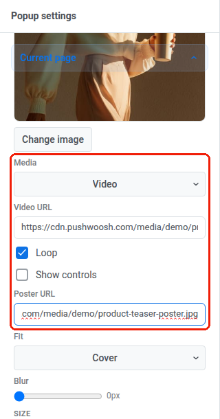
1. Set **Media** to **Video**.
2. Enter a **Video URL**: a direct link to the video file. Video only accepts an external URL. You cannot upload a video to the Media store. Export it as an MP4 (H.264 video, AAC audio) with "fast start" enabled (sometimes called "web-optimized"), so the browser can start playing before the whole file downloads. If the URL fails to load, visitors just see the poster.
3. **Loop** is on by default, so the video replays continuously. Turn it off to stop after one play.
4. Turn on **Show controls** to display the browser's built-in play, pause, and volume controls. Videos always start muted. Without this option, visitors have no way to turn the sound on.
5. Optionally set a **Poster URL**: the image shown while the video loads. Recommended. On an older popup script that doesn't support video, the poster is the only thing shown. Leave it empty, and that visitor sees nothing where the video would be.
### Media layout
Some layouts also add a **Template variables** section with placement settings for the media block. Set **Image width** (share of the popup width, as a percentage) and **Image position** (**Left** or **Right**) when the layout has media beside the text.
The **Template variables** section only appears when the current layout has settings like these. On a bottom bar layout, it offers **Buttons width** instead of image controls.
## Popup size and style
1. Under **Current page** → **SIZE**, leave **Width** and **Height** empty for a popup that sizes itself to its content, or set a fixed size in pixels. In a popup with multiple pages, each page has its own size.
2. Turn on **Full height** when the page should fill the available height.
3. In **General settings**, set **Corner radius** and **Shadow** for the popup's corner rounding and drop shadow.
4. Choose **Animation**: how the popup appears (**Default**, **None**, **Fade**, or **Slide**).
With [dark theme](#dark-mode) enabled, **Shadow** follows the sun/moon scheme switch. Set the switch to **Dark** to edit the dark-palette shadow separately from the light one. A shadow tuned for a light page is often invisible on a dark one, so the two usually need different values. Leave the dark shadow untouched to keep using the light **Shadow** value in both schemes.
## Colors
1. Click **Colors** to expand the popup's color palette.
2. Set **Background** and **Accent (buttons)** for the popup background and the accent color applied to buttons.
3. Set **Text** and **Secondary text** for body text and for secondary text such as captions and eyebrows.
4. If the layout has text over a background image, set **Text over image** for that text.
## Dark mode
1. In **Colors**, turn on **Enable dark theme** to give the popup a second palette for visitors whose device is set to a dark color scheme. With it off, the popup always renders with the light palette above, on every visitor.
2. Use the sun/moon switch above the color fields to pick which palette you're editing. The canvas redraws in that scheme.
3. Click **Auto from light** to (re)generate the dark palette from the current light colors. Backgrounds and surfaces turn dark, and text turns light. **Accent** and **Text over image** carry over unchanged. Edit any of the five fields afterward to fine-tune.
Turning **Enable dark theme** back off keeps the dark palette. Switching it on again restores your edits instead of regenerating from scratch.
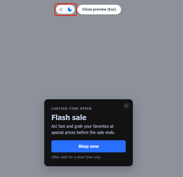
The same sun/moon switch appears next to **Close preview (Esc)** when you open **Preview** on a popup with dark theme enabled. You can check both palettes in the full-size preview too.
A visitor's browser decides which palette they see, based on their OS-level dark mode setting. There's no dark/light toggle on the popup itself. A site can force one scheme for everyone regardless of OS setting. See [webPopups.colorScheme](/developer/pushwoosh-sdk/web-push-notifications/web-push-sdk-30/#web-popups) in the Web SDK docs.
Dark theme also affects [images](#images), [shadow](#popup-size-and-style), and [overlay](#placement-and-overlay) in this panel. Each follows the same sun/moon scheme switch once enabled.
## Placement and overlay
1. In **PLACEMENT**, pick where the popup anchors on the page using the **Position** 3×3 grid.
2. Set **Edge offset** to the distance in pixels from the selected edge.
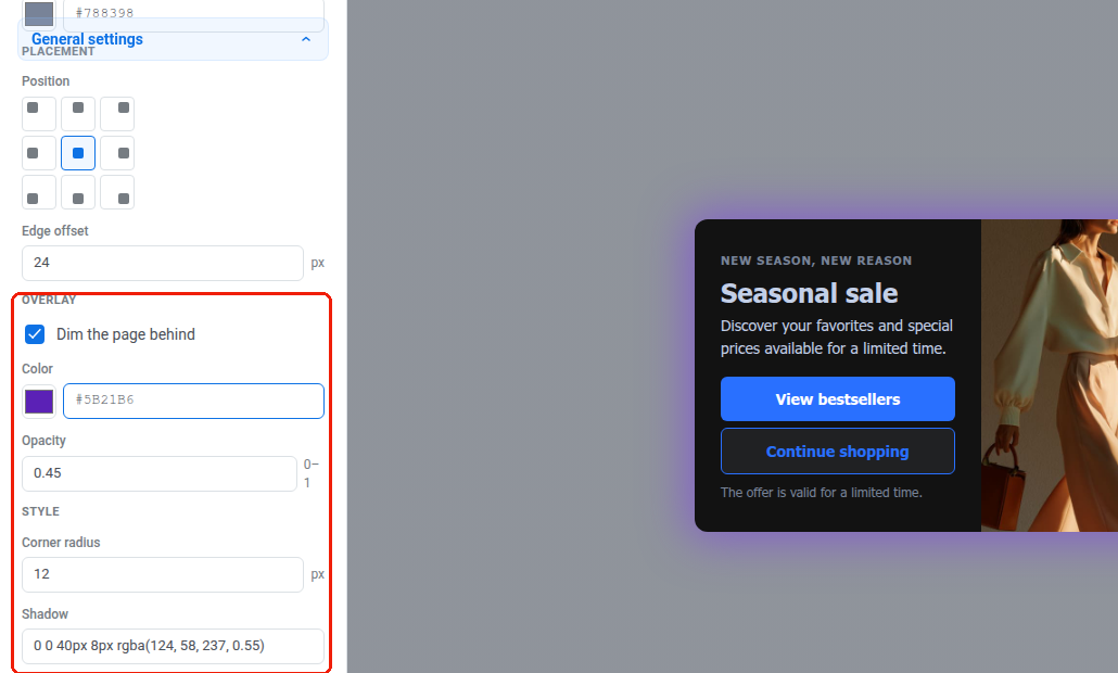
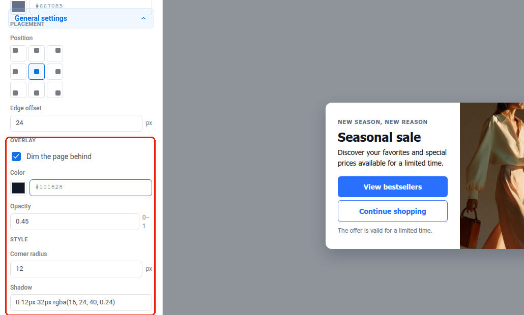
3. In **OVERLAY**, turn on **Dim the page behind** to darken the rest of the page while the popup is shown, in both schemes. Turning it off removes the dim entirely, including any dark-scheme values set below.
4. Set **Color** and **Opacity** for the overlay (opacity from 0 to 1).
With [dark theme](#dark-mode) enabled, **Color** and **Opacity** also follow the sun/moon scheme switch. Set the switch to **Dark** to give the dim its own color and strength for the dark palette. Until you edit them there, the dark scheme shows the same **Color** and **Opacity** as the light scheme.
 ### Dark theme image
With [dark theme](#dark-mode) enabled, each image block adds a **Dark theme image** row.
1. Click **Change image** or set **Image URL (dark theme)** to pick a different image for dark mode (for example a logo with dark ink).
2. Leave it empty to keep showing the light **Image URL** in both schemes.
The dark theme image applies everywhere that block's image paints, including a background image or a video poster.
### Dark theme image
With [dark theme](#dark-mode) enabled, each image block adds a **Dark theme image** row.
1. Click **Change image** or set **Image URL (dark theme)** to pick a different image for dark mode (for example a logo with dark ink).
2. Leave it empty to keep showing the light **Image URL** in both schemes.
The dark theme image applies everywhere that block's image paints, including a background image or a video poster.
 ### Video
1. Set **Media** to **Video**.
2. Enter a **Video URL**: a direct link to the video file. Video only accepts an external URL. You cannot upload a video to the Media store. Export it as an MP4 (H.264 video, AAC audio) with "fast start" enabled (sometimes called "web-optimized"), so the browser can start playing before the whole file downloads. If the URL fails to load, visitors just see the poster.
3. **Loop** is on by default, so the video replays continuously. Turn it off to stop after one play.
4. Turn on **Show controls** to display the browser's built-in play, pause, and volume controls. Videos always start muted. Without this option, visitors have no way to turn the sound on.
5. Optionally set a **Poster URL**: the image shown while the video loads. Recommended. On an older popup script that doesn't support video, the poster is the only thing shown. Leave it empty, and that visitor sees nothing where the video would be.
### Video
1. Set **Media** to **Video**.
2. Enter a **Video URL**: a direct link to the video file. Video only accepts an external URL. You cannot upload a video to the Media store. Export it as an MP4 (H.264 video, AAC audio) with "fast start" enabled (sometimes called "web-optimized"), so the browser can start playing before the whole file downloads. If the URL fails to load, visitors just see the poster.
3. **Loop** is on by default, so the video replays continuously. Turn it off to stop after one play.
4. Turn on **Show controls** to display the browser's built-in play, pause, and volume controls. Videos always start muted. Without this option, visitors have no way to turn the sound on.
5. Optionally set a **Poster URL**: the image shown while the video loads. Recommended. On an older popup script that doesn't support video, the poster is the only thing shown. Leave it empty, and that visitor sees nothing where the video would be.
 ### Media layout
Some layouts also add a **Template variables** section with placement settings for the media block. Set **Image width** (share of the popup width, as a percentage) and **Image position** (**Left** or **Right**) when the layout has media beside the text.
The **Template variables** section only appears when the current layout has settings like these. On a bottom bar layout, it offers **Buttons width** instead of image controls.
## Popup size and style
1. Under **Current page** → **SIZE**, leave **Width** and **Height** empty for a popup that sizes itself to its content, or set a fixed size in pixels. In a popup with multiple pages, each page has its own size.
2. Turn on **Full height** when the page should fill the available height.
3. In **General settings**, set **Corner radius** and **Shadow** for the popup's corner rounding and drop shadow.
4. Choose **Animation**: how the popup appears (**Default**, **None**, **Fade**, or **Slide**).
### Media layout
Some layouts also add a **Template variables** section with placement settings for the media block. Set **Image width** (share of the popup width, as a percentage) and **Image position** (**Left** or **Right**) when the layout has media beside the text.
The **Template variables** section only appears when the current layout has settings like these. On a bottom bar layout, it offers **Buttons width** instead of image controls.
## Popup size and style
1. Under **Current page** → **SIZE**, leave **Width** and **Height** empty for a popup that sizes itself to its content, or set a fixed size in pixels. In a popup with multiple pages, each page has its own size.
2. Turn on **Full height** when the page should fill the available height.
3. In **General settings**, set **Corner radius** and **Shadow** for the popup's corner rounding and drop shadow.
4. Choose **Animation**: how the popup appears (**Default**, **None**, **Fade**, or **Slide**).
 With [dark theme](#dark-mode) enabled, **Shadow** follows the sun/moon scheme switch. Set the switch to **Dark** to edit the dark-palette shadow separately from the light one. A shadow tuned for a light page is often invisible on a dark one, so the two usually need different values. Leave the dark shadow untouched to keep using the light **Shadow** value in both schemes.
## Colors
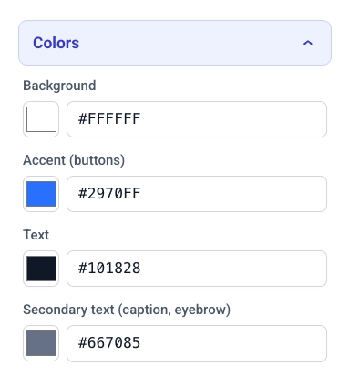
1. Click **Colors** to expand the popup's color palette.
2. Set **Background** and **Accent (buttons)** for the popup background and the accent color applied to buttons.
3. Set **Text** and **Secondary text** for body text and for secondary text such as captions and eyebrows.
4. If the layout has text over a background image, set **Text over image** for that text.
With [dark theme](#dark-mode) enabled, **Shadow** follows the sun/moon scheme switch. Set the switch to **Dark** to edit the dark-palette shadow separately from the light one. A shadow tuned for a light page is often invisible on a dark one, so the two usually need different values. Leave the dark shadow untouched to keep using the light **Shadow** value in both schemes.
## Colors
1. Click **Colors** to expand the popup's color palette.
2. Set **Background** and **Accent (buttons)** for the popup background and the accent color applied to buttons.
3. Set **Text** and **Secondary text** for body text and for secondary text such as captions and eyebrows.
4. If the layout has text over a background image, set **Text over image** for that text.
 ## Dark mode
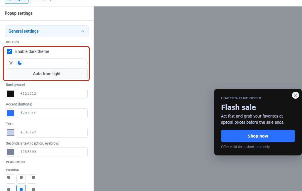
1. In **Colors**, turn on **Enable dark theme** to give the popup a second palette for visitors whose device is set to a dark color scheme. With it off, the popup always renders with the light palette above, on every visitor.
2. Use the sun/moon switch above the color fields to pick which palette you're editing. The canvas redraws in that scheme.
3. Click **Auto from light** to (re)generate the dark palette from the current light colors. Backgrounds and surfaces turn dark, and text turns light. **Accent** and **Text over image** carry over unchanged. Edit any of the five fields afterward to fine-tune.
## Dark mode
1. In **Colors**, turn on **Enable dark theme** to give the popup a second palette for visitors whose device is set to a dark color scheme. With it off, the popup always renders with the light palette above, on every visitor.
2. Use the sun/moon switch above the color fields to pick which palette you're editing. The canvas redraws in that scheme.
3. Click **Auto from light** to (re)generate the dark palette from the current light colors. Backgrounds and surfaces turn dark, and text turns light. **Accent** and **Text over image** carry over unchanged. Edit any of the five fields afterward to fine-tune.
 Turning **Enable dark theme** back off keeps the dark palette. Switching it on again restores your edits instead of regenerating from scratch.
The same sun/moon switch appears next to **Close preview (Esc)** when you open **Preview** on a popup with dark theme enabled. You can check both palettes in the full-size preview too.
Turning **Enable dark theme** back off keeps the dark palette. Switching it on again restores your edits instead of regenerating from scratch.
The same sun/moon switch appears next to **Close preview (Esc)** when you open **Preview** on a popup with dark theme enabled. You can check both palettes in the full-size preview too.
 A visitor's browser decides which palette they see, based on their OS-level dark mode setting. There's no dark/light toggle on the popup itself. A site can force one scheme for everyone regardless of OS setting. See [webPopups.colorScheme](/developer/pushwoosh-sdk/web-push-notifications/web-push-sdk-30/#web-popups) in the Web SDK docs.
Dark theme also affects [images](#images), [shadow](#popup-size-and-style), and [overlay](#placement-and-overlay) in this panel. Each follows the same sun/moon scheme switch once enabled.
## Placement and overlay
1. In **PLACEMENT**, pick where the popup anchors on the page using the **Position** 3×3 grid.
2. Set **Edge offset** to the distance in pixels from the selected edge.
3. In **OVERLAY**, turn on **Dim the page behind** to darken the rest of the page while the popup is shown, in both schemes. Turning it off removes the dim entirely, including any dark-scheme values set below.
4. Set **Color** and **Opacity** for the overlay (opacity from 0 to 1).
A visitor's browser decides which palette they see, based on their OS-level dark mode setting. There's no dark/light toggle on the popup itself. A site can force one scheme for everyone regardless of OS setting. See [webPopups.colorScheme](/developer/pushwoosh-sdk/web-push-notifications/web-push-sdk-30/#web-popups) in the Web SDK docs.
Dark theme also affects [images](#images), [shadow](#popup-size-and-style), and [overlay](#placement-and-overlay) in this panel. Each follows the same sun/moon scheme switch once enabled.
## Placement and overlay
1. In **PLACEMENT**, pick where the popup anchors on the page using the **Position** 3×3 grid.
2. Set **Edge offset** to the distance in pixels from the selected edge.
3. In **OVERLAY**, turn on **Dim the page behind** to darken the rest of the page while the popup is shown, in both schemes. Turning it off removes the dim entirely, including any dark-scheme values set below.
4. Set **Color** and **Opacity** for the overlay (opacity from 0 to 1).
 With [dark theme](#dark-mode) enabled, **Color** and **Opacity** also follow the sun/moon scheme switch. Set the switch to **Dark** to give the dim its own color and strength for the dark palette. Until you edit them there, the dark scheme shows the same **Color** and **Opacity** as the light scheme.