# Create in-app messages in the built-in editor
Build an in-app message template in the Pushwoosh built-in editor without writing code. You get a reusable layout with content blocks, images, buttons, and personalized text that you can show in a Customer Journey, as a one-time in-app, or from a push.
## Create a new in-app template
An in-app template is a reusable design you create once and then show to users in campaigns. You can create one in the built-in editor, upload a custom HTML ZIP, or build a native rich media template. This article covers creating a template from scratch in the built-in editor. Follow the same steps to customize an existing template.
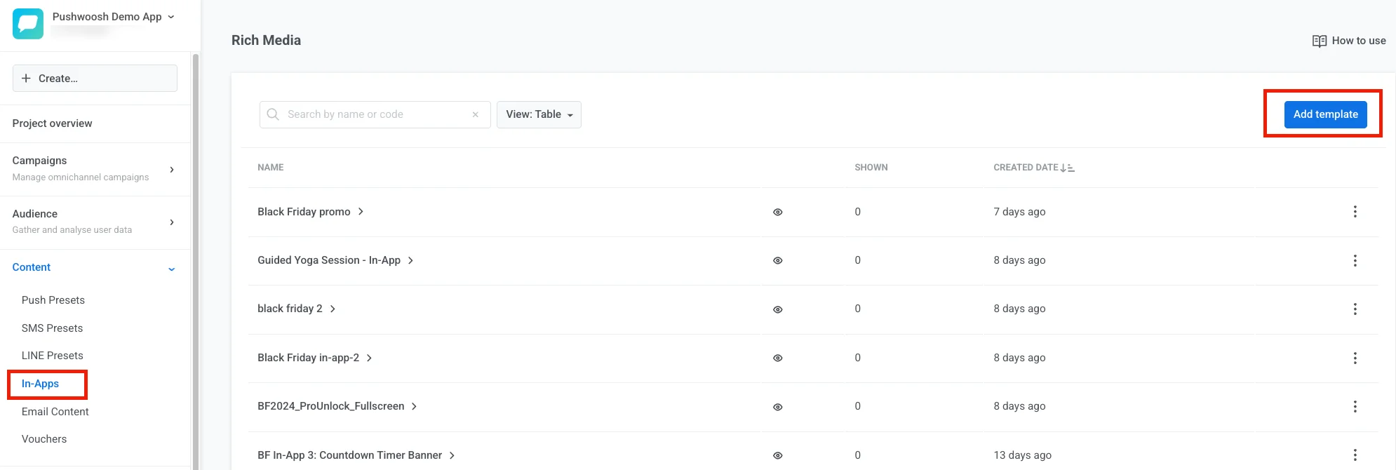
1. Go to **Content** → **In-apps**.
2. Click **Add template**.
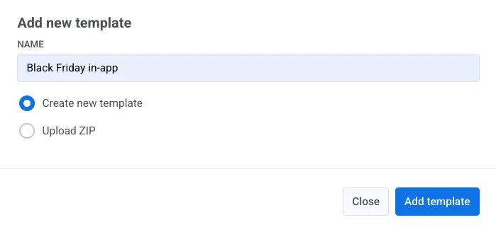
3. Enter a template name.
4. Choose how to create the template:
* **Create new template:** build a template in the built-in editor.
* **Upload ZIP:** [upload a ZIP file](/developer/guides/content/rich-media-templates-syntax) with your HTML in-app message.
* **Create native rich media:** build an SDK-rendered native in-app. [Learn more](/product/content/in-apps/create-native-in-app-messages/)
5. Select **Create new template**.
6. Click **Add template**.
## Explore the editor layout
The built-in editor has four areas. Each one has a clear job.
### Top bar
The top bar is where you manage the template as a whole: its name, undo history, save status, how it looks on device (**In-app settings**), languages (**Auto-translate** and the language switcher), and phone or desktop preview width. See [Configure how the in-app looks on device](/product/content/in-apps/no-code-in-app-editor/configure-in-app-template-settings/#configure-how-the-in-app-looks-on-device) and [Localize the template](#localize-the-template).
Open the **⋮** menu in the top bar for more actions:
#### Preview
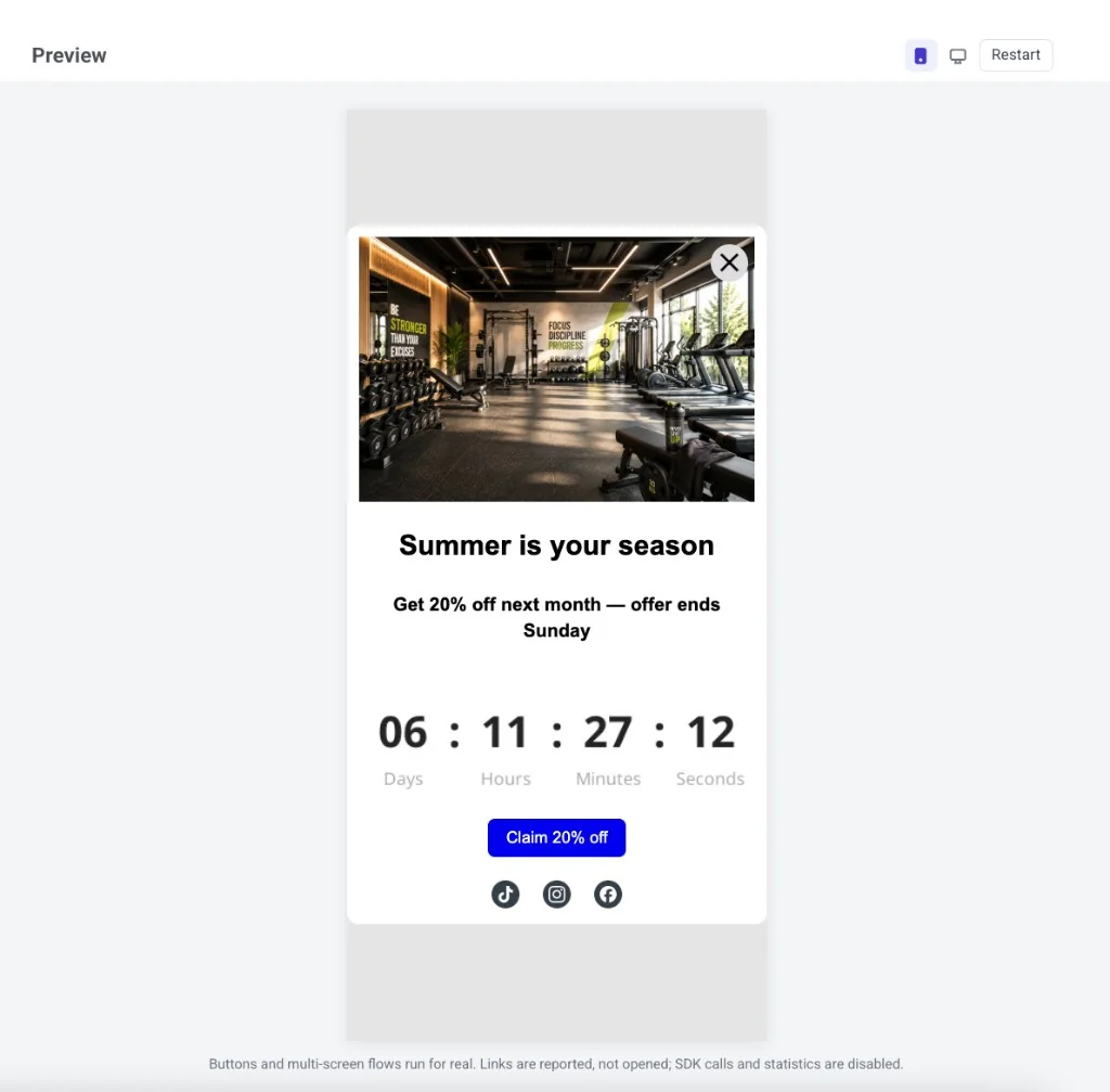
**Preview** lets you try the message before you save it: tap buttons, move through multi-screen flows, and check layout on phone or desktop.
What works in preview:
* Buttons and multi-screen flows run for real.
* Links and deep links are reported, not opened.
* SDK calls and open/click statistics stay off.
* The language matches the language switcher. Merge Tags stay as placeholders.
In the preview header, switch between phone and desktop to see both layouts. Click **Restart** to show the message from the beginning again. To leave preview, press Esc or click outside the panel.
#### Brand book
* **Brand book:** open your account [Brand book](/product/content/brand-book/).
* **Apply brand book styles:** restyle the template to match your Brand book (once you've set one up).
* **Reset custom styles:** remove style overrides on the template and return to the defaults.
### Canvas
Edit the message on the canvas: click text, images, and buttons to change them. Use the phone/desktop toggle in the top bar to check how the layout looks at each width. The toggle only changes the preview, not the layout itself.
### Layers
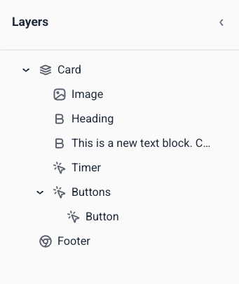
The Layers panel lists every block in your template as a tree, in the same order as on the canvas. Open it from the left edge to select a nested block (for example, a button inside a group) or drag rows to reorder content.
### Right panel
Switch between three tabs:
* **Blocks:** add content to the message. See [In-app editor blocks reference](/product/content/in-apps/no-code-in-app-editor/built-in-editor-blocks-reference/).
* **Settings:** apply styling to the whole template at once. See [Configure in-app template settings](/product/content/in-apps/no-code-in-app-editor/configure-in-app-template-settings/).
* **AI:** chat with the AI assistant to generate or edit content from a prompt.
## Add content blocks
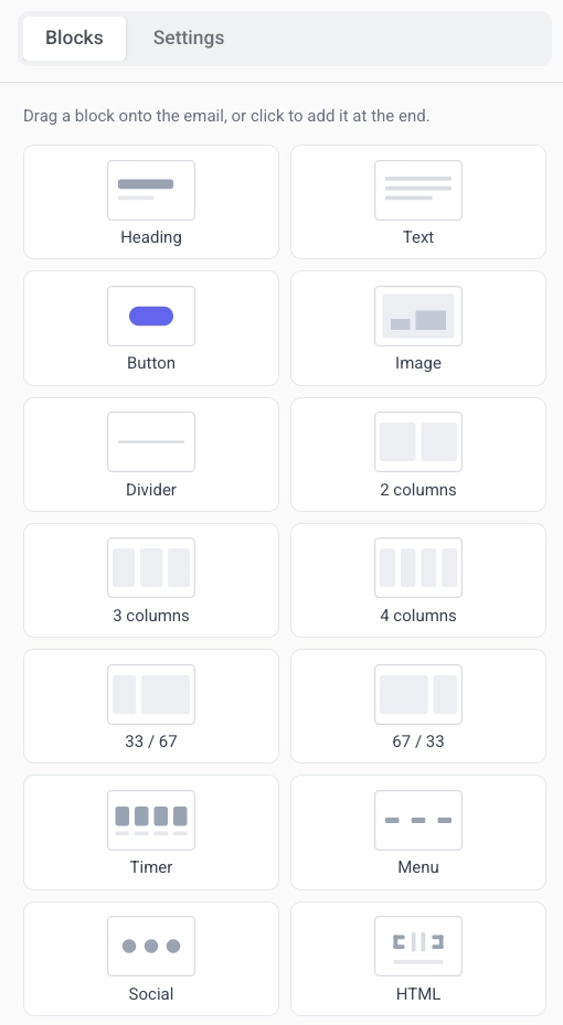
1. Open the **Blocks** tab in the right panel.
2. Drag a block onto the canvas, or click a block to add it at the end of the template.
3. Keep adding blocks until the layout is ready.
Each block type serves a different purpose in the message:
* **[Heading](/product/content/in-apps/no-code-in-app-editor/built-in-editor-blocks-reference/#heading-and-text):** titles and short headlines
* **[Text](/product/content/in-apps/no-code-in-app-editor/built-in-editor-blocks-reference/#heading-and-text):** body copy and longer descriptions
* **[Button](/product/content/in-apps/no-code-in-app-editor/built-in-editor-blocks-reference/#button):** a tappable call to action
* **[Image](/product/content/in-apps/no-code-in-app-editor/built-in-editor-blocks-reference/#image):** pictures from [Media store](/product/content/media-store/), upload, or URL
* **[Video](/product/content/in-apps/no-code-in-app-editor/built-in-editor-blocks-reference/#video):** a tappable video thumbnail that opens a YouTube or Vimeo video
* **[Card](/product/content/in-apps/no-code-in-app-editor/built-in-editor-blocks-reference/#card):** an image with heading, text, and button in one layout
* **[Divider](/product/content/in-apps/no-code-in-app-editor/built-in-editor-blocks-reference/#divider):** a line that separates sections
* **[Columns](/product/content/in-apps/no-code-in-app-editor/built-in-editor-blocks-reference/#columns):** side-by-side layouts (2, 3, or 4 equal columns, or 33/67 and 67/33 splits)
* **[Timer](/product/content/in-apps/no-code-in-app-editor/built-in-editor-blocks-reference/#countdown-timer):** a countdown for offers and deadlines
* **[Menu](/product/content/in-apps/no-code-in-app-editor/built-in-editor-blocks-reference/#menu):** a row or column of navigation or contact links
* **[Social](/product/content/in-apps/no-code-in-app-editor/built-in-editor-blocks-reference/#social):** icons that link to your social profiles
* **[HTML](/product/content/in-apps/no-code-in-app-editor/built-in-editor-blocks-reference/#html):** custom HTML, such as a form, survey, or embedded video
* **[Products](/product/content/in-apps/no-code-in-app-editor/built-in-editor-blocks-reference/#products):** a grid of product cards from your [Product Catalog](/product/content/product-catalog/) or a user's abandoned cart
See the [In-app editor blocks reference](/product/content/in-apps/no-code-in-app-editor/built-in-editor-blocks-reference/) for settings for each block, and [how to save and reuse blocks](/product/content/in-apps/no-code-in-app-editor/built-in-editor-blocks-reference/#save-and-reuse-blocks).
### Show blocks to specific users
Not every user needs to see the same blocks. Set a **display condition** on a block so it shows or hides based on the user's [Tags](/product/audience-data-and-segmentation/user-data-tags/tags/). You still send one template, but each person only sees the parts that apply to them.
Select the block on the canvas, open **Display condition** in the right panel, and turn on **Show this block conditionally**. [Learn more](/product/content/in-apps/no-code-in-app-editor/show-in-app-content-to-specific-users/)
## Localize the template
A multi-language template stores localized copy for each language in one in-app design. Use the language switcher in the top bar to add languages and edit content per language. Click **Auto-translate** to generate translations. For how multi-language messaging works across channels, see [Multi-language messaging](/product/personalization/multi-language/).
## Configure template settings
Use two places to style and place the message:
* **Settings** tab (right panel): document size, colors, typography, and default styles for blocks.
* **In-app settings** (top bar): position on screen, animations, and the close button.
[Learn more](/product/content/in-apps/no-code-in-app-editor/configure-in-app-template-settings/)
## Save the template
Click **Save** in the top bar to save your changes. Use **Undo**/**Redo** in the top bar to step back and forward through your edits.
 3. Enter a template name.
4. Choose how to create the template:
* **Create new template:** build a template in the built-in editor.
* **Upload ZIP:** [upload a ZIP file](/developer/guides/content/rich-media-templates-syntax) with your HTML in-app message.
* **Create native rich media:** build an SDK-rendered native in-app. [Learn more](/product/content/in-apps/create-native-in-app-messages/)
5. Select **Create new template**.
6. Click **Add template**.
3. Enter a template name.
4. Choose how to create the template:
* **Create new template:** build a template in the built-in editor.
* **Upload ZIP:** [upload a ZIP file](/developer/guides/content/rich-media-templates-syntax) with your HTML in-app message.
* **Create native rich media:** build an SDK-rendered native in-app. [Learn more](/product/content/in-apps/create-native-in-app-messages/)
5. Select **Create new template**.
6. Click **Add template**.
 ## Explore the editor layout
The built-in editor has four areas. Each one has a clear job.
### Top bar
The top bar is where you manage the template as a whole: its name, undo history, save status, how it looks on device (**In-app settings**), languages (**Auto-translate** and the language switcher), and phone or desktop preview width. See [Configure how the in-app looks on device](/product/content/in-apps/no-code-in-app-editor/configure-in-app-template-settings/#configure-how-the-in-app-looks-on-device) and [Localize the template](#localize-the-template).
## Explore the editor layout
The built-in editor has four areas. Each one has a clear job.
### Top bar
The top bar is where you manage the template as a whole: its name, undo history, save status, how it looks on device (**In-app settings**), languages (**Auto-translate** and the language switcher), and phone or desktop preview width. See [Configure how the in-app looks on device](/product/content/in-apps/no-code-in-app-editor/configure-in-app-template-settings/#configure-how-the-in-app-looks-on-device) and [Localize the template](#localize-the-template).
 Open the **⋮** menu in the top bar for more actions:
#### Preview
**Preview** lets you try the message before you save it: tap buttons, move through multi-screen flows, and check layout on phone or desktop.
Open the **⋮** menu in the top bar for more actions:
#### Preview
**Preview** lets you try the message before you save it: tap buttons, move through multi-screen flows, and check layout on phone or desktop.
 What works in preview:
* Buttons and multi-screen flows run for real.
* Links and deep links are reported, not opened.
* SDK calls and open/click statistics stay off.
* The language matches the language switcher. Merge Tags stay as placeholders.
In the preview header, switch between phone and desktop to see both layouts. Click **Restart** to show the message from the beginning again. To leave preview, press Esc or click outside the panel.
#### Brand book
* **Brand book:** open your account [Brand book](/product/content/brand-book/).
* **Apply brand book styles:** restyle the template to match your Brand book (once you've set one up).
* **Reset custom styles:** remove style overrides on the template and return to the defaults.
### Canvas
Edit the message on the canvas: click text, images, and buttons to change them. Use the phone/desktop toggle in the top bar to check how the layout looks at each width. The toggle only changes the preview, not the layout itself.
### Layers
The Layers panel lists every block in your template as a tree, in the same order as on the canvas. Open it from the left edge to select a nested block (for example, a button inside a group) or drag rows to reorder content.
What works in preview:
* Buttons and multi-screen flows run for real.
* Links and deep links are reported, not opened.
* SDK calls and open/click statistics stay off.
* The language matches the language switcher. Merge Tags stay as placeholders.
In the preview header, switch between phone and desktop to see both layouts. Click **Restart** to show the message from the beginning again. To leave preview, press Esc or click outside the panel.
#### Brand book
* **Brand book:** open your account [Brand book](/product/content/brand-book/).
* **Apply brand book styles:** restyle the template to match your Brand book (once you've set one up).
* **Reset custom styles:** remove style overrides on the template and return to the defaults.
### Canvas
Edit the message on the canvas: click text, images, and buttons to change them. Use the phone/desktop toggle in the top bar to check how the layout looks at each width. The toggle only changes the preview, not the layout itself.
### Layers
The Layers panel lists every block in your template as a tree, in the same order as on the canvas. Open it from the left edge to select a nested block (for example, a button inside a group) or drag rows to reorder content.
 ### Right panel
Switch between three tabs:
* **Blocks:** add content to the message. See [In-app editor blocks reference](/product/content/in-apps/no-code-in-app-editor/built-in-editor-blocks-reference/).
* **Settings:** apply styling to the whole template at once. See [Configure in-app template settings](/product/content/in-apps/no-code-in-app-editor/configure-in-app-template-settings/).
* **AI:** chat with the AI assistant to generate or edit content from a prompt.
### Right panel
Switch between three tabs:
* **Blocks:** add content to the message. See [In-app editor blocks reference](/product/content/in-apps/no-code-in-app-editor/built-in-editor-blocks-reference/).
* **Settings:** apply styling to the whole template at once. See [Configure in-app template settings](/product/content/in-apps/no-code-in-app-editor/configure-in-app-template-settings/).
* **AI:** chat with the AI assistant to generate or edit content from a prompt.
 ## Add content blocks
1. Open the **Blocks** tab in the right panel.
2. Drag a block onto the canvas, or click a block to add it at the end of the template.
3. Keep adding blocks until the layout is ready.
## Add content blocks
1. Open the **Blocks** tab in the right panel.
2. Drag a block onto the canvas, or click a block to add it at the end of the template.
3. Keep adding blocks until the layout is ready.
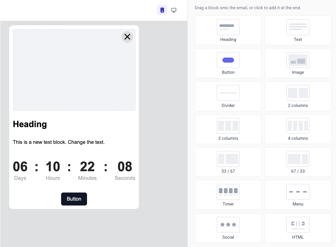 Each block type serves a different purpose in the message:
* **[Heading](/product/content/in-apps/no-code-in-app-editor/built-in-editor-blocks-reference/#heading-and-text):** titles and short headlines
* **[Text](/product/content/in-apps/no-code-in-app-editor/built-in-editor-blocks-reference/#heading-and-text):** body copy and longer descriptions
* **[Button](/product/content/in-apps/no-code-in-app-editor/built-in-editor-blocks-reference/#button):** a tappable call to action
* **[Image](/product/content/in-apps/no-code-in-app-editor/built-in-editor-blocks-reference/#image):** pictures from [Media store](/product/content/media-store/), upload, or URL
* **[Video](/product/content/in-apps/no-code-in-app-editor/built-in-editor-blocks-reference/#video):** a tappable video thumbnail that opens a YouTube or Vimeo video
* **[Card](/product/content/in-apps/no-code-in-app-editor/built-in-editor-blocks-reference/#card):** an image with heading, text, and button in one layout
* **[Divider](/product/content/in-apps/no-code-in-app-editor/built-in-editor-blocks-reference/#divider):** a line that separates sections
* **[Columns](/product/content/in-apps/no-code-in-app-editor/built-in-editor-blocks-reference/#columns):** side-by-side layouts (2, 3, or 4 equal columns, or 33/67 and 67/33 splits)
* **[Timer](/product/content/in-apps/no-code-in-app-editor/built-in-editor-blocks-reference/#countdown-timer):** a countdown for offers and deadlines
* **[Menu](/product/content/in-apps/no-code-in-app-editor/built-in-editor-blocks-reference/#menu):** a row or column of navigation or contact links
* **[Social](/product/content/in-apps/no-code-in-app-editor/built-in-editor-blocks-reference/#social):** icons that link to your social profiles
* **[HTML](/product/content/in-apps/no-code-in-app-editor/built-in-editor-blocks-reference/#html):** custom HTML, such as a form, survey, or embedded video
* **[Products](/product/content/in-apps/no-code-in-app-editor/built-in-editor-blocks-reference/#products):** a grid of product cards from your [Product Catalog](/product/content/product-catalog/) or a user's abandoned cart
See the [In-app editor blocks reference](/product/content/in-apps/no-code-in-app-editor/built-in-editor-blocks-reference/) for settings for each block, and [how to save and reuse blocks](/product/content/in-apps/no-code-in-app-editor/built-in-editor-blocks-reference/#save-and-reuse-blocks).
### Show blocks to specific users
Not every user needs to see the same blocks. Set a **display condition** on a block so it shows or hides based on the user's [Tags](/product/audience-data-and-segmentation/user-data-tags/tags/). You still send one template, but each person only sees the parts that apply to them.
Select the block on the canvas, open **Display condition** in the right panel, and turn on **Show this block conditionally**. [Learn more](/product/content/in-apps/no-code-in-app-editor/show-in-app-content-to-specific-users/)
## Localize the template
A multi-language template stores localized copy for each language in one in-app design. Use the language switcher in the top bar to add languages and edit content per language. Click **Auto-translate** to generate translations. For how multi-language messaging works across channels, see [Multi-language messaging](/product/personalization/multi-language/).
## Configure template settings
Use two places to style and place the message:
* **Settings** tab (right panel): document size, colors, typography, and default styles for blocks.
* **In-app settings** (top bar): position on screen, animations, and the close button.
[Learn more](/product/content/in-apps/no-code-in-app-editor/configure-in-app-template-settings/)
## Save the template
Click **Save** in the top bar to save your changes. Use **Undo**/**Redo** in the top bar to step back and forward through your edits.
Each block type serves a different purpose in the message:
* **[Heading](/product/content/in-apps/no-code-in-app-editor/built-in-editor-blocks-reference/#heading-and-text):** titles and short headlines
* **[Text](/product/content/in-apps/no-code-in-app-editor/built-in-editor-blocks-reference/#heading-and-text):** body copy and longer descriptions
* **[Button](/product/content/in-apps/no-code-in-app-editor/built-in-editor-blocks-reference/#button):** a tappable call to action
* **[Image](/product/content/in-apps/no-code-in-app-editor/built-in-editor-blocks-reference/#image):** pictures from [Media store](/product/content/media-store/), upload, or URL
* **[Video](/product/content/in-apps/no-code-in-app-editor/built-in-editor-blocks-reference/#video):** a tappable video thumbnail that opens a YouTube or Vimeo video
* **[Card](/product/content/in-apps/no-code-in-app-editor/built-in-editor-blocks-reference/#card):** an image with heading, text, and button in one layout
* **[Divider](/product/content/in-apps/no-code-in-app-editor/built-in-editor-blocks-reference/#divider):** a line that separates sections
* **[Columns](/product/content/in-apps/no-code-in-app-editor/built-in-editor-blocks-reference/#columns):** side-by-side layouts (2, 3, or 4 equal columns, or 33/67 and 67/33 splits)
* **[Timer](/product/content/in-apps/no-code-in-app-editor/built-in-editor-blocks-reference/#countdown-timer):** a countdown for offers and deadlines
* **[Menu](/product/content/in-apps/no-code-in-app-editor/built-in-editor-blocks-reference/#menu):** a row or column of navigation or contact links
* **[Social](/product/content/in-apps/no-code-in-app-editor/built-in-editor-blocks-reference/#social):** icons that link to your social profiles
* **[HTML](/product/content/in-apps/no-code-in-app-editor/built-in-editor-blocks-reference/#html):** custom HTML, such as a form, survey, or embedded video
* **[Products](/product/content/in-apps/no-code-in-app-editor/built-in-editor-blocks-reference/#products):** a grid of product cards from your [Product Catalog](/product/content/product-catalog/) or a user's abandoned cart
See the [In-app editor blocks reference](/product/content/in-apps/no-code-in-app-editor/built-in-editor-blocks-reference/) for settings for each block, and [how to save and reuse blocks](/product/content/in-apps/no-code-in-app-editor/built-in-editor-blocks-reference/#save-and-reuse-blocks).
### Show blocks to specific users
Not every user needs to see the same blocks. Set a **display condition** on a block so it shows or hides based on the user's [Tags](/product/audience-data-and-segmentation/user-data-tags/tags/). You still send one template, but each person only sees the parts that apply to them.
Select the block on the canvas, open **Display condition** in the right panel, and turn on **Show this block conditionally**. [Learn more](/product/content/in-apps/no-code-in-app-editor/show-in-app-content-to-specific-users/)
## Localize the template
A multi-language template stores localized copy for each language in one in-app design. Use the language switcher in the top bar to add languages and edit content per language. Click **Auto-translate** to generate translations. For how multi-language messaging works across channels, see [Multi-language messaging](/product/personalization/multi-language/).
## Configure template settings
Use two places to style and place the message:
* **Settings** tab (right panel): document size, colors, typography, and default styles for blocks.
* **In-app settings** (top bar): position on screen, animations, and the close button.
[Learn more](/product/content/in-apps/no-code-in-app-editor/configure-in-app-template-settings/)
## Save the template
Click **Save** in the top bar to save your changes. Use **Undo**/**Redo** in the top bar to step back and forward through your edits.