# Configure in-app template settings
These settings apply to the whole in-app template at once, rather than a single block.
## Configure template-wide styling
Template settings control styling for the whole in-app template: document size and background, popup look, and default styles for blocks.
Open the **Settings** tab in the right-hand panel.
Available sections:
* **Document:** width, padding, a background image, the gap between blocks, and a default corner radius for images.
* **Color scheme:** named color roles (heading, accent, links, background, borders, and more) that repaint the template at once. Existing blocks keep colors you already set explicitly.
* **Typography:** default font family and sizing for text in the template.
* **Popup:** how the message sits on the dimmed backdrop: corner radius, plus overlay color and opacity.
* **Block defaults:** shared starting styles for blocks you add later, so new content matches the template until you override a block on the canvas.
* **Columns defaults:** spacing for every Columns layout: outer padding, padding inside each column, and the gap between columns.
* **Card defaults:** starting look for Card containers that group content in the layout, applied until you style a card individually.
* **Button group defaults:** spacing and alignment when several buttons sit together as a group.
* **Button defaults:** starting look for new Button blocks so CTAs stay consistent across the template until you style one separately.
* **Divider defaults:** starting line style, color, thickness, and width for new Divider blocks.
Defaults apply wherever an individual block does not override them.
## Configure how the in-app looks on device
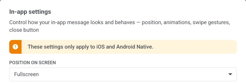
**In-app settings** control how the message appears and behaves on the device: position, animations, swipe gestures, and the close button. These settings only apply to iOS and Android Native.
Click **In-app settings** in the top bar.
### Position on screen
Choose **Fullscreen**, **Top**, **Center**, or **Bottom**.
### Animations
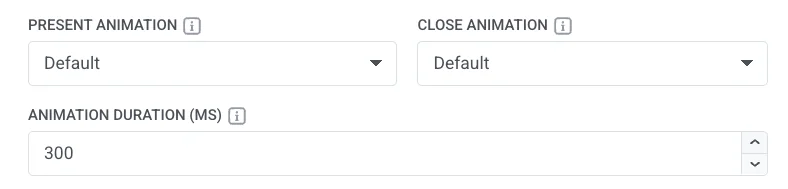
* **Present Animation** / **Close Animation:** None, Fade, Left, Right, Up, or Down, or Default to use your app's SDK default.
* **Animation Duration (MS):** 100 to 3000 milliseconds. Leave empty to use the SDK default timing.
### Swipe to close
Enable any combination of Left, Right, Up, and Down.
### Close button
Turn **Show close button** on or off.
When it's on, set:
* **Position:** Top right, Top left, Bottom right, or Bottom left.
* **Background:** a color or **Transparent**.
* **Corner radius:** rounds the corners of the close button background. Available only when **Background** is a color (not **Transparent**). Set 0–16 px: 16 px makes a circle (default), 0 px makes a square.
* **Icon Color:** color of the close icon.
* **Margin:** space around the close button on each side (**Top**, **Right**, **Bottom**, **Left**).
Unlike the other options in **In-app settings**, the close button style is saved in the message itself. It appears on every platform, not only on iOS and Android Native.
Click **Apply** to save your choices, or **Cancel** to discard them. Open **Preview** to check position, animations, and the close button before you save.
 Available sections:
* **Document:** width, padding, a background image, the gap between blocks, and a default corner radius for images.
* **Color scheme:** named color roles (heading, accent, links, background, borders, and more) that repaint the template at once. Existing blocks keep colors you already set explicitly.
* **Typography:** default font family and sizing for text in the template.
* **Popup:** how the message sits on the dimmed backdrop: corner radius, plus overlay color and opacity.
* **Block defaults:** shared starting styles for blocks you add later, so new content matches the template until you override a block on the canvas.
* **Columns defaults:** spacing for every Columns layout: outer padding, padding inside each column, and the gap between columns.
* **Card defaults:** starting look for Card containers that group content in the layout, applied until you style a card individually.
* **Button group defaults:** spacing and alignment when several buttons sit together as a group.
* **Button defaults:** starting look for new Button blocks so CTAs stay consistent across the template until you style one separately.
* **Divider defaults:** starting line style, color, thickness, and width for new Divider blocks.
Defaults apply wherever an individual block does not override them.
## Configure how the in-app looks on device
**In-app settings** control how the message appears and behaves on the device: position, animations, swipe gestures, and the close button. These settings only apply to iOS and Android Native.
Click **In-app settings** in the top bar.
Available sections:
* **Document:** width, padding, a background image, the gap between blocks, and a default corner radius for images.
* **Color scheme:** named color roles (heading, accent, links, background, borders, and more) that repaint the template at once. Existing blocks keep colors you already set explicitly.
* **Typography:** default font family and sizing for text in the template.
* **Popup:** how the message sits on the dimmed backdrop: corner radius, plus overlay color and opacity.
* **Block defaults:** shared starting styles for blocks you add later, so new content matches the template until you override a block on the canvas.
* **Columns defaults:** spacing for every Columns layout: outer padding, padding inside each column, and the gap between columns.
* **Card defaults:** starting look for Card containers that group content in the layout, applied until you style a card individually.
* **Button group defaults:** spacing and alignment when several buttons sit together as a group.
* **Button defaults:** starting look for new Button blocks so CTAs stay consistent across the template until you style one separately.
* **Divider defaults:** starting line style, color, thickness, and width for new Divider blocks.
Defaults apply wherever an individual block does not override them.
## Configure how the in-app looks on device
**In-app settings** control how the message appears and behaves on the device: position, animations, swipe gestures, and the close button. These settings only apply to iOS and Android Native.
Click **In-app settings** in the top bar.
 ### Position on screen
Choose **Fullscreen**, **Top**, **Center**, or **Bottom**.
### Position on screen
Choose **Fullscreen**, **Top**, **Center**, or **Bottom**.
 ### Animations
* **Present Animation** / **Close Animation:** None, Fade, Left, Right, Up, or Down, or Default to use your app's SDK default.
* **Animation Duration (MS):** 100 to 3000 milliseconds. Leave empty to use the SDK default timing.
### Animations
* **Present Animation** / **Close Animation:** None, Fade, Left, Right, Up, or Down, or Default to use your app's SDK default.
* **Animation Duration (MS):** 100 to 3000 milliseconds. Leave empty to use the SDK default timing.
 ### Swipe to close
Enable any combination of Left, Right, Up, and Down.
### Swipe to close
Enable any combination of Left, Right, Up, and Down.
 ### Close button
Turn **Show close button** on or off.
When it's on, set:
* **Position:** Top right, Top left, Bottom right, or Bottom left.
* **Background:** a color or **Transparent**.
* **Corner radius:** rounds the corners of the close button background. Available only when **Background** is a color (not **Transparent**). Set 0–16 px: 16 px makes a circle (default), 0 px makes a square.
* **Icon Color:** color of the close icon.
* **Margin:** space around the close button on each side (**Top**, **Right**, **Bottom**, **Left**).
### Close button
Turn **Show close button** on or off.
When it's on, set:
* **Position:** Top right, Top left, Bottom right, or Bottom left.
* **Background:** a color or **Transparent**.
* **Corner radius:** rounds the corners of the close button background. Available only when **Background** is a color (not **Transparent**). Set 0–16 px: 16 px makes a circle (default), 0 px makes a square.
* **Icon Color:** color of the close icon.
* **Margin:** space around the close button on each side (**Top**, **Right**, **Bottom**, **Left**).
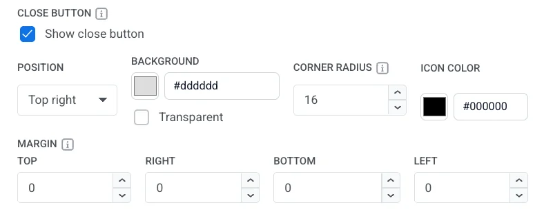 Unlike the other options in **In-app settings**, the close button style is saved in the message itself. It appears on every platform, not only on iOS and Android Native.
Click **Apply** to save your choices, or **Cancel** to discard them. Open **Preview** to check position, animations, and the close button before you save.
Unlike the other options in **In-app settings**, the close button style is saved in the message itself. It appears on every platform, not only on iOS and Android Native.
Click **Apply** to save your choices, or **Cancel** to discard them. Open **Preview** to check position, animations, and the close button before you save.