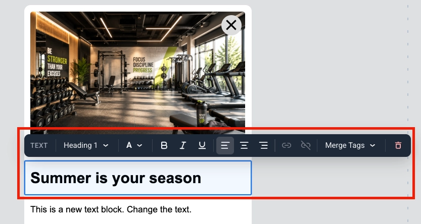
 Merge Tags are placeholders that insert a [Tag](/product/audience-data-and-segmentation/user-data-tags/tags/) value from the user's profile into the message, so each subscriber sees personalized copy. To add one, select the text, click **Merge Tags** in the toolbar, and choose a Tag from your account. [Learn more about personalized in-app messages](/product/how-to-guides/how-to-send-a-personalized-message/how-to-send-a-personalized-in-app-message/)
### Image
An **Image** block displays a picture in the in-app template.
Merge Tags are placeholders that insert a [Tag](/product/audience-data-and-segmentation/user-data-tags/tags/) value from the user's profile into the message, so each subscriber sees personalized copy. To add one, select the text, click **Merge Tags** in the toolbar, and choose a Tag from your account. [Learn more about personalized in-app messages](/product/how-to-guides/how-to-send-a-personalized-message/how-to-send-a-personalized-in-app-message/)
### Image
An **Image** block displays a picture in the in-app template.
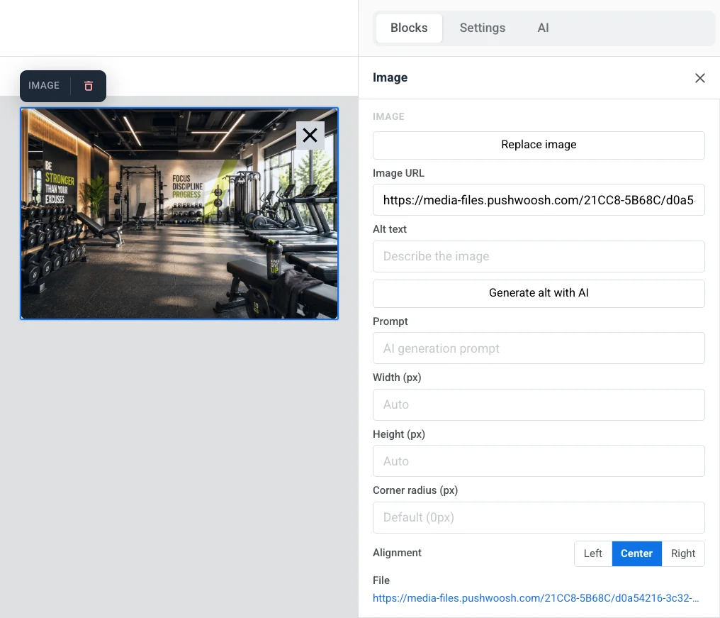 Select it on the canvas to open the **Image** settings in the right panel.
* **Add image** / **Replace image:** click **Add image** when the block is empty, or **Replace image** when a picture is already set. You can upload a file or pick one from your [Media store](/product/content/media-store/).
* **Image URL:** paste a hosted link to the image.
* **Alt text:** describe the image for accessibility.
* **Prompt:** the AI generation prompt for an image you created with **Generate with AI**.
* **Width (px)** / **Height (px):** fix the image to a pixel size. Leave a field empty for it to size automatically.
* **Corner radius (px):** round the image's corners.
* **Alignment:** left, center, or right.
In **Link**, set an **Action Type** (for example **Open Website** or **URL or Deeplink**) and its **URL** to open something when the image is tapped, and a **Link target** to open it in the same tab or a new one.
In **Spacing**, turn on **Padding** to add space around the image. Use **All sides** for the same padding on every side, or turn on **More options** to set each side separately.
### Video
A **Video** block adds a YouTube or Vimeo video to the message as a tappable thumbnail. The message shows a still image with a ▶ overlay. Tapping it opens the video in the YouTube or Vimeo app or browser.
Select it on the canvas to open the **Image** settings in the right panel.
* **Add image** / **Replace image:** click **Add image** when the block is empty, or **Replace image** when a picture is already set. You can upload a file or pick one from your [Media store](/product/content/media-store/).
* **Image URL:** paste a hosted link to the image.
* **Alt text:** describe the image for accessibility.
* **Prompt:** the AI generation prompt for an image you created with **Generate with AI**.
* **Width (px)** / **Height (px):** fix the image to a pixel size. Leave a field empty for it to size automatically.
* **Corner radius (px):** round the image's corners.
* **Alignment:** left, center, or right.
In **Link**, set an **Action Type** (for example **Open Website** or **URL or Deeplink**) and its **URL** to open something when the image is tapped, and a **Link target** to open it in the same tab or a new one.
In **Spacing**, turn on **Padding** to add space around the image. Use **All sides** for the same padding on every side, or turn on **More options** to set each side separately.
### Video
A **Video** block adds a YouTube or Vimeo video to the message as a tappable thumbnail. The message shows a still image with a ▶ overlay. Tapping it opens the video in the YouTube or Vimeo app or browser.
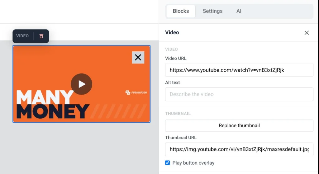 Select the block on the canvas to open its settings:
* **Video URL:** paste a YouTube or Vimeo link. The editor fetches a thumbnail automatically.
* **Alt text:** describe the video for accessibility.
* **Thumbnail URL:** keep the auto-fetched thumbnail, or click **Add thumbnail** / **Replace thumbnail** to pick one from [Media store](/product/content/media-store/), or paste a hosted link directly.
* **Play button overlay:** on by default. Turn off to show the plain thumbnail without the ▶ overlay.
* **Width (px)**, **Corner radius (px)**, and **Alignment:** control how the thumbnail looks and where it sits in the layout.
### Card
A **Card** block pairs an image with a heading, text, and button in a single ready-made layout, so you don't have to place and align four separate blocks by hand.
Select the block on the canvas to open its settings:
* **Video URL:** paste a YouTube or Vimeo link. The editor fetches a thumbnail automatically.
* **Alt text:** describe the video for accessibility.
* **Thumbnail URL:** keep the auto-fetched thumbnail, or click **Add thumbnail** / **Replace thumbnail** to pick one from [Media store](/product/content/media-store/), or paste a hosted link directly.
* **Play button overlay:** on by default. Turn off to show the plain thumbnail without the ▶ overlay.
* **Width (px)**, **Corner radius (px)**, and **Alignment:** control how the thumbnail looks and where it sits in the layout.
### Card
A **Card** block pairs an image with a heading, text, and button in a single ready-made layout, so you don't have to place and align four separate blocks by hand.
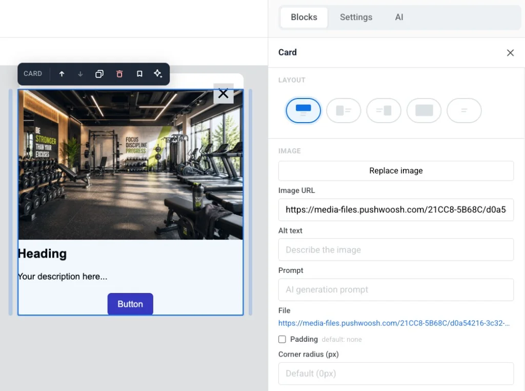 * **Layout:** choose which side the image sits on relative to the content, or turn on **Wrap text around image**.
* **Image:** add or replace the image, set alt text, edit the AI generation **Prompt**, add **Padding**, and set **Corner radius (px)**.
* **Size & fit:** set the image's **Width**, **Height**, **Crop** (Original or a fixed ratio), and **Fit** (Cover or a focal point). The exact fields depend on the **Layout** you picked.
* **Link:** make the whole card open a URL when tapped.
Edit the card's heading, text, and button the same way you edit the standalone [Heading, Text](#heading-and-text), and [Button](#button) blocks.
### Button
A **Button** is a tappable call to action in the in-app message. Use it to open a URL, run custom JavaScript, or close the message.
Click a **Button** block to edit its label on the canvas. Use the toolbar to change font size, text color, bold, italic, underline, and alignment.
To set what happens when the user taps the button:
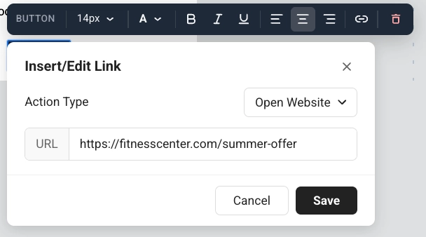
1. Click the link icon in the toolbar to open **Insert/Edit Link**.
2. Choose an **Action type**: **Open Website**, **URL or Deeplink**, or **Custom Javascript**.
3. Fill in the fields for that action (see below).
4. Click **Save**.
#### Open Website
**Open Website** opens a web page when the user taps the button. Enter the address in **URL**, for example `https://example.com`.
* **Layout:** choose which side the image sits on relative to the content, or turn on **Wrap text around image**.
* **Image:** add or replace the image, set alt text, edit the AI generation **Prompt**, add **Padding**, and set **Corner radius (px)**.
* **Size & fit:** set the image's **Width**, **Height**, **Crop** (Original or a fixed ratio), and **Fit** (Cover or a focal point). The exact fields depend on the **Layout** you picked.
* **Link:** make the whole card open a URL when tapped.
Edit the card's heading, text, and button the same way you edit the standalone [Heading, Text](#heading-and-text), and [Button](#button) blocks.
### Button
A **Button** is a tappable call to action in the in-app message. Use it to open a URL, run custom JavaScript, or close the message.
Click a **Button** block to edit its label on the canvas. Use the toolbar to change font size, text color, bold, italic, underline, and alignment.
To set what happens when the user taps the button:
1. Click the link icon in the toolbar to open **Insert/Edit Link**.
2. Choose an **Action type**: **Open Website**, **URL or Deeplink**, or **Custom Javascript**.
3. Fill in the fields for that action (see below).
4. Click **Save**.
#### Open Website
**Open Website** opens a web page when the user taps the button. Enter the address in **URL**, for example `https://example.com`.
 #### URL or Deeplink
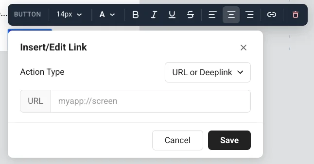
**URL or Deeplink** opens a link or deep link when the user taps the button. Enter the address in **URL**, for example an app screen: `myapp://screen`.
#### URL or Deeplink
**URL or Deeplink** opens a link or deep link when the user taps the button. Enter the address in **URL**, for example an app screen: `myapp://screen`.
 #### Run custom JavaScript
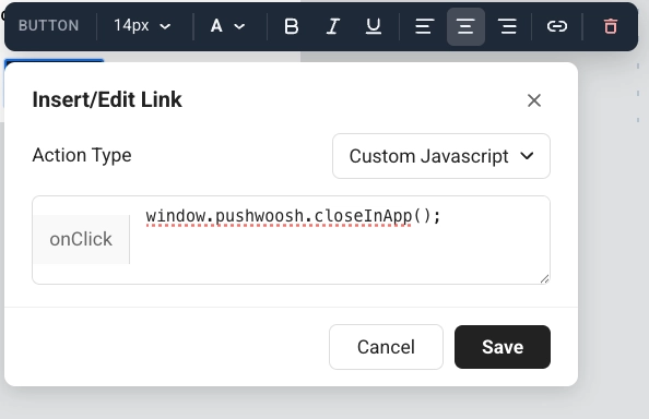
**Custom Javascript** runs code when the user taps the button. Enter the code in the **onClick** field.
Use it when a tap should do something in Pushwoosh, not only open a link. The person in the app still sees a normal button. They do not see tags or events. You decide what happens next on screen: leave the message open, or close it in the same **onClick**.
#### Run custom JavaScript
**Custom Javascript** runs code when the user taps the button. Enter the code in the **onClick** field.
Use it when a tap should do something in Pushwoosh, not only open a link. The person in the app still sees a normal button. They do not see tags or events. You decide what happens next on screen: leave the message open, or close it in the same **onClick**.
 **Available methods in onClick**
* `pushwoosh.closeInApp()`: close the in-app message. Omit it to keep the message open after the tap.
* `pushwoosh.sendTags({...})`: save values as [device tags](/product/audience-data-and-segmentation/user-data-tags/tags/) for later campaigns.
* `pushwoosh.postEvent(...)`: send a [custom event](/product/audience-data-and-segmentation/events/custom-events/), for example to start a Customer Journey.
* `pushwoosh.getTags(...)`: read current tags. Useful in custom HTML to change what the message shows.
* `pushwoosh.getCustomData()`: read custom data passed from the push that opened this in-app.
##### Example: let users pick an interest and save it for later campaigns
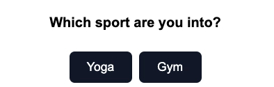
1. Add a question in a **Text** or **Heading** block, for example: "Which sport are you into?"
2. Add one **Button** per option, for example: **Yoga** and **Gym**.
**Available methods in onClick**
* `pushwoosh.closeInApp()`: close the in-app message. Omit it to keep the message open after the tap.
* `pushwoosh.sendTags({...})`: save values as [device tags](/product/audience-data-and-segmentation/user-data-tags/tags/) for later campaigns.
* `pushwoosh.postEvent(...)`: send a [custom event](/product/audience-data-and-segmentation/events/custom-events/), for example to start a Customer Journey.
* `pushwoosh.getTags(...)`: read current tags. Useful in custom HTML to change what the message shows.
* `pushwoosh.getCustomData()`: read custom data passed from the push that opened this in-app.
##### Example: let users pick an interest and save it for later campaigns
1. Add a question in a **Text** or **Heading** block, for example: "Which sport are you into?"
2. Add one **Button** per option, for example: **Yoga** and **Gym**.
 3. Set **Action type** to **Custom Javascript** for each button.
4. For the **Yoga** button, paste this into **onClick**:
```js
pushwoosh.sendTags({ interest: "yoga" });
pushwoosh.closeInApp();
```
5. For the **Gym** button, paste this into **onClick**:
```js
pushwoosh.sendTags({ interest: "gym" });
pushwoosh.closeInApp();
```
When the user taps **Yoga**, Pushwoosh writes the `interest` tag on their device and closes the in-app. You can then target that user in a [segment](/product/audience-data-and-segmentation/segmentation/) or [Customer Journey](/product/customer-journey/journey-elements/#in-app).
3. Set **Action type** to **Custom Javascript** for each button.
4. For the **Yoga** button, paste this into **onClick**:
```js
pushwoosh.sendTags({ interest: "yoga" });
pushwoosh.closeInApp();
```
5. For the **Gym** button, paste this into **onClick**:
```js
pushwoosh.sendTags({ interest: "gym" });
pushwoosh.closeInApp();
```
When the user taps **Yoga**, Pushwoosh writes the `interest` tag on their device and closes the in-app. You can then target that user in a [segment](/product/audience-data-and-segmentation/segmentation/) or [Customer Journey](/product/customer-journey/journey-elements/#in-app).
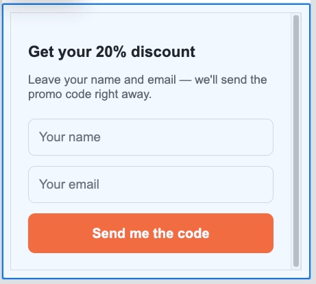
HTML code
```htmlGet your 20% discount
Leave your name and email. We'll send the promo code right away.
🎉 Done! Check your inbox for the promo code.
```
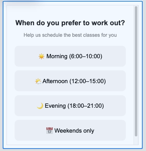
HTML code
```htmlWhen do you prefer to work out?
Help us schedule the best classes for you
Got it! We'll send you the best schedule 💪
```
 ### Countdown timer
The **Timer** block is a countdown in the in-app message. Use it for limited-time offers, flash sales, and event reminders.
To set it up:
1. In **Countdown**, set **End date** and **End time**, then choose the **Timezone** and **Language** for the timer labels.
2. Turn **Labels** on to show "days / hours / minutes / seconds" captions under the digits, or off for numbers only.
3. In **Appearance**, set **Background**, **Digits color**, **Labels color**, and the font size for digits (default 40px) and labels (default 16px).
4. Adjust **Spacing** (padding) as needed.
### Countdown timer
The **Timer** block is a countdown in the in-app message. Use it for limited-time offers, flash sales, and event reminders.
To set it up:
1. In **Countdown**, set **End date** and **End time**, then choose the **Timezone** and **Language** for the timer labels.
2. Turn **Labels** on to show "days / hours / minutes / seconds" captions under the digits, or off for numbers only.
3. In **Appearance**, set **Background**, **Digits color**, **Labels color**, and the font size for digits (default 40px) and labels (default 16px).
4. Adjust **Spacing** (padding) as needed.
 ### Columns
**Columns** split the canvas into side-by-side sections so you can place content next to each other in one row.
Drag one of these blocks onto the canvas:
* **2 columns:** two equal columns
* **3 columns:** three equal columns
* **4 columns:** four equal columns
* **33 / 67:** left column about 33% wide, right about 67%
* **67 / 33:** left column about 67% wide, right about 33%
Then add content to each column. To change spacing for all columns in the template, open **Settings** → **Columns defaults** and adjust outer padding, column padding, and the gap between columns.
### Products
A **Products** block shows a grid of product cards from one shared template. Each card can include an image, title, description, price, and a buy button. The template repeats for every product.
### Columns
**Columns** split the canvas into side-by-side sections so you can place content next to each other in one row.
Drag one of these blocks onto the canvas:
* **2 columns:** two equal columns
* **3 columns:** three equal columns
* **4 columns:** four equal columns
* **33 / 67:** left column about 33% wide, right about 67%
* **67 / 33:** left column about 67% wide, right about 33%
Then add content to each column. To change spacing for all columns in the template, open **Settings** → **Columns defaults** and adjust outer padding, column padding, and the gap between columns.
### Products
A **Products** block shows a grid of product cards from one shared template. Each card can include an image, title, description, price, and a buy button. The template repeats for every product.
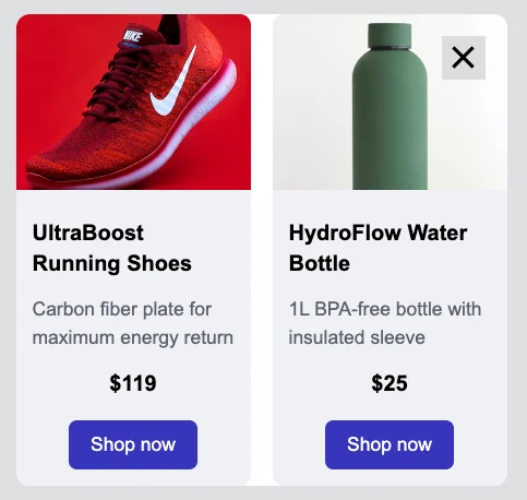 In the settings panel, under **Source**, choose where the products come from:
* **Manual:** enter products by hand, or click **Pick from catalog…** to select specific items from your [Product Catalog](/product/content/product-catalog/) by ID. You can mix both in the same block.
* **Catalog rule:** pull products automatically by category and sort order, resolved fresh from the catalog when the message is shown.
* **Cart:** show the items from each user's current abandoned cart. [How to set up an abandoned cart campaign](/product/how-to-guides/lifecycle-marketing-campaigns/how-to-set-up-an-abandoned-cart-campaign/)
Once you've picked a source, these settings control how the grid and its cards look:
* **Number of products** (or **Max products shown** for **Cart**): how many cards to show.
* **Columns:** 1, 2, or 3 cards per row.
* **Gap:** the space between cards.
* **Description limit:** the character limit description text is trimmed to, so cards stay a consistent size.
* **Card template:** pick a layout, then set **Card background**, **Card corner radius**, and **Content padding** for every card.
## Save and reuse blocks
Save a block to reuse it in this or other in-app templates instead of rebuilding it each time.
1. Select the block on the canvas.
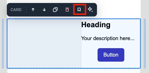
2. Click the bookmark icon (**Save block for reuse**) in the block's toolbar and give it a name.
In the settings panel, under **Source**, choose where the products come from:
* **Manual:** enter products by hand, or click **Pick from catalog…** to select specific items from your [Product Catalog](/product/content/product-catalog/) by ID. You can mix both in the same block.
* **Catalog rule:** pull products automatically by category and sort order, resolved fresh from the catalog when the message is shown.
* **Cart:** show the items from each user's current abandoned cart. [How to set up an abandoned cart campaign](/product/how-to-guides/lifecycle-marketing-campaigns/how-to-set-up-an-abandoned-cart-campaign/)
Once you've picked a source, these settings control how the grid and its cards look:
* **Number of products** (or **Max products shown** for **Cart**): how many cards to show.
* **Columns:** 1, 2, or 3 cards per row.
* **Gap:** the space between cards.
* **Description limit:** the character limit description text is trimmed to, so cards stay a consistent size.
* **Card template:** pick a layout, then set **Card background**, **Card corner radius**, and **Content padding** for every card.
## Save and reuse blocks
Save a block to reuse it in this or other in-app templates instead of rebuilding it each time.
1. Select the block on the canvas.
2. Click the bookmark icon (**Save block for reuse**) in the block's toolbar and give it a name.
 Saved blocks appear under **Saved blocks** at the bottom of the **Blocks** tab.
* Drag a saved block onto the canvas, or click it to add it at the end of the template.
* Click the **×** on a saved block's tile to delete it.
### Keep copies in sync
When you save a block, turn on **Keep copies in sync** to link every inserted copy to the same source. Edit the source once, and the change applies everywhere that block is used.
A synced copy is locked on the canvas. You can't edit it directly. Select the copy to open its settings:
* **Edit synced block:** unlock this copy so you can change it. A banner appears at the top. Click **Apply to all** to save your changes to the source and every other copy, or **Cancel** to discard them. You can unlock only one synced block at a time.
* **Update from source:** replace this copy with the latest version from the source.
* **Detach from source:** unlink this copy from the source so you can edit it on its own.
Saved blocks appear under **Saved blocks** at the bottom of the **Blocks** tab.
* Drag a saved block onto the canvas, or click it to add it at the end of the template.
* Click the **×** on a saved block's tile to delete it.
### Keep copies in sync
When you save a block, turn on **Keep copies in sync** to link every inserted copy to the same source. Edit the source once, and the change applies everywhere that block is used.
A synced copy is locked on the canvas. You can't edit it directly. Select the copy to open its settings:
* **Edit synced block:** unlock this copy so you can change it. A banner appears at the top. Click **Apply to all** to save your changes to the source and every other copy, or **Cancel** to discard them. You can unlock only one synced block at a time.
* **Update from source:** replace this copy with the latest version from the source.
* **Detach from source:** unlink this copy from the source so you can edit it on its own.