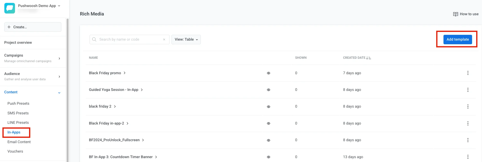
 3. Enter a template name.
4. Choose how to create the template:
* **Upload ZIP:** [upload a ZIP file](/developer/guides/content/rich-media-templates-syntax) with your HTML in-app message.
* **Create new template:** build a template in the built-in editor.
5. Select **Create new template**.
6. Click **Add template**.
3. Enter a template name.
4. Choose how to create the template:
* **Upload ZIP:** [upload a ZIP file](/developer/guides/content/rich-media-templates-syntax) with your HTML in-app message.
* **Create new template:** build a template in the built-in editor.
5. Select **Create new template**.
6. Click **Add template**.
 ### Explore the editor layout
The built-in editor has four areas. Each one has a clear job.
**Top bar**
Use the top bar to rename the template, undo mistakes, save your work, or open **In-app settings** when you need to change how the message appears on the device. See [Configure how the in-app looks on device](#configure-how-the-in-app-looks-on-device).
### Explore the editor layout
The built-in editor has four areas. Each one has a clear job.
**Top bar**
Use the top bar to rename the template, undo mistakes, save your work, or open **In-app settings** when you need to change how the message appears on the device. See [Configure how the in-app looks on device](#configure-how-the-in-app-looks-on-device).
 **Canvas**
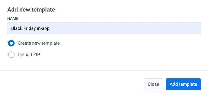
Use the canvas to see the message as users will see it and to edit text, images, and buttons directly on the layout. An empty template shows **Start with a block**. Above the canvas, a phone/tablet toggle switches the preview width — it doesn't change your layout, just how wide a screen you're previewing it on.
**Canvas**
Use the canvas to see the message as users will see it and to edit text, images, and buttons directly on the layout. An empty template shows **Start with a block**. Above the canvas, a phone/tablet toggle switches the preview width — it doesn't change your layout, just how wide a screen you're previewing it on.
 **Layers**
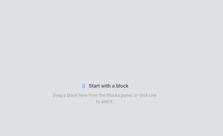
The Layers panel lists every block in your template as a tree, in the same order as on the canvas. Open it from the left edge when you want to select a nested block (for example, a button inside a group) or drag rows to change the order of content.
**Layers**
The Layers panel lists every block in your template as a tree, in the same order as on the canvas. Open it from the left edge when you want to select a nested block (for example, a button inside a group) or drag rows to change the order of content.
 **Right panel**
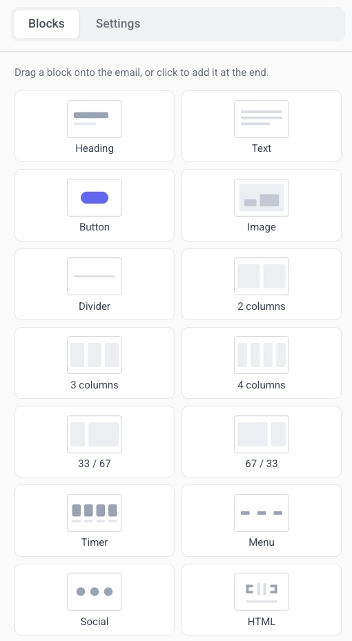
Use **Blocks** in the right panel to add content to the message, and **Settings** when you want styling that applies to the whole template at once. See [Configure template-wide styling](#configure-template-wide-styling).
**Right panel**
Use **Blocks** in the right panel to add content to the message, and **Settings** when you want styling that applies to the whole template at once. See [Configure template-wide styling](#configure-template-wide-styling).
 ### Start building the template
After you create a template, the editor opens with an empty canvas and the **Blocks** tab on the right.
1. Drag a block from the **Blocks** panel onto the canvas, or click a block in the panel to add it.
2. Keep adding blocks the same way until the layout is ready.
3. Open the **Settings** tab when you need template-wide styling.
### Start building the template
After you create a template, the editor opens with an empty canvas and the **Blocks** tab on the right.
1. Drag a block from the **Blocks** panel onto the canvas, or click a block in the panel to add it.
2. Keep adding blocks the same way until the layout is ready.
3. Open the **Settings** tab when you need template-wide styling.
 ### Add content blocks
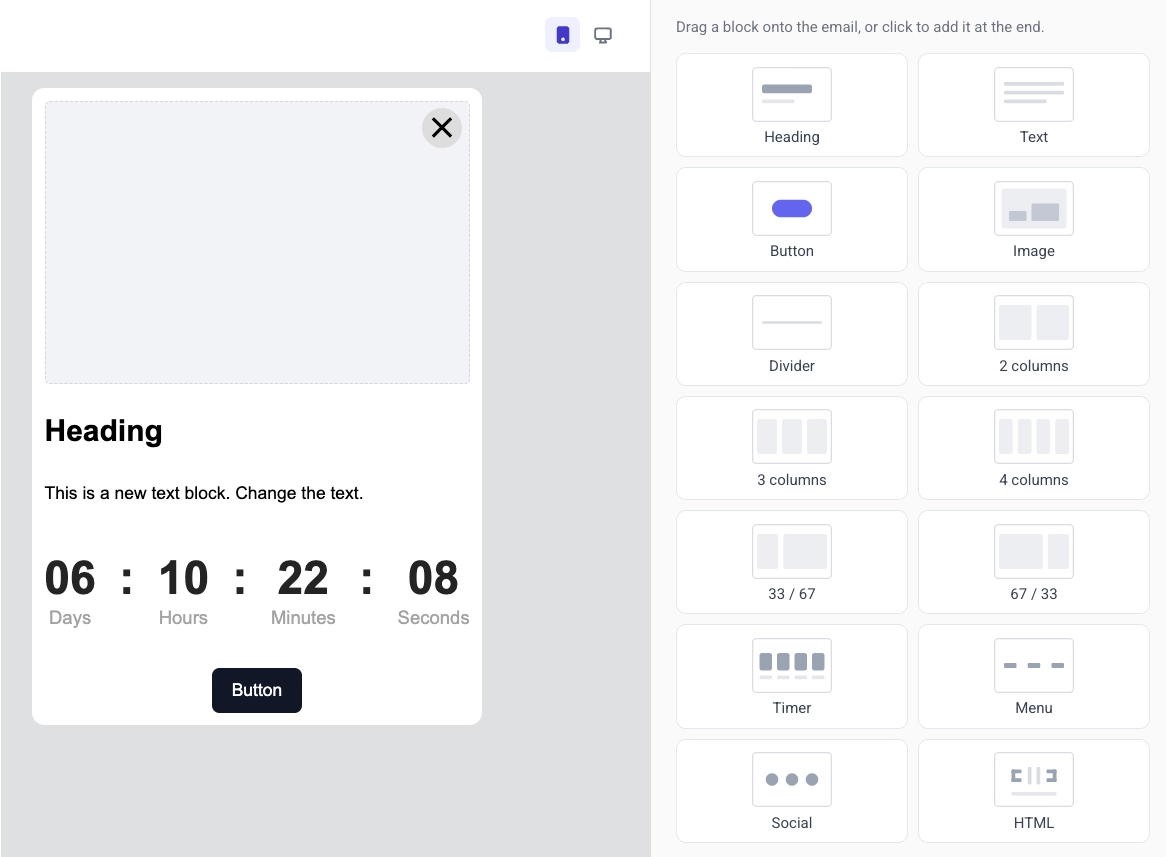
Content blocks are the building pieces of an in-app template in the built-in editor. You combine headings, text, images, buttons, and other blocks into one layout.
Open the **Blocks** tab and drag a block onto the canvas, or click a block to add it. Available blocks:
* **[Heading](#heading-and-text):** titles and short headlines in the message
* **[Text](#heading-and-text):** body copy and longer descriptions
* **[Button](#button):** a tappable call to action
* **[Image](#image):** pictures from [Media store](/product/content/media-store/), upload, or URL
* **[Divider](#divider):** a line that separates sections visually
* **[2 columns](#columns):** two equal columns side by side
* **[3 columns](#columns):** three equal columns side by side
* **[4 columns](#columns):** four equal columns side by side
* **[33 / 67](#columns):** two columns where the left takes about 33% of the width and the right about 67%
* **[67 / 33](#columns):** two columns where the left takes about 67% of the width and the right about 33%
* **[Timer](#countdown-timer):** a countdown for offers and deadlines
* **[Menu](#menu):** a row or column of links, such as navigation or contacts
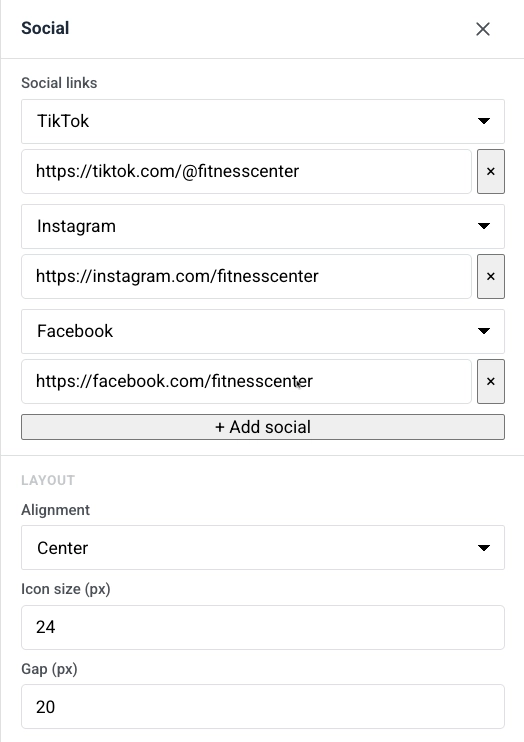
* **[Social](#social):** icons that link to your social profiles
* **[HTML](#html):** custom HTML, such as a form or embedded video
### Heading and text
**Heading** and **Text** blocks hold the copy users read in the in-app message. Edit the text on the canvas and format it with the toolbar.
Click a **Heading** or **Text** block to edit its copy on the canvas. Select some text to bring up the formatting toolbar: bold, italic, underline, alignment, a link button, and a **text style** dropdown.
### Add content blocks
Content blocks are the building pieces of an in-app template in the built-in editor. You combine headings, text, images, buttons, and other blocks into one layout.
Open the **Blocks** tab and drag a block onto the canvas, or click a block to add it. Available blocks:
* **[Heading](#heading-and-text):** titles and short headlines in the message
* **[Text](#heading-and-text):** body copy and longer descriptions
* **[Button](#button):** a tappable call to action
* **[Image](#image):** pictures from [Media store](/product/content/media-store/), upload, or URL
* **[Divider](#divider):** a line that separates sections visually
* **[2 columns](#columns):** two equal columns side by side
* **[3 columns](#columns):** three equal columns side by side
* **[4 columns](#columns):** four equal columns side by side
* **[33 / 67](#columns):** two columns where the left takes about 33% of the width and the right about 67%
* **[67 / 33](#columns):** two columns where the left takes about 67% of the width and the right about 33%
* **[Timer](#countdown-timer):** a countdown for offers and deadlines
* **[Menu](#menu):** a row or column of links, such as navigation or contacts
* **[Social](#social):** icons that link to your social profiles
* **[HTML](#html):** custom HTML, such as a form or embedded video
### Heading and text
**Heading** and **Text** blocks hold the copy users read in the in-app message. Edit the text on the canvas and format it with the toolbar.
Click a **Heading** or **Text** block to edit its copy on the canvas. Select some text to bring up the formatting toolbar: bold, italic, underline, alignment, a link button, and a **text style** dropdown.
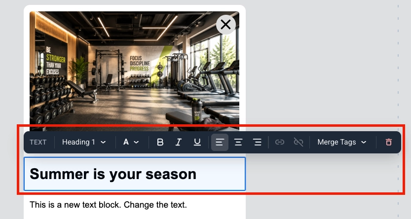 Merge Tags are placeholders that insert a [Tag](/product/audience-data-and-segmentation/user-data-tags/tags/) value from the user’s profile into the message, so each subscriber sees personalized copy. To add one, select the text, click **Merge Tags** in the toolbar, and choose a Tag from your account. [Learn more about personalized in-app messages](/product/how-to-guides/how-to-send-a-personalized-message/how-to-send-a-personalized-in-app-message/)
### Image
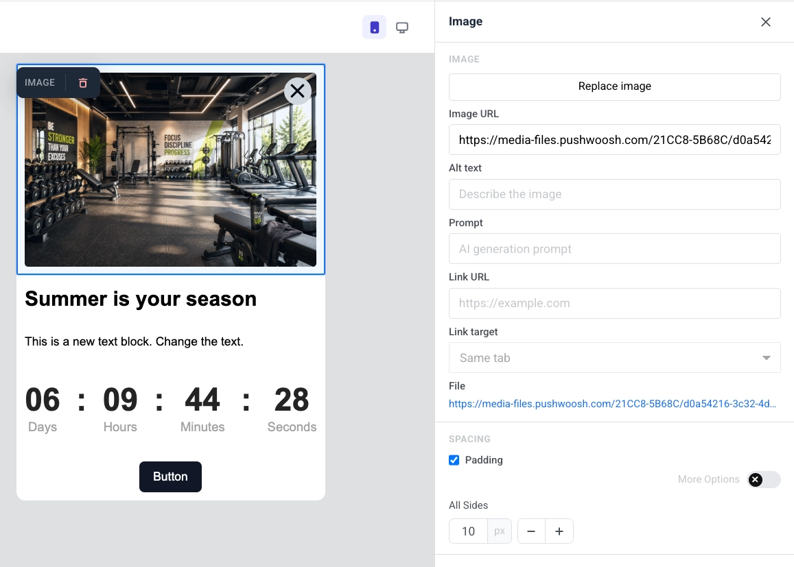
An **Image** block displays a picture in the in-app template. Select it on the canvas to open the **Image** settings in the right panel.
* **Add image** / **Replace image:** click **Add image** when the block is empty, or **Replace image** when a picture is already set. You can upload a file or pick one from your [Media store](/product/content/media-store/).
* **Image URL:** paste a hosted link to the image.
* **Alt text:** describe the image for accessibility.
* **Link URL:** open a website when the image is tapped.
* **Link target:** open the link in the same tab or a new one.
* **File:** after you add an image, shows the path of the file in use.
In **Spacing**, turn on **Padding** to add space around the image. Use **All sides** for the same padding on every side, or turn on **More options** to set each side separately.
Merge Tags are placeholders that insert a [Tag](/product/audience-data-and-segmentation/user-data-tags/tags/) value from the user’s profile into the message, so each subscriber sees personalized copy. To add one, select the text, click **Merge Tags** in the toolbar, and choose a Tag from your account. [Learn more about personalized in-app messages](/product/how-to-guides/how-to-send-a-personalized-message/how-to-send-a-personalized-in-app-message/)
### Image
An **Image** block displays a picture in the in-app template. Select it on the canvas to open the **Image** settings in the right panel.
* **Add image** / **Replace image:** click **Add image** when the block is empty, or **Replace image** when a picture is already set. You can upload a file or pick one from your [Media store](/product/content/media-store/).
* **Image URL:** paste a hosted link to the image.
* **Alt text:** describe the image for accessibility.
* **Link URL:** open a website when the image is tapped.
* **Link target:** open the link in the same tab or a new one.
* **File:** after you add an image, shows the path of the file in use.
In **Spacing**, turn on **Padding** to add space around the image. Use **All sides** for the same padding on every side, or turn on **More options** to set each side separately.
 ### Button
A **Button** is a tappable call to action in the in-app message. Use it to open a URL, run custom JavaScript, or close the message.
Click a **Button** block to edit its label on the canvas. Use the toolbar to change font size, text color, bold, italic, underline, and alignment.
To set what happens when the user taps the button:
1. Click the link icon in the toolbar to open **Insert/Edit Link**.
2. Choose an **Action type**.
3. Fill in the fields for that action (see below).
4. Click **Save**.
#### Open a website
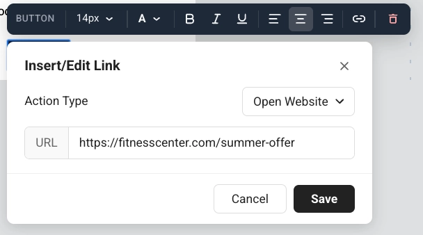
**Open Website** opens a link when the user taps the button. Enter the address in **URL**. What you can enter:
* A website: `https://example.com`
* An app link that opens a screen inside your app: `myapp://promo`
* Close the in-app without JavaScript: `pushwoosh://close`
### Button
A **Button** is a tappable call to action in the in-app message. Use it to open a URL, run custom JavaScript, or close the message.
Click a **Button** block to edit its label on the canvas. Use the toolbar to change font size, text color, bold, italic, underline, and alignment.
To set what happens when the user taps the button:
1. Click the link icon in the toolbar to open **Insert/Edit Link**.
2. Choose an **Action type**.
3. Fill in the fields for that action (see below).
4. Click **Save**.
#### Open a website
**Open Website** opens a link when the user taps the button. Enter the address in **URL**. What you can enter:
* A website: `https://example.com`
* An app link that opens a screen inside your app: `myapp://promo`
* Close the in-app without JavaScript: `pushwoosh://close`
 #### Run custom JavaScript
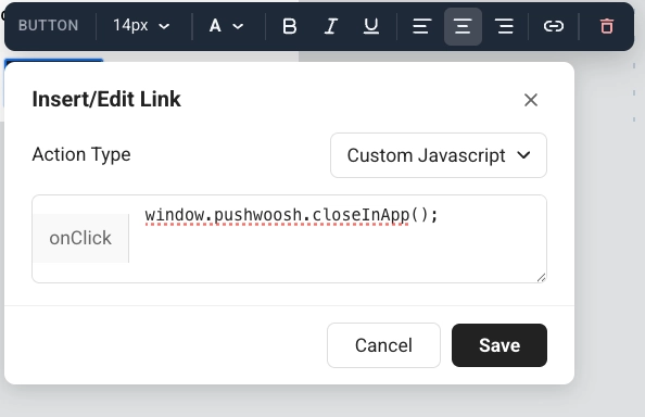
**Custom Javascript** runs code when the user taps the button. Enter the code in the **onClick** field.
Use it when a tap should do something in Pushwoosh, not only open a link. The person in the app still sees a normal button. They do not see tags or events. You decide what happens next on screen: leave the message open, or close it in the same **onClick**.
#### Run custom JavaScript
**Custom Javascript** runs code when the user taps the button. Enter the code in the **onClick** field.
Use it when a tap should do something in Pushwoosh, not only open a link. The person in the app still sees a normal button. They do not see tags or events. You decide what happens next on screen: leave the message open, or close it in the same **onClick**.
 **Available methods in onClick**
* `pushwoosh.closeInApp()`: close the in-app message. Omit it to keep the message open after the tap.
* `pushwoosh.sendTags({...})`: save values as [device tags](/product/audience-data-and-segmentation/user-data-tags/tags/) for later campaigns.
* `pushwoosh.postEvent(...)`: send a [custom event](/product/audience-data-and-segmentation/events/custom-events/), for example to start a Customer Journey.
* `pushwoosh.getTags(...)`: read current tags. Useful in custom HTML to change what the message shows.
* `pushwoosh.getCustomData()`: read custom data passed from the push that opened this in-app.
##### Example: let users pick an interest and save it for later campaigns
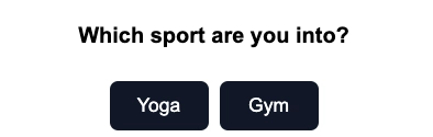
1. Add a question in a **Text** or **Heading** block, for example: "Which sport are you into?"
2. Add one **Button** per option, for example: **Yoga** and **Gym**.
**Available methods in onClick**
* `pushwoosh.closeInApp()`: close the in-app message. Omit it to keep the message open after the tap.
* `pushwoosh.sendTags({...})`: save values as [device tags](/product/audience-data-and-segmentation/user-data-tags/tags/) for later campaigns.
* `pushwoosh.postEvent(...)`: send a [custom event](/product/audience-data-and-segmentation/events/custom-events/), for example to start a Customer Journey.
* `pushwoosh.getTags(...)`: read current tags. Useful in custom HTML to change what the message shows.
* `pushwoosh.getCustomData()`: read custom data passed from the push that opened this in-app.
##### Example: let users pick an interest and save it for later campaigns
1. Add a question in a **Text** or **Heading** block, for example: "Which sport are you into?"
2. Add one **Button** per option, for example: **Yoga** and **Gym**.
 3. Set **Action type** to **Custom Javascript** for each button.
4. For the **Yoga** button, paste this into **onClick**:
```js
pushwoosh.sendTags({ interest: "yoga" });
pushwoosh.closeInApp();
```
5. For the **Gym** button, paste this into **onClick**:
```js
pushwoosh.sendTags({ interest: "gym" });
pushwoosh.closeInApp();
```
When the user taps **Yoga**, Pushwoosh writes the `interest` tag on their device and closes the in-app. You can then target that user in a [segment](/product/audience-data-and-segmentation/segmentation/) or [Customer Journey](/product/customer-journey/journey-elements/#in-app).
3. Set **Action type** to **Custom Javascript** for each button.
4. For the **Yoga** button, paste this into **onClick**:
```js
pushwoosh.sendTags({ interest: "yoga" });
pushwoosh.closeInApp();
```
5. For the **Gym** button, paste this into **onClick**:
```js
pushwoosh.sendTags({ interest: "gym" });
pushwoosh.closeInApp();
```
When the user taps **Yoga**, Pushwoosh writes the `interest` tag on their device and closes the in-app. You can then target that user in a [segment](/product/audience-data-and-segmentation/segmentation/) or [Customer Journey](/product/customer-journey/journey-elements/#in-app).
HTML code
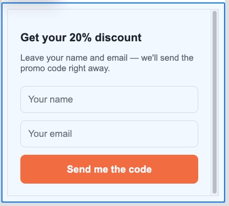
```htmlGet your 20% discount
Leave your name and email — we'll send the promo code right away.
🎉 Done! Check your inbox for the promo code.
```
HTML code
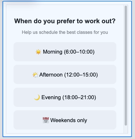
```htmlWhen do you prefer to work out?
Help us schedule the best classes for you
Got it! We'll send you the best schedule 💪
```
 ### Countdown timer
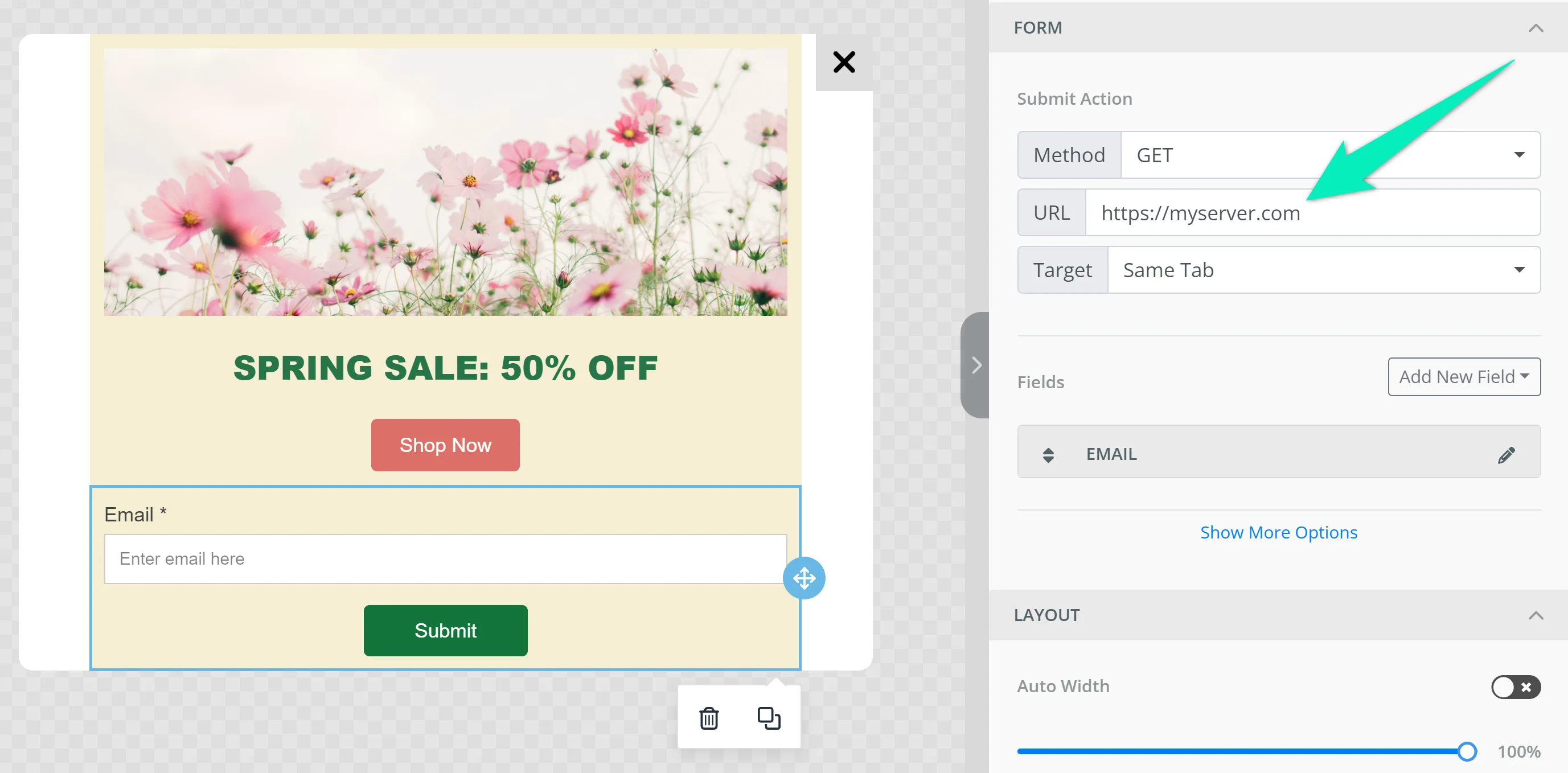
The **Timer** block is a countdown in the in-app message. Use it for limited-time offers, flash sales, and event reminders.
To set it up:
1. In **Countdown**, set **End date** and **End time**, then choose the **Timezone** and **Language** for the timer labels.
2. Turn **Labels** on to show "days / hours / minutes / seconds" captions under the digits, or off for numbers only.
3. In **Appearance**, set **Background**, **Digits color**, **Labels color**, and the font size for digits (default 40px) and labels (default 16px).
4. Adjust **Spacing** (padding) as needed.
### Countdown timer
The **Timer** block is a countdown in the in-app message. Use it for limited-time offers, flash sales, and event reminders.
To set it up:
1. In **Countdown**, set **End date** and **End time**, then choose the **Timezone** and **Language** for the timer labels.
2. Turn **Labels** on to show "days / hours / minutes / seconds" captions under the digits, or off for numbers only.
3. In **Appearance**, set **Background**, **Digits color**, **Labels color**, and the font size for digits (default 40px) and labels (default 16px).
4. Adjust **Spacing** (padding) as needed.
 ### Columns
**Columns** split the canvas into side-by-side sections so you can place content next to each other in one row.
Drag one of these blocks onto the canvas:
* **2 columns:** two equal columns
* **3 columns:** three equal columns
* **4 columns:** four equal columns
* **33 / 67:** left column about 33% wide, right about 67%
* **67 / 33:** left column about 67% wide, right about 33%
Then add content to each column. To change spacing for all columns in the template, open **Settings** → **Columns defaults** and adjust outer padding, column padding, and the gap between columns.
## Configure template-wide styling
Template settings control styling for the whole in-app template: document size and background, popup look, and default styles for blocks.
Open the **Settings** tab in the right-hand panel.
### Columns
**Columns** split the canvas into side-by-side sections so you can place content next to each other in one row.
Drag one of these blocks onto the canvas:
* **2 columns:** two equal columns
* **3 columns:** three equal columns
* **4 columns:** four equal columns
* **33 / 67:** left column about 33% wide, right about 67%
* **67 / 33:** left column about 67% wide, right about 33%
Then add content to each column. To change spacing for all columns in the template, open **Settings** → **Columns defaults** and adjust outer padding, column padding, and the gap between columns.
## Configure template-wide styling
Template settings control styling for the whole in-app template: document size and background, popup look, and default styles for blocks.
Open the **Settings** tab in the right-hand panel.
 Available sections:
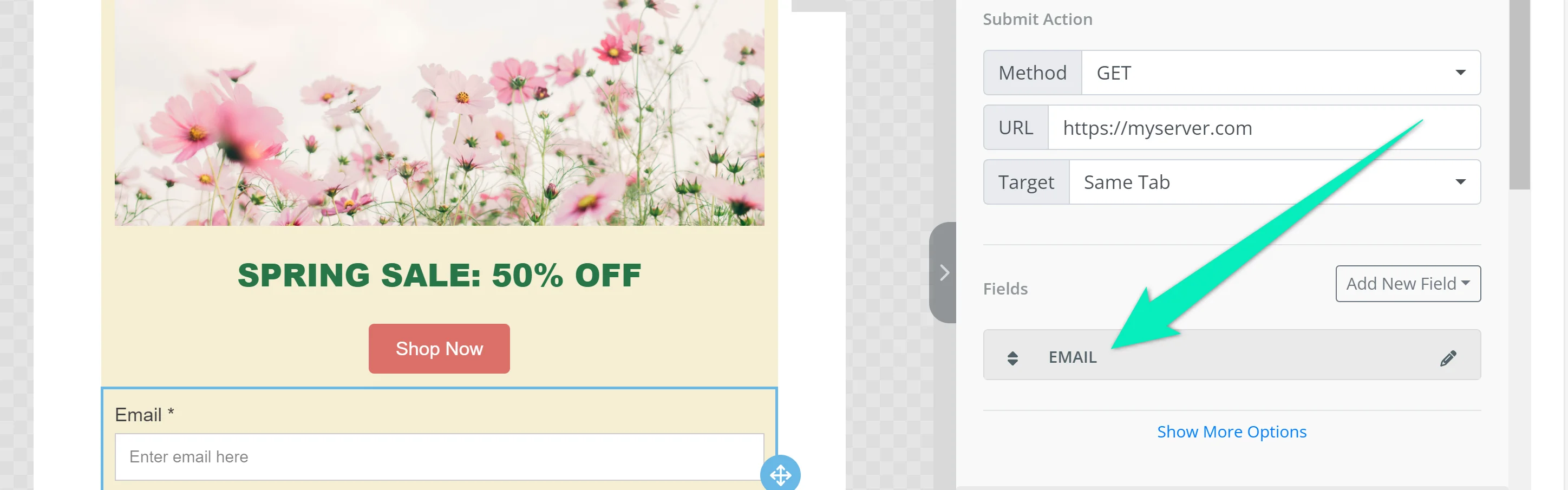
* **Document:** size and look of the whole message area: width, padding, background color or image, text color, font family, and the gap between blocks.
* **Popup:** how the message sits on the dimmed backdrop: corner radius, plus overlay color and opacity.
* **Block defaults:** shared starting styles for blocks you add later, so new content matches the template until you override a block on the canvas.
* **Columns defaults:** spacing for every Columns layout: outer padding, padding inside each column, and the gap between columns.
* **Card defaults:** starting look for Card containers that group content in the layout, applied until you style a card individually.
* **Button group defaults:** spacing and alignment when several buttons sit together as a group.
* **Button defaults:** starting look for new Button blocks so CTAs stay consistent across the template until you style one separately.
* **Divider defaults:** starting line style, color, thickness, and width for new Divider blocks.
Defaults apply wherever an individual block does not override them.
## Localize the template
A multi-language template stores localized copy for each language in one in-app design. Use the language switcher above the canvas to add languages and edit content per language. For how multi-language messaging works across channels, see [Multi-language messaging](/product/personalization/multi-language/).
Content you haven't translated yet for the current language shows dimmed. Start typing to create the translation. The default language keeps showing until you do.
## Configure how the in-app looks on device
**In-app settings** control how the message appears and behaves on the device: position, animations, swipe gestures, and the close button. These settings only apply to iOS and Android Native.
Click **In-app settings** in the top bar:
* **Position on Screen:** Fullscreen, Top, Center, or Bottom.
* **Present Animation** / **Close Animation:** None, Fade, Left, Right, Up, or Down, or Default to use your app's SDK default.
* **Animation Duration (MS):** 100 to 3000 milliseconds. Leave empty to use the SDK default timing.
* **Swipe to Close:** enable any combination of Left, Right, Up, and Down.
* **Show close button:** turn the close control on or off. When on, set **Position** (Top right, Top left, Bottom right, Bottom left), **Background** (a color, or **Transparent**), and **Icon Color**. Unlike the other settings in this modal, the close button's appearance is rendered into the message itself and shows on every platform, not just iOS and Android Native.
Available sections:
* **Document:** size and look of the whole message area: width, padding, background color or image, text color, font family, and the gap between blocks.
* **Popup:** how the message sits on the dimmed backdrop: corner radius, plus overlay color and opacity.
* **Block defaults:** shared starting styles for blocks you add later, so new content matches the template until you override a block on the canvas.
* **Columns defaults:** spacing for every Columns layout: outer padding, padding inside each column, and the gap between columns.
* **Card defaults:** starting look for Card containers that group content in the layout, applied until you style a card individually.
* **Button group defaults:** spacing and alignment when several buttons sit together as a group.
* **Button defaults:** starting look for new Button blocks so CTAs stay consistent across the template until you style one separately.
* **Divider defaults:** starting line style, color, thickness, and width for new Divider blocks.
Defaults apply wherever an individual block does not override them.
## Localize the template
A multi-language template stores localized copy for each language in one in-app design. Use the language switcher above the canvas to add languages and edit content per language. For how multi-language messaging works across channels, see [Multi-language messaging](/product/personalization/multi-language/).
Content you haven't translated yet for the current language shows dimmed. Start typing to create the translation. The default language keeps showing until you do.
## Configure how the in-app looks on device
**In-app settings** control how the message appears and behaves on the device: position, animations, swipe gestures, and the close button. These settings only apply to iOS and Android Native.
Click **In-app settings** in the top bar:
* **Position on Screen:** Fullscreen, Top, Center, or Bottom.
* **Present Animation** / **Close Animation:** None, Fade, Left, Right, Up, or Down, or Default to use your app's SDK default.
* **Animation Duration (MS):** 100 to 3000 milliseconds. Leave empty to use the SDK default timing.
* **Swipe to Close:** enable any combination of Left, Right, Up, and Down.
* **Show close button:** turn the close control on or off. When on, set **Position** (Top right, Top left, Bottom right, Bottom left), **Background** (a color, or **Transparent**), and **Icon Color**. Unlike the other settings in this modal, the close button's appearance is rendered into the message itself and shows on every platform, not just iOS and Android Native.
 Click **Apply** to save your choices, or **Cancel** to discard them.
## Save the template
Click **Save** in the top bar to save your changes. Use **Undo**/**Redo** in the top bar to step back and forward through your edits.
## Use the saved template
After you save an in-app template, you can show it to users in a Customer Journey, as a one-time in-app, or when a user taps a push.
* [Show an in-app as part of a customer journey](/product/customer-journey/journey-elements/#in-app)
* [Send a push that opens an in-app when clicked](/product/messaging-channels/push-notifications/send-push-notifications/one-time-push)
* [Display a single in-app to your users](/product/messaging-channels/in-apps/)
Click **Apply** to save your choices, or **Cancel** to discard them.
## Save the template
Click **Save** in the top bar to save your changes. Use **Undo**/**Redo** in the top bar to step back and forward through your edits.
## Use the saved template
After you save an in-app template, you can show it to users in a Customer Journey, as a one-time in-app, or when a user taps a push.
* [Show an in-app as part of a customer journey](/product/customer-journey/journey-elements/#in-app)
* [Send a push that opens an in-app when clicked](/product/messaging-channels/push-notifications/send-push-notifications/one-time-push)
* [Display a single in-app to your users](/product/messaging-channels/in-apps/)