# Create native in-app messages
Native in-apps use ready-made layouts that the Pushwoosh SDK renders directly on the device, instead of the HTML page a custom in-app loads. This makes them load faster and animate more smoothly, and you don't need design or development skills to build one.
Reach for a native in-app when you want to launch a promotion, reminder, or feature announcement quickly and a fully custom layout isn't necessary. If you need full control over the design, build an [HTML-based in-app](/product/content/in-apps/create-rich-media-in-the-built-in-editor/) instead.
## Prerequisites
Before you create a native in-app template, make sure:
* The Pushwoosh SDK is integrated in your app so in-app messages can appear. [Learn more](/developer/pushwoosh-sdk/pushwoosh-sdk-overview/)
* Your app runs iOS SDK 7.2.0+ or Android SDK 6.10.0+. All three display types (**modal**, **fullscreen**, **stories**) need the same minimum version and work on both platforms.
## Create a native in-app template
1. Go to **Content** → **In-apps**.
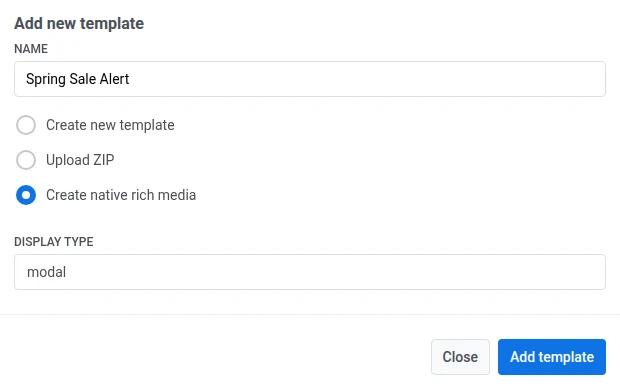
2. Click **Add template**.
3. Enter a template name.
4. Select **Create native rich media**.
5. In **DISPLAY TYPE**, pick **modal**, **fullscreen**, or **stories**.
6. Click **Add template**.
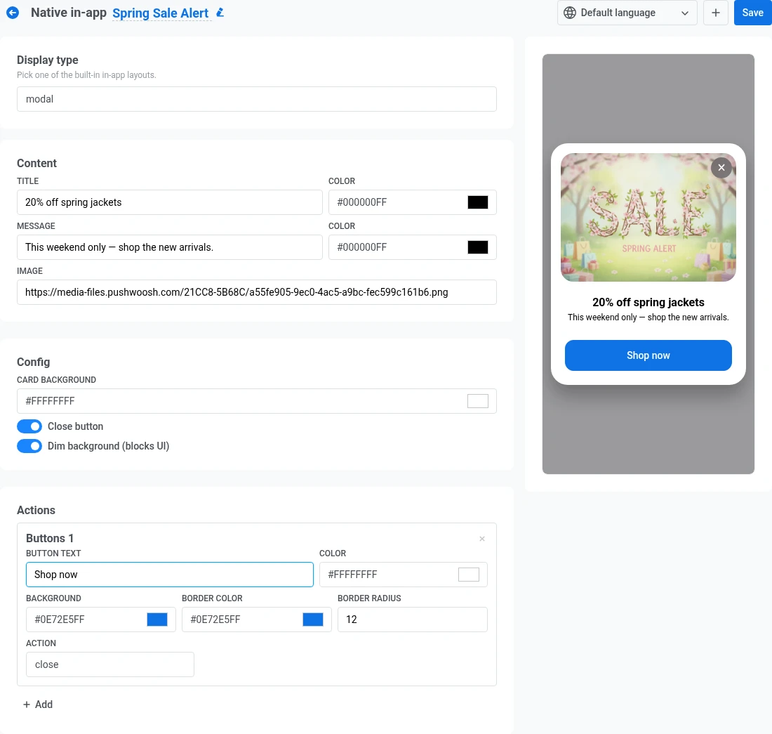
The editor opens with a live mobile preview on the right and the template fields on the left, grouped into **Content**, **Config**, and **Actions**. What you see in each group depends on the display type you picked.
### Configure the display type
#### Modal
A centered card, optionally shown over a dimmed background. Fill in these fields on the left panel:
* **Content:** a title and message, each with its own text color, plus an optional image.
* **Config:** card background color, a **Close button** toggle, and a **Dim background** toggle that darkens the screen behind the card.
* **Actions:** one or more buttons. See [Configure buttons](#configure-buttons).
#### Fullscreen
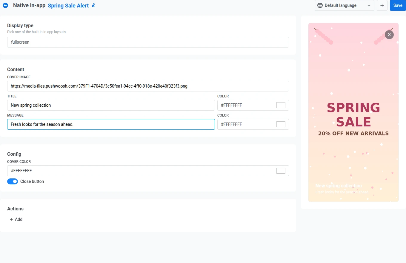
An edge-to-edge cover image with text and buttons on top. Fill in these fields on the left panel:
* **Content:** a cover image, plus a title and message, each with its own text color.
* **Config:** a cover color (shown while the image loads, or instead of it) and a **Close button** toggle.
* **Actions:** one or more buttons. See [Configure buttons](#configure-buttons).
#### Stories
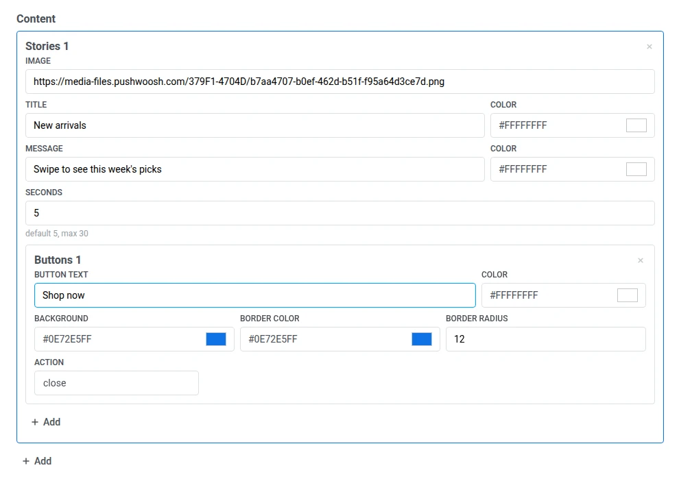
A sequence of full-screen slides with progress bars at the top, similar to social media stories. Each slide is its own **Stories** entry under **Content**.
1. Fill in the first slide's **Image**, **Title**, and **Message** (each with its own text color).
2. Set **Seconds** to how long the slide stays on screen before advancing. The default is 5. Enter a value from 1 to 30. Values outside this range block **Save** with a validation error.
3. Optionally, click **Add** inside the slide to give it its own CTA button. See [Configure buttons](#configure-buttons).
4. Click **Add** below the last slide to add another slide, then repeat steps 1-3 for it.
5. Under **Config**, set these options that apply to the whole story, not a single slide:
* **Loop:** restart from the first slide after the last one.
* **Close button:** show a close (✕) control.
##### Example of how the finished story looks for the user
### Configure buttons
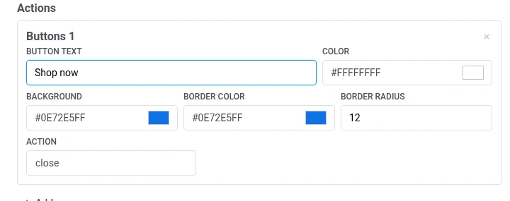
Modal, fullscreen, and each stories slide use the same button fields:
* **Button text** and its color.
* **Background**, **Border color**, and **Border radius**.
* **Action:** choose what happens when the user taps the button:
* **close:** dismisses the in-app.
* **url:** opens the link you enter in the field that appears. Use a web address (for example, `https://example.com`) or a deep link into your app (for example, `myapp://product/123`).
Click **Add** to add another button, or the **×** on a button to remove it.
### Add localizations
By default, a native in-app has one language. To add more:
1. Click **+** next to the language selector in the top bar.
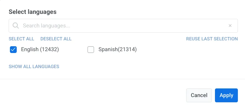
2. Select the languages to add and click **Apply**.
3. Use the language selector in the top bar to switch between languages and fill in the text fields for each one.
## Save the template
Click **Save** in the top right to persist your changes.
The template then appears in **Content** → [**In-apps**](/product/content/in-apps/) alongside your other in-app templates.
## Use it in a campaign
A native in-app template appears in the template picker together with your other in-app templates.
You can use it to:
* [Send an instant in-app](/product/messaging-channels/in-apps/send-in-apps/send-instant-in-apps/)
* Add an in-app step to a [Customer Journey](/product/messaging-channels/in-apps/send-in-apps/send-in-apps-via-customer-journey/)
* [Open an in-app when the user taps a push](/product/messaging-channels/push-notifications/send-push-notifications/one-time-push#define-what-happens-when-the-push-is-clicked)
 The editor opens with a live mobile preview on the right and the template fields on the left, grouped into **Content**, **Config**, and **Actions**. What you see in each group depends on the display type you picked.
### Configure the display type
#### Modal
A centered card, optionally shown over a dimmed background. Fill in these fields on the left panel:
* **Content:** a title and message, each with its own text color, plus an optional image.
* **Config:** card background color, a **Close button** toggle, and a **Dim background** toggle that darkens the screen behind the card.
* **Actions:** one or more buttons. See [Configure buttons](#configure-buttons).
The editor opens with a live mobile preview on the right and the template fields on the left, grouped into **Content**, **Config**, and **Actions**. What you see in each group depends on the display type you picked.
### Configure the display type
#### Modal
A centered card, optionally shown over a dimmed background. Fill in these fields on the left panel:
* **Content:** a title and message, each with its own text color, plus an optional image.
* **Config:** card background color, a **Close button** toggle, and a **Dim background** toggle that darkens the screen behind the card.
* **Actions:** one or more buttons. See [Configure buttons](#configure-buttons).
 #### Fullscreen
An edge-to-edge cover image with text and buttons on top. Fill in these fields on the left panel:
* **Content:** a cover image, plus a title and message, each with its own text color.
* **Config:** a cover color (shown while the image loads, or instead of it) and a **Close button** toggle.
* **Actions:** one or more buttons. See [Configure buttons](#configure-buttons).
#### Fullscreen
An edge-to-edge cover image with text and buttons on top. Fill in these fields on the left panel:
* **Content:** a cover image, plus a title and message, each with its own text color.
* **Config:** a cover color (shown while the image loads, or instead of it) and a **Close button** toggle.
* **Actions:** one or more buttons. See [Configure buttons](#configure-buttons).
 #### Stories
A sequence of full-screen slides with progress bars at the top, similar to social media stories. Each slide is its own **Stories** entry under **Content**.
1. Fill in the first slide's **Image**, **Title**, and **Message** (each with its own text color).
2. Set **Seconds** to how long the slide stays on screen before advancing. The default is 5. Enter a value from 1 to 30. Values outside this range block **Save** with a validation error.
3. Optionally, click **Add** inside the slide to give it its own CTA button. See [Configure buttons](#configure-buttons).
#### Stories
A sequence of full-screen slides with progress bars at the top, similar to social media stories. Each slide is its own **Stories** entry under **Content**.
1. Fill in the first slide's **Image**, **Title**, and **Message** (each with its own text color).
2. Set **Seconds** to how long the slide stays on screen before advancing. The default is 5. Enter a value from 1 to 30. Values outside this range block **Save** with a validation error.
3. Optionally, click **Add** inside the slide to give it its own CTA button. See [Configure buttons](#configure-buttons).
 4. Click **Add** below the last slide to add another slide, then repeat steps 1-3 for it.
5. Under **Config**, set these options that apply to the whole story, not a single slide:
* **Loop:** restart from the first slide after the last one.
* **Close button:** show a close (✕) control.
4. Click **Add** below the last slide to add another slide, then repeat steps 1-3 for it.
5. Under **Config**, set these options that apply to the whole story, not a single slide:
* **Loop:** restart from the first slide after the last one.
* **Close button:** show a close (✕) control.
 ##### Example of how the finished story looks for the user
### Configure buttons
Modal, fullscreen, and each stories slide use the same button fields:
* **Button text** and its color.
* **Background**, **Border color**, and **Border radius**.
* **Action:** choose what happens when the user taps the button:
* **close:** dismisses the in-app.
* **url:** opens the link you enter in the field that appears. Use a web address (for example, `https://example.com`) or a deep link into your app (for example, `myapp://product/123`).
##### Example of how the finished story looks for the user
### Configure buttons
Modal, fullscreen, and each stories slide use the same button fields:
* **Button text** and its color.
* **Background**, **Border color**, and **Border radius**.
* **Action:** choose what happens when the user taps the button:
* **close:** dismisses the in-app.
* **url:** opens the link you enter in the field that appears. Use a web address (for example, `https://example.com`) or a deep link into your app (for example, `myapp://product/123`).
 Click **Add** to add another button, or the **×** on a button to remove it.
### Add localizations
By default, a native in-app has one language. To add more:
1. Click **+** next to the language selector in the top bar.
2. Select the languages to add and click **Apply**.
Click **Add** to add another button, or the **×** on a button to remove it.
### Add localizations
By default, a native in-app has one language. To add more:
1. Click **+** next to the language selector in the top bar.
2. Select the languages to add and click **Apply**.
 3. Use the language selector in the top bar to switch between languages and fill in the text fields for each one.
## Save the template
Click **Save** in the top right to persist your changes.
The template then appears in **Content** → [**In-apps**](/product/content/in-apps/) alongside your other in-app templates.
## Use it in a campaign
A native in-app template appears in the template picker together with your other in-app templates.
You can use it to:
* [Send an instant in-app](/product/messaging-channels/in-apps/send-in-apps/send-instant-in-apps/)
* Add an in-app step to a [Customer Journey](/product/messaging-channels/in-apps/send-in-apps/send-in-apps-via-customer-journey/)
* [Open an in-app when the user taps a push](/product/messaging-channels/push-notifications/send-push-notifications/one-time-push#define-what-happens-when-the-push-is-clicked)
3. Use the language selector in the top bar to switch between languages and fill in the text fields for each one.
## Save the template
Click **Save** in the top right to persist your changes.
The template then appears in **Content** → [**In-apps**](/product/content/in-apps/) alongside your other in-app templates.
## Use it in a campaign
A native in-app template appears in the template picker together with your other in-app templates.
You can use it to:
* [Send an instant in-app](/product/messaging-channels/in-apps/send-in-apps/send-instant-in-apps/)
* Add an in-app step to a [Customer Journey](/product/messaging-channels/in-apps/send-in-apps/send-in-apps-via-customer-journey/)
* [Open an in-app when the user taps a push](/product/messaging-channels/push-notifications/send-push-notifications/one-time-push#define-what-happens-when-the-push-is-clicked)