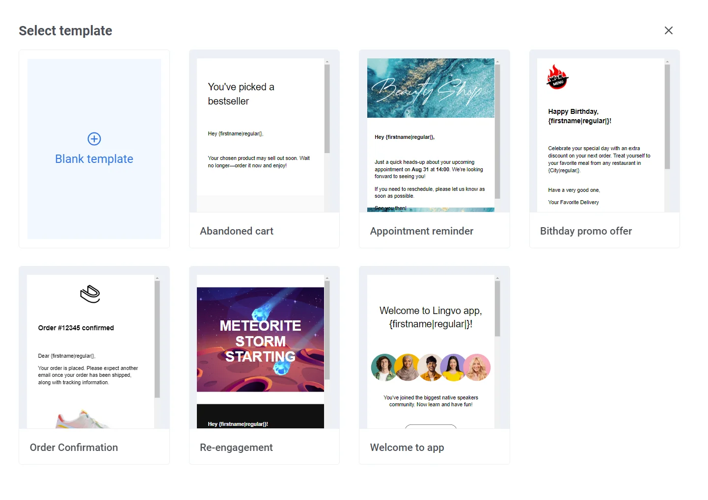
 ## Explore the editor layout
Once you open an email, the built-in editor has these areas:
**Top bar**
Rename the email, undo or redo changes, and save your work. Open the **⋮** menu for more actions:
* **Preview:** see the email as it will render for recipients, with its own Desktop/Mobile toggle. See [Edit the mobile view](#edit-the-mobile-view).
* **Validate Liquid:** check the [Liquid](/product/personalization/liquid-templates/) syntax in your subject, preheader, footer, and body across all languages before you send.
* **Test email:** send a preview to a test device or address. See [Send a test email](#send-a-test-email).
## Explore the editor layout
Once you open an email, the built-in editor has these areas:
**Top bar**
Rename the email, undo or redo changes, and save your work. Open the **⋮** menu for more actions:
* **Preview:** see the email as it will render for recipients, with its own Desktop/Mobile toggle. See [Edit the mobile view](#edit-the-mobile-view).
* **Validate Liquid:** check the [Liquid](/product/personalization/liquid-templates/) syntax in your subject, preheader, footer, and body across all languages before you send.
* **Test email:** send a preview to a test device or address. See [Send a test email](#send-a-test-email).
 **Language / Subject / Preheader bar**
Above the canvas, switch the editing language and set the subject line and preheader for the email. [Learn how to set these up](/product/content/email-content/set-up-your-email-in-the-editor/).
**Language / Subject / Preheader bar**
Above the canvas, switch the editing language and set the subject line and preheader for the email. [Learn how to set these up](/product/content/email-content/set-up-your-email-in-the-editor/).
 **Canvas**
See the email as recipients will see it, and edit text, images, and buttons directly on the layout. An empty email shows **Start with a block**.
**Canvas**
See the email as recipients will see it, and edit text, images, and buttons directly on the layout. An empty email shows **Start with a block**.
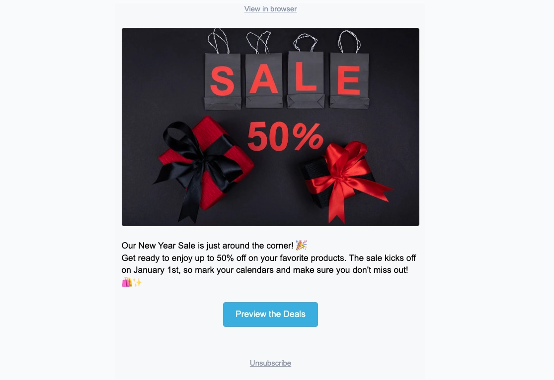 **Layers panel**
Lists every block in your email as a tree, in the same order as on the canvas. Open it from the left edge to select a nested block or drag rows to reorder content.
**Layers panel**
Lists every block in your email as a tree, in the same order as on the canvas. Open it from the left edge to select a nested block or drag rows to reorder content.
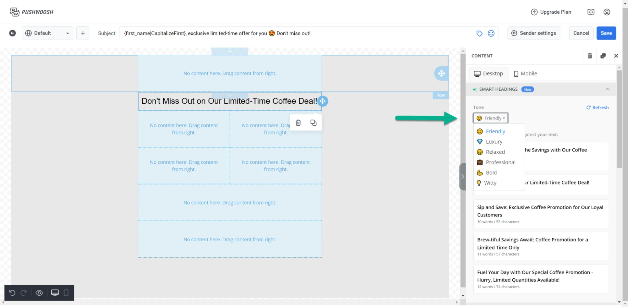 **Right panel**
Switch between three tabs:
* **Blocks:** add content to the email. See [Add content blocks](#add-content-blocks).
* **Settings:** apply styling to the whole email at once. See [Configure email-wide styling](#configure-email-wide-styling).
* **AI:** chat with the AI assistant to generate or edit content from a prompt.
## Start building your email
1. Drag a block from the **Blocks** panel onto the canvas, or click a block in the panel to add it at the end of the email.
2. Keep adding blocks the same way until the layout is ready.
3. Open the **Settings** tab when you need email-wide styling.
### Add content blocks
Open the **Blocks** tab and drag a block onto the canvas, or click a block to add it at the end of the email. Available blocks:
* **[Heading](#heading-and-text):** titles and short headlines in the email
* **[Text](#heading-and-text):** body copy and longer descriptions
* **[Button](#button):** a clickable call to action
* **[Image](#image):** pictures from [Media store](/product/content/media-store/), upload, or URL
* **[Card](#card):** an image paired with a heading, text, and button in one layout
* **[Divider](#divider):** a line that separates sections visually
* **[2 columns](#columns):** two equal columns side by side
* **[3 columns](#columns):** three equal columns side by side
* **[4 columns](#columns):** four equal columns side by side
* **[33 / 67](#columns):** two columns where the left takes about 33% of the width and the right about 67%
* **[67 / 33](#columns):** two columns where the left takes about 67% of the width and the right about 33%
* **[Timer](#countdown-timer):** a countdown for offers and deadlines
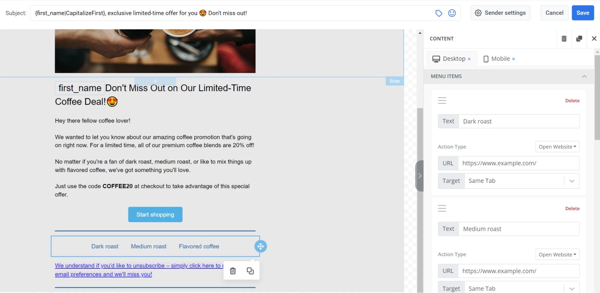
* **[Menu](#menu):** a row or column of links, such as navigation or contacts
* **[Social](#social):** icons that link to your social profiles
* **[HTML](#html):** custom HTML, such as a form, survey, or embedded video
#### Heading and text
**Heading** and **Text** blocks hold the copy recipients read in the email. Edit the text on the canvas and format it with the toolbar.
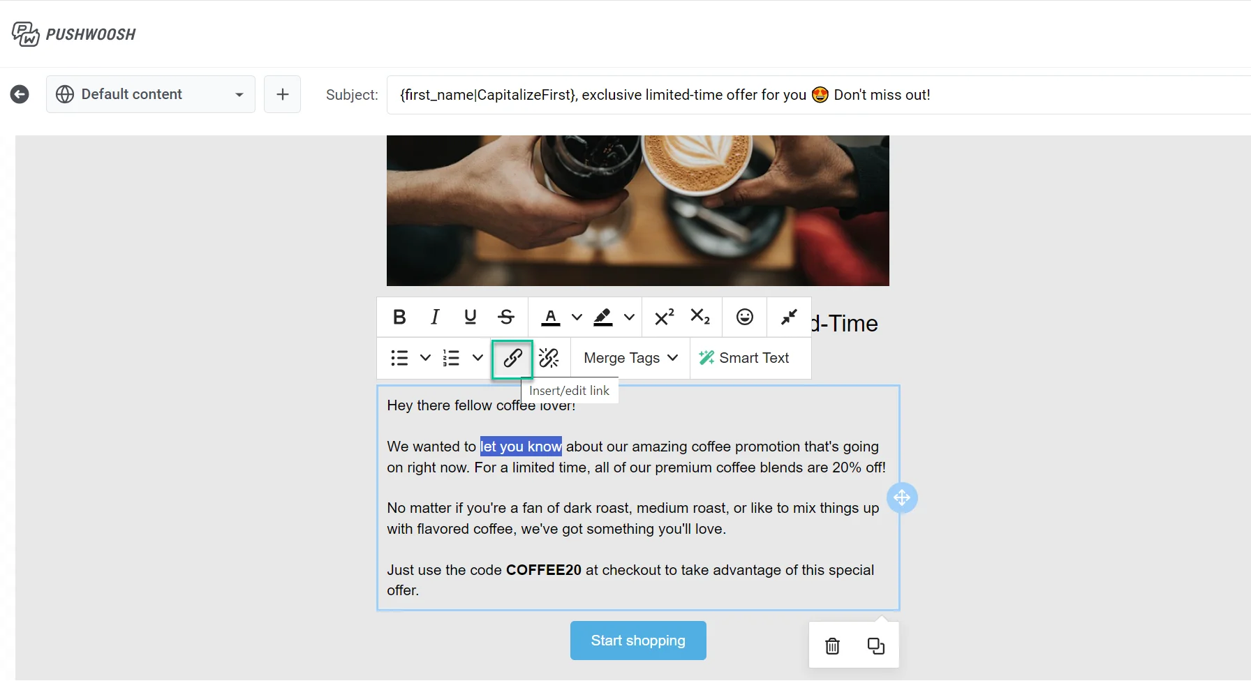
Click a **Heading** or **Text** block to edit its copy on the canvas. Select some text to bring up the formatting toolbar: bold, italic, underline, alignment, a link button, and a **text style** dropdown.
**Right panel**
Switch between three tabs:
* **Blocks:** add content to the email. See [Add content blocks](#add-content-blocks).
* **Settings:** apply styling to the whole email at once. See [Configure email-wide styling](#configure-email-wide-styling).
* **AI:** chat with the AI assistant to generate or edit content from a prompt.
## Start building your email
1. Drag a block from the **Blocks** panel onto the canvas, or click a block in the panel to add it at the end of the email.
2. Keep adding blocks the same way until the layout is ready.
3. Open the **Settings** tab when you need email-wide styling.
### Add content blocks
Open the **Blocks** tab and drag a block onto the canvas, or click a block to add it at the end of the email. Available blocks:
* **[Heading](#heading-and-text):** titles and short headlines in the email
* **[Text](#heading-and-text):** body copy and longer descriptions
* **[Button](#button):** a clickable call to action
* **[Image](#image):** pictures from [Media store](/product/content/media-store/), upload, or URL
* **[Card](#card):** an image paired with a heading, text, and button in one layout
* **[Divider](#divider):** a line that separates sections visually
* **[2 columns](#columns):** two equal columns side by side
* **[3 columns](#columns):** three equal columns side by side
* **[4 columns](#columns):** four equal columns side by side
* **[33 / 67](#columns):** two columns where the left takes about 33% of the width and the right about 67%
* **[67 / 33](#columns):** two columns where the left takes about 67% of the width and the right about 33%
* **[Timer](#countdown-timer):** a countdown for offers and deadlines
* **[Menu](#menu):** a row or column of links, such as navigation or contacts
* **[Social](#social):** icons that link to your social profiles
* **[HTML](#html):** custom HTML, such as a form, survey, or embedded video
#### Heading and text
**Heading** and **Text** blocks hold the copy recipients read in the email. Edit the text on the canvas and format it with the toolbar.
Click a **Heading** or **Text** block to edit its copy on the canvas. Select some text to bring up the formatting toolbar: bold, italic, underline, alignment, a link button, and a **text style** dropdown.
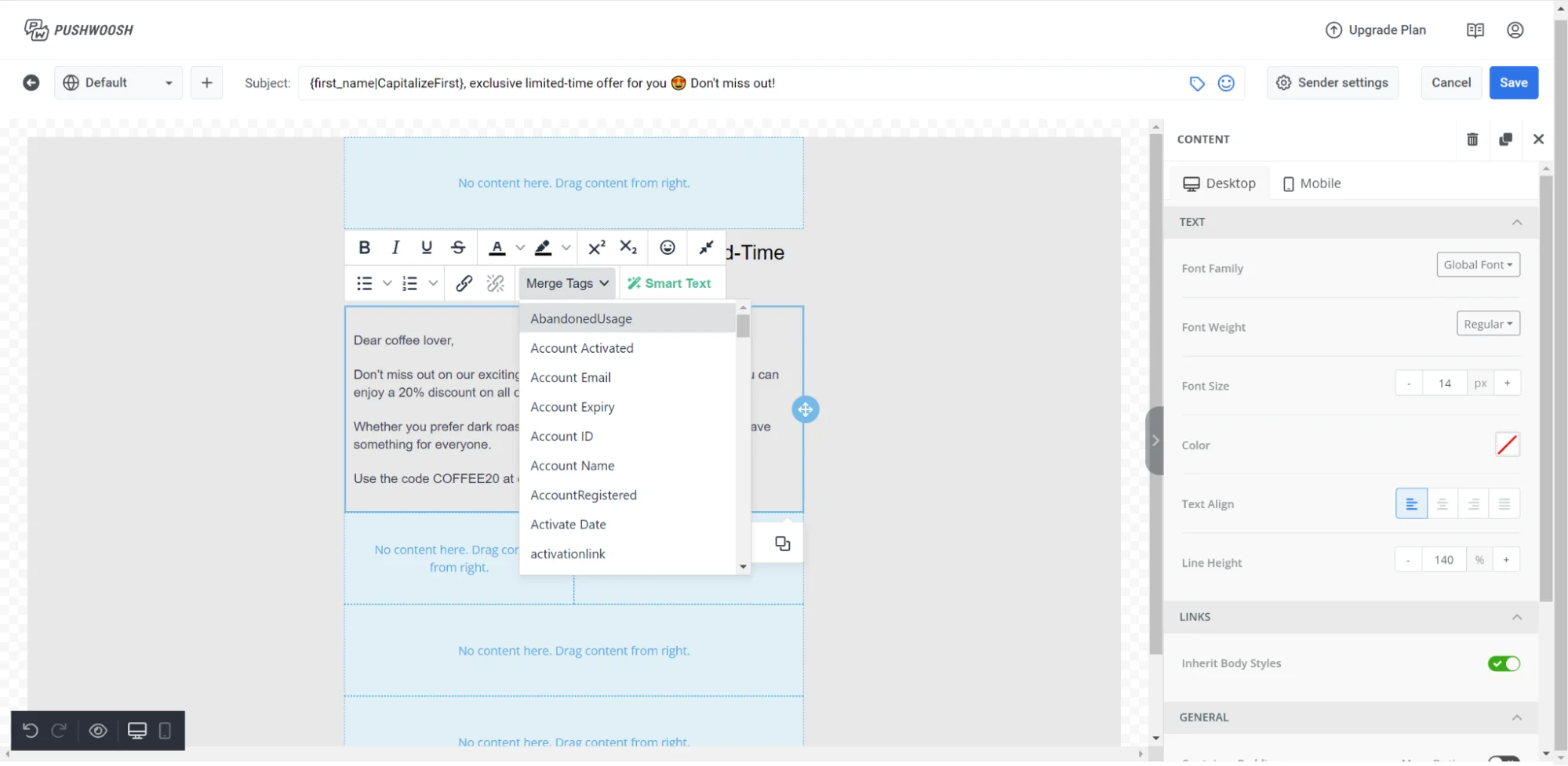 Merge Tags are placeholders that insert a [Tag](/product/audience-data-and-segmentation/user-data-tags/tags/) value from the recipient's profile into the email, so each subscriber sees personalized copy. To add one, select the text, click **Merge Tags** in the toolbar, and choose a Tag from your account.
#### Image
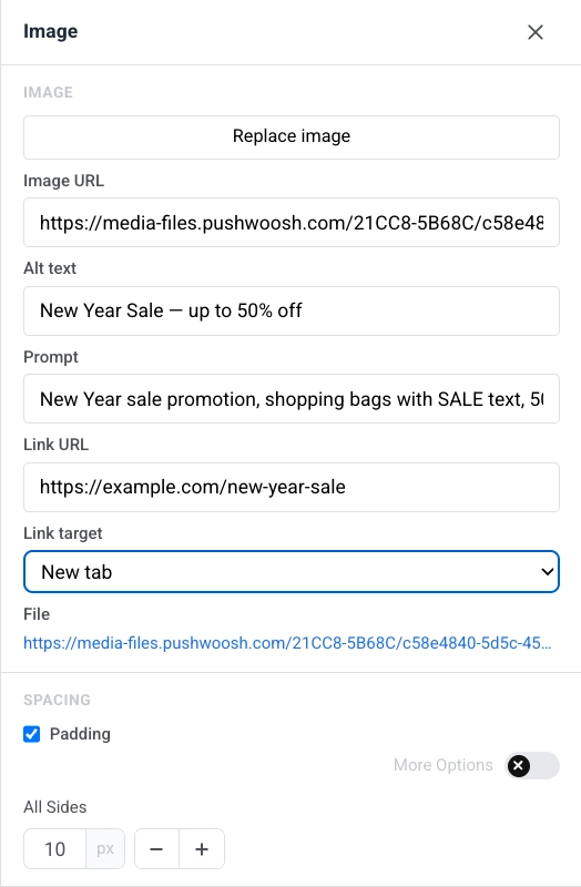
An **Image** block displays a picture in the email. Select it on the canvas to open the **Image** settings in the right panel.
* **Add image** / **Replace image:** click **Add image** when the block is empty, or **Replace image** when a picture is already set. You can upload a file or pick one from your [Media store](/product/content/media-store/).
* **Image URL:** paste a hosted link to the image.
* **Alt text:** describe the image for accessibility.
* **Link URL:** open a link when the image is clicked. See [Add links](#add-links) for the available link types.
* **Link target:** open the link in the same tab or a new one.
* **File:** after you add an image, shows the path of the file in use.
In **Spacing**, turn on **Padding** to add space around the image. Use **All sides** for the same padding on every side, or turn on **More options** to set each side separately.
Merge Tags are placeholders that insert a [Tag](/product/audience-data-and-segmentation/user-data-tags/tags/) value from the recipient's profile into the email, so each subscriber sees personalized copy. To add one, select the text, click **Merge Tags** in the toolbar, and choose a Tag from your account.
#### Image
An **Image** block displays a picture in the email. Select it on the canvas to open the **Image** settings in the right panel.
* **Add image** / **Replace image:** click **Add image** when the block is empty, or **Replace image** when a picture is already set. You can upload a file or pick one from your [Media store](/product/content/media-store/).
* **Image URL:** paste a hosted link to the image.
* **Alt text:** describe the image for accessibility.
* **Link URL:** open a link when the image is clicked. See [Add links](#add-links) for the available link types.
* **Link target:** open the link in the same tab or a new one.
* **File:** after you add an image, shows the path of the file in use.
In **Spacing**, turn on **Padding** to add space around the image. Use **All sides** for the same padding on every side, or turn on **More options** to set each side separately.
 #### Card
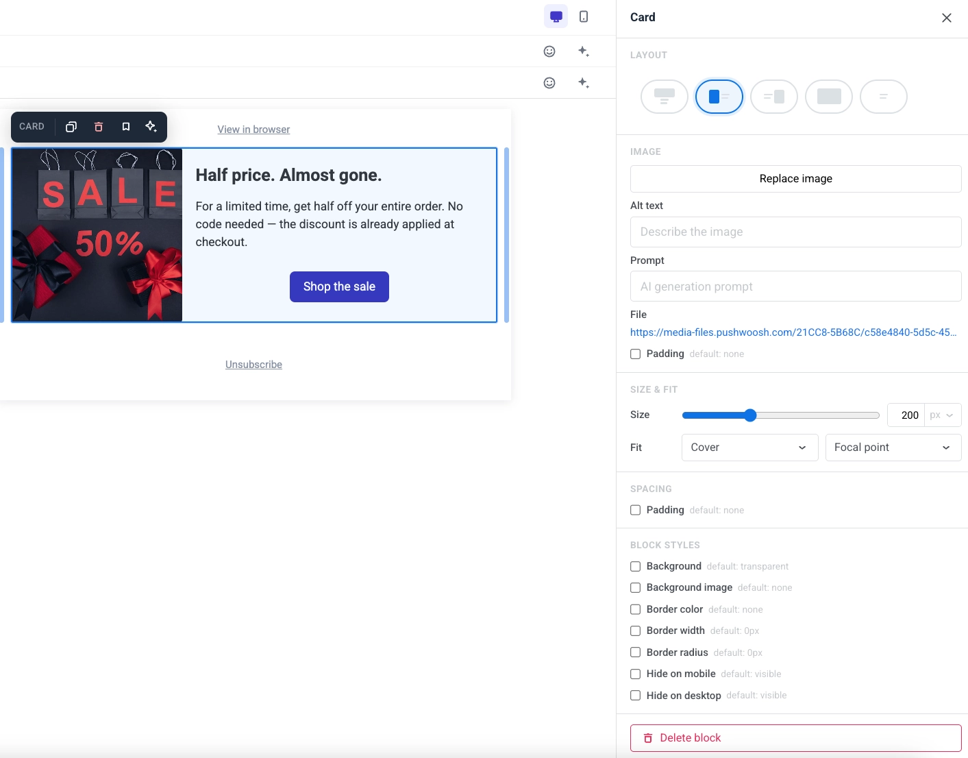
A **Card** block pairs an image with a heading, text, and button in a single ready-made layout. Select it on the canvas to open its settings in the right panel.
* **Layout:** choose which side the image sits on relative to the content.
* **Image:** replace the image, set alt text, and (for AI-generated images) edit the prompt used to create it.
* **Size & fit:** set the image size and how it fits and positions within its area.
* **Spacing:** set the padding around the card's content.
#### Card
A **Card** block pairs an image with a heading, text, and button in a single ready-made layout. Select it on the canvas to open its settings in the right panel.
* **Layout:** choose which side the image sits on relative to the content.
* **Image:** replace the image, set alt text, and (for AI-generated images) edit the prompt used to create it.
* **Size & fit:** set the image size and how it fits and positions within its area.
* **Spacing:** set the padding around the card's content.
 #### Button
A **Button** is a clickable call to action in the email.
Click a **Button** block to edit its label on the canvas. Use the toolbar to change font size, text color, bold, italic, underline, and alignment.
To set what happens when the recipient clicks the button:
* Click the link icon in the toolbar to open **Insert/Edit Link**.
* Or use **Action type** and **URL** in the **Link** section of the right panel.
#### Button
A **Button** is a clickable call to action in the email.
Click a **Button** block to edit its label on the canvas. Use the toolbar to change font size, text color, bold, italic, underline, and alignment.
To set what happens when the recipient clicks the button:
* Click the link icon in the toolbar to open **Insert/Edit Link**.
* Or use **Action type** and **URL** in the **Link** section of the right panel.
 See [Add links](#add-links) for the available action types.
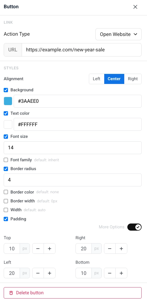
In the right panel, under **Styles**:
* **Alignment:** left, center, or right.
* **Background**, **Text color**, **Font size**, and **Font family:** turn each option on to override the default look.
* **Border radius**, **Border color**, and **Border width:** shape and outline of the button.
* **Width:** set a fixed button width or leave it automatic.
* **Padding:** add space inside the button. Use **All sides** for uniform padding, or turn on **More options** to set each side separately.
See [Add links](#add-links) for the available action types.
In the right panel, under **Styles**:
* **Alignment:** left, center, or right.
* **Background**, **Text color**, **Font size**, and **Font family:** turn each option on to override the default look.
* **Border radius**, **Border color**, and **Border width:** shape and outline of the button.
* **Width:** set a fixed button width or leave it automatic.
* **Padding:** add space inside the button. Use **All sides** for uniform padding, or turn on **More options** to set each side separately.
 #### Divider
A **Divider** is a horizontal line between content blocks. Use it to separate sections visually in the email.
Configure **line style** (Solid, Dashed, Dotted), **color**, **thickness**, and **width** in the settings panel.
#### Divider
A **Divider** is a horizontal line between content blocks. Use it to separate sections visually in the email.
Configure **line style** (Solid, Dashed, Dotted), **color**, **thickness**, and **width** in the settings panel.
 #### HTML
The **HTML** block lets you paste custom HTML into your email. Use it for a custom form, survey, or embedded video.
##### Examples
#### HTML
The **HTML** block lets you paste custom HTML into your email. Use it for a custom form, survey, or embedded video.
##### Examples
HTML code
```htmlGet your New Year Sale code
Enter your email and we'll send you an exclusive promo code for up to 50% off.
HTML code
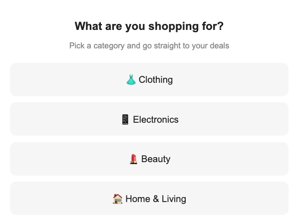
```htmlWhat are you shopping for?
Pick a category and go straight to your deals
👗 Clothing 📱 Electronics 💄 Beauty 🏠 Home & Living ```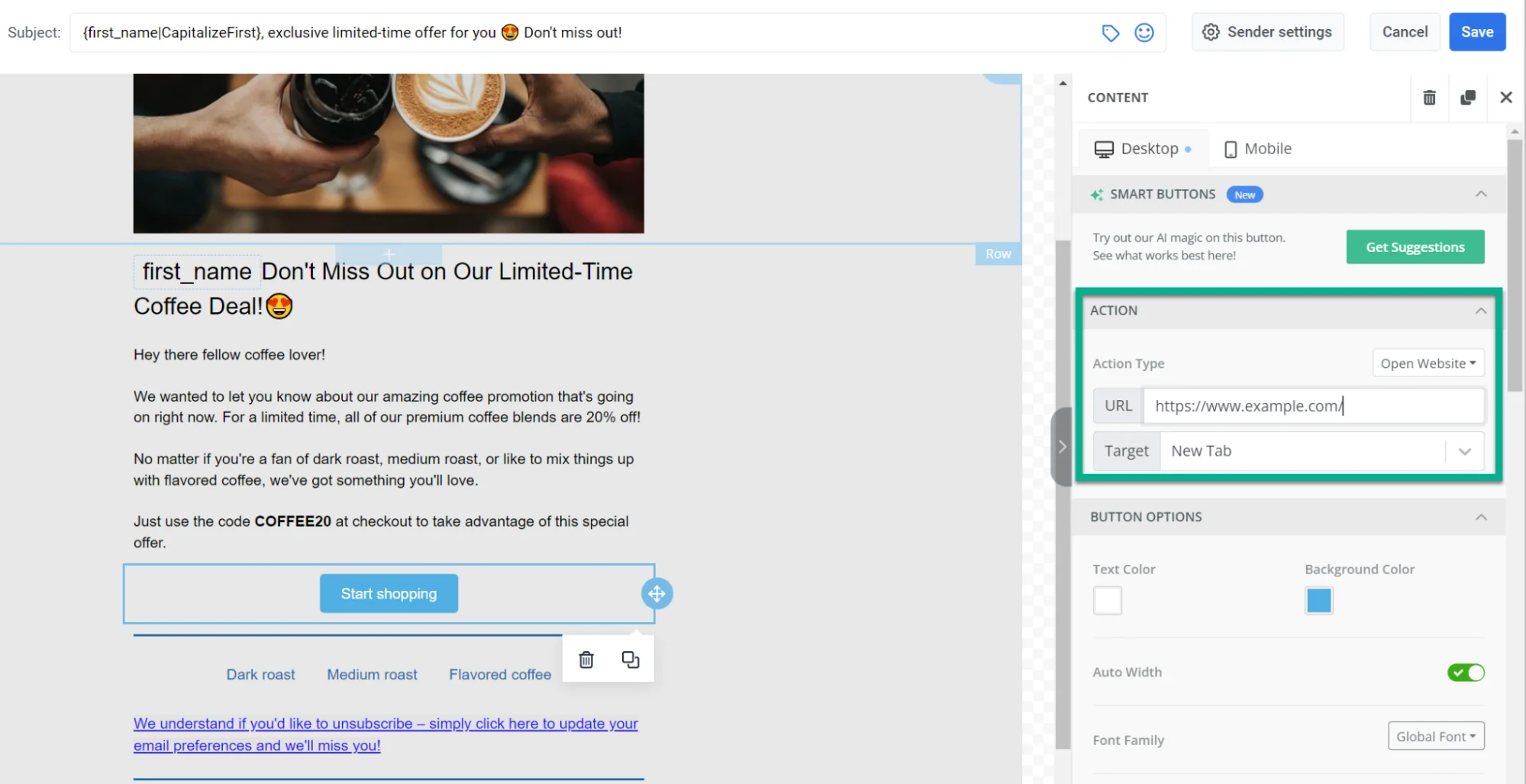 #### Social
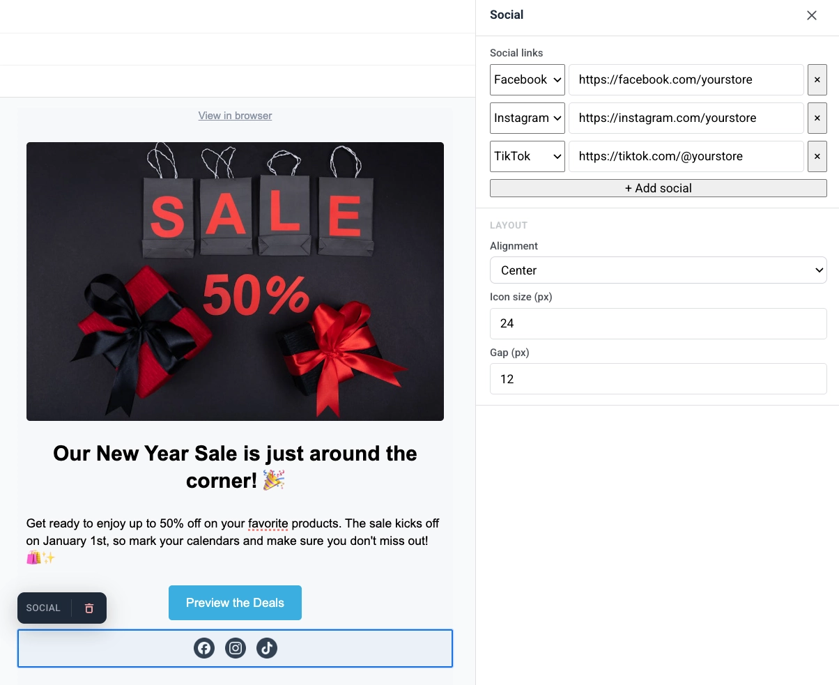
The **Social** block displays a row of social media icons that link to your profiles. Use it to send recipients to Facebook, Instagram, X, and other platforms from the email.
Add platform entries, then set alignment, icon size, and the gap between icons.
#### Social
The **Social** block displays a row of social media icons that link to your profiles. Use it to send recipients to Facebook, Instagram, X, and other platforms from the email.
Add platform entries, then set alignment, icon size, and the gap between icons.
 #### Countdown timer
The **Timer** block is a countdown in the email. Use it for limited-time offers, flash sales, and event reminders.
To set it up:
1. In **Countdown**, set **End date** and **End time**, then choose the **Timezone** and **Language** for the timer labels.
2. Turn **Labels** on to show "days / hours / minutes / seconds" captions under the digits, or off for numbers only.
3. In **Appearance**, set **Background**, **Digits color**, **Labels color**, and the font size for digits (default 40px) and labels (default 16px).
4. Adjust **Spacing** (padding) as needed.
#### Countdown timer
The **Timer** block is a countdown in the email. Use it for limited-time offers, flash sales, and event reminders.
To set it up:
1. In **Countdown**, set **End date** and **End time**, then choose the **Timezone** and **Language** for the timer labels.
2. Turn **Labels** on to show "days / hours / minutes / seconds" captions under the digits, or off for numbers only.
3. In **Appearance**, set **Background**, **Digits color**, **Labels color**, and the font size for digits (default 40px) and labels (default 16px).
4. Adjust **Spacing** (padding) as needed.
 #### Columns
**Columns** split the canvas into side-by-side sections so you can place content next to each other in one row.
Drag one of these blocks onto the canvas:
* **2 columns:** two equal columns
* **3 columns:** three equal columns
* **4 columns:** four equal columns
* **33 / 67:** left column about 33% wide, right about 67%
* **67 / 33:** left column about 67% wide, right about 33%
Then add content to each column. To change spacing for all columns in the email, open **Settings** → **Columns defaults** and adjust outer padding, column padding, and the gap between columns.
### Save and reuse blocks
Save a block to reuse it in this or other emails instead of rebuilding it each time.
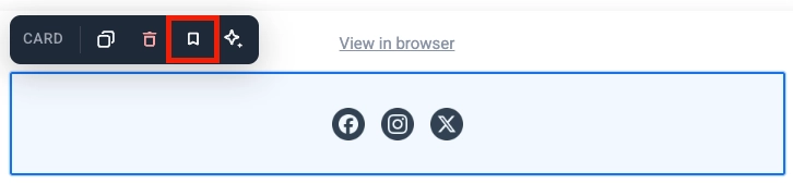
1. Click the block itself (its frame or background, not the text or button inside it) to select the whole block. Card, Columns, and Social are examples of blocks that work this way.
2. Click the bookmark icon in the block's toolbar and give it a name.
#### Columns
**Columns** split the canvas into side-by-side sections so you can place content next to each other in one row.
Drag one of these blocks onto the canvas:
* **2 columns:** two equal columns
* **3 columns:** three equal columns
* **4 columns:** four equal columns
* **33 / 67:** left column about 33% wide, right about 67%
* **67 / 33:** left column about 67% wide, right about 33%
Then add content to each column. To change spacing for all columns in the email, open **Settings** → **Columns defaults** and adjust outer padding, column padding, and the gap between columns.
### Save and reuse blocks
Save a block to reuse it in this or other emails instead of rebuilding it each time.
1. Click the block itself (its frame or background, not the text or button inside it) to select the whole block. Card, Columns, and Social are examples of blocks that work this way.
2. Click the bookmark icon in the block's toolbar and give it a name.
 Saved blocks appear under **Saved blocks** at the bottom of the **Blocks** tab.
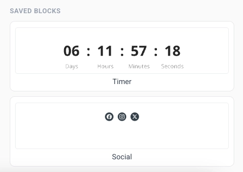 * Drag a saved block onto the canvas, or click it to add it at the end of the email.
* Click the **×** on a saved block's tile to delete it.
## Edit the mobile view
Once you've added your content blocks, switch to mobile to check and adjust how they look on a phone. Next to the language switcher above the canvas, use the **Desktop / Mobile** toggle to switch into a fully editable mobile view at real phone width. Select, edit, and rearrange content exactly the way your subscribers will see it on their phone, instead of just previewing how the desktop layout adapts.
Every mobile-overridable setting has a checkbox next to it. When the checkbox is off, a hint shows the inherited desktop value, and the setting keeps using it. Turn the checkbox on to set a separate value for mobile. Turn it off again to fall back to the desktop value.
### Set different padding and font size per device
* **Padding:** every block, column, card, and individual element (such as text, an image, or a button) has a padding control you can override for mobile. Switch the canvas to **Mobile**, turn on the checkbox next to **Padding**, and set the new value. The desktop padding stays the same until you turn the checkbox on.
* **Font size:** turn on **Font size (mobile)** on a text element to set a size just for mobile. Without this override, large headlines shrink automatically to fit the phone screen.
### Control how columns stack on mobile
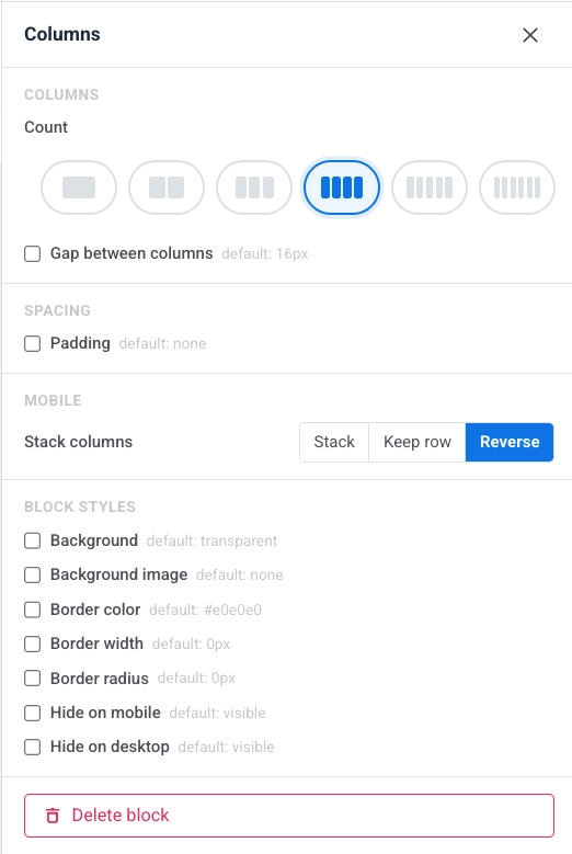
[Columns](#columns) layouts stack vertically on phones by default. In the mobile view, use **Stack columns** to set how each Columns block behaves:
* **Stack:** columns flow into a single column, top to bottom (default).
* **Keep row:** columns stay side by side, preserving the desktop layout.
* **Reverse:** columns stack in reverse order. Useful for image + text rows: keep the image on the right on desktop, but show it on top on mobile.
* Drag a saved block onto the canvas, or click it to add it at the end of the email.
* Click the **×** on a saved block's tile to delete it.
## Edit the mobile view
Once you've added your content blocks, switch to mobile to check and adjust how they look on a phone. Next to the language switcher above the canvas, use the **Desktop / Mobile** toggle to switch into a fully editable mobile view at real phone width. Select, edit, and rearrange content exactly the way your subscribers will see it on their phone, instead of just previewing how the desktop layout adapts.
Every mobile-overridable setting has a checkbox next to it. When the checkbox is off, a hint shows the inherited desktop value, and the setting keeps using it. Turn the checkbox on to set a separate value for mobile. Turn it off again to fall back to the desktop value.
### Set different padding and font size per device
* **Padding:** every block, column, card, and individual element (such as text, an image, or a button) has a padding control you can override for mobile. Switch the canvas to **Mobile**, turn on the checkbox next to **Padding**, and set the new value. The desktop padding stays the same until you turn the checkbox on.
* **Font size:** turn on **Font size (mobile)** on a text element to set a size just for mobile. Without this override, large headlines shrink automatically to fit the phone screen.
### Control how columns stack on mobile
[Columns](#columns) layouts stack vertically on phones by default. In the mobile view, use **Stack columns** to set how each Columns block behaves:
* **Stack:** columns flow into a single column, top to bottom (default).
* **Keep row:** columns stay side by side, preserving the desktop layout.
* **Reverse:** columns stack in reverse order. Useful for image + text rows: keep the image on the right on desktop, but show it on top on mobile.
 ### Show or hide content per device
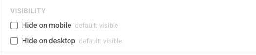
Open a block or element's settings and use **Hide on mobile** or **Hide on desktop** under **Visibility** to show it on only one device, so you can build device-specific banners, CTAs, or navigation without maintaining two templates.
### Show or hide content per device
Open a block or element's settings and use **Hide on mobile** or **Hide on desktop** under **Visibility** to show it on only one device, so you can build device-specific banners, CTAs, or navigation without maintaining two templates.
 ## Add links
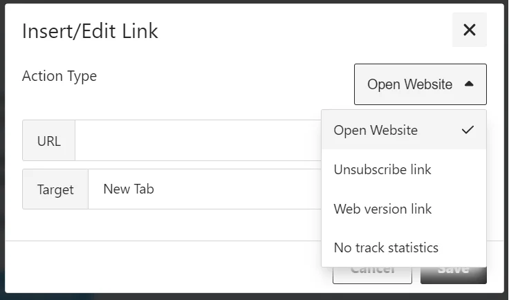
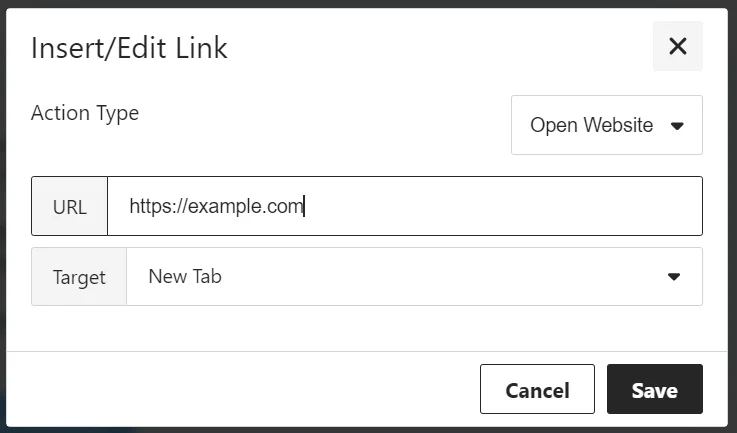
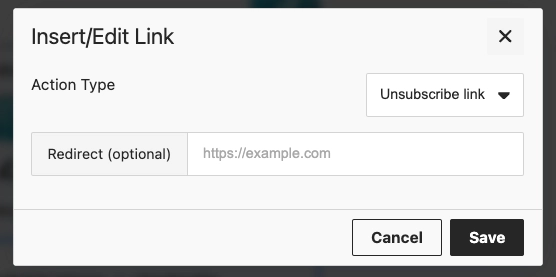
Use the **Insert/Edit Link** dialog to set what happens when a recipient clicks a button or selected text. Choose an **Action type**, then fill in the fields for that action.
#### Open Website
Opens a link when the recipient clicks. Enter the address in **URL**.
## Add links
Use the **Insert/Edit Link** dialog to set what happens when a recipient clicks a button or selected text. Choose an **Action type**, then fill in the fields for that action.
#### Open Website
Opens a link when the recipient clicks. Enter the address in **URL**.
 #### Manage preferences link
Adds a link to the [subscription preference center](/product/messaging-channels/emails/email-preferences/#optional-setup-full-preference-center) where recipients can choose which email categories they receive. The link is inserted automatically.
#### Manage preferences link
Adds a link to the [subscription preference center](/product/messaging-channels/emails/email-preferences/#optional-setup-full-preference-center) where recipients can choose which email categories they receive. The link is inserted automatically.
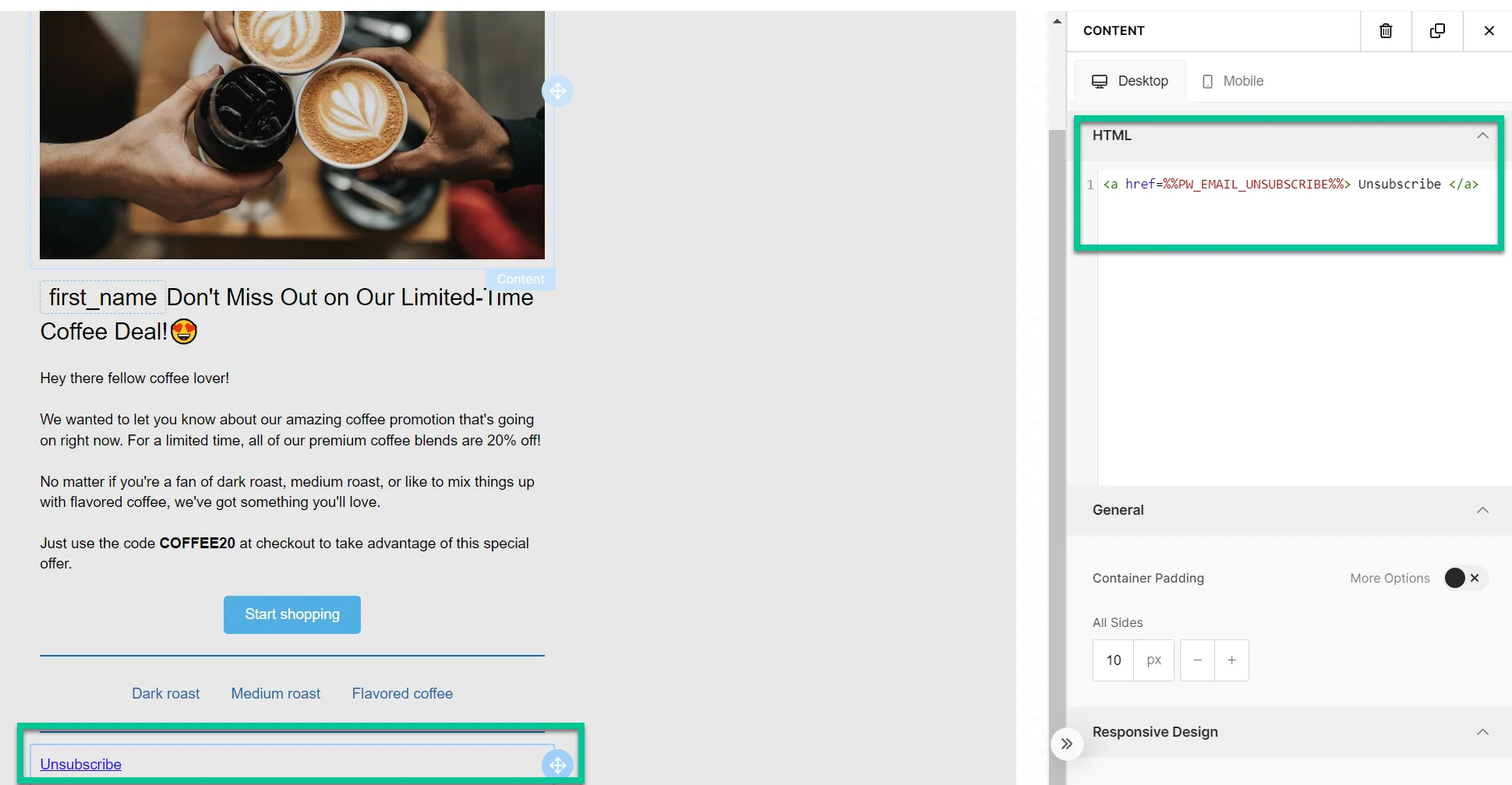
 #### Unsubscribe link
Lets recipients opt out in line with regulations and their preferences.
#### Unsubscribe link
Lets recipients opt out in line with regulations and their preferences.
 ##### What happens when the recipient clicks the unsubscribe link
###### If the subscription preference center is enabled
The recipient is unsubscribed only from the category assigned to that email (e.g., *Newsletter*). The category name is added to their [**Unsubscribed Email Categories**](/product/messaging-channels/emails/email-preferences/#how-opt-outs-are-stored) tag.
A confirmation screen appears with **Resubscribe** and **Manage preferences** options. [Learn more](/product/messaging-channels/emails/email-preferences/#default-behavior-unsubscribe-from-a-category).
###### If the subscription preference center is not enabled
The recipient is opted out of all marketing emails and the [**Unsubscribed Emails**](/product/audience-data-and-segmentation/user-data-tags) tag is set to `true`. Transactional emails are not affected and will continue to be delivered. [Learn more about message types](/product/messaging-channels/marketing-vs-transactional/).
Clicks are counted in the unsubscribe rate in [Message History](/product/statistics-and-analytics/message-history).
#### Web version link
Gives recipients access to a web version of the email, useful if they have trouble viewing it in their inbox.
##### What happens when the recipient clicks the unsubscribe link
###### If the subscription preference center is enabled
The recipient is unsubscribed only from the category assigned to that email (e.g., *Newsletter*). The category name is added to their [**Unsubscribed Email Categories**](/product/messaging-channels/emails/email-preferences/#how-opt-outs-are-stored) tag.
A confirmation screen appears with **Resubscribe** and **Manage preferences** options. [Learn more](/product/messaging-channels/emails/email-preferences/#default-behavior-unsubscribe-from-a-category).
###### If the subscription preference center is not enabled
The recipient is opted out of all marketing emails and the [**Unsubscribed Emails**](/product/audience-data-and-segmentation/user-data-tags) tag is set to `true`. Transactional emails are not affected and will continue to be delivered. [Learn more about message types](/product/messaging-channels/marketing-vs-transactional/).
Clicks are counted in the unsubscribe rate in [Message History](/product/statistics-and-analytics/message-history).
#### Web version link
Gives recipients access to a web version of the email, useful if they have trouble viewing it in their inbox.
 #### No track statistics
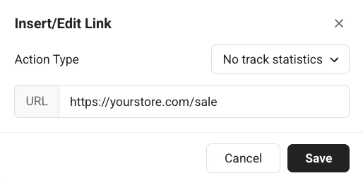
Opens a link when the recipient clicks, without counting the click toward your email's click statistics. Enter the address in **URL**.
#### No track statistics
Opens a link when the recipient clicks, without counting the click toward your email's click statistics. Enter the address in **URL**.
 #### Subscription form confirmation link
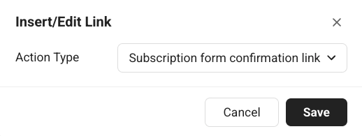
Inserts a confirmation link for a subscription form submission (for example, to confirm a double opt-in). [Learn more about double opt-in](/product/audience-data-and-segmentation/subscription-forms/double-opt-in/).
#### Subscription form confirmation link
Inserts a confirmation link for a subscription form submission (for example, to confirm a double opt-in). [Learn more about double opt-in](/product/audience-data-and-segmentation/subscription-forms/double-opt-in/).
 ## Configure email-wide styling
Email settings control styling for the whole email: document size and background, sender-facing options, and default styles for blocks.
Open the **Settings** tab in the right-hand panel.
Available sections:
* **Document:** size and look of the whole email area: width, padding, background color, background image or gradient, text color, font family, and the gap between blocks.
* **Email options:** turn **View in browser** and **Unsubscribe link** on or off for the email.
* **Block defaults:** starting background, background image, border color, border width, border radius, and default mobile/desktop visibility for blocks you add later, so new content matches the email until you override a block on the canvas.
* **Columns defaults:** spacing for every Columns layout: outer padding, padding inside each column, and the gap between columns.
* **Card defaults:** starting look for Card containers that group content in the layout, applied until you style a card individually.
* **Button group defaults:** spacing and alignment when several buttons sit together as a group.
* **Button defaults:** starting look for new Button blocks so CTAs stay consistent across the email until you style one separately.
* **Divider defaults:** starting line style, color, thickness, and width for new Divider blocks.
Defaults apply wherever an individual block does not override them.
## Configure the email footer
Every email includes a **Footer** block for the legally required sender information and unsubscribe link. Select **Footer** in the **Layers panel** to open its settings.
## Configure email-wide styling
Email settings control styling for the whole email: document size and background, sender-facing options, and default styles for blocks.
Open the **Settings** tab in the right-hand panel.
Available sections:
* **Document:** size and look of the whole email area: width, padding, background color, background image or gradient, text color, font family, and the gap between blocks.
* **Email options:** turn **View in browser** and **Unsubscribe link** on or off for the email.
* **Block defaults:** starting background, background image, border color, border width, border radius, and default mobile/desktop visibility for blocks you add later, so new content matches the email until you override a block on the canvas.
* **Columns defaults:** spacing for every Columns layout: outer padding, padding inside each column, and the gap between columns.
* **Card defaults:** starting look for Card containers that group content in the layout, applied until you style a card individually.
* **Button group defaults:** spacing and alignment when several buttons sit together as a group.
* **Button defaults:** starting look for new Button blocks so CTAs stay consistent across the email until you style one separately.
* **Divider defaults:** starting line style, color, thickness, and width for new Divider blocks.
Defaults apply wherever an individual block does not override them.
## Configure the email footer
Every email includes a **Footer** block for the legally required sender information and unsubscribe link. Select **Footer** in the **Layers panel** to open its settings.
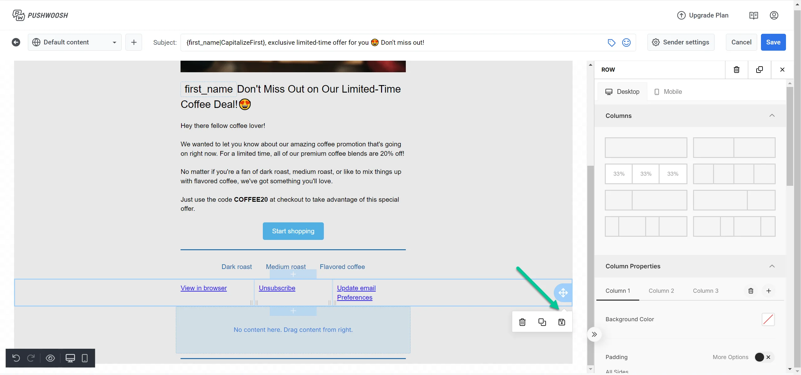 Use **Load from account** to pull in your saved account-level footer, or **Save as account default** to reuse the current footer as the starting point for future emails.
* **Email type:** **Marketing** or **Transactional**. Unsubscribe visibility follows this setting.
* **Logo:** set the logo URL or pick one from the gallery, then set the width in px and an optional click-through link.
* **Company name**, **Postal address**, and **Copyright:** your sender identity in the footer.
In **Links & badges**:
* **Footer links:** add labeled links, such as Privacy Policy or Terms.
* **App store badges:** add App Store or Google Play badges with destination URLs.
* **Social links:** add icons that link to your social profiles.
Use **Load from account** to pull in your saved account-level footer, or **Save as account default** to reuse the current footer as the starting point for future emails.
* **Email type:** **Marketing** or **Transactional**. Unsubscribe visibility follows this setting.
* **Logo:** set the logo URL or pick one from the gallery, then set the width in px and an optional click-through link.
* **Company name**, **Postal address**, and **Copyright:** your sender identity in the footer.
In **Links & badges**:
* **Footer links:** add labeled links, such as Privacy Policy or Terms.
* **App store badges:** add App Store or Google Play badges with destination URLs.
* **Social links:** add icons that link to your social profiles.
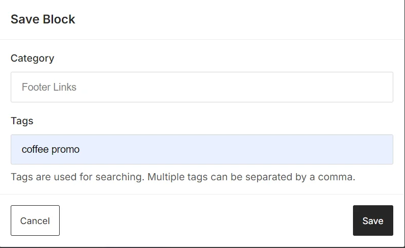 In **Style**:
* **Text color:** set the footer text color.
* **Font size (px):** set the footer font size.
* **Alignment:** left, center, or right.
* **Underline links:** turn on to underline footer links.
In **Options**:
* **Unsubscribe link text:** the label for the managed unsubscribe link on marketing emails. Transactional emails omit it.
## Localize your email content
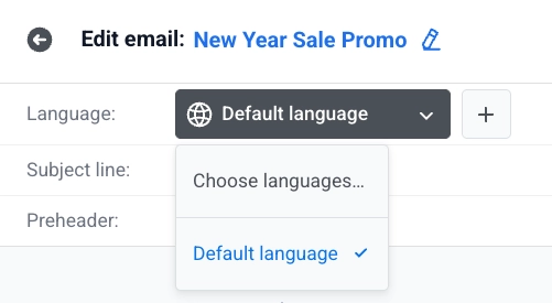
Use the language switcher above the canvas to add languages and edit content per language. [Learn how to add languages](/product/content/email-content/set-up-your-email-in-the-editor/#define-the-languages-you-want-to-use-in-your-email).
Content you haven't translated yet for the current language shows dimmed. Start typing to create the translation. The default language keeps showing until you do.
In **Style**:
* **Text color:** set the footer text color.
* **Font size (px):** set the footer font size.
* **Alignment:** left, center, or right.
* **Underline links:** turn on to underline footer links.
In **Options**:
* **Unsubscribe link text:** the label for the managed unsubscribe link on marketing emails. Transactional emails omit it.
## Localize your email content
Use the language switcher above the canvas to add languages and edit content per language. [Learn how to add languages](/product/content/email-content/set-up-your-email-in-the-editor/#define-the-languages-you-want-to-use-in-your-email).
Content you haven't translated yet for the current language shows dimmed. Start typing to create the translation. The default language keeps showing until you do.
 ## Save your email
Click **Save** in the top bar to save your changes. Use **Undo**/**Redo** in the top bar to step back and forward through your edits.
## Send a test email
Before sending your email campaign, you can send a test email to preview how the content will appear in recipients' inboxes.
1. Open the **⋮** menu in the top bar and select **Test email**.
## Save your email
Click **Save** in the top bar to save your changes. Use **Undo**/**Redo** in the top bar to step back and forward through your edits.
## Send a test email
Before sending your email campaign, you can send a test email to preview how the content will appear in recipients' inboxes.
1. Open the **⋮** menu in the top bar and select **Test email**.
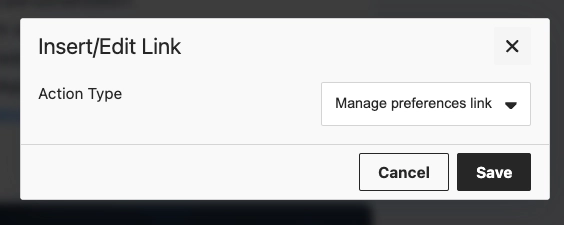 2. In the window that opens, pick a saved [test device](/developer/first-steps/test-your-integration/test-devices/) or type any email address.
 3. Click **Send** to send the test message to the address you chose.
## Use your saved email content
Now that your email content is ready, it can be used in email campaigns. [Learn more about how to use it](/product/messaging-channels/emails/sending-emails)
3. Click **Send** to send the test message to the address you chose.
## Use your saved email content
Now that your email content is ready, it can be used in email campaigns. [Learn more about how to use it](/product/messaging-channels/emails/sending-emails)