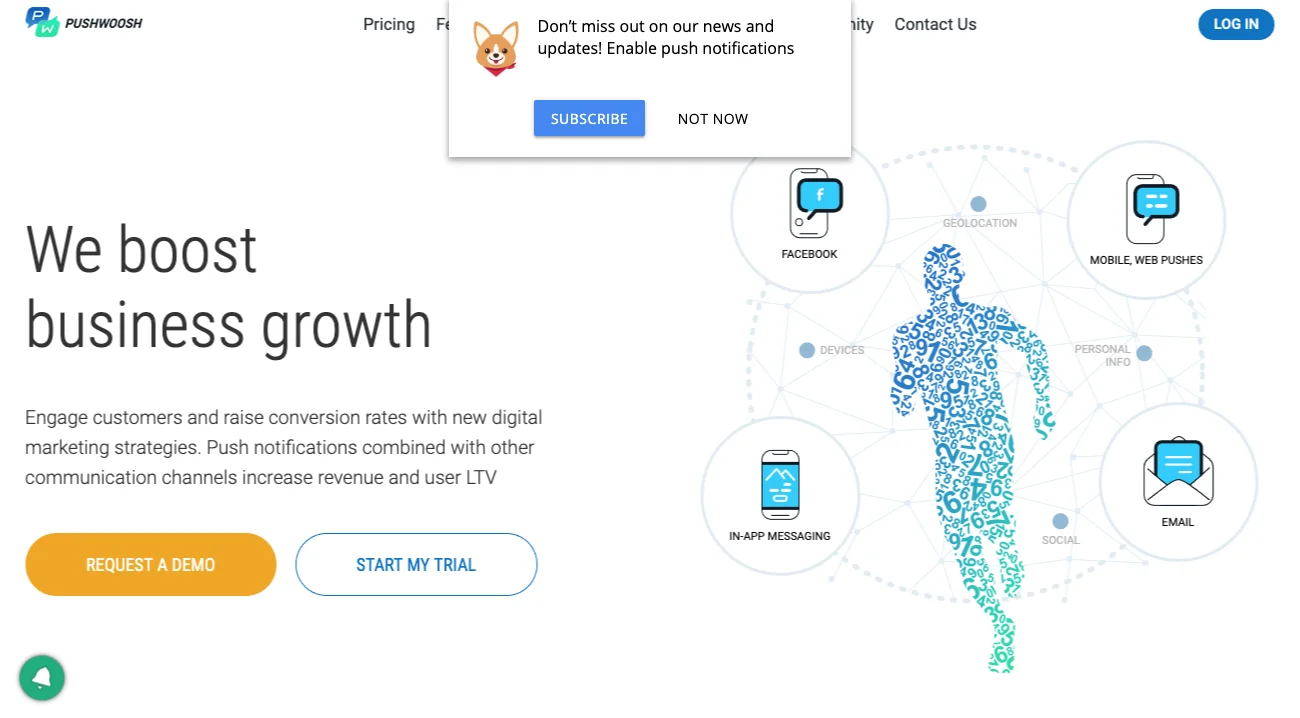
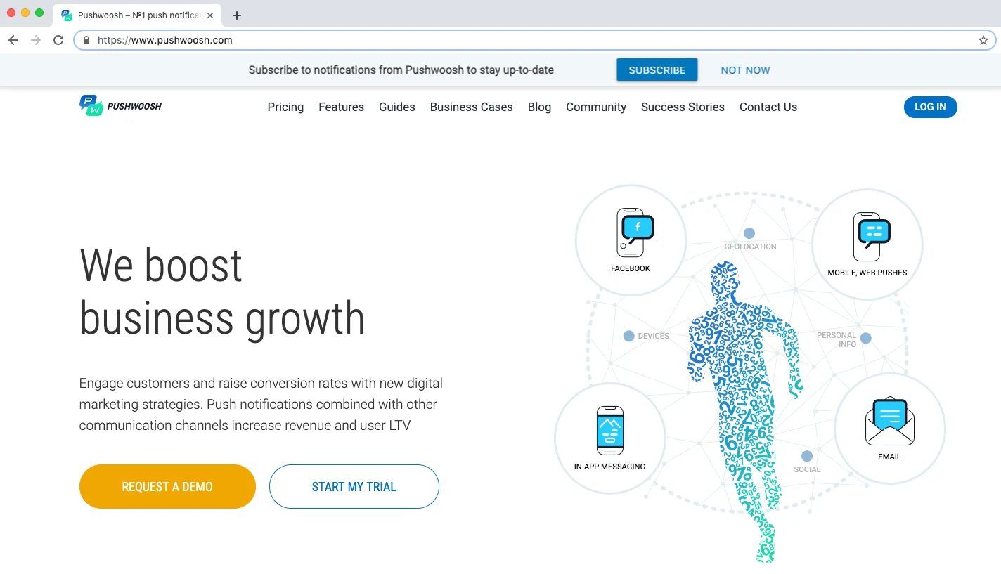
Custom subscription Popup
Custom Subscription Popup is a pop-up window displayed on the web page and suggesting users to subscribe to web push notifications. It’s implemented with Pushwoosh WebSDK and allows to overcome the browser restrictions on a native subscription prompts displaying. A native subscription popup can be shown to a particular user only twice. If a user doesn’t allow push notifications and closes the native subscription popup two times in a row, it won’t be shown again and push notifications are considered blocked. A Custom Subscription Popup in its turn can be displayed as many times as needed unless a user subscribes to or blocks push notifications explicitly.
A Custom Subscription Popup can contain any text explaining the advantages of subscription to push notifications and two customizable buttons — a one for an “Ask later” option and a one for “Subscribe.”
Once a user presses a “Subscribe” button, a native subscription popup appears.
When a user presses an “Ask Later” button or simply closes the window, the Custom Subscription Popup will appear again in a specified time (by default, in a week after; a delay to retry can be customized via the “retryOffset” parameter).
Implementation
Anchor link toTo enable and customize a Custom Subscription Popup, use the following script while initializing Pushwoosh WebSDK:
Pushwoosh.push('init', {    // . . .,    subscribePopup: {        enable: true,                      // (boolean) popup activation        text: 'Text on popup',             // (string) a text to display on the popup        confirmSubscriptionButtonText: 'Subscribe', // (string) custom text for the “Subscribe” button
        manualToggle: false,               // (boolean) manual control for showing the popup        delay: 60,                         // (integer) a delay between the page loading and popup appearance        retryOffset: 604800,               // (integer) an offset in seconds to display the popup again
        iconUrl: 'https://...',            // (string) custom icon URL        iconAlt: 'Descriptive text for your icon', // (string) ALT text for the icon        overlay: false,                    // (boolean) enables page overlaying when popup is displayed        position: 'top',                   // (string) position on the page. Possible values: ’top' | 'center' | 'bottom’        mobileViewMargin: '10px',          // (string) margin for mobile view
        bgColor: '#fff',                   // (string) popup’s background color        borderColor: 'transparent',        // (string) popup’s border color        boxShadow: '0 3px 6px rgba(0,0,0,0.16)', // (string) popup’s shadow
        textColor: '#000',                 // (string) popup’s text color        textSize: 'inherit',               // (string) popup’s text size        textWeight: 'normal',              // (string) popup’s text weight        fontFamily: 'inherit',             // (string) popup’s text font
        subscribeBtnBgColor: '#4285f4',         // (string) “Subscribe” button’s background color        subscribeBtnTextColor: '#fff',          // (string) “Subscribe” button text’s color        subscribeBtnTextWeight: 'bold',         // (string) “Subscribe” button text weight        subscribeBtnBorderColor: 'transparent', // (string) “Subscribe” button border color        subscribeBtnBorderRadius: '4px',        // (string) “Subscribe” button border radius
        askLaterButtonText: 'Not now',          // (string) custom text for the “Ask later” button        askLaterBtnBgColor: 'transparent',      // (string) “Ask later” button’s background color        askLaterBtnTextColor: '#000',           // (string) “Ask later” button text’s color        askLaterBtnBorderColor: 'transparent',  // (string) “Ask later” button border color        askLaterBtnBorderRadius: '4px',         // (string) “Ask later” button border radius        askLaterBtnTextWeight: 'normal',        // (string) “Ask later” button text weight
        theme: 'material',               // (string) popup theme, possible values: 'material' | 'topbar'        viewport: 'desktop'              // (string) target viewport, possible values: 'desktop' | 'mobile'    }});
Accessing the Custom Subscription Popup Instance
Anchor link toThe Custom Subscription Popup instance is available via Pushwoosh.moduleRegistry.subscribePopup.
Note: This instance becomes accessible only after the subscribe-popup-ready event is triggered. However, it will not be available if the user is already subscribed to push notifications.
The instance provides a toggle() method that allows you to manually show or hide the popup:
// Show or hide the Custom Subscription Popup manuallyPushwoosh.moduleRegistry.subscribePopup.toggle(); // Toggles visibilityPushwoosh.moduleRegistry.subscribePopup.toggle(true); // Shows the popupPushwoosh.moduleRegistry.subscribePopup.toggle(false); // Hides the popupThis allows for more control over the popup’s behavior directly from your code.
Themes
Anchor link toBy default, the Subscription Popup uses a ‘material’ theme and overlays some part of a screen when shown, thus hiding some content from a website visitor.
To avoid hiding valuable content by the Subscription Popup, use the ‘topbar’ theme so that the popup is shown as a narrow bar on the top of the screen.
Custom Subscription Popup Events
Anchor link toThe following events are available for tracking interactions with the Custom Subscription Popup:
// Executed when the custom subscription popup is loaded and ready to be shown// Note: This event will NOT trigger if the user is already subscribed to push notifications.Pushwoosh.addEventHandler('subscribe-popup-ready', function() {  console.log("Triggered event: subscribe-popup-ready");});
// Executed when the custom subscription popup is shownPushwoosh.addEventHandler('subscribe-popup-show', function() {  console.log("Triggered event: subscribe-popup-show");});
// Executed when a user clicks on the 'Subscribe' button in the pop-up windowPushwoosh.addEventHandler('subscribe-popup-accept', function() {  console.log("Triggered event: subscribe-popup-accept");});
// Executed when a user clicks on the 'Ask later' button in the pop-up windowPushwoosh.addEventHandler('subscribe-popup-decline', function() {  console.log("Triggered event: subscribe-popup-decline");});
// Executed when the popup hidesPushwoosh.addEventHandler('subscribe-popup-hide', function() {  console.log("Triggered event: subscribe-popup-hide");});