# iOS push primer
A push primer is a soft opt-in dialog you show **before** the iOS system push permission prompt. iOS shows the system prompt only once per install — if the user taps **Don't Allow**, push is lost until they re-enable it in Settings. The primer lets you explain the value first and ask at the right moment, so you spend the one-shot system prompt on users who already said yes.
Available since version 7.1.1. The primer is part of `PushwooshFramework`; no extra module is required.
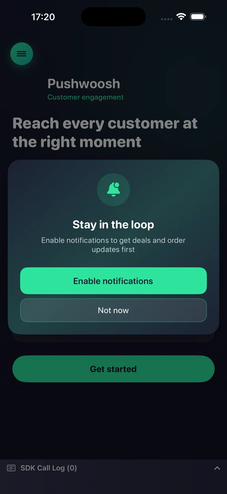
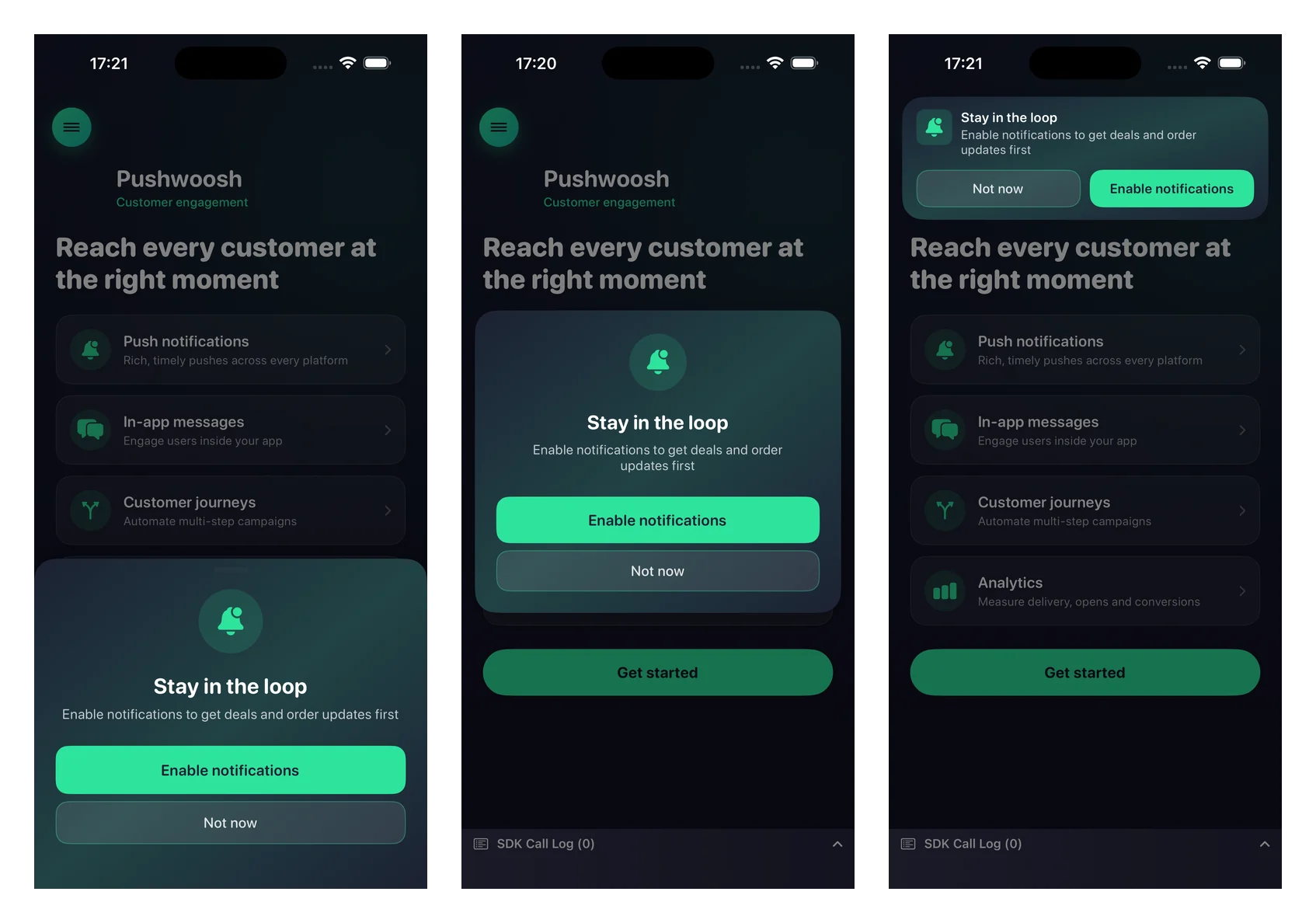
Push primer shown before the iOS system permission prompt
## How it works
The primer is fully state-aware. It reads the current notification authorization status and decides what to do, so it is safe to call on every launch:
- **Not determined** — shows the primer; on accept it triggers the system permission prompt.
- **Authorized or provisional** — silently suppresses the primer (nothing is shown).
- **Denied** — shows the primer; on accept it routes the user to the app's notification settings (when `fallbackToSettings` is enabled).
You decide **when** to call the primer (for example after onboarding or after a key action). The SDK does not impose any timing of its own, except for the optional `minInterval` throttle described below.
## Basic usage
Configure the primer with a fluent builder and call `present`. The minimum setup needs a title, a message, and the two button titles.
```swift
import PushwooshFramework
Pushwoosh.configure.pushPrimer
.title("Stay in the loop")
.message("Get notified about deals and order updates first")
.acceptButton("Enable notifications")
.declineButton("Not now")
.present()
```
## Styles and positions
Use `style` to choose between a system alert and a custom sheet, and `position` to place the custom sheet. Each position has its own default design.
| Value | Description |
|-------|-------------|
| `.alert` | System `UIAlertController`. Position is ignored. |
| `.sheet` + `.bottom` | Bottom sheet that slides up, with a grabber and full-width buttons (default). |
| `.sheet` + `.top` | Compact banner that drops in from the top, like a notification. |
| `.sheet` + `.center` | Centered dialog that scales and fades in. |
```swift
Pushwoosh.configure.pushPrimer
.style(.sheet)
.position(.top)
.title("Stay in the loop")
.message("Get notified about deals and order updates first")
.acceptButton("Enable notifications")
.declineButton("Not now")
.present()
```
## Customization
All visual settings are optional — omit them to use the native defaults that adapt to light and dark mode.
```swift
Pushwoosh.configure.pushPrimer
.style(.sheet)
.position(.center)
.title("Stay in the loop")
.message("Get notified about deals and order updates first")
.acceptButton("Enable notifications")
.declineButton("Not now")
.image(UIImage(named: "PrimerHero")) // local image, or .imageURL("https://…")
.backgroundColor(.systemBackground)
.titleColor(.label)
.messageColor(.secondaryLabel)
.acceptButtonColor(.systemBlue)
.acceptButtonTextColor(.white)
.declineButtonColor(.clear)
.declineButtonTextColor(.secondaryLabel)
.cornerRadius(24)
.buttonCornerRadius(14)
.buttonBorderColor(.separator)
.present()
```
Customization reference:
| Setter | Description |
|--------|-------------|
| `image` / `imageURL` | A local `UIImage` or a remote URL. Rendered as a circle on the center and bottom layouts, and as the icon on the top banner. A local image takes precedence over a URL. |
| `backgroundColor` | Solid background color of the card. |
| `backgroundGradient` | An array of colors rendered as a soft multi-color gradient. Overrides `backgroundColor`. |
| `titleColor` / `messageColor` | Title and message text colors. |
| `acceptButtonColor` / `acceptButtonTextColor` | Accept button background and text colors. The accept color also tints the default icon. |
| `declineButtonColor` / `declineButtonTextColor` | Decline button background and text colors. |
| `cornerRadius` | Corner radius of the card. |
| `buttonCornerRadius` / `buttonBorderColor` | Corner radius and border color of both buttons. |
## Behavior settings
### Settings fallback
By default, when notifications are already denied the primer is shown and the accept button takes the user to the app's notification settings. Pass `false` to suppress the primer entirely in the denied state instead.
```swift
.fallbackToSettings(false)
```
### Display frequency
By default the primer has no built-in throttling — it shows whenever you call `present` (and is auto-suppressed once notifications are authorized). Use `minInterval` to cap how often the primer reappears. The last shown time is persisted across launches.
```swift
.minInterval(7 * 24 * 60 * 60) // show at most once a week
```
## Handling the result
Pass a completion to `present` to react to the outcome.
```swift
Pushwoosh.configure.pushPrimer
.title("Stay in the loop")
.message("Get notified about deals and order updates first")
.acceptButton("Enable notifications")
.declineButton("Not now")
.present { outcome in
switch outcome {
case .accepted: break // shown, user accepted, system prompt requested
case .declined: break // shown, user declined
case .suppressed: break // not shown (already authorized, or throttled)
case .redirectedToSettings: break // denied state, user sent to Settings
@unknown default: break
}
}
```
The final system-prompt result (the granted/denied state and the device token) arrives through the regular registration callbacks — the primer reuses `registerForPushNotifications` on accept and does not duplicate that chain.
## References
 ## Customization
All visual settings are optional — omit them to use the native defaults that adapt to light and dark mode.
## Customization
All visual settings are optional — omit them to use the native defaults that adapt to light and dark mode.